harmony 鸿蒙Border Image
Border Image
You can draw an image around a component.
NOTE
The APIs of this module are supported since API version 9. Updates will be marked with a superscript to indicate their earliest API version.
borderImage
borderImage(value: BorderImageOption)
Sets the border image of the component.
Widget capability: Since API version 9, this feature is supported in ArkTS widgets.
Atomic service API: This API can be used in atomic services since API version 11.
System capability: SystemCapability.ArkUI.ArkUI.Full
Parameters
| Name | Type | Mandatory | Description |
|---|---|---|---|
| value | BorderImageOption | Yes | Border image or border gradient. |
BorderImageOption
Widget capability: Since API version 9, this feature is supported in ArkTS widgets.
| Name | Type | Mandatory | Description |
|---|---|---|---|
| source | string |Resource |linearGradient | No | Source or gradient color of the border image. When the type is string, this parameter sets the border image source. For details about how to reference image resources, see Loading Image Resources . NOTE The border image source applies only to container components, such as Row, Column, and Flex. Atomic service API: This API can be used in atomic services since API version 11. |
| slice | Length |EdgeWidths |LocalizedEdgeWidths12+ | No | Slice width of the upper left corner, upper right corner, lower left corner, and lower right corner of the border image. Default value: 0 NOTE If this parameter is set to a negative value, the default value is used. When this parameter is set to a value of the Length type, the value applies to the four corners in a unified manner. When this parameter is set to a value of the EdgeWidths type: - Top: slice height of the upper left or upper right corner of the image. - Bottom: slice height of the lower left or lower right corner of the image. - Left: slice width of the upper left or lower left corner of the image. - Right: slice width of the upper right or lower right corner of the image. When the parameter type is LocalizedEdgeWidths12+: - Top: slice height of the upper left or upper right corner of the image. - Bottom: slice height of the lower left or lower right corner of the image. - Start: slice width of the upper left or lower left corner of the image for left-to-right scripts; slice width of the upper right or lower right corner of the image for right-to-left scripts. - End: slice width of the upper right or lower right corner of the image for left-to-right scripts; slice width of the upper left or lower left corner of the image for right-to-left scripts. Atomic service API: This API can be used in atomic services since API version 11. |
| width | Length |EdgeWidths |LocalizedEdgeWidths12+ | No | Width of the border image. Default value: 0 NOTE If this parameter is set to a negative value, the default value is used. When this parameter is set to a value of the Length type, the value applies to the four corners in a unified manner. When this parameter is set to a value of the EdgeWidths type: - Top: width of the top edge of the border image. - Bottom: width of the bottom edge of the border image. - Left: width of the left edge of the border image. - Right: width of the right edge of the border image. When the parameter type is LocalizedEdgeWidths12+: - Top: width of the top edge of the border image. - Bottom: width of the bottom edge of the border image. - Start: width of the left edge of the border image for left-to-right scripts; width of the right edge of the border image for right-to-left scripts. - End: width of the right edge of the border image for left-to-right scripts; width of the left edge of the border image for right-to-left scripts. If this parameter is set to a negative value, the value 1 is used. Atomic service API: This API can be used in atomic services since API version 11. |
| outset | Length |EdgeWidths |LocalizedEdgeWidths12+ | No | Amount by which the border image is extended beyond the border box. Default value: 0 NOTE If this parameter is set to a negative value, the default value is used. When this parameter is set to a value of the Length type, the value applies to the four corners in a unified manner. When this parameter is set to a value of the EdgeWidths type: - Top: amount by which the top edge of the border image is extended beyond the border box. - Bottom: amount by which the bottom edge of the border image is extended beyond the border box. - Left: amount by which the left edge of the border image is extended beyond the border box. - Right: amount by which the right edge of the border image is extended beyond the border box. When the parameter type is LocalizedEdgeWidths12+: - Top: amount by which the top edge of the border image is extended beyond the border box. - Bottom: amount by which the bottom edge of the border image is extended beyond the border box. - Start: amount by which the left edge of the border image is extended beyond the border box for left-to-right scripts; amount by which the right edge of the border image is extended beyond the border box for right-to-left scripts. - End: amount by which the right edge of the border image is extended beyond the border box for left-to-right scripts; amount by which the left edge of the border image is extended beyond the border box for right-to-left scripts. Atomic service API: This API can be used in atomic services since API version 11. |
| repeat | RepeatMode | No | Repeat mode of the source image’s slices on the border. Default value: RepeatMode.Stretch Atomic service API: This API can be used in atomic services since API version 11. |
| fill | boolean | No | Whether to fill the center of the border image. true: Fill the center of the border image. false: Do not fill the center of the border image. Default value: false Atomic service API: This API can be used in atomic services since API version 11. |
RepeatMode
Widget capability: Since API version 9, this feature is supported in ArkTS widgets.
Atomic service API: This API can be used in atomic services since API version 11.
| Name | Description |
|---|---|
| Repeat | The source image’s slices are tiled. Tiles beyond the border box will be clipped. |
| Stretch | The source image’s slices are stretched to fill the border box. |
| Round | The source image’s slices are tiled to fill the border box. Tiles may be compressed when needed. |
| Space | The source image’s slices are tiled to fill the border box. Extra space will be distributed in between tiles. |
Example
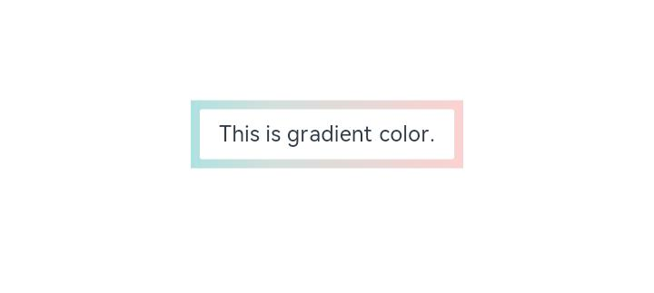
Example 1: Setting a Gradient Border
This example demonstrates how to set a gradient border for a component using the borderImage API.
// xxx.ets
@Entry
@Component
struct Index {
  build() {
    Row() {
      Column() {
        Text('This is gradient color.').textAlign(TextAlign.Center).height(50).width(200)
          .borderImage({
            source: {
              angle: 90,
              direction: GradientDirection.Left,
              colors: [[0xAEE1E1, 0.0], [0xD3E0DC, 0.3], [0xFCD1D1, 1.0]]
            },
            slice: { top: 10, bottom: 10, left: 10, right: 10 },
            width: { top: "10px", bottom: "10px", left: "10px", right: "10px" },
            repeat: RepeatMode.Stretch,
            fill: false
          })
      }
      .width('100%')
    }
    .height('100%')
  }
}
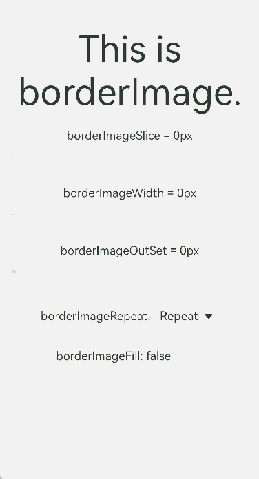
Example 2: Dynamically Adjusting Property Values
This example demonstrates how to dynamically adjust the properties of the borderImage API using the slider component.
// xxx.ets
@Entry
@Component
struct BorderImage {
  @State WidthValue: number = 0
  @State SliceValue: number = 0
  @State OutSetValue: number = 0
  @State RepeatValue: RepeatMode[] = [RepeatMode.Repeat, RepeatMode.Stretch, RepeatMode.Round, RepeatMode.Space]
  @State SelectIndex: number = 0
  @State SelectText: string = 'Repeat'
  @State FillValue: boolean = false

  build() {
    Row() {
      Column({ space: 20 }) {
        Row() {
          Text('This is borderImage.').textAlign(TextAlign.Center).fontSize(50)
        }
        .borderImage({
          source: $r('app.media.icon'),
          slice: this.SliceValue,
          width: this.WidthValue,
          outset: this.OutSetValue,
          repeat: this.RepeatValue[this.SelectIndex],
          fill: this.FillValue
        })

        Column() {
          Text(`borderImageSlice = ${this.SliceValue}px`)
          Slider({
            value: this.SliceValue,
            min: 0,
            max: 100,
            style: SliderStyle.OutSet
          })
            .onChange((value: number, mode: SliderChangeMode) => {
              this.SliceValue = value
            })
        }

        Column() {
          Text(`borderImageWidth = ${this.WidthValue}px`)
          Slider({
            value: this.WidthValue,
            min: 0,
            max: 100,
            style: SliderStyle.OutSet
          })
            .onChange((value: number, mode: SliderChangeMode) => {
              this.WidthValue = value
            })
        }

        Column() {
          Text(`borderImageOutSet = ${this.OutSetValue}px`)
          Slider({
            value: this.OutSetValue,
            min: 0,
            max: 100,
            style: SliderStyle.OutSet
          })
            .onChange((value: number, mode: SliderChangeMode) => {
              this.OutSetValue = value
            })
        }

        Row() {
          Text('borderImageRepeat: ')
          Select([{ value: 'Repeat' }, { value: 'Stretch' }, { value: 'Round' }, { value: 'Space' }])
            .value(this.SelectText)
            .selected(this.SelectIndex)
            .onSelect((index: number, value?: string) => {
              this.SelectIndex = index
              this.SelectText = value as string
            })
        }

        Row() {
          Text(`borderImageFill: ${this.FillValue} `)
          Toggle({ type: ToggleType.Switch, isOn: this.FillValue })
            .onChange((isOn: boolean) => {
              this.FillValue = isOn
            })
        }

      }
      .width('100%')
    }
    .height('100%')
  }
}
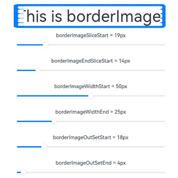
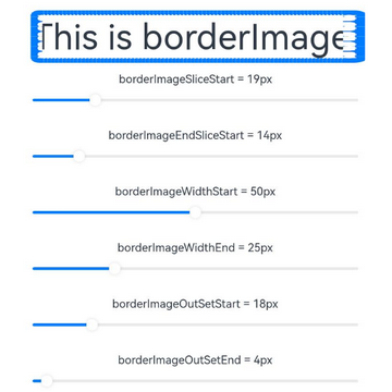
Example 3: Using LocalizedEdgeWidths Type Values
This example demonstrates how to use the LocalizedEdgeWidths type for the slice, width, and outset properties in the borderImage API.
// xxx.ets
import { LengthMetrics } from '@kit.ArkUI'

@Entry
@Component
struct BorderImage {
  @State WidthStartValue: number = 0
  @State WidthEndValue: number = 0
  @State SliceStartValue: number = 0
  @State SliceEndValue: number = 0
  @State OutSetStartValue: number = 0
  @State OutSetEndValue: number = 0
  @State RepeatValue: RepeatMode[] = [RepeatMode.Repeat, RepeatMode.Stretch, RepeatMode.Round, RepeatMode.Space]
  @State SelectIndex: number = 0
  @State SelectText: string = 'Repeat'
  @State FillValue: boolean = false

  build() {
    Row() {
      Column({ space: 20 }) {
        Row() {
          Text('This is borderImage.').textAlign(TextAlign.Center).fontSize(50)
        }
        .borderImage({
          source: $r('app.media.icon'),
          slice: {
            top: LengthMetrics.px(10),
            bottom: LengthMetrics.px(10),
            start: LengthMetrics.px(this.SliceStartValue),
            end: LengthMetrics.px(this.SliceEndValue) },
          width: {
            top: LengthMetrics.px(10),
            bottom: LengthMetrics.px(10),
            start: LengthMetrics.px(this.WidthStartValue),
            end: LengthMetrics.px(this.WidthEndValue)
          },
          outset: {
            top: LengthMetrics.px(10),
            bottom: LengthMetrics.px(10),
            start: LengthMetrics.px(this.OutSetStartValue),
            end: LengthMetrics.px(this.OutSetEndValue)
          },
          repeat: this.RepeatValue[this.SelectIndex],
          fill: this.FillValue
        })

        Column() {
          Text(`borderImageSliceStart = ${this.SliceStartValue}px`)
          Slider({
            value: this.SliceStartValue,
            min: 0,
            max: 100,
            style: SliderStyle.OutSet
          })
            .onChange((value: number, mode: SliderChangeMode) => {
              this.SliceStartValue = value
            })
        }

        Column() {
          Text(`borderImageEndSliceStart = ${this.SliceEndValue}px`)
          Slider({
            value: this.SliceEndValue,
            min: 0,
            max: 100,
            style: SliderStyle.OutSet
          })
            .onChange((value: number, mode: SliderChangeMode) => {
              this.SliceEndValue = value
            })
        }

        Column() {
          Text(`borderImageWidthStart = ${this.WidthStartValue}px`)
          Slider({
            value: this.WidthStartValue,
            min: 0,
            max: 100,
            style: SliderStyle.OutSet
          })
            .onChange((value: number, mode: SliderChangeMode) => {
              this.WidthStartValue = value
            })
        }

        Column() {
          Text(`borderImageWidthEnd = ${this.WidthEndValue}px`)
          Slider({
            value: this.WidthEndValue,
            min: 0,
            max: 100,
            style: SliderStyle.OutSet
          })
            .onChange((value: number, mode: SliderChangeMode) => {
              this.WidthEndValue = value
            })
        }

        Column() {
          Text(`borderImageOutSetStart = ${this.OutSetStartValue}px`)
          Slider({
            value: this.OutSetStartValue,
            min: 0,
            max: 100,
            style: SliderStyle.OutSet
          })
            .onChange((value: number, mode: SliderChangeMode) => {
              this.OutSetStartValue = value
            })
        }

        Column() {
          Text(`borderImageOutSetEnd = ${this.OutSetEndValue}px`)
          Slider({
            value: this.OutSetEndValue,
            min: 0,
            max: 100,
            style: SliderStyle.OutSet
          })
            .onChange((value: number, mode: SliderChangeMode) => {
              this.OutSetEndValue = value
            })
        }

        Row() {
          Text('borderImageRepeat: ')
          Select([{ value: 'Repeat' }, { value: 'Stretch' }, { value: 'Round' }, { value: 'Space' }])
            .value(this.SelectText)
            .selected(this.SelectIndex)
            .onSelect((index: number, value?: string) => {
              this.SelectIndex = index
              this.SelectText = value as string
            })
        }

        Row() {
          Text(`borderImageFill: ${this.FillValue} `)
          Toggle({ type: ToggleType.Switch, isOn: this.FillValue })
            .onChange((isOn: boolean) => {
              this.FillValue = isOn
            })
        }

      }
      .width('100%')
    }
    .height('100%')
  }
}
The following shows how the example is represented with left-to-right scripts.
The following shows how the example is represented with right-to-left scripts.
你可能感兴趣的鸿蒙文章
- 所属分类: 后端技术
- 本文标签:
热门推荐
-
2、 优质文章
-
3、 gt
-
7、 openharmony
-
9、 golang
-
10、 Vue中input框自动聚焦