harmony 鸿蒙Image Display (Image)
Image Display (Image)
More often than not, you may need to display images in your application, for example, icons in buttons, online images, and local images. This is where the Image component comes in handy. The Image component supports a wide range of image formats, including PNG, JPG, BMP, SVG, and GIF. For details, see Image.
To use the Image component, call the following API:
Image(src: PixelMap|ResourceStr|DrawableDescriptor)
This API obtains a local or online image from the data source specified by src. For details about how to load the data source, see Loading Image Resources.
Loading Image Resources
The Image component supports two types of images: archived and pixel map.
Archived Type Data Sources
Data sources of the archived type can be classified into local resources, online resources, Resource objects, media library resources, and Base64 resources.
- Local resources
To load local images, create an ets folder and place the local images in any position in the folder.
Then, in the Image component, set src to the local image path, with the root directory being the ets folder.
  Image('images/view.jpg')
  .width(200)
- Online resources
To use online images, first apply for the ohos.permission.INTERNET permission. For details, see Declaring Permissions. Then, in the Image component, set src to the URL of the online image.
Currently, the Image component supports only simple online images.
If an online image has been loaded before, the Image component can obtain it from the cache, instead of having to request it from the Internet again. For details about the image cache, see setImageCacheCount, setImageRawDataCacheSize, and setImageFileCacheSize. It should be noted that these image caching APIs are not flexible and will not be further developed. For complex scenarios, you are advised to use ImageKnife.
Image('https://www.example.com/example.JPG') // Replace the URL with the actual URL.
- Resource objects
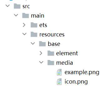
Resource objects can be used to import images across bundles and modules. To load Resource objects, place images in the resources folder, which can be read and converted to the Resource objects through $r.
Figure 1 resources
API:
Image($r('app.media.icon'))
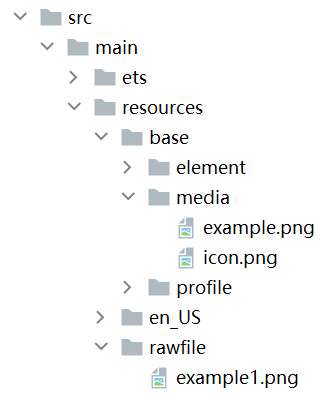
You can also place the images in the rawfile folder.
Figure 2 rawfile folder
API:
Image($rawfile('example1.png'))
- Media library file://data/storage
To load images from the media library, use a path string that starts with file://.
Call the API to obtain the image URL in the media library.
  import { photoAccessHelper } from '@kit.MediaLibraryKit';
  import { BusinessError } from '@kit.BasicServicesKit';


  @Entry
  @Component
  struct Index {
    @State imgDatas: string[] = [];
    // Obtain the image URL set.
    getAllImg() {
      try {
        let PhotoSelectOptions:photoAccessHelper.PhotoSelectOptions = new photoAccessHelper.PhotoSelectOptions();
        PhotoSelectOptions.MIMEType = photoAccessHelper.PhotoViewMIMETypes.IMAGE_TYPE;
        PhotoSelectOptions.maxSelectNumber = 5;
        let photoPicker:photoAccessHelper.PhotoViewPicker = new photoAccessHelper.PhotoViewPicker();
        photoPicker.select(PhotoSelectOptions).then((PhotoSelectResult:photoAccessHelper.PhotoSelectResult) => {
          this.imgDatas = PhotoSelectResult.photoUris;
          console.info('PhotoViewPicker.select successfully, PhotoSelectResult uri: ' + JSON.stringify(PhotoSelectResult));
        }).catch((err:Error) => {
          let message = (err as BusinessError).message;
          let code = (err as BusinessError).code;
          console.error(`PhotoViewPicker.select failed with. Code: ${code}, message: ${message}`);
        });
      } catch (err) {
        let message = (err as BusinessError).message;
        let code = (err as BusinessError).code;
        console.error(`PhotoViewPicker failed with. Code: ${code}, message: ${message}`);    }
    }


    // Call the preceding function in aboutToAppear to obtain the image URL set and store the URLs in imgDatas.
    async aboutToAppear() {
      this.getAllImg();
    }
    // Use the URL of imgDatas to load the image.
    build() {
      Column() {
        Grid() {
          ForEach(this.imgDatas, (item:string) => {
            GridItem() {
              Image(item)
                .width(200)
            }
          }, (item:string):string => JSON.stringify(item))
        }
      }.width('100%').height('100%')
    }
  }
Check the format of the URL obtained from the media library:
  Image('file://media/Photos/5')
  .width(200)
Base64
As shown above, the URL format is data:image/[png|jpeg|bmp|webp];base64,[base64 data], where [base64 data] indicates a Base64 string.
Base64 strings are widely used on web pages for storing pixel data of images.
Pixel Map
A pixel map is a pixel image obtained after image decoding. For details, see Introduction to Image Kit. In the following example, the data returned by the loaded online image is decoded into a pixel map, which is then displayed on the Image component.
- Create a PixelMap state variable.
@State image: PixelMap|undefined = undefined;
- Reference multimedia.
Request an online image and implement transcoding to generate a pixel map.
Reference the network and media library access permissions.
ts
   import { http } from '@kit.NetworkKit';
   import { image } from '@kit.ImageKit';
   import { BusinessError } from '@kit.BasicServicesKit';
Enter the online image address.
ts
   let OutData: http.HttpResponse
   http.createHttp().request("https://www.example.com/xxx.png",
     (error: BusinessError, data: http.HttpResponse) => {
       if (error) {
         console.error(`http request failed with. Code: ${error.code}, message: ${error.message}`);
       } else {
         OutData = data
       }
     }
   )
Transcode the data returned by the online image address to a pixel map.
   let code: http.ResponseCode|number = OutData.responseCode
   if (http.ResponseCode.OK === code) {
     let imageData: ArrayBuffer = OutData.result as ArrayBuffer;
     let imageSource: image.ImageSource = image.createImageSource(imageData);


     class tmp {
       height: number = 100
       width: number = 100
     }


     let si: tmp = new tmp()
     let options: Record<string, number|boolean|tmp> = {
       'alphaType': 0, // Alpha type.
       'editable': false, // Whether the image is editable.
       'pixelFormat': 3, // Pixel format.
       'scaleMode': 1, // Scale mode.
       'size': { height: 100, width: 100 }
     }  // Image size.


     class imagetmp {
       image: PixelMap|undefined = undefined
       set(val: PixelMap) {
         this.image = val
       }
     }


     imageSource.createPixelMap(options).then((pixelMap: PixelMap) => {
       let im = new imagetmp()
       im.set(pixelMap)
     })
   }
Display the image.
   class htp{
    httpRequest: Function|undefined = undefined
    set(){
      if(this.httpRequest){
        this.httpRequest()
      }
    }
  }
   Button("Get Online Image")
     .onClick(() => {
       let sethtp = new htp()
       sethtp.set()
     })
   Image(this.image).height(100).width(100)
You can also pass pixelMap to create a PixelMapDrawableDescriptor object for displaying images.
   import { DrawableDescriptor, PixelMapDrawableDescriptor } from '@kit.ArkUI'
   class htp{
    httpRequest: Function|undefined = undefined
    set(){
      if(this.httpRequest){
        this.httpRequest()
      }
    }
   }
   Button("Get Online Image")
     .onClick(() => {
       let sethtp = new htp()
       sethtp.set()
       this.drawablePixelMap = new PixelMapDrawableDescriptor(this.image)
     })
   Image(this.drawablePixelMap).height(100).width(100)
Displaying Vector Images
The Image component can display vector images in SVG format. The supported SVG labels are svg, rect, circle, ellipse, path, line, polyline, polygon, and animate.
You can use the fillColor attribute to change the fill color of an SVG image.
Image($r('app.media.cloud'))
  .width(50)
  .fillColor(Color.Blue)
Figure 3 Original image

Figure 4 SVG image after the fill color is set

Setting Attributes
Setting attributes for the Image component can spruce up the image with custom effects. The following are usage examples of common attributes. For details about all attributes, see Image.
Setting the Image Scale Mode
You can use the objectFit attribute to scale an image to fit it into a container whose height and width are determined.
@Entry
@Component
struct MyComponent {
  scroller: Scroller = new Scroller()

  build() {
    Scroll(this.scroller) {
      Column() {
        Row() {
          Image($r('app.media.img_2'))
            .width(200)
            .height(150)
            .border({ width: 1 })
              // The image is scaled with its aspect ratio retained for the content to be completely displayed within the display boundaries.
            .objectFit(ImageFit.Contain)
            .margin(15)
            .overlay('Contain', { align: Alignment.Bottom, offset: { x: 0, y: 20 } })
          Image($r('app.media.ic_img_2'))
            .width(200)
            .height(150)
            .border({ width: 1 })
            .objectFit(ImageFit.Cover)
            .margin(15)
              // The image is scaled with its aspect ratio retained for both sides to be greater than or equal to the display boundaries.
            .overlay('Cover', { align: Alignment.Bottom, offset: { x: 0, y: 20 } })
          Image($r('app.media.img_2'))
            .width(200)
            .height(150)
            .border({ width: 1 })
              // The image is scaled automatically to fit the display area.
            .objectFit(ImageFit.Auto)
            .margin(15)
            .overlay('Auto', { align: Alignment.Bottom, offset: { x: 0, y: 20 } })
        }

        Row() {
          Image($r('app.media.img_2'))
            .width(200)
            .height(150)
            .border({ width: 1 })
              // The image is scaled to fill the display area, and its aspect ratio is not retained.
            .objectFit(ImageFit.Fill)
            .margin(15)
            .overlay('Fill', { align: Alignment.Bottom, offset: { x: 0, y: 20 } })
          Image($r('app.media.img_2'))
            .width(200)
            .height(150)
            .border({ width: 1 })
              // The image content is displayed with its aspect ratio retained. The size is smaller than or equal to the original size.
            .objectFit(ImageFit.ScaleDown)
            .margin(15)
            .overlay('ScaleDown', { align: Alignment.Bottom, offset: { x: 0, y: 20 } })
          Image($r('app.media.img_2'))
            .width(200)
            .height(150)
            .border({ width: 1 })
              // The original size is retained.
            .objectFit(ImageFit.None)
            .margin(15)
            .overlay('None', { align: Alignment.Bottom, offset: { x: 0, y: 20 } })
        }
      }
    }
  }
}

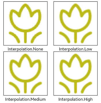
Using Image Interpolation
An image of low resolution may suffer quality loss with aliasing when scaled up. If this is the case, you can use the interpolation attribute to conduct image interpolation and improve image quality.
@Entry
@Component
struct Index {
  build() {
    Column() {
      Row() {
        Image($r('app.media.grass'))
          .width('40%')
          .interpolation(ImageInterpolation.None)
          .borderWidth(1)
          .overlay("Interpolation.None", { align: Alignment.Bottom, offset: { x: 0, y: 20 } })
          .margin(10)
        Image($r('app.media.grass'))
          .width('40%')
          .interpolation(ImageInterpolation.Low)
          .borderWidth(1)
          .overlay("Interpolation.Low", { align: Alignment.Bottom, offset: { x: 0, y: 20 } })
          .margin(10)
      }.width('100%')
      .justifyContent(FlexAlign.Center)

      Row() {
        Image($r('app.media.grass'))
          .width('40%')
          .interpolation(ImageInterpolation.Medium)
          .borderWidth(1)
          .overlay("Interpolation.Medium", { align: Alignment.Bottom, offset: { x: 0, y: 20 } })
          .margin(10)
        Image($r('app.media.grass'))
          .width('40%')
          .interpolation(ImageInterpolation.High)
          .borderWidth(1)
          .overlay("Interpolation.High", { align: Alignment.Bottom, offset: { x: 0, y: 20 } })
          .margin(10)
      }.width('100%')
      .justifyContent(FlexAlign.Center)
    }
    .height('100%')
  }
}
Setting Image Repeat Pattern
You can use the objectRepeat attribute to set the repeat pattern of an image. For details, see ImageRepeat.
@Entry
@Component
struct MyComponent {
  build() {
    Column({ space: 10 }) {
      Row({ space: 5 }) {
        Image($r('app.media.ic_public_favor_filled_1'))
          .width(110)
          .height(115)
          .border({ width: 1 })
          .objectRepeat(ImageRepeat.XY)
          .objectFit(ImageFit.ScaleDown)
          // Repeat the image along both the horizontal and vertical axes.
          .overlay('ImageRepeat.XY', { align: Alignment.Bottom, offset: { x: 0, y: 20 } })
        Image($r('app.media.ic_public_favor_filled_1'))
          .width(110)
          .height(115)
          .border({ width: 1 })
          .objectRepeat(ImageRepeat.Y)
          .objectFit(ImageFit.ScaleDown)
          // Repeat the image only along the vertical axis.
          .overlay('ImageRepeat.Y', { align: Alignment.Bottom, offset: { x: 0, y: 20 } })
        Image($r('app.media.ic_public_favor_filled_1'))
          .width(110)
          .height(115)
          .border({ width: 1 })
          .objectRepeat(ImageRepeat.X)
          .objectFit(ImageFit.ScaleDown)
          // Repeat the image only along the horizontal axis.
          .overlay('ImageRepeat.X', { align: Alignment.Bottom, offset: { x: 0, y: 20 } })
      }
    }.height(150).width('100%').padding(8)
  }
}

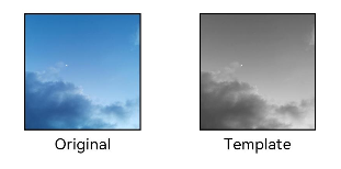
Setting Image Rendering Mode
You can use the renderMode attribute to set the rendering mode of an image.
@Entry
@Component
struct MyComponent {
  build() {
    Column({ space: 10 }) {
      Row({ space: 50 }) {
        Image($r('app.media.example'))
          // Set the rendering mode to Original.
          .renderMode(ImageRenderMode.Original)
          .width(100)
          .height(100)
          .border({ width: 1 })
            // overlay is a universal attribute, which is used to add overlay text on the component.
          .overlay('Original', { align: Alignment.Bottom, offset: { x: 0, y: 20 } })
        Image($r('app.media.example'))
          // Set the rendering mode to Template.
          .renderMode(ImageRenderMode.Template)
          .width(100)
          .height(100)
          .border({ width: 1 })
          .overlay('Template', { align: Alignment.Bottom, offset: { x: 0, y: 20 } })
      }
    }.height(150).width('100%').padding({ top: 20,right: 10 })
  }
}
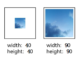
Setting Image Decoding Size
You can use the sourceSize attribute to set the image decoding size. By setting the decoding size to lower than the source size, you can decrease the image resolution.
In this example, the source image size is 1280 x 960, and the decoding sizes are 40 x 40 and 90 x 90.
@Entry
@Component
struct Index {
  build() {
    Column() {
      Row({ space: 50 }) {
        Image($r('app.media.example'))
          .sourceSize({
            width: 40,
            height: 40
          })
          .objectFit(ImageFit.ScaleDown)
          .aspectRatio(1)
          .width('25%')
          .border({ width: 1 })
          .overlay('width:40 height:40', { align: Alignment.Bottom, offset: { x: 0, y: 40 } })
        Image($r('app.media.example'))
          .sourceSize({
            width: 90,
            height: 90
          })
          .objectFit(ImageFit.ScaleDown)
          .width('25%')
          .aspectRatio(1)
          .border({ width: 1 })
          .overlay('width:90 height:90', { align: Alignment.Bottom, offset: { x: 0, y: 40 } })
      }.height(150).width('100%').padding(20)
    }
  }
}
Adding a Filter to an Image
You can use the colorFilter attribute to add a filter to an image.
@Entry
@Component
struct Index {
  build() {
    Column() {
      Row() {
        Image($r('app.media.example'))
          .width('40%')
          .margin(10)
        Image($r('app.media.example'))
          .width('40%')
          .colorFilter(
            [1, 1, 0, 0, 0,
             0, 1, 0, 0, 0,
             0, 0, 1, 0, 0,
             0, 0, 0, 1, 0])
          .margin(10)
      }.width('100%')
      .justifyContent(FlexAlign.Center)
    }
  }
}

Synchronously Loading Images
Generally, the image loading process is performed asynchronously to avoid blocking the main thread and to streamline UI interaction. In certain cases, however, the image may flicker when refreshed. If this occurs, you can use the syncLoad attribute to load the image synchronously to avoid flickering. Avoid using this attribute if the image loading may take a long time. Otherwise, the page may fail to respond.
Image($r('app.media.icon'))
  .syncLoad(true)
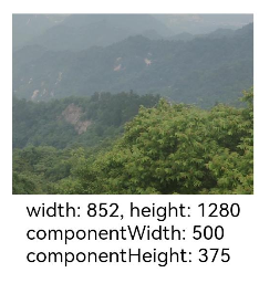
Adding Events
By binding the onComplete event to the Image component, you can obtain necessary information about the image after the image is successfully loaded. You can also bind the onError event to obtain error information when the image fails to be loaded.
@Entry
@Component
struct MyComponent {
  @State widthValue: number = 0
  @State heightValue: number = 0
  @State componentWidth: number = 0
  @State componentHeight: number = 0

  build() {
    Column() {
      Row() {
        Image($r('app.media.ic_img_2'))
          .width(200)
          .height(150)
          .margin(15)
          .onComplete(msg => {
            if(msg){
              this.widthValue = msg.width
              this.heightValue = msg.height
              this.componentWidth = msg.componentWidth
              this.componentHeight = msg.componentHeight
            }
          })
            // If the image fails to be obtained, print the result.
          .onError(() => {
            console.info('load image fail')
          })
          .overlay('\nwidth: ' + String(this.widthValue) + ', height: ' + String(this.heightValue) + '\ncomponentWidth: ' + String(this.componentWidth) + '\ncomponentHeight: ' + String(this.componentHeight), {
            align: Alignment.Bottom,
            offset: { x: 0, y: 60 }
          })
      }
    }
  }
}
你可能感兴趣的鸿蒙文章
harmony 鸿蒙Atomic Service Full Screen Launch Component (FullScreenLaunchComponent)
harmony 鸿蒙Arc Button (ArcButton)
harmony 鸿蒙Frame Animation (ohos.animator)
harmony 鸿蒙Implementing Property Animation
- 所属分类: 后端技术
- 本文标签:
热门推荐
-
2、 优质文章
-
3、 gt
-
7、 openharmony
-
9、 golang
-
10、 Vue中input框自动聚焦