harmony 鸿蒙Animation Overview
Animation Overview
The UI contains various components (such as time and wallpaper) that users see when interacting with their devices. Attributes are APIs used to control the behavior of components. For example, you can adjust the location of a component on the screen through the location attribute.
In general cases, if the value of an attribute is changed, the UI will be updated accordingly. Animations can add smooth transitions when the UI is updated. Without presence of animations, attributes would change immediately, resulting in a sense of visual discontinuity.
With the aid of animations, you can:
- Create smooth transitions between states.
- Provide visual feedback to give users a sense of control.
- Inform users of the system status, for example, the loading progress, to make them less stressed while waiting.
- Show users how to interact with the UI.
Smart use of animations can breathe life into the process of interaction. The frequently seen animations include those that play under device startup, application startup or exit, and pull-down-to-access-the-control-panel scenarios. These animations provide effective user feedback and direct the user attention to where it should be focused.
ArkUI provides a wide range of animation APIs (such as property animation and transition animation), which you can leverage to cause attributes to gradually change from the start value to the end value based on the specified settings. Although the attribute values are not absolutely continuous during the change, but rather discrete to some extent, what you finally see is a continuous animation, since human eyes retain persistence of vision. A change of the UI is called an animation frame, which corresponds to a screen refresh. An important indicator that determines the animation smoothness is the frame rate (FPS), that is, the number of animation frames per second. The higher the frame rate, the smoother the animation. In ArkUI, animation parameters include animation duration, animation curve, and more. As the main factor of the animation, the animation curve determines the law of attribute value changes. For example, with a linear animation curve, the attribute changes from the start value to the end value at a constant speed over the given duration. If the attribute changes too fast or too slow, the visual experience may suffer. Therefore, animation parameters, especially animation curves, must be well designed and adjusted to be tailored to use cases.
Animation APIs drive attribute values to continuously transit from one state to another according to the rule determined by the animation parameters, and thereby generate a continuous visual effect on the UI. This walkthrough demonstrates the steps and precautions to follow, for creating a fascinating animation experience for users. It is organized as follows.
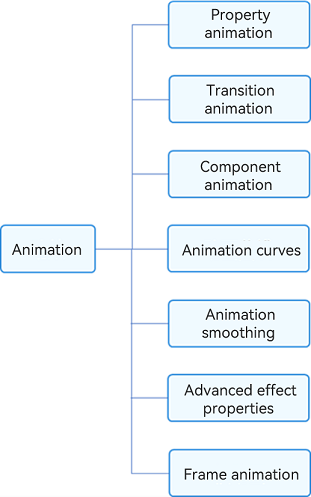
Attribute animation: It is the most basic animation type. It drives attribute changes frame by frame based on animation parameters to create an animation on a frame-by-frame basis.
Transition animation: animation for transitioning when components appear and disappear. To maintain animation consistency, some animation curves have been built in and cannot be customized.
- Whenever possible, avoid UIAbility redirection in your application. A UIAbility is a task in effect and is individually displayed on the recent tasks screen. Redirection between UIAbilities is redirection between tasks. In the typical scenario of viewing large images in an application, if you call the gallery UIAbility from the application to open large images, then the gallery UIAbility will appear on the recent tasks screen. This is not recommended. A more recommended practice is as follows: Build a large image component in the application and invoke that component through modal transition. In this way, the entire animation can be completed in one UIAbility.
- To implement navigation, use the Navigation component, instead of the page+router mode. The page+router mode causes page separation, which is inconvenient for implementing linked transition effects. In addition, it does not allow for one-time development for multi-device deployment.
Component animation: Components provide default animations (such as the slide animation of the List component). Some of them even support custom animations.
Animation curve: You can use traditional and spring curves to control how the attribute values change, to create an engaging animation effect.
Animation connection: Make the transition between animations and between gestures and animations as natural as possible.
Advanced animation effects: You can up your animation game with advanced effects such as blur, shadow, color gradient, and the like.
你可能感兴趣的鸿蒙文章
harmony 鸿蒙Atomic Service Full Screen Launch Component (FullScreenLaunchComponent)
harmony 鸿蒙Arc Button (ArcButton)
harmony 鸿蒙Frame Animation (ohos.animator)
harmony 鸿蒙Implementing Property Animation
- 所属分类: 后端技术
- 本文标签:
热门推荐
-
2、 优质文章
-
3、 gt
-
7、 openharmony
-
9、 golang
-
10、 Vue中input框自动聚焦