harmony 鸿蒙Arc Button (ArcButton)
Arc Button (ArcButton)
The ArcButton component represents an arc button specifically designed for circular screens on wearable devices. It offers various button styles, such as emphasized, normal, and warning, tailored for watch UIs. For details, see ArcButton.
Creating a Button
To create an ArcButton component, use the following:
ArcButton({
  options: new ArcButtonOptions({
    label: 'OK',
    position: ArcButtonPosition.TOP_EDGE,
    styleMode: ArcButtonStyleMode.EMPHASIZED_LIGHT
  })
})
label: sets the text displayed on the button.
position: sets the type of the button.
styleMode: sets the style mode of the button.
Setting the Button Type
The ArcButton component offers two types: top arc button and bottom arc button. Use the position attribute to set the type.
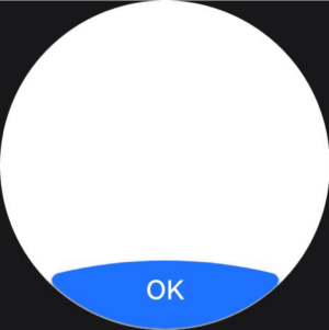
- Lower arc button (default type)
Set position to ArcButtonPosition.BOTTOM_EDGE.
  ArcButton({
    options: new ArcButtonOptions({
      label: 'OK',
      position: ArcButtonPosition.BOTTOM_EDGE,
      styleMode: ArcButtonStyleMode.EMPHASIZED_LIGHT
    })
  })
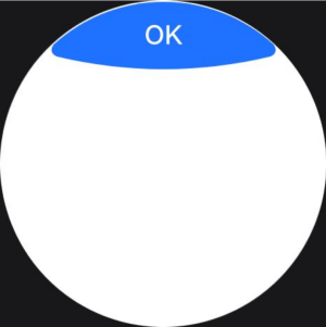
- Upper arc button
Set position to ArcButtonPosition.TOP_EDGE.
  ArcButton({
    options: new ArcButtonOptions({
      label: 'OK',
      position: ArcButtonPosition.TOP_EDGE,
      styleMode: ArcButtonStyleMode.EMPHASIZED_LIGHT
    })
  })
Customizing the Style
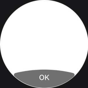
- Setting the background color
Use the backgroundColor attribute to set the background color of the button.
  ArcButton({
    options: new ArcButtonOptions({
      label: 'OK',
      styleMode: ArcButtonStyleMode.CUSTOM,
      backgroundColor: ColorMetrics.resourceColor('#707070')
    })
  })
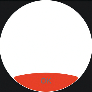
- Setting the font color
Use the fontColor attribute to set the font color of the button.
  ArcButton({
    options: new ArcButtonOptions({
      label: 'OK',
      styleMode: ArcButtonStyleMode.CUSTOM,
      backgroundColor: ColorMetrics.resourceColor('#E84026'),
      fontColor: ColorMetrics.resourceColor('#707070')
    })
  })
- Setting the shadow color
Enable the button shadow using the shadowEnabled attribute and set the shadow color using the shadowColor attribute.
  ArcButton({
    options: new ArcButtonOptions({
      label: 'OK',
      shadowEnabled: true,
      shadowColor: ColorMetrics.resourceColor('#707070')
    })
  })
Adding Events
- Bind the onClick event to define custom behavior to be executed when the button is clicked.
  ArcButton({
    options: new ArcButtonOptions({
      label: 'OK',
      onClick: () => {
        console.info('ArcButton onClick')
      }
    })
  })
- Bind the onTouch event to define custom behavior to be executed when the button is touched.
  ArcButton({
    options: new ArcButtonOptions({
      label: 'OK',
      onTouch: (event: TouchEvent) => {
        console.info('ArcButton onTouch')
      }
    })
  })
Example
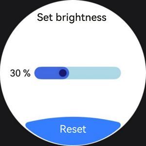
This example demonstrates a brightness settings screen where a slider displays the current brightness level at 30%. When the reset button is clicked, the brightness value is reset to the default value of 50%.
import { LengthMetrics, LengthUnit, ArcButton, ArcButtonOptions, ArcButtonStyleMode, } from '@kit.ArkUI';

@Entry
@ComponentV2
struct BrightnessPage {
  @Local brightnessValue: number = 30
  private defaultBrightnessValue: number = 50

  build() {
    RelativeContainer() {
      Text('Set brightness')
        .fontColor(Color.Black)
        .id('id_brightness_set_text')
        .fontSize(24)
        .margin({ top: 16 })
        .alignRules({
          middle: { anchor: '__container__', align: HorizontalAlign.Center }
        })

      Text(`${this.brightnessValue} %`)
        .fontColor(Color.Black)
        .id('id_brightness_min_text')
        .margin({ left: 16 })
        .alignRules({
          start: { anchor: '__container__', align: HorizontalAlign.Start },
          center: { anchor: '__container__', align: VerticalAlign.Center }
        })

      Slider({
        value: this.brightnessValue,
        min: 0,
        max: 100,
        style: SliderStyle.InSet
      })
        .blockColor('#191970')
        .trackColor('#ADD8E6')
        .selectedColor('#4169E1')
        .width(150)
        .id('id_brightness_slider')
        .margin({ left: 16, right: 16 })
        .onChange((value: number, mode: SliderChangeMode) => {
          this.brightnessValue = value
        })
        .alignRules({
          center: { anchor: 'id_brightness_min_text', align: VerticalAlign.Center },
          start: { anchor: 'id_brightness_min_text', align: HorizontalAlign.End },
          end: { anchor: 'id_brightness_max_text', align: HorizontalAlign.Start }
        })

      ArcButton({
        options: new ArcButtonOptions({
          label: 'Reset',
          styleMode: ArcButtonStyleMode.EMPHASIZED_LIGHT,
          fontSize: new LengthMetrics(19, LengthUnit.FP),
          onClick: () => {
            this.brightnessValue = this.defaultBrightnessValue
          }
        })
      })
        .alignRules({
          middle: { anchor: '__container__', align: HorizontalAlign.Center },
          bottom: { anchor: '__container__', align: VerticalAlign.Bottom }
        })
    }
    .height('100%')
    .width('100%')
    .backgroundColor(Color.White)
  }
}
你可能感兴趣的鸿蒙文章
harmony 鸿蒙Atomic Service Full Screen Launch Component (FullScreenLaunchComponent)
harmony 鸿蒙Frame Animation (ohos.animator)
harmony 鸿蒙Implementing Property Animation
- 所属分类: 后端技术
- 本文标签:
热门推荐
-
2、 优质文章
-
3、 gt
-
7、 openharmony
-
9、 golang
-
10、 Vue中input框自动聚焦