harmony 鸿蒙Image
Image
The Image component is usually used to display images in applications. It supports images in PNG, JPG, JPEG, BMP, SVG, WEBP, GIF, or HEIF format from the following data sources: PixelMap, ResourceStr, or DrawableDescriptor.
NOTE
This component is supported since API version 7. Updates will be marked with a superscript to indicate their earliest API version.
To use shortcut keys to copy the Image component, the component must be in focus. By default, the Image component is not focusable. To enable it to gain focus, set both the focusable and focusOnTouch attributes to true.
The Image component supports SVG image sources. For details about SVG tags, see SVG Tags.
For animated images, animation playback is disabled by default and depends on the visibility of the Image component. When the component is visible, the animation is started through the callback. When the component is invisible, the animation is stopped. The visibility status of the Image component can be identified through the onVisibleAreaChange event. If the value of ratios is greater than 0, the component is visible.
Since API version 18, the Image component offloads the tasks of downloading and caching online images to the download and cache module. This module provides a pre-download API that allows you to download images before using the Image component. Once the component is created, it requests the image data from the download and cache module. This way, the display performance of the Image component is improved. Regarding cache locations:
- For versions before API version 18, the cache is stored in the local sandbox directory of the application.
- For versions API version 18 and later, the cache is stored in the cache directory under the application’s root directory.
Required Permissions
The ohos.permission.INTERNET permission is required for using online images. For details about how to apply for a permission, see Declaring Permissions.
Child Components
Not supported
APIs
Image
Image(src: PixelMap|ResourceStr|DrawableDescriptor)
Obtains an image from the specified source for subsequent rendering and display.
If the Image component fails to obtain the image or the obtained image size is 0, the Image component is automatically resized to 0 and does not follow the layout constraints of its parent component.
By default, the Image component crops images to keep their center. For example, if the component has the same width and height, it crops any image whose width and height are different, so as to keep its center.
If the Image component does not have its width and height set, its size adapts to that of its parent component once the image is successfully loaded.
Widget capability: This API can be used in ArkTS widgets since API version 9.
Atomic service API: This API can be used in atomic services since API version 11.
System capability: SystemCapability.ArkUI.ArkUI.Full
Parameters
| Name | Type | Mandatory | Description |
|---|---|---|---|
| src | PixelMap |ResourceStr|DrawableDescriptor | Yes | Data source of the image. Local and online sources are supported. For details about how to reference an image, see Loading Image Resources. 1. PixelMap: an array of pixels storing graphical information. This type is usually used in image editing scenarios. 2. ResourceStr: a string or a Resource object. The string type can be used to load local images and, more frequently, online images. When using an image referenced using a relative path, for example, Image(“common/test.jpg”), the Image component cannot be called across bundles or modules. If an image needs to be used globally, you are advised to use the Resource format. The following types of strings are supported: - Base64 strings in the format of data:image/[png|jpeg|bmp|webp|heif];base64,[base64 data], where [base64 data] is a Base64 string. - Strings with the file:// prefix, that is, application sandbox URIs: file://<bundleName>/<sandboxPath>, When accessing a path that contains special characters, use fileUri.getUriFromPath(path) to transform the path into a URI that can handle special symbols. In addition, ensure that the application has the read permission to the files in the specified path. The Resource format allows for access across bundles and modules. It is recommended for accessing local images. 3. DrawableDescriptor: an object created when the passed resource ID or name belongs to a common image. If the AnimatedDrawableDescriptor type is passed in, the PixelMap array animation can be played. NOTE - ArkTS widgets support GIF animations, but the animations only play once on display. - ArkTS widgets do not support the strings with the http:/\/ or file:/\/ prefix. - When a local image is being loaded, any modification or replacement of it may cause application crash. Therefore, to overwrite an image file, delete the file first and then create one with the same name. - Online images must support the RFC 9113 standard to be successfully loaded. - If images to download are greater than 10 MB or in large number, consider using HTTP to preload them to improve the image loading performance and facilitate data management on the application side. - Directly passing a URL to the Image component can lead to potential performance issues, such as: (1) Large images cannot be preloaded, resulting in longer display times for white blocks; (2) Small images set to load synchronously can block the UI thread in weak network environments, causing screen freezing issues; (3) In fast-scrolling water flow layouts, images that are about to be displayed could not be preloaded, leading to more white blocks during scrolling. Performance issues manifest differently in different scenarios. To address these issues, decouple the network downloading part from the display of the Image component, which allows for preloading or asynchronous downloading. - To display an SVG image that does not have the native size, you must set the width and height for the Image component. - If an SVG image references another local image through the Image tag, the referenced image cannot be in .svg or .gif format. - When the src attribute changes from a valid value to an invalid one, the image remains unchanged. - If this parameter is of the PixelMap type, the Image component can detect data changes only when the reference to the PixelMap object is updated to point to a new instance. If modifications are made to the content of the PixelMap object, such as pixel values, but the reference to the object remains the same, the Image component will not recognize these modifications as a data change. |
Image12+
Image(src: PixelMap|ResourceStr|DrawableDescriptor|ImageContent)
Obtains an image. The ImageContent type allows you to specify the image content.
Widget capability: This API can be used in ArkTS widgets since API version 12.
Atomic service API: This API can be used in atomic services since API version 12.
System capability: SystemCapability.ArkUI.ArkUI.Full
Parameters
| Name | Type | Mandatory | Description |
|---|---|---|---|
| src | PixelMap |ResourceStr|DrawableDescriptor|ImageContent | Yes | Data source of the image. Local and online sources are supported. For details about how to reference an image, see Loading Image Resources. 1. PixelMap: an array of pixels storing graphical information. This type is usually used in image editing scenarios. 2. ResourceStr: a string or a Resource object. The string type can be used to load local images and, more frequently, online images. When using an image referenced using a relative path, for example, Image(“common/test.jpg”), the Image component cannot be called across bundles or modules. If an image needs to be used globally, you are advised to use the Resource format. The following types of strings are supported: - Base64 strings in the format of data:image/[png|jpeg|bmp|webp|heif];base64,[base64 data], where [base64 data] is a Base64 string. - Strings with the file:// prefix, that is, application sandbox URIs: file://<bundleName>/<sandboxPath>, When accessing a path that contains special characters, use fileUri.getUriFromPath(path) to transform the path into a URI that can handle special symbols. In addition, ensure that the application has the read permission to the files in the specified path. The Resource format allows for access across bundles and modules. It is recommended for accessing local images. 3. DrawableDescriptor: an object created when the passed resource ID or name belongs to a common image. If the AnimatedDrawableDescriptor type is passed in, the PixelMap array animation can be played. 4. ImageContent: image content. NOTE - ArkTS widgets support GIF animations, but the animations only play once on display. - ArkTS widgets do not support the strings with the http:/\/ or file:/\/ prefix. - When a local image is being loaded, any modification or replacement of it may cause application crash. Therefore, to overwrite an image file, delete the file first and then create one with the same name. - Online images must support the RFC 9113 standard to be successfully loaded. - If images to download are greater than 10 MB or in large number, consider using HTTP to preload them to improve the image loading performance and facilitate data management on the application side. - Directly passing a URL to the Image component can lead to potential performance issues, such as: (1) Large images cannot be preloaded, resulting in longer display times for white blocks; (2) Small images set to load synchronously can block the UI thread in weak network environments, causing screen freezing issues; (3) In fast-scrolling water flow layouts, images that are about to be displayed could not be preloaded, leading to more white blocks during scrolling. Performance issues manifest differently in different scenarios. To address these issues, decouple the network downloading part from the display of the Image component, which allows for preloading or asynchronous downloading. - To display an SVG image that does not have the native size, you must set the width and height for the Image component. - If an SVG image references another local image through the Image tag, the referenced image cannot be in .svg or .gif format. - When the src attribute changes from a valid value to an invalid one, the image remains unchanged. - If this parameter is of the PixelMap type, the Image component can detect data changes only when the reference to the PixelMap object is updated to point to a new instance. If modifications are made to the content of the PixelMap object, such as pixel values, but the reference to the object remains the same, the Image component will not recognize these modifications as a data change. |
Image12+
Image(src: PixelMap|ResourceStr|DrawableDescriptor, imageAIOptions: ImageAIOptions)
Obtains an image. The imageAIOptions parameter allows you to set AI image analysis options.
Atomic service API: This API can be used in atomic services since API version 12.
System capability: SystemCapability.ArkUI.ArkUI.Full
Parameters
| Name | Type | Mandatory | Description |
|---|---|---|---|
| src | PixelMap |ResourceStr|DrawableDescriptor | Yes | Data source of the image. Local and online sources are supported. For details about how to reference an image, see Loading Image Resources. 1. PixelMap: an array of pixels storing graphical information. This type is usually used in image editing scenarios. 2. ResourceStr: a string or a Resource object. The string type can be used to load local images and, more frequently, online images. When using an image referenced using a relative path, for example, Image(“common/test.jpg”), the Image component cannot be called across bundles or modules. If an image needs to be used globally, you are advised to use the Resource format. The following types of strings are supported: - Base64 strings in the format of data:image/[png|jpeg|bmp|webp|heif];base64,[base64 data], where [base64 data] is a Base64 string. - Strings with the file:// prefix, that is, application sandbox URIs: file://<bundleName>/<sandboxPath>, When accessing a path that contains special characters, use fileUri.getUriFromPath(path) to transform the path into a URI that can handle special symbols. In addition, ensure that the application has the read permission to the files in the specified path. The Resource format allows for access across bundles and modules. It is recommended for accessing local images. 3. DrawableDescriptor: an object created when the passed resource ID or name belongs to a common image. If the AnimatedDrawableDescriptor type is passed in, the PixelMap array animation can be played. NOTE - ArkTS widgets support GIF animations, but the animations only play once on display. - ArkTS widgets do not support the strings with the http:/\/ or file:/\/ prefix. - When a local image is being loaded, any modification or replacement of it may cause application crash. Therefore, to overwrite an image file, delete the file first and then create one with the same name. - Online images must support the RFC 9113 standard to be successfully loaded. - If images to download are greater than 10 MB or in large number, consider using HTTP to preload them to improve the image loading performance and facilitate data management on the application side. - Directly passing a URL to the Image component can lead to potential performance issues, such as: (1) Large images cannot be preloaded, resulting in longer display times for white blocks; (2) Small images set to load synchronously can block the UI thread in weak network environments, causing screen freezing issues; (3) In fast-scrolling water flow layouts, images that are about to be displayed could not be preloaded, leading to more white blocks during scrolling. Performance issues manifest differently in different scenarios. To address these issues, decouple the network downloading part from the display of the Image component, which allows for preloading or asynchronous downloading. - To display an SVG image that does not have the native size, you must set the width and height for the Image component. - If an SVG image references another local image through the Image tag, the referenced image cannot be in .svg or .gif format. - When the src attribute changes from a valid value to an invalid one, the image remains unchanged. - If this parameter is of the PixelMap type, the Image component can detect data changes only when the reference to the PixelMap object is updated to point to a new instance. If modifications are made to the content of the PixelMap object, such as pixel values, but the reference to the object remains the same, the Image component will not recognize these modifications as a data change. |
| imageAIOptions | ImageAIOptions | Yes | AI image analysis options. You can configure the analysis type or bind an analyzer controller through this parameter. |
Attributes
For details about how to use the attributes, see Setting Attributes. In addition to the universal attributes, the following attributes are supported.
NOTE
The Image component does not support the universal attribute foregroundColor. Instead, you can set the fill color using the component’s fillColor attribute.
alt
alt(value: string|Resource|PixelMap)
Sets the placeholder image displayed during loading.
This attribute does not take effect when the parameter type of the component is AnimatedDrawableDescriptor.
Widget capability: This API can be used in ArkTS widgets since API version 9.
Atomic service API: This API can be used in atomic services since API version 11.
System capability: SystemCapability.ArkUI.ArkUI.Full
Parameters
| Name | Type | Mandatory | Description |
|---|---|---|---|
| value | string |Resource |PixelMap12+ | Yes | Placeholder image displayed during loading. Local images (in PNG, JPG, BMP, SVG, GIF, or HEIF format) and PixelMap objects are supported, but online images are not. Default value: null |
objectFit
objectFit(value: ImageFit)
Sets how the image is resized to fit its container.
Widget capability: This API can be used in ArkTS widgets since API version 9.
Atomic service API: This API can be used in atomic services since API version 11.
System capability: SystemCapability.ArkUI.ArkUI.Full
Parameters
| Name | Type | Mandatory | Description |
|---|---|---|---|
| value | ImageFit | Yes | How the image is resized to fit its container. Default value: ImageFit.Cover |
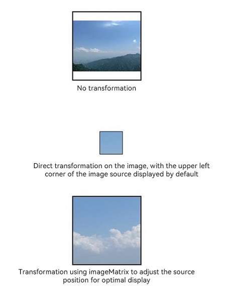
imageMatrix15+
imageMatrix(matrix: ImageMatrix)
Sets the transformation matrix of the image. This API allows you to use the APIs provided by the ImageMatrix object, such as translate, rotate, and scale, to achieve the optimal display of grid thumbnails. This attribute is not applicable to SVG images.
This attribute does not take effect when the resizable or objectRepeat attributes are set. This attribute only processes the image source and does not trigger any callback events of the Image component.
This attribute is strongly related to the objectFit setting and only works when objectFit is set to ImageFit.MATRIX.
Atomic service API: This API can be used in atomic services since API version 15.
System capability: SystemCapability.ArkUI.ArkUI.Full
Parameters
| Name | Type | Mandatory | Description |
|---|---|---|---|
| matrix | ImageMatrix | Yes | Transformation matrix of the image. |
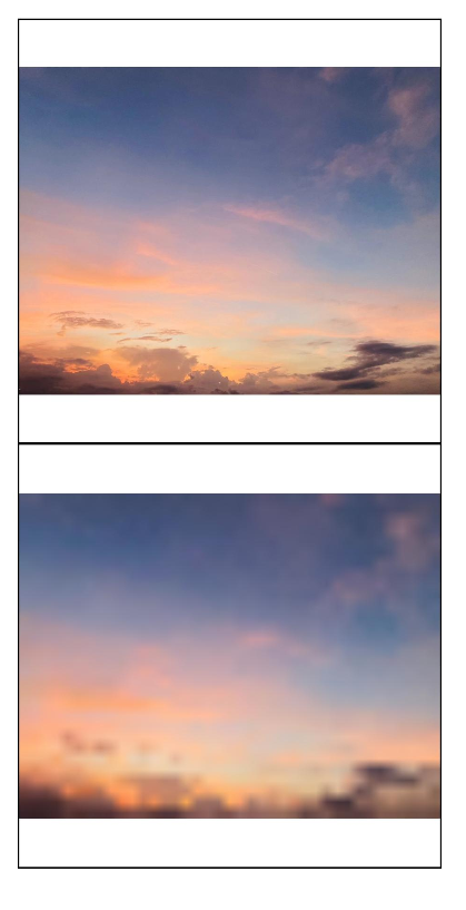
objectRepeat
objectRepeat(value: ImageRepeat)
Sets how the image is repeated. When set to repeat, the image is repeated from the center to edges, and the last image will be clipped if it does not fit in the component. This attribute is not applicable to SVG images.
This attribute does not take effect when the parameter type of the component is AnimatedDrawableDescriptor.
Widget capability: This API can be used in ArkTS widgets since API version 9.
Atomic service API: This API can be used in atomic services since API version 11.
System capability: SystemCapability.ArkUI.ArkUI.Full
Parameters
| Name | Type | Mandatory | Description |
|---|---|---|---|
| value | ImageRepeat | Yes | How the image is repeated. Default value: ImageRepeat.NoRepeat |
interpolation
interpolation(value: ImageInterpolation)
Sets the interpolation effect of the image, which can alleviate aliasing that occurs when the image is zoomed. This attribute is not applicable to SVG images.
This attribute does not take effect when the parameter type of the component is AnimatedDrawableDescriptor.
Widget capability: This API can be used in ArkTS widgets since API version 9.
Atomic service API: This API can be used in atomic services since API version 11.
System capability: SystemCapability.ArkUI.ArkUI.Full
Parameters
| Name | Type | Mandatory | Description |
|---|---|---|---|
| value | ImageInterpolation | Yes | Interpolation effect of the image. Default value: ImageInterpolation.Low |
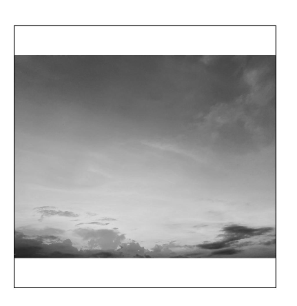
renderMode
renderMode(value: ImageRenderMode)
Sets the rendering mode of the image. This attribute is not applicable to SVG images.
When ColorFilter is set, this attribute is not effective.
This attribute does not take effect when the parameter type of the component is AnimatedDrawableDescriptor.
Widget capability: This API can be used in ArkTS widgets since API version 9.
Atomic service API: This API can be used in atomic services since API version 11.
System capability: SystemCapability.ArkUI.ArkUI.Full
Parameters
| Name | Type | Mandatory | Description |
|---|---|---|---|
| value | ImageRenderMode | Yes | Rendering mode of the image, which can be Original or Template (monochrome). Default value: ImageRenderMode.Original |
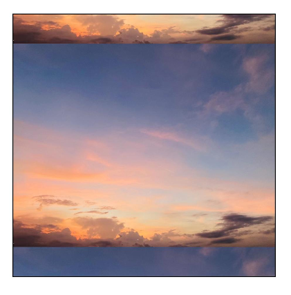
sourceSize
sourceSize(value: ImageSourceSize)
Sets the decoding size of the image. This attribute works only when the target size is smaller than the source size. This attribute is not applicable to SVG images or PixelMap objects.
This attribute does not take effect when the parameter type of the component is AnimatedDrawableDescriptor.
Widget capability: This API can be used in ArkTS widgets since API version 9.
Atomic service API: This API can be used in atomic services since API version 11.
System capability: SystemCapability.ArkUI.ArkUI.Full
Parameters
| Name | Type | Mandatory | Description |
|---|---|---|---|
| value | ImageSourceSize | Yes | Decoding size of the image. This parameter can be used to reduce the image resolution when the image display size needs to be smaller than the component size. When used together with ImageFit.None, it can display a small image in the component. |
matchTextDirection
matchTextDirection(value: boolean)
Specifies whether to display the image in the system language direction. When value is set to true, the image is horizontally flipped in the right-to-left (RTL) language context.
This attribute does not take effect when the parameter type of the component is AnimatedDrawableDescriptor.
Widget capability: This API can be used in ArkTS widgets since API version 9.
Atomic service API: This API can be used in atomic services since API version 11.
System capability: SystemCapability.ArkUI.ArkUI.Full
Parameters
| Name | Type | Mandatory | Description |
|---|---|---|---|
| value | boolean | Yes | Whether to display the image in the system language direction. Default value: false true: Display the image in the system language direction. false: Do not display the image in the system language direction. |
fitOriginalSize
fitOriginalSize(value: boolean)
Specifies whether to fit the component to the size of the image source when the component size is not set.
This attribute does not take effect when the parameter type of the component is AnimatedDrawableDescriptor.
Widget capability: This API can be used in ArkTS widgets since API version 9.
Atomic service API: This API can be used in atomic services since API version 11.
System capability: SystemCapability.ArkUI.ArkUI.Full
Parameters
| Name | Type | Mandatory | Description |
|---|---|---|---|
| value | boolean | Yes | Whether to fit the image to the size of the image source. Default value: false NOTE If fitOriginalSize is set to false or is not set, the component does not fit the image to the size of the image source. If fitOriginalSize is set to true, the component fits the image to the size of the image source. |
fillColor
fillColor(value: ResourceColor)
Sets the fill color to be superimposed on the image. This attribute applies only to SVG images. Once set, the fill color will replace the fill colors of all drawable elements within the SVG image. To set the fill color for a PNG image, use colorFilter.
This attribute does not take effect when the parameter type of the component is AnimatedDrawableDescriptor.
Widget capability: This API can be used in ArkTS widgets since API version 9.
Atomic service API: This API can be used in atomic services since API version 11.
System capability: SystemCapability.ArkUI.ArkUI.Full
Parameters
| Name | Type | Mandatory | Description |
|---|---|---|---|
| value | ResourceColor | Yes | Fill color to be superimposed on the image. NOTE By default, no fill color is applied. If an invalid value is passed, the system uses the default theme color: black in light mode and white in dark mode. |
fillColor15+
fillColor(color: ResourceColor|ColorContent)
Sets the fill color to be superimposed on the image. This attribute applies only to SVG images. Once set, the fill color will replace the fill colors of all drawable elements within the SVG image. To set the fill color for a PNG image, use colorFilter. To reset the fill color, pass a value of the ColorContent type.
This attribute does not take effect when the parameter type of the component is AnimatedDrawableDescriptor.
Atomic service API: This API can be used in atomic services since API version 15.
System capability: SystemCapability.ArkUI.ArkUI.Full
Parameters
| Name | Type | Mandatory | Description |
|---|---|---|---|
| color | ResourceColor|ColorContent | Yes | Fill color to be superimposed on the image. NOTE By default, no fill color is applied. If an invalid value is passed, the system uses the default theme color: black in light mode and white in dark mode. |
autoResize
autoResize(value: boolean)
Specifies whether to resize the image source based on the size of the display area during image decoding. As downsampling images results in some loss of information, it may reduce the image quality, causing issues such as aliasing. To retain the original image quality, set autoResize to false, but this may increase the memory usage.
If the original image size does not match the display size, the image may be distorted or blurred. Recommended configuration for the optimal definition:
When the image is scaled down: .autoResize(false) + .interpolation(.Medium)
When the image is scaled up: .interpolation(.High)
This attribute does not take effect when the parameter type of the component is AnimatedDrawableDescriptor or SVG.
Widget capability: This API can be used in ArkTS widgets since API version 9.
Atomic service API: This API can be used in atomic services since API version 11.
System capability: SystemCapability.ArkUI.ArkUI.Full
Parameters
| Name | Type | Mandatory | Description |
|---|---|---|---|
| value | boolean | Yes | Whether to resize the image source based on the size of the display area during image decoding. This resizing can help reduce the memory usage. For example, if the size of the original image is 1920 x 1080 and the size of the display area is 200 x 200, you can set this attribute to true so that the image is downsampled to 200 x 200. Default value: false true: Enable resizing. false: Disable resizing. |
syncLoad8+
syncLoad(value: boolean)
Specifies whether to load the image synchronously. When loading a small image, you are advised to set syncLoad to true so that the image loading can be quickly completed on the main thread.
This attribute does not take effect when the parameter type of the component is AnimatedDrawableDescriptor.
Widget capability: This API can be used in ArkTS widgets since API version 9.
Atomic service API: This API can be used in atomic services since API version 11.
System capability: SystemCapability.ArkUI.ArkUI.Full
Parameters
| Name | Type | Mandatory | Description |
|---|---|---|---|
| value | boolean | Yes | Whether to load the image synchronously. By default, the image is loaded asynchronously. During synchronous loading, the UI thread is blocked and the placeholder image is not displayed. Default value: false true: Load the image synchronously. false: Load the image asynchronously. |
copyOption9+
copyOption(value: CopyOptions)
Whether the image can be copied. When copyOption is set to a value other than CopyOptions.None, the image can be copied in various manners, such as long pressing, right-clicking, or pressing Ctrl+C. SVG images cannot be copied.
This attribute does not take effect when the parameter type of the component is AnimatedDrawableDescriptor.
Widget capability: This API can be used in ArkTS widgets since API version 9.
Atomic service API: This API can be used in atomic services since API version 11.
System capability: SystemCapability.ArkUI.ArkUI.Full
Parameters
| Name | Type | Mandatory | Description |
|---|---|---|---|
| value | CopyOptions | Yes | Specifies whether the image can be copied. Default value: CopyOptions.None |
colorFilter9+
colorFilter(value: ColorFilter|DrawingColorFilter)
Sets the color filter for the image.
When this attribute is set, renderMode is not effective.
Widget capability: This API can be used in ArkTS widgets since API version 9.
Atomic service API: This API can be used in atomic services since API version 11.
System capability: SystemCapability.ArkUI.ArkUI.Full
Parameters
| Name | Type | Mandatory | Description |
|---|---|---|---|
| value | ColorFilter |DrawingColorFilter | Yes | 1. Color filter of the image. The input parameter is a 4 x 5 RGBA transformation matrix. The first row of the matrix represents a vector value of R (red), the second row represents a vector value of G (green), the third row represents a vector value of B (blue), and the fourth row represents a vector value of A (alpha). The four rows represent different RGBA vector values. If the matrix contains entries of 1 on the diagonal and entries of 0 in other places, the original color of the image is retained. Calculation rule: If the input filter matrix is as follows:  Wherein the color is [R, G, B, A]. Then the color after filtering is [R’, G’, B’, A’].  2. The ColorFilter type of @ohos.graphics.drawing can be used as the input parameter since API Version 12. NOTE This parameter is not available for SVG images in API version 11 and earlier versions. The DrawingColorfilter type can be used in atomic services since API version 12. The SVG image to set as the source must have the stroke attribute. |
draggable9+
draggable(value: boolean)
Specifies whether the image is draggable. This attribute cannot be used together with the onDragStart event.
Atomic service API: This API can be used in atomic services since API version 11.
System capability: SystemCapability.ArkUI.ArkUI.Full
Parameters
| Name | Type | Mandatory | Description |
|---|---|---|---|
| value | boolean | Yes | Whether the image is draggable. The value true means that the image is draggable, in which case the bound long press gesture will not take effect. Default value: API version 9 and earlier: false Since API version 10: true To bind custom gestures to the component, set draggable to false. |
enableAnalyzer11+
enableAnalyzer(enable: boolean)
Sets whether to enable the AI analyzer, which supports subject recognition, text recognition, and object lookup.
This attribute cannot be used together with the overlay attribute. If they are set at the same time, the CustomBuilder attribute in overlay has no effect. This attribute depends on device capabilities.
Images to be analyzed must be static, non-vector images. That is, SVG and GIF images cannot be analyzed. Pixel maps in RGBA_8888 format can be passed in for analysis. For details, see Example 4.
The placeholder images (specified by alt) cannot be analyzed. An image can be analyzed only when objectRepeat is set to ImageRepeat.NoRepeat and obscured is disabled.
Analysis is performed based on the complete original image. If the clip, margin, borderRadius, position, or objectFit attribute is set, the image is not displayed completely. If renderMode is used to apply a mask, analysis is still performed based on the complete original image. The copyOption attribute does not affect the AI analyzer.
This attribute does not take effect when the parameter type of the component is AnimatedDrawableDescriptor.
NOTE
The ohos.permission.INTERNET permission must be declared.
Atomic service API: This API can be used in atomic services since API version 12.
System capability: SystemCapability.ArkUI.ArkUI.Full
Parameters
| Name | Type | Mandatory | Description |
|---|---|---|---|
| enable | boolean | Yes | Whether to enable the AI analyzer. Default value: false true: Enable the AI analyzer. false: Disable the AI analyzer. |
resizable11+
resizable(value: ResizableOptions)
Sets the resizable image options. Resizing is effective for drag previews and placeholder images.
When ResizableOptions is set to a valid value, the objectRepeat attribute does not take effect.
When the sum of the values of top and bottom is greater than the source image height, or the sum of the values of left and right is greater than the source image width, the ResizableOptions attribute does not take effect.
This attribute does not take effect when the parameter type of the component is AnimatedDrawableDescriptor or SVG.
Atomic service API: This API can be used in atomic services since API version 12.
System capability: SystemCapability.ArkUI.ArkUI.Full
Parameters
| Name | Type | Mandatory | Description |
|---|---|---|---|
| value | ResizableOptions | Yes | Resizable image options. |
privacySensitive12+
privacySensitive(supported: boolean)
Sets whether to secure sensitive information on widgets.
Widget capability: This API can be used in ArkTS widgets since API version 12.
Atomic service API: This API can be used in atomic services since API version 12.
System capability: SystemCapability.ArkUI.ArkUI.Full
Parameters
| Name | Type | Mandatory | Description |
|---|---|---|---|
| supported | boolean | Yes | Whether to secure sensitive information on widgets. Default value: false. If this parameter is set to true, the image is obscured with a translucent background. NOTE If this parameter is set to null, the image is not obscured. Obscuring requires widget framework support. |
dynamicRangeMode12+
dynamicRangeMode(value: DynamicRangeMode)
Sets the dynamic range of the image to be displayed. This attribute is not applicable to SVG images.
Atomic service API: This API can be used in atomic services since API version 12.
System capability: SystemCapability.ArkUI.ArkUI.Full
Parameters
| Name | Type | Mandatory | Description |
|---|---|---|---|
| value | DynamicRangeMode | Yes | Dynamic range of the image. Default value: dynamicRangeMode.Standard |
orientation14+
orientation(orientation: ImageRotateOrientation)
Sets the display orientation of the image content.
Atomic service API: This API can be used in atomic services since API version 14.
System capability: SystemCapability.ArkUI.ArkUI.Full
Parameters
| Name | Type | Mandatory | Description |
|---|---|---|---|
| orientation | ImageRotateOrientation | Yes | Display orientation of the image content. Default value: ImageRotateOrientation.UP |
ImageContent12+
Defines the image content.
Widget capability: This API can be used in ArkTS widgets since API version 12.
Atomic service API: This API can be used in atomic services since API version 12.
System capability: SystemCapability.ArkUI.ArkUI.Full
| Name | Value | Description |
|---|---|---|
| EMPTY | 0 | Empty image. |
ImageInterpolation
Widget capability: This API can be used in ArkTS widgets since API version 9.
Atomic service API: This API can be used in atomic services since API version 11.
System capability: SystemCapability.ArkUI.ArkUI.Full
| Name | Description |
|---|---|
| None | Nearest neighbor interpolation. |
| High | Cubic interpolation. This mode produces scaled images of the highest possible quality, but may require more image rendering time. |
| Medium | MipMap interpolation. |
| Low | Bilinear interpolation. |
ImageRenderMode
Widget capability: This API can be used in ArkTS widgets since API version 9.
Atomic service API: This API can be used in atomic services since API version 11.
System capability: SystemCapability.ArkUI.ArkUI.Full
| Name | Description |
|---|---|
| Original | Render image pixels as they are in the original source image. |
| Template | Render image pixels to create a monochrome template image. |
ResizableOptions11+
Defines the resizable image options.
Atomic service API: This API can be used in atomic services since API version 12.
System capability: SystemCapability.ArkUI.ArkUI.Full
| Name | Type | Mandatory | Description |
|---|---|---|---|
| slice | EdgeWidths | No | Edge widths in different directions of a component. NOTE This parameter takes effect only when values of bottom and right are both greater than 0. When a number is passed, the default unit is vp. |
| lattice12+ | DrawingLattice | No | Lattice object, which is used to divide the image by lattice. NOTE A lattice object can be created through the createImageLattice API of the @ohos.graphics.drawing module. The lattices on both even columns and even rows are fixed. This parameter does not take effect for the backgroundImageResizable API. When a number is passed, the default unit is px. |
EdgeWidths
Atomic service API: This API can be used in atomic services since API version 11.
System capability: SystemCapability.ArkUI.ArkUI.Full
| Name | Type | Mandatory | Description |
|---|---|---|---|
| top | Length | No | Pixel value of the image that remains unchanged when the top side of the image is stretched. Default value: 0 Unit: vp |
| right | Length | No | Pixel value of the image that remains unchanged when the right side of the image is stretched. Default value: 0 Unit: vp |
| bottom | Length | No | Pixel value of the image that remains unchanged when the bottom side of the image is stretched. Default value: 0 Unit: vp |
| left | Length | No | Pixel value of the image that remains unchanged when the left side of the image is stretched. Default value: 0 Unit: vp |
DynamicRangeMode12+
Describes the dynamic range of the image to be displayed.
Atomic service API: This API can be used in atomic services since API version 12.
System capability: SystemCapability.ArkUI.ArkUI.Full
| Name | Value | Description |
|---|---|---|
| HIGH | 0 | Unrestricted dynamic range, which allows for the maximum brightening of an image. |
| CONSTRAINT | 1 | Restricted dynamic range, which brightens an image within certain constraints. |
| STANDARD | 2 | Standard dynamic range, which does not brighten an image. |
ImageRotateOrientation14+
Describes the desired display orientation for image content.
Atomic service API: This API can be used in atomic services since API version 14.
System capability: SystemCapability.ArkUI.ArkUI.Full
| Name | Value | Description |
|---|---|---|
| AUTO | 0 | Use the EXIF metadata of the image to determine the display orientation. |
| UP | 1 | Display the image in its original orientation without any EXIF processing. Default value. |
| RIGHT | 2 | Rotate the image 90 degrees clockwise before displaying it. |
| DOWN | 3 | Rotate the image 180 degrees before displaying it. |
| LEFT | 4 | Rotate the image 90 degrees counterclockwise before displaying it. |
ImageSourceSize14+
Widget capability: This API can be used in ArkTS widgets since API version 14.
Atomic service API: This API can be used in atomic services since API version 14.
System capability: SystemCapability.ArkUI.ArkUI.Full
| Name | Type | Mandatory | Description |
|---|---|---|---|
| width7+ | number | Yes | Decoded width of the image. Unit: vp Widget capability: This API can be used in ArkTS widgets since API version 9. Atomic service API: This API can be used in atomic services since API version 11. |
| height7+ | number | Yes | Decoded height of the image. Unit: vp Widget capability: This API can be used in ArkTS widgets since API version 9. Atomic service API: This API can be used in atomic services since API version 11. |
DrawableDescriptor10+
type DrawableDescriptor = DrawableDescriptor
Represents a parameter object for the Image component.
Atomic service API: This API can be used in atomic services since API version 11.
System capability: SystemCapability.ArkUI.ArkUI.Full
| Type | Description |
|---|---|
| DrawableDescriptor | DrawableDescriptor object. |
DrawingColorFilter12+
type DrawingColorFilter = ColorFilter
Represents a color filter object.
Atomic service API: This API can be used in atomic services since API version 12.
System capability: SystemCapability.ArkUI.ArkUI.Full
| Type | Description |
|---|---|
| ColorFilter | Color filter created. |
DrawingLattice12+
type DrawingLattice = Lattice
Represents a matrix grid object that divides an image into a rectangular grid.
Atomic service API: This API can be used in atomic services since API version 12.
System capability: SystemCapability.ArkUI.ArkUI.Full
| Type | Description |
|---|---|
| Lattice | Matrix grid object used to divide the image into a rectangular grid. |
ImageMatrix15+
type ImageMatrix = Matrix4Transit
Represents the current matrix object.
Atomic service API: This API can be used in atomic services since API version 15.
System capability: SystemCapability.ArkUI.ArkUI.Full
| Type | Description |
|---|---|
| Matrix4Transit | Current matrix object. |
ColorContent15+
Defines the content for color filling.
Atomic service API: This API can be used in atomic services since API version 15.
System capability: SystemCapability.ArkUI.ArkUI.Full
| Name | Type | Mandatory | Description |
|---|---|---|---|
| ORIGIN | ColorContent | Yes | Resets the fillColor API, effectively the same as not setting fillColor. |
Events
In addition to the universal events, the following events are supported.
onComplete
onComplete(callback: (event?: { width: number, height: number, componentWidth: number, componentHeight: number, loadingStatus: number,contentWidth: number, contentHeight: number, contentOffsetX: number, contentOffsetY: number }) => void)
Triggered when an image is successfully loaded or decoded. The size of the loaded image is returned.
This event is not triggered if the parameter type of the component is AnimatedDrawableDescriptor.
Widget capability: This API can be used in ArkTS widgets since API version 9.
Atomic service API: This API can be used in atomic services since API version 11.
System capability: SystemCapability.ArkUI.ArkUI.Full
Parameters
| Name | Type | Mandatory | Description |
|---|---|---|---|
| width | number | Yes | Width of the image. Unit: pixel |
| height | number | Yes | Height of the image. Unit: pixel |
| componentWidth | number | Yes | Width of the component. Unit: pixel |
| componentHeight | number | Yes | Height of the component. Unit: pixel |
| loadingStatus | number | Yes | Loading status of the image. NOTE If the return value is 0, the image is successfully loaded. If the return value is 1, the image is successfully decoded. |
| contentWidth10+ | number | Yes | Actual rendered width of the image. Unit: pixel NOTE This parameter is valid only when the return value of loadingStatus is 1. |
| contentHeight10+ | number | Yes | Actual rendered height of the image. Unit: pixel NOTE This parameter is valid only when the return value of loadingStatus is 1. |
| contentOffsetX10+ | number | Yes | Offset of the rendered content relative to the component on the x-axis. Unit: pixel NOTE This parameter is valid only when the return value of loadingStatus is 1. |
| contentOffsetY10+ | number | Yes | Offset of the rendered content relative to the component on the y-axis Unit: pixel NOTE This parameter is valid only when the return value of loadingStatus is 1. |
onError9+
onError(callback: ImageErrorCallback)
Triggered when an error occurs during image loading.
This event is not triggered if the parameter type of the component is AnimatedDrawableDescriptor.
Widget capability: This API can be used in ArkTS widgets since API version 9.
Atomic service API: This API can be used in atomic services since API version 11.
System capability: SystemCapability.ArkUI.ArkUI.Full
Parameters
| Name | Type | Mandatory | Description |
|---|---|---|---|
| callback | ImageErrorCallback | Yes | Callback triggered when an error occurs during image loading. NOTE You are advised to use this callback to quickly identify the specific causes for image loading failures. |
onFinish
onFinish(event: () => void)
Triggered when the animation playback in the loaded SVG image is complete. If the animation is an infinite loop, this callback is not triggered.
Only SVG images are supported. This event is not triggered if the parameter type of the component is AnimatedDrawableDescriptor.
Widget capability: This API can be used in ArkTS widgets since API version 9.
Atomic service API: This API can be used in atomic services since API version 11.
System capability: SystemCapability.ArkUI.ArkUI.Full
ImageErrorCallback9+
type ImageErrorCallback = (error: ImageError) => void
Represents the callback triggered when an error occurs during image loading.
The callback is not triggered if the parameter type of the component is AnimatedDrawableDescriptor.
Widget capability: This API can be used in ArkTS widgets since API version 9.
Atomic service API: This API can be used in atomic services since API version 11.
System capability: SystemCapability.ArkUI.ArkUI.Full
| Name | Type | Mandatory | Description |
|---|---|---|---|
| error | ImageError | Yes | Return object that triggers the callback for when an error occurs during image loading. |
ImageError9+
Describes the return object that triggers the callback for when an error occurs during image loading.
This event is not triggered if the parameter type of the component is AnimatedDrawableDescriptor.
Atomic service API: This API can be used in atomic services since API version 11.
System capability: SystemCapability.ArkUI.ArkUI.Full
| Name | Type | Mandatory | Description |
|---|---|---|---|
| componentWidth | number | Yes | Width of the component. Unit: pixel Widget capability: This API can be used in ArkTS widgets since API version 9. |
| componentHeight | number | Yes | Height of the component. Unit: pixel Widget capability: This API can be used in ArkTS widgets since API version 9. |
| message10+ | string | Yes | Error information. Widget capability: This API can be used in ArkTS widgets since API version 10. |
Example
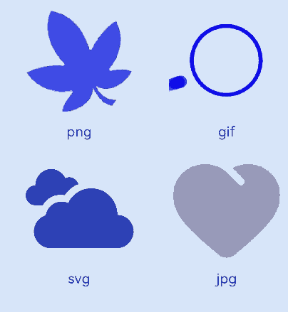
Example 1: Loading Images of Basic Types
This example demonstrates how to load images of basic types, such as PNG, GIF, SVG, and JPG.
@Entry
@Component
struct ImageExample1 {
  build() {
    Column() {
      Flex({ direction: FlexDirection.Column, alignItems: ItemAlign.Start }) {
        Row() {
          // Load a PNG image.
          Image($r('app.media.ic_camera_master_ai_leaf'))
            .width(110).height(110).margin(15)
            .overlay('png', { align: Alignment.Bottom, offset: { x: 0, y: 20 } })
          // Load a GIF image.
          Image($r('app.media.loading'))
            .width(110).height(110).margin(15)
            .overlay('gif', { align: Alignment.Bottom, offset: { x: 0, y: 20 } })
        }
        Row() {
          // Load an SVG image.
          Image($r('app.media.ic_camera_master_ai_clouded'))
            .width(110).height(110).margin(15)
            .overlay('svg', { align: Alignment.Bottom, offset: { x: 0, y: 20 } })
          // Load a JPG image.
          Image($r('app.media.ic_public_favor_filled'))
            .width(110).height(110).margin(15)
            .overlay('jpg', { align: Alignment.Bottom, offset: { x: 0, y: 20 } })
        }
      }
    }.height(320).width(360).padding({ right: 10, top: 10 })
  }
}
Example 2: Downloading and Displaying Online Images
The default timeout is 5 minutes for loading online images. When using an online image, you are advised to use alt to configure a placeholder image displayed during loading. You can use HTTP to send a network request, and then decode the returned data into a PixelMap object in the Image component. For details about image development, see Introduction to Image Kit.
The ohos.permission.INTERNET permission is required for using online images. For details about how to apply for a permission, see Declaring Permissions.
import { http } from '@kit.NetworkKit';
import { BusinessError } from '@kit.BasicServicesKit';
import { image } from '@kit.ImageKit';

@Entry
@Component
struct ImageExample2 {
  @State pixelMapImg: PixelMap|undefined = undefined;

  aboutToAppear() {
    this.requestImageUrl('https://www.example.com/xxx.png');// Enter a specific online image URL.
  }

  requestImageUrl(url: string) {
    http.createHttp().request(url, (error: BusinessError, data: http.HttpResponse)=> {
      if (error) {
        console.error(`request image failed: url: ${url}, code: ${error.code}, message: ${error.message}`);
      } else {
        let imgData: ArrayBuffer = data.result as ArrayBuffer;
        console.info(`request image success, size: ${imgData.byteLength}`);
        let imgSource: image.ImageSource = image.createImageSource(imgData);
        class sizeTmp {
          height: number = 100
          width: number = 100
        }
        let options: Record<string, number|boolean|sizeTmp> = {
          'alphaType': 0,
          'editable': false,
          'pixelFormat': 3,
          'scaleMode': 1,
          'size': { height: 100, width: 100 }
        }
        imgSource.createPixelMap(options).then((pixelMap: PixelMap) => {
          console.error('image createPixelMap success');
          this.pixelMapImg = pixelMap;
        })
      }
    })
  }

  build() {
    Column() {
      Image(this.pixelMapImg)
        .alt($r('app.media.img'))
        .objectFit(ImageFit.None)
        .width('100%')
        .height('100%')
    }
  }
}

Example 3: Adding Events to an Image
This example shows how to add onClick and onFinish events to an image.
@Entry
@Component
struct ImageExample3 {
  private imageOne: Resource = $r('app.media.earth');
  private imageTwo: Resource = $r('app.media.star');
  private imageThree: Resource = $r('app.media.moveStar');
  @State src: Resource = this.imageOne
  @State src2: Resource = this.imageThree
  build(){
    Column(){
      // Add a click event so that a specific image is loaded upon clicking.
      Image(this.src)
        .width(100)
        .height(100)
        .onClick(() => {
          this.src = this.imageTwo
        })

      // When the image to be loaded is in SVG format:
      Image(this.src2)
        .width(100)
        .height(100)
        .onFinish(() => {
          // Load another image when the SVG image has finished its animation.
          this.src2 = this.imageOne
        })
    }.width('100%').height('100%')
  }
}
Example 4: Enabling the AI Analyzer
This example shows how to use enableAnalyzer to enable the AI analyzer.
import { image } from '@kit.ImageKit'

@Entry
@Component
struct ImageExample4 {
  @State imagePixelMap: image.PixelMap|undefined = undefined
  private aiController: ImageAnalyzerController = new ImageAnalyzerController()
  private options: ImageAIOptions = {
    types: [ImageAnalyzerType.SUBJECT, ImageAnalyzerType.TEXT],
    aiController: this.aiController
  }

  async aboutToAppear() {
    this.imagePixelMap = await this.getPixmapFromMedia($r('app.media.app_icon'))
  }

  build() {
    Column() {
      Image(this.imagePixelMap, this.options)
        .enableAnalyzer(true)
        .width(200)
        .height(200)
        .margin({bottom:10})
      Button('getTypes')
        .width(80)
        .height(80)
        .onClick(() => {
          this.aiController.getImageAnalyzerSupportTypes()
        })
    }
  }
  private async getPixmapFromMedia(resource: Resource) {
    let unit8Array = await getContext(this)?.resourceManager?.getMediaContent({
      bundleName: resource.bundleName,
      moduleName: resource.moduleName,
      id: resource.id
    })
    let imageSource = image.createImageSource(unit8Array.buffer.slice(0, unit8Array.buffer.byteLength))
    let createPixelMap: image.PixelMap = await imageSource.createPixelMap({
      desiredPixelFormat: image.PixelMapFormat.RGBA_8888
    })
    await imageSource.release()
    return createPixelMap
  }
}

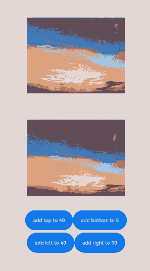
Example 5: Resizing an Image
This example shows how to resize an image in different directions.
@Entry
@Component
struct Index {
  @State top: number = 10
  @State bottom: number = 10
  @State left: number = 10
  @State right: number = 10

  build() {
    Column({ space: 5 }) {
      // Original image effect
      Image($r("app.media.landscape"))
        .width(200).height(200)
        .border({ width: 2, color: Color.Pink })
        .objectFit(ImageFit.Contain)

      // Set the resizable attribute to resize the image in different directions.
      Image($r("app.media.landscape"))
        .resizable({
          slice: {
            left: this.left,
            right: this.right,
            top: this.top,
            bottom: this.bottom
          }
        })
        .width(200)
        .height(200)
        .border({ width: 2, color: Color.Pink })
        .objectFit(ImageFit.Contain)

      Row() {
        Button("add top to " + this.top).fontSize(10)
          .onClick(() => {
            this.top += 10
          })
        Button("add bottom to " + this.bottom).fontSize(10)
          .onClick(() => {
            this.bottom += 10
          })
      }

      Row() {
        Button("add left to " + this.left).fontSize(10)
          .onClick(() => {
            this.left += 10
          })
        Button("add right to " + this.right).fontSize(10)
          .onClick(() => {
            this.right += 10
          })
      }

    }
    .justifyContent(FlexAlign.Start).width('100%').height('100%')
  }
}
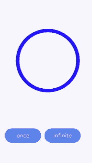
Example 6: Playing a PixelMap Array Animation
This example demonstrates how to play an animation of a PixelMap array using AnimatedDrawableDescriptor.
import {AnimationOptions, AnimatedDrawableDescriptor} from '@kit.ArkUI'
import { image } from '@kit.ImageKit'

@Entry
@Component
struct ImageExample {
  pixelmaps: Array<PixelMap>  = [];
  options: AnimationOptions = {duration:2000, iterations:1};
  @State animated: AnimatedDrawableDescriptor|undefined = undefined;

  async aboutToAppear() {
    this.pixelmaps = await this.getPixelMaps();
    this.animated = new AnimatedDrawableDescriptor(this.pixelmaps, this.options);
  }

  build() {
    Column() {
      Row() {
        Image(this.animated)
          .width('500px').height('500px')
          .onFinish(() => {
            console.info("finish")
          })
      }.height('50%')
      Row() {
        Button('once').width(100).padding(5).onClick(() => {
          this.options = {duration:2000, iterations:1};
          this.animated = new AnimatedDrawableDescriptor(this.pixelmaps, this.options);
        }).margin(5)
        Button('infinite').width(100).padding(5).onClick(() => {
          this.options = {duration:2000, iterations:-1};
          this.animated = new AnimatedDrawableDescriptor(this.pixelmaps, this.options);
        }).margin(5)
      }
    }.width('50%')
  }

  private async getPixmapListFromMedia(resource: Resource) {
    let unit8Array = await getContext(this)?.resourceManager?.getMediaContent({
      bundleName: resource.bundleName,
      moduleName: resource.moduleName,
      id: resource.id
    })
    let imageSource = image.createImageSource(unit8Array.buffer.slice(0, unit8Array.buffer.byteLength))
    let createPixelMap: Array<image.PixelMap> = await imageSource.createPixelMapList({
      desiredPixelFormat: image.PixelMapFormat.RGBA_8888
    })
    await imageSource.release()
    return createPixelMap
  }

  private async getPixmapFromMedia(resource: Resource) {
    let unit8Array = await getContext(this)?.resourceManager?.getMediaContent({
      bundleName: resource.bundleName,
      moduleName: resource.moduleName,
      id: resource.id
    })
    let imageSource = image.createImageSource(unit8Array.buffer.slice(0, unit8Array.buffer.byteLength))
    let createPixelMap: image.PixelMap = await imageSource.createPixelMap({
      desiredPixelFormat: image.PixelMapFormat.RGBA_8888
    })
    await imageSource.release()
    return createPixelMap
  }

  private async getPixelMaps() {
    let Mypixelmaps:Array<PixelMap> = await this.getPixmapListFromMedia($r('app.media.view'))// A GIF image, when processed, can generate multiple PixelMap instances.
    Mypixelmaps.push(await this.getPixmapFromMedia($r('app.media.icon'))) // Add an image.
    return Mypixelmaps;
  }
}
Example 7: Setting a Color Filter for an Image
This example shows how to set a color filter for an image using colorFilter.
import { drawing, common2D } from '@kit.ArkGraphics2D';

@Entry
@Component
struct ImageExample3 {
  private imageOne: Resource = $r('app.media.1');
  private imageTwo: Resource = $r('app.media.2');
  @State src: Resource = this.imageOne
  @State src2: Resource = this.imageTwo
  private ColorFilterMatrix: number[] = [1, 0, 1, 0, 1, 0, 0, 0, 1, 0, 1, 0, 1, 0, 0, 0, 1, 0, 1, 0]
  private color: common2D.Color = { alpha: 255, red: 255, green: 0, blue: 0 };
  @State DrawingColorFilterFirst: ColorFilter|undefined = undefined
  @State DrawingColorFilterSecond: ColorFilter|undefined = undefined
  @State DrawingColorFilterThird: ColorFilter|undefined = undefined

  build() {
    Column() {
      Image(this.src)
        .width(100)
        .height(100)
        .colorFilter(this.DrawingColorFilterFirst)
        .onClick(()=>{
          this.DrawingColorFilterFirst = drawing.ColorFilter.createBlendModeColorFilter(this.color, drawing.BlendMode.SRC_IN);
        })

      Image(this.src2)
        .width(100)
        .height(100)
        .colorFilter(this.DrawingColorFilterSecond)
        .onClick(()=>{
          this.DrawingColorFilterSecond = new ColorFilter(this.ColorFilterMatrix);
        })

      // When the image to be loaded is in SVG format:
      Image($r('app.media.test_self'))
        .width(110).height(110).margin(15)
        .colorFilter(this.DrawingColorFilterThird)
        .onClick(()=>{
          this.DrawingColorFilterThird = drawing.ColorFilter.createBlendModeColorFilter(this.color, drawing.BlendMode.SRC_IN);
        })
    }
  }
}
Example 8: Setting the Fill Effect for an Image
This example shows how to objectFit to specify how an image is resized to fit its container.
@Entry
@Component
struct ImageExample{
  build() {
    Column() {
      Flex({ direction: FlexDirection.Column, alignItems: ItemAlign.Start }) {
        Row() {
          // Load a PNG image.
          Image($r('app.media.sky'))
            .width(110).height(110).margin(15)
            .overlay('png', { align: Alignment.Bottom, offset: { x: 0, y: 20 } })
            .border({ width: 2, color: Color.Pink })
            .objectFit(ImageFit.TOP_START)
          // Load a GIF image.
          Image($r('app.media.loading'))
            .width(110).height(110).margin(15)
            .overlay('gif', { align: Alignment.Bottom, offset: { x: 0, y: 20 } })
            .border({ width: 2, color: Color.Pink })
            .objectFit(ImageFit.BOTTOM_START)
        }
        Row() {
          // Load an SVG image.
          Image($r('app.media.svg'))
            .width(110).height(110).margin(15)
            .overlay('svg', { align: Alignment.Bottom, offset: { x: 0, y: 20 } })
            .border({ width: 2, color: Color.Pink })
            .objectFit(ImageFit.TOP_END)
          // Load a JPG image.
          Image($r('app.media.jpg'))
            .width(110).height(110).margin(15)
            .overlay('jpg', { align: Alignment.Bottom, offset: { x: 0, y: 20 } })
            .border({ width: 2, color: Color.Pink })
            .objectFit(ImageFit.CENTER)
        }
      }
    }.height(320).width(360).padding({ right: 10, top: 10 })
  }
}

Example 9: Switching Between Different Types of Images
This example demonstrates the display effects of images when using ResourceStr type and ImageContent type as data sources.
@Entry
@Component
struct ImageContentExample {
  @State imageSrcIndex: number = 0;
  @State imageSrcList: (ResourceStr|ImageContent)[] = [$r('app.media.app_icon'), ImageContent.EMPTY]

  build() {
    Column({ space: 10 }) {
      Image(this.imageSrcList[this.imageSrcIndex])
        .width(100)
        .height(100)
      Button('Change Image src')
        .padding(20)
        .onClick(() => {
          this.imageSrcIndex = (this.imageSrcIndex + 1) % this.imageSrcList.length
        })
    }.width('100%')
    .padding(20)
  }
}

Example 10: Securing Sensitive Information
This example shows how to secure sensitive information on widgets using privacySensitive. The display requires widget framework support.
@Entry
@Component
struct ImageExample {
  build() {
    Column({ space: 10 }) {
      Image($r("app.media.startIcon"))
        .width(50)
        .height(50)
        .margin({top :30})
        .privacySensitive(true)
    }
    .alignItems(HorizontalAlign.Center)
    .width("100%")
  }
}

Example 11: Setting the Scan Effect for an Image
This example shows how to enable the scan effect for an image using linearGradient and animateTo().
import { curves } from '@kit.ArkUI';

@Entry
@Component
struct ImageExample11 {
  private curve = curves.cubicBezier(0.33, 0, 0.67, 1);
  @State moveImg: string[] = ['imageScanEffect'];
  @State moveImgVisible: Visibility = Visibility.Visible;
  @State durationTime: number = 1500;
  @State iterationsTimes: number = -1;
  @State private opacityValue: number = 0.5;
  @State imageWidth: number = 450;
  @State visible: Visibility = Visibility.Hidden;
  @State stackBackgroundColor: string = '#E1E4E9';
  @State linePositionX: number = 0 - this.imageWidth;
  @State linePositionY: number = 0;
  @State imgResource: Resource|undefined = undefined;

  startupAnimate() {
    this.moveImg.pop();
    this.moveImg.push('imageScanEffect');
    setTimeout(() => {
      this.imgResource = $r('app.media.img');
    }, 3000);
    animateTo({
      duration: this.durationTime,
      curve: this.curve,
      tempo: 1,
      iterations: this.iterationsTimes,
      delay: 0
    }, () => {
      this.linePositionX = this.imageWidth;
    })
  }

  build() {
    Column() {
      Row() {
        Stack() {
          Image(this.imgResource)
            .width(this.imageWidth)
            .height(200)
            .objectFit(ImageFit.Contain)
            .visibility(this.visible)
            .onComplete(() => {
              this.visible = Visibility.Visible;
              this.moveImg.pop();
            })
            .onError(() =>{
              setTimeout(() => {
                this.visible = Visibility.Visible;
                this.moveImg.pop();
              }, 2600)
            })
          ForEach(this.moveImg, (item: string) => {
            Row()
              .width(this.imageWidth)
              .height(200)
              .visibility(this.moveImgVisible)
              .position({ x: this.linePositionX, y: this.linePositionY })
              .linearGradient({
                direction: GradientDirection.Right,
                repeating: false,
                colors: [[0xE1E4E9, 0], [0xFFFFFF, 0.75], [0xE1E4E9, 1]]
              })
              .opacity(this.opacityValue)
          })
        }
        .backgroundColor(this.visible ? this.stackBackgroundColor : undefined)
        .margin({top: 20, left: 20, right: 20})
        .borderRadius(20)
        .clip(true)
        .onAppear(() => {
          this.startupAnimate();
        })
      }
    }
  }
}

Example 12: Adding Transform Effects to Images
This example demonstrates how to apply rotation and translation effects to images using imageMatrix and objectFit.
import { matrix4 } from '@kit.ArkUI'

@Entry
@Component
struct Test {
  private matrix1 = matrix4.identity()
    .translate({ x: -400, y: -750 })
    .scale({ x: 0.5, y: 0.5 })
    .rotate({
      x: 2,
      y: 0.5,
      z: 3,
      centerX: 10,
      centerY: 10,
      angle: -10
    })

  build() {
    Row() {
      Column({ space: 50 }) {
        Column({ space: 5 }) {
          Image($r("app.media.example"))
            .border({ width:2, color: Color.Black })
            .objectFit(ImageFit.Contain)
            .width(150)
            .height(150)
          Text("No transformation")
            .fontSize('25px')
        }
        Column({ space: 5 }) {
          Image($r("app.media.example"))
            .border({ width:2, color: Color.Black })
            .objectFit(ImageFit.None)
            .translate({ x: 10, y: 10 })
            .scale({ x: 0.5, y: 0.5 })
            .width(100)
            .height(100)
          Text("Direct transformation on the image, with the upper left corner of the image source displayed by default")
            .fontSize('25px')
        }
        Column({ space: 5 }) {
          Image($r("app.media.example"))
            .objectFit(ImageFit.MATRIX)
            .imageMatrix(this.matrix1)
            .border({ width:2, color: Color.Black })
            .width(150)
            .height(150)
          Text("Transformation using imageMatrix to adjust the source position for optimal display")
            .fontSize('25px')
        }
      }
      .width('100%')
    }
  }
}
Example 13: Setting the Image Decoding Size Using sourceSize
This example uses the sourceSize API to customize the decoding size of the image.
@Entry
@Component
struct Index {
  @State borderRadiusValue: number = 10;
  build() {
    Column() {
      Image($r("app.media.sky"))
        .sourceSize({width:1393, height:1080})
        .height(300)
        .width(300)
        .objectFit(ImageFit.Contain)
        .borderWidth(1)
      Image($r("app.media.sky"))
        .sourceSize({width:13, height:10})
        .height(300)
        .width(300)
        .objectFit(ImageFit.Contain)
        .borderWidth(1)
    }
    .height('100%')
    .width('100%')
  }
}
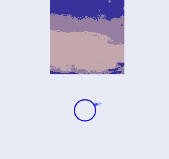
Example 14: Setting the Image Rendering Mode Using renderMode
This example uses the renderMode API to set the image rendering mode to grayscale.
@Entry
@Component
struct Index {
  @State borderRadiusValue: number = 10;
  build() {
    Column() {
      Image($r("app.media.sky"))
        .renderMode(ImageRenderMode.Template)
        .height(300)
        .width(300)
        .objectFit(ImageFit.Contain)
        .borderWidth(1)
    }
    .height('100%')
    .width('100%')
  }
}
Example 15: Setting the Image Repeat Pattern Using objectRepeat
This example uses the objectRepeat API to repeat the image along the vertical axis.
@Entry
@Component
struct Index {
  @State borderRadiusValue: number = 10;
  build() {
    Column() {
      Image($r("app.media.sky"))
        .objectRepeat(ImageRepeat.Y)
        .height(300)
        .width(300)
        .objectFit(ImageFit.Contain)
        .borderWidth(1)
    }
    .height('100%')
    .width('100%')
  }
}
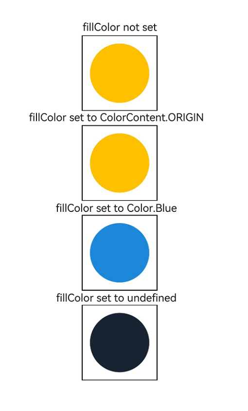
Example 16: Setting the Fill Color for SVG Images
This example shows how to use fillColor to set different fill colors for SVG images.
@Entry
@Component
struct Index {
  build() {
    Column() {
      Text("FillColor not set")
      Image($r("app.media.svgExample"))
        .height(100)
        .width(100)
        .objectFit(ImageFit.Contain)
        .borderWidth(1)
      Text("fillColor set to ColorContent.ORIGIN")
      Image($r("app.media.svgExample"))
        .height(100)
        .width(100)
        .objectFit(ImageFit.Contain)
        .borderWidth(1)
        .fillColor(ColorContent.ORIGIN)
      Text("fillColor set to Color.Blue")
      Image($r("app.media.svgExample"))
        .height(100)
        .width(100)
        .objectFit(ImageFit.Contain)
        .borderWidth(1)
        .fillColor(Color.Blue)
      Text("fillColor set to undefined")
      Image($r("app.media.svgExample"))
        .height(100)
        .width(100)
        .objectFit(ImageFit.Contain)
        .borderWidth(1)
        .fillColor(undefined)
    }
    .height('100%')
    .width('100%')
  }
}
你可能感兴趣的鸿蒙文章
- 所属分类: 后端技术
- 本文标签:
热门推荐
-
2、 优质文章
-
3、 gt
-
7、 openharmony
-
9、 golang
-
10、 Vue中input框自动聚焦