harmony 鸿蒙ImageAnimator
ImageAnimator
The ImageAnimator component enables images to be played a frame-by-frame basis. The list of images to be played as well as the duration of each image can be configured.
NOTE
This component is supported since API version 7. Updates will be marked with a superscript to indicate their earliest API version.
Child Components
Not supported
APIs
ImageAnimator()
Widget capability: This API can be used in ArkTS widgets since API version 10.
Atomic service API: This API can be used in atomic services since API version 11.
System capability: SystemCapability.ArkUI.ArkUI.Full
Attributes
In addition to the universal attributes, the following attributes are supported.
images
images(value: Array<ImageFrameInfo>)
Sets the image frame information. Dynamic update is not supported.
Widget capability: This API can be used in ArkTS widgets since API version 10.
Atomic service API: This API can be used in atomic services since API version 11.
System capability: SystemCapability.ArkUI.ArkUI.Full
Parameters
| Name | Type | Mandatory | Description |
|---|---|---|---|
| value | Array<ImageFrameInfo> | Yes | Image frame information. The information of each frame includes the image path, image size, image position, and image playback duration. For details, see ImageFrameInfo. Default value: [] NOTE If the input array is too large, memory usage may increase. Therefore, as the controller of memory usage, be sure to assess potential memory consumption before passing in the data to avoid issues such as insufficient memory. |
state
state(value: AnimationStatus)
Sets the playback state of the animation.
Widget capability: This API can be used in ArkTS widgets since API version 10.
Atomic service API: This API can be used in atomic services since API version 11.
System capability: SystemCapability.ArkUI.ArkUI.Full
Parameters
| Name | Type | Mandatory | Description |
|---|---|---|---|
| value | AnimationStatus | Yes | Playback state of the animation. The default state is Initial. Default value: AnimationStatus.Initial |
duration
duration(value: number)
Sets the playback duration. This attribute does not take effect when a separate duration is set for any of the image frames.
Widget capability: This API can be used in ArkTS widgets since API version 10.
Atomic service API: This API can be used in atomic services since API version 11.
System capability: SystemCapability.ArkUI.ArkUI.Full
Parameters
| Name | Type | Mandatory | Description |
|---|---|---|---|
| value | number | Yes | Playback duration. If the value is 0, no image is played. The value change takes effect only at the start of the next cycle. Unit: ms Default value: 1000 |
reverse
reverse(value: boolean)
Sets the playback direction.
Widget capability: This API can be used in ArkTS widgets since API version 10.
Atomic service API: This API can be used in atomic services since API version 11.
System capability: SystemCapability.ArkUI.ArkUI.Full
Parameters
| Name | Type | Mandatory | Description |
|---|---|---|---|
| value | boolean | Yes | Playback direction. The value false indicates that images are played from the first one to the last one, and true indicates that images are played from the last one to the first one. Default value: false |
fixedSize
fixedSize(value: boolean)
Sets whether the image size is fixed at the component size.
Widget capability: This API can be used in ArkTS widgets since API version 10.
Atomic service API: This API can be used in atomic services since API version 11.
System capability: SystemCapability.ArkUI.ArkUI.Full
Parameters
| Name | Type | Mandatory | Description |
|---|---|---|---|
| value | boolean | Yes | Whether the image size is fixed at the component size. true: The image size is fixed at the component size. In this case, the width, height, top, and left attributes of the image are invalid. false: The width, height, top, and left attributes of each image must be set separately. Default value: true |
preDecode(deprecated)
preDecode(value: number)
Sets the number of images to be pre-decoded.
This API is deprecated since API version 9.
System capability: SystemCapability.ArkUI.ArkUI.Full
Parameters
| Name | Type | Mandatory | Description |
|---|---|---|---|
| value | number | Yes | Number of images to be pre-decoded. For example, the value 2 indicates that two images following the currently playing one are pre-decoded. Default value: 0 |
fillMode
fillMode(value: FillMode)
Sets the status before and after execution of the animation in the current playback direction. The status after execution of the animation is jointly determined by the fillMode and reverse attributes. For example, if fillMode is set to Forwards, the target will retain the state defined by the last keyframe encountered during execution. In this case, if reverse is set to false, the target will retain the state defined by the last keyframe encountered in the forward direction, that is, the last image; if reverse is set to true, the target will retain the state defined by the last keyframe encountered in the backward direction, that is, the first image.
Widget capability: This API can be used in ArkTS widgets since API version 10.
Atomic service API: This API can be used in atomic services since API version 11.
System capability: SystemCapability.ArkUI.ArkUI.Full
Parameters
| Name | Type | Mandatory | Description |
|---|---|---|---|
| value | FillMode | Yes | Status before and after execution of the animation in the current playback direction. Default value: FillMode.Forwards |
iterations
iterations(value: number)
Sets the number of times that the animation is played.
Atomic service API: This API can be used in atomic services since API version 11.
System capability: SystemCapability.ArkUI.ArkUI.Full
Parameters
| Name | Type | Mandatory | Description |
|---|---|---|---|
| value | number | Yes | Number of times that the animation is played. By default, the animation is played once. The value -1 indicates that the animation is played for an unlimited number of times. Default value: 1 |
monitorInvisibleArea17+
monitorInvisibleArea(monitorInvisibleArea: boolean)
Sets whether the component should automatically pause or resume based on its visibility, using the system’s onVisibleAreaChange event.
Atomic service API: This API can be used in atomic services since API version 17.
System capability: SystemCapability.ArkUI.ArkUI.Full
Parameters
| Name | Type | Mandatory | Description |
|---|---|---|---|
| monitorInvisibleArea | boolean | Yes | Whether the component should automatically pause or resume based on its visibility, using the system’s onVisibleAreaChange event. With the value true, when the component’s AnimationStatus is Running, the component automatically pauses once it becomes invisible and resumes playback if it becomes visible again, based on the onVisibleAreaChange event. Default value: false NOTE When this parameter is dynamically changed from true to false, the component will resume from its last paused state based on the current AnimationStatus. Changes to this property do not affect the custom state value. |
ImageFrameInfo
Atomic service API: This API can be used in atomic services since API version 11.
System capability: SystemCapability.ArkUI.ArkUI.Full
| Name | Type | Mandatory | Description |
|---|---|---|---|
| src | string |Resource9+ |PixelMap12+ | Yes | Image path. The image format can be .jpg, .jpeg, .svg, .png, .bmp, .webp, .ico, or .heif. The Resource type is supported since API version 9, and the PixelMap type is supported since API version 12. Widget capability: This API can be used in ArkTS widgets since API version 10. |
| width | number |string | No | Image width. For the string type, numeric string values with optional units, for example, “2” or “2px”, are supported. Default value: 0 Unit: vp Widget capability: This API can be used in ArkTS widgets since API version 10. |
| height | number |string | No | Image height. For the string type, numeric string values with optional units, for example, “2” or “2px”, are supported. Default value: 0 Unit: vp Widget capability: This API can be used in ArkTS widgets since API version 10. |
| top | number |string | No | Vertical coordinate of the image relative to the upper left corner of the widget For the string type, numeric string values with optional units, for example, “2” or “2px”, are supported. Default value: 0 Unit: vp Widget capability: This API can be used in ArkTS widgets since API version 10. |
| left | number |string | No | Horizontal coordinate of the image relative to the upper left corner of the widget For the string type, numeric string values with optional units, for example, “2” or “2px”, are supported. Default value: 0 Unit: vp Widget capability: This API can be used in ArkTS widgets since API version 10. |
| duration | number | No | Playback duration of each image frame, in milliseconds. Default value: 0 |
Events
In addition to the universal events, the following events are supported.
onStart
onStart(event: () => void)
Triggered when the animation starts to play.
Widget capability: This API can be used in ArkTS widgets since API version 10.
Atomic service API: This API can be used in atomic services since API version 11.
System capability: SystemCapability.ArkUI.ArkUI.Full
onPause
onPause(event: () => void)
Triggered when the animation playback is paused.
Widget capability: This API can be used in ArkTS widgets since API version 10.
Atomic service API: This API can be used in atomic services since API version 11.
System capability: SystemCapability.ArkUI.ArkUI.Full
onRepeat
onRepeat(event: () => void)
Triggered when the animation playback is repeated.
Atomic service API: This API can be used in atomic services since API version 11.
System capability: SystemCapability.ArkUI.ArkUI.Full
onCancel
onCancel(event: () => void)
Triggered when the animation playback returns to the initial state.
Widget capability: This API can be used in ArkTS widgets since API version 10.
Atomic service API: This API can be used in atomic services since API version 11.
System capability: SystemCapability.ArkUI.ArkUI.Full
onFinish
onFinish(event: () => void)
Triggered when the animation playback is complete or stopped.
Widget capability: This API can be used in ArkTS widgets since API version 10.
Atomic service API: This API can be used in atomic services since API version 11.
System capability: SystemCapability.ArkUI.ArkUI.Full
Example
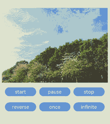
Example 1: Playing an Animation Using Images of the Resource Type
This example demonstrates how to play an animation using the ImageAnimator component with images of the Resource type.
// xxx.ets
@Entry
@Component
struct ImageAnimatorExample {
  @State state: AnimationStatus = AnimationStatus.Initial;
  @State reverse: boolean = false;
  @State iterations: number = 1;

  build() {
    Column({ space: 10 }) {
      ImageAnimator()
        .images([
          {
            src: $r('app.media.img1')
          },
          {
            src: $r('app.media.img2')
          },
          {
            src: $r('app.media.img3')
          },
          {
            src: $r('app.media.img4')
          }
        ])
        .duration(2000)
        .state(this.state).reverse(this.reverse)
        .fillMode(FillMode.None).iterations(this.iterations).width(340).height(240)
        .margin({ top: 100 })
        .onStart(() => {
          console.info('Start')
        })
        .onPause(() => {
          console.info('Pause')
        })
        .onRepeat(() => {
          console.info('Repeat')
        })
        .onCancel(() => {
          console.info('Cancel')
        })
        .onFinish(() => {
          console.info('Finish')
          this.state = AnimationStatus.Stopped
        })
      Row() {
        Button('start').width(100).padding(5).onClick(() => {
          this.state = AnimationStatus.Running
        }).margin(5)
        Button('pause').width(100).padding(5).onClick(() => {
          this.state = AnimationStatus.Paused     // Display the image of the current frame.
        }).margin(5)
        Button('stop').width(100).padding(5).onClick(() => {
          this.state = AnimationStatus.Stopped    // Display the image of the initial frame.
        }).margin(5)
      }

      Row() {
        Button('reverse').width(100).padding(5).onClick(() => {
          this.reverse = !this.reverse
        }).margin(5)
        Button('once').width(100).padding(5).onClick(() => {
          this.iterations = 1
        }).margin(5)
        Button('infinite').width(100).padding(5).onClick(() => {
          this.iterations = -1 // The animation is played for an unlimited number of times.
        }).margin(5)
      }
    }.width('100%').height('100%')
  }
}
Example 2: Playing an Animation Using Images of the PixelMap Type
This example demonstrates how to play an animation using the ImageAnimator component with images of the PixelMap type.
// xxx.ets
import { image } from '@kit.ImageKit';

@Entry
@Component
struct ImageAnimatorExample {
  imagePixelMap: Array<PixelMap> = [];
  @State state: AnimationStatus = AnimationStatus.Initial;
  @State reverse: boolean = false;
  @State iterations: number = 1;
  @State images:Array<ImageFrameInfo> = [];
  async aboutToAppear() {
    this.imagePixelMap.push(await this.getPixmapFromMedia($r('app.media.icon')));
    this.images.push({src:this.imagePixelMap[0]});
  }
  build() {
    Column({ space: 10 }) {
      ImageAnimator()
        .images(this.images)
        .duration(2000)
        .state(this.state).reverse(this.reverse)
        .fillMode(FillMode.None).iterations(this.iterations).width(340).height(240)
        .margin({ top: 100 })
        .onStart(() => {
          console.info('Start');
        })
        .onPause(() => {
          console.info('Pause');
        })
        .onRepeat(() => {
          console.info('Repeat');
        })
        .onCancel(() => {
          console.info('Cancel');
        })
        .onFinish(() => {
          console.info('Finish');
          this.state = AnimationStatus.Stopped;
        })
      Row() {
        Button('start').width(100).padding(5).onClick(() => {
          this.state = AnimationStatus.Running;
        }).margin(5)
        Button('pause').width(100).padding(5).onClick(() => {
          this.state = AnimationStatus.Paused;    // Display the image of the current frame.
        }).margin(5)
        Button('stop').width(100).padding(5).onClick(() => {
          this.state = AnimationStatus.Stopped;   // Display the image of the initial frame.
        }).margin(5)
      }
      Row() {
        Button('reverse').width(100).padding(5).onClick(() => {
          this.reverse = !this.reverse;
        }).margin(5)
        Button('once').width(100).padding(5).onClick(() => {
          this.iterations = 1;
        }).margin(5)
        Button('infinite').width(100).padding(5).onClick(() => {
          this.iterations = -1; // The animation is played for an unlimited number of times.
        }).margin(5)
      }
    }.width('100%').height('100%')
  }

  private async getPixmapFromMedia(resource: Resource) {
    let unit8Array = await this.getUIContext().getHostContext()?.resourceManager?.getMediaContent({
      bundleName: resource.bundleName,
      moduleName: resource.moduleName,
      id: resource.id
    });
    let imageSource = image.createImageSource(unit8Array?.buffer.slice(0, unit8Array.buffer.byteLength));
    let createPixelMap: image.PixelMap = await imageSource.createPixelMap({
      desiredPixelFormat: image.PixelMapFormat.RGBA_8888
    });
    await imageSource.release();
    return createPixelMap;
  }
}
Example 3: Enabling Automatic Pause on Invisibility
This example demonstrates how to use monitorInvisibleArea to automatically pause the ImageAnimator component when it becomes invisible and resume playback when it becomes visible again. This behavior is controlled based on the component’s state being set to AnimationStatus.Running.
@Entry
@Component
struct ImageAnimatorAutoPauseTest {
  scroller: Scroller = new Scroller();
  @State state: AnimationStatus = AnimationStatus.Running;
  @State reverse: boolean = false;
  @State iterations: number = 100;
  @State preCallBack: string = 'Null';
  private arr: number[] = [0, 1, 2, 3, 4, 5, 6, 7, 8, 9];

  build() {
    Stack({ alignContent: Alignment.TopStart }) {
      Scroll(this.scroller) {
        Column() {
          ImageAnimator()
            .images([
              {
                src: $r('app.media.Clouds')
              },
              {
                src: $r('app.media.landscape')
              },
              {
                src: $r('app.media.sky')
              },
              {
                src: $r('app.media.mountain')
              }
            ])
            .borderRadius(10)
            .monitorInvisibleArea(true)
            .clip(true).duration(4000).state(this.state).reverse(this.reverse)
            .fillMode(FillMode.Forwards).iterations(this.iterations).width(340).height(240)
            .margin({ top: 100 })
            .onStart(() => {
              this.preCallBack = "Start";
              console.info('ImageAnimator Start');
            })
            .onPause(() => {
              this.preCallBack = "Pause";
              console.info('ImageAnimator Pause');
            })
            .onRepeat(() => {
              console.info('ImageAnimator Repeat');
            })
            .onCancel(() => {
              console.info('ImageAnimator Cancel');
            })
            .onFinish(() => {
              console.info('ImageAnimator Finish');
            })
          ForEach(this.arr, (item: number) => {
            Text(item.toString())
              .width('90%')
              .height(150)
              .backgroundColor(0xFFFFFF)
              .borderRadius(15)
              .fontSize(16)
              .textAlign(TextAlign.Center)
              .margin({ top: 10 })
          }, (item: string) => item)
        }.width('100%')
      }
      .scrollable(ScrollDirection.Vertical) // The scrollbar scrolls in the vertical direction.
      .scrollBar(BarState.On) // The scrollbar is always displayed.
      .scrollBarColor(Color.Gray) // The scrollbar color is gray.
      .scrollBarWidth(10) // The scrollbar width is 10.
      .friction(0.6)
      .edgeEffect(EdgeEffect.None)
      .onWillScroll((xOffset: number, yOffset: number, scrollState: ScrollState) => {
        console.info(xOffset + ' ' + yOffset);
      })
      .onScrollEdge((side: Edge) => {
        console.info('To the edge');
      })
      .onScrollStop(() => {
        console.info('Scroll Stop');
      })
      Text("Last triggered callback (Pause/Start): " + this.preCallBack)
        .margin({ top: 60, left: 20 })
    }.width('100%').height('100%').backgroundColor(0xDCDCDC)
  }
}

你可能感兴趣的鸿蒙文章
- 所属分类: 后端技术
- 本文标签:
热门推荐
-
2、 优质文章
-
3、 gt
-
7、 openharmony
-
9、 golang
-
10、 Vue中input框自动聚焦