harmony 鸿蒙ImageSpan
ImageSpan
As a child of the Text and ContainerSpan components, the ImageSpan component is used to display inline images.
NOTE
This component is supported since API version 10. Updates will be marked with a superscript to indicate their earliest API version.
Child Components
Not supported
APIs
ImageSpan(value: ResourceStr|PixelMap)
Atomic service API: This API can be used in atomic services since API version 11.
System capability: SystemCapability.ArkUI.ArkUI.Full
Parameters
| Name | Type | Mandatory | Description |
|---|---|---|---|
| value | ResourceStr |PixelMap | Yes | Image source. Both local and online images are supported. When using an image referenced using a relative path, for example, ImageSpan(“common/test.jpg”), the ImageSpan component cannot be called across bundles or modules. Therefore, you are advised to use \$r to reference image resources that need to be used globally. - The supported formats include PNG, JPG, BMP, SVG, GIF, and HEIF. - Base64 strings are supported. The value format is data:image/[png|jpeg|bmp|webp|heif];base64,[base64 data], where [base64 data] is a Base64 string. - Strings with the file:///data/storage prefix are supported, which are used to read image resources in the files folder in the installation directory of the application. Ensure that the application has the read permission to the files in the specified path. |
Attributes
The attributes inherit from BaseSpan. Among the universal attributes, size, background, and border are supported.
verticalAlign
verticalAlign(value: ImageSpanAlignment)
Sets the alignment mode of the image relative to the line height.
Atomic service API: This API can be used in atomic services since API version 11.
System capability: SystemCapability.ArkUI.ArkUI.Full
Parameters
| Name | Type | Mandatory | Description |
|---|---|---|---|
| value | ImageSpanAlignment | Yes | Alignment mode of the image relative to the line height. Default value: ImageSpanAlignment.BOTTOM |
objectFit
objectFit(value: ImageFit)
Sets the image scale type.
Atomic service API: This API can be used in atomic services since API version 11.
System capability: SystemCapability.ArkUI.ArkUI.Full
Parameters
| Name | Type | Mandatory | Description |
|---|---|---|---|
| value | ImageFit | Yes | Image scale type. Default value: ImageFit.Cover |
alt12+
alt(value: PixelMap)
Sets the placeholder image displayed during loading.
Atomic service API: This API can be used in atomic services since API version 12.
System capability: SystemCapability.ArkUI.ArkUI.Full
Parameters
| Name | Type | Mandatory | Description |
|---|---|---|---|
| value | PixelMap | Yes | Placeholder image displayed during loading. The PixelMap type is supported. Default value: null |
colorFilter14+
colorFilter(filter: ColorFilter|DrawingColorFilter)
Sets the color filter for the image.
Atomic service API: This API can be used in atomic services since API version 14.
System capability: SystemCapability.ArkUI.ArkUI.Full
Parameters
| Name | Type | Mandatory | Description |
|---|---|---|---|
| filter | ColorFilter |DrawingColorFilter | Yes | 1. Color filter of the image. The input parameter is a 4 x 5 RGBA transformation matrix. The first row of the matrix represents a vector value of R (red), the second row represents a vector value of G (green), the third row represents a vector value of B (blue), and the fourth row represents a vector value of A (alpha). The four rows represent different RGBA vector values. If the matrix contains entries of 1 on the diagonal and entries of 0 in other places, the original color of the image is retained. Calculation rule: If the input filter matrix is as follows:  Wherein the color is [R, G, B, A]. Then the color after filtering is [R’, G’, B’, A’]. 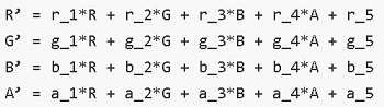 2. The ColorFilter type of @ohos.graphics.drawing can be used as the input parameter. NOTE The DrawingColorfilter type can be used in atomic services. The SVG image to set as the source must have the stroke attribute. |
Events
Among all the universal events, only the click event is supported. The following events are also supported.
onComplete12+
onComplete(callback: ImageCompleteCallback)
Triggered when the image is successfully loaded or decoded. The size of the loaded image is returned.
Atomic service API: This API can be used in atomic services since API version 12.
System capability: SystemCapability.ArkUI.ArkUI.Full
Parameters
| Name | Type | Mandatory | Description |
|---|---|---|---|
| callback | ImageCompleteCallback | Yes | Callback triggered when the image is successfully loaded or decoded. |
onError12+
onError(callback: ImageErrorCallback)
Triggered when an error occurs during image loading.
Atomic service API: This API can be used in atomic services since API version 12.
System capability: SystemCapability.ArkUI.ArkUI.Full
Parameters
| Name | Type | Mandatory | Description |
|---|---|---|---|
| callback | ImageErrorCallback | Yes | Callback triggered when an error occurs during image loading. |
ImageCompleteCallback12+
type ImageCompleteCallback = (result: ImageLoadResult) => void
Defines the callback triggered when the image is successfully loaded or decoded.
Atomic service API: This API can be used in atomic services since API version 12.
System capability: SystemCapability.ArkUI.ArkUI.Full
| Name | Type | Mandatory | Description |
|---|---|---|---|
| result | ImageLoadResult | Yes | Object returned after the callback is triggered when an image is successfully loaded or decoded. |
ImageLoadResult12+
Object returned after the callback is triggered when an image is successfully loaded or decoded.
Atomic service API: This API can be used in atomic services since API version 12.
System capability: SystemCapability.ArkUI.ArkUI.Full
| Name | Type | Mandatory | Description |
|---|---|---|---|
| width | number | Yes | Width of the image. Unit: pixel |
| height | number | Yes | Height of the image. Unit: pixel |
| componentWidth | number | Yes | Width of the component. Unit: pixel |
| componentHeight | number | Yes | Height of the component. Unit: pixel |
| loadingStatus | number | Yes | Loading status of the image. NOTE If the return value is 0, the image is successfully loaded. If the return value is 1, the image is successfully decoded. |
| contentWidth | number | Yes | Actual rendered width of the image. Unit: pixel NOTE This parameter is valid only when the return value of loadingStatus is 1. |
| contentHeight | number | Yes | Actual rendered height of the image. Unit: pixel NOTE This parameter is valid only when the return value of loadingStatus is 1. |
| contentOffsetX | number | Yes | Offset of the rendered content relative to the component on the x-axis. Unit: pixel NOTE This parameter is valid only when the return value of loadingStatus is 1. |
| contentOffsetY | number | Yes | Offset of the rendered content relative to the component on the y-axis Unit: pixel NOTE This parameter is valid only when the return value of loadingStatus is 1. |
Example
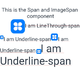
Example 1: Setting the Alignment Mode
This example demonstrates the alignment and scaling effects of the ImageSpan component using the verticalAlign and objectFit attributes.
// xxx.ets
@Entry
@Component
struct SpanExample {
  build() {
    Flex({ direction: FlexDirection.Column, alignItems: ItemAlign.Center, justifyContent: FlexAlign.Center }) {
      Text() {
        Span('This is the Span and ImageSpan component').fontSize(25).textCase(TextCase.Normal)
          .decoration({ type: TextDecorationType.None, color: Color.Pink })
      }.width('100%').textAlign(TextAlign.Center)

      Text() {
        ImageSpan($r('app.media.app_icon'))
          .width('200px')
          .height('200px')
          .objectFit(ImageFit.Fill)
          .verticalAlign(ImageSpanAlignment.CENTER)
        Span('I am LineThrough-span')
          .decoration({ type: TextDecorationType.LineThrough, color: Color.Red }).fontSize(25)
        ImageSpan($r('app.media.app_icon'))
          .width('50px')
          .height('50px')
          .verticalAlign(ImageSpanAlignment.TOP)
        Span('I am Underline-span')
          .decoration({ type: TextDecorationType.Underline, color: Color.Red }).fontSize(25)
        ImageSpan($r('app.media.app_icon'))
          .size({ width: '100px', height: '100px' })
          .verticalAlign(ImageSpanAlignment.BASELINE)
        Span('I am Underline-span')
          .decoration({ type: TextDecorationType.Underline, color: Color.Red }).fontSize(25)
        ImageSpan($r('app.media.app_icon'))
          .width('70px')
          .height('70px')
          .verticalAlign(ImageSpanAlignment.BOTTOM)
        Span('I am Underline-span')
          .decoration({ type: TextDecorationType.Underline, color: Color.Red }).fontSize(50)
      }
      .width('100%')
      .textIndent(50)
    }.width('100%').height('100%').padding({ left: 0, right: 0, top: 0 })
  }
}
Example 2: Setting the Background Style
This example demonstrates the effect of setting a background style for text using the textBackgroundStyle attribute.
// xxx.ets
@Component
@Entry
struct Index {
  build() {
    Row() {
      Column() {
        Text() {
          ImageSpan($r('app.media.sky'))// You are advised to use a custom local image.
            .width('60vp')
            .height('60vp')
            .verticalAlign(ImageSpanAlignment.CENTER)
            .borderRadius(20)
            .textBackgroundStyle({ color: '#7F007DFF', radius: "5vp" })
        }
      }.width('100%')
    }.height('100%')
  }
}

Example 3: Adding Events to an Image
This example demonstrates how to add load success and load error events to the ImageSpan component using onComplete and onError.
// xxx.ets
@Entry
@Component
struct Index {
  @State src: ResourceStr = $r('app.media.app_icon');

  build() {
    Column() {
      Text() {
        ImageSpan(this.src)
          .width(100).height(100)
          .onError((err) => {
            console.log("onError: " + err.message);
          })
          .onComplete((event) => {
            console.log("onComplete: " + event.loadingStatus);
          })
      }
    }.width('100%').height('100%')
  }
}
Example 4: Setting the Color Filter
This example demonstrates the effect of setting a color filter for the ImageSpan component using the colorFilter attribute.
// xxx.ets
import { drawing } from '@kit.ArkGraphics2D';

@Entry
@Component
struct SpanExample {
  private ColorFilterMatrix: number[] = [0.239, 0, 0, 0, 0, 0, 0.616, 0, 0, 0, 0, 0, 0.706, 0, 0, 0, 0, 0, 1, 0];
  @State DrawingColorFilterFirst: ColorFilter|undefined = new ColorFilter(this.ColorFilterMatrix);

  build() {
    Row() {
      Column({ space: 10 }) {
        // Use a ColorFilter object to apply a color filter to the image.
        Text() {
          ImageSpan($r('app.media.sky'))// You are advised to use a custom local image.
            .width('60vp')
            .height('60vp')
            .colorFilter(this.DrawingColorFilterFirst)
        }

        // Create a color filter using the drawing.ColorFilter API.
        Text() {
          ImageSpan($r('app.media.sky'))// You are advised to use a custom local image.
            .width('60vp')
            .height('60vp')
            .colorFilter(drawing.ColorFilter.createBlendModeColorFilter({
              alpha: 255,
              red: 112,
              green: 112,
              blue: 112
            }, drawing.BlendMode.SRC))
        }
      }.width('100%')
    }.height('100%')
  }
}

Example 5: Setting a Placeholder Image
This example shows how a placeholder image is used in the ImageSpan component during the process of loading an image from the Internet.
// xxx.ets
import { http } from '@kit.NetworkKit';
import { image } from '@kit.ImageKit';
import { BusinessError } from '@kit.BasicServicesKit';

@Entry
@Component
struct SpanExample {
  @State imageAlt: PixelMap|undefined = undefined

  httpRequest() {
    // Enter an image URL.
    http.createHttp().request("https://www.example.com/xxx.png", (error: BusinessError, data: http.HttpResponse) => {
      if (error) {
        console.error(`http request failed with. Code: ${error.code}, message: ${error.message}`);
      } else {
        console.log(`http request success.`);
        let imageData: ArrayBuffer = data.result as ArrayBuffer;
        let imageSource: image.ImageSource = image.createImageSource(imageData);

        class tmp {
          height: number = 100;
          width: number = 100;
        }

        let option: Record<string, number|boolean|tmp> = {
          'alphaType': 0, // Alpha type.
          'editable': false, // Whether the image is editable.
          'pixelFormat': 3, // Pixel format.
          'scaleMode': 1, // Scale mode.
          'size': { height: 100, width: 100 }
        };
        // Image size.
        imageSource.createPixelMap(option).then((pixelMap: PixelMap) => {
          this.imageAlt = pixelMap;
        })
      }
    })
  }

  build() {
    Column() {
      Button("Get Online Image")
        .onClick(() => {
          this.httpRequest();
        })

      Text() {
        // Enter an image URL.
        ImageSpan('https://www.example.com/xxx.png')
          .alt(this.imageAlt)
          .width(300)
          .height(300)
      }

    }.width('100%').height(250).padding({ left: 35, right: 35, top: 35 })
  }
}

你可能感兴趣的鸿蒙文章
- 所属分类: 后端技术
- 本文标签:
热门推荐
-
2、 优质文章
-
3、 gt
-
7、 openharmony
-
9、 golang
-
10、 Vue中input框自动聚焦