harmony 鸿蒙LoadingProgress
LoadingProgress
The LoadingProgress component is used to create a loading progress animation.
The loading progress animation stops when the component is invisible. The component’s visibility is determined by the value of ratios in the onVisibleAreaChange event callback: If the value is greater than 0, the component is visible.
NOTE
This component is supported since API version 8. Updates will be marked with a superscript to indicate their earliest API version.
Child Components
Not supported
APIs
LoadingProgress()
Creates a LoadingProgress component.
Widget capability: This API can be used in ArkTS widgets since API version 9.
Atomic service API: This API can be used in atomic services since API version 11.
System capability: SystemCapability.ArkUI.ArkUI.Full
Attributes
In addition to the universal attributes, the following attributes are supported.
NOTE
Set the component’s width and height to reasonable values. If they are too large, the loading animation might not work as expected.
color
color(value: ResourceColor)
Sets the foreground color for the LoadingProgress component.
Widget capability: This API can be used in ArkTS widgets since API version 9.
Atomic service API: This API can be used in atomic services since API version 11.
System capability: SystemCapability.ArkUI.ArkUI.Full
Parameters
| Name | Type | Mandatory | Description |
|---|---|---|---|
| value | ResourceColor | Yes | Foreground color of the LoadingProgress component. Default value: API version 10 or earlier: ’#99666666’ API version 11 or later: ’#ff666666’ |
enableLoading10+
enableLoading(value: boolean)
Sets whether to show the loading animation. The component still takes up space in the layout when the loading animation is not shown. The universal attribute Visibility.Hidden hides the entire component area, including the borders and paddings. In contrast, enableLoading=false only hides the loading animation itself and does not affect the borders or other elements.
Atomic service API: This API can be used in atomic services since API version 11.
System capability: SystemCapability.ArkUI.ArkUI.Full
Parameters
| Name | Type | Mandatory | Description |
|---|---|---|---|
| value | boolean | Yes | Whether to show the loading animation. Default value: true true: Show the loading animation. false: Do not show the loading animation. |
contentModifier12+
contentModifier(modifier: ContentModifier<LoadingProgressConfiguration>)
Creates a content modifier.
Atomic service API: This API can be used in atomic services since API version 12.
System capability: SystemCapability.ArkUI.ArkUI.Full
Parameters
| Name | Type | Mandatory | Description |
|---|---|---|---|
| modifier | ContentModifier<LoadingProgressConfiguration> | Yes | Content modifier to apply to the current component. modifier: content modifier. You need a custom class to implement the ContentModifier API. |
Events
The universal events are supported.
LoadingProgressConfiguration12+
You need a custom class to implement the ContentModifier API.
Atomic service API: This API can be used in atomic services since API version 12.
System capability: SystemCapability.ArkUI.ArkUI.Full
| Name | Type | Read Only | Optional | Description |
|---|---|---|---|---|
| enableLoading | boolean | No | No | Whether to show the loading animation. Default value: true true: Show the loading animation. false: Do not show the loading animation. |
LoadingProgressStyle(deprecated)
This API is deprecated since API version 8.
Widget capability: This API can be used in ArkTS widgets since API version 9.
Atomic service API: This API can be used in atomic services since API version 11.
System capability: SystemCapability.ArkUI.ArkUI.Full
| Name | Description |
|---|---|
| Default | Default loading style. Setting this value is not supported since API version 8. |
| Circular | Circular loading style. Setting this value is not supported since API version 8. |
| Orbital | Comet-shaped loading style. This is the default style since API version 8. |
Example
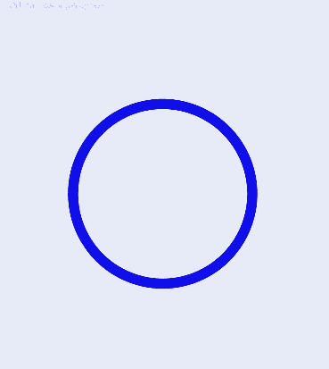
Example 1 : Setting the Color of the Loading Progress Animation
This example demonstrates how to set the color of the loading progress animation using the color attribute.
// xxx.ets
@Entry
@Component
struct LoadingProgressExample {
  build() {
    Column({ space: 5 }) {
      Text('Orbital LoadingProgress ').fontSize(9).fontColor(0xCCCCCC).width('90%')
      LoadingProgress()
        .color(Color.Blue)
        .layoutWeight(1)
    }.width('100%').margin({ top: 5 })
  }
}
Example 2: Setting the Custom Content Area
This example demonstrates how to customize the content area using the contentModifier API and how to toggle the display of the LoadingProgress component using the enableLoading API.
// xxx.ets
import { promptAction } from '@kit.ArkUI'

class MyLoadingProgressStyle implements ContentModifier<LoadingProgressConfiguration> {
  enableLoading: boolean = false

  constructor(enableLoading: boolean) {
    this.enableLoading = enableLoading
  }

  applyContent(): WrappedBuilder<[LoadingProgressConfiguration]> {
    return wrapBuilder(buildLoadingProgress)
  }
}

let arr1: string[] =
  ["0", "1", "2", "3", "4", "5", "6", "7", "8", "9", "10", "11", "12", "13", "14", "15", "16", "17", "18", "19"]
let arr2: string[] = ["0", "1", "2", "3", "4", "5", "6", "7", "8", "9"]

@Builder
function buildLoadingProgress(config: LoadingProgressConfiguration) {
  Column({ space: 8 }) {
    Row() {
      Column() {
        Circle({
          width: ((config.contentModifier as MyLoadingProgressStyle).enableLoading) ? 100 : 80,
          height: ((config.contentModifier as MyLoadingProgressStyle).enableLoading) ? 100 : 80
        })
          .fill(((config.contentModifier as MyLoadingProgressStyle).enableLoading) ? Color.Grey : 0x2577e3)
      }.width('50%')

      Column() {
        Button('' + ((config.contentModifier as MyLoadingProgressStyle).enableLoading))
          .onClick((event: ClickEvent) => {
            promptAction.showToast({
              message: ((config.contentModifier as MyLoadingProgressStyle).enableLoading) + ''
            })
          })
          .fontColor(Color.White)
          .backgroundColor(((config.contentModifier as MyLoadingProgressStyle).enableLoading) ? Color.Grey : 0x2577e3)
      }.width('50%')

    }

    Row() {
      Column() {
        Gauge({
          value: (config.contentModifier as MyLoadingProgressStyle).enableLoading ? 50 : 30, min: 11, max: 100
        }) {
          Column() {
            Text('60')
              .maxFontSize("180sp")
              .minFontSize("160.0vp")
              .fontWeight(FontWeight.Medium)
              .fontColor("#ff182431")
              .width('40%')
              .height('30%')
              .textAlign(TextAlign.Center)
              .margin({ top: '22.2%' })
              .textOverflow({ overflow: TextOverflow.Ellipsis })
              .maxLines(1)
          }.width('100%').height('100%')
        }
        .colors(((config.contentModifier as MyLoadingProgressStyle).enableLoading) ? Color.Grey : 0x2577e3)
        .width(200)
        .strokeWidth(18)
        .padding(5)
        .trackShadow({ radius: 7, offsetX: 7, offsetY: 7 })
        .height(200)
      }.width('100%')

    }

    Column() {
      List({ space: 20, initialIndex: 0 }) {
        ForEach(arr2, (item: string) => {
          ListItem() {
            Text((config.contentModifier as MyLoadingProgressStyle).enableLoading ? '' + item : Number(item) * 2 + '')
              .width('100%')
              .height('100%')
              .fontColor((config.contentModifier as MyLoadingProgressStyle).enableLoading ? Color.White : Color.Orange)
              .fontSize((config.contentModifier as MyLoadingProgressStyle).enableLoading ? 16 : 20)
              .textAlign(TextAlign.Center)
              .backgroundColor((config.contentModifier as MyLoadingProgressStyle).enableLoading ? Color.Grey : 0x2577e3)
          }
          .height(110)
          .border({
            width: 2,
            color: Color.White
          })
        }, (item: string) => item)
      }
      .height(200)
      .width('100%')
      .friction(0.6)

      .lanes({
        minLength: (config.contentModifier as MyLoadingProgressStyle).enableLoading ? 40 : 80,
        maxLength: (config.contentModifier as MyLoadingProgressStyle).enableLoading ? 40 : 80
      })
      .scrollBar(BarState.Off)
    }

  }.width("100%").padding(10)
}


@Entry
@Component
struct LoadingProgressDemoExample {
  @State loadingProgressList: (boolean|undefined|null)[] = [undefined, true, null, false]
  @State widthList: (number|string)[] = ['110%', 220, '40%', 80]
  @State loadingProgressIndex: number = 0
  @State clickFlag: number = 0
  scroller: Scroller = new Scroller()

  build() {
    Column() {
      Scroll(this.scroller) {
        Column({ space: 5 }) {
          Column() {
            LoadingProgress()
              .color('#106836')
              .size({ width: '100%' })
              .contentModifier(new MyLoadingProgressStyle(this.loadingProgressList[this.loadingProgressIndex]))
          }.width('100%').backgroundColor(0xdcdcdc)
        }.width('100%').margin({ top: 5 })
      }.height('85%')

      Button('Switch config.enableloading').onClick(() => {
        this.clickFlag++
        this.loadingProgressIndex = (this.loadingProgressIndex + 1) % this.loadingProgressList.length
        console.log('enableLoading:' + this.loadingProgressList[this.loadingProgressIndex])
      }).margin(20)
    }

  }
}
你可能感兴趣的鸿蒙文章
- 所属分类: 后端技术
- 本文标签:
热门推荐
-
2、 优质文章
-
3、 gt
-
7、 openharmony
-
9、 golang
-
10、 Vue中input框自动聚焦