harmony 鸿蒙Marquee
Marquee
The Marquee component is used to display a scrolling piece of text. The text is scrolled only when its width exceeds the width of the Marquee component.
NOTE
This component is supported since API version 8. Updates will be marked with a superscript to indicate their earliest API version.
To ensure that scrolling frame rates are not affected, it is recommended that the number of Marquee components in a scroll container does not exceed four, or alternatively, use the Text component’s TextOverflow.MARQUEE as a substitute.
Child Components
Not supported
APIs
Marquee(options: MarqueeOptions)
Widget capability: This API can be used in ArkTS widgets since API version 9.
Atomic service API: This API can be used in atomic services since API version 11.
System capability: SystemCapability.ArkUI.ArkUI.Full
Parameters
| Name | Type | Mandatory | Description |
|---|---|---|---|
| options | MarqueeOptions | Yes | Parameters of the marquee. |
MarqueeOptions18+
Describes the initialization options of the Marquee component.
Widget capability: This API can be used in ArkTS widgets since API version 18.
Atomic service API: This API can be used in atomic services since API version 18.
System capability: SystemCapability.ArkUI.ArkUI.Full
Parameters
| Name | Type | Mandatory | Description |
|---|---|---|---|
| start8+ | boolean | Yes | Whether to start scrolling. true: Start scrolling. false: Do not start scrolling. NOTE This parameter cannot be used to restart scrolling that has been completed. Widget capability: This API can be used in ArkTS widgets since API version 9. Atomic service API: This API can be used in atomic services since API version 11. |
| step8+ | number | No | Step length of the scrolling animation text. If the value is greater than the text width of the marquee, the default value is used. Default value: 6 Unit: vp Widget capability: This API can be used in ArkTS widgets since API version 9. Atomic service API: This API can be used in atomic services since API version 11. |
| loop8+ | number | No | Number of times the marquee will scroll. If the value is less than or equal to 0, the marquee will scroll continuously. Default value: -1 NOTE Regardless of the value, the marquee scrolls only once on an ArkTS widget. Widget capability: This API can be used in ArkTS widgets since API version 9. Atomic service API: This API can be used in atomic services since API version 11. |
| fromStart8+ | boolean | No | Whether the text scrolls from the start. Default value: true Widget capability: This API can be used in ArkTS widgets since API version 9. Atomic service API: This API can be used in atomic services since API version 11. |
| src8+ | string | Yes | Text to scroll. Widget capability: This API can be used in ArkTS widgets since API version 9. Atomic service API: This API can be used in atomic services since API version 11. |
Attributes
In addition to the universal attributes, the following attributes are supported.
fontColor
fontColor(value: ResourceColor)
Sets the font color.
Widget capability: This API can be used in ArkTS widgets since API version 9.
Atomic service API: This API can be used in atomic services since API version 11.
System capability: SystemCapability.ArkUI.ArkUI.Full
Parameters
| Name | Type | Mandatory | Description |
|---|---|---|---|
| value | ResourceColor | Yes | Font color. |
fontSize
fontSize(value: Length)
Sets the text size.
Widget capability: This API can be used in ArkTS widgets since API version 9.
Atomic service API: This API can be used in atomic services since API version 11.
System capability: SystemCapability.ArkUI.ArkUI.Full
Parameters
| Name | Type | Mandatory | Description |
|---|---|---|---|
| value | Length | Yes | Font size. If fontSize is of the number type, the unit fp is used. The default font size is 16 fp. This parameter cannot be set in percentage. |
fontWeight
fontWeight(value: number|FontWeight|string)
Sets the font weight. If the value is too large, the text may be clipped depending on the font.
Widget capability: This API can be used in ArkTS widgets since API version 9.
Atomic service API: This API can be used in atomic services since API version 11.
System capability: SystemCapability.ArkUI.ArkUI.Full
Parameters
| Name | Type | Mandatory | Description |
|---|---|---|---|
| value | number |FontWeight |string | Yes | Font weight. For the number type, the value range is [100, 900], at an interval of 100. The default value is 400. A larger value indicates a heavier font weight. For the string type, only strings that represent a number, for example, “400”, and the following enumerated values of FontWeight are supported: “bold”, “bolder”, “lighter”, “regular”, and “medium”. Default value: FontWeight.Normal |
fontFamily
fontFamily(value: string|Resource)
Sets the font family.
Widget capability: This API can be used in ArkTS widgets since API version 9.
Atomic service API: This API can be used in atomic services since API version 11.
System capability: SystemCapability.ArkUI.ArkUI.Full
Parameters
| Name | Type | Mandatory | Description |
|---|---|---|---|
| value | string |Resource | Yes | Font family. Default font: ‘HarmonyOS Sans’ The ‘HarmonyOS Sans’ font and registered custom fonts are supported for applications. Only the ‘HarmonyOS Sans’ font is supported for widgets. |
allowScale
allowScale(value: boolean)
Sets whether to allow text to scale.
Widget capability: This API can be used in ArkTS widgets since API version 9.
Atomic service API: This API can be used in atomic services since API version 11.
System capability: SystemCapability.ArkUI.ArkUI.Full
Parameters
| Name | Type | Mandatory | Description |
|---|---|---|---|
| value | boolean | Yes | Whether to allow text to scale. Default value: false NOTE This parameter is effective only when fontSize is in fp units. |
marqueeUpdateStrategy12+
marqueeUpdateStrategy(value: MarqueeUpdateStrategy)
Sets the scrolling strategy for the marquee after its attributes are updated. (This attribute takes effect when the marquee is in the playing state and the text content width exceeds the width of the marquee component.)
Atomic service API: This API can be used in atomic services since API version 12.
System capability: SystemCapability.ArkUI.ArkUI.Full
Parameters
| Name | Type | Mandatory | Description |
|---|---|---|---|
| value | MarqueeUpdateStrategy | Yes | Scrolling strategy of the marquee after its attributes are updated. Default value: MarqueeUpdateStrategy.DEFAULT |
Events
onStart
onStart(event: () => void)
Called when the marquee text changes or starts scrolling.
Widget capability: This API can be used in ArkTS widgets since API version 9.
Atomic service API: This API can be used in atomic services since API version 11.
System capability: SystemCapability.ArkUI.ArkUI.Full
onBounce
onBounce(event: () => void)
Triggered when the marquee has reached the end. This event will be triggered for multiple times if the loop attribute is not set to 1.
Widget capability: This API can be used in ArkTS widgets since API version 9.
Atomic service API: This API can be used in atomic services since API version 11.
System capability: SystemCapability.ArkUI.ArkUI.Full
onFinish
onFinish(event: () => void)
Triggered when the marquee has finished the number of scrolling times set by the loop attribute.
Widget capability: This API can be used in ArkTS widgets since API version 9.
Atomic service API: This API can be used in atomic services since API version 11.
System capability: SystemCapability.ArkUI.ArkUI.Full
Example
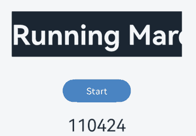
This example demonstrates the dynamic updating of a marquee’s content by setting properties such as start, step, loop, fromStart, src, and marqueeUpdateStrategy.
// xxx.ets
@Entry
@Component
struct MarqueeExample {
  @State start: boolean = false;
  @State src: string = '';
  @State marqueeText: string = 'Running Marquee';
  private fromStart: boolean = true;
  private step: number = 10;
  private loop: number = Number.POSITIVE_INFINITY;
  controller: TextClockController = new TextClockController();

  convert2time(value: number): string {
    let date = new Date(Number(value + '000'));
    let hours = date.getHours().toString().padStart(2, '0');
    let minutes = date.getMinutes().toString().padStart(2, '0');
    let seconds = date.getSeconds().toString().padStart(2, '0');
    return hours + ":" + minutes + ":" + seconds;
  }

  build() {
    Flex({ direction: FlexDirection.Column, alignItems: ItemAlign.Center, justifyContent: FlexAlign.Center }) {
      Marquee({
        start: this.start,
        step: this.step,
        loop: this.loop,
        fromStart: this.fromStart,
        src: this.marqueeText + this.src
      })
        .marqueeUpdateStrategy(MarqueeUpdateStrategy.PRESERVE_POSITION)
        .width('300vp')
        .height('80vp')
        .fontColor('#FFFFFF')
        .fontSize('48fp')
        .allowScale(true) // Set this to true if you want the marquee text to scale with the system font size when using the fp unit for fontSize.
        .fontWeight(700)
        .fontFamily('HarmonyOS Sans') // Use 'HarmonyOS Sans' to avoid following the theme font.
        .backgroundColor('#182431')
        .margin({ bottom: '40vp' })
        .onStart(() => {
          console.info('Succeeded in completing the onStart callback of marquee animation');
        })
        .onBounce(() => {
          console.info('Succeeded in completing the onBounce callback of marquee animation');
        })
        .onFinish(() => {
          console.info('Succeeded in completing the onFinish callback of marquee animation');
        })
      Button('Start')
        .onClick(() => {
          this.start = true
          // Start the text clock.
          this.controller.start();
        })
        .width('120vp')
        .height('40vp')
        .fontSize('16fp')
        .fontWeight(500)
        .backgroundColor('#007DFF')
      TextClock({ timeZoneOffset: -8, controller: this.controller })
        .format('hms')
        .onDateChange((value: number) => {
          this.src = this.convert2time(value);
        })
        .margin('20vp')
        .fontSize('30fp')
    }
    .width('100%')
    .height('100%')
  }
}
你可能感兴趣的鸿蒙文章
- 所属分类: 后端技术
- 本文标签:
热门推荐
-
2、 优质文章
-
3、 gt
-
7、 openharmony
-
9、 golang
-
10、 Vue中input框自动聚焦