harmony 鸿蒙Text
Text
The Text component is used to display a piece of textual information.
NOTE
This component is supported since API version 7. Updates will be marked with a superscript to indicate their earliest API version.
Child Components
This component can contain the Span, ImageSpan, SymbolSpan, and ContainerSpan child components.
APIs
Text(content?: string|Resource , value?: TextOptions)
Widget capability: This API can be used in ArkTS widgets since API version 9.
Atomic service API: This API can be used in atomic services since API version 11.
System capability: SystemCapability.ArkUI.ArkUI.Full
Parameters
| Name | Type | Mandatory | Description |
|---|---|---|---|
| content | string |Resource | No | Text content. This parameter does not take effect if the component contains a Span child component and does not have any styled string configured. In this case, the span content is displayed, and the style of the component does not take effect. Default value: ’ ‘ |
| value11+ | TextOptions | No | Initialization options of the component. |
Attributes
In addition to the universal attributes, the following attributes are supported.
textAlign
textAlign(value: TextAlign)
Sets the horizontal alignment mode of the text.
The text takes up the full width of the Text component.
To set vertical alignment for the text, use the align attribute. The align attribute alone does not control the horizontal position of the text. In other words, Alignment.TopStart, Alignment.Top, and Alignment.TopEnd produce the same effect, top-aligning the text; Alignment.Start, Alignment.Center, and Alignment.End produce the same effect, centered-aligning the text vertically; Alignment.BottomStart, Alignment.Bottom, and Alignment.BottomEnd produce the same effect, bottom-aligning the text. Yet, it can work with the textAlign attribute to jointly determine the horizontal position of the text.
When textAlign is set to TextAlign.JUSTIFY, you must set the wordBreak attribute, and the text in the last line is horizontally aligned with the start edge.
Widget capability: This API can be used in ArkTS widgets since API version 9.
Atomic service API: This API can be used in atomic services since API version 11.
System capability: SystemCapability.ArkUI.ArkUI.Full
Parameters
| Name | Type | Mandatory | Description |
|---|---|---|---|
| value | TextAlign | Yes | Horizontal alignment of the text. Default value: TextAlign.Start on non-wearable devices and TextAlign.Center on wearable devices |
textOverflow
textOverflow(options: TextOverflowOptions)
Sets the display mode when the text is too long.
Text is clipped at the transition between words. To clip text in the middle of a word, add \u200B between characters. Since API version 11, preferably set the wordBreak attribute to WordBreak.BREAK_ALL to achieve the same purpose. For details, see Example 4.
If overflow is set to TextOverflow.None, TextOverflow.Clip, or TextOverflow.Ellipsis, this attribute must be used with maxLines for the settings to take effect. TextOverflow.None produces the same effect as TextOverflow.Clip.
If overflow is set to TextOverflow.MARQUEE, the text scrolls in a line, and neither maxLines nor copyOption takes effect. The textAlign attribute takes effect only when the text is not scrollable. With overflow set to TextOverflow.MARQUEE, the clip attribute is set to true by default. TextOverflow.MARQUEE is not available for CustomSpan of the styled string.
Since API version 12, TextOverflow.MARQUEE is available for the ImageSpan component, where the text and images are displayed in scrolling mode in a line.
Widget capability: This API can be used in ArkTS widgets since API version 9.
Atomic service API: This API can be used in atomic services since API version 11.
System capability: SystemCapability.ArkUI.ArkUI.Full
Parameters
| Name | Type | Mandatory | Description |
|---|---|---|---|
| options | TextOverflowOptions | Yes | Display mode when the text is too long. |
maxLines
maxLines(value: number)
Sets the maximum number of lines in the text. By default, text is automatically folded. If this attribute is specified, the text will not exceed the specified number of lines. If there is extra text, you can use textOverflow to specify how it is displayed.
Widget capability: This API can be used in ArkTS widgets since API version 9.
Atomic service API: This API can be used in atomic services since API version 11.
System capability: SystemCapability.ArkUI.ArkUI.Full
Parameters
| Name | Type | Mandatory | Description |
|---|---|---|---|
| value | number | Yes | Maximum number of lines in the text. |
lineHeight
lineHeight(value: number|string|Resource)
Sets the text line height. If the value is less than or equal to 0, the line height is not limited and the font size is adaptive. If the value is of the number type, the unit fp is used. For the string type, numeric string values with optional units, for example, “10” or “10fp”, are supported.
Widget capability: This API can be used in ArkTS widgets since API version 9.
Atomic service API: This API can be used in atomic services since API version 11.
System capability: SystemCapability.ArkUI.ArkUI.Full
Parameters
| Name | Type | Mandatory | Description |
|---|---|---|---|
| value | number |string |Resource | Yes | Text line height. |
decoration
decoration(value: DecorationStyleInterface)
Sets the color, type, and style of the text decorative line.
Widget capability: This API can be used in ArkTS widgets since API version 9.
Atomic service API: This API can be used in atomic services since API version 11.
System capability: SystemCapability.ArkUI.ArkUI.Full
Parameters
| Name | Type | Mandatory | Description |
|---|---|---|---|
| value | DecorationStyleInterface12+ | Yes | Style of the text decorative line. Default value: { type: TextDecorationType.None, color: Color.Black, style: TextDecorationStyle.SOLID } NOTE The style parameter cannot be used in widgets. |
baselineOffset
baselineOffset(value: number|string)
Sets the offset of the text baseline. If the value specified is a percentage, the default value is used.
Positive values shift the content upwards, while negative values shift it downwards.
Widget capability: This API can be used in ArkTS widgets since API version 9.
Atomic service API: This API can be used in atomic services since API version 11.
System capability: SystemCapability.ArkUI.ArkUI.Full
Parameters
| Name | Type | Mandatory | Description |
|---|---|---|---|
| value | number |string | Yes | Offset of the text baseline. Default value: 0 |
letterSpacing
letterSpacing(value: number|string)
Sets the letter spacing for a text style. If the value specified is a percentage or 0, the default value is used. For the string type, numeric string values with optional units, for example, “10” or “10fp”, are supported.
If the value specified is a negative value, the text is compressed. A negative value too small may result in the text being compressed to 0 and no content being displayed.
Widget capability: This API can be used in ArkTS widgets since API version 9.
Atomic service API: This API can be used in atomic services since API version 11.
System capability: SystemCapability.ArkUI.ArkUI.Full
Parameters
| Name | Type | Mandatory | Description |
|---|---|---|---|
| value | number |string | Yes | Letter spacing. Unit: fp |
minFontSize
minFontSize(value: number|string|Resource)
Sets the minimum font size. For the string type, numeric string values with optional units, for example, “10” or “10fp”, are supported.
For the setting to take effect, this attribute must be used together with maxFontSize and maxLines, or layout constraint settings.
When the adaptive font size is used, the fontSize settings do not take effect.
If the value of minFontSize is less than or equal to 0, font size adaptation does not take effect. In this case, the actual font size is determined by the value of fontSize. If fontSize is not specified, the default value is used.
Since API version 18, this attribute takes effect on child components and styled strings, and the adaptive font size is applied to parts where the font size is not set.
Widget capability: This API can be used in ArkTS widgets since API version 9.
Atomic service API: This API can be used in atomic services since API version 11.
System capability: SystemCapability.ArkUI.ArkUI.Full
Parameters
| Name | Type | Mandatory | Description |
|---|---|---|---|
| value | number |string |Resource | Yes | Minimum font size. Unit: fp |
maxFontSize
maxFontSize(value: number|string|Resource)
Sets the maximum font size. For the string type, numeric string values with optional units, for example, “10” or “10fp”, are supported.
For the setting to take effect, this attribute must be used together with minFontSize and maxLines, or layout constraint settings.
When the adaptive font size is used, the fontSize settings do not take effect.
If the value of maxFontSize is less than or equal to 0, font size adaptation does not take effect. In this case, the actual font size is determined by the value of fontSize. If fontSize is not specified, the default value is used.
Since API version 18, this attribute takes effect on child components and styled strings, and the adaptive font size is applied to parts where the font size is not set.
Widget capability: This API can be used in ArkTS widgets since API version 9.
Atomic service API: This API can be used in atomic services since API version 11.
System capability: SystemCapability.ArkUI.ArkUI.Full
Parameters
| Name | Type | Mandatory | Description |
|---|---|---|---|
| value | number |string |Resource | Yes | Maximum font size. Unit: fp |
textCase
textCase(value: TextCase)
Sets the text case.
Widget capability: This API can be used in ArkTS widgets since API version 9.
Atomic service API: This API can be used in atomic services since API version 11.
System capability: SystemCapability.ArkUI.ArkUI.Full
Parameters
| Name | Type | Mandatory | Description |
|---|---|---|---|
| value | TextCase | Yes | Text case. Default value: TextCase.Normal |
fontColor
fontColor(value: ResourceColor)
Sets the font color. The default value on wearable devices is ’#dbffffff’.
Widget capability: This API can be used in ArkTS widgets since API version 9.
Atomic service API: This API can be used in atomic services since API version 11.
System capability: SystemCapability.ArkUI.ArkUI.Full
Parameters
| Name | Type | Mandatory | Description |
|---|---|---|---|
| value | ResourceColor | Yes | Font color. |
fontSize
fontSize(value: number|string|Resource)
Sets the text size. The default value on wearable devices is 5fp.
Widget capability: This API can be used in ArkTS widgets since API version 9.
Atomic service API: This API can be used in atomic services since API version 11.
System capability: SystemCapability.ArkUI.ArkUI.Full
Parameters
| Name | Type | Mandatory | Description |
|---|---|---|---|
| value | number |string |Resource | Yes | Font size. If fontSize is of the number type, the unit fp is used. The default font size is 16 fp. This parameter cannot be set in percentage. |
fontStyle
fontStyle(value: FontStyle)
Sets the font style.
Widget capability: This API can be used in ArkTS widgets since API version 9.
Atomic service API: This API can be used in atomic services since API version 11.
System capability: SystemCapability.ArkUI.ArkUI.Full
Parameters
| Name | Type | Mandatory | Description |
|---|---|---|---|
| value | FontStyle | Yes | Font style. Default value: FontStyle.Normal |
fontWeight
fontWeight(value: number|FontWeight|string)
Sets the font weight. If the value is too large, the text may be clipped depending on the font.
Widget capability: This API can be used in ArkTS widgets since API version 9.
Atomic service API: This API can be used in atomic services since API version 11.
System capability: SystemCapability.ArkUI.ArkUI.Full
Parameters
| Name | Type | Mandatory | Description |
|---|---|---|---|
| value | number |FontWeight |string | Yes | Font weight. For the number type, the value range is [100, 900], at an interval of 100. The default value is 400. A larger value indicates a heavier font weight. For the string type, only strings that represent a number, for example, “400”, and the following enumerated values of FontWeight are supported: “bold”, “bolder”, “lighter”, “regular”, and “medium”. Default value: FontWeight.Normal on non-wearable devices and FontWeight.Regular on wearable devices |
fontFamily
fontFamily(value: string|Resource)
Sets the font family.
Widget capability: This API can be used in ArkTS widgets since API version 9.
Atomic service API: This API can be used in atomic services since API version 11.
System capability: SystemCapability.ArkUI.ArkUI.Full
Parameters
| Name | Type | Mandatory | Description |
|---|---|---|---|
| value | string |Resource | Yes | Font family. Default font: ‘HarmonyOS Sans’ The ‘HarmonyOS Sans’ font and registered custom fonts are supported for applications. Only the ‘HarmonyOS Sans’ font is supported for widgets. |
copyOption9+
copyOption(value: CopyOptions)
Sets whether copy and paste is allowed. If this attribute is set to CopyOptions.InApp or CopyOptions.LocalDevice, a long press on the text will display a context menu that offers the copy and select-all options.
Because widgets do not have the long press event, the context menu will not be displayed when users long press text.
Widget capability: This API can be used in ArkTS widgets since API version 9.
Atomic service API: This API can be used in atomic services since API version 11.
System capability: SystemCapability.ArkUI.ArkUI.Full
Parameters
| Name | Type | Mandatory | Description |
|---|---|---|---|
| value | CopyOptions | Yes | Whether copy and paste is allowed. Default value: CopyOptions.None |
draggable9+
draggable(value: boolean)
Sets the drag effect of the selected text.
This attribute cannot be used together with the onDragStart event.
It must be used together with CopyOptions. When it is set to true and copyOptions is set to CopyOptions.InApp or CopyOptions.LocalDevice, the selected text can be dragged and copied to the text box.
Atomic service API: This API can be used in atomic services since API version 11.
System capability: SystemCapability.ArkUI.ArkUI.Full
Parameters
| Name | Type | Mandatory | Description |
|---|---|---|---|
| value | boolean | Yes | Drag effect of the selected text. Default value: false |
font10+
font(value: Font)
Sets the text style, covering the font size, font width, font family, and font style.
Atomic service API: This API can be used in atomic services since API version 11.
System capability: SystemCapability.ArkUI.ArkUI.Full
Parameters
| Name | Type | Mandatory | Description |
|---|---|---|---|
| value | Font | Yes | Text style. |
textShadow10+
textShadow(value: ShadowOptions|Array<ShadowOptions>)
Sets the text shadow.
This API does not work with the fill attribute or coloring strategy.
Since API version 11, this API supports input parameters in an array to implement multiple text shadows.
Widget capability: This API can be used in ArkTS widgets since API version 10.
Atomic service API: This API can be used in atomic services since API version 11.
System capability: SystemCapability.ArkUI.ArkUI.Full
Parameters
| Name | Type | Mandatory | Description |
|---|---|---|---|
| value | ShadowOptions | Array<ShadowOptions>11+ | Yes | Text shadow. |
heightAdaptivePolicy10+
heightAdaptivePolicy(value: TextHeightAdaptivePolicy)
Sets how the font size of text adapts to layout constraints.
When this attribute is set to TextHeightAdaptivePolicy.MAX_LINES_FIRST, the maxLines attribute takes precedence for adjusting the text height. If the maxLines setting results in a layout beyond the layout constraints, the text will shrink to a font size between minFontSize and maxFontSize to allow for more content to be shown.
If this attribute is set to TextHeightAdaptivePolicy.MIN_FONT_SIZE_FIRST, the minFontSize attribute takes precedence for adjusting the text height. If the text fits on one line at minFontSize, the system attempts to increase the font size within the range of minFontSize and maxFontSize to display the text as large as possible on one line. If the text cannot fit into a single line even at minFontSize, it sticks with minFontSize.
If this attribute is set to TextHeightAdaptivePolicy.LAYOUT_CONSTRAINT_FIRST, the layout constraints take precedence for adjusting the text height. If the resultant layout is beyond the layout constraints, the text will shrink to a font size between minFontSize and maxFontSize to respect the layout constraints. If the text still extends beyond the layout constraints after shrinking to minFontSize, the lines that exceed the constraints are deleted.
Atomic service API: This API can be used in atomic services since API version 11.
System capability: SystemCapability.ArkUI.ArkUI.Full
Parameters
| Name | Type | Mandatory | Description |
|---|---|---|---|
| value | TextHeightAdaptivePolicy | Yes | How the adaptive height is determined for the text. Default value: TextHeightAdaptivePolicy.MAX_LINES_FIRST |
textIndent10+
textIndent(value: Length)
Sets the indent of the first line text.
Atomic service API: This API can be used in atomic services since API version 11.
System capability: SystemCapability.ArkUI.ArkUI.Full
Parameters
| Name | Type | Mandatory | Description |
|---|---|---|---|
| value | Length | Yes | Indent of the first line text. Default value: 0 |
wordBreak11+
wordBreak(value: WordBreak)
Sets the word break rule. When used with {overflow: TextOverflow.Ellipsis} and maxLines, WordBreak.BREAK_ALL can insert line breaks between letters when overflow occurs and display excess content with an ellipsis (…).
Atomic service API: This API can be used in atomic services since API version 11.
System capability: SystemCapability.ArkUI.ArkUI.Full
Parameters
| Name | Type | Mandatory | Description |
|---|---|---|---|
| value | WordBreak | Yes | Word break rule. Default value: WordBreak.BREAK_WORD |
selection11+
selection(selectionStart: number, selectionEnd: number)
Sets text selection. The selected text is highlighted, and a selection handle is displayed together with a menu of available actions.
When copyOption is set to CopyOptions.None, the selection attribute is not effective.
When overflow is set to TextOverflow.MARQUEE, the selection attribute is not effective.
If the value of selectionStart is greater than or equal to that of selectionEnd, no text will be selected. The value range is [0, textSize], where textSize indicates the maximum number of characters in the text content. If the value is less than 0, the value 0 will be used. If the value is greater than textSize, textSize will be used.
If the value of selectionStart or selectionEnd falls within the invisible area, no text will be selected. If clipping is disabled, the text selection outside of the parent component takes effect.
Atomic service API: This API can be used in atomic services since API version 11.
System capability: SystemCapability.ArkUI.ArkUI.Full
Parameters
| Name | Type | Mandatory | Description |
|---|---|---|---|
| selectionStart | number | Yes | Start position of the selected text. Default value: -1 |
| selectionEnd | number | Yes | End position of the selected text. Default value: -1 |
ellipsisMode11+
ellipsisMode(value: EllipsisMode)
Sets the ellipsis position. For the settings to work, overflow must be set to TextOverflow.Ellipsis and maxLines must be specified. Setting ellipsisMode alone does not take effect.
EllipsisMode.START and EllipsisMode.CENTER take effect only when text overflows in a single line.
Atomic service API: This API can be used in atomic services since API version 12.
System capability: SystemCapability.ArkUI.ArkUI.Full
Parameters
| Name | Type | Mandatory | Description |
|---|---|---|---|
| value | EllipsisMode | Yes | Ellipsis position. Default value: EllipsisMode.END |
enableDataDetector11+
enableDataDetector(enable: boolean)
Enables recognition for special entities within the text.
This API only works on devices that provide text recognition.
When enableDataDetector is set to true, and the dataDetectorConfig attribute is not set, all types of entities are recognized by default, and the color and decoration of the recognized entities will be changed to the following styles:
color: '#ff007dff'
decoration:{
  type: TextDecorationType.Underline,
  color: '#ff007dff',
  style: TextDecorationStyle.SOLID
}
Touching and right-clicking an entity with the mouse will pop up the corresponding entity operation menu based on the type of entity, while left-clicking an entity with the mouse will directly respond to the first option of the menu.
This API does not work when overflow is set to TextOverflow.MARQUEE.
When copyOption is set to CopyOptions.None, the menu displayed after an entity is clicked does not provide the text selection, copy, translation, or sharing functionality. When copyOption is not set to CopyOptions.None, and textSelectable is set to TextSelectableMode.UNSELECTABLE, the entity still has the copy functionality but does not have the text selection feature.
Atomic service API: This API can be used in atomic services since API version 12.
System capability: SystemCapability.ArkUI.ArkUI.Full
Parameters
| Name | Type | Mandatory | Description |
|---|---|---|---|
| enable | boolean | Yes | Whether to enable text recognition. Default value: false |
dataDetectorConfig11+
dataDetectorConfig(config: TextDataDetectorConfig)
Configures text recognition settings.
This API must be used together with enableDataDetector. It takes effect only when enableDataDetector is set to true.
When entities A and B overlap, the following rules are followed:
If A is a subset of B (A ⊂ B), then B is retained; otherwise, A is retained.
If A is not a subset of B (A ⊄ B) and B is not a subset of A (B ⊄ A), and if the starting point of A is earlier than that of B (A.start < B.start), then A is retained; otherwise, B is retained.
Atomic service API: This API can be used in atomic services since API version 12.
System capability: SystemCapability.ArkUI.ArkUI.Full
Parameters
| Name | Type | Mandatory | Description |
|---|---|---|---|
| config | TextDataDetectorConfig | Yes | Text recognition configuration. |
bindSelectionMenu11+
bindSelectionMenu(spanType: TextSpanType, content: CustomBuilder, responseType: TextResponseType, options?: SelectionMenuOptions)
Sets the custom context menu on text selection.
The duration required for a long-press gesture is 600 ms for bindSelectionMenu and 800 ms for bindContextMenu. When both bindSelectionMenu and bindContextMenu are set and both are configured to be triggered by a long-press gesture, bindSelectionMenu is triggered first.
If the custom menu is too long, embed a Scroll component to prevent the keyboard from being blocked.
Atomic service API: This API can be used in atomic services since API version 12.
System capability: SystemCapability.ArkUI.ArkUI.Full
Parameters
| Name | Type | Mandatory | Description |
|---|---|---|---|
| spanType | TextSpanType | Yes | Span type of the menu. Default value: TextSpanType.TEXT |
| content | CustomBuilder | Yes | Content of the menu. |
| responseType | TextResponseType | Yes | Response type of the menu. Default value: TextResponseType.LONG_PRESS |
| options | SelectionMenuOptions | No | Options of the menu. |
fontFeature12+
fontFeature(value: string)
Sets the font feature, for example, monospaced digits.
Format: normal |<feature-tag-value>
Format of <feature-tag-value>: <string> [ <integer> |on |off ]
There can be multiple <feature-tag-value> values, which are separated by commas (,).
For example, the input format for monospaced clock fonts is “ss01” on.
Widget capability: This API can be used in ArkTS widgets since API version 12.
Atomic service API: This API can be used in atomic services since API version 12.
System capability: SystemCapability.ArkUI.ArkUI.Full
Parameters
| Name | Type | Mandatory | Description |
|---|---|---|---|
| value | string | Yes | Font feature. |
Font feature list

Font features are advanced typographic features, such as ligatures and monospace, for OpenType fonts. They are typically used in custom fonts and require the support of the font itself. For more information about the font features, see Low-level font feature settings control: the font-feature-settings property and The Complete CSS Demo for OpenType Features.
NOTE
The Text component cannot contain both text and the child component Span or ImageSpan. If both of them exist, only the content in Span or ImageSpan is displayed.
The typesetting engine rounds down the value of width to ensure that the value is an integer. If the typesetting engine rounds up the value instead, the right side of the text may be clipped.
When multiple Text components are placed in the Row container with no specific layout or space allocation settings configured, the components are laid out based on the maximum size of the container. To make sure the sum of the components’ main axis sizes does not exceed the main axis size of the container, you can set layoutWeight or use the flex layout.
lineSpacing12+
lineSpacing(value: LengthMetrics)
Sets the line spacing of the text. If the value specified is less than or equal to 0, the default value 0 is used.
Atomic service API: This API can be used in atomic services since API version 12.
System capability: SystemCapability.ArkUI.ArkUI.Full
Parameters
| Name | Type | Mandatory | Description |
|---|---|---|---|
| value | LengthMetrics | Yes | Line spacing. Default value: 0 |
privacySensitive12+
privacySensitive(supported: boolean)
Sets whether to enable privacy mode on widgets.
Widget capability: This API can be used in ArkTS widgets since API version 12.
Atomic service API: This API can be used in atomic services since API version 12.
System capability: SystemCapability.ArkUI.ArkUI.Full
Parameters
| Name | Type | Mandatory | Description |
|---|---|---|---|
| supported | boolean | Yes | Whether to enable privacy mode on widgets. The value true means to enable privacy mode, in which case text is obscured as hyphens (-). Default value: false NOTE If this parameter is set to null, privacy mode is disabled. Enabling privacy mode requires widget framework support. |
lineBreakStrategy12+
lineBreakStrategy(strategy: LineBreakStrategy)
Sets the line break rule. This attribute takes effect when wordBreak is not set to breakAll. Hyphens are not supported.
Atomic service API: This API can be used in atomic services since API version 12.
System capability: SystemCapability.ArkUI.ArkUI.Full
Parameters
| Name | Type | Mandatory | Description |
|---|---|---|---|
| strategy | LineBreakStrategy | Yes | Line break rule. Default value: LineBreakStrategy.GREEDY |
textSelectable12+
textSelectable(mode: TextSelectableMode)
Sets whether the text is selectable and focusable.
Atomic service API: This API can be used in atomic services since API version 12.
System capability: SystemCapability.ArkUI.ArkUI.Full
Parameters
| Name | Type | Mandatory | Description |
|---|---|---|---|
| mode | TextSelectableMode | Yes | Whether the text is selectable and focusable. Default value: TextSelectableMode.SELECTABLE_UNFOCUSABLE |
editMenuOptions12+
editMenuOptions(editMenu: EditMenuOptions)
Sets the extended options of the custom context menu on selection, including the text content, icon, and callback.
Atomic service API: This API can be used in atomic services since API version 12.
System capability: SystemCapability.ArkUI.ArkUI.Full
Parameters
| Name | Type | Mandatory | Description |
|---|---|---|---|
| editMenu | EditMenuOptions | Yes | Extended options of the custom context menu on selection. |
minFontScale12+
minFontScale(scale: number|Resource)
Sets the minimum font scale factor for text.
Atomic service API: This API can be used in atomic services since API version 12.
System capability: SystemCapability.ArkUI.ArkUI.Full
Parameters
| Name | Type | Mandatory | Description |
|---|---|---|---|
| scale | number |Resource | Yes | Minimum font scale factor for text. Value range: [0, 1] NOTE A value less than 0 is handled as 0. A value greater than 1 is handled as 1. Abnormal values are ineffective by default. |
maxFontScale12+
maxFontScale(scale: number|Resource)
Sets the maximum font scale factor for text.
Atomic service API: This API can be used in atomic services since API version 12.
System capability: SystemCapability.ArkUI.ArkUI.Full
Parameters
| Name | Type | Mandatory | Description |
|---|---|---|---|
| scale | number |Resource | Yes | Maximum font scale factor for text. Value range: [1, +∞) NOTE A value less than 1 is handled as 1. Abnormal values are ineffective by default. |
halfLeading12+
halfLeading(halfLeading: boolean)
Sets whether half leading is enabled.
The halfLeading settings configured within the component take precedence over those in module.json5.
Atomic service API: This API can be used in atomic services since API version 12.
System capability: SystemCapability.ArkUI.ArkUI.Full
Parameters
| Name | Type | Mandatory | Description |
|---|---|---|---|
| halfLeading | boolean | Yes | Whether half leading is enabled. Half leading is the leading split in half and applied equally to the top and bottom edges. The value true means that half leading is enabled, and false means the opposite. Default value: false |
font12+
font(fontValue: Font, options?: FontSettingOptions)
Sets the font style, with support for font settings.
It is only effective for the Text component, not for its child components.
Widget capability: This API can be used in ArkTS widgets since API version 12.
Atomic service API: This API can be used in atomic services since API version 12.
System capability: SystemCapability.ArkUI.ArkUI.Full
Parameters
| Name | Type | Mandatory | Description |
|---|---|---|---|
| fontValue | Font | Yes | Text style. |
| options | FontSettingOptions | No | Font settings. |
fontWeight12+
fontWeight(weight: number|FontWeight|string, options?: FontSettingOptions)
Sets the text font weight, with support for font settings.
It is only effective for the Text component, not for its child components.
Widget capability: This API can be used in ArkTS widgets since API version 12.
Atomic service API: This API can be used in atomic services since API version 12.
System capability: SystemCapability.ArkUI.ArkUI.Full
Parameters
| Name | Type | Mandatory | Description |
|---|---|---|---|
| weight | number |FontWeight |string | Yes | Font weight. For the number type, the value ranges from 100 to 900, at an interval of 100. A larger value indicates a heavier font weight. The default value is 400. For the string type, only strings that represent a number, for example, “400”, and the following enumerated values of FontWeight are supported: “bold”, “bolder”, “lighter”, “regular”, and “medium”. |
| options | FontSettingOptions | No | Font settings. |
enableHapticFeedback13+
enableHapticFeedback(isEnabled: boolean)
Specifies whether to enable haptic feedback.
Atomic service API: This API can be used in atomic services since API version 13.
System capability: SystemCapability.ArkUI.ArkUI.Full
Parameters
| Name | Type | Mandatory | Description |
|---|---|---|---|
| isEnabled | boolean | Yes | Whether to enable haptic feedback. Default value: true |
NOTE
To enable haptic feedback, you must declare the ohos.permission.VIBRATE permission under requestPermissions in the module.json5 file of the project.
> "requestPermissions": [ > { > "name": "ohos.permission.VIBRATE", > } > ] > ``` ### caretColor<sup>14+</sup> caretColor(color: ResourceColor) Sets the color of the text selection handle, also known as the caret, in the text box. **Atomic service API**: This API can be used in atomic services since API version 14. **System capability**: SystemCapability.ArkUI.ArkUI.Full **Parameters** |Name|Type |Mandatory|Description | |------|------------------------------------------|----|--------------------------------------| |color|[ResourceColor](https://m.seaxiang.com/blog/QdcP30color)|Yes|Color of the text selection handle.<br>Default value: **'#007DFF'**| ### selectedBackgroundColor<sup>14+</sup> selectedBackgroundColor(color: ResourceColor) Sets the background color of the selected text. If the opacity is not set, a 20% opacity will be used. **Atomic service API**: This API can be used in atomic services since API version 14. **System capability**: SystemCapability.ArkUI.ArkUI.Full **Parameters** |Name|Type |Mandatory|Description | |------|------------------------------------------|----|------------------------------------------| |color|[ResourceColor](https://m.seaxiang.com/blog/QdcP30color)|Yes|Background color of the selected text.<br>By default, a 20% opacity is applied.<br>Default value: **'#007DFF'**| ### marqueeOptions<sup>18+</sup> marqueeOptions(options: Optional\<TextMarqueeOptions>) Sets the marquee effect for text. The **marqueeOptions** settings take effect only when **textOverflow** is set to **TextOverflow.MARQUEE**. **Atomic service API**: This API can be used in atomic services since API version 18. **System capability**: SystemCapability.ArkUI.ArkUI.Full **Parameters** |Name|Type |Mandatory|Description | |------|------------------------------------------|----|------------------------------------------| |options|[Optional](ts-universal-attributes-custom-property.md#optional12)\<[TextMarqueeOptions](#textmarqueeoptions18)>|Yes|Marquee settings, including the switch, step length, number of loops, and direction.| ## TextSpanType<sup>11+</sup> Provides the [span](https://m.seaxiang.com/blog/JlgvJH) type information. **System capability**: SystemCapability.ArkUI.ArkUI.Full |Name|Value|Description| |--------|----|--------| |TEXT|0|Text span.<br>**Atomic service API**: This API can be used in atomic services since API version 12.| |IMAGE|1|Image span.<br>**Atomic service API**: This API can be used in atomic services since API version 12.| |MIXED|2|Mixed span, which contains both text and imagery.<br>**Atomic service API**: This API can be used in atomic services since API version 12.| |DEFAULT<sup>15+</sup>|3|When this type is registered but **TEXT**, **IMAGE**, or **MIXED** types are not registered, this type will be triggered and displayed for those registered types.<br>**Atomic service API**: This API can be used in atomic services since API version 15.| > **NOTE** > > The order for menu type matching is as follows. When the user interacts with text, the system follows this order to decides which type of menu to display. > 1. Check whether a menu is registered for **TextSpanType.TEXT** and **TextResponseType.LONG_PRESS**. > 2. Check whether a menu is registered for **TextSpanType.TEXT** and **TextResponseType.DEFAULT**. > 3. Check whether a menu is registered for **TextSpanType.DEFAULT** and **TextResponseType.LONG_PRESS**. > 4. Check whether a menu is registered for **TextSpanType.DEFAULT** and **TextResponseType.DEFAULT**. ## TextResponseType<sup>11+</sup> **System capability**: SystemCapability.ArkUI.ArkUI.Full |Name |Value| Description | |----------|---|-------------| |RIGHT_CLICK|0|The menu is displayed when the component is right-clicked.<br>**Atomic service API**: This API can be used in atomic services since API version 12.| |LONG_PRESS|1|The menu is displayed when the component is long-pressed.<br>**Atomic service API**: This API can be used in atomic services since API version 12.| |SELECT|2|The menu is displayed when the component is selected.<br>**Atomic service API**: This API can be used in atomic services since API version 12.| |DEFAULT<sup>15+</sup>|3|When this type is registered but **RIGHT_CLICK**, **LONG_PRESS**, or **SELECT** types are not registered, this type will be triggered and displayed for right-click, long press, and mouse selection actions.<br>**Atomic service API**: This API can be used in atomic services since API version 15.| > **NOTE** > > The order for menu type matching is as follows. When the user interacts with text, the system follows this order to decides which type of menu to display. > 1. Check whether a menu is registered for **TextSpanType.TEXT** and **TextResponseType.LONG_PRESS**. > 2. Check whether a menu is registered for **TextSpanType.TEXT** and **TextResponseType.DEFAULT**. > 3. Check whether a menu is registered for **TextSpanType.DEFAULT** and **TextResponseType.LONG_PRESS**. > 4. Check whether a menu is registered for **TextSpanType.DEFAULT** and **TextResponseType.DEFAULT**. ## TextOverflowOptions<sup>18+</sup> Describes the display mode when the text is too long. **Widget capability**: This API can be used in ArkTS widgets since API version 18. **Atomic service API**: This API can be used in atomic services since API version 18. **System capability**: SystemCapability.ArkUI.ArkUI.Full **Parameters** |Name|Type |Mandatory|Description | |------|------------------------------------------------------------|----|------------------------------------------------------------| |overflow<sup>7+</sup>|[TextOverflow](ts-appendix-enums.md#textoverflow)|Yes|Display mode when the text is too long.<br>Default value: **TextOverflow.Clip**<br>**Widget capability**: This API can be used in ArkTS widgets since API version 9.<br>**Atomic service API**: This API can be used in atomic services since API version 11.| ## Events In addition to the [universal events](ts-component-general-events.md), the following events are supported. ### onCopy<sup>11+</sup> onCopy(callback:(value: string) => void) Called when data is copied to the pasteboard, which is displayed when the text box is long pressed. Currently, only text can be copied. **Atomic service API**: This API can be used in atomic services since API version 11. **System capability**: SystemCapability.ArkUI.ArkUI.Full **Parameters** |Name|Type|Mandatory|Description | |------|------|----|----------------| |value|string|Yes|Text that is copied.| ### onTextSelectionChange<sup>11+</sup> onTextSelectionChange(callback: (selectionStart: number, selectionEnd: number) => void) Called when the text selection position changes. **Atomic service API**: This API can be used in atomic services since API version 12. **System capability**: SystemCapability.ArkUI.ArkUI.Full **Parameters** |Name |Type|Mandatory|Description | |--------------|------|----|--------------------| |selectionStart|number|Yes|Start position of the selected text.| |selectionEnd |number|Yes|End position of the selected text.| ### onMarqueeStateChange<sup>18+</sup> onMarqueeStateChange(callback: Callback\<MarqueeState\>) Called when the marquee animation reaches the specified state. **Atomic service API**: This API can be used in atomic services since API version 18. **System capability**: SystemCapability.ArkUI.ArkUI.Full **Parameters** |Name |Type |Mandatory|Description | |--------|---------------------------------------------------|-----|--------------------------| |callback|Callback\<[MarqueeState](#marqueestate18)\>|Yes|Callback that receives a **MarqueeState** enum value, which indicates the current state of the marquee animation.| ## TextOptions<sup>11+</sup> Describes the initialization options of the **Text** component. **Atomic service API**: This API can be used in atomic services since API version 12. **System capability**: SystemCapability.ArkUI.ArkUI.Full |Name|Type|Mandatory|Description| |--------|--------|--------|--------| |controller|[TextController](#textcontroller11)|Yes|Text controller.| ## TextController<sup>11+</sup> Defines the controller of the **Text** component. **Atomic service API**: This API can be used in atomic services since API version 12. **System capability**: SystemCapability.ArkUI.ArkUI.Full ### Objects to Importcontroller: TextController = new TextController()
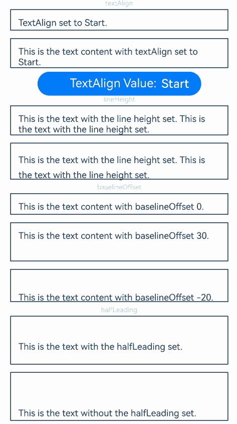
### closeSelectionMenu

closeSelectionMenu(): void

Closes the custom or default context menu on selection.

**Atomic service API**: This API can be used in atomic services since API version 12.

**System capability**: SystemCapability.ArkUI.ArkUI.Full

### setStyledString<sup>12+</sup>

setStyledString(value: StyledString): void

Binds to or updates the specified styled string.

**Atomic service API**: This API can be used in atomic services since API version 12.

**System capability**: SystemCapability.ArkUI.ArkUI.Full

**Parameters**

|Name|Type|Mandatory|Description             |
|-----|------|----|-------------------|
|value|[StyledString](ts-universal-styled-string.md#styledstring)|Yes |Styled string.<br>**NOTE**<br>The child class [MutableStyledString](ts-universal-styled-string.md#mutablestyledstring) of **StyledString** can also serve as the argument.|

### getLayoutManager<sup>12+</sup>

getLayoutManager(): LayoutManager

Obtains the **LayoutManager** object.

**Atomic service API**: This API can be used in atomic services since API version 12.

**System capability**: SystemCapability.ArkUI.ArkUI.Full

**Return value**

|Type                                    |Description   |
|----------------------------------------|-------|
|[LayoutManager](ts-text-common.md#layoutmanager12)|**LayoutManager** object.|

## TextMarqueeOptions<sup>18+</sup>

Describes the initialization options of the **Marquee** component.

**Atomic service API**: This API can be used in atomic services since API version 18.

**System capability**: SystemCapability.ArkUI.ArkUI.Full

**Parameters**

|Name             |Type                                           |Mandatory|Description                                                                               |
|--------------------|-------------------------------------------------|----|-------------------------------------------------------------------------------------|
|start            |boolean                                       |Yes|Whether to start the marquee.                                                                     |
|step             |number                                        |No|Step length of the scrolling animation text.<br>Default value: **4.0** (in vp)                                                        |
|loop             |number                                        |No|Number of times the marquee will scroll. If the value is less than or equal to **0**, the marquee will scroll continuously.<br>Default value: **-1**                                                 |
|fromStart        |boolean                                       |No|Whether the text scrolls from the start.<br>Default value: **true**                                                    |
|delay            |number                                        |No|Time interval between scroll movements.<br>Default value: **0**                                                           |
|fadeout          |boolean                                       |No|Whether to apply a fade-out effect when the text is too long. With this parameter set to **true**: When the text content exceeds the display range, the edges of the partially visible text will have a fade-out effect applied; If both ends have partially visible text, both ends will have the fade-out effect applied; The **clip** attribute is automatically locked to **true** and cannot be set to **false**.<br>Default value: **false**|
|marqueeStartPolicy|[MarqueeStartPolicy](#marqueestartpolicy18)|No|Start policy of the marquee.<br>Default value: **MarqueeStartPolicy.DEFAULT**                                    |

## MarqueeStartPolicy<sup>18+</sup>

Enumerates the marquee scrolling modes.

**Atomic service API**: This API can be used in atomic services since API version 18.

**System capability**: SystemCapability.ArkUI.ArkUI.Full

|Name     |Value|Description         |
|----------|----|---------------|
|DEFAULT|0|The marquee scrolls continuously. Default value.    |
|ON_FOCUS|1|The marquee starts scrolling when it has focus or when the mouse hovers over it.|

## MarqueeState<sup>18+</sup>

Enumerates the return values of the marquee state callback.

**Atomic service API**: This API can be used in atomic services since API version 18.

**System capability**: SystemCapability.ArkUI.ArkUI.Full

|Name  |Value|Description                         |
|--------|----|-------------------------------|
|START|0|The marquee starts scrolling.                  |
|BOUNCE|1|The marquee completes one scroll movement. If the number of **loops** is not 1, this value will be returned multiple times.|
|FINISH|2|All loops of the marquee are completed.           |

## Example

### Example 1: Setting the Text Layout
This example demonstrates the effects of text layout attributes such as **textAlign**, **lineHeight**, **baselineOffset**, and **halfLeading**.
```ts
// xxx.ets
@Extend(Text)
function style(TextAlign: TextAlign) {
  .textAlign(TextAlign)
  .fontSize(12)
  .border({ width: 1 })
  .padding(10)
  .width('100%')
  .margin(5)
}

@Entry
@Component
struct TextExample1 {
  @State changeTextAlignIndex: number = 0;
  @State changeDecorationIndex: number = 0;
  @State TextAlign: TextAlign[] = [TextAlign.Start, TextAlign.Center, TextAlign.End];
  @State TextAlignStr: string[] = ['Start', 'Center', 'End'];
  @State TextDecorationType: TextDecorationType[] =
    [TextDecorationType.LineThrough, TextDecorationType.Overline, TextDecorationType.Underline];
  @State TextDecorationTypeStr: string[] = ['LineThrough', 'Overline', 'Underline'];
  @State TextDecorationStyle: TextDecorationStyle[] =
    [TextDecorationStyle.SOLID, TextDecorationStyle.DOTTED, TextDecorationStyle.WAVY];
  @State TextDecorationStyleStr: string[] = ['SOLID', 'DOTTED', 'WAVY'];

  build() {
    Flex({ direction: FlexDirection.Column, alignItems: ItemAlign.Center }) {
      // Set horizontal alignment for text.
      // Single-line text
      Text('textAlign').fontSize(9).fontColor(0xCCCCCC)
      Text(`TextAlign set to ${this.TextAlignStr[this.changeTextAlignIndex]}.`)
        .style(this.TextAlign[this.changeTextAlignIndex])

      // Multi-line text
      Text(`This is the text content with textAlign set to ${this.TextAlignStr[this.changeTextAlignIndex]}.`)
        .style(this.TextAlign[this.changeTextAlignIndex])
        .margin(5)

      Row() {
        Button('TextAlign Value: ' + this.TextAlignStr[this.changeTextAlignIndex]).onClick(() => {
          this.changeTextAlignIndex++;
          if (this.changeTextAlignIndex > (this.TextAlignStr.length - 1)) {
            this.changeTextAlignIndex = 0;
          }
        })
      }.justifyContent(FlexAlign.Center).width('100%')

      // Set the text line height.
      Text('lineHeight').fontSize(9).fontColor(0xCCCCCC)
      Text('This is the text with the line height set. This is the text with the line height set.')
        .style(TextAlign.Start)
      Text('This is the text with the line height set. This is the text with the line height set.')
        .style(TextAlign.Start)
        .lineHeight(20)

      // Set the text baseline offset.
      Text('baselineOffset').fontSize(9).fontColor(0xCCCCCC)
      Text('This is the text content with baselineOffset 0.')
        .baselineOffset(0)
        .style(TextAlign.Start)
      Text('This is the text content with baselineOffset 30.')
        .baselineOffset(30)
        .style(TextAlign.Start)
      Text('This is the text content with baselineOffset -20.')
        .baselineOffset(-20)
        .style(TextAlign.Start)

      // Set whether half leading is enabled.
      Text('halfLeading').fontSize(9).fontColor(0xCCCCCC)
      Text("This is the text with the halfLeading set.")
        .lineHeight(60)
        .halfLeading(true)
        .style(TextAlign.Start)
      Text("This is the text without the halfLeading set.")
        .lineHeight(60)
        .halfLeading(false)
        .style(TextAlign.Start)
    }.height(600).width('100%').padding({ left: 35, right: 35, top: 35 })
  }
}
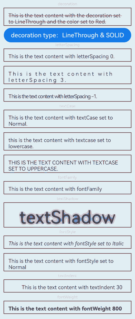
Example 2: Setting the Text Style
This example shows how to set various text styles using decoration, letterSpacing, and textCase, fontFamily, textShadow, fontStyle, textIndent, and fontWeight attributes.
@Extend(Text)
function style() {
  .font({ size: 12 })
  .border({ width: 1 })
  .padding(10)
  .width('100%')
  .margin(5)
}

@Entry
@Component
struct TextExample2 {
  @State changeDecorationIndex: number = 0;
  @State TextDecorationType: TextDecorationType[] =
    [TextDecorationType.LineThrough, TextDecorationType.Overline, TextDecorationType.Underline];
  @State TextDecorationTypeStr: string[] = ['LineThrough', 'Overline', 'Underline'];
  @State TextDecorationStyle: TextDecorationStyle[] =
    [TextDecorationStyle.SOLID, TextDecorationStyle.DOTTED, TextDecorationStyle.WAVY];
  @State TextDecorationStyleStr: string[] = ['SOLID', 'DOTTED', 'WAVY'];

  build() {
    Flex({ direction: FlexDirection.Column, alignItems: ItemAlign.Center }) {
      Text('decoration').fontSize(9).fontColor(0xCCCCCC)
      Text('This is the text content with the decoration set to LineThrough and the color set to Red.')
        .decoration({
          type: this.TextDecorationType[this.changeDecorationIndex],
          color: Color.Red,
          style: this.TextDecorationStyle[this.changeDecorationIndex]
        })
        .style()
        .margin(5)

      Row() {
        Button('Decoration Type: ' + this.TextDecorationTypeStr[this.changeDecorationIndex] + ' & ' +
        this.TextDecorationStyleStr[this.changeDecorationIndex]).onClick(() => {
          this.changeDecorationIndex++;
          if (this.changeDecorationIndex > (this.TextDecorationTypeStr.length - 1)) {
            this.changeDecorationIndex = 0;
          }
        })
      }.justifyContent(FlexAlign.Center).width('100%')

      // Set the letter spacing.
      Text('letterSpacing').fontSize(9).fontColor(0xCCCCCC)
      Text('This is the text content with letterSpacing 0.')
        .letterSpacing(0)
        .style()
      Text('This is the text content with letterSpacing 3.')
        .letterSpacing(3)
        .style()
      Text('This is the text content with letterSpacing -1.')
        .letterSpacing(-1)
        .style()

      Text('textCase').fontSize(9).fontColor(0xCCCCCC)
      Text('This is the text content with textCase set to Normal.')
        .textCase(TextCase.Normal)
        .style()
      // Display the text in lowercase.
      Text('This is the text content with textCase set to LowerCase.')
        .textCase(TextCase.LowerCase)
        .style()
      // Display the text in uppercase.
      Text('This is the text content with textCase set to UpperCase.')
        .textCase(TextCase.UpperCase)
        .style()

      Text('fontFamily').fontSize(9).fontColor(0xCCCCCC)
      // Set the font family.
      Text('This is the text content with fontFamily')
        .style()
        .fontFamily('HarmonyOS Sans')

      Text('textShadow').fontSize(9).fontColor(0xCCCCCC)
      // Set the text shadow.
      Text('textShadow')
        .style()
        .textAlign(TextAlign.Center)
        .fontSize(40)
        .textShadow({
          radius: 10,
          color: Color.Black,
          offsetX: 0,
          offsetY: 0
        })

      Text('fontStyle').fontSize(9).fontColor(0xCCCCCC)
      // Set the font style.
      Text('This is the text content with fontStyle set to Italic')
        .style()
        .fontStyle(FontStyle.Italic)
      Text('This is the text content with fontStyle set to Normal')
        .style()
        .fontStyle(FontStyle.Normal)

      Text('textIndent').fontSize(9).fontColor(0xCCCCCC)
      // Set the text indentation.
      Text('This is the text content with textIndent 30')
        .style()
        .textIndent(30)

      Text('fontWeight').fontSize(9).fontColor(0xCCCCCC)
      // Set the font weight.
      Text('This is the text content with fontWeight 800')
        .style()
        .fontWeight('800', { enableVariableFontWeight: true })

    }.width('100%').padding({ left: 35, right: 35 })
  }
}
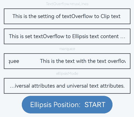
Example 3: Setting Text Overflow
This example demonstrates how to use maxLines, textOverflow, and ellipsisMode to display excess content with an ellipsis (…) when the text is too long.
@Extend(Text)
function style() {
  .textAlign(TextAlign.Center)
  .fontSize(12)
  .border({ width: 1 })
  .padding(10)
  .width('100%')
  .margin(5)
}

@Entry
@Component
struct TextExample3 {
  @State text: string =
    'The text component is used to display a piece of textual information.Support universal attributes and universal text attributes.';
  @State ellipsisModeIndex: number = 0;
  @State ellipsisMode: EllipsisMode[] = [EllipsisMode.START, EllipsisMode.CENTER, EllipsisMode.END];
  @State ellipsisModeStr: string[] = ['START', 'CENTER', 'END'];

  build() {
    Flex({ direction: FlexDirection.Column, alignItems: ItemAlign.Center }) {
      // Set the display mode when the text is too long.
      Text('TextOverflow+maxLines').fontSize(9).fontColor(0xCCCCCC)
      // Clip the text when the value of maxLines is exceeded.
      Text('This is the setting of textOverflow to Clip text content This is the setting of textOverflow to None text content. This is the setting of textOverflow to Clip text content This is the setting of textOverflow to None text content.')
        .textOverflow({ overflow: TextOverflow.Clip })
        .maxLines(1)
        .style()

      // Show an ellipsis (...) when the value of maxLines is exceeded.
      Text('This is set textOverflow to Ellipsis text content This is set textOverflow to Ellipsis text content.')
        .textOverflow({ overflow: TextOverflow.Ellipsis })
        .maxLines(1)
        .style()

      Text('marquee').fontSize(9).fontColor(0xCCCCCC)
      // Set the text to continuously scroll when text overflow occurs.
      Text('This is the text with the text overflow set marquee')
        .textOverflow({ overflow: TextOverflow.MARQUEE })
        .style()
        .marqueeOptions({
          start: true,
          fromStart: true,
          step: 6,
          loop: -1,
          delay: 0,
          fadeout: false,
          marqueeStartPolicy: MarqueeStartPolicy.DEFAULT
        })
        .onMarqueeStateChange((state: MarqueeState) => {
          if (state == MarqueeState.START) {
            // "Received state: START";
          } else if (state == MarqueeState.BOUNCE) {
            // "Received state: BOUNCE";
          } else if (state == MarqueeState.FINISH) {
            // "Received state: FINISH";
          }
        })

      Text('ellipsisMode').fontSize(9).fontColor(0xCCCCCC)
      // Set the position of the ellipsis (...) for text truncation.
      Text(this.text)
        .textOverflow({ overflow: TextOverflow.Ellipsis })
        .ellipsisMode(this.ellipsisMode[this.ellipsisModeIndex])
        .maxLines(1)
        .style()

      Row() {
        Button('Ellipsis Position: ' + this.ellipsisModeStr[this.ellipsisModeIndex]).onClick(() => {
          this.ellipsisModeIndex++;
          if (this.ellipsisModeIndex > (this.ellipsisModeStr.length - 1)) {
            this.ellipsisModeIndex = 0;
          }
        })
      }
    }.height(600).width('100%').padding({ left: 35, right: 35, top: 35 })
  }
}
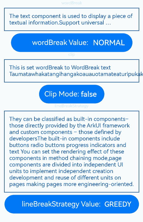
Example 4: Setting Text Wrapping and Line Breaking
This example demonstrates the effects of different text wrapping and line breaking rules, as well as whether text is clipped when it exceeds the container’s length, using the wordBreak, lineBreakStrategy, and clip attributes.
// xxx.ets
@Extend(Text)
function style() {
  .fontSize(12)
  .border({ width: 1 })
  .padding(10)
  .width('100%')
  .margin(5)
}

@Entry
@Component
struct TextExample4 {
  @State text: string =
    'The text component is used to display a piece of textual information.Support universal attributes and universal text attributes.';
  @State text2: string =
    "They can be classified as built-in components–those directly provided by the ArkUI framework and custom components – those defined by developers" +
      "The built-in components include buttons radio buttons progress indicators and text You can set the rendering effect of these components in method chaining mode," +
      "page components are divided into independent UI units to implement independent creation development and reuse of different units on pages making pages more engineering-oriented.";
  @State textClip: boolean = false;
  @State wordBreakIndex: number = 0;
  @State wordBreak: WordBreak[] = [WordBreak.NORMAL, WordBreak.BREAK_ALL, WordBreak.BREAK_WORD];
  @State wordBreakStr: string[] = ['NORMAL', 'BREAK_ALL', 'BREAK_WORD'];
  @State lineBreakStrategyIndex: number = 0;
  @State lineBreakStrategy: LineBreakStrategy[] =
    [LineBreakStrategy.GREEDY, LineBreakStrategy.HIGH_QUALITY, LineBreakStrategy.BALANCED];
  @State lineBreakStrategyStr: string[] = ['GREEDY', 'HIGH_QUALITY', 'BALANCED'];

  build() {
    Flex({ direction: FlexDirection.Column, alignItems: ItemAlign.Center }) {
      Text('wordBreak').fontSize(9).fontColor(0xCCCCCC)
      // Set the word break rule.
      Text(this.text)
        .maxLines(2)
        .textOverflow({ overflow: TextOverflow.Ellipsis })
        .wordBreak(this.wordBreak[this.wordBreakIndex])
        .style()

      Row() {
        Button('wordBreak Value: ' + this.wordBreakStr[this.wordBreakIndex]).onClick(() => {
          this.wordBreakIndex++;
          if (this.wordBreakIndex > (this.wordBreakStr.length - 1)) {
            this.wordBreakIndex = 0;
          }
        })
      }

      Text('clip').fontSize(9).fontColor(0xCCCCCC)
      // Set whether text is clipped when it exceeds the length.
      Text('This is set wordBreak to WordBreak text Taumatawhakatangihangakoauauotamateaturipukakapikimaungahoronukupokaiwhenuakitanatahu.')
        .wordBreak(WordBreak.NORMAL)
        .maxLines(2)
        .clip(this.textClip)
        .style()
      Row() {
        Button('Clip Mode: ' + this.textClip).onClick(() => {
          this.textClip = !this.textClip;
        })
      }

      Text('lineBreakStrategy').fontSize(9).fontColor(0xCCCCCC)
      // Set the text line breaking rule.
      Text(this.text2)
        .lineBreakStrategy(this.lineBreakStrategy[this.lineBreakStrategyIndex])
        .style()
      Row() {
        Button('lineBreakStrategy Value: ' + this.lineBreakStrategyStr[this.lineBreakStrategyIndex]).onClick(() => {
          this.lineBreakStrategyIndex++;
          if (this.lineBreakStrategyIndex > (this.lineBreakStrategyStr.length - 1)) {
            this.lineBreakStrategyIndex = 0;
          }
        })
      }
    }.height(600).width('100%').padding({ left: 35, right: 35, top: 35 })
  }
}
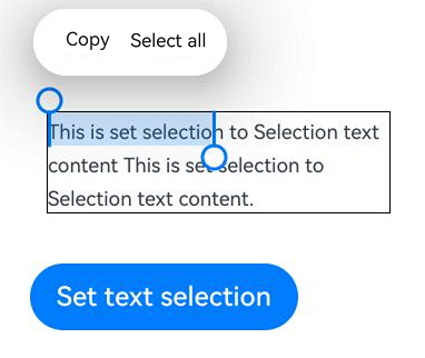
Example 5: Setting Text Selection and Copy
This example demonstrates how to set text selection, trigger a copy callback, make text selection draggable, and modify the caret and selection background colors using selection, onCopy, draggable, caretColor, and selectedBackgroundColor.
// xxx.ets
@Entry
@Component
struct TextExample5 {
  @State onCopy: string = '';
  @State text: string =
    'This is set selection to Selection text content This is set selection to Selection text content.';
  @State start: number = 0;
  @State end: number = 20;

  build() {
    Flex({ direction: FlexDirection.Column, alignItems: ItemAlign.Start, justifyContent: FlexAlign.Start }) {
      Text(this.text)
        .fontSize(12)
        .border({ width: 1 })
        .lineHeight(20)
        .margin(30)
        .copyOption(CopyOptions.InApp)
        .selection(this.start, this.end)
        .onCopy((value: string) => {
          this.onCopy = value;
        })
        .draggable(true)
        .caretColor(Color.Red)
        .selectedBackgroundColor(Color.Grey)
        .enableHapticFeedback(true)
      Button('Set text selection')
        .margin({ left: 20 })
        .onClick(() => {
          // Change the start point and end point of the text selection.
          this.start = 10;
          this.end = 30;
        })
      Text(this.onCopy).fontSize(12).margin(10).key('copy')
    }.height(600).width(335).padding({ left: 35, right: 35, top: 35 })
  }
}
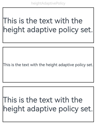
Example 6: Setting Text Adaptation and Font Scale Factor Limits
This example demonstrates how to implement text adaptation using heightAdaptivePolicy and to set font scale factor limits using minFontScale and maxFontScale.
// xxx.ets
@Extend(Text)
function style(HeightAdaptivePolicy: TextHeightAdaptivePolicy) {
  .width('80%')
  .height(90)
  .borderWidth(1)
  .minFontSize(10)
  .maxFontSize(30)
  .maxLines(2)
  .margin(5)
  .textOverflow({ overflow: TextOverflow.Ellipsis })
  .heightAdaptivePolicy(HeightAdaptivePolicy)
}

@Entry
@Component
struct TextExample6 {
  build() {
    Flex({ direction: FlexDirection.Column, alignItems: ItemAlign.Center }) {
      // Set how the adaptive height is determined for the text.
      Text('heightAdaptivePolicy').fontSize(9).fontColor(0xCCCCCC)
      Text('This is the text with the height adaptive policy set.')
        .style(TextHeightAdaptivePolicy.MAX_LINES_FIRST)
      Text('This is the text with the height adaptive policy set.')
        .style(TextHeightAdaptivePolicy.MIN_FONT_SIZE_FIRST)
      Text('This is the text with the height adaptive policy set.')
        .style(TextHeightAdaptivePolicy.LAYOUT_CONSTRAINT_FIRST)

      Text('fontScale').fontSize(9).fontColor(0xCCCCCC)
      Text('This is the text content with minFontScale set to 1 and maxFontScale set to 1.2')
        .style(TextHeightAdaptivePolicy.MAX_LINES_FIRST)
        .minFontScale(1)
        .maxFontScale(1.2)
    }.height(600).width('100%').padding({ left: 35, right: 35, top: 35 })
  }
}
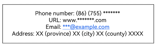
Example 7: Setting Text Recognition
This example demonstrates how to implement text recognition features using the enableDataDetector and dataDetectorConfig APIs.
// xxx.ets
@Entry
@Component
struct TextExample7 {
  @State phoneNumber: string = '(86) (755) ********';
  @State url: string = 'www.********.com';
  @State email: string = '***@example.com';
  @State address: string = 'XX (province) XX (city) XX (county) XXXX';
  @State datetime: string = 'XX-XX-XX XXXX';
  @State enableDataDetector: boolean = true;
  @State types: TextDataDetectorType[] = [];

  build() {
    Row() {
      Column() {
        Text(
          'Phone number:' + this.phoneNumber + '\n' +
            'URL:' + this.url + '\n' +
            'Email:' + this.email + '\n' +
            'Address:' + this.address + '\n' +
            'Time:' + this.datetime
        )
          .fontSize(16)
          .copyOption(CopyOptions.InApp)
          .enableDataDetector(this.enableDataDetector)
          .dataDetectorConfig({
            types: this.types, onDetectResultUpdate: (result: string) => {
            }
          })
          .textAlign(TextAlign.Center)
          .borderWidth(1)
          .padding(10)
          .width('100%')
      }
      .width('100%')
    }
    .height('100%')
  }
}
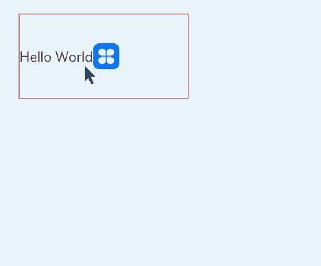
Example 8: Binding Text to a Custom Menu
This example showcases how to bind text to a custom menu using the bindSelectionMenu, onTextSelectionChange, and closeSelectionMenu APIs.
// xxx.ets
@Entry
@Component
struct TextExample8 {
  controller: TextController = new TextController();
  options: TextOptions = { controller: this.controller };

  build() {
    Column() {
      Column() {
        Text(undefined, this.options) {
          Span('Hello World')
          ImageSpan($r('app.media.icon'))
            .width('100px')
            .height('100px')
            .objectFit(ImageFit.Fill)
            .verticalAlign(ImageSpanAlignment.CENTER)
        }
        .copyOption(CopyOptions.InApp)
        .bindSelectionMenu(TextSpanType.IMAGE, this.LongPressImageCustomMenu, TextResponseType.LONG_PRESS, {
          onDisappear: () => {
            console.info(`Callback when the custom menu is closed`);
          },
          onAppear: () => {
            console.info(`Callback when the custom menu is displayed`);
          }
        })
        .bindSelectionMenu(TextSpanType.TEXT, this.RightClickTextCustomMenu, TextResponseType.RIGHT_CLICK)
        .bindSelectionMenu(TextSpanType.MIXED, this.SelectMixCustomMenu, TextResponseType.SELECT)
        .onTextSelectionChange((selectionStart: number, selectionEnd: number) => {
          console.info(`Callback when the text selection changes, selectionStart: ${selectionStart}, selectionEnd: ${selectionEnd}`);
        })
        .borderWidth(1)
        .borderColor(Color.Red)
        .width(200)
        .height(100)
      }
      .width('100%')
      .backgroundColor(Color.White)
      .alignItems(HorizontalAlign.Start)
      .padding(25)
    }
    .height('100%')
  }

  @Builder
  RightClickTextCustomMenu() {
    Column() {
      Menu() {
        MenuItemGroup() {
          MenuItem({ startIcon: $r('app.media.app_icon'), content: "Right Click Menu 1", labelInfo: "" })
            .onClick((event) => {
              this.controller.closeSelectionMenu();
            })
          MenuItem({ startIcon: $r('app.media.app_icon'), content: "Right Click Menu 2", labelInfo: "" })
          MenuItem({ startIcon: $r('app.media.app_icon'), content: "Right Click Menu 3", labelInfo: "" })
        }
      }
      .MenuStyles()
    }
  }

  @Builder
  LongPressImageCustomMenu() {
    Column() {
      Menu() {
        MenuItemGroup() {
          MenuItem({ startIcon: $r('app.media.app_icon'), content: "Long Press Image Menu 1", labelInfo: "" })
            .onClick((event) => {
              this.controller.closeSelectionMenu();
            })
          MenuItem({ startIcon: $r('app.media.app_icon'), content: "Long Press Image Menu 2", labelInfo: "" })
          MenuItem({ startIcon: $r('app.media.app_icon'), content: "Long Press Image Menu 3", labelInfo: "" })
        }
      }
      .MenuStyles()
    }
  }

  @Builder
  SelectMixCustomMenu() {
    Column() {
      Menu() {
        MenuItemGroup() {
          MenuItem({ startIcon: $r('app.media.app_icon'), content: "Select Mixed Menu 1", labelInfo: "" })
            .onClick((event) => {
              this.controller.closeSelectionMenu();
            })
          MenuItem({ startIcon: $r('app.media.app_icon'), content: "Select Mixed Menu 2", labelInfo: "" })
          MenuItem({ startIcon: $r('app.media.app_icon'), content: "Select Mixed Menu 3", labelInfo: "" })
        }
      }
      .MenuStyles()
    }
  }
}

@Extend(Menu)
function MenuStyles() {
  .radius($r('sys.float.ohos_id_corner_radius_card'))
  .clip(true)
  .backgroundColor('#F0F0F0')
}
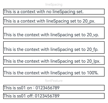
Example 9: Setting Text Features and Line Spacing
This example demonstrates the effects of setting text features and line spacing using the fontFeature and lineSpacing APIs.
// xxx.ets
import { LengthMetrics } from '@kit.ArkUI'

@Extend(Text)
function style() {
  .fontSize(12)
  .border({ width: 1 })
  .width('100%')
}

@Entry
@Component
struct TextExample9 {
  build() {
    Flex({ direction: FlexDirection.Column, alignItems: ItemAlign.Center, justifyContent: FlexAlign.SpaceBetween }) {
      Text('lineSpacing').fontSize(9).fontColor(0xCCCCCC)
      // Set the line spacing.
      Text('This is a context with no lineSpacing set.')
        .lineSpacing(undefined)
        .style()
      Text('This is a context with lineSpacing set to 20_px.')
        .lineSpacing(LengthMetrics.px(20))
        .style()
      Text('This is the context with lineSpacing set to 20_vp.')
        .lineSpacing(LengthMetrics.vp(20))
        .style()
      Text('This is the context with lineSpacing set to 20_fp.')
        .lineSpacing(LengthMetrics.fp(20))
        .style()
      Text('This is the context with lineSpacing set to 20_lpx.')
        .lineSpacing(LengthMetrics.lpx(20))
        .style()
      Text('This is the context with lineSpacing set to 100%.')
        .lineSpacing(LengthMetrics.percent(1))
        .style()

      Text('fontFeature').fontSize(9).fontColor(0xCCCCCC)
      // Set text features.
      Text('This is ss01 on : 0123456789')
        .fontFeature("\"ss01\" on")
        .style()
      Text('This is ss01 off: 0123456789')
        .fontFeature("\"ss01\" off")
        .style()
    }.height(300).width(350).padding({ left: 35, right: 35, top: 35 })
  }
}
Example 10: Obtaining Text Information
This example shows how to obtain text information by calling the layout manager object of the text using the getLayoutManager API.
// xxx.ets
import { text } from '@kit.ArkGraphics2D'

@Entry
@Component
struct TextExample10 {
  @State lineCount: string = "";
  @State glyphPositionAtCoordinate: string = "";
  @State lineMetrics: string = "";
  @State rectsForRangeStr: string = "";
  controller: TextController = new TextController();
  @State textStr: string =
    'Hello World!';

  build() {
    Scroll() {
      Column() {
        Text('Use getLayoutManager to get layout information')
          .fontSize(15)
          .fontColor(0xCCCCCC)
          .width('90%')
          .padding(10)
        Text(this.textStr, { controller: this.controller })
          .fontSize(25)
          .borderWidth(1)
          .onAreaChange(() => {
            let layoutManager: LayoutManager = this.controller.getLayoutManager();
            this.lineCount = "LineCount: " + layoutManager.getLineCount();
          })

        Text('LineCount').fontSize(15).fontColor(0xCCCCCC).width('90%').padding(10)
        Text(this.lineCount)

        Text('GlyphPositionAtCoordinate').fontSize(15).fontColor(0xCCCCCC).width('90%').padding(10)
        Button("Relative Component Coordinates [150,50]")
          .onClick(() => {
            let layoutManager: LayoutManager = this.controller.getLayoutManager();
            let position: PositionWithAffinity = layoutManager.getGlyphPositionAtCoordinate(150, 50);
            this.glyphPositionAtCoordinate =
              "Relative component coordinates [150,50] glyphPositionAtCoordinate position: " + position.position + " affinity: " +
              position.affinity;
          })
          .margin({ bottom: 20, top: 10 })
        Text(this.glyphPositionAtCoordinate)

        Text('LineMetrics').fontSize(15).fontColor(0xCCCCCC).width('90%').padding(10)
        Button("Line Metrics")
          .onClick(() => {
            let layoutManager: LayoutManager = this.controller.getLayoutManager();
            let lineMetrics: LineMetrics = layoutManager.getLineMetrics(0);
            this.lineMetrics = "lineMetrics is " + JSON.stringify(lineMetrics) + "\n\n";
            let runMetrics = lineMetrics.runMetrics;
            runMetrics.forEach((value, key) => {
              this.lineMetrics += "runMetrics key is " + key + " " + JSON.stringify(value) + "\n\n";
            })
          })
          .margin({ bottom: 20, top: 10 })
        Text(this.lineMetrics)

        Text('getRectsForRange').fontSize(15).fontColor(0xCCCCCC).width('90%').padding(10)
        Button("Drawing Area Info for Characters/Placeholders within Specified Text Range")
          .onClick(() => {
            let layoutManager: LayoutManager = this.controller.getLayoutManager();
            let range: TextRange = { start: 0, end: 1 };
            let rectsForRangeInfo: text.TextBox[] =
              layoutManager.getRectsForRange(range, text.RectWidthStyle.TIGHT, text.RectHeightStyle.TIGHT);
            this.rectsForRangeStr = "getRectsForRange result is " + "\n\n";
            rectsForRangeInfo.forEach((value, key) => {
              this.rectsForRangeStr += "rectsForRange key is " + key + " " + JSON.stringify(value) + "\n\n";
            })
          })
          .margin({ bottom: 20, top: 10 })
        Text(this.rectsForRangeStr)
      }
      .margin({ top: 100, left: 8, right: 8 })
    }
  }
}

Example 11: Implementing Keyboard-based Text Selection
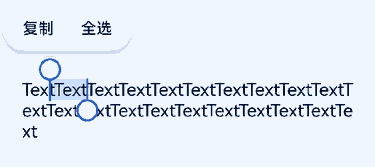
This example demonstrates how to implement the feature to select text using the keyboard by setting the textSelectable attribute to TextSelectMode.SELECTABLE_FOCUSABLE.
// xxx.ets
@Entry
@Component
struct TextExample11 {
  @State message: string =
    'TextTextTextTextTextTextTextText' + 'TextTextTextTextTextTextTextTextTextTextTextTextTextTextTextText';

  build() {
    Column() {
      Text(this.message)
        .width(300)
        .height(100)
        .maxLines(5)
        .fontColor(Color.Black)
        .copyOption(CopyOptions.InApp)
        .selection(3, 8)
        .textSelectable(TextSelectableMode.SELECTABLE_FOCUSABLE)
    }.width('100%').margin({ top: 100 })
  }
}
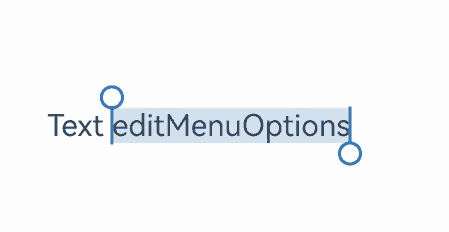
Example 12: Setting Custom Menu Extensions
This example demonstrates how to use the editMenuOptions API to create custom menu extensions for text settings. It includes customizing text content, icons, and callbacks for these extensions.
// xxx.ets
@Entry
@Component
struct TextExample12 {
  @State text: string = 'Text editMenuOptions'
  onCreateMenu = (menuItems: Array<TextMenuItem>) => {
    let item1: TextMenuItem = {
      content: 'Custom 1',
      icon: $r('app.media.startIcon'),
      id: TextMenuItemId.of('custom1'),
    };
    let item2: TextMenuItem = {
      content: 'Custom 2',
      id: TextMenuItemId.of('custom2'),
      icon: $r('app.media.startIcon'),
    };
    menuItems.push(item1);
    menuItems.unshift(item2);
    return menuItems;
  }
  onMenuItemClick = (menuItem: TextMenuItem, textRange: TextRange) => {
    if (menuItem.id.equals(TextMenuItemId.of("custom2"))) {
      console.log("Intercept id: custom2 start:" + textRange.start + "; end:" + textRange.end);
      return true;
    }
    if (menuItem.id.equals(TextMenuItemId.COPY)) {
      console.log("Intercept COPY start:" + textRange.start + "; end:" + textRange.end);
      return true;
    }
    if (menuItem.id.equals(TextMenuItemId.SELECT_ALL)) {
      console.log("Do not intercept SELECT_ALL start:" + textRange.start + "; end:" + textRange.end);
      return false;
    }
    return false;
  };
  @State editMenuOptions: EditMenuOptions = {
    onCreateMenu: this.onCreateMenu, onMenuItemClick: this.onMenuItemClick
  };

  build() {
    Column() {
      Text(this.text)
        .fontSize(20)
        .copyOption(CopyOptions.LocalDevice)
        .editMenuOptions(this.editMenuOptions)
        .margin({ top: 100 })
    }
    .width("90%")
    .margin("5%")
  }
}
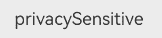
Example 13: Securing Sensitive Information
This example illustrates how to secure sensitive information using the privacySensitive attribute. Note that the display requires widget framework support.
// xxx.ets
@Entry
@Component
struct TextExample13 {
  build() {
    Column({ space: 10 }) {
      Text("privacySensitive")
        .privacySensitive(true)
        .margin({ top: 30 })
    }
    .alignItems(HorizontalAlign.Center)
    .width("100%")
  }
}
你可能感兴趣的鸿蒙文章
- 所属分类: 后端技术
- 本文标签:
热门推荐
-
2、 优质文章
-
3、 gt
-
7、 openharmony
-
9、 golang
-
10、 Vue中input框自动聚焦