harmony 鸿蒙SymbolSpan
SymbolSpan
As a child component of the Text component, the SymbolSpan component is used to display small icons.
NOTE
This component is supported since API version 11. Updates will be marked with a superscript to indicate their earliest API version.
This component can inherit attribute settings from its parent component Text. This means that, if an attribute is not set in this component, it takes the value of the attribute (if set) from its parent component.
The SymbolSpan component is not dimmed when dragged.
Child Components
Not supported
APIs
SymbolSpan(value: Resource)
Widget capability: This API can be used in ArkTS widgets since API version 12.
Atomic service API: This API can be used in atomic services since API version 12.
System capability: SystemCapability.ArkUI.ArkUI.Full
Parameters
| Name | Type | Mandatory | Description |
|---|---|---|---|
| value | Resource | Yes | Resource of the SymbolSpan component, for example, $r(‘sys.symbol.ohos_wifi’). |
NOTE
The resources referenced in $r(‘sys.symbol.ohos_wifi’) are preset in the system. The SymbolSpan component supports only the preset symbol resources. If unsupported resources are referenced, an exception occurs.
Attributes
The universal attributes are not supported. Only the following attributes are supported.
fontColor
fontColor(value: Array<ResourceColor>)
Sets the color of the symbol span.
Widget capability: This API can be used in ArkTS widgets since API version 12.
Atomic service API: This API can be used in atomic services since API version 12.
System capability: SystemCapability.ArkUI.ArkUI.Full
Parameters
| Name | Type | Mandatory | Description |
|---|---|---|---|
| value | Array<ResourceColor> | Yes | Color of the symbol span. Default value: depending on the rendering strategy |
fontSize
fontSize(value: number|string|Resource)
Sets the size of the symbol span.
Widget capability: This API can be used in ArkTS widgets since API version 12.
Atomic service API: This API can be used in atomic services since API version 12.
System capability: SystemCapability.ArkUI.ArkUI.Full
Parameters
| Name | Type | Mandatory | Description |
|---|---|---|---|
| value | number |string |Resource | Yes | Size of the symbol span. Default value: system default value |
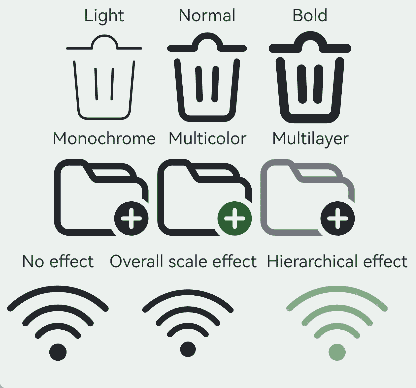
fontWeight
fontWeight(value: number|FontWeight|string)
Sets the weight of the symbol span. For the number type, the value ranges from 100 to 900, at an interval of 100. A larger value indicates a heavier font weight. The default value is 400. For the string type, only strings of the number type are supported, for example, “400”, “bold”, “bolder”, “lighter”, “regular”, and “medium”, which correspond to the enumerated values in FontWeight.
The sys.symbol.ohos_lungs icon does not support font weight setting.
Widget capability: This API can be used in ArkTS widgets since API version 12.
Atomic service API: This API can be used in atomic services since API version 12.
System capability: SystemCapability.ArkUI.ArkUI.Full
Parameters
| Name | Type | Mandatory | Description |
|---|---|---|---|
| value | number |FontWeight |string | Yes | Weight of the symbol span. Default value: FontWeight.Normal |
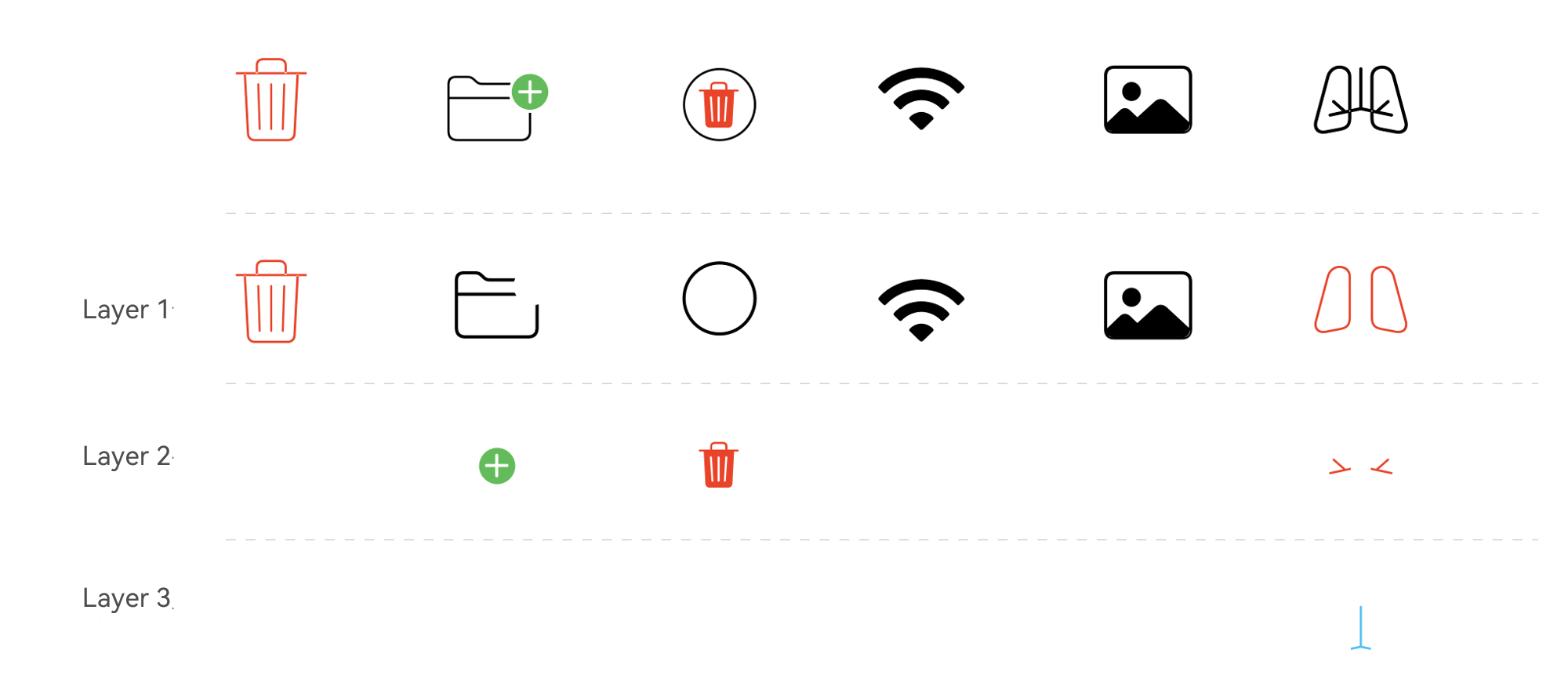
renderingStrategy
renderingStrategy(value: SymbolRenderingStrategy)
Sets the rendering strategy of the symbol span.
Widget capability: This API can be used in ArkTS widgets since API version 12.
Atomic service API: This API can be used in atomic services since API version 12.
System capability: SystemCapability.ArkUI.ArkUI.Full
Parameters
| Name | Type | Mandatory | Description |
|---|---|---|---|
| value | SymbolRenderingStrategy | Yes | Rendering strategy of the symbol span. Default value: SymbolRenderingStrategy.SINGLE |
The figure below shows the effects of different rendering strategies.
effectStrategy
effectStrategy(value: SymbolEffectStrategy)
Sets the symbol effect of the symbol span.
Widget capability: This API can be used in ArkTS widgets since API version 12.
Atomic service API: This API can be used in atomic services since API version 12.
System capability: SystemCapability.ArkUI.ArkUI.Full
Parameters
| Name | Type | Mandatory | Description |
|---|---|---|---|
| value | SymbolEffectStrategy | Yes | Symbol effect of the symbol span. Default value: SymbolEffectStrategy.NONE |
attributeModifier12+
attributeModifier(modifier: AttributeModifier<SymbolSpanAttribute>)
Creates an attribute modifier.
Atomic service API: This API can be used in atomic services since API version 12.
System capability: SystemCapability.ArkUI.ArkUI.Full
Parameters
| Name | Type | Mandatory | Description |
|---|---|---|---|
| modifier | AttributeModifier<SymbolSpanAttribute> | Yes | Modifier for dynamically setting attributes on the current component. |
Events
The universal events are not supported.
Example
This example demonstrates different rendering and effect strategies using renderingStrategy and effectStrategy.
// xxx.ets
@Entry
@Component
struct Index {
  build() {
    Column() {
      Row() {
        Column() {
          Text("Light")
          Text() {
            SymbolSpan($r('sys.symbol.ohos_trash'))
              .fontWeight(FontWeight.Lighter)
              .fontSize(96)
          }
        }

        Column() {
          Text("Normal")
          Text() {
            SymbolSpan($r('sys.symbol.ohos_trash'))
              .fontWeight(FontWeight.Normal)
              .fontSize(96)
          }
        }

        Column() {
          Text("Bold")
          Text() {
            SymbolSpan($r('sys.symbol.ohos_trash'))
              .fontWeight(FontWeight.Bold)
              .fontSize(96)
          }
        }
      }

      Row() {
        Column() {
          Text("Monochrome")
          Text() {
            SymbolSpan($r('sys.symbol.ohos_folder_badge_plus'))
              .fontSize(96)
              .renderingStrategy(SymbolRenderingStrategy.SINGLE)
              .fontColor([Color.Black, Color.Green, Color.White])
          }
        }

        Column() {
          Text("Multicolor")
          Text() {
            SymbolSpan($r('sys.symbol.ohos_folder_badge_plus'))
              .fontSize(96)
              .renderingStrategy(SymbolRenderingStrategy.MULTIPLE_COLOR)
              .fontColor([Color.Black, Color.Green, Color.White])
          }
        }

        Column() {
          Text("Multilayer")
          Text() {
            SymbolSpan($r('sys.symbol.ohos_folder_badge_plus'))
              .fontSize(96)
              .renderingStrategy(SymbolRenderingStrategy.MULTIPLE_OPACITY)
              .fontColor([Color.Black, Color.Green, Color.White])
          }
        }
      }

      Row() {
        Column() {
          Text("No effect")
          Text() {
            SymbolSpan($r('sys.symbol.ohos_wifi'))
              .fontSize(96)
              .effectStrategy(SymbolEffectStrategy.NONE)
          }
        }

        Column() {
          Text("Overall scale effect")
          Text() {
            SymbolSpan($r('sys.symbol.ohos_wifi'))
              .fontSize(96)
              .effectStrategy(1)
          }
        }

        Column() {
          Text("Hierarchical effect")
          Text() {
            SymbolSpan($r('sys.symbol.ohos_wifi'))
              .fontSize(96)
              .effectStrategy(2)
          }
        }
      }
    }
  }
}
你可能感兴趣的鸿蒙文章
- 所属分类: 后端技术
- 本文标签:
热门推荐
-
2、 优质文章
-
3、 gt
-
7、 openharmony
-
9、 golang
-
10、 Vue中input框自动聚焦