harmony 鸿蒙Styled String
Styled String
Styled strings are string objects that facilitate the flexible use of text styles. They can be bound to the Text component using the setStyledString API in TextController, and to the RichEditor component using the setStyledString API in RichEditorStyledStringController.
NOTE
The initial APIs of this module are supported since API version 12. Updates will be marked with a superscript to indicate their earliest API version.
Currently, styled strings cannot be used in worker threads.
Rules of Use
- If a styled string conflicts with the current style settings in a component, the style set in the styled string takes effect.
- If a styled string conflicts with the child components in Text, the style set in the styled string is applied to the Text component, and style settings of the child components, including Span, are ignored.
- @State is not supported.
- To prevent the application from being inadvertently terminated while running in the background, define StyledString as a member variable.
StyledString
constructor
constructor(value: string|ImageAttachment|CustomSpan , styles?: Array<StyleOptions>)
A constructor used to create a styled string.
Atomic service API: This API can be used in atomic services since API version 12.
System capability: SystemCapability.ArkUI.ArkUI.Full
Parameters
| Name | Type | Mandatory | Description |
|---|---|---|---|
| value | string |ImageAttachment |CustomSpan | Yes | Text of the styled string. NOTE If this parameter is of the ImageAttachment or CustomSpan type, the styles parameter does not take effect. |
| styles | Array<StyleOptions> | No | Initialization options of the styled string. NOTE If start is set to an invalid value, it uses the default value 0. If the value of start is valid but that of length is invalid, the difference between the length of the styled string and the value of start is used as the value of length. If StyledStringKey does not match StyledStringValue, it does not take effect. The styledKey parameter has no default value. |
Properties
Atomic service API: This API can be used in atomic services since API version 12.
System capability: SystemCapability.ArkUI.ArkUI.Full
| Name | Type | Read Only | Optional | Description |
|---|---|---|---|---|
| length | number | Yes | No | Length of the styled string. NOTE If the styled string contains an image or a custom span, its length is 1. |
getString
getString(): string
Obtains the text of this styled string.
Atomic service API: This API can be used in atomic services since API version 12.
System capability: SystemCapability.ArkUI.ArkUI.Full
Return value
| Type | Description |
|---|---|
| string | Text of the styled string. NOTE If the styled string contains an image, the image is represented by a space in the return value. |
equals
equals(other: StyledString): boolean
Checks whether this styled string the same as another styled string.
Atomic service API: This API can be used in atomic services since API version 12.
System capability: SystemCapability.ArkUI.ArkUI.Full
Parameters
| Name | Type | Mandatory | Description |
|---|---|---|---|
| other | StyledString | Yes | StyledString object to compare. |
Return value
| Type | Description |
|---|---|
| boolean | Whether two styled strings are equal. NOTE The two styled strings are the same if they have the same text and style. GestureStyle in styled strings is not compared. This means that, if two styled strings are the same except for the event configured, they are the same. In comparing CustomSpan objects, addresses are compared. The objects that have the same address are the same. |
subStyledString
subStyledString(start: number , length?: number): StyledString
Obtains a substring of this styled string.
Atomic service API: This API can be used in atomic services since API version 12.
System capability: SystemCapability.ArkUI.ArkUI.Full
Parameters
| Name | Type | Mandatory | Description |
|---|---|---|---|
| start | number | Yes | Subscript that corresponds to the start position of the styled substring. |
| length | number | No | Length of the styled substring. |
Return value
| Type | Description |
|---|---|
| StyledString | Styled substring. NOTE If the value of start is valid, the difference between the length of the styled string and the value of start is used as the default value of length. If the values of start and length are out of the acceptable range or if any mandatory parameter is passed as undefined, an exception is thrown. |
Error codes
For details about the error codes, see Universal Error Codes.
| ID | Error Message |
|---|---|
| 401 | Parameter error. Possible causes: 1. Mandatory parameters are left unspecified; 2.Incorrect parameters types; 3. Parameter verification failed. |
getStyles
getStyles(start: number , length: number , styledKey?: StyledStringKey): Array<SpanStyle>
Obtains the styles in the specified range of a styled string.
Atomic service API: This API can be used in atomic services since API version 12.
System capability: SystemCapability.ArkUI.ArkUI.Full
Parameters
| Name | Type | Mandatory | Description |
|---|---|---|---|
| start | number | Yes | Subscript that corresponds to the target range in the styled string. |
| length | number | Yes | Length of the target range in the styled string. |
| styledKey | StyledStringKey | No | Style key of the styled string. |
Return value
| Type | Description |
|---|---|
| Array<SpanStyle> | Array of styles. NOTE If no style is set for the specified range in the styled string, an empty array is returned. If the values of start and length are out of the acceptable range or if any mandatory parameter is passed as undefined, an exception is thrown. If styledKey is set to an invalid value or undefined, an exception is thrown. If styledKey is a CustomSpan object, the style returned is the one passed to create the object. That is, modifying the style object also affects the actual display effect. |
Error codes
For details about the error codes, see Universal Error Codes.
| ID | Error Message |
|---|---|
| 401 | Parameter error. Possible causes: 1. Mandatory parameters are left unspecified; 2.Incorrect parameters types; 3. Parameter verification failed. |
fromHtml
static fromHtml(html: string): Promise<StyledString>
Converts an HTML-formatted string into a styled string. Currently, the conversion supports the following HTML tags: <p>, <span>, <img>. Only the styles defined by the style attributes of these tags can be converted into corresponding styles in styled strings.
Atomic service API: This API can be used in atomic services since API version 12.
System capability: SystemCapability.ArkUI.ArkUI.Full
Parameters
| Name | Type | Mandatory | Description |
|---|---|---|---|
| html | string | Yes | HTML-formatted string. |
Return value
| Type | Description |
|---|---|
| StyledString | Styled string. |
Error codes
For details about the error codes, see Universal Error Codes.
| ID | Error Message |
|---|---|
| 401 | Parameter error. Possible causes: 1. Mandatory parameters are left unspecified; 2.Incorrect parameters types; 3. Parameter verification failed. |
toHtml14+
static toHtml(styledString: StyledString): string
Converts a styled string into an HTML-formatted string. The supported styled string keys for conversion, as detailed in StyledStringKey, include: StyledStringKey.FONT, StyledStringKey.DECORATION, StyledStringKey.LETTER_SPACING, StyledStringKey.TEXT_SHADOW, StyledStringKey.LINE_HEIGHT, and StyledStringKey.IMAGE.
Atomic service API: This API can be used in atomic services since API version 14.
System capability: SystemCapability.ArkUI.ArkUI.Full
Parameters
| Name | Type | Mandatory | Description |
|---|---|---|---|
| styledString | StyledString | Yes | Styled string. |
Return value
| Type | Description |
|---|---|
| string | HTML string. |
Error codes
For details about the error codes, see Universal Error Codes.
| ID | Error Message |
|---|---|
| 401 | Parameter error. Possible causes: 1. Mandatory parameters are left unspecified; 2.Incorrect parameters types; 3. Parameter verification failed. |
MutableStyledString
Inherits from the StyledString class.
An exception is thrown in the following cases:
The values of start and length are out of the acceptable range or if any mandatory parameter is passed as undefined.
styledKey or styledValue is set to an invalid value or they do not match.
replaceString
replaceString(start: number , length: number , other: string): void
Replaces the string in the specified range of this styled string.
Atomic service API: This API can be used in atomic services since API version 12.
System capability: SystemCapability.ArkUI.ArkUI.Full
Parameters
| Name | Type | Mandatory | Description |
|---|---|---|---|
| start | number | Yes | Subscript of the target range. |
| length | number | Yes | Length of the target range. |
| other | string | Yes | String to replace the content in the target range. NOTE The string specified here uses the style of the character at the start position. |
Error codes
For details about the error codes, see Universal Error Codes.
| ID | Error Message |
|---|---|
| 401 | Parameter error. Possible causes: 1. Mandatory parameters are left unspecified; 2.Incorrect parameters types; 3. Parameter verification failed. |
insertString
insertString(start: number , other: string): void
Inserts a string.
Atomic service API: This API can be used in atomic services since API version 12.
System capability: SystemCapability.ArkUI.ArkUI.Full
Parameters
| Name | Type | Mandatory | Description |
|---|---|---|---|
| start | number | Yes | Subscript of the position where the string will be inserted. |
| other | string | Yes | String to insert. NOTE The string specified here uses the style of the character at the start - 1 position or, if that character does not have style set, the style of the character at the start position. |
Error codes
For details about the error codes, see Universal Error Codes.
| ID | Error Message |
|---|---|
| 401 | Parameter error. Possible causes: 1. Mandatory parameters are left unspecified; 2.Incorrect parameters types; 3. Parameter verification failed. |
removeString
removeString(start: number , length: number): void
Removes the string in the specified range of this styled string.
This API equally works when the styled string contains an image.
Atomic service API: This API can be used in atomic services since API version 12.
System capability: SystemCapability.ArkUI.ArkUI.Full
Parameters
| Name | Type | Mandatory | Description |
|---|---|---|---|
| start | number | Yes | Subscript of the target range. |
| length | number | Yes | Length of the target range. |
Error codes
For details about the error codes, see Universal Error Codes.
| ID | Error Message |
|---|---|
| 401 | Parameter error. Possible causes: 1. Mandatory parameters are left unspecified; 2.Incorrect parameters types; 3. Parameter verification failed. |
replaceStyle
replaceStyle(spanStyle: SpanStyle): void
Replaces the style in the specified range of this styled string.
Atomic service API: This API can be used in atomic services since API version 12.
System capability: SystemCapability.ArkUI.ArkUI.Full
Parameters
| Name | Type | Mandatory | Description |
|---|---|---|---|
| spanStyle | SpanStyle | Yes | Style object. NOTE By default, the original style is removed and replaced with the new style. If styledKey of SpanStyle is IMAGE or CUSTOM_SPAN, this API takes effect only when an image or custom span with the length of 1 is at the start position. |
Error codes
For details about the error codes, see Universal Error Codes.
| ID | Error Message |
|---|---|
| 401 | Parameter error. Possible causes: 1. Mandatory parameters are left unspecified; 2.Incorrect parameters types; 3. Parameter verification failed. |
setStyle
setStyle(spanStyle: SpanStyle): void
Sets a new style for the specified range of this styled string.
Atomic service API: This API can be used in atomic services since API version 12.
System capability: SystemCapability.ArkUI.ArkUI.Full
Parameters
| Name | Type | Mandatory | Description |
|---|---|---|---|
| spanStyle | SpanStyle | Yes | Style object. NOTE By default, the new style is applied without removing the original style. If the style already exists, it is updated. If styledKey of SpanStyle is IMAGE or CUSTOM_SPAN, this API takes effect only when an image or custom span with the length of 1 is at the start position. |
Error codes
For details about the error codes, see Universal Error Codes.
| ID | Error Message |
|---|---|
| 401 | The parameter check failed. |
removeStyle
removeStyle(start: number , length: number , styledKey: StyledStringKey): void
Removes the style for the specified range of this styled string.
After a style is removed, the value set for the corresponding style attribute in the Text component is used. If the value is not set, the default value is used.
This API equally works when the styled string contains an image.
Atomic service API: This API can be used in atomic services since API version 12.
System capability: SystemCapability.ArkUI.ArkUI.Full
Parameters
| Name | Type | Mandatory | Description |
|---|---|---|---|
| start | number | Yes | Subscript that corresponds to the start position of the target range. |
| length | number | Yes | Length of the target range. |
| styledKey | StyledStringKey | Yes | Styled key. |
Error codes
For details about the error codes, see Universal Error Codes.
| ID | Error Message |
|---|---|
| 401 | Parameter error. Possible causes: 1. Mandatory parameters are left unspecified; 2.Incorrect parameters types; 3. Parameter verification failed. |
removeStyles
removeStyles(start: number , length: number): void
Removes all styles for the specified range of this styled string.
After a style is removed, the value set for the corresponding style attribute in the Text component is used. If the value is not set, the default value is used.
This API equally works when the styled string contains an image.
Atomic service API: This API can be used in atomic services since API version 12.
System capability: SystemCapability.ArkUI.ArkUI.Full
Parameters
| Name | Type | Mandatory | Description |
|---|---|---|---|
| start | number | Yes | Subscript that corresponds to the start position of the target range. |
| length | number | Yes | Length of the target range. |
Error codes
For details about the error codes, see Universal Error Codes.
| ID | Error Message |
|---|---|
| 401 | Parameter error. Possible causes: 1. Mandatory parameters are left unspecified; 2.Incorrect parameters types; 3. Parameter verification failed. |
clearStyles
clearStyles(): void
Removes all styles of this styled string.
After a style is removed, the value set for the corresponding style attribute in the Text component is used. If the value is not set, the default value is used.
Atomic service API: This API can be used in atomic services since API version 12.
System capability: SystemCapability.ArkUI.ArkUI.Full
replaceStyledString
replaceStyledString(start: number , length: number , other: StyledString): void
Replaces the styled string in the specified range.
Atomic service API: This API can be used in atomic services since API version 12.
System capability: SystemCapability.ArkUI.ArkUI.Full
Parameters
| Name | Type | Mandatory | Description |
|---|---|---|---|
| start | number | Yes | Subscript that corresponds to the start position of the target range. |
| length | number | Yes | Length of the target range. |
| other | StyledString | Yes | New styled string. |
Error codes
For details about the error codes, see Universal Error Codes.
| ID | Error Message |
|---|---|
| 401 | Parameter error. Possible causes: 1. Mandatory parameters are left unspecified; 2.Incorrect parameters types; 3. Parameter verification failed. |
insertStyledString
insertStyledString(start: number , other: StyledString): void
Inserts a new styled string at the specified position.
Atomic service API: This API can be used in atomic services since API version 12.
System capability: SystemCapability.ArkUI.ArkUI.Full
Parameters
| Name | Type | Mandatory | Description |
|---|---|---|---|
| start | number | Yes | Subscript of the position to insert the styled string. |
| other | StyledString | Yes | New styled string. |
Error codes
For details about the error codes, see Universal Error Codes.
| ID | Error Message |
|---|---|
| 401 | Parameter error. Possible causes: 1. Mandatory parameters are left unspecified; 2.Incorrect parameters types; 3. Parameter verification failed. |
appendStyledString
appendStyledString(other: StyledString): void
Appends a styled string.
Atomic service API: This API can be used in atomic services since API version 12.
System capability: SystemCapability.ArkUI.ArkUI.Full
Parameters
| Name | Type | Mandatory | Description |
|---|---|---|---|
| other | StyledString | Yes | New styled string. |
StyledStringValue
type StyledStringValue = TextStyle|DecorationStyle|BaselineOffsetStyle|LetterSpacingStyle| TextShadowStyle|GestureStyle|ImageAttachment|ParagraphStyle|LineHeightStyle|UrlStyle|CustomSpan|UserDataSpan|BackgroundColorStyle
Defines the style for a styled string.
Atomic service API: This API can be used in atomic services since API version 12.
System capability: SystemCapability.ArkUI.ArkUI.Full
| Type | Description |
|---|---|
| TextStyle | Text style. |
| DecorationStyle | Text decorative line style. |
| BaselineOffsetStyle | Text baseline offset style. |
| LetterSpacingStyle | Text letter spacing style. |
| LineHeightStyle | Text line height style. |
| TextShadowStyle | Text shadow style. |
| GestureStyle | Gesture style. |
| ParagraphStyle | Text paragraph style. |
| ImageAttachment | Image style. |
| CustomSpan | Custom span style. |
| UserDataSpan | User data span style. |
StyleOptions
Atomic service API: This API can be used in atomic services since API version 12.
System capability: SystemCapability.ArkUI.ArkUI.Full
| Name | Type | Mandatory | Description |
|---|---|---|---|
| start | number | No | Start position of the styled string style. If the value is less than 0 or exceeds the string length, it is treated as 0. |
| length | number | No | Length of the styled string style. f the value is less than 0 or exceeds the difference between the string length and the value of start, it is treated as the difference between the string length and the value of start. |
| styledKey | StyledStringKey | Yes | Style key. |
| styledValue | StyledStringValue | Yes | Style object. |
SpanStyle
Atomic service API: This API can be used in atomic services since API version 12.
System capability: SystemCapability.ArkUI.ArkUI.Full
| Name | Type | Mandatory | Description |
|---|---|---|---|
| start | number | Yes | Start position of the styled string style. |
| length | number | Yes | Length of the styled string style. |
| styledKey | StyledStringKey | Yes | Style key. |
| styledValue | StyledStringValue | Yes | Style object. |
TextStyle
Describes the text font style.
System capability: SystemCapability.ArkUI.ArkUI.Full
Properties
Atomic service API: This API can be used in atomic services since API version 12.
System capability: SystemCapability.ArkUI.ArkUI.Full
| Name | Type | Read Only | Optional | Description |
|---|---|---|---|---|
| fontColor | ResourceColor | Yes | Yes | Font color of the styled string. |
| fontFamily | string | Yes | Yes | Font family of the styled string. |
| fontSize | number | Yes | Yes | Font size of the styled string. Unit: fp |
| fontWeight | number | Yes | Yes | Font weight of the styled string. |
| fontStyle | FontStyle | Yes | Yes | Font style of the styled string. |
constructor
constructor(value?: TextStyleInterface)
A constructor used to create a text style.
Atomic service API: This API can be used in atomic services since API version 12.
System capability: SystemCapability.ArkUI.ArkUI.Full
Parameters
| Name | Type | Mandatory | Description |
|---|---|---|---|
| value | TextStyleInterface | No | Font style options. |
TextStyleInterface
Atomic service API: This API can be used in atomic services since API version 12.
System capability: SystemCapability.ArkUI.ArkUI.Full
| Name | Type | Mandatory | Description |
|---|---|---|---|
| fontColor | ResourceColor | No | Font color. |
| fontFamily | ResourceStr | No | Font family. |
| fontSize | LengthMetrics | No | Font size. If unit of LengthMetrics is percent, the setting does not take effect, and 16 fp is used. Unit: fp |
| fontWeight | number |FontWeight |string | No | Font weight. For the number type, the value ranges from 100 to 900, at an interval of 100. A larger value indicates a heavier font weight. The default value is 400. For the string type, only strings that represent a number, for example, 400, and the following enumerated values of FontWeight are supported: bold, bolder, lighter, regular, and medium. |
| fontStyle | FontStyle | No | Font style. |
GestureStyle
Describes the event gesture style.
System capability: SystemCapability.ArkUI.ArkUI.Full
constructor
constructor(value?: GestureStyleInterface)
A constructor used to create a gesture style.
Atomic service API: This API can be used in atomic services since API version 12.
System capability: SystemCapability.ArkUI.ArkUI.Full
Parameters
| Name | Type | Mandatory | Description |
|---|---|---|---|
| value | GestureStyleInterface | No | Event options. |
GestureStyleInterface
Atomic service API: This API can be used in atomic services since API version 12.
System capability: SystemCapability.ArkUI.ArkUI.Full
| Name | Type | Mandatory | Description |
|---|---|---|---|
| onClick | Callback<ClickEvent> | No | Callback for click events. |
| onLongPress | Callback<GestureEvent> | No | Callback for long press events. |
DecorationStyle
Describes the text decorative line style.
System capability: SystemCapability.ArkUI.ArkUI.Full
Properties
Atomic service API: This API can be used in atomic services since API version 12.
System capability: SystemCapability.ArkUI.ArkUI.Full
| Name | Type | Read Only | Optional | Description |
|---|---|---|---|---|
| type | TextDecorationType | Yes | No | Type of the text decorative line. |
| color | ResourceColor | Yes | Yes | Color of the text decorative line. |
| style | TextDecorationStyle | Yes | Yes | Style of the text decorative line. |
constructor
constructor(value: DecorationStyleInterface)
A constructor used to create a text decorative line style.
Atomic service API: This API can be used in atomic services since API version 12.
System capability: SystemCapability.ArkUI.ArkUI.Full
Parameters
| Name | Type | Mandatory | Description |
|---|---|---|---|
| value | DecorationStyleInterface | Yes | Text decorative line options. Default value: { type: TextDecorationType.None, color: Color.Black, style: TextDecorationStyle.SOLID } |
DecorationStyleInterface
Atomic service API: This API can be used in atomic services since API version 12.
System capability: SystemCapability.ArkUI.ArkUI.Full
| Name | Type | Mandatory | Description |
|---|---|---|---|
| type | TextDecorationType | Yes | Type of the text decorative line. |
| color | ResourceColor | No | Color of the text decorative line. |
| style | TextDecorationStyle | No | Style of the text decorative line. |
BaselineOffsetStyle
Describes the text baseline offset style.
System capability: SystemCapability.ArkUI.ArkUI.Full
Properties
Atomic service API: This API can be used in atomic services since API version 12.
System capability: SystemCapability.ArkUI.ArkUI.Full
| Name | Type | Read Only | Optional | Description |
|---|---|---|---|---|
| baselineOffset | number | Yes | No | Text baseline offset. Unit: vp |
constructor
constructor(value: LengthMetrics)
A constructor used to create a text baseline offset style.
Atomic service API: This API can be used in atomic services since API version 12.
System capability: SystemCapability.ArkUI.ArkUI.Full
Parameters
| Name | Type | Mandatory | Description |
|---|---|---|---|
| value | LengthMetrics | Yes | Text baseline offset options. This API does not work if unit of LengthMetrics is percent. |
LetterSpacingStyle
Describes the letter spacing style.
System capability: SystemCapability.ArkUI.ArkUI.Full
Properties
Atomic service API: This API can be used in atomic services since API version 12.
System capability: SystemCapability.ArkUI.ArkUI.Full
| Name | Type | Read Only | Optional | Description |
|---|---|---|---|---|
| letterSpacing | number | Yes | No | Letter spacing. Unit: vp |
constructor
constructor(value: LengthMetrics)
A constructor used to create a text letter spacing style.
Atomic service API: This API can be used in atomic services since API version 12.
System capability: SystemCapability.ArkUI.ArkUI.Full
Parameters
| Name | Type | Mandatory | Description |
|---|---|---|---|
| value | LengthMetrics | Yes | Letter spacing options. This API does not work if unit of LengthMetrics is percent. |
LineHeightStyle
Describes the text line height style.
System capability: SystemCapability.ArkUI.ArkUI.Full
Properties
Atomic service API: This API can be used in atomic services since API version 12.
System capability: SystemCapability.ArkUI.ArkUI.Full
| Name | Type | Read Only | Optional | Description |
|---|---|---|---|---|
| lineHeight | number | Yes | No | Text line height of the styled string. Unit: vp |
constructor
constructor(lineHeight: LengthMetrics)
A constructor used to create a text line height style.
Atomic service API: This API can be used in atomic services since API version 12.
System capability: SystemCapability.ArkUI.ArkUI.Full
Parameters
| Name | Type | Mandatory | Description |
|---|---|---|---|
| lineHeight | LengthMetrics | Yes | Text line height options. If value of LengthMetrics is less than or equal to 0, the text line height is unlimited and automatically adapts to the font size. |
TextShadowStyle
Describes the text shadow style.
System capability: SystemCapability.ArkUI.ArkUI.Full
Properties
Atomic service API: This API can be used in atomic services since API version 12.
System capability: SystemCapability.ArkUI.ArkUI.Full
| Name | Type | Read Only | Optional | Description |
|---|---|---|---|---|
| textShadow | Array<ShadowOptions> | Yes | No | Text shadow of the styled string. |
constructor
constructor(value: ShadowOptions|Array<ShadowOptions>)
A constructor used to create a text shadow style.
Atomic service API: This API can be used in atomic services since API version 12.
System capability: SystemCapability.ArkUI.ArkUI.Full
Parameters
| Name | Type | Mandatory | Description |
|---|---|---|---|
| value | ShadowOptions |Array<ShadowOptions> | Yes | Text shadow options. |
ImageAttachment
Describes the image attachment.
System capability: SystemCapability.ArkUI.ArkUI.Full
Properties
System capability: SystemCapability.ArkUI.ArkUI.Full
| Name | Type | Read Only | Optional | Description |
|---|---|---|---|---|
| value | PixelMap | Yes | No | Image data source of the styled string. Atomic service API: This API can be used in atomic services since API version 12. |
| size | SizeOptions | Yes | Yes | Image size of the styled string. Atomic service API: This API can be used in atomic services since API version 12. |
| verticalAlign | ImageSpanAlignment | Yes | Yes | Image alignment mode of the styled string. Atomic service API: This API can be used in atomic services since API version 12. |
| objectFit | ImageFit | Yes | Yes | Image scale type of the styled string. Atomic service API: This API can be used in atomic services since API version 12. |
| layoutStyle | ImageAttachmentLayoutStyle | Yes | Yes | Image layout of the styled string. Atomic service API: This API can be used in atomic services since API version 12. |
| colorFilter15+ | ColorFilterType | Yes | Yes | Image color filter of the styled string. Atomic service API: This API can be used in atomic services since API version 15. |
constructor
constructor(value: ImageAttachmentInterface)
A constructor used to create an image object.
Atomic service API: This API can be used in atomic services since API version 12.
System capability: SystemCapability.ArkUI.ArkUI.Full
Parameters
| Name | Type | Mandatory | Description |
|---|---|---|---|
| value | ImageAttachmentInterface | Yes | Image attachment options. |
constructor15+
constructor(attachment: Optional<AttachmentType>)
A constructor used to create an image object. Compared to the constructor with a value type parameter, this constructor with an attachment type parameter supports images of undefined and ResourceStr types.
Atomic service API: This API can be used in atomic services since API version 15.
System capability: SystemCapability.ArkUI.ArkUI.Full
Parameters
| Name | Type | Mandatory | Description |
|---|---|---|---|
| attachment | Optional<AttachmentType> | Yes | Image attachment, which can be of type PixelMap or ResourceStr. |
AttachmentType15+
type AttachmentType = ImageAttachmentInterface|ResourceImageAttachmentOptions
Defines the image attachment type, which is used to set images of PixelMap or ResourceStr type for styled strings.
Atomic service API: This API can be used in atomic services since API version 15.
System capability: SystemCapability.ArkUI.ArkUI.Full
| Type | Description |
|---|---|
| ImageAttachmentInterface | Settings for images of the PixelMap type. |
| ResourceImageAttachmentOptions | Settings for images of the ResourceStr type. |
ColorFilterType15+
type ColorFilterType = ColorFilter|DrawingColorFilter
Defines the type for image color filter settings.
Atomic service API: This API can be used in atomic services since API version 15.
System capability: SystemCapability.ArkUI.ArkUI.Full
| Type | Description |
|---|---|
| ColorFilter | Color filter settings of the ColorFilter type. |
| DrawingColorFilter | Color filter settings of the DrawingColorFilter type. |
ImageAttachmentInterface
System capability: SystemCapability.ArkUI.ArkUI.Full
| Name | Type | Mandatory | Description |
|---|---|---|---|
| value | PixelMap | Yes | Image data source. Atomic service API: This API can be used in atomic services since API version 12. |
| size | SizeOptions | No | Image size. Atomic service API: This API can be used in atomic services since API version 12. The default value of size depends on the value of objectFit. For example, if the value of objectFit is Cover, the image height is the component height minus the top and bottom paddings, and the image width is the component width minus the left and right paddings. |
| verticalAlign | ImageSpanAlignment | No | Alignment mode of the image with the text. Atomic service API: This API can be used in atomic services since API version 12. Default value: ImageSpanAlignment.BOTTOM |
| objectFit | ImageFit | No | Image scale type. Atomic service API: This API can be used in atomic services since API version 12. Default value: ImageFit.Cover |
| layoutStyle | ImageAttachmentLayoutStyle | No | Image layout. Atomic service API: This API can be used in atomic services since API version 12. |
| colorFilter15+ | ColorFilterType | No | Image color filter of the styled string. Atomic service API: This API can be used in atomic services since API version 15. |
ImageAttachmentLayoutStyle
Atomic service API: This API can be used in atomic services since API version 12.
System capability: SystemCapability.ArkUI.ArkUI.Full
| Name | Type | Mandatory | Description |
|---|---|---|---|
| margin | LengthMetrics |Margin | No | Image margin. Default value: 0. Unit: vp |
| padding | LengthMetrics |Padding | No | Image padding. Default value: 0. Unit: vp |
| borderRadius | LengthMetrics |BorderRadiuses | No | Radius of the image border corners. Default value: 0. Unit: vp |
ResourceImageAttachmentOptions15+
Defines the settings for images of the ResourceStr type.
Atomic service API: This API can be used in atomic services since API version 15.
System capability: SystemCapability.ArkUI.ArkUI.Full
| Name | Type | Mandatory | Description |
|---|---|---|---|
| resourceValue | Optional<ResourceStr> | Yes | Image data source. |
| size | SizeOptions | No | Image size. |
| verticalAlign | ImageSpanAlignment | No | Alignment mode of the image with the text. Default value: ImageSpanAlignment.BOTTOM |
| objectFit | ImageFit | No | Image scale type. Default value: ImageFit.Cover |
| layoutStyle | ImageAttachmentLayoutStyle | No | Image layout. |
| colorFilter | ColorFilterType | No | Image color filter of the styled string. |
| syncLoad | boolean | No | Whether to load the image synchronously. By default, the image is loaded asynchronously. During synchronous loading, the UI thread is blocked and the placeholder image is not displayed. Default value: false |
CustomSpan
Describes the custom span. Only the base class is provided. You need to define the specific implementation.
The drag preview of a custom span is blank.
System capability: SystemCapability.ArkUI.ArkUI.Full
onMeasure
abstract onMeasure(measureInfo: CustomSpanMeasureInfo): CustomSpanMetrics
Called to obtain the size of a custom span.
Atomic service API: This API can be used in atomic services since API version 12.
System capability: SystemCapability.ArkUI.ArkUI.Full
Parameters
| Name | Type | Mandatory | Description |
|---|---|---|---|
| measureInfo | CustomSpanMeasureInfo | Yes | Font size of the text. |
Return value
| Type | Description |
|---|---|
| CustomSpanMetrics | Size of the custom span. NOTE The final height of the custom span is subject to the line height of the Text component. If no value is specified for height, the custom span takes the fontSize value of the Text component as its height. If the value specified is greater than the height of other child components on the same line, the custom span takes the line height of the Text component as its height. |
onDraw
abstract onDraw(context: DrawContext, drawInfo: CustomSpanDrawInfo): void
Called to draw a custom span.
Atomic service API: This API can be used in atomic services since API version 12.
System capability: SystemCapability.ArkUI.ArkUI.Full
Parameters
| Name | Type | Mandatory | Description |
|---|---|---|---|
| context | DrawContext | Yes | Drawing context. NOTE The canvas method of DrawContext obtains the canvas of the Text component. As such, the custom span does not extend beyond the area of the Text component. |
| drawInfo | CustomSpanDrawInfo | Yes | Drawing information of the custom span. |
invalidate13+
invalidate(): void
Manually triggers a refresh of the Text component that uses this CustomSpan.
Atomic service API: This API can be used in atomic services since API version 13.
System capability: SystemCapability.ArkUI.ArkUI.Full
CustomSpanMeasureInfo
Atomic service API: This API can be used in atomic services since API version 12.
System capability: SystemCapability.ArkUI.ArkUI.Full
| Name | Type | Mandatory | Description |
|---|---|---|---|
| fontSize | number | Yes | Text font size. Unit: fp |
CustomSpanMetrics
Atomic service API: This API can be used in atomic services since API version 12.
System capability: SystemCapability.ArkUI.ArkUI.Full
| Name | Type | Mandatory | Description |
|---|---|---|---|
| width | number | Yes | Width of the custom span. Unit: vp |
| height | number | No | Height of the custom span. Unit: vp |
CustomSpanDrawInfo
Atomic service API: This API can be used in atomic services since API version 12.
System capability: SystemCapability.ArkUI.ArkUI.Full
| Name | Type | Mandatory | Description |
|---|---|---|---|
| x | number | Yes | Offset of the custom span relative to the mounted component. Unit: px |
| lineTop | number | Yes | Top margin of the custom span relative to the Text component. Unit: px |
| lineBottom | number | Yes | Bottom margin of the custom span relative to the Text component. Unit: px |
| baseline | number | Yes | Baseline offset of the line where the custom span is located. Unit: px |
ParagraphStyle
Describes the text paragraph style.
Except the first paragraph, all paragraphs are formed using the character escape ‘\n’.
The style of a paragraph is the one (if any) set for the first element or the paragraph style of the bound component.
System capability: SystemCapability.ArkUI.ArkUI.Full
Properties
System capability: SystemCapability.ArkUI.ArkUI.Full
| Name | Type | Read Only | Optional | Description |
|---|---|---|---|---|
| textAlign | TextAlign | Yes | Yes | Horizontal alignment of the text paragraph. Atomic service API: This API can be used in atomic services since API version 12. |
| textIndent | number | Yes | Yes | First line indent of the text paragraph. Unit: VP. Atomic service API: This API can be used in atomic services since API version 12. |
| maxLines | number | Yes | Yes | Maximum number of lines in the text paragraph. Atomic service API: This API can be used in atomic services since API version 12. |
| overflow | TextOverflow | Yes | Yes | Display mode when the text is too long in the text paragraph. Atomic service API: This API can be used in atomic services since API version 12. |
| wordBreak | WordBreak | Yes | Yes | Word break rule of the text paragraph. Atomic service API: This API can be used in atomic services since API version 12. |
| leadingMargin | number |LeadingMarginPlaceholder | Yes | Yes | Indent of the text paragraph. Atomic service API: This API can be used in atomic services since API version 12. |
| paragraphSpacing18+ | number | Yes | Yes | Paragraph spacing of the styled string text. Unit: VP. Atomic service API: This API can be used in atomic services since API version 18. |
NOTE
As the maxLines and overflow attributes of the styled string take effect only in the Text component, you are advised to set them in the component.
constructor
constructor(value?: ParagraphStyleInterface)
A constructor used to create a text paragraph style.
Atomic service API: This API can be used in atomic services since API version 12.
System capability: SystemCapability.ArkUI.ArkUI.Full
Parameters
| Name | Type | Mandatory | Description |
|---|---|---|---|
| value | ParagraphStyleInterface | No | Paragraph style options. |
ParagraphStyleInterface
System capability: SystemCapability.ArkUI.ArkUI.Full
| Name | Type | Mandatory | Description |
|---|---|---|---|
| textAlign | TextAlign | No | Horizontal alignment of the text paragraph. Atomic service API: This API can be used in atomic services since API version 12. |
| textIndent | LengthMetrics | No | First line indent of the text paragraph. The value cannot be in percentage. Atomic service API: This API can be used in atomic services since API version 12. |
| maxLines | number | No | Maximum number of lines in the text paragraph. Atomic service API: This API can be used in atomic services since API version 12. |
| overflow | TextOverflow | No | Display mode when the text is too long in the text paragraph. This parameter must be used with maxLines for the settings to take effect. TextOverflow.MARQUEE is not supported. Atomic service API: This API can be used in atomic services since API version 12. |
| wordBreak | WordBreak | No | Word break rule of the text paragraph. Atomic service API: This API can be used in atomic services since API version 12. |
| leadingMargin | LengthMetrics |LeadingMarginPlaceholder | No | Indent of the text paragraph. The value cannot be in percentage. Atomic service API: This API can be used in atomic services since API version 12. |
| paragraphSpacing18+ | LengthMetrics | No | Paragraph spacing of the styled string text. Default value: 0. The value cannot be in percentage. Atomic service API: This API can be used in atomic services since API version 18. |
UserDataSpan
Implements a UserDataSpan object for storing and obtaining user data. Only the base class is provided. You need to define the specific implementation.
The extended user data does not affect the display effect.
Atomic service API: This API can be used in atomic services since API version 12.
System capability: SystemCapability.ArkUI.ArkUI.Full
StyledStringKey
System capability: SystemCapability.ArkUI.ArkUI.Full
| Name | Value | Description |
|---|---|---|
| FONT | 0 | Font style key, applicable to TextStyle. Atomic service API: This API can be used in atomic services since API version 12. |
| DECORATION | 1 | Text decorative line style key, applicable to DecorationStyle. Atomic service API: This API can be used in atomic services since API version 12. |
| BASELINE_OFFSET | 2 | Text baseline offset style key, applicable to BaselineOffsetStyle. Atomic service API: This API can be used in atomic services since API version 12. |
| LETTER_SPACING | 3 | Text letter spacing style key, applicable to LetterSpacingStyle. Atomic service API: This API can be used in atomic services since API version 12. |
| TEXT_SHADOW | 4 | Text shadow style key, applicable to TextShadowStyle. Atomic service API: This API can be used in atomic services since API version 12. |
| LINE_HEIGHT | 5 | Text line height style key, applicable to LineHeightStyle. Atomic service API: This API can be used in atomic services since API version 12. |
| BACKGROUND_COLOR14+ | 6 | Text background color style key, applicable to BackgroundColorStyle. Atomic service API: This API can be used in atomic services since API version 14. |
| URL14+ | 7 | Hyperlink style key, applicable to UrlStyle. Atomic service API: This API can be used in atomic services since API version 14. |
| GESTURE | 100 | Gesture key, applicable to GestureStyle. Atomic service API: This API can be used in atomic services since API version 12. |
| PARAGRAPH_STYLE | 200 | Paragraph style key, applicable to ParagraphStyle. Atomic service API: This API can be used in atomic services since API version 12. |
| IMAGE | 300 | Image key, applicable to ImageAttachment. Atomic service API: This API can be used in atomic services since API version 12. |
| CUSTOM_SPAN | 400 | Custom span key, applicable to CustomSpan. Atomic service API: This API can be used in atomic services since API version 12. |
| USER_DATA | 500 | User data span key, applicable to UserDataSpan. Atomic service API: This API can be used in atomic services since API version 12. |
BackgroundColorStyle14+
Describes the text background color style.
System capability: SystemCapability.ArkUI.ArkUI.Full
Properties
Atomic service API: This API can be used in atomic services since API version 14.
System capability: SystemCapability.ArkUI.ArkUI.Full
| Name | Type | Read Only | Optional | Description |
|---|---|---|---|---|
| textBackgroundStyle | TextBackgroundStyle | Yes | No | Text background color of the styled string. Default value: { color: Color.Transparent, radius: 0 } |
constructor14+
constructor(textBackgroundStyle: TextBackgroundStyle)
A constructor used to create a text background style.
Atomic service API: This API can be used in atomic services since API version 14.
System capability: SystemCapability.ArkUI.ArkUI.Full
Parameters
| Name | Type | Mandatory | Description |
|---|---|---|---|
| textBackgroundStyle | TextBackgroundStyle | Yes | Options of the text background color. Default value: { color: Color.Transparent, radius: 0 } |
UrlStyle14+
Describes the hyperlink style.
The default color, font size, and font weight are ’#ff0a59f7’, ‘16fp’, and ‘FontWeight.Regular’, respectively. If the styled string has TextStyle set, the TextStyle settings take precedence.
System capability: SystemCapability.ArkUI.ArkUI.Full
Properties
Atomic service API: This API can be used in atomic services since API version 14.
System capability: SystemCapability.ArkUI.ArkUI.Full
| Name | Type | Read Only | Optional | Description |
|---|---|---|---|---|
| url | string | Yes | No | Hyperlink content of the styled string. |
constructor14+
constructor(url: string)
A constructor used to create a URL object.
Atomic service API: This API can be used in atomic services since API version 14.
System capability: SystemCapability.ArkUI.ArkUI.Full
Parameters
| Name | Type | Mandatory | Description |
|---|---|---|---|
| url | string | Yes | Options of the hyperlink. |
Example
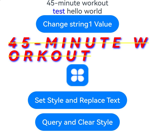
Example 1: Processing Styled Strings
This example shows how to perform insertion, deletion, replacement, and viewing of styled strings using the insertString, removeStyles, replaceStyle, and getStyles APIs.
// xxx.ets
@Entry
@Component
struct styled_string_demo1 {
  @State height1: number = 450;
  @State fontSize1: number = 16;
  @State fontWeight1: number = 400;
  @State color1: Color = Color.Blue;
  scroll: Scroller = new Scroller();
  fontStyleAttr1: TextStyle = new TextStyle({ fontColor: Color.Blue });
  fontStyleAttr2: StyledStringValue = new TextStyle({ fontColor: Color.Orange });
  // Create a readable and writable styled string object: mutableStyledString1.
  mutableStyledString1: MutableStyledString = new MutableStyledString ("45-minute workout");
  // Create the mutableStyledString2 object whose input parameters contain strings and styles.
  mutableStyledString2: MutableStyledString = new MutableStyledString("test hello world", [{
    start: 0,
    length: 5,
    styledKey: StyledStringKey.FONT,
    styledValue: this.fontStyleAttr1
  }]);
  // Create a read-only styled string object: styledString2.
  styledString2: StyledString = new StyledString("45-minute workout");
  spanStyle1: SpanStyle = {
    start: 0,
    length: 5,
    styledKey: StyledStringKey.FONT,
    styledValue: new TextStyle({ fontColor: Color.Pink })
  };
  spanStyle2: SpanStyle = {
    start: 0,
    length: 2,
    styledKey: StyledStringKey.FONT,
    styledValue: new TextStyle({ fontColor: Color.Red })
  };
  @State string1: string = '';
  @State fontColor1: ResourceColor = Color.Red;
  controller1: TextController = new TextController();
  controller2: TextController = new TextController();
  controller3: TextController = new TextController();

  async onPageShow() {
    this.controller1.setStyledString(this.styledString2)
    this.controller2.setStyledString(this.mutableStyledString1)
    this.controller3.setStyledString(this.mutableStyledString2)
  }

  build() {
    Column() {
      Scroll(this.scroll) {
        Column() {
          // Display the styled string.
          Text(undefined, { controller: this.controller1 })
          Text(undefined, { controller: this.controller3 }).key('mutableStyledString2')
          Button('Change string1 Value')
            .onClick(() => {
              let result = this.mutableStyledString1.equals(this.styledString2);
              if (result) {
                this.string1 = this.mutableStyledString1.getString();
                console.info("mutableStyledString1 content:", this.mutableStyledString1.getString());
                console.info("mutableStyledString1 length:", this.mutableStyledString1.length);
              }
            })

          // If the styled string conflicts with the span, the span is ignored. The attributes of the Text component take effect if they do not conflict with the styled string.
          Text(undefined, { controller: this.controller2 }) {
            Span("span and styledString test")
              .fontColor(Color.Yellow)
              .decoration({ type: TextDecorationType.LineThrough })
            ImageSpan($r('app.media.icon'))
          }
          .key('styledString2')
          .fontColor(this.fontColor1)
          .letterSpacing(10)
          .fontSize(32)
          .fontWeight(600)
          .fontStyle(FontStyle.Italic)
          .lineHeight(30)
          .textShadow({ radius: 5, color: Color.Blue, offsetX: 5, offsetY: 5 })
          .textCase(TextCase.UpperCase)
          .decoration({ type: TextDecorationType.LineThrough, color: Color.Yellow })
          .baselineOffset(2)
          .copyOption(CopyOptions.InApp)
          .margin({ top: 10 })
          .draggable(true)

          // The following is for comparison with the preceding.
          Text() {
            Span(this.string1)
              .fontColor(this.color1)
              .decoration({ type: TextDecorationType.LineThrough })
            ImageSpan($r('app.media.icon'))
              .width(50).height(50)
          }
          .letterSpacing(10)
          .fontSize(32)
          .fontWeight(600)
          .fontStyle(FontStyle.Italic)
          .lineHeight(30)
          .textShadow({ radius: 5, color: Color.Blue, offsetX: 5, offsetY: 5 })
          .textCase(TextCase.UpperCase)
          .decoration({ type: TextDecorationType.LineThrough, color: Color.Yellow })
          .baselineOffset(2)

          Button('Set Style and Replace Text')
            .onClick(() => {
              this.mutableStyledString1.replaceStyle({
                start: 2,
                length: 2,
                styledKey: StyledStringKey.FONT,
                styledValue: this.fontStyleAttr1
              })
              this.mutableStyledString1.insertString(0, "Blood Pressure: 85 (High)")
              this.mutableStyledString1.setStyle({
                start: 2,
                length: 2,
                styledKey: StyledStringKey.FONT,
                styledValue: this.fontStyleAttr2
              })
              this.controller2.setStyledString(this.mutableStyledString1)
            })
            .margin({ top: 10 })

          Button('Query and Clear Style')
            .onClick(() => {
              let styles = this.mutableStyledString1.getStyles(0, this.mutableStyledString1.length)
              if (styles.length == 2) {
                for (let i = 0; i < styles.length; i++) {
                  console.info('StyledString style object start:' + styles[i].start)
                  console.info('StyledString style object length:' + styles[i].length)
                  console.info('StyledString style object key:' + styles[i].styledKey)
                  if (styles[i].styledKey === 0) {
                    let fontAttr = styles[i].styledValue as TextStyle;
                    console.info('StyledString fontColor:' + fontAttr.fontColor)
                  }
                }
              }
              if (styles[0] !== undefined) {
                this.mutableStyledString2.setStyle(styles[0]);
                this.controller3.setStyledString(this.mutableStyledString2);
              }
              this.mutableStyledString1.removeStyles(2, 3);
              this.controller2.setStyledString(this.mutableStyledString1);
            })
            .margin({ top: 10 })
        }.width('100%')

      }
      .expandSafeArea([SafeAreaType.KEYBOARD])
      .scrollable(ScrollDirection.Vertical)
      .scrollBar(BarState.On)
      .scrollBarColor(Color.Gray)
      .scrollBarWidth(10)
      .edgeEffect(EdgeEffect.None)
    }
    .width('100%')
  }
}
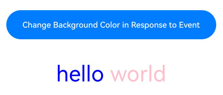
Example 2: Binding Events
This example demonstrates how to bind events to styled strings using the styledKey and styledValue APIs.
// xxx.ets
import { promptAction } from '@kit.ArkUI';

@Entry
@Component
struct styled_string_demo2 {
  scroll: Scroller = new Scroller();
  fontStyleAttr1: TextStyle = new TextStyle({ fontColor: Color.Blue });
  clickGestureAttr: GestureStyle = new GestureStyle({
    onClick: () => {
      promptAction.showToast({ message: 'clickGestureAttr object trigger click event' })
      this.backgroundColor1 = Color.Yellow
    }
  })
  gestureStyleAttr: GestureStyle = new GestureStyle({
    onClick: () => {
      promptAction.showToast({ message: 'gestureStyleAttr object trigger click event' })
      this.backgroundColor1 = Color.Green
    },
    onLongPress: () => {
      promptAction.showToast({ message: 'gestureStyleAttr object trigger long press event' })
      this.backgroundColor1 = Color.Orange
    }
  });
  // Create the event object mutableStyledString3.
  mutableStyledString3: MutableStyledString = new MutableStyledString("hello world", [{
    start: 0,
    length: 5,
    styledKey: StyledStringKey.GESTURE,
    styledValue: this.clickGestureAttr
  },
    {
      start: 0,
      length: 5,
      styledKey: StyledStringKey.FONT,
      styledValue: this.fontStyleAttr1
    },
    {
      start: 6,
      length: 5,
      styledKey: StyledStringKey.GESTURE,
      styledValue: this.gestureStyleAttr
    },
    {
      start: 6,
      length: 5,
      styledKey: StyledStringKey.FONT,
      styledValue: new TextStyle({ fontColor: Color.Pink })
    }]);
  @State fontColor1: ResourceColor = Color.Red;
  @State backgroundColor1: ResourceColor|undefined = undefined;
  controller3: TextController = new TextController();

  async onPageShow() {
    this.controller3.setStyledString(this.mutableStyledString3)
  }

  build() {
    Column() {
      Scroll(this.scroll) {
        Column({ space: 30 }) {
          Button("Change Background Color in Response to Event").backgroundColor(this.backgroundColor1).width('80%')
          // Styled string that contains an event
          Text(undefined, { controller: this.controller3 }).fontSize(30)
            .copyOption(CopyOptions.InApp)
            .draggable(true)
            .clip(true)
        }.width('100%')
      }
      .expandSafeArea([SafeAreaType.KEYBOARD])
      .scrollable(ScrollDirection.Vertical)
      .scrollBar(BarState.On)
      .scrollBarColor(Color.Gray)
      .scrollBarWidth(10)
      .edgeEffect(EdgeEffect.None)
    }
    .width('100%')
  }
}
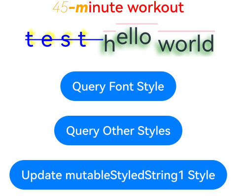
Example 3: Setting the Text Style
This example shows how to query and set styles for styled strings using the getStyles and setStyle APIs.
// xxx.ets
import { LengthMetrics, LengthUnit } from '@kit.ArkUI'

@Entry
@Component
struct styled_string_demo3 {
  fontStyleAttr1: TextStyle = new TextStyle({ fontColor: Color.Blue });
  fontStyleAttr2: StyledStringValue = new TextStyle({
    fontColor: Color.Orange,
    fontSize: LengthMetrics.vp(20),
    fontWeight: FontWeight.Bolder,
    fontStyle: FontStyle.Italic,
    fontFamily: "Arial"
  });
  fontStyleAttr3: StyledStringValue = new TextStyle({
    fontColor: Color.Orange,
    fontSize: LengthMetrics.vp(20),
    fontWeight: FontWeight.Lighter,
    fontStyle: FontStyle.Italic,
    fontFamily: "Arial"
  });
  // Create a styled string object with multiple text styles: mutableStyledString1.
  mutableStyledString1: MutableStyledString = new MutableStyledString("45-minute workout", [{
    start: 0,
    length: 2,
    styledKey: StyledStringKey.FONT,
    styledValue: this.fontStyleAttr3
  }, {
    start: 2,
    length: 2,
    styledKey: StyledStringKey.FONT,
    styledValue: this.fontStyleAttr2
  }
  ]);
  // Create a styled string object with multiple styles: mutableStyledString2.
  mutableStyledString2: MutableStyledString = new MutableStyledString("test hello world", [{
    start: 0,
    length: 5,
    styledKey: StyledStringKey.FONT,
    styledValue: this.fontStyleAttr1
  }, {
    start: 0,
    length: 5,
    styledKey: StyledStringKey.DECORATION,
    styledValue: new DecorationStyle({ type: TextDecorationType.LineThrough, color: Color.Blue })
  }, {
    start: 0,
    length: 5,
    styledKey: StyledStringKey.TEXT_SHADOW,
    styledValue: new TextShadowStyle({
      radius: 5,
      type: ShadowType.COLOR,
      color: Color.Yellow,
      offsetX: 10,
      offsetY: -10
    })
  }, {
    start: 0,
    length: 5,
    styledKey: StyledStringKey.BASELINE_OFFSET,
    styledValue: new BaselineOffsetStyle(LengthMetrics.px(20))
  }, {
    start: 0,
    length: 5,
    styledKey: StyledStringKey.LETTER_SPACING,
    styledValue: new LetterSpacingStyle(new LengthMetrics(10, LengthUnit.VP))
  }, {
    start: 6,
    length: 5,
    styledKey: StyledStringKey.BASELINE_OFFSET,
    styledValue: new BaselineOffsetStyle(LengthMetrics.fp(10))
  }
  ]);
  @State fontColor1: ResourceColor = Color.Red;
  controller: TextController = new TextController();
  options: TextOptions = { controller: this.controller };
  controller2: TextController = new TextController();
  spanStyle1: SpanStyle = {
    start: 0,
    length: 5,
    styledKey: StyledStringKey.FONT,
    styledValue: new TextStyle({ fontColor: Color.Pink })
  };

  async onPageShow() {
    this.controller.setStyledString(this.mutableStyledString1)
    this.controller2.setStyledString(this.mutableStyledString2)
  }

  build() {
    Column() {
      Column({ space: 10 }) {
        // Display the styled string configured with various font styles. If the styled string conflicts with the style settings in the Text component, the style set in the styled string takes effect.
        Text(undefined, this.options)
          .fontColor(this.fontColor1)
          .font({ size: 20, weight: 500, style: FontStyle.Normal })
        // Display the styled string for which the text shadow, text decorative line, letter spacing, and baseline offset are configured. If the styled string conflicts with the style settings in the Text component, the style set in the styled string takes effect.
        Text(undefined, { controller: this.controller2 })
          .fontSize(30)
          .copyOption(CopyOptions.InApp)
          .draggable(true)
          .decoration({ type: TextDecorationType.Overline, color: Color.Pink })
          .textShadow({
            radius: 10,
            type: ShadowType.COLOR,
            color: Color.Green,
            offsetX: -10,
            offsetY: 10
          })
        Button('Query Font Style')
          .onClick(() => {
            let styles = this.mutableStyledString1.getStyles(0, this.mutableStyledString1.length)
            if (styles.length !== 0) {
              for (let i = 0; i < styles.length; i++) {
                console.info('mutableStyledString1 style object start:' + styles[i].start)
                console.info('mutableStyledString1 style object length:' + styles[i].length)
                console.info('mutableStyledString1 style object key:' + styles[i].styledKey)
                if (styles[i].styledKey === 0) {
                  let fontAttr = styles[i].styledValue as TextStyle;
                  console.info('mutableStyledString1 fontColor:' + fontAttr.fontColor)
                  console.info('mutableStyledString1 fontSize:' + fontAttr.fontSize)
                  console.info('mutableStyledString1 fontWeight:' + fontAttr.fontWeight)
                  console.info('mutableStyledString1 fontStyle:' + fontAttr.fontStyle)
                  console.info('mutableStyledString1 fontStyle:' + fontAttr.fontFamily)
                }
              }
            }
          })
          .margin({ top: 10 })
        Button('Query Other Styles')
          .onClick(() => {
            let styles = this.mutableStyledString2.getStyles(0, this.mutableStyledString2.length)
            if (styles.length !== 0) {
              for (let i = 0; i < styles.length; i++) {
                console.info('mutableStyledString2 style object start:' + styles[i].start)
                console.info('mutableStyledString2 style object length:' + styles[i].length)
                console.info('mutableStyledString2 style object key:' + styles[i].styledKey)
                if (styles[i].styledKey === 1) {
                  let decoAttr = styles[i].styledValue as DecorationStyle;
                  console.info('mutableStyledString2 decoration type:' + decoAttr.type)
                  console.info('mutableStyledString2 decoration color:' + decoAttr.color)
                }
                if (styles[i].styledKey === 2) {
                  let baselineAttr = styles[i].styledValue as BaselineOffsetStyle;
                  console.info('mutableStyledString2 baselineOffset:' + baselineAttr.baselineOffset)
                }
                if (styles[i].styledKey === 3) {
                  let letterAttr = styles[i].styledValue as LetterSpacingStyle;
                  console.info('mutableStyledString2 letterSpacing:' + letterAttr.letterSpacing)
                }
                if (styles[i].styledKey === 4) {
                  let textShadowAttr = styles[i].styledValue as TextShadowStyle;
                  let shadowValues = textShadowAttr.textShadow;
                  if (shadowValues.length > 0) {
                    for (let j = 0; j < shadowValues.length; j++) {
                      console.info('mutableStyledString2 textShadow type:' + shadowValues[j].type);
                      console.info('mutableStyledString2 textShadow radius:' + shadowValues[j].radius);
                      console.info('mutableStyledString2 textShadow color:' + shadowValues[j].color);
                      console.info('mutableStyledString2 textShadow offsetX:' + shadowValues[j].offsetX);
                      console.info('mutableStyledString2 textShadow offsetY:' + shadowValues[j].offsetY);
                    }
                  }
                }
              }
            }
          })
          .margin({ top: 10 })
        Button('Update mutableStyledString1 Style')
          .onClick(() => {
            this.mutableStyledString1.setStyle(this.spanStyle1)
            this.controller.setStyledString(this.mutableStyledString1)
          })
          .margin({ top: 10 })
      }.width('100%')
    }
    .width('100%')
  }
}
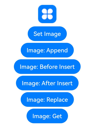
Example 4: Setting Images
This example illustrates how to set images in styled strings using the ImageAttachment API.
// xxx.ets
import { image } from '@kit.ImageKit'
import { LengthMetrics } from '@kit.ArkUI'

@Entry
@Component
struct styled_string_demo4 {
  @State message: string = 'Hello World'
  imagePixelMap: image.PixelMap|undefined = undefined
  @State imagePixelMap3: image.PixelMap|undefined = undefined
  mutableStr: MutableStyledString = new MutableStyledString('123');
  controller: TextController = new TextController();
  mutableStr2: MutableStyledString = new MutableStyledString('This is set decoration line style to the mutableStr2', [{
    start: 0,
    length: 15,
    styledKey: StyledStringKey.DECORATION,
    styledValue: new DecorationStyle({
      type: TextDecorationType.Overline,
      color: Color.Orange,
      style: TextDecorationStyle.DOUBLE
    })
  }])

  async aboutToAppear() {
    console.info("aboutToAppear initial imagePixelMap")
    this.imagePixelMap = await this.getPixmapFromMedia($r('app.media.icon'))
  }

  private async getPixmapFromMedia(resource: Resource) {
    let unit8Array = await getContext(this)?.resourceManager?.getMediaContent({
      bundleName: resource.bundleName,
      moduleName: resource.moduleName,
      id: resource.id
    })
    let imageSource = image.createImageSource(unit8Array.buffer.slice(0, unit8Array.buffer.byteLength))
    let createPixelMap: image.PixelMap = await imageSource.createPixelMap({
      desiredPixelFormat: image.PixelMapFormat.RGBA_8888
    })
    await imageSource.release()
    return createPixelMap
  }

  build() {
    Row() {
      Column({ space: 5 }) {
        Text(undefined, { controller: this.controller })
          .copyOption(CopyOptions.InApp)
          .draggable(true)
          .fontSize(30)

        Button('Set Image')
          .onClick(() => {
            if (this.imagePixelMap !== undefined) {
              this.mutableStr = new MutableStyledString(new ImageAttachment({
                value: this.imagePixelMap,
                size: { width: 50, height: 50 },
                layoutStyle: { borderRadius: LengthMetrics.vp(10) },
                verticalAlign: ImageSpanAlignment.BASELINE,
                objectFit: ImageFit.Contain
              }))
              this.controller.setStyledString(this.mutableStr)
            }
          })

        Button('Set Resource Type Image')
          .onClick(() => {
            if (this.imagePixelMap !== undefined) {
              this.mutableStr = new MutableStyledString(new ImageAttachment({
                resourceValue: $r('app.media.icon'),
                size: { width: 50, height: 50 },
                layoutStyle: { borderRadius: LengthMetrics.vp(10) },
                verticalAlign: ImageSpanAlignment.BASELINE,
                objectFit: ImageFit.Contain,
                syncLoad: true
              }))
              this.controller.setStyledString(this.mutableStr)
            }
          })

        Button('Image: Append')
          .onClick(() => {
            let str = new StyledString('123')
            this.mutableStr.appendStyledString(str)
            this.controller.setStyledString(this.mutableStr)
          })

        Button('Image: Before Insert')
          .onClick(() => {
            this.mutableStr.insertString(0, '123')
            this.controller.setStyledString(this.mutableStr)
          })

        Button('Image: After Insert')
          .onClick(() => {
            this.mutableStr.insertString(1, '123')
            this.controller.setStyledString(this.mutableStr)
          })

        Button('Image: Replace')
          .onClick(() => {
            this.mutableStr.replaceString(2, 5, "789")
            this.controller.setStyledString(this.mutableStr)
          })

        Button('Image: Get')
          .onClick(() => {
            let imageArray = this.mutableStr.getStyles(0, 1, StyledStringKey.IMAGE)
            for (let i = 0; i < imageArray.length; ++i) {
              console.info('mutableStr start ' + imageArray[i].start + ' length ' + imageArray[i].length + ' type ' + imageArray[i].styledKey)
              if (imageArray[i].styledKey === 300) {
                let attachment = imageArray[i].styledValue as ImageAttachment
                this.imagePixelMap3 = attachment.value
                console.info('mutableStr value ' + JSON.stringify(attachment.value))
                if (attachment.size !== undefined) {
                  console.info('mutableStr size width ' + attachment.size.width + ' height ' + attachment.size.height)
                }
                console.info('mutableStr vertical ' + attachment.verticalAlign)
                console.info('mutableStr fit ' + attachment.objectFit)
                if (attachment.layoutStyle !== undefined) {
                  let radius = attachment.layoutStyle.borderRadius as BorderRadiuses
                  console.info('mutableStr radius ' + JSON.stringify(radius))
                }
              }

            }
          })

        Image(this.imagePixelMap3).width(50).height(50)

      }
      .width('100%')
    }
    .height('100%')
  }
}
Example 5: Setting the Text Line Height and Paragraph Style
This example demonstrates how to set the line height and paragraph styles for styled strings using the LineHeightStyle and ParagraphStyle APIs.
import { LengthMetrics } from '@kit.ArkUI'
const canvasWidth = 1000
const canvasHeight = 100
class LeadingMarginCreator {
private settings: RenderingContextSettings = new RenderingContextSettings(true)
private offscreenCanvas: OffscreenCanvas = new OffscreenCanvas(canvasWidth, canvasHeight)
private offContext: OffscreenCanvasRenderingContext2D = this.offscreenCanvas.getContext("2d", this.settings)
public static instance: LeadingMarginCreator = new LeadingMarginCreator()
public genSquareMark(fontSize: number): PixelMap {
this.offContext = this.offscreenCanvas.getContext("2d", this.settings)
this.clearCanvas()
const coordinate = fontSize * (1 - 1 / 1.5) / 2
const sideLength = fontSize / 1.5
this.offContext.fillRect(coordinate, coordinate, sideLength, sideLength)
return this.offContext.getPixelMap(0, 0, fontSize, fontSize)
}
private clearCanvas() {
this.offContext.clearRect(0, 0, canvasWidth, canvasHeight)
}
}
@Entry
@Component
struct Index {
private leadingMarkCreatorInstance = LeadingMarginCreator.instance
leadingMarginPlaceholder1: LeadingMarginPlaceholder = {
pixelMap: this.leadingMarkCreatorInstance.genSquareMark(24),
size:[15, 15]
}
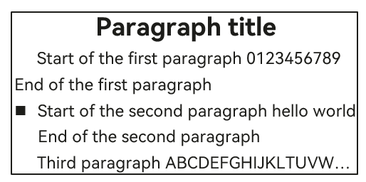
titleParagraphStyleAttr: ParagraphStyle = new ParagraphStyle({ textAlign: TextAlign.Center, paragraphSpacing: LengthMetrics.px(10)});
// Indent the first line of the first paragraph by 15 vp.
paragraphStyleAttr1: ParagraphStyle = new ParagraphStyle({ textIndent: LengthMetrics.vp(15) });
// Indent the second paragraph by 15 vp, with a placeholder in the first line.
paragraphStyleAttr2: ParagraphStyle = new ParagraphStyle({ textAlign: TextAlign.Start, leadingMargin: this.leadingMarginPlaceholder1 });
// Set the maximum number of lines and text overflow mode for the third paragraph, without setting the indent.
paragraphStyleAttr3: ParagraphStyle = new ParagraphStyle({ textAlign: TextAlign.End, maxLines: 1, wordBreak: WordBreak.BREAK_ALL, overflow: TextOverflow.Ellipsis});
// Line height style object
lineHeightStyle1: LineHeightStyle= new LineHeightStyle(new LengthMetrics(24));
// Create a paragraph style object paragraphStyledString1.
paragraphStyledString1: StyledString = new StyledString("Paragraph title\nStart of the first paragraph 0123456789 End of the first paragraph\nStart of the second paragraph hello world End of the second paragraph\nThird paragraph ABCDEFGHIJKLMNOPQRSTUVWXYZ", [
{
start: 0,
length: 4,
styledKey: StyledStringKey.PARAGRAPH_STYLE,
styledValue: this.titleParagraphStyleAttr
},
{
start: 0,
length: 4,
styledKey: StyledStringKey.LINE_HEIGHT,
styledValue: new LineHeightStyle(new LengthMetrics(50))
},{
start: 0,
length: 4,
styledKey: StyledStringKey.FONT,
styledValue: new TextStyle({ fontSize: LengthMetrics.vp(24), fontWeight: FontWeight.Bolder })
},
{
start: 5,
length: 3,
styledKey: StyledStringKey.PARAGRAPH_STYLE,
styledValue: this.paragraphStyleAttr1
},
{
start: 5,
length: 20,
styledKey: StyledStringKey.LINE_HEIGHT,
styledValue: this.lineHeightStyle1
},
{
start: 32,
length: 5,
styledKey: StyledStringKey.PARAGRAPH_STYLE,
styledValue: this.paragraphStyleAttr2
},
{
start: 32,
length: 20,
styledKey: StyledStringKey.LINE_HEIGHT,
styledValue: this.lineHeightStyle1
},
{
start: 60,
length: 5,
styledKey: StyledStringKey.PARAGRAPH_STYLE,
styledValue: this.paragraphStyleAttr3
},
{
start: 60,
length: 5,
styledKey: StyledStringKey.LINE_HEIGHT,
styledValue: this.lineHeightStyle1
}
]);
controller: TextController = new TextController();
async onPageShow() {
this.controller.setStyledString(this.paragraphStyledString1)
}
build() {
Row() {
Column( { space : 5 }) {
Text(undefined, { controller: this.controller })
.width(240)
.borderWidth(1)
.copyOption(CopyOptions.InApp)
.draggable(true)
// Query the paragraph style.
Text()
.onClick(() => {
let styles = this.paragraphStyledString1.getStyles(0, this.paragraphStyledString1.length)
if (styles.length !== 0) {
for (let i = 0; i < styles.length; i++) {
console.info('paragraphStyledString1 style object start:' + styles[i].start)
console.info('paragraphStyledString1 style object length:' + styles[i].length)
console.info('paragraphStyledString1 style object key:' + styles[i].styledKey)
if (styles[i].styledKey === 200) {
let paraAttr = styles[i].styledValue as ParagraphStyle;
console.info('paragraphStyledString1 textAlign:' + paraAttr.textAlign)
console.info('paragraphStyledString1 textIndent:' + paraAttr.textIndent)
console.info('paragraphStyledString1 maxLines:' + paraAttr.maxLines)
console.info('paragraphStyledString1 wordBreak:' + paraAttr.wordBreak)
console.info('paragraphStyledString1 leadingMargin:' + paraAttr.leadingMargin)
console.info('paragraphStyledString1 overflow:' + paraAttr.overflow)
}
}
}
})
.margin({ top: 10 })
}
.width('100%')
}
.height('100%')
}
}
Example 6: Setting Custom Spans
This example shows how to set custom spans within styled strings using the CustomSpan API.
// xxx.ets
import { drawing } from '@kit.ArkGraphics2D'
import { LengthMetrics } from '@kit.ArkUI'

class MyCustomSpan extends CustomSpan {
  constructor(word: string, width: number, height: number) {
    super();
    this.word = word;
    this.width = width;
    this.height = height;
  }

  onMeasure(measureInfo: CustomSpanMeasureInfo): CustomSpanMetrics {
    return { width: this.width, height: this.height };
  }

  onDraw(context: DrawContext, options: CustomSpanDrawInfo) {
    let canvas = context.canvas;

    const brush = new drawing.Brush();
    brush.setColor({
      alpha: 255,
      red: 0,
      green: 74,
      blue: 175
    });
    const font = new drawing.Font();
    font.setSize(25);
    const textBlob = drawing.TextBlob.makeFromString(this.word, font, drawing.TextEncoding.TEXT_ENCODING_UTF8);
    canvas.attachBrush(brush);
    canvas.drawRect({
      left: options.x + 10,
      right: options.x + vp2px(this.width) - 10,
      top: options.lineTop + 10,
      bottom: options.lineBottom - 10
    });

    brush.setColor({
      alpha: 255,
      red: 23,
      green: 169,
      blue: 141
    });
    canvas.attachBrush(brush);
    canvas.drawTextBlob(textBlob, options.x + 20, options.lineBottom - 15);
    canvas.detachBrush();
  }

  setWord(word: string) {
    this.word = word;
  }

  width: number = 160;
  word: string = "drawing";
  height: number = 10;
}

@Entry
@Component
struct styled_string_demo6 {
  customSpan1: MyCustomSpan = new MyCustomSpan("Hello", 80, 10);
  customSpan2: MyCustomSpan = new MyCustomSpan("World", 80, 40);
  style: MutableStyledString = new MutableStyledString(this.customSpan1);
  textStyle: MutableStyledString = new MutableStyledString("123");
  textController: TextController = new TextController();
  isPageShow: boolean = true;

  async onPageShow() {
    if (!this.isPageShow) {
      return
    }
    this.isPageShow = false;

    this.style.appendStyledString(new MutableStyledString("Text drawing sample CustomSpan", [
      {
        start: 0,
        length: 5,
        styledKey: StyledStringKey.FONT,
        styledValue: new TextStyle({ fontColor: Color.Pink })
      }, {
      start: 5,
      length: 5,
      styledKey: StyledStringKey.FONT,
      styledValue: new TextStyle({ fontColor: Color.Orange, fontStyle: FontStyle.Italic })
    }, {
      start: 10,
      length: 500,
      styledKey: StyledStringKey.FONT,
      styledValue: new TextStyle({ fontColor: Color.Green, fontWeight: FontWeight.Bold })
    }
    ]))
    this.style.appendStyledString(new StyledString(this.customSpan2))
    this.style.appendStyledString(new StyledString("Custom drawing", [{
      start: 0,
      length: 5,
      styledKey: StyledStringKey.FONT,
      styledValue: new TextStyle({ fontColor: Color.Green, fontSize: LengthMetrics.px(50) })
    }]))
    this.textController.setStyledString(this.style)
  }

  build() {
    Row() {
      Column() {
        Text(undefined, { controller: this.textController })
          .copyOption(CopyOptions.InApp)
          .fontSize(30)

        Button("invalidate").onClick(() => {
          this.customSpan1.setWord("Hello")
          this.customSpan1.invalidate()
        })
      }
      .width('100%')
    }
    .height('100%')
  }
}

Example 7: Storing Custom Extension Information
This example illustrates how to store custom extension information within styled strings using the UserDataSpan API.
// xxx.ets
class MyUserDateSpan extends UserDataSpan {
  constructor(name: string, age: number) {
    super()
    this.name = name
    this.age = age
  }

  name: string
  age: number
}

@Entry
@Component
struct styled_string_demo7 {
  @State name: string = "world"
  @State age: number = 10
  controller: TextController = new TextController()
  styleString: MutableStyledString = new MutableStyledString("hello world", [{
    start: 0,
    length: 11,
    styledKey: StyledStringKey.USER_DATA,
    styledValue: new MyUserDateSpan("hello", 21)
  }])

  onPageShow(): void {
    this.controller.setStyledString(this.styleString)
  }

  build() {
    Column() {
      Text(undefined, { controller: this.controller })
      Button("get user data").onClick(() => {
        let arr = this.styleString.getStyles(0, this.styleString.length)
        let userDataSpan = arr[0].styledValue as MyUserDateSpan
        this.name = userDataSpan.name
        this.age = userDataSpan.age
      })
      Text("name:" + this.name + "  age: " + this.age)
    }.width('100%').height(250).padding({ left: 35, right: 35, top: 35 })
  }
}
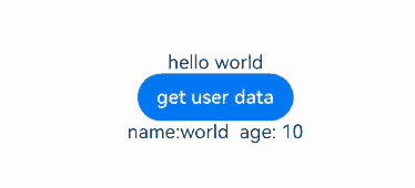
Example 8: Implementing Conversion Between Styled Strings and HTML-Formatted Strings
This example demonstrates the conversion between styled strings and HTML-formatted strings using the toHtml and fromHtml APIs.
// xxx.ets
import { image } from '@kit.ImageKit'
import { LengthMetrics } from '@kit.ArkUI'

@Entry
@Component
struct styled_string_demo8 {
  imagePixelMap: image.PixelMap|undefined = undefined
  @State html : string|undefined = undefined
  @State styledString : StyledString|undefined = undefined
  controller1 : TextController = new TextController
  controller2 : TextController = new TextController

  async aboutToAppear() {
    console.info("aboutToAppear initial imagePixelMap")
    this.imagePixelMap = await this.getPixmapFromMedia($r('app.media.icon'))
  }

  private async getPixmapFromMedia(resource: Resource) {
    let unit8Array = await getContext(this)?.resourceManager?.getMediaContent({
      bundleName: resource.bundleName,
      moduleName: resource.moduleName,
      id: resource.id
    })
    let imageSource = image.createImageSource(unit8Array.buffer.slice(0, unit8Array.buffer.byteLength))
    let createPixelMap: image.PixelMap = await imageSource.createPixelMap({
      desiredPixelFormat: image.PixelMapFormat.RGBA_8888
    })
    await imageSource.release()
    return createPixelMap
  }

  build() {
    Column() {
      Text(undefined, { controller: this.controller1 }).height(100)
      Row() {
        Button("Add Styled String").onClick(() => {
          let mutableStyledString1: MutableStyledString = new MutableStyledString("Styled string", [{
            start: 0,
            length: 6,
            styledKey: StyledStringKey.FONT,
            styledValue: new TextStyle({ fontColor: Color.Green, fontSize: LengthMetrics.px(50) })
          }]);
          if (this.imagePixelMap !== undefined) {
            let mutableStyledString2 = new MutableStyledString(new ImageAttachment({
              value: this.imagePixelMap,
              size: { width: 50, height: 50 },
            }))
            mutableStyledString1.appendStyledString(mutableStyledString2)
          }
          this.styledString = mutableStyledString1
          this.controller1.setStyledString(mutableStyledString1)
        }).margin(5)
        Button("toHtml").onClick(() => {
          this.html = StyledString.toHtml(this.styledString)
        }).margin(5)
        Button("fromHtml").onClick(async () => {
          let styledString = await StyledString.fromHtml(this.html)
          this.controller2.setStyledString(styledString)
        }).margin(5)
      }
      Text(undefined, { controller: this.controller2 }).height(100)
      Text(this.html)
    }.width("100%")
  }
}

Example 9: Setting a Hyperlink
This example demonstrates how to set a hyperlink within a styled string using the UrlStyle API.
// xxx.ets
@Entry
@Component
struct styled_string {
  urlString: StyledStringValue = new UrlStyle( "https://www.example.com" );
  mutableStyledString: MutableStyledString = new MutableStyledString("Hello World", [{
    start: 0,
    length: "Hello".length,
    styledKey: StyledStringKey.URL,
    styledValue: this.urlString
  }]);
  controller: TextController = new TextController();
  async onPageShow() {
    this.controller.setStyledString(this.mutableStyledString)
  }
  build() {
    Column() {
      Column() {
        Text(undefined, { controller: this.controller }).key('mutableStyledString').fontSize(30)
      }
    }.width('100%').height(250).padding({ left: 35, right: 35, top: 35 })
  }
}

Example 10: Setting a Color Filter for an Image
This example demonstrates how to apply a color filter to an image by setting colorFilter for imageAttachment.
// xxx.ets
import { LengthMetrics } from '@kit.ArkUI'
import { drawing, common2D } from '@kit.ArkGraphics2D';
@Entry
@Component
struct styled_string_demo4 {
  @State message: string = 'Hello World'
  mutableStr: MutableStyledString = new MutableStyledString('origin image:');
  mutableStr2: MutableStyledString = new MutableStyledString('with filter:');
  controller: TextController = new TextController();
  controller2: TextController = new TextController();
  private color: common2D.Color = { alpha: 125, red: 125, green: 125, blue: 255 };
  build() {
    Row() {
      Column({ space: 5 }) {
        Text(undefined, { controller: this.controller })
          .copyOption(CopyOptions.InApp)
          .draggable(true)
          .fontSize(30)
          .onAppear(() => {
            this.mutableStr = new MutableStyledString(new ImageAttachment({
              resourceValue: $r('app.media.startIcon'),
              size: { width: 50, height: 50 },
              layoutStyle: { borderRadius: LengthMetrics.vp(10) },
              verticalAlign: ImageSpanAlignment.BASELINE,
              objectFit: ImageFit.Contain,
              syncLoad: true
            }))
            this.controller.setStyledString(this.mutableStr)
          })
        Text(undefined, { controller: this.controller2 })
          .copyOption(CopyOptions.InApp)
          .draggable(true)
          .fontSize(30)
        Button('set image color filter')
          .onClick(() => {
            this.mutableStr2 = new MutableStyledString(new ImageAttachment({
              resourceValue: $r('app.media.startIcon'),
              size: { width: 50, height: 50 },
              layoutStyle: { borderRadius: LengthMetrics.vp(10) },
              verticalAlign: ImageSpanAlignment.BASELINE,
              objectFit: ImageFit.Contain,
              colorFilter: drawing.ColorFilter.createBlendModeColorFilter(this.color, drawing.BlendMode.SRC_IN),
              syncLoad: true
            }))
            this.controller2.setStyledString(this.mutableStr2)
          })
      }
      .width('100%')
    }
    .height('100%')
  }
}
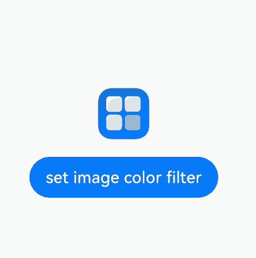
Example 11: Inserting, Deleting, and Replacing Styled Strings
This example demonstrates how to insert, delete, and replace styled strings using the getSubStyledString, removeString, removeStyle, clearStyles, replaceStyledString, and insertStyledString APIs.
// xxx.ets
@Entry
@Component
struct styled_string_demo4 {
  @State message: string = 'Hello World'
  mutableStr: MutableStyledString = new MutableStyledString('123456', [{
    start: 0,
    length: 2,
    styledKey: StyledStringKey.FONT,
    styledValue: new TextStyle({fontColor: Color.Red})
  }, {
    start: 0,
    length: 3,
    styledKey: StyledStringKey.DECORATION,
    styledValue: new DecorationStyle({type: TextDecorationType.LineThrough})
  }]);
  mutableStr2: MutableStyledString = new MutableStyledString('with filter:');
  controller: TextController = new TextController();
  controller2: TextController = new TextController();
  build() {
    Row() {
      Column({ space: 5 }) {
        Text(undefined, { controller: this.controller })
          .copyOption(CopyOptions.InApp)
          .draggable(true)
          .fontSize(30)
          .onAppear(() => {
            this.controller.setStyledString(this.mutableStr)
          })
        Text(undefined, { controller: this.controller2 })
          .copyOption(CopyOptions.InApp)
          .draggable(true)
          .fontSize(30)
        Button('GetSubStyledString (0,3)').onClick(() => {
          this.controller2.setStyledString(this.mutableStr.subStyledString(0, 3))
        })
        Button('RemoveStyle (0,1,Decoration)').onClick(() => {
          this.mutableStr.removeStyle(0, 1, StyledStringKey.DECORATION)
          this.controller.setStyledString(this.mutableStr)
        })
        Button('RemoveString (5,1)').onClick(() => {
          this.mutableStr.removeString(5, 1)
          this.controller.setStyledString(this.mutableStr)
        })
        Button('ClearStyles').onClick(() => {
          this.mutableStr.clearStyles()
          this.controller.setStyledString(this.mutableStr)
        })
        Button('replaceStyledString').onClick(() => {
          this.mutableStr.replaceStyledString(3, 1, new StyledString("abc", [{
            start: 0,
            length: 3,
            styledKey: StyledStringKey.FONT,
            styledValue: new TextStyle({fontColor: Color.Blue})
          }]))
          this.controller.setStyledString(this.mutableStr)
        })
        Button('insertStyledString').onClick(() => {
          this.mutableStr.insertStyledString(4, new StyledString("A"))
          this.controller.setStyledString(this.mutableStr)
        })
      }
      .width('100%')
    }
    .height('100%')
  }
}
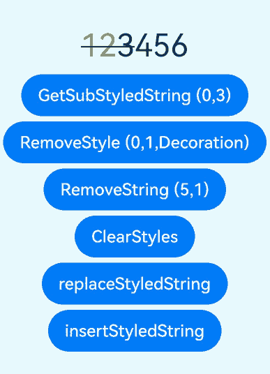
你可能感兴趣的鸿蒙文章
- 所属分类: 后端技术
- 本文标签:
热门推荐
-
2、 优质文章
-
3、 gt
-
7、 openharmony
-
9、 golang
-
10、 Vue中input框自动聚焦