harmony 鸿蒙ContainerSpan
ContainerSpan
As a child of the Text component, the ContainerSpan component is used to manage the background colors and rounded corners of multiple Span and ImageSpan components in a unified manner.
NOTE
This component is supported since API version 11. Updates will be marked with a superscript to indicate their earliest API version.
Child Components
This component can contain the Span and ImageSpan child components.
APIs
ContainerSpan()
Atomic service API: This API can be used in atomic services since API version 12.
System capability: SystemCapability.ArkUI.ArkUI.Full
Attributes
Only the following attributes are supported.
textBackgroundStyle
textBackgroundStyle(style: TextBackgroundStyle)
Sets the text background style. If this attribute is not separately set for a child component, the child component inherits the settings from the component.
Atomic service API: This API can be used in atomic services since API version 12.
System capability: SystemCapability.ArkUI.ArkUI.Full
Parameters
| Name | Type | Mandatory | Description |
|---|---|---|---|
| style | TextBackgroundStyle | Yes | Text background style. Default value: { color: Color.Transparent, radius: 0 } |
attributeModifier12+
attributeModifier(modifier: AttributeModifier<ContainerSpanAttribute>)
Creates an attribute modifier.
Atomic service API: This API can be used in atomic services since API version 12.
System capability: SystemCapability.ArkUI.ArkUI.Full
Parameters
| Name | Type | Mandatory | Description |
|---|---|---|---|
| modifier | AttributeModifier<ContainerSpanAttribute> | Yes | Modifier for dynamically setting attributes on the current component. |
Events
The universal events are not supported.
Example
Example 1: Setting the Background Style
This example demonstrates how to set the background style for text using textBackgroundStyle.
// xxx.ets
@Component
@Entry
struct Index {
  build() {
    Column() {
      Text() {
        ContainerSpan() {
          ImageSpan($r('app.media.app_icon'))
            .width('40vp')
            .height('40vp')
            .verticalAlign(ImageSpanAlignment.CENTER)
          Span('   Hello World !   ').fontSize('16fp').fontColor(Color.White)
        }.textBackgroundStyle({ color: "#7F007DFF", radius: "12vp" })
      }
    }.width('100%').alignItems(HorizontalAlign.Center)
  }
}

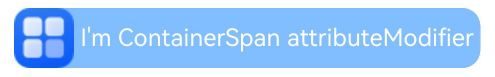
Example 2: Setting the Background Style Using attributeModifier
This example demonstrates how to set the background style for text using attributeModifier.
// xxx.ets
import { ContainerSpanModifier } from '@ohos.arkui.modifier'

class MyContainerSpanModifier extends ContainerSpanModifier {
  applyNormalAttribute(instance: ContainerSpanAttribute): void {
    super.applyNormalAttribute?.(instance);
    this.textBackgroundStyle({ color: "#7F007DFF", radius: "12vp" })
  }
}

@Entry
@Component
struct ContainerSpanModifierExample {
  @State containerSpanModifier: ContainerSpanModifier = new MyContainerSpanModifier()

  build() {
    Column() {
      Text() {
        ContainerSpan() {
          ImageSpan($r('app.media.app_icon'))
            .width('40vp')
            .height('40vp')
            .verticalAlign(ImageSpanAlignment.CENTER)
          Span(' I\'m ContainerSpan attributeModifier ').fontSize('16fp').fontColor(Color.White)
        }.attributeModifier(this.containerSpanModifier as MyContainerSpanModifier)
      }
    }.width('100%').alignItems(HorizontalAlign.Center)
  }
}
你可能感兴趣的鸿蒙文章
- 所属分类: 后端技术
- 本文标签:
热门推荐
-
2、 优质文章
-
3、 gt
-
7、 openharmony
-
9、 golang
-
10、 Vue中input框自动聚焦