harmony 鸿蒙Obscuring
Obscuring
When needed, you can obscure content of a component.
NOTE
The APIs of this module are supported since API version 10. Updates will be marked with a superscript to indicate their earliest API version.
obscured
obscured(reasons: Array<ObscuredReasons>)
Sets how the component content is obscured.
Atomic service API: This API can be used in atomic services since API version 11.
System capability: SystemCapability.ArkUI.ArkUI.Full
Parameters
| Name | Type | Mandatory | Description |
|---|---|---|---|
| reasons | Array<ObscuredReasons> | Yes | How the component content is obscured. Default value: [] This API only works for the Image, Formcomponent12+, and Text components. NOTE To obscure an image when it is being loaded, you must set the width and height of the Image component. Obscuring is not available for Text components that have child components or have any styled string configured. |
Example
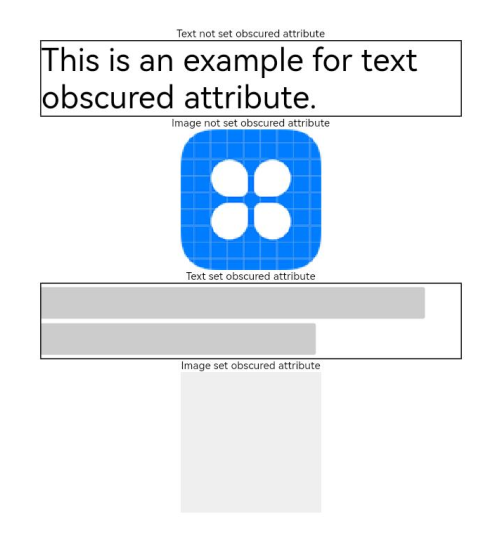
This example demonstrates how to obscure the content of Text and Image components using the obscured API.
// xxx.ets
@Entry
@Component
struct ObscuredExample {
  build() {
    Row() {
      Column() {
        Text('Text not set obscured attribute').fontSize(10).fontColor(Color.Black)
        Text('This is an example for text obscured attribute.')
          .fontSize(30)
          .width('600px')
          .fontColor(Color.Black)
          .border({ width: 1 })
        Text('Image not set obscured attribute').fontSize(10).fontColor(Color.Black)
        Image($r('app.media.icon'))
          .width('200px')
          .height('200px')
        Text('Text set obscured attribute').fontSize(10).fontColor(Color.Black)
        Text('This is an example for text obscured attribute.')
          .fontSize(30)
          .width('600px')
          .fontColor(Color.Black)
          .border({ width: 1 })
          .obscured([ObscuredReasons.PLACEHOLDER])
        Text('Image set obscured attribute').fontSize(10).fontColor(Color.Black)
        Image($r('app.media.icon'))
          .width('200px')
          .height('200px')
          .obscured([ObscuredReasons.PLACEHOLDER])
      }
      .width('100%')
    }
    .height('100%')
  }
}
你可能感兴趣的鸿蒙文章
0
赞
- 所属分类: 后端技术
- 本文标签:
热门推荐
-
2、 优质文章
-
3、 gt
-
7、 openharmony
-
9、 golang
-
10、 Vue中input框自动聚焦