harmony 鸿蒙Overlay
Overlay
The overlay feature allows you to place elements on top of a component.
NOTE
The APIs of this module are supported since API version 7. Updates will be marked with a superscript to indicate their earliest API version.
overlay
overlay(value: string|CustomBuilder|ComponentContent, options?: OverlayOptions )
Adds an overlay to this component, which can be text, a custom component, or ComponentContent. The overlay is not rendered through the component tree, meaning some APIs (for example, getRectangleById) cannot access components within the overlay.
Widget capability: Since API version 9, this feature is supported in ArkTS widgets.
Atomic service API: This API can be used in atomic services since API version 11.
System capability: SystemCapability.ArkUI.ArkUI.Full
Parameters
| Name | Type | Mandatory | Description |
|---|---|---|---|
| value | string |CustomBuilder10+ |ComponentContent12+ | Yes | Content of the overlay, which can be text or a custom component. NOTE When the overlay is a custom component, it cannot obtain focus through sequential keyboard navigation. Using CustomBuilder will cause the overlay content to be destroyed and recreated on page refresh, which may incur performance overhead. For scenarios with frequent page updates, using ComponentContent is recommended. |
| options | OverlayOptions | No | Options for positioning the overlay. NOTE The value must be in JSON format. In versions earlier than API version 12, options is defined as follows: { align?: Alignment, offset?: {x?: number, y?: number} } |
NOTE
The overlay node does not support events related to node mounting or unmounting, such as onAppear and onDisappear.
OverlayOptions12+
System capability: SystemCapability.ArkUI.ArkUI.Full
| Name | Type | Read Only | Optional | Description |
|---|---|---|---|---|
| align7+ | Alignment | No | Yes | Alignment of the overlay relative to the component. Default value: TopStart |
| offset7+ | OverlayOffset | No | Yes | Offset of the overlay from the upper left corner. By default, the overlay is in the upper left corner of the component. |
NOTE
When both align and offset are set, the effects are combined. The overlay is first aligned relative to the component and then offset from its current upper left corner.
OverlayOffset12+
| Name | Type | Read Only | Optional | Description |
|---|---|---|---|---|
| x | number | No | Yes | Horizontal offset. Unit: vp. |
| y | number | No | Yes | Vertical offset. Unit: vp. |
Example
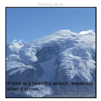
Example 1: Setting an Overlay Using a String
This example demonstrates how to set an overlay using a string.
// xxx.ets
@Entry
@Component
struct OverlayExample {
  build() {
    Column() {
      Column() {
        Text('floating layer')
          .fontSize(12).fontColor(0xCCCCCC).maxLines(1)
        Column() {
          Image($r('app.media.img'))
            .width(240).height(240)
            .overlay("Winter is a beautiful season, especially when it snows.", {
              align: Alignment.Bottom,
              offset: { x: 0, y: -15 }
            })
        }.border({ color: Color.Black, width: 2 })
      }.width('100%')
    }.padding({ top: 20 })
  }
}
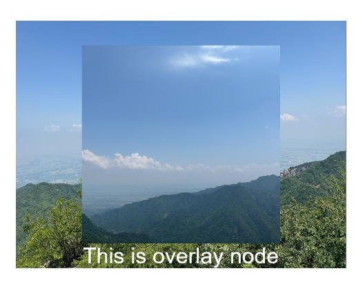
Example 2: Setting an Overlay Using a Custom Builder
This example demonstrates how to set an overlay using a custom builder.
// xxx.ets
@Entry
@Component
struct OverlayExample {
  @Builder OverlayNode() {
    Column() {
      Image($r('app.media.img1'))
      Text("This is overlayNode").fontSize(20).fontColor(Color.White)
    }.width(180).height(180).alignItems(HorizontalAlign.Center)
  }

  build() {
    Column() {
      Image($r('app.media.img2'))
        .overlay(this.OverlayNode(), { align: Alignment.Center })
        .objectFit(ImageFit.Contain)
    }.width('100%')
    .border({ color: Color.Black, width: 2 }).padding(20)
  }
}
Example 3: Setting an Overlay Using ComponentContent
This example demonstrates how to use ComponentContent to dynamically change the background color of the overlay.
// xxx.ets
import { ComponentContent } from '@kit.ArkUI';

class Params{
  backgroundColor: string|Resource = ""
  constructor(backgroundColor: string|Resource) {
    this.backgroundColor = backgroundColor;
  }
}

@Builder
function overlayBuilder(params: Params){
  Row(){
  }.width('100%').height('100%').backgroundColor(params.backgroundColor)
}

@Entry
@Component
struct Page_4040 {
  @State overlayColor: string = 'rgba(0, 0, 0, 0.6)';
  private uiContext: UIContext = this.getUIContext();
  private overlayNode: ComponentContent<Params> = new ComponentContent(this.uiContext, wrapBuilder(overlayBuilder), new Params(this.overlayColor))

  aboutToAppear(): void {
    setInterval(() => {
      if (this.overlayColor.includes('0.6')) {
        this.overlayColor = 'rgba(0, 0, 0, 0.1)'
        this.overlayNode.update(new Params(this.overlayColor));
      } else {
        this.overlayColor = 'rgba(0, 0, 0, 0.6)'
        this.overlayNode.update(new Params(this.overlayColor));
      }
    }, 1000)
  }

  build() {
    Row() {
      Column(){
        Text(this.overlayColor)
          .fontSize(40)
          .fontWeight(FontWeight.Bold)
      }
      .width('100%')
    }
    .height('100%')
    .overlay(this.overlayNode)
  }
}

你可能感兴趣的鸿蒙文章
- 所属分类: 后端技术
- 本文标签:
热门推荐
-
2、 优质文章
-
3、 gt
-
7、 openharmony
-
9、 golang
-
10、 Vue中input框自动聚焦