harmony 鸿蒙Focus Event
Focus Event
Basic Concepts and Specifications
Basic Concepts
Focus, Focus Chain, and Focus Traversal
- Focus: refers to the single interactive element on the current application screen. When users interact indirectly with the application using non-pointing input devices such as keyboards, TV remote controls, or in-car joysticks/knobs, navigation and interaction based on focus are crucial means of input.
- Focus chain: refers to the sequence of nodes from the root to a focused component in the application’s component tree, where all nodes are considered focused.
- Focus traversal: refers to the behavior of focus shifting between components in an application. This process is transparent to the user but can be monitored through onFocus and onBlur events. For details on how focus traversal is managed, see Focus Traversal Guidelines
Focus State
Refers to the style indicating the currently focused component.
- Display rules: The focus state is not displayed by default; it only appears when the application is active. A component with the focus state is definitely focused, but not all focused components show the state, depending on the activation status. Most components come with default focus state styles; you customize these styles when needed. Once customized, the component will no longer display the default focus state style. For details about how to set the focus state style, see Focus Style. In a focus chain, if multiple components have the focus state, the system shows the focus state for only one, prioritizing the child component’s focus state over others.
- Entering the activation state: Pressing the Tab key on an external keyboard or using the activate(true) API of FocusController activates focus, allowing subsequent use of the Tab key or arrow keys for focus traversal. The initial Tab press that activates focus does not cause focus to move.
- Exiting the activation state: Focus activation ends when the application receives either the activate(true) API call from FocusController or any form of click event, such as touchscreen presses or mouse clicks.
@Entry
@Component
struct FocusActiveExample {
  build() {
    Column() {
      Button('Set Active').width(140).height(45).margin(5).onClick(() => {
        this.getUIContext().getFocusController().activate(true, true);
      })
      Button('Set Not Active').width(140).height(45).margin(5).onClick(() => {
        this.getUIContext().getFocusController().activate(false, true);
      })
    }.width('100%')
  }
}
When the Tab key is pressed, the focus state is activated. Clicking the mouse button exits the focus state.

The activate API is used to enter and exit the focus activation state.
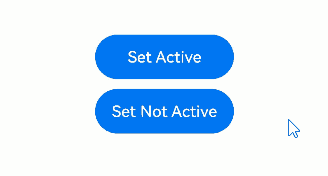
Example steps: 1. Click Set Active and call the activate API to enter the focus activation state. 2. Use the Tab key to move the focus to the Set Not Active button, and then press the Enter key to trigger the key event and call the activate API to exit the focus activation state.
Hierarchical Pages
Hierarchical pages are specialized container components, such as Page, Dialog, SheetPage, ModalPage, Menu, Popup, NavBar, and NavDestination, within a focus framework. These components typically have the following key features:
- Visual layering: They appear on top of other content, creating a distinct visual hierarchy.
- Focus capture: They automatically take focus when first displayed.
- Focus limitation: When focus is within these components, users cannot use keyboard keys to move focus outside to other elements. In other words, focus movement is confined within the component.
An application always has at least one hierarchical page in focus. When this hierarchical page is closed or no longer visible, the focus shifts to another, ensuring smooth user interaction.
NOTE
The Popup component does not capture focus if it has focusable set to false.
The NavBar and NavDestination components do not restrict focus movement and share the focus scope of their immediate parent hierarchical page.
Root Container
In hierarchical pages, the root container is where the default focus resides when the page is first shown.
You can change the default focus using the defaultFocus attribute.
Pressing Tab with focus on the root container activates focus and passes it to child components. Focus proceeds to the last focused child or the first child if no previous focus exists, until it reaches the leaf node.
Focus Traversal Guidelines
Focus traversal can be divided into active and passive based on how it is triggered.
Active Focus Traversal
Active focus traversal refers to focus movement initiated by deliberate actions, such as keyboard shortcuts (Tab, Shift+Tab, arrow keys) and programmatic focus control through requestFocus, clearFocus, and focusOnTouch.
Keyboard traversal
Prerequisite: The application is in the focus activation state.
Scope: limited to the currently focused hierarchical page, as detailed in the “Focus limitation” section under “Hierarchical Pages.”
Key types: Tab key: follows a Z-shaped logic to traverse all leaf nodes within the scope, looping back to the first after the last. Shift+Tab: reverses the direction of the Tab key. Arrow keys (up, down, left, and right): moves focus in a cross-shaped pattern, with container-specific algorithms determining the next focus in a single-layer container. If the algorithm determines the next focus should be on a container component, the system uses a center-point distance priority algorithm to further identify the target child node within the container.
Traversal algorithm: Each focusable container has a unique algorithm defining how focus moves.
Priority: Child components take precedence in handling keyboard events over parents.
requestFocus Moves focus to a specific component, which is allowed across hierarchical pages but not across windows or different ArkUI instances. For details, see Active Focus Acquisition/Loss.
clearFocus Clears the focus within the current hierarchical page, with the focus reverting to the root container. For details, see clearFocus.
focusOnTouch Enables a component to gain focus on touch. It is ineffective on non-focusable components. For container components, focus goes to the last focused child or the first focusable child upon touch. For details, see focusOnTouch.
Passive Focus Traversal
Passive focus traversal occurs when the focus automatically shifts due to system actions or other operations without developer intervention, reflecting the default behavior of the focus system.
Mechanisms that trigger passive focus traversal include:
- Component removal: If a focused component is removed, the system tries to shift focus to the next available sibling, following a back-to-front order. If no siblings are focusable, focus is released to the parent component.
- Attribute change: Changing a component’s focusable or enabled to false, or visibility to invisible causes the system to automatically move focus to another focusable component, using the same method as for component removal.
- Hierarchical page transition: During switching between hierarchical pages, the current page’s focus is automatically released, and the new page may automatically gain focus according to preset logic.
- Web component initialization: The Web component may immediately gain focus upon creation if designed to do so (for example, certain dialog boxes or text boxes), which is part of the component’s behavior and not governed by the focus framework specifications.
Focus Traversal Algorithms
In the focus management system, every focusable container is assigned a specific algorithm that dictates how focus moves from the current to the next focusable child component when Tab, Shift+Tab, or arrow keys are used.
The algorithm used by a container is based on its UX design and is implemented by the component itself. The focus framework supports three focus traversal algorithms: linear, projection, and custom.
Linear Focus Traversal Algorithm
The linear focus traversal algorithm is the default algorithm, focusing on the order of child nodes in the node tree, commonly used in single-direction layouts such as Row, Column, and Flex containers. Its operation rules are as follows:
- Order dependency: The focus order is based solely on the mounting sequence of child nodes in the node tree, independent of their visual layout.
- Tab key focus traversal: The Tab key moves focus through focusable elements in the order they are mounted in the component tree.
- Arrow key focus traversal: Arrow keys perpendicular to the container’s layout direction are ignored. For example, a horizontal Row container does not accept focus requests from up and down keys.
- Boundary handling: The container rejects focus requests in the opposite direction from the current focus edge. For example, if the focus is on the first child of a horizontal Row container, it won’t process leftward focus requests.
@Entry
@Component
struct FocusLinerExample {
  build() {
    Column() {
      Column() {
        Button("Column Button1")
          .width(150)
          .height(45)
          .fontColor(Color.White)
          .margin(10)
        Button("Column Button2")
          .width(150)
          .height(45)
          .fontColor(Color.White)
          .margin(10)
      }
      .margin(10)

      Row() {
        Button("Row Button1")
          .width(150)
          .height(45)
          .fontColor(Color.White)
          .margin(10)
        Button("Row Button2")
          .width(150)
          .height(45)
          .fontColor(Color.White)
          .margin(10)
      }
    }
  }
}
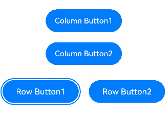
Pressing the Tab key moves focus through focusable elements in the order they are mounted in the component tree.
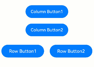
In a vertical Column container, you can use the up and down arrow keys to navigate between focusable elements. The left and right arrow keys are not applicable.
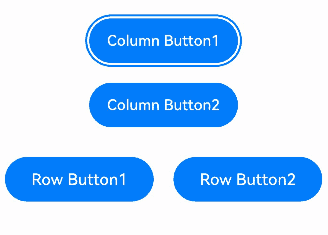
In a horizontal Row container, use the left and right arrow keys to navigate between focusable elements. The up and down arrow keys are not applicable.
Projection-based Focus Traversal Algorithm
The projection-based focus traversal algorithm determines the next focus based on the overlap area and center-point distance of the projection of the current focused component in the direction of focus movement. It is particularly suitable for containers with varying child sizes, such as the Flex component with the wrap attribute. Its operation rules are as follows:
- Arrow keys: Focus goes to the child with the largest overlap area and the shortest center-point distance to the projection of the current focus. If multiple children qualify, the first in the node tree is chosen. If no components overlap with the projection, the focus request is unprocessable.
- Tab key: It mimics a rightward shift to find the next focus; if none is available, it simulates moving the current focus down its height, and then checks leftward. The child farthest in the direction with overlapping projection wins.
- Shift+Tab key: It mimics a leftward shift to find the next focus; if none is available, it simulates moving the current focus up its height, and then checks rightward. The child farthest in the direction with overlapping projection wins.
@Entry
@Component
struct ProjectAreaFocusExample {
  build() {
    Column() {
      Column({ space: 5 }) {
        Text('Wrap').fontSize(12).width('90%')
        // Multi-line layout for child components
        Flex({ wrap: FlexWrap.Wrap }) {
          Button('1').width(140).height(50).margin(5)
          Button('2').width(140).height(50).margin(5)
          Button('3').width(140).height(50).margin(5)
          Button('4').width(140).height(50).margin(5)
          Button('5').width(140).height(50).margin(5)
        }
        .width('90%')
        .padding(10)
      }.width('100%').margin({ top: 5 })
    }.width('100%')
  }
}
NOTE
- The focus order calculated by the projection-based focusing algorithm is closely related to the component layout and size. It is recommended for use in scenarios where components are arranged in a regular and uniform manner. If components have varying sizes and overlap horizontally or vertically, the resulting focus order may deviate from the expected sequence.
- If a clear focus order is required, it is recommended that you use containers that support sequential focusing, such as Column or Row.
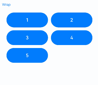
When the components in a Flex multi-line layout have uniform sizes, the focus traversal works as expected.
@Entry
@Component
struct ProjectAreaFocusExample2 {
  build() {
    Column() {
      Column({ space: 5 }) {
        Text('Wrap').fontSize(12).width('90%')
        // Multi-line layout for child components
        Flex({ wrap: FlexWrap.Wrap }) {
          Button('1').width(145).height(50).margin(5)
          Button('2').width(145).height(50).margin(5)
          Button('3').width(150).height(50).margin(5)
          Button('4').width(160).height(50).margin(5)
          Button('5').width(170).height(50).margin(5)
        }
        .width('90%')
        .padding(10)
      }.width('100%').margin({ top: 5 })
    }.width('100%')
  }
}
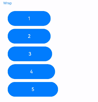
When components in a Flex multi-line layout have varying sizes and overlap vertically, the Tab key focus traversal fails to reach the buttons labeled 3, 4, and 5 in the lower row.
Custom Focus Traversal Algorithm
The custom focus traversal algorithm is defined by the component itself, allowing for specific focus traversal behaviors as determined by the component’s design specifications.
onFocus/onBlur Events
onFocus(event: () => void)
Triggered when the bound component obtains focus.
onBlur(event:() => void)
Triggered when the bound component loses focus.
The onFocus and onBlur APIs are usually used in pairs to listen for the focus changes of the component.
// xxx.ets
@Entry
@Component
struct FocusEventExample {
  @State oneButtonColor: Color = Color.Gray;
  @State twoButtonColor: Color = Color.Gray;
  @State threeButtonColor: Color = Color.Gray;

  build() {
    Column({ space: 20 }) {
      // You can use the up and down arrow keys on an external keyboard to move the focus between the three buttons. When a button gains focus, its color changes. When it loses focus, its color changes back.
      Button('First Button')
        .width(260)
        .height(70)
        .backgroundColor(this.oneButtonColor)
        .fontColor(Color.Black)
          // Listen for the focus obtaining event of the first component and change its color when it obtains focus.
        .onFocus(() => {
          this.oneButtonColor = Color.Green;
        })
          // Listen for the focus loss event of the first component and change its color when it loses focus.
        .onBlur(() => {
          this.oneButtonColor = Color.Gray;
        })

      Button('Second Button')
        .width(260)
        .height(70)
        .backgroundColor(this.twoButtonColor)
        .fontColor(Color.Black)
          // Listen for the focus obtaining event of the second component and change its color when it obtains focus.
        .onFocus(() => {
          this.twoButtonColor = Color.Green;
        })
          // Listen for the focus loss event of the second component and change its color when it loses focus.
        .onBlur(() => {
          this.twoButtonColor = Color.Grey;
        })

      Button('Third Button')
        .width(260)
        .height(70)
        .backgroundColor(this.threeButtonColor)
        .fontColor(Color.Black)
          // Listen for the focus obtaining event of the third component and change its color when it obtains focus.
        .onFocus(() => {
          this.threeButtonColor = Color.Green;
        })
          // Listen for the focus loss event of the third component and change its color when it loses focus.
        .onBlur(() => {
          this.threeButtonColor = Color.Gray ;
        })
    }.width('100%').margin({ top: 20 })
  }
}
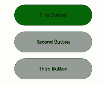
The preceding example includes three steps:
- When the application is opened, pressing the Tab key activates focus traversal, First Button displays a focus state style – a blue bounding box around the component – and its onFocus callback is triggered, changing the background color to green.
- When the Tab key is pressed again, Second Button gains focus, triggering its onFocus callbacktriggered, and its background color turns green, while First Button loses focus, triggering its onBlur callback, and its background color reverts to gray.
- A subsequent Tab key press causes Third Button to gain focus, triggering its onFocus callback, and its background color turns green. Concurrently, Second Button loses focus, triggering its onBlur callback, and its background color reverts to gray.
When both parent and child nodes have focus acquisition and loss events simultaneously, the order of event responses is as follows:
Parent node Row1 loses focus -> Child node Button1 loses focus -> Child node Button2 gains focus -> Parent node Row2 gains focus
@Entry
@Component
struct FocusAndBlurExample {
  build() {
    Column() {
      Column({ space: 5 }) {
        Row() { // Parent node Row1
          Button('Button1') // Child node Button1
            .width(140)
            .height(45)
            .margin(5)
            .onFocus(() => {
              console.log("Button1 onFocus");
            })
            .onBlur(() => {
              console.log("Button1 onBlur");
            })
        }
        .onFocus(() => {
          console.log("Row1 onFocus");
        })
        .onBlur(() => {
          console.log("Row1 onBlur");
        })

        Row() { // Parent node Row2
          Button('Button2') // Child node Button2
            .width(140)
            .height(45)
            .margin(5)
            .onFocus(() => {
              console.log("Button2 onFocus");
            })
            .onBlur(() => {
              console.log("Button2 onBlur");
            })
        }
        .onFocus(() => {
          console.log("Row2 onFocus");
        })
        .onBlur(() => {
          console.log("Row2 onBlur");
        })
      }.width('100%').margin({ top: 5 })
    }.width('100%')
  }
}
When focus moves from Button1 to Button2, the log printing order is as follows:
Row1 onBlur
Button1 onBlur
Button2 onFocus
Row2 onFocus
Setting Whether a Component Is Focusable
focusable(value: boolean)
Sets whether the component is focusable.
Components can be classified into the following types based on their focus capability:
Default focusable components: These components are usually interactive components, such as Button, Checkbox, and TextInput.
Components with focus capability but not focusable by default: Typical examples are Text and Image. To enable them to be focusable, set focusable(true). When these components do not have the focusable attribute set, setting an onClick event or a single-tap gesture implicitly makes them focusable. However, when these components have the focusable attribute set to false, they are still not focusable even if you bind the aforementioned event or gesture to them.
Non-focusable components: Components that do not allow for interactions, such as Blank and Circle, cannot be made focusable, even with the focusable attribute applied.
enabled(value: boolean)
Sets the component’s interactivity. If enabled is set to false, the component becomes non-interactive and cannot gain focus.
visibility(value: Visibility)
Sets the component’s visibility. If visibility set to Visibility.None or Visibility.Hidden, the component becomes invisible and cannot gain focus.
focusOnTouch(value: boolean)
Sets whether the component is focusable on touch.
NOTE
When a component that is currently focused has its focusable or enabled attribute set to false, it automatically loses focus. The focus then shifts to another component according to the Focus Traversal Guidelines.
// xxx.ets
@Entry
@Component
struct FocusableExample {
@State textFocusable: boolean = true;
@State textEnabled: boolean = true;
@State color1: Color = Color.Yellow;
@State color2: Color = Color.Yellow;
@State color3: Color = Color.Yellow;
build() {
Column({ space: 5 }) {
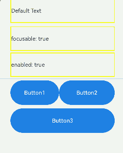
Text('Default Text') // The first Text component does not have the focusable attribute set, and is not focusable by default.
.borderColor(this.color1)
.borderWidth(2)
.width(300)
.height(70)
.onFocus(() => {
this.color1 = Color.Blue;
})
.onBlur(() => {
this.color1 = Color.Yellow;
})
Divider()
Text('focusable: ' + this.textFocusable) // The second Text component initially has focusable set to true and focusableOnTouch true.
.borderColor(this.color2)
.borderWidth(2)
.width(300)
.height(70)
.focusable(this.textFocusable)
.focusOnTouch(true)
.onFocus(() => {
this.color2 = Color.Blue;
})
.onBlur(() => {
this.color2 = Color.Yellow;
})
Text('enabled: ' + this.textEnabled) // The third Text component has focusable set to true, enabled initially true.
.borderColor(this.color3)
.borderWidth(2)
.width(300)
.height(70)
.focusable(true)
.enabled(this.textEnabled)
.focusOnTouch(true)
.onFocus(() => {
this.color3 = Color.Blue;
})
.onBlur(() => {
this.color3 = Color.Yellow;
})
Divider()
Row() {
Button('Button1')
.width(140).height(70)
Button('Button2')
.width(160).height(70)
}
Divider()
Button('Button3')
.width(300).height(70)
Divider()
}.width('100%').justifyContent(FlexAlign.Center)
.onKeyEvent((e) => {
// Bind onKeyEvent. When this Column component has focus, pressing F will toggle the focusable state of the second Text component.
if (e.keyCode === 2022 && e.type === KeyType.Down) {
this.textFocusable = !this.textFocusable;
}
// Bind onKeyEvent. When this Column component has focus, pressing G will toggle the enabled state of the third Text component.
if (e.keyCode === 2023 && e.type === KeyType.Down) {
this.textEnabled = !this.textEnabled;
}
})
}
}
Operation result:
The preceding example includes three steps:
- As the first Text component does not have focusable(true) set, it is not focusable.
- The second Text component is set with focusOnTouch(true), allowing it to gain focus on touch. Pressing the Tab key triggers focus traversal, but the focus remains on the second component. When the F key is pressed, the onKeyEvent callback toggles focusable to false, making the second Text component not focusable, and the focus shifts to the next available focusable component, which is the third Text component.
- Pressing the G key triggers the onKeyEvent callback, which sets enabled to false, making the third Text component not focusable. The focus then automatically moves to the Row container, where the default configuration causes the focus to shift to Button1.
Setting the Focus Box for a Container
Although container components can gain focus, they are unable to draw a focus box by themselves. To enable focus box drawing for a container, you can configure an onClick event or a single-finger tap gesture on the container.
NOTE
Prerequisites for drawing a focus box on a container: - The container has no focusable child nodes. - The container has an onClick event or a single-finger tap gesture configured. - The container itself does not have the focusable attribute set, or the focusable attribute is set after the onClick event or single-finger tap gesture is configured.
@Entry
@Component
struct ScopeFocusExample {
  @State scopeFocusState: boolean = true;

  build() {
    Column() {
      Column({ space: 5 }) {
        Text("Container focus").textAlign(TextAlign.Center)
      }
      .justifyContent(FlexAlign.Center)
      .width('80%')
      .height(50)
      .margin({ top: 5, bottom: 5 })
      .onClick(() => {
      })
      .focusable(this.scopeFocusState)

      Button('Button1')
        .width(140)
        .height(45)
        .margin(5)
        .onClick(() => {
          this.scopeFocusState = !this.scopeFocusState;
          console.log("Button1 onFocus");
        })
      Button('Button2')
        .width(140)
        .height(45)
        .margin(5)
    }.width('100%')
  }
}
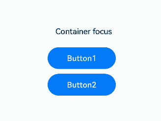
The preceding example includes two steps: - After the onClick event and focusable is set to true for the Column container, the container can draw a focus box when the Tab key is used for focus traversal. - When Button1 is clicked, the focusable attribute of the Column container is set to false, preventing the container from gaining focus and drawing a focus box.
Setting Focus to Stop on a Container
tabStop(isTabStop: boolean)
Use the tabStop API to control whether the focus will stop on the container during focus traversal.
@Entry
@Component
struct TabStopExample {
  build() {
    Column({ space: 20 }) {
      Button('Button1')
        .width(140)
        .height(45)
        .margin(5)
      Column() {
        Button('Button2')
          .width(140)
          .height(45)
          .margin(5)
        Button('Button3')
          .width(140)
          .height(45)
          .margin(5)
      }.tabStop(true)
    }.width('100%')
  }
}
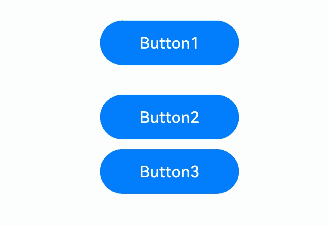
The preceding example includes two steps: - When tabStop is set to true on the Column component, pressing the Tab key will cycle focus between Button1 and the Column container. The Column container shows a focus box when it gains focus. - Once the Column container gains focus, pressing Enter moves the focus to the first focusable element inside the container. Further Tab key presses will move focus through other focusable elements within the container.
Default Focus
Default Focus on a Page
defaultFocus(value: boolean)
Specifies whether to set the component as the default focus of the page.
// xxx.ets
@Entry
@Component
struct morenjiaodian {
  @State oneButtonColor: Color = Color.Gray;
  @State twoButtonColor: Color = Color.Gray;
  @State threeButtonColor: Color = Color.Gray;

  build() {
    Column({ space: 20 }) {
      // You can use the up and down arrow keys on an external keyboard to move the focus between the three buttons. When a button gains focus, its color changes. When it loses focus, its color changes back.
      Button('First Button')
        .width(260)
        .height(70)
        .backgroundColor(this.oneButtonColor)
        .fontColor(Color.Black)
          // Listen for the focus obtaining event of the first component and change its color when it obtains focus.
        .onFocus(() => {
          this.oneButtonColor = Color.Green;
        })
          // Listen for the focus loss event of the first component and change its color when it loses focus.
        .onBlur(() => {
          this.oneButtonColor = Color.Gray;
        })

      Button('Second Button')
        .width(260)
        .height(70)
        .backgroundColor(this.twoButtonColor)
        .fontColor(Color.Black)
          // Listen for the focus obtaining event of the second component and change its color when it obtains focus.
        .onFocus(() => {
          this.twoButtonColor = Color.Green;
        })
          // Listen for the focus loss event of the second component and change its color when it loses focus.
        .onBlur(() => {
          this.twoButtonColor = Color.Grey;
        })

      Button('Third Button')
        .width(260)
        .height(70)
        .backgroundColor(this.threeButtonColor)
        .fontColor(Color.Black)
          // Set the default focus.
        .defaultFocus(true)
          // Listen for the focus obtaining event of the third component and change its color when it obtains focus.
        .onFocus(() => {
          this.threeButtonColor = Color.Green;
        })
          // Listen for the focus loss event of the third component and change its color when it loses focus.
        .onBlur(() => {
          this.threeButtonColor = Color.Gray ;
        })
    }.width('100%').margin({ top: 20 })
  }
}

The preceding example includes two steps:
- The defaultFocus(true) is set on the third Button component, which means it gains focus by default when the page is loaded, displaying in green.
- Pressing the Tab key triggers focus traversal, and since the third Button component is in focus, a focus frame appears around it.
Default Focus for Containers
The default focus within a container is affected by focus priority.
Differences Between defaultFocus and FocusPriority
defaultFocus specifies the initial focus when the page loads. FocusPriority defines the order in which child components gain focus within a container. Behavior is undefined when both attributes are set in some scenarios. For example, a page’s initial display cannot simultaneously meet the focus requirements of a component with **defaultFocus **and a high-priority component.
Example
@Entry
@Component
struct Index {
  build() {
    Row() {
      Button('Button1')
        .defaultFocus(true)
      Button('Button2')
        .focusScopePriority('RowScope', FocusPriority.PREVIOUS)
    }.focusScopeId('RowScope')
  }
}
Focus Chain for Pages/Containers
Overall Focus and Non-Overall Focus
Overall focus: The entire page or container gains focus first, then the focus shifts to its child components. Examples include page transitions, route switches within Navigation components, focus group traversal, and when a container component proactively calls requestFocusById.
Non-overall focus: A specific component gains focus, pulling its parent components into focus. Examples include a TextInput component proactively obtaining focus or using the Tab key for traversal in non-focus group.
Formation of the Focus Chain in Overall Focus
Initial page focus:
The leaf node of the focus chain is the node with defaultFocus set.
If no defaultFocus is configured, the focus remains on the page’s root container.
Subsequent page focus: Focus is gained by the node that last held focus.
Focus chain with priority configuration:
If a container has a component with a focus priority higher than PREVIOUS, the component with the highest priority gains focus.
If no component with a priority higher than PREVIOUS exists, the last focused node regains focus, such as when a window refocuses after being out of focus.
Focus Style
NOTE
When a component is in the focused state, its zIndex value is automatically elevated to INT_MAX to ensure that it is rendered above other components. If the component already has a specified zIndex value, this value will not be adjusted. When the component exits the focused state (for example, loses focus or leaves the focus chain), its zIndex value will revert to its original settings.
focusBox(style: FocusBoxStyle)
Sets the system focus box style for the component.
import { ColorMetrics, LengthMetrics } from '@kit.ArkUI'

@Entry
@Component
struct RequestFocusExample {
  build() {
    Column({ space: 30 }) {
      Button("small black focus box")
        .focusBox({
          margin: new LengthMetrics(0),
          strokeColor: ColorMetrics.rgba(0, 0, 0),
        })
      Button("large red focus box")
        .focusBox({
          margin: LengthMetrics.px(20),
          strokeColor: ColorMetrics.rgba(255, 0, 0),
          strokeWidth: LengthMetrics.px(10)
        })
    }
    .alignItems(HorizontalAlign.Center)
    .width('100%')
  }
}
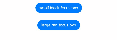
The preceding example includes two steps:
- After the page opens, pressing the Tab key initiates focus traversal. The first Button gains focus, displaying a small, black focus box that is closely fitted to the edge.
- Pressing the Tab key again shifts focus to the second Button, which features a large, red focus box with a thicker stroke and a more significant margin from the edge.
Active Focus Acquisition/Loss
- Using FocusController APIs
You are advised to use requestFocus from FocusController for actively acquiring focus. It provides the following benefits: - Takes effect in the current frame, preventing interference from subsequent component tree changes. - Provides exception handling, aiding in troubleshooting focus acquisition issues. - Prevents errors in multi-instance scenarios by avoiding incorrect instance retrieval.
You must first obtain an instance using the getFocusController() API in UIContext and then use this instance to call the corresponding methods.
requestFocus(key: string): void
Transfers focus to a component node by the component ID, which is effective immediately.
clearFocus(): void
Clears the focus and forcibly moves the focus to the root container node of the page, causing other nodes in the focus chain to lose focus.
- Using focusControl APIs
ts
requestFocus(value: string): boolean
Moves focus to a specified component, with the change taking effect in the next frame.
// focusTest.ets
@Entry
@Component
struct RequestExample {
  @State btColor: string = '#ff2787d9'
  @State btColor2: string = '#ff2787d9'

  build() {
    Column({ space: 20 }) {
      Column({ space: 5 }) {
        Button('Button')
          .width(200)
          .height(70)
          .fontColor(Color.White)
          .focusOnTouch(true)
          .backgroundColor(this.btColor)
          .onFocus(() => {
            this.btColor = '#ffd5d5d5'
          })
          .onBlur(() => {
            this.btColor = '#ff2787d9'
          })
          .id("testButton")

        Button('Button')
          .width(200)
          .height(70)
          .fontColor(Color.White)
          .focusOnTouch(true)
          .backgroundColor(this.btColor2)
          .onFocus(() => {
            this.btColor2 = '#ffd5d5d5'
          })
          .onBlur(() => {
            this.btColor2 = '#ff2787d9'
          })
          .id("testButton2")

        Divider()
          .vertical(false)
          .width("80%")
          .backgroundColor('#ff707070')
          .height(10)

        Button('FocusController.requestFocus')
          .width(200).height(70).fontColor(Color.White)
          .onClick(() => {
            this.getUIContext().getFocusController().requestFocus("testButton")
          })
          .backgroundColor('#ff2787d9')

        Button("focusControl.requestFocus")
          .width(200).height(70).fontColor(Color.White)
          .onClick(() => {
            focusControl.requestFocus("testButton2")
          })
          .backgroundColor('#ff2787d9')

        Button("clearFocus")
          .width(200).height(70).fontColor(Color.White)
          .onClick(() => {
            this.getUIContext().getFocusController().clearFocus()
          })
          .backgroundColor('#ff2787d9')
      }
    }
    .width('100%')
    .height('100%')
  }
}
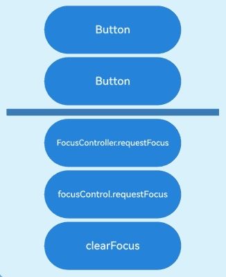
The preceding example includes three steps:
- When the FocusController.requestFocus button is clicked, the first button gains focus.
- When the focusControl.requestFocus button is clicked, the second button gains focus.
- When the clearFocus button is clicked, the second button loses focus.
Customizing the Tab Focus Order
tabIndex(index: number)
Use tabIndex to control the order in which components receive focus when the Tab key is used for focus traversal.
When components with positive tabIndex values are present, only these components are reachable through sequential focus navigation, and they are navigated cyclically in ascending order based on the tabIndex value. When components with positive tabIndex values are not present, those components with a tabIndex value of 0 are navigated based on the preset focus navigation rule.
NOTE
tabIndex and focusScopeId cannot be both set on the same component.
@Entry
@Component
struct TabIndexExample {
  build() {
    Column() {
      Button('Button1')
        .width(140)
        .height(45)
        .margin(5)
      Button('Focus Button1')
        .width(140)
        .height(45)
        .margin(5).tabIndex(1)
      Button('Button2')
        .width(140)
        .height(45)
        .margin(5)
      Button('Focus Button2')
        .width(140)
        .height(45)
        .margin(5).tabIndex(2)
    }.width('100%')
  }
}
Pressing the Tab key moves focus only between components with tabIndex values.
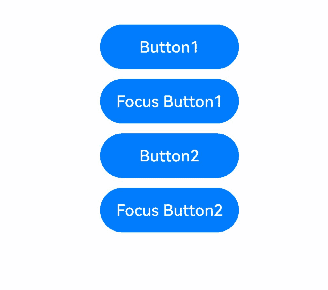
When tabIndex is set on a container: If no child component has ever gained focus, focus goes to the first focusable child component; otherwise, focus goes to the last child that previously had focus.
@Entry
@Component
struct TabIndexExample2 {
  build() {
    Column() {
      Button('Focus Button1')
        .width(140)
        .height(45)
        .margin(5).tabIndex(1)
      Column() {
        Button('Button1')
          .width(140)
          .height(45)
          .margin(5)
        Button('Button2')
          .width(140)
          .height(45)
          .margin(5)
      }.tabIndex(2)
    }.width('100%')
  }
}
Tab focus traversal with tabIndex on a container
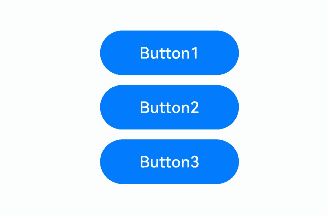
The preceding example includes three steps:
- When the Tab key is pressed, focus moves between Button1 and Button2 (as their parent container has tabIndex set).
- When focus is on Button2, using the down arrow key moves focus to Button3.
- When the Tab key is used for focus traversal, focus moves between Button1 and Button3.
Focus Group and Focus Priority
focusScopePriority(scopeId: string, priority?: FocusPriority)
Sets the focus priority of this component in a specified container. It must be used together with focusScopeId.
focusScopeId(id: string, isGroup?: boolean)
Assigns an ID to this container component and specifies whether the container is a focus group. Focus groups should not be mixed with tabIndex usage.
// focusTest.ets
@Entry
@Component
struct FocusableExample {
  @State inputValue: string = ''

  build() {
    Scroll() {
      Row({ space: 20 }) {
        Column({ space: 20 }) {  // Labeled as Column1.
          Column({ space: 5 }) {
            Button('Group1')
              .width(165)
              .height(40)
              .fontColor(Color.White)
            Row({ space: 5 }) {
              Button()
                .width(80)
                .height(40)
                .fontColor(Color.White)
              Button()
                .width(80)
                .height(40)
                .fontColor(Color.White)
            }
            Row({ space: 5 }) {
              Button()
                .width(80)
                .height(40)
                .fontColor(Color.White)
              Button()
                .width(80)
                .height(40)
                .fontColor(Color.White)
            }
          }.borderWidth(2).borderColor(Color.Red).borderStyle(BorderStyle.Dashed)
          Column({ space: 5 }) {
            Button('Group2')
              .width(165)
              .height(40)
              .fontColor(Color.White)
            Row({ space: 5 }) {
              Button()
                .width(80)
                .height(40)
                .fontColor(Color.White)
              Button()
                .width(80)
                .height(40)
                .fontColor(Color.White)
                .focusScopePriority('ColumnScope1', FocusPriority.PRIOR) // Focuses when Column1 first gains focus.
            }
            Row({ space: 5 }) {
              Button()
                .width(80)
                .height(40)
                .fontColor(Color.White)
              Button()
                .width(80)
                .height(40)
                .fontColor(Color.White)
            }
          }.borderWidth(2).borderColor(Color.Green).borderStyle(BorderStyle.Dashed)
        }
        .focusScopeId('ColumnScope1')
        Column({ space: 5 }) {  // Labeled as Column2.
          TextInput({placeholder: 'input', text: this.inputValue})
            .onChange((value: string) => {
              this.inputValue = value
            })
            .width(156)
          Button('Group3')
            .width(165)
            .height(40)
            .fontColor(Color.White)
          Row({ space: 5 }) {
            Button()
              .width(80)
              .height(40)
              .fontColor(Color.White)
            Button()
              .width(80)
              .height(40)
              .fontColor(Color.White)
          }
          Button()
            .width(165)
            .height(40)
            .fontColor(Color.White)
            .focusScopePriority('ColumnScope2', FocusPriority.PREVIOUS)  // Focuses when Column2 first gains focus.
          Row({ space: 5 }) {
            Button()
              .width(80)
              .height(40)
              .fontColor(Color.White)
            Button()
              .width(80)
              .height(40)
              .fontColor(Color.White)
          }
          Button()
            .width(165)
            .height(40)
            .fontColor(Color.White)
          Row({ space: 5 }) {
            Button()
              .width(80)
              .height(40)
              .fontColor(Color.White)
            Button()
              .width(80)
              .height(40)
              .fontColor(Color.White)
          }
        }.borderWidth(2).borderColor(Color.Orange).borderStyle(BorderStyle.Dashed)
        .focusScopeId('ColumnScope2', true) // Column2 is a focus group.
      }.alignItems(VerticalAlign.Top)
    }
  }
}
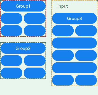
The preceding example includes two steps:
- The TextInput component is part of a focus group. When the Tab key is pressed, the focus quickly moves out of the TextInput component to the next focusable element outside the group. Arrow keys can be used to move focus within the TextInput component.
- The Column component in the upper left corner does not have a focus group set. Therefore, focus can only be traversed one by one with the Tab key.
In API version 14, you can use the arrowStepOut parameter on a focus group to specify whether focus can move out of the group using arrow keys.
focusScopeId(id: string, isGroup?: boolean, arrowStepOut?: boolean)
@Entry
@Component
struct FocusScopeIdExample {
  build() {
    Column({ space: 20 }) {
      Column() {
        Button('Group1')
          .width(165)
          .height(40)
          .margin(5)
          .fontColor(Color.White)
        Row({ space: 5 }) {
          Button("Button1")
            .width(80)
            .height(40)
            .margin(5)
            .fontColor(Color.White)
          Button("Button2")
            .width(80)
            .height(40)
            .margin(5)
            .fontColor(Color.White)
        }
      }.focusScopeId("1", true, true)
      .borderWidth(2).borderColor(Color.Red).borderStyle(BorderStyle.Dashed)

      TextInput()
      Column() {
        Button('Group2')
          .width(165)
          .height(40)
          .margin(5)
          .fontColor(Color.White)
        Row({ space: 5 }) {
          Button("Button3")
            .width(80)
            .height(40)
            .margin(5)
            .fontColor(Color.White)
          Button("Button4")
            .width(80)
            .height(40)
            .margin(5)
            .fontColor(Color.White)
        }
      }.focusScopeId("2", true, false)
      .borderWidth(2).borderColor(Color.Green).borderStyle(BorderStyle.Dashed)

      TextInput()
    }.width('100%')
  }
}
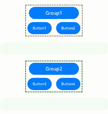
The preceding example includes three steps: - Group1 and Group2 are defined as focus groups using focusScopeId. When the Tab key is pressed, focus quickly moves between these groups, skipping over individual buttons within the groups. - Group1 is configured with arrowStepOut set to true, allowing focus to move out of the group using arrow keys. When focus is within Group1, arrow keys can be used to move focus to the TextInput component outside the group. - Group2 is configured with arrowStepOut set to false, preventing focus from moving out of the group using arrow keys. When focus is within Group2, arrow keys cannot be used to move focus to the TextInput component outside the group.
NOTE
The TextInput component has its own handling for arrow keys, so you cannot directly move focus out of it using arrow keys.
Focus and Key Events
When a component is in focus and has either an onClick or TapGesture event defined, pressing the Enter key or spacebar triggers the associated event callback.
NOTE
- If the onClick or TapGesture event is triggered by pressing the Enter key or spacebar, the event does not bubble up by default. This means that the parent component’s corresponding key event is not triggered synchronously.
- The key event (onKeyEvent) bubbles up by default, which means that it will also trigger the parent component’s key event callback.
- If the component has both an onClick event and an onKeyEvent, pressing the Enter key or spacebar trigger both events.
- The component’s response to the onClick event is independent of whether the focus is activated or not.
@Entry
@Component
struct FocusOnclickExample {
  @State count: number = 0
  @State name: string = 'Button'

  build() {
    Column() {
      Button(this.name)
        .fontSize(30)
        .onClick(() => {
          this.count++
          if (this.count <= 0) {
            this.name = "count is negative number"
          } else if (this.count % 2 === 0) {
            this.name = "count is even number"
          } else {
            this.name = "count is odd number"
          }
        }).height(60)
    }.height('100%').width('100%').justifyContent(FlexAlign.Center)
  }
}
Component Focusability
Table 1 Focusability of basic components
| Basic Component | Focusable | Default Value of focusable |
|---|---|---|
| AlphabetIndexer | Yes | true |
| Blank | No | false |
| Button | Yes | true |
| CalendarPicker | Yes | true |
| Checkbox | Yes | true |
| CheckboxGroup | Yes | true |
| ContainerSpan | No | false |
| DataPanel | Yes | false |
| DatePicker | Yes | true |
| Divider | Yes | false |
| Gauge | Yes | false |
| Image | Yes | false |
| ImageAnimator | No | false |
| ImageSpan | No | false |
| LoadingProgress | Yes | true |
| Marquee | No | false |
| Menu | Yes | true |
| MenuItem | Yes | true |
| MenuItemGroup | No | false |
| Navigation | Yes | true |
| NavRouter | No | false |
| NavDestination | Yes | true |
| PatternLock | Yes | true |
| Progress | Yes | true |
| QRCode | Yes | true |
| Radio | Yes | true |
| Rating | Yes | true |
| RichEditor | Yes | true |
| RichText | No | false |
| ScrollBar | No | false |
| Search | Yes | true |
| Select | Yes | true |
| Slider | Yes | true |
| Span | No | false |
| Stepper | Yes | true |
| StepperItem | Yes | true |
| SymbolSpan | No | false |
| SymbolGlyph | No | false |
| Text | Yes | false |
| TextArea | No | false |
| TextClock | No | false |
| TextInput | Yes | true |
| TextPicker | Yes | true |
| TextTimer | No | false |
| TimePicker | No | false |
| Toggle | Yes | true |
| XComponent | Yes | false |
Table 2 Focusability of container components
| Container Component | Focusable | Default Value of focusable |
|---|---|---|
| Badge | No | false |
| Column | Yes | true |
| ColumnSplit | Yes | true |
| Counter | Yes | false |
| EmbeddedComponent | No | false |
| Flex | Yes | true |
| FlowItem | Yes | true |
| FolderStack | Yes | true |
| FormLink | No | false |
| GridCol | Yes | true |
| GridRow | Yes | true |
| Grid | Yes | true |
| GridItem | Yes | true |
| Hyperlink | Yes | true |
| List | Yes | true |
| ListItem | Yes | true |
| ListItemGroup | Yes | true |
| Navigator | Yes | true |
| Refresh | Yes | true |
| RelativeContainer | No | false |
| Row | Yes | true |
| RowSplit | Yes | true |
| Scroll | Yes | true |
| SideBarContainer | Yes | true |
| Stack | Yes | true |
| Swiper | Yes | true |
| Tabs | Yes | true |
| TabContent | Yes | true |
| WaterFlow | No | false |
| WithTheme | Yes | true |
Table 3 Focusability of media components
| Media Component | Focusable | Default Value of focusable |
|---|---|---|
| Video | Yes | true |
你可能感兴趣的鸿蒙文章
harmony 鸿蒙Atomic Service Full Screen Launch Component (FullScreenLaunchComponent)
harmony 鸿蒙Arc Button (ArcButton)
harmony 鸿蒙Frame Animation (ohos.animator)
harmony 鸿蒙Implementing Property Animation
- 所属分类: 后端技术
- 本文标签:
热门推荐
-
2、 优质文章
-
3、 gt
-
7、 openharmony
-
9、 golang
-
10、 Vue中input框自动聚焦