harmony 鸿蒙Keyboard and Mouse Event
Keyboard and Mouse Event
Keyboard and mouse events refer to the input events of external keyboards and mouse devices.
Mouse Event
The supported mouse events include the events triggered by external mouse devices and touchpads.
Mouse events can trigger the following callbacks.
| Name | Description |
|---|---|
| onHover(event: (isHover: boolean) => void) | Triggered when the mouse pointer enters or leaves the component. isHover: whether the mouse pointer hovers over the component. The value true means that the mouse pointer enters the component, and the value false means that the mouse pointer leaves the component. |
| onMouse(event: (event?: MouseEvent) => void) | Triggered when the component is clicked by a mouse button or the mouse pointer moves over the component. The event parameter indicates the timestamp, mouse button, action, coordinates of the clicked point on the entire screen, and coordinates of the clicked point relative to the component when the event is triggered. |
When the component is bound to the onHover callback, you can use the hoverEffect attribute to set the hover effect of the component in hover state.
Figure 1 Mouse event data flow
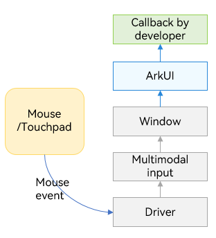
After a mouse event is passed to ArkUI, it is processed as follows:
If the event is a left-click (pressing, releasing, or moving): The mouse event is first converted into a touch event in the same position. Then the touch event undergoes hit testing, gesture recognition, and callback responses. Finally the mouse event undergoes its own hit testing and callback responses.
If the event is not a left-click: The event is only used for mouse-specific hit testing and callback responses.
NOTE
All single-finger touch events and gesture events may be triggered and responded to using the left-click. For example, to implement page redirection invoked by clicking a button with support for finger touches and left-clicks, you just need to bind an onClick event. If you want to implement different effects for the finger touch and the left-click, you can use the source parameter in the onClick callback to determine whether the current event is triggered by a finger or a mouse device.
onHover
onHover(event: (isHover: boolean) => void)
Triggered when the mouse pointer enters or leaves the component. The isHover parameter indicates whether the mouse pointer hovers over the component. This event does not support custom bubbling settings. By default, event bubbling occurs between parent and child components.
If this API is bound to a component, it is triggered when the mouse pointer enters the component from outside and the value of isHover is true, or when the mouse pointer leaves the component and the value of isHover is false.
NOTE
Event bubbling is an event propagation in the document object model (DOM) when an event is first handled by an element and then passed to its parent element for further processing.
// xxx.ets
@Entry
@Component
struct MouseExample {
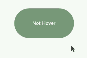
@State hoverText: string = 'Not Hover';
@State Color: Color = Color.Gray;
build() {
Column() {
Button(this.hoverText)
.width(200).height(100)
.backgroundColor(this.Color)
.onHover((isHover?: boolean) => { // Listen for whether the mouse cursor is hovered over the button.
if (isHover) {
this.hoverText = 'Hovered!';
this.Color = Color.Green;
}
else {
this.hoverText = 'Not Hover';
this.Color = Color.Gray;
}
})
}.width('100%').height('100%').justifyContent(FlexAlign.Center)
}
}
In this example, a Button component is created, with an initial gray background color and the content Not Hover. The component is bound to the onHover callback. In the callback, this.isHovered is set to the callback parameter isHover.
When the mouse pointer moves from outside the Button component to inside, the callback is invoked, setting the value of isHover to true. As a result, the background color of the component changes to Color.Green, and the content is updated to Hovered!.
When the mouse pointer moves from inside the Button component to outside, the callback is invoked again, setting the value of isHover to false. The component then reverts to its initial style.
onMouse
onMouse(event: (event?: MouseEvent) => void)
Triggered when a mouse event occurs. It is triggered each time a mouse pointer action (MouseAction) is detected in the component. The parameter is a MouseEvent object, which indicates the mouse event that triggers the callback. This event supports custom bubbling settings. By default, event bubbling occurs between parent and child components. It is commonly used for custom mouse behavior logic.
You can use the MouseEvent object in the callback to obtain information about the triggered event, including the coordinates (displayX, displayY, windowX, windowY, x, and y), button (MouseButton), action (MouseAction), timestamp (timestamp), display area of the object that triggers the event (EventTarget), and event source (SourceType). The stopPropagation callback of MouseEvent can be used to prevent the event from bubbling up.
NOTE
MouseButton indicates the physical mouse button being pressed or released that triggers the mouse event. The values are Left, Right, Middle, Back, Forward, and None. None indicates that no button is pressed or released, which means that the event is triggered by the mouse pointer moving on the component.
// xxx.ets
@Entry
@Component
struct MouseExample {
@State buttonText: string = '';
@State columnText: string = '';
@State hoverText: string = 'Not Hover';
@State Color: Color = Color.Gray;
build() {
Column() {
Button(this.hoverText)
.width(200)
.height(100)
.backgroundColor(this.Color)
.onHover((isHover?: boolean) => {
if (isHover) {
this.hoverText = 'Hovered!';
this.Color = Color.Green;
}
else {
this.hoverText = 'Not Hover';
this.Color = Color.Gray;
}
})
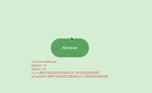
.onMouse((event?: MouseEvent) => { // Set the onMouse callback for the button.
if (event) {
this.buttonText = 'Button onMouse:\n' + '' +
'button = ' + event.button + '\n' +
'action = ' + event.action + '\n' +
'x,y = (' + event.x + ',' + event.y + ')' + '\n' +
'windowXY=(' + event.windowX + ',' + event.windowY + ')';
}
})
Divider()
Text(this.buttonText).fontColor(Color.Green)
Divider()
Text(this.columnText).fontColor(Color.Red)
}
.width('100%')
.height('100%')
.justifyContent(FlexAlign.Center)
.borderWidth(2)
.borderColor(Color.Red)
.onMouse((event?: MouseEvent) => { // Set the onMouse callback for the column.
if (event) {
this.columnText = 'Column onMouse:\n' + '' +
'button = ' + event.button + '\n' +
'action = ' + event.action + '\n' +
'x,y = (' + event.x + ',' + event.y + ')' + '\n' +
'windowXY=(' + event.windowX + ',' + event.windowY + ')';
}
})
}
}
Bind the onMouse API to the Button component based on the onHover example, and display the values of the callback parameters, such as button and action. Apply the same settings to the outer Column container. The entire process can be divided into the following two actions:
Moving the mouse pointer: When the mouse pointer moves from outside the Button component to inside, only the onMouse callback of the Column component is triggered. When the mouse pointer enters the button, as the onMouse event bubbles up by default, both the onMouse callbacks of the Column and Button components are invoked. Because no mouse button is clicked during this process, the displayed information shows button as 0 (enumerated value of MouseButton.None) and action as 3 (enumerated value of MouseAction.Move).
Clicking the mouse button: After the mouse pointer enters the Button component, clicking the component twice (left-click and right-click) produces the following results: Left-click: button = 1 (enumerated value of MouseButton.Left); action = 1 (enumerated value of MouseAction.Press); action = 2 (enumerated value of MouseAction.Release).
Right-click: button = 2 (enumerated value of MouseButton.Right); action = 1 (enumerated value of MouseAction.Press); action = 2 (enumerated value of MouseAction.Release)
To prevent the mouse event from bubbling, call the stopPropagation() API.
class ish{
  isHovered:boolean = false
  set(val:boolean){
    this.isHovered = val;
  }
}
class butf{
  buttonText:string = ''
  set(val:string){
    this.buttonText = val
  }
}
@Entry
@Component
struct MouseExample {
  @State isHovered:ish = new ish()
  build(){
    Column(){
      Button(this.isHovered ? 'Hovered!' : 'Not Hover')
        .width(200)
        .height(100)
        .backgroundColor(this.isHovered ? Color.Green : Color.Gray)
        .onHover((isHover?: boolean) => {
          if(isHover) {
            let ishset = new ish()
            ishset.set(isHover)
          }
        })
        .onMouse((event?: MouseEvent) => {
          if (event) {
            if (event.stopPropagation) {
              event.stopPropagation(); // Prevent the onMouse event from bubbling.
            }
            let butset = new butf()
            butset.set('Button onMouse:\n' + '' +
              'button = ' + event.button + '\n' +
              'action = ' + event.action + '\n' +
              'x,y = (' + event.x + ',' + event.y + ')' + '\n' +
              'windowXY=(' + event.windowX + ',' + event.windowY + ')');
          }
        })
    }
  }
}
To prevent the mouse event of the child component (Button) from bubbling up to its parent component (Column), use the event parameter in the onMouse callback of Button to call the stopPropagation API.
event.stopPropagation()
With bubbling prevented, the mouse event on the Button component will trigger the onMouse callback of the Button component, but not the onMouse callback of the Column component.
hoverEffect
hoverEffect(value: HoverEffect)
Sets the hover effect of the component in hover state. The parameter value type is HoverEffect. The Auto, Scale, and Highlight effects are preset and do not support customization.
Table 1 HoverEffect
| Value | Description |
|---|---|
| Auto | Default hover effect, which varies by component. |
| Scale | Scale effect. When the mouse pointer is placed over the component, the component is scaled up from 100% to 105%. When the mouse pointer is moved away, the component is scaled down from 105% to 100%. |
| Highlight | Background fade-in and fade-out effect. When the mouse pointer is placed over the component, a white layer with 5% opacity is applied to the background color of the component, resulting in a dimmed background. When the mouse pointer is moved away, the background color of the component is restored to the original style. |
| None | No effect. |
// xxx.ets
@Entry
@Component
struct HoverExample {
  build() {
    Column({ space: 10 }) {
      Button('Auto')
        .width(170).height(70)
      Button('Scale')
        .width(170).height(70)
        .hoverEffect(HoverEffect.Scale)
      Button('Highlight')
        .width(170).height(70)
        .hoverEffect(HoverEffect.Highlight)
      Button('None')
        .width(170).height(70)
        .hoverEffect(HoverEffect.None)
    }.width('100%').height('100%').justifyContent(FlexAlign.Center)
  }
}
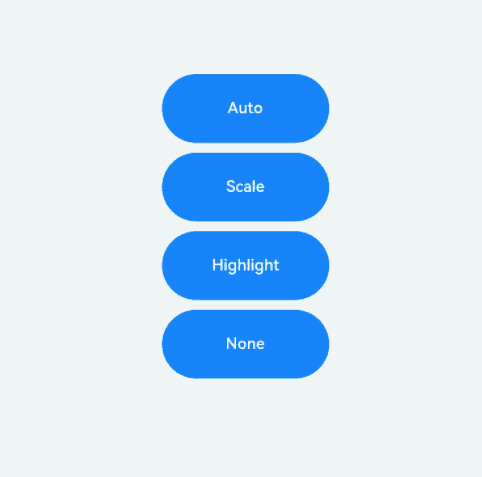
The default hover effect for the button is the Highlight effect. Therefore, the effects of Auto and Highlight are the same. The Highlight effect darkens the background color, Scale causes the component to scale, and None disables the hover effect.
Key Event
Key Event Data Flow
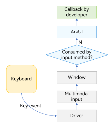
After being triggered by a device such as a peripheral keyboard, a key event has its data processed and converted by the driver and multimodal input modules, and then is sent to the currently focused window. The window dispatches the received event, following the sequence below. The dispatch stops once the event is consumed.
- The window first dispatches the event to the ArkUI framework for invoking the onKeyPreIme callback bound to the component in focus as well as the page keyboard shortcuts.
- If the ArkUI framework does not consume the event, the window dispatches the event to the input method for key input.
- If the input method does not consume the event, the window dispatches the event to the ArkUI framework again for responding to the system default key event (for example, focus navigation) and for invoking the onKeyEvent callback bound to the component in focus.
When a text box has focus and the input method is enabled, most key events are consumed by the input method. For example, a letter key is used by the input method to enter a letter in the text box, and an arrow key is used by the input method to switch to the desired candidate word. Yet, if a keyboard shortcut is bound to the text box, the shortcut responds to the event first, and the event will not be consumed by the input method.
After the key event is sent to the ArkUI framework, it first identifies the complete focus chain, and then sends the key event from one node to the next, following the leaf-to-root path.
The key event process for the Web component differs from the aforementioned process. The Web component does not match keyboard shortcuts when onKeyPreIme returns false. The unconsumed key event will be re-dispatched back to ArkUI through ReDispatch during the third key press dispatch. It is within this ReDispatch that operations such as matching keyboard shortcuts are performed again.
onKeyEvent & onKeyPreIme
onKeyEvent(event: (event: KeyEvent) => void): T
onKeyEvent(event: Callback<KeyEvent, boolean>): T
onKeyPreIme(event: Callback<KeyEvent, boolean>): T
onKeyEventDispatch(event: Callback<KeyEvent, boolean>): T
The difference between the preceding two methods lies only in the triggering time. For details, see Key Event Data Flow. The return value of onKeyPreIme determines whether the key event will be dispatched for the page keyboard shortcut, input method, and onKeyEvent.
The methods are triggered when the bound component has focus and a key event occurs on the component. The callback parameter KeyEvent can be used to obtain the information about the key event, including KeyType, keyCode, keyText, KeySource, deviceId, metaKey, timestamp, and stopPropagation.
// xxx.ets
@Entry
@Component
struct KeyEventExample {
  @State buttonText: string = '';
  @State buttonType: string = '';
  @State columnText: string = '';
  @State columnType: string = '';

  build() {
    Column() {
      Button('onKeyEvent')
        .defaultFocus(true)
        .width(140).height(70)
        .onKeyEvent((event?: KeyEvent) => { // Set the onKeyEvent event for the button.
          if(event){
            if (event.type === KeyType.Down) {
              this.buttonType = 'Down';
            }
            if (event.type === KeyType.Up) {
              this.buttonType = 'Up';
            }
            this.buttonText = 'Button: \n' +
            'KeyType:' + this.buttonType + '\n' +
            'KeyCode:' + event.keyCode + '\n' +
            'KeyText:' + event.keyText;
          }
        })

      Divider()
      Text(this.buttonText).fontColor(Color.Green)

      Divider()
      Text(this.columnText).fontColor(Color.Red)
    }.width('100%').height('100%').justifyContent(FlexAlign.Center)
    .onKeyEvent((event?: KeyEvent) => { // Set the onKeyEvent event for the parent container Column.
      if(event){
        if (event.type === KeyType.Down) {
          this.columnType = 'Down';
        }
        if (event.type === KeyType.Up) {
          this.columnType = 'Up';
        }
        this.columnText = 'Column: \n' +
        'KeyType:' + this.buttonType + '\n' +
        'KeyCode:' + event.keyCode + '\n' +
        'KeyText:' + event.keyText;
      }
    })
  }
}
In the preceding example, onKeyEvent is bound to the Button component and its parent container Column. After the application opens and loads a page, the first focusable non-container component in the component tree automatically obtains focus. Set the Button component as the default focus of the current page. Because the Button component is a child node of the Column component, the Column component also obtains focus. For details about the focus obtaining mechanism, see Focus Event.
After the application is opened, press the following keys in sequence: Space, Enter, Left Ctrl, Left Shift, Letter A, and Letter Z.
Because the onKeyEvent event bubbles by default, the onKeyEvent callbacks of both Button and Column are invoked.
Each key has two callbacks, which correspond to KeyType.Down and KeyType.Up respectively, indicating that the key is pressed and then lifted.
To prevent the key event of the Button component from bubbling up to its parent container Column, add the event.stopPropagation() API to the onKeyEvent callback of Button.
@Entry
@Component
struct KeyEventExample {
  @State buttonText: string = '';
  @State buttonType: string = '';
  @State columnText: string = '';
  @State columnType: string = '';

  build() {
    Column() {
      Button('onKeyEvent')
        .defaultFocus(true)
        .width(140).height(70)
        .onKeyEvent((event?: KeyEvent) => {
          // Use stopPropagation to prevent the key event from bubbling up.
          if(event){
            if(event.stopPropagation){
              event.stopPropagation();
            }
            if (event.type === KeyType.Down) {
              this.buttonType = 'Down';
            }
            if (event.type === KeyType.Up) {
              this.buttonType = 'Up';
            }
            this.buttonText = 'Button: \n' +
              'KeyType:' + this.buttonType + '\n' +
              'KeyCode:' + event.keyCode + '\n' +
              'KeyText:' + event.keyText;
          }
        })

      Divider()
      Text(this.buttonText).fontColor(Color.Green)

      Divider()
      Text(this.columnText).fontColor(Color.Red)
    }.width('100%').height('100%').justifyContent(FlexAlign.Center)
    .onKeyEvent((event?: KeyEvent) => { // Set the onKeyEvent event for the parent container Column.
      if(event){
        if (event.type === KeyType.Down) {
          this.columnType = 'Down';
        }
        if (event.type === KeyType.Up) {
          this.columnType = 'Up';
        }
        this.columnText = 'Column: \n' +
          'KeyType:' + this.buttonType + '\n' +
          'KeyCode:' + event.keyCode + '\n' +
          'KeyText:' + event.keyText;
      }
    })
  }
}
This example shows how to use OnKeyPreIme to block the left arrow key input in the text box.
import { KeyCode } from '@kit.InputKit';

@Entry
@Component
struct PreImeEventExample {
  @State buttonText: string = '';
  @State buttonType: string = '';
  @State columnText: string = '';
  @State columnType: string = '';

  build() {
    Column() {
      Search({
        placeholder: "Search..."
      })
        .width("80%")
        .height("40vp")
        .border({ radius:"20vp" })
        .onKeyPreIme((event:KeyEvent) => {
          if (event.keyCode == KeyCode.KEYCODE_DPAD_LEFT) {
            return true;
          }
          return false;
        })
    }
  }
}
This example demonstrates how to use onKeyEventDispatch to distribute key events to child components, which handle the events using onKeyEvent.
@Entry
@Component
struct Index {
  build() {
    Row() {
      Row() {
        Button('button1').id('button1').onKeyEvent((event) => {
          console.log("button1");
          return true
        })
        Button('button1').id('button2').onKeyEvent((event) => {
          console.log("button2");
          return true
        })
      }
      .width('100%')
      .height('100%')
      .id('Row1')
      .onKeyEventDispatch((event) => {
        let context = this.getUIContext();
        context.getFocusController().requestFocus('button1');
        return context.dispatchKeyEvent('button1', event);
      })

    }
    .height('100%')
    .width('100%')
    .onKeyEventDispatch((event) => {
      if (event.type == KeyType.Down) {
        let context = this.getUIContext();
        context.getFocusController().requestFocus('Row1');
        return context.dispatchKeyEvent('Row1', event);
      }
      return true;
    })
  }
}
你可能感兴趣的鸿蒙文章
harmony 鸿蒙Atomic Service Full Screen Launch Component (FullScreenLaunchComponent)
harmony 鸿蒙Arc Button (ArcButton)
harmony 鸿蒙Frame Animation (ohos.animator)
harmony 鸿蒙Implementing Property Animation
- 所属分类: 后端技术
- 本文标签:
热门推荐
-
2、 优质文章
-
3、 gt
-
7、 openharmony
-
9、 golang
-
10、 Vue中input框自动聚焦