harmony 鸿蒙Button
Button
The Button component is usually activated by user clicks to perform a specific action. Buttons are classified as capsule, circle, or normal buttons. When used as a container, the Button component accepts child components such as text and images. For details, see Button.
Creating a Button
You can create a button that contains or does not contain child components.
- Create a button that does not contain child components.
Button(label?: ResourceStr, options?: { type?: ButtonType, stateEffect?: boolean })
In this API, label indicates the button text, type indicates the button type, and stateEffect specifies whether to enable the pressed effect on the click of the button.
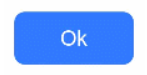
  Button('Ok', { type: ButtonType.Normal, stateEffect: true })
    .borderRadius(8)
    .backgroundColor(0x317aff)
    .width(90)
    .height(40)
- Create a button that contains a single child component.
Button(options?: {type?: ButtonType, stateEffect?: boolean})
The child component contained can either be a basic component or a container component.
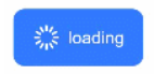
  Button({ type: ButtonType.Normal, stateEffect: true }) {
    Row() {
      Image($r('app.media.loading')).width(20).height(40).margin({ left: 12 })
      Text('loading').fontSize(12).fontColor(0xffffff).margin({ left: 5, right: 12 })
    }.alignItems(VerticalAlign.Center)
  }.borderRadius(8).backgroundColor(0x317aff).width(90).height(40)
Setting the Button Type
Use the type parameter to set the button type to Capsule, Circle, or Normal.
- Capsule button (default type)
Buttons of this type have rounded corners whose radius is automatically set to half of the button height. The rounded corners cannot be reset through the borderRadius attribute.
  Button('Disable', { type: ButtonType.Capsule, stateEffect: false })
    .backgroundColor(0x317aff)
    .width(90)
    .height(40)

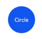
- Circle button
Buttons of this type are round. The rounded corners cannot be reset through the borderRadius attribute.
  Button('Circle', { type: ButtonType.Circle, stateEffect: false })
    .backgroundColor(0x317aff)
    .width(90)
    .height(90)
- Normal button
Buttons of this type have rounded corners set to 0. The rounded corners can be reset through the borderRadius attribute.
  Button('Ok', { type: ButtonType.Normal, stateEffect: true })
    .borderRadius(8)
    .backgroundColor(0x317aff)
    .width(90)
    .height(40)
- Rounded rectangle button The rounded rectangle button has a default corner radius of 20 vp when controlSize is NORMAL, and 14 vp when controlSize is SMALL. You can define custom corner radius settings through borderRadius.
  Button('Disable', { type: ButtonType.ROUNDED_RECTANGLE, stateEffect: true })
    .backgroundColor(0x317aff)
    .width(90)
    .height(40)
Setting Styles
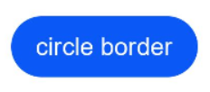
- Setting the border radius
You can use universal attributes to define the button styles. For example, you can use the borderRadius attribute to set the border radius.
  Button('circle border', { type: ButtonType.Normal })
    .borderRadius(20)
    .height(40)
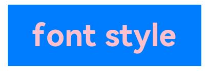
- Setting the text style
Add text style attributes for the button.
  Button('font style', { type: ButtonType.Normal })
    .fontSize(20)
    .fontColor(Color.Pink)
    .fontWeight(800)
- Setting the background color
Add the backgroundColor attribute for the button.
Button('background color').backgroundColor(0xF55A42)

- Assigning a function to the button
In this example, the delete function is assigned to the button.
  let MarLeft: Record<string, number> = { 'left': 20 }
  Button({ type: ButtonType.Circle, stateEffect: true }) {
    Image($r('app.media.ic_public_delete_filled')).width(30).height(30)
  }.width(55).height(55).margin(MarLeft).backgroundColor(0xF55A42)

Adding Events
The Button component is usually used to trigger actions. You can bind the onClick event to the button to have it respond with custom behavior after being clicked.
Button('Ok', { type: ButtonType.Normal, stateEffect: true })
  .onClick(()=>{
    console.info('Button onClick')
  })
Example
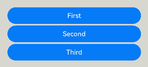
- Using the button for startup
You can use the button for any UI element that involves the startup operation. The button triggers the predefined event based on the user’s operation. For example, you can use a button in the List container to redirect the user to another page.
  // xxx.ets
  @Entry
  @Component
  struct ButtonCase1 {
    pathStack: NavPathStack = new NavPathStack();

    @Builder
    PageMap(name: string) {
      if (name === "first_page") {
        pageOneTmp()
      } else if (name === "second_page") {
        pageTwoTmp()
      } else if (name === "third_page") {
        pageThreeTmp()
      }
    }

    build() {
      Navigation(this.pathStack) {
        List({ space: 4 }) {
          ListItem() {
            Button("First").onClick(() => {
              this.pathStack.pushPath({ name: "first_page"})
            })
              .width('100%')
          }

          ListItem() {
            Button("Second").onClick(() => {
              this.pathStack.pushPath({ name: "second_page"})
            })
              .width('100%')
          }

          ListItem() {
            Button("Third").onClick(() => {
              this.pathStack.pushPath({ name: "third_page"})
            })
              .width('100%')
          }
        }
        .listDirection(Axis.Vertical)
        .backgroundColor(0xDCDCDC).padding(20)
      }
      .mode(NavigationMode.Stack)
      .navDestination(this.PageMap)
    }
  }

  // pageOne
  @Component
  export struct pageOneTmp {
    pathStack: NavPathStack = new NavPathStack();

    build() {
      NavDestination() {
        Column() {
          Text("first_page")
        }.width('100%').height('100%')
      }.title("pageOne")
      .onBackPressed(() => {
        const popDestinationInfo = this.pathStack.pop() // Pop the top element out of the navigation stack.
        console.log('pop' + 'Return value' + JSON.stringify(popDestinationInfo))
        return true
      })
      .onReady((context: NavDestinationContext) => {
        this.pathStack = context.pathStack
      })
    }
  }

  // pageTwo
  @Component
  export struct pageTwoTmp {
    pathStack: NavPathStack = new NavPathStack();

    build() {
      NavDestination() {
        Column() {
          Text("second_page")
        }.width('100%').height('100%')
      }.title("pageTwo")
      .onBackPressed(() => {
        const popDestinationInfo = this.pathStack.pop() // Pop the top element out of the navigation stack.
        console.log('pop' + 'Return value' + JSON.stringify(popDestinationInfo))
        return true
      })
      .onReady((context: NavDestinationContext) => {
        this.pathStack = context.pathStack
      })
    }
  }

  // pageThree
  @Component
  export struct pageThreeTmp {
    pathStack: NavPathStack = new NavPathStack();

    build() {
      NavDestination() {
        Column() {
          Text("third_page")
        }.width('100%').height('100%')
      }.title("pageThree")
      .onBackPressed(() => {
        const popDestinationInfo = this.pathStack.pop() // Pop the top element out of the navigation stack.
        console.log('pop' + 'Return value' + JSON.stringify(popDestinationInfo))
        return true
      })
      .onReady((context: NavDestinationContext) => {
        this.pathStack = context.pathStack
      })
    }
  }
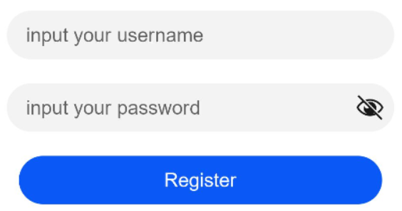
- Using the button for submitting forms
On the user login/registration page, you can use a button to submit a login or registration request.
  // xxx.ets
  @Entry
  @Component
  struct ButtonCase2 {
    build() {
      Column() {
        TextInput({ placeholder: 'input your username' }).margin({ top: 20 })
        TextInput({ placeholder: 'input your password' }).type(InputType.Password).margin({ top: 20 })
        Button('Register').width(300).margin({ top: 20 })
          .onClick(() => {
            // Operation
          })
      }.padding(20)
    }
  }
- Configuring the button to float
The button can remain floating when the user swipes on the screen.
  // xxx.ets
  @Entry
  @Component
  struct HoverButtonExample {
    private arr: number[] = [0, 1, 2, 3, 4, 5, 6, 7, 8, 9]
    build() {
      Stack() {
        List({ space: 20, initialIndex: 0 }) {
          ForEach(this.arr, (item:number) => {
            ListItem() {
              Text('' + item)
                .width('100%').height(100).fontSize(16)
                .textAlign(TextAlign.Center).borderRadius(10).backgroundColor(0xFFFFFF)
            }
          }, (item:number) => item.toString())
        }.width('90%')
        Button() {
          Image($r('app.media.ic_public_add'))
            .width(50)
            .height(50)
        }
        .width(60)
        .height(60)
        .position({x: '80%', y: 600})
        .shadow({radius: 10})
        .onClick(() => {
          // Operation
        })
      }
      .width('100%')
      .height('100%')
      .backgroundColor(0xDCDCDC)
      .padding({ top: 5 })
    }
  }

你可能感兴趣的鸿蒙文章
harmony 鸿蒙Atomic Service Full Screen Launch Component (FullScreenLaunchComponent)
harmony 鸿蒙Arc Button (ArcButton)
harmony 鸿蒙Frame Animation (ohos.animator)
harmony 鸿蒙Implementing Property Animation
- 所属分类: 后端技术
- 本文标签:
热门推荐
-
2、 优质文章
-
3、 gt
-
7、 openharmony
-
9、 golang
-
10、 Vue中input框自动聚焦