harmony 鸿蒙Button
Button
The Button component can be used to create different types of buttons.
NOTE
This component is supported since API version 7. Updates will be marked with a superscript to indicate their earliest API version.
Child Components
This component can contain only one child component.
APIs
Button
Button(options: ButtonOptions)
Creates a button that can contain a single child component.
Widget capability: This API can be used in ArkTS widgets since API version 9.
Atomic service API: This API can be used in atomic services since API version 11.
System capability: SystemCapability.ArkUI.ArkUI.Full
Parameters
| Name | Type | Mandatory | Description |
|---|---|---|---|
| options | ButtonOptions | Yes | Button settings. |
Button
Button(label: ResourceStr, options?: ButtonOptions)
Creates a button based on text content. In this case, the component cannot contain child components.
By default, the text content is displayed in a one line.
Widget capability: This API can be used in ArkTS widgets since API version 9.
Atomic service API: This API can be used in atomic services since API version 11.
System capability: SystemCapability.ArkUI.ArkUI.Full
Parameters
| Name | Type | Mandatory | Description |
|---|---|---|---|
| label | ResourceStr | Yes | Button text. NOTE If the text is longer than the width of the button, it is truncated. |
| options | ButtonOptions | No | Button settings. |
Button
Button()
Creates an empty button.
Widget capability: This API can be used in ArkTS widgets since API version 9.
Atomic service API: This API can be used in atomic services since API version 11.
System capability: SystemCapability.ArkUI.ArkUI.Full
ButtonOptions
System capability: SystemCapability.ArkUI.ArkUI.Full
| Name | Type | Mandatory | Description |
|---|---|---|---|
| type | ButtonType | No | Button type. Default value: - API version 18 and later versions: ButtonType.ROUNDED_RECTANGLE - Versions earlier than API version 18: ButtonType.Capsule Widget capability: This API can be used in ArkTS widgets since API version 9. Atomic service API: This API can be used in atomic services since API version 11. |
| stateEffect | boolean | No | Whether to enable the pressed effect on the click of the button. The value false means to disable the pressed effect. Default value: true NOTE When the pressed effect is enabled on the click of the button and the state style is set, the background color is applied based on the state style. Widget capability: This API can be used in ArkTS widgets since API version 9. Atomic service API: This API can be used in atomic services since API version 11. |
| buttonStyle11+ | ButtonStyleMode | No | Style and primacy of the button. Default value: ButtonStyleMode.EMPHASIZED NOTE The button primacy is as follows, from high to low: emphasized button, normal button, text button. Widget capability: This API can be used in ArkTS widgets since API version 11. Atomic service API: This API can be used in atomic services since API version 12. |
| controlSize11+ | ControlSize | No | Size of the button. Default value: ControlSize.NORMAL Widget capability: This API can be used in ArkTS widgets since API version 11. Atomic service API: This API can be used in atomic services since API version 12. |
| role12+ | ButtonRole | No | Role of the button. Default value: ButtonRole.NORMAL Widget capability: This API can be used in ArkTS widgets since API version 12. Atomic service API: This API can be used in atomic services since API version 12. |
Attributes
In addition to the universal attributes, the following attributes are supported.
type
type(value: ButtonType)
Sets the button type.
Widget capability: This API can be used in ArkTS widgets since API version 9.
Atomic service API: This API can be used in atomic services since API version 11.
System capability: SystemCapability.ArkUI.ArkUI.Full
Parameters
| Name | Type | Mandatory | Description |
|---|---|---|---|
| value | ButtonType | Yes | Button type. Default value: ButtonType.ROUNDED_RECTANGLE |
fontSize
fontSize(value: Length)
Sets the font size for the button.
Widget capability: This API can be used in ArkTS widgets since API version 9.
Atomic service API: This API can be used in atomic services since API version 11.
System capability: SystemCapability.ArkUI.ArkUI.Full
Parameters
| Name | Type | Mandatory | Description |
|---|---|---|---|
| value | Length | Yes | Font size of the button. Default value: $r(‘sys.float.Body_L’) when controlSize is set to ControlSize.NORMAL $r(‘sys.float.Body_S’) when controlSize is set to ControlSize.SMALL NOTE For the string type, percentage values are not supported. |
fontColor
fontColor(value: ResourceColor)
Sets the font color for the button.
Widget capability: This API can be used in ArkTS widgets since API version 9.
Atomic service API: This API can be used in atomic services since API version 11.
System capability: SystemCapability.ArkUI.ArkUI.Full
Parameters
| Name | Type | Mandatory | Description |
|---|---|---|---|
| value | ResourceColor | Yes | Font color of the button. Default value: $r(‘sys.color.font_on_primary’), which means white |
fontWeight
fontWeight(value: number|FontWeight|string)
Sets the font weight for the button.
Widget capability: This API can be used in ArkTS widgets since API version 9.
Atomic service API: This API can be used in atomic services since API version 11.
System capability: SystemCapability.ArkUI.ArkUI.Full
Parameters
| Name | Type | Mandatory | Description |
|---|---|---|---|
| value | number |FontWeight |string | Yes | Font weight of the button. For the number type, the value ranges from 100 to 900, at an interval of 100. A larger value indicates a thicker font. Default value: 500 |
fontStyle8+
fontStyle(value: FontStyle)
Sets the font style for the button.
Widget capability: This API can be used in ArkTS widgets since API version 9.
Atomic service API: This API can be used in atomic services since API version 11.
System capability: SystemCapability.ArkUI.ArkUI.Full
Parameters
| Name | Type | Mandatory | Description |
|---|---|---|---|
| value | FontStyle | Yes | Font style of the button. Default value: FontStyle.Normal |
stateEffect
stateEffect(value: boolean)
Specifies whether to enable the pressed effect on the click of the button.
Widget capability: This API can be used in ArkTS widgets since API version 9.
Atomic service API: This API can be used in atomic services since API version 11.
System capability: SystemCapability.ArkUI.ArkUI.Full
Parameters
| Name | Type | Mandatory | Description |
|---|---|---|---|
| value | boolean | Yes | Whether to enable the pressed effect on the click of the button. The value false means to disable the pressed effect. Default value: true |
NOTE
When the polymorphic style is used to set the pressed state, set stateEffect to false to avoid conflicts between the built-in and custom pressed state effects.
fontFamily8+
fontFamily(value: string|Resource)
Sets the font family.
Widget capability: This API can be used in ArkTS widgets since API version 9.
Atomic service API: This API can be used in atomic services since API version 11.
System capability: SystemCapability.ArkUI.ArkUI.Full
Parameters
| Name | Type | Mandatory | Description |
|---|---|---|---|
| value | string |Resource | Yes | Font family. The ‘HarmonyOS Sans’ font and registered custom fonts are supported. |
labelStyle10+
labelStyle(value: LabelStyle)
Sets the label style for the button.
Atomic service API: This API can be used in atomic services since API version 11.
System capability: SystemCapability.ArkUI.ArkUI.Full
Parameters
| Name | Type | Mandatory | Description |
|---|---|---|---|
| value | LabelStyle | Yes | Label style of the button. |
buttonStyle11+
buttonStyle(value: ButtonStyleMode)
Sets the style and primacy for the button.
Widget capability: This API can be used in ArkTS widgets since API version 11.
Atomic service API: This API can be used in atomic services since API version 12.
System capability: SystemCapability.ArkUI.ArkUI.Full
Parameters
| Name | Type | Mandatory | Description |
|---|---|---|---|
| value | ButtonStyleMode | Yes | Style and primacy of the button Default value: ButtonStyleMode.EMPHASIZED |
controlSize11+
controlSize(value: ControlSize)
Sets the size for the button.
Widget capability: This API can be used in ArkTS widgets since API version 11.
Atomic service API: This API can be used in atomic services since API version 12.
System capability: SystemCapability.ArkUI.ArkUI.Full
Parameters
| Name | Type | Mandatory | Description |
|---|---|---|---|
| value | ControlSize | Yes | Size of the button. Default value: ControlSize.NORMAL |
role12+
role(value: ButtonRole)
Sets the role of the button.
Widget capability: This API can be used in ArkTS widgets since API version 12.
Atomic service API: This API can be used in atomic services since API version 12.
System capability: SystemCapability.ArkUI.ArkUI.Full
Parameters
| Name | Type | Mandatory | Description |
|---|---|---|---|
| value | ButtonRole | Yes | Role of the button. Default value: ButtonRole.NORMAL |
contentModifier12+
contentModifier(modifier: ContentModifier<ButtonConfiguration>)
Creates a content modifier.
Atomic service API: This API can be used in atomic services since API version 12.
System capability: SystemCapability.ArkUI.ArkUI.Full
Parameters
| Name | Type | Mandatory | Description |
|---|---|---|---|
| modifier | ContentModifier<ButtonConfiguration> | Yes | Content modifier to apply to the button. modifier: content modifier. You need a custom class to implement the ContentModifier API. |
minFontScale18+
minFontScale(scale: number|Resource)
Sets the minimum font scale factor for text.
Atomic service API: This API can be used in atomic services since API version 18.
System capability: SystemCapability.ArkUI.ArkUI.Full
Parameters
| Name | Type | Mandatory | Description |
|---|---|---|---|
| scale | number |Resource | Yes | Minimum font scale factor for text. Value range: [0, 1] NOTE A value less than 0 is handled as 0. A value greater than 1 is handled as 1. Abnormal values are ineffective by default. If the multiplier is set to 0, no content is displayed. |
maxFontScale18+
maxFontScale(scale: number|Resource)
Setting the scale factor to 0 hides the content.
Atomic service API: This API can be used in atomic services since API version 18.
System capability: SystemCapability.ArkUI.ArkUI.Full
Parameters
| Name | Type | Mandatory | Description |
|---|---|---|---|
| scale | number |Resource | Yes | Maximum font scale factor for text. Value range: [1, +∞) NOTE A value less than 1 is handled as 1. Abnormal values are ineffective by default. If not set, the maximum scale factor for circle buttons is 1. |
ButtonType
System capability: SystemCapability.ArkUI.ArkUI.Full
| Name | Description |
|---|---|
| Capsule | Capsule-type button (the round corner is half of the height by default). Widget capability: This API can be used in ArkTS widgets since API version 9. Atomic service API: This API can be used in atomic services since API version 11. |
| Circle | Circular button. Widget capability: This API can be used in ArkTS widgets since API version 9. Atomic service API: This API can be used in atomic services since API version 11. |
| Normal | Normal button, with no rounded corners by default. Widget capability: This API can be used in ArkTS widgets since API version 9. Atomic service API: This API can be used in atomic services since API version 11. |
| ROUNDED_RECTANGLE15+ | Rounded rectangle button (default value: when controlSize is NORMAL, the corner radius is 20 vp; when controlSize is SMALL, the corner radius is 14 vp). Widget capability: This API can be used in ArkTS widgets since API version 15. Atomic service API: This API can be used in atomic services since API version 15. |
NOTE - The corner radius of the rounded rectangle button is set using the universal attribute borderRadius. - For a button of the Capsule type, the borderRadius settings do not take effect, and the radius of its rounded corner is always half of the button height or width, whichever is smaller. - For a button of the Circle type: (1) If both its width and height are set, borderRadius does not take effect, and the button radius is half of the width or height (whichever is smaller). (2) If either its width or height is set, borderRadius does not take effect, and the button radius is half of the set width or height. (3) If neither its width nor height is set, the button radius is as specified by borderRadius; if borderRadius is set to a negative value, the value 0 will be used. - The button text is set using fontSize, fontColor, fontStyle, fontFamily and fontWeight. - Before setting the gradient color, you need to set backgroundColor to transparent. - When borderRadius is not set, the corner radius of the rounded rectangle button remains at the default value. In this case, the corner radius does not change with the button height and is subject to the controlSize property. When controlSize is NORMAL, the corner radius is 20 vp; when controlSize is SMALL, the corner radius is 14 vp.
LabelStyle10+
Atomic service API: This API can be used in atomic services since API version 11.
System capability: SystemCapability.ArkUI.ArkUI.Full
| Name | Type | Mandatory | Description |
|---|---|---|---|
| overflow | TextOverflow | No | Display mode when the label text is too long. Text is clipped at the transition between words. To clip text in the middle of a word, add zero-width spaces between characters. Default value: TextOverflow.Ellipsis |
| maxLines | number | No | Maximum number of lines in the label text. By default, text is automatically folded. If this attribute is specified, the text will not exceed the specified number of lines. If there is extra text, you can use overflow to specify how it is displayed. Default value: 1 |
| minFontSize | number |ResourceStr | No | Minimum font size of the label text. For the setting to take effect, this attribute must be used together with maxFontSize, maxLines, or layout constraint settings. NOTE If the value of minFontSize is less than or equal to 0, the adaptive font size does not take effect. |
| maxFontSize | number |ResourceStr | No | Maximum font size of the label text. For the setting to take effect, this attribute must be used together with minFontSize, maxLines, or layout constraint settings. |
| heightAdaptivePolicy | TextHeightAdaptivePolicy | No | How the adaptive height is determined for the label text. Default value: TextHeightAdaptivePolicy.MAX_LINES_FIRST |
| font | Font | No | Font of the label text. Default value: See Font. |
ButtonStyleMode11+
Widget capability: This API can be used in ArkTS widgets since API version 11.
Atomic service API: This API can be used in atomic services since API version 12.
System capability: SystemCapability.ArkUI.ArkUI.Full
|Name |Value|Description | |——-|–|——————| |NORMAL|0|Normal button (used to direct the user to a common task). | |EMPHASIZED|1|Emphasized button (used to direct the user to the most important task).| |TEXTUAL|2|Text button (displayed as simple text without any background color). |
ControlSize11+
Widget capability: This API can be used in ArkTS widgets since API version 11.
Atomic service API: This API can be used in atomic services since API version 12.
System capability: SystemCapability.ArkUI.ArkUI.Full
|Name |Value|Description | |——-|–|——————| |SMALL|“small”|Small button.| |NORMAL|“normal”|Normal button. |
ButtonRole12+
Widget capability: This API can be used in ArkTS widgets since API version 12.
Atomic service API: This API can be used in atomic services since API version 12.
System capability: SystemCapability.ArkUI.ArkUI.Full
|Name |Value|Description | |——-|–|——————| |NORMAL|0|Normal button.| |ERROR|1|Warning button. |
ButtonConfiguration12+
You need a custom class to implement the ContentModifier API.
Atomic service API: This API can be used in atomic services since API version 12.
System capability: SystemCapability.ArkUI.ArkUI.Full
| Name | Type | Read Only | Optional | Description |
|---|---|---|---|---|
| label | string | No | No | Text label of the button. NOTE If the text is longer than the width of the button, it is truncated. |
| pressed | boolean | No | No | Whether the button is pressed. true: The button is pressed. false: The button is not pressed. NOTE The button here refers to the original button, not the new component constructed using the builder. If the new component is larger than the original button, this parameter does not signify the pressed state of the excess part. Default value: false |
| triggerClick | ButtonTriggerClickCallback | No | No | Click event of the new component constructed using the builder. |
ButtonTriggerClickCallback12+
type ButtonTriggerClickCallback = (xPos: number, yPos: number) => void
Defines the callback type used in ButtonConfiguration.
Atomic service API: This API can be used in atomic services since API version 12.
System capability: SystemCapability.ArkUI.ArkUI.Full
Parameters
| Name | Type | Mandatory | Description |
|---|---|---|---|
| xPos | number | Yes | X-coordinate of the click point. Unit: vp |
| yPos | number | Yes | Y-coordinate of the click point. Unit: vp |
Events
The universal events are supported.
Example
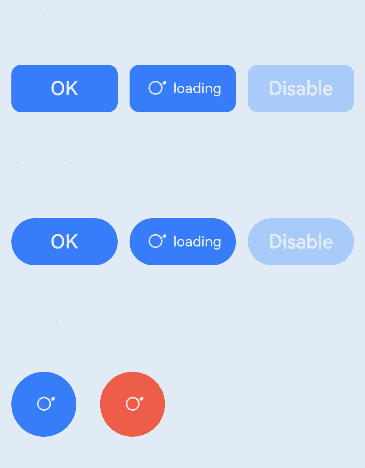
Example 1: Setting the Button Display Style
This example demonstrates two methods to create buttons, either with child components or using text content.
// xxx.ets
@Entry
@Component
struct ButtonExample {
  build() {
    Flex({ direction: FlexDirection.Column, alignItems: ItemAlign.Start, justifyContent: FlexAlign.SpaceBetween }) {
      Text('Normal button').fontSize(9).fontColor(0xCCCCCC)
      Flex({ alignItems: ItemAlign.Center, justifyContent: FlexAlign.SpaceBetween }) {
        Button('OK', { type: ButtonType.Normal, stateEffect: true })
          .borderRadius(8)
          .backgroundColor(0x317aff)
          .width(90)
          .onClick(() => {
            console.log('ButtonType.Normal')
          })
        Button({ type: ButtonType.Normal, stateEffect: true }) {
          Row() {
            LoadingProgress().width(20).height(20).margin({ left: 12 }).color(0xFFFFFF)
            Text('loading').fontSize(12).fontColor(0xffffff).margin({ left: 5, right: 12 })
          }.alignItems(VerticalAlign.Center)
        }.borderRadius(8).backgroundColor(0x317aff).width(90).height(40)

        Button('Disable', { type: ButtonType.Normal, stateEffect: false }).opacity(0.4)
          .borderRadius(8).backgroundColor(0x317aff).width(90)
      }

      Text('Capsule button').fontSize(9).fontColor(0xCCCCCC)
      Flex({ alignItems: ItemAlign.Center, justifyContent: FlexAlign.SpaceBetween }) {
        Button('OK', { type: ButtonType.Capsule, stateEffect: true }).backgroundColor(0x317aff).width(90)
        Button({ type: ButtonType.Capsule, stateEffect: true }) {
          Row() {
            LoadingProgress().width(20).height(20).margin({ left: 12 }).color(0xFFFFFF)
            Text('loading').fontSize(12).fontColor(0xffffff).margin({ left: 5, right: 12 })
          }.alignItems(VerticalAlign.Center).width(90).height(40)
        }.backgroundColor(0x317aff)

        Button('Disable', { type: ButtonType.Capsule, stateEffect: false }).opacity(0.4)
          .backgroundColor(0x317aff).width(90)
      }

      Text('Circle button').fontSize(9).fontColor(0xCCCCCC)
      Flex({ alignItems: ItemAlign.Center, wrap: FlexWrap.Wrap }) {
        Button({ type: ButtonType.Circle, stateEffect: true }) {
          LoadingProgress().width(20).height(20).color(0xFFFFFF)
        }.width(55).height(55).backgroundColor(0x317aff)

        Button({ type: ButtonType.Circle, stateEffect: true }) {
          LoadingProgress().width(20).height(20).color(0xFFFFFF)
        }.width(55).height(55).margin({ left: 20 }).backgroundColor(0xF55A42)
      }
    }.height(400).padding({ left: 35, right: 35, top: 35 })
  }
}
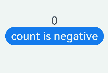
Example 2: Adding Render Control to a Button
This example uses if/else statements to control the display text of the button.
// xxx.ets
@Entry
@Component
struct SwipeGestureExample {
  @State count: number = 0

  build() {
    Column() {
      Text(`${this.count}`)
        .fontSize(30)
        .onClick(() => {
          this.count++
        })
      if (this.count <= 0) {
        Button('count is negative').fontSize(30).height(50)
      } else if (this.count % 2 === 0) {
        Button('count is even').fontSize(30).height(50)
      } else {
        Button('count is odd').fontSize(30).height(50)
      }
    }.height('100%').width('100%').justifyContent(FlexAlign.Center)
  }
}
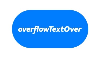
Example 3: Setting the Button Text Style
This example customizes the display style of button text by configuring labelStyle.
// xxx.ets
@Entry
@Component
struct buttonTestDemo {
  @State txt: string = 'overflowTextOverlengthTextOverflow.Clip';
  @State widthShortSize: number = 210;

  build() {
    Row() {
      Column() {
        Button(this.txt)
          .width(this.widthShortSize)
          .height(100)
          .backgroundColor(0x317aff)
          .labelStyle({ overflow: TextOverflow.Clip,
            maxLines: 1,
            minFontSize: 20,
            maxFontSize: 20,
            font: {
              size: 20,
              weight: FontWeight.Bolder,
              family: 'cursive',
              style: FontStyle.Italic
            }
          })
          .fontSize(40)
      }
      .width('100%')
    }
    .height('100%')
  }
}
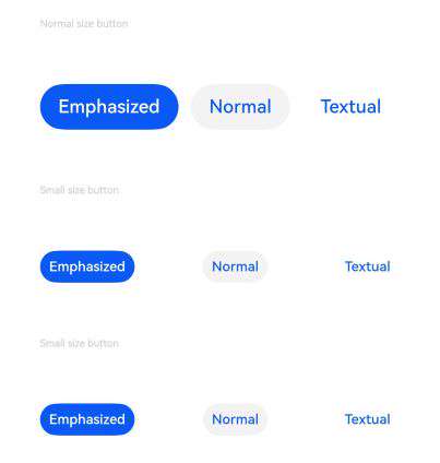
Example 4: Setting Importance of Different Sized Buttons
This example demonstrates how to set the importance of buttons of different sizes by configuring controlSize and buttonStyle.
// xxx.ets
@Entry
@Component
struct ButtonExample {
  build() {
    Flex({ direction: FlexDirection.Column, alignItems: ItemAlign.Start, justifyContent: FlexAlign.SpaceBetween }) {
      Text('Normal size button').fontSize(9).fontColor(0xCCCCCC)
      Flex({ alignItems: ItemAlign.Center, justifyContent: FlexAlign.SpaceBetween }) {
        Button('Emphasized', { buttonStyle: ButtonStyleMode.EMPHASIZED });
        Button('Normal', { buttonStyle: ButtonStyleMode.NORMAL });
        Button('Textual', { buttonStyle: ButtonStyleMode.TEXTUAL });
      }

      Text('Small size button').fontSize(9).fontColor(0xCCCCCC)
      Flex({ alignItems: ItemAlign.Center, justifyContent: FlexAlign.SpaceBetween }) {
        Button('Emphasized', { controlSize: ControlSize.SMALL, buttonStyle: ButtonStyleMode.EMPHASIZED });
        Button('Normal', { controlSize: ControlSize.SMALL, buttonStyle: ButtonStyleMode.NORMAL });
        Button('Textual', { controlSize: ControlSize.SMALL, buttonStyle: ButtonStyleMode.TEXTUAL });
      }

      Text('Small size button').fontSize(9).fontColor(0xCCCCCC)
      Flex({ alignItems: ItemAlign.Center, justifyContent: FlexAlign.SpaceBetween }) {
        Button('Emphasized').controlSize(ControlSize.SMALL).buttonStyle(ButtonStyleMode.EMPHASIZED);
        Button('Normal').controlSize(ControlSize.SMALL).buttonStyle(ButtonStyleMode.NORMAL);
        Button('Textual').controlSize(ControlSize.SMALL).buttonStyle(ButtonStyleMode.TEXTUAL);
      }

    }.height(400).padding({ left: 35, right: 35, top: 35 })
  }
}
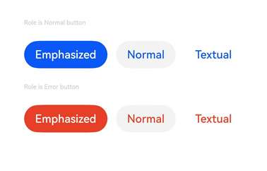
Example 5: Setting the Button Role
This example demonstrates how to set the role of the button by configuring role.
// xxx.ets
@Entry
@Component
struct ButtonExample {
  build() {
    Flex({ direction: FlexDirection.Column, alignItems: ItemAlign.Start, justifyContent: FlexAlign.SpaceBetween }) {
      Text('Role is Normal button').fontSize(9).fontColor(0xCCCCCC)
      Flex({ alignItems: ItemAlign.Center, justifyContent: FlexAlign.SpaceBetween }) {
        Button('Emphasized', { buttonStyle: ButtonStyleMode.EMPHASIZED, role: ButtonRole.NORMAL });
        Button('Normal', { buttonStyle: ButtonStyleMode.NORMAL, role: ButtonRole.NORMAL });
        Button('Textual', { buttonStyle: ButtonStyleMode.TEXTUAL, role: ButtonRole.NORMAL });
      }
      Text('Role is Error button').fontSize(9).fontColor(0xCCCCCC)
      Flex({ alignItems: ItemAlign.Center, justifyContent: FlexAlign.SpaceBetween }) {
        Button('Emphasized', { buttonStyle: ButtonStyleMode.EMPHASIZED, role: ButtonRole.ERROR});
        Button('Normal', { buttonStyle: ButtonStyleMode.NORMAL, role: ButtonRole.ERROR });
        Button('Textual', { buttonStyle: ButtonStyleMode.TEXTUAL, role: ButtonRole.ERROR });
      }
    }.height(200).padding({ left: 35, right: 35, top: 35 })
  }
}
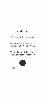
Example 6: Implementing a Custom Button
This example implements a custom button in the shape of a circle. The circle is red when pressed, accompanied by the text “Pressed” in the title. It is black when not pressed, accompanied by the text “Not pressed” in the title.
class MyButtonStyle implements ContentModifier<ButtonConfiguration> {
  x: number = 0
  y: number = 0
  selectedColor:Color = Color.Black

  constructor(x : number, y: number,ColorType:Color) {
    this.x = x
    this.y = y
    this.selectedColor = ColorType
  }
  applyContent() : WrappedBuilder<[ButtonConfiguration]>
  {
    return wrapBuilder(buildButton1)
  }
}

@Builder function buildButton1(config: ButtonConfiguration) {
  Column({space:30}) {
    Text(config.enabled ? "enabled true" : "enabled false")
    Text('Circle state' + (config.pressed? "(Pressed)" : "(Not pressed)"))
    Text('X-coordinate of the click point:' + (config.enabled ? (config.contentModifier as MyButtonStyle).x : "0"))
    Text('Y-coordinate of the click point:' + (config.enabled ? (config.contentModifier as MyButtonStyle).y : "0"))
    Circle({ width: 50, height: 50 })
      .fill(config.pressed ? (config.contentModifier as MyButtonStyle).selectedColor : Color.Black)
      .gesture(
        TapGesture({count:1}).onAction((event: GestureEvent)=>{
          config.triggerClick(event.fingerList[0].localX,event.fingerList[0].localY)
        })).opacity(config.enabled ? 1 : 0.1)
  }
}

@Entry
@Component
struct ButtonExample {
  @State buttonEnabled: boolean = true;
  @State positionX: number = 0
  @State positionY: number = 0
  @State state : boolean[] = [true,false]
  @State index:number = 0
  build() {
    Column() {
      Button('OK')
        .contentModifier(new MyButtonStyle(this.positionX,this.positionY,Color.Red))
        .onClick((event) => {
          console.info('change' + JSON.stringify(event))
          this.positionX = event.displayX
          this.positionY = event.displayY
        }).enabled(this.buttonEnabled)
      Row() {
        Toggle({ type: ToggleType.Switch, isOn: true }).onChange((value: boolean) => {
          if (value) {
            this.buttonEnabled = true
          } else {
            this.buttonEnabled = false
          }
        }).margin({left:-80})
      }
    }.height('100%').width('100%').justifyContent(FlexAlign.Center)
  }
}
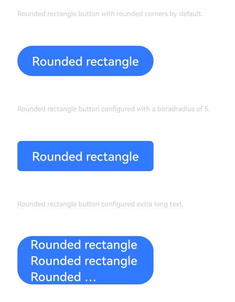
Example 7: Setting Rounded Rectangle Buttons
This example creates rounded rectangle buttons by configuring ButtonType.ROUNDED_RECTANGLE.
@Entry
@Component
struct ButtonExample {
  build() {
    Flex({ direction: FlexDirection.Column, alignItems: ItemAlign.Start, justifyContent: FlexAlign.SpaceBetween }) {
      Text('Rounded rectangle button with rounded corners by default.').fontSize(9).fontColor(0xCCCCCC)
      Flex({ alignItems: ItemAlign.Center, justifyContent: FlexAlign.SpaceBetween }) {
        Button('Rounded rectangle')
          .type(ButtonType.ROUNDED_RECTANGLE)
          .backgroundColor(0x317aff)
          .controlSize(ControlSize.NORMAL)
          .width(180)
      }
      Text('Rounded rectangle button configured with a borderRadius of 5.').fontSize(9).fontColor(0xCCCCCC)
      Flex({ alignItems: ItemAlign.Center, justifyContent: FlexAlign.SpaceBetween }) {
        Button('Rounded rectangle')
          .type(ButtonType.ROUNDED_RECTANGLE)
          .backgroundColor(0x317aff)
          .controlSize(ControlSize.NORMAL)
          .width(180)
          .borderRadius(5)
      }
      Text('Rounded rectangle button configured extra long text.').fontSize(9).fontColor(0xCCCCCC)
      Flex({ alignItems: ItemAlign.Center, justifyContent: FlexAlign.SpaceBetween }) {
        Button('Rounded rectangle Rounded rectangle Rounded rectangle Rounded rectangle')
          .type(ButtonType.ROUNDED_RECTANGLE)
          .backgroundColor(0x317aff)
          .width(180)
            //.buttonStyle(ButtonStyleMode.NORMAL)
          .labelStyle({overflow:TextOverflow.Ellipsis, maxLines:3, minFontSize: 0})
      }
    }.height(400).padding({ left: 35, right: 35, top: 35 })
  }
}
你可能感兴趣的鸿蒙文章
- 所属分类: 后端技术
- 本文标签:
热门推荐
-
2、 优质文章
-
3、 gt
-
7、 openharmony
-
9、 golang
-
10、 Vue中input框自动聚焦