harmony 鸿蒙Blank
Blank
The Blank component is a spacer in the layout, automatically filling the remaining space along the main axis of its parent container. It works only when the parent component is Row, Column, or Flex.
NOTE
This component is supported since API version 7. Updates will be marked with a superscript to indicate their earliest API version.
Child Components
Not supported
APIs
Blank(min?: number|string)
Since API version 10: - When the Blank component is used within a Row, Column, or Flex container, it will automatically stretch or shrink along the main axis if it does not have a main axis size specified. If the Blank component has a main axis size specified or if the container is set to adapt to the size of its child nodes, the component will not automatically stretch or shrink. - Relationship between size and min of the Blank component on the main axis: max(min, size). - If the Blank component has a cross axis size specified, it will not fill up the parent container on the cross axis. If it does not have a cross axis size specified, it will fill up the parent container on the cross axis, following the ItemAlign.Stretch mode, the default setting of alignSelf.
Widget capability: This API can be used in ArkTS widgets since API version 9.
Atomic service API: This API can be used in atomic services since API version 11.
System capability: SystemCapability.ArkUI.ArkUI.Full
Parameters
| Name | Type | Mandatory | Description |
|---|---|---|---|
| min | number |string | No | Minimum size of the Blank component in the container along the main axis. Default value: 0 If the type is number, the default unit is vp. If the type is string, the pixel unit can be explicitly specified, for example, ‘10px’. If the unit is not specified, the default unit vp is used, in which case ‘10’ is equivalent to 10vp. NOTE This parameter cannot be set in percentage. If the value is negative, the default value is used. If the minimum size is larger than the available space of the container, it is used as the component size, and the component extends beyond the container. |
Attributes
In addition to the universal attributes, the following attributes are supported.
color
color(value: ResourceColor)
Sets the color to fill the blank.
Widget capability: This API can be used in ArkTS widgets since API version 9.
Atomic service API: This API can be used in atomic services since API version 11.
System capability: SystemCapability.ArkUI.ArkUI.Full
Parameters
| Name | Type | Mandatory | Description |
|---|---|---|---|
| value | ResourceColor | Yes | Color to fill the blank. Default value: Color.Transparent |
Events
The universal events are supported.
Example
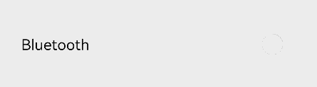
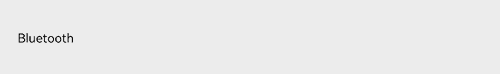
Example 1: Filling Remaining Space
This example shows how the Blank component fills the remaining space in landscape and portrait modes.
// xxx.ets
@Entry
@Component
struct BlankExample {
  build() {
    Column() {
      Row() {
        Text('Bluetooth').fontSize(18)
        Blank()
        Toggle({ type: ToggleType.Switch }).margin({ top: 14, bottom: 14, left: 6, right: 6 })
      }.width('100%').backgroundColor(0xFFFFFF).borderRadius(15).padding({ left: 12 })
    }.backgroundColor(0xEFEFEF).padding(20)
  }
}
Portrait mode
Landscape mode
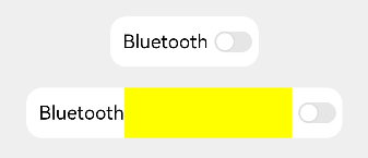
Example 2: Filling a Fixed Width
This example shows the effect of using the min parameter of the Blank component when its parent component does not have a width set.
// xxx.ets
@Entry
@Component
struct BlankExample {
  build() {
    Column({ space: 20 }) {
      // If the width of the parent container is not set, the Blank component becomes invalid. In this case, you can set min to specify the minimum width of the Blank component.
      Row() {
        Text('Bluetooth').fontSize(18)
        Blank().color(Color.Yellow)
        Toggle({ type: ToggleType.Switch }).margin({ top: 14, bottom: 14, left: 6, right: 6 })
      }.backgroundColor(0xFFFFFF).borderRadius(15).padding({ left: 12 })

      Row() {
        Text('Bluetooth').fontSize(18)
        // Set the minimum width to 160.
        Blank('160').color(Color.Yellow)
        Toggle({ type: ToggleType.Switch }).margin({ top: 14, bottom: 14, left: 6, right: 6 })
      }.backgroundColor(0xFFFFFF).borderRadius(15).padding({ left: 12 })

    }.backgroundColor(0xEFEFEF).padding(20).width('100%')
  }
}
If the width of the parent container is not set, set min to specify the minimum width of the Blank component.
你可能感兴趣的鸿蒙文章
- 所属分类: 后端技术
- 本文标签:
热门推荐
-
2、 优质文章
-
3、 gt
-
7、 openharmony
-
9、 golang
-
10、 Vue中input框自动聚焦