harmony 鸿蒙Pixel Units
Pixel Units
ArkUI provides four pixel units, with vp as the reference data unit.
NOTE
The initial APIs of this module are supported since API version 7. Newly added APIs will be marked with a superscript to indicate their earliest API version.
| Name | Description |
|---|---|
| px | Physical pixel unit of the screen. |
| vp | Pixel unit specific to the screen density. Pixels in this unit are converted into physical pixels of the screen based on the screen pixel density. This unit is used for values whose unit is not specified. NOTE The ratio of vp to px is subject to the screen pixel density. |
| fp | Font pixel, which is similar to vp and varies according to the system font size. |
| lpx | Logical pixel unit of the window. It is the ratio of the actual screen width to the logical width (configured by designWidth). For example, if designWidth is set to 720 (default value), then 1 lpx is equal to 2 px for a screen with an actual width of 1440 physical pixels. |
Pixel Unit Conversion
Conversion between px and other pixel units is supported.
Widget capability: This API can be used in ArkTS widgets since API version 9.
Atomic service API: This API can be used in atomic services since API version 11.
System capability: SystemCapability.ArkUI.ArkUI.Full
| API | Description |
|---|---|
| vp2px(value : number) : number | Converts a value in units of vp to a value in units of px. Value range of value: (-∞, +∞). Value range of the return value: (-∞, +∞). NOTE By default, the virtual pixel ratio of the screen where the current UI instance is located is used for conversion. If no UI instance is available, the virtual pixel ratio of the default screen is used instead. |
| px2vp(value : number) : number | Converts a value in units of px to a value in units of vp. Value range of value: (-∞, +∞). Value range of the return value: (-∞, +∞). NOTE By default, the virtual pixel ratio of the screen where the current UI instance is located is used for conversion. If no UI instance is available, the virtual pixel ratio of the default screen is used instead. |
| fp2px(value : number) : number | Converts a value in units of fp to a value in units of px. Value range of value: (-∞, +∞). Value range of the return value: (-∞, +∞). |
| px2fp(value : number) : number | Converts a value in units of px to a value in units of fp. Value range of value: (-∞, +∞). Value range of the return value: (-∞, +∞). |
| lpx2px(value : number) : number | Converts a value in units of lpx to a value in units of px. Value range of value: (-∞, +∞). Value range of the return value: (-∞, +∞). |
| px2lpx(value : number) : number | Converts a value in units of px to a value in units of lpx. Value range of value: (-∞, +∞). Value range of the return value: (-∞, +∞). |
Example
NOTE
When performing pixel unit conversions, directly calling the vp2px, px2vp, fp2px, px2fp, lpx2px, or px2lpx API may result in ambiguity regarding which UI instance it is tied to. To avoid this issue, obtain a UIContext instance using the getUIContext API, and then call the pixel unit conversion API under the specific UIContext instance.
// xxx.ets
@Entry
@Component
struct Example {
build() {
Column() {
Flex({ wrap: FlexWrap.Wrap }) {
Column() {
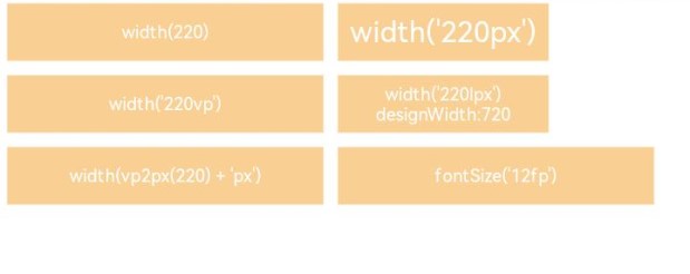
Text("width(220)")
.width(220)
.height(40)
.backgroundColor(0xF9CF93)
.textAlign(TextAlign.Center)
.fontColor(Color.White)
.fontSize('12vp')
}.margin(5)
Column() {
Text("width('220px')")
.width('220px')
.height(40)
.backgroundColor(0xF9CF93)
.textAlign(TextAlign.Center)
.fontColor(Color.White)
}.margin(5)
Column() {
Text("width('220vp')")
.width('220vp')
.height(40)
.backgroundColor(0xF9CF93)
.textAlign(TextAlign.Center)
.fontColor(Color.White)
.fontSize('12vp')
}.margin(5)
Column() {
Text("width('220lpx') designWidth:720")
.width('220lpx')
.height(40)
.backgroundColor(0xF9CF93)
.textAlign(TextAlign.Center)
.fontColor(Color.White)
.fontSize('12vp')
}.margin(5)
Column() {
Text("width(vp2px(220) + 'px')")
// You are advised to use this.getUIContext().vp2px().
.width(vp2px(220) + 'px')
.height(40)
.backgroundColor(0xF9CF93)
.textAlign(TextAlign.Center)
.fontColor(Color.White)
.fontSize('12vp')
}.margin(5)
Column() {
Text("fontSize('12fp')")
.width(220)
.height(40)
.backgroundColor(0xF9CF93)
.textAlign(TextAlign.Center)
.fontColor(Color.White)
.fontSize('12fp')
}.margin(5)
Column() {
Text("width(px2vp(220))")
// You are advised to use this.getUIContext().px2vp().
.width(px2vp(220))
.height(40)
.backgroundColor(0xF9CF93)
.textAlign(TextAlign.Center)
.fontColor(Color.White)
.fontSize('12fp')
}.margin(5)
}.width('100%')
}
}
}
你可能感兴趣的鸿蒙文章
- 所属分类: 后端技术
- 本文标签:
热门推荐
-
2、 优质文章
-
3、 gt
-
7、 openharmony
-
9、 golang
-
10、 Vue中input框自动聚焦