harmony 鸿蒙Progress Indicator (Progress)
Progress Indicator (Progress)
The Progress component is used to provide an indicator that shows the progress of an operation. For details, see Progress.
Creating a Progress Indicator
You can create a progress indicator by calling the following API:
Progress(options: {value: number, total?: number, type?: ProgressType})
In this API, value indicates the initial progress, total indicates the total progress, and type indicates the style of the progress indicator.
Progress({ value: 24, total: 100, type: ProgressType.Linear }) // Create a linear progress indicator whose total progress is 100 and initial progress is 24.

Setting the Progress Indicator Style
Progress indicators come in five styles. When creating a progress indicator, you can specify its style by setting the ProgressType parameter to any of the following: ProgressType.Linear (linear style), ProgressType.Ring (indeterminate ring style), ProgressType.ScaleRing (determinate ring style), ProgressType.Eclipse (eclipse style), and ProgressType.Capsule (capsule style).
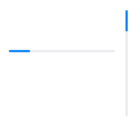
- Linear style (default style)
NOTE
Since API version 9, the progress indicator adaptively switches to the vertical layout if its height is greater than the width and remains the horizontal layout if the height is equal to the width.
  Progress({ value: 20, total: 100, type: ProgressType.Linear }).width(200).height(50)
  Progress({ value: 20, total: 100, type: ProgressType.Linear }).width(50).height(200)
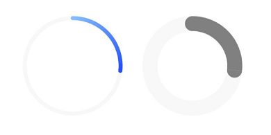
- Indeterminate ring style
  // The progress indicator in the indeterminate ring style on the left: Retain its default settings for the foreground color (blue gradient) and stroke width (2.0 vp).
  Progress({ value: 40, total: 150, type: ProgressType.Ring }).width(100).height(100)
  // The right progress indicator in the indeterminate ring style on the right.
  Progress({ value: 40, total: 150, type: ProgressType.Ring }).width(100).height(100)
      .color(Color.Grey)	// Set the foreground color to gray.
      .style({ strokeWidth: 15})	// Set the stroke width to 15.0 vp.
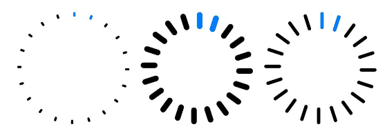
- Determinate ring style
  Progress({ value: 20, total: 150, type: ProgressType.ScaleRing }).width(100).height(100)
      .backgroundColor(Color.Black)
      .style({ scaleCount: 20, scaleWidth: 5 })	// Set the total number of scales to 20 and the scale width to 5 vp.
  Progress({ value: 20, total: 150, type: ProgressType.ScaleRing }).width(100).height(100)
      .backgroundColor(Color.Black)
      .style({ strokeWidth: 15, scaleCount: 20, scaleWidth: 5 })	// Set the stroke width to 15, the total number of scales to 20, and the scale width to 5 vp.
  Progress({ value: 20, total: 150, type: ProgressType.ScaleRing }).width(100).height(100)
      .backgroundColor(Color.Black)
      .style({ strokeWidth: 15, scaleCount: 20, scaleWidth: 3 })	// Set the stroke width to 15, the total number of scales to 20, and the scale width to 3 vp.
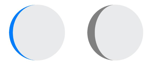
- Eclipse style
  // The progress indicator in the eclipse style on the left: Retain its default settings for the foreground color (blue).
  Progress({ value: 10, total: 150, type: ProgressType.Eclipse }).width(100).height(100)
  // The progress indicator in the eclipse style on the right: Set its foreground color to gray.
  Progress({ value: 20, total: 150, type: ProgressType.Eclipse }).color(Color.Grey).width(100).height(100)
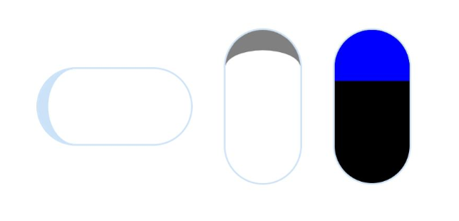
- Capsule style >NOTE > >- At both ends, the progress indicator in the capsule style works in a same manner as that in the eclipse style. >- In the middle part of the capsule, the progress indicator works in a same manner as the linear style. > >- If the height is greater than the width, the progress indicator adaptively switches to the vertical layout.
  Progress({ value: 10, total: 150, type: ProgressType.Capsule }).width(100).height(50)
  Progress({ value: 20, total: 150, type: ProgressType.Capsule }).width(50).height(100).color(Color.Grey)
  Progress({ value: 50, total: 150, type: ProgressType.Capsule }).width(50).height(100).color(Color.Blue).backgroundColor(Color.Black)
Example Scenario
In this example, the progress of the Progress component is updated by clicking the button. After the button is clicked, the value of progressValue is incremented and passed by the value attribute to the Progress component, which is then updated accordingly.
@Entry
@Component
struct ProgressCase1 {
  @State progressValue: number = 0	// Set the initial progress of the progress indicator to 0.
  build() {
    Column() {
      Column() {
        Progress({value:0, total:100, type:ProgressType.Capsule}).width(200).height(50).value(this.progressValue)
        Row().width('100%').height(5)
        Button("Progress + 5")
          .onClick(()=>{
            this.progressValue += 5
            if (this.progressValue > 100){
              this.progressValue = 0
            }
          })
      }
    }.width('100%').height('100%')
  }
}

你可能感兴趣的鸿蒙文章
harmony 鸿蒙Atomic Service Full Screen Launch Component (FullScreenLaunchComponent)
harmony 鸿蒙Arc Button (ArcButton)
harmony 鸿蒙Frame Animation (ohos.animator)
harmony 鸿蒙Implementing Property Animation
- 所属分类: 后端技术
- 本文标签:
热门推荐
-
2、 优质文章
-
3、 gt
-
7、 openharmony
-
9、 golang
-
10、 Vue中input框自动聚焦