harmony 鸿蒙Radio Button (Radio)
Radio Button (Radio)
The Radio component allows users to select from a set of mutually exclusive options. Only one radio button in a given group can be selected at the same time. For details, see Radio.
Creating a Radio Button
You can create a radio button by calling the following API:
Radio(options: {value: string, group: string})
In this API, value indicates the name of the radio button, and group indicates the name of the group to which the radio button belongs. You can use the checked attribute to specify whether the radio button is selected. Setting it to true means that the radio button is selected.
In addition, you can customize the style of the radio button for both the selected and unselected states.
Radio({ value: 'Radio1', group: 'radioGroup' })
  .checked(false)
Radio({ value: 'Radio2', group: 'radioGroup' })
  .checked(true)

Adding Events
The Radio component supports the universal events. In addition, it can be bound to the onChange event so that it responds with custom behavior after being selected.
  Radio({ value: 'Radio1', group: 'radioGroup' })
    .onChange((isChecked: boolean) => {
      if(isChecked) {
        // Operation
      }
    })
  Radio({ value: 'Radio2', group: 'radioGroup' })
    .onChange((isChecked: boolean) => {
      if(isChecked) {
        // Operation
      }
    })
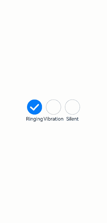
Example
In this example, the Radio components are used to switch between sound modes.
// xxx.ets
import { promptAction } from '@kit.ArkUI';

@Entry
@Component
struct RadioExample {
  @State Rst:promptAction.ShowToastOptions = {'message': 'Ringing mode.'}
  @State Vst:promptAction.ShowToastOptions = {'message': 'Vibration mode.'}
  @State Sst:promptAction.ShowToastOptions = {'message': 'Silent mode.'}
  build() {
    Row() {
      Column() {
        Radio({ value: 'Radio1', group: 'radioGroup' }).checked(true)
          .height(50)
          .width(50)
          .onChange((isChecked: boolean) => {
            if(isChecked) {
              // Switch to the ringing mode.
              promptAction.showToast(this.Rst)
            }
          })
        Text('Ringing')
      }
      Column() {
        Radio({ value: 'Radio2', group: 'radioGroup' })
          .height(50)
          .width(50)
          .onChange((isChecked: boolean) => {
            if(isChecked) {
              // Switch to the vibration mode.
              promptAction.showToast(this.Vst)
            }
          })
        Text('Vibration')
      }
      Column() {
        Radio({ value: 'Radio3', group: 'radioGroup' })
          .height(50)
          .width(50)
          .onChange((isChecked: boolean) => {
            if(isChecked) {
              // Switch to the silent mode.
              promptAction.showToast(this.Sst)
            }
          })
        Text('Silent')
      }
    }.height('100%').width('100%').justifyContent(FlexAlign.Center)
  }
}
你可能感兴趣的鸿蒙文章
harmony 鸿蒙Atomic Service Full Screen Launch Component (FullScreenLaunchComponent)
harmony 鸿蒙Arc Button (ArcButton)
harmony 鸿蒙Frame Animation (ohos.animator)
harmony 鸿蒙Implementing Property Animation
- 所属分类: 后端技术
- 本文标签:
热门推荐
-
2、 优质文章
-
3、 gt
-
7、 openharmony
-
9、 golang
-
10、 Vue中input框自动聚焦