harmony 鸿蒙Radio
Radio
The Radio component allows users to select from a set of mutually exclusive options.
NOTE
Since API version 12, the default indicator type for the Radio component changes from RadioIndicatorType.DOT to RadioIndicatorType.TICK.
This component is supported since API version 8. Updates will be marked with a superscript to indicate their earliest API version.
Child Components
Not supported
APIs
Radio(options: RadioOptions)
Creates a radio button.
Widget capability: This API can be used in ArkTS widgets since API version 9.
Atomic service API: This API can be used in atomic services since API version 11.
System capability: SystemCapability.ArkUI.ArkUI.Full
Parameters
| Name | Type | Mandatory | Description |
|---|---|---|---|
| options | RadioOptions | Yes | Parameters of the radio button. |
RadioOptions
System capability: SystemCapability.ArkUI.ArkUI.Full
| Name | Type | Mandatory | Description |
|---|---|---|---|
| value | string | Yes | Current value of the radio button. Widget capability: This API can be used in ArkTS widgets since API version 9. Atomic service API: This API can be used in atomic services since API version 11. |
| group | string | Yes | Name of the group to which the radio button belongs. Only one radio button in a given group can be selected at a time. Widget capability: This API can be used in ArkTS widgets since API version 9. Atomic service API: This API can be used in atomic services since API version 11. |
| indicatorType12+ | RadioIndicatorType | No | Indicator type of the radio button. If no value is specified, the value of RadioIndicatorType.TICK is used. Widget capability: This API can be used in ArkTS widgets since API version 12. Atomic service API: This API can be used in atomic services since API version 12. |
| indicatorBuilder12+ | CustomBuilder | No | Custom component to indicate that the radio button is selected. This custom component is center aligned with the radio button. If this parameter is set to undefined, the value of RadioIndicatorType.TICK is used as the indicator type. Widget capability: This API can be used in ArkTS widgets since API version 12. Atomic service API: This API can be used in atomic services since API version 12. |
RadioIndicatorType12+
Widget capability: This API can be used in ArkTS widgets since API version 12.
Atomic service API: This API can be used in atomic services since API version 12.
System capability: SystemCapability.ArkUI.ArkUI.Full
| Name | Value | Description |
|---|---|---|
| TICK | 0 | Default tick icon. |
| DOT | 1 | Default dot icon. |
| CUSTOM | 2 | Custom component. |
Attributes
In addition to the universal attributes, the following attributes are supported.
checked
checked(value: boolean)
Sets whether the radio button is selected.
Since API version 10, this attribute supports two-way binding through $$. Since API version 18, this attribute supports two-way binding through !!.
Widget capability: This API can be used in ArkTS widgets since API version 9.
Atomic service API: This API can be used in atomic services since API version 11.
System capability: SystemCapability.ArkUI.ArkUI.Full
Parameters
| Name | Type | Mandatory | Description |
|---|---|---|---|
| value | boolean | Yes | Whether the radio button is selected. Default value: false true: The radio button is selected. false: The radio button is not selected. |
checked18+
checked(isChecked: Optional<boolean>)
Sets whether the radio button is selected. Compared to checked, this API supports the undefined type for the isChecked parameter.
This attribute supports two-way binding through $$. Since API version 18, this attribute supports two-way binding through !!.
Widget capability: This API can be used in ArkTS widgets since API version 18.
Atomic service API: This API can be used in atomic services since API version 18.
System capability: SystemCapability.ArkUI.ArkUI.Full
Parameters
| Name | Type | Mandatory | Description |
|---|---|---|---|
| isChecked | Optional<boolean> | Yes | Whether the radio button is selected. If isChecked is set to undefined, the default value false is used. true: The radio button is selected. false: The radio button is not selected. |
radioStyle10+
radioStyle(value?: RadioStyle)
Sets the style of the radio button in selected or deselected state.
Since API version 10, this API is supported in ArkTS widgets.
Atomic service API: This API can be used in atomic services since API version 11.
System capability: SystemCapability.ArkUI.ArkUI.Full
Parameters
| Name | Type | Mandatory | Description |
|---|---|---|---|
| value | RadioStyle | No | Style of the radio button in selected or deselected state. |
contentModifier12+
contentModifier(modifier: ContentModifier<RadioConfiguration>)
Creates a content modifier.
Atomic service API: This API can be used in atomic services since API version 12.
System capability: SystemCapability.ArkUI.ArkUI.Full
Parameters
| Name | Type | Mandatory | Description |
|---|---|---|---|
| modifier | ContentModifier<RadioConfiguration> | Yes | Content modifier to apply to the current component. modifier: content modifier. You need a custom class to implement the ContentModifier API. |
contentModifier18+
contentModifier(modifier: Optional
Creates a content modifier. Compared to contentModifier12+, this API supports the undefined type for the modifier parameter.
Atomic service API: This API can be used in atomic services since API version 18.
System capability: SystemCapability.ArkUI.ArkUI.Full
Parameters
| Name | Type | Mandatory | Description |
|---|---|---|---|
| modifier | Optional<ContentModifier<RadioConfiguration>> | Yes | Content modifier to apply to the current component. modifier: content modifier. You need a custom class to implement the ContentModifier API. If modifier is set to undefined, no content modifier is used. |
Events
In addition to the universal events, the following events are supported.
onChange
onChange(callback: (isChecked: boolean) => void)
Triggered when the selected state of the radio button changes.
Widget capability: This API can be used in ArkTS widgets since API version 9.
Atomic service API: This API can be used in atomic services since API version 11.
System capability: SystemCapability.ArkUI.ArkUI.Full
Parameters
| Name | Type | Mandatory | Description |
|---|---|---|---|
| isChecked | boolean | Yes | Selected state of the radio button. |
onChange18+
onChange(callback: Optional<OnRadioChangeCallback>)
Triggered when the selected state of the radio button changes. Compared to onChange, this API supports the undefined type for the callback parameter.
Widget capability: This API can be used in ArkTS widgets since API version 18.
Atomic service API: This API can be used in atomic services since API version 18.
System capability: SystemCapability.ArkUI.ArkUI.Full
Parameters
| Name | Type | Mandatory | Description |
|---|---|---|---|
| callback | Optional<OnRadioChangeCallback> | Yes | Called invoked when the selected state of the radio button changes. If callback is set to undefined, the callback function is not used. |
OnRadioChangeCallback18+
type OnRadioChangeCallback = (isChecked: boolean) => void
Triggered when the selected state of the radio button changes.
Atomic service API: This API can be used in atomic services since API version 18.
System capability: SystemCapability.ArkUI.ArkUI.Full
Parameters
| Name | Type | Mandatory | Description |
|---|---|---|---|
| isChecked | boolean | Yes | Selected state of the radio button. The value true means that the radio button changes from unselected to selected, and false means that the radio button changes from selected to unselected. |
RadioStyle10+
Atomic service API: This API can be used in atomic services since API version 11.
System capability: SystemCapability.ArkUI.ArkUI.Full
| Name | Type | Mandatory | Description |
|---|---|---|---|
| checkedBackgroundColor | ResourceColor | No | Color of the background when the radio button is selected. Default value: $r(‘sys.color.ohos_id_color_text_primary_activated’) |
| uncheckedBorderColor | ResourceColor | No | Color of the border when the radio button is deselected. Default value: $r(‘sys.color.ohos_id_color_switch_outline_off’) |
| indicatorColor | ResourceColor | No | Color of the indicator when the radio button is selected. Since API version 12, this parameter takes effect only when indicatorType is set to RadioIndicatorType.TICK or RadioIndicatorType.DOT. Default value: $r(‘sys.color.ohos_id_color_foreground_contrary’) |
RadioConfiguration12+
You need a custom class to implement the ContentModifier API.
Atomic service API: This API can be used in atomic services since API version 12.
System capability: SystemCapability.ArkUI.ArkUI.Full
| Name | Type | Read Only | Optional | Description |
|---|---|---|---|---|
| value | string | No | No | Current value of the radio button. |
| checked | boolean | No | No | Whether the radio button is selected. Default value: false true: The radio button is selected. false: The radio button is not selected. |
| triggerChange | Callback<boolean> | No | No | Changes the selected state of the radio button. The value true means that the radio button changes from unselected to selected, and false means that the radio button changes from selected to unselected. |
Example
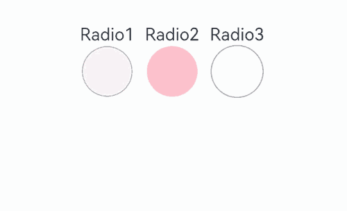
Example 1: Setting the Background Color
This example demonstrates how to set checkedBackgroundColor to customize the background color of a radio button.
// xxx.ets
@Entry
@Component
struct RadioExample {
  build() {
    Flex({ direction: FlexDirection.Row, justifyContent: FlexAlign.Center, alignItems: ItemAlign.Center }) {
      Column() {
        Text('Radio1')
        Radio({ value: 'Radio1', group: 'radioGroup' }).checked(true)
          .radioStyle({
            checkedBackgroundColor: Color.Pink
          })
          .height(50)
          .width(50)
          .onChange((isChecked: boolean) => {
            console.log('Radio1 status is ' + isChecked)
          })
      }
      Column() {
        Text('Radio2')
        Radio({ value: 'Radio2', group: 'radioGroup' }).checked(false)
          .radioStyle({
            checkedBackgroundColor: Color.Pink
          })
          .height(50)
          .width(50)
          .onChange((isChecked: boolean) => {
            console.log('Radio2 status is ' + isChecked)
          })
      }
      Column() {
        Text('Radio3')
        Radio({ value: 'Radio3', group: 'radioGroup' }).checked(false)
          .radioStyle({
            checkedBackgroundColor: Color.Pink
          })
          .height(50)
          .width(50)
          .onChange((isChecked: boolean) => {
            console.log('Radio3 status is ' + isChecked)
          })
      }
    }.padding({ top: 30 })
  }
}
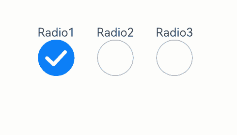
Example 2: Setting the Indicator Type
This example shows how to customize the appearance of a radio button when it is selected by configuring indicatorType and indicatorBuilder.
// xxx.ets
@Entry
@Component
struct RadioExample {
  @Builder
  indicatorBuilder() {
    Image($r("app.media.star"))
  }
  build() {
    Flex({ direction: FlexDirection.Row, justifyContent: FlexAlign.Center, alignItems: ItemAlign.Center }) {
      Column() {
        Text('Radio1')
        Radio({ value: 'Radio1', group: 'radioGroup',
          indicatorType:RadioIndicatorType.TICK
        }).checked(true)
          .height(50)
          .width(80)
          .onChange((isChecked: boolean) => {
            console.log('Radio1 status is ' + isChecked)
          })
      }
      Column() {
        Text('Radio2')
        Radio({ value: 'Radio2', group: 'radioGroup',
          indicatorType:RadioIndicatorType.DOT
        }).checked(false)
          .height(50)
          .width(80)
          .onChange((isChecked: boolean) => {
            console.log('Radio2 status is ' + isChecked)
          })
      }
      Column() {
        Text('Radio3')
        Radio({ value: 'Radio3', group: 'radioGroup',
          indicatorType:RadioIndicatorType.CUSTOM,
          indicatorBuilder:()=>{this.indicatorBuilder()}
        }).checked(false)
          .height(50)
          .width(80)
          .onChange((isChecked: boolean) => {
            console.log('Radio3 status is ' + isChecked)
          })
      }
    }.padding({ top: 30 })
  }
}
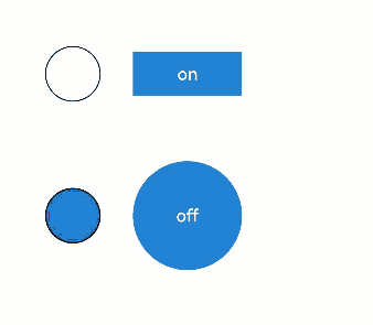
Example 3: Implementing a Custom Radio Button
This example illustrates how to implement a custom radio button using the contentModifier API.
class MyRadioStyle implements ContentModifier<RadioConfiguration> {
  type: number = 0
  selectedColor: ResourceColor = Color.Black

  constructor(numberType: number, colorType: ResourceColor) {
    this.type = numberType
    this.selectedColor = colorType
  }

  applyContent(): WrappedBuilder<[RadioConfiguration]> {
    return wrapBuilder(buildRadio)
  }
}

@Builder
function buildRadio(config: RadioConfiguration) {
  Row({ space: 30 }) {
    Circle({ width: 50, height: 50 })
      .stroke(Color.Black)
      .fill(config.checked ? (config.contentModifier as MyRadioStyle).selectedColor : Color.White)
    Button(config.checked ? "off" : "on")
      .width(100)
      .type(config.checked ? (config.contentModifier as MyRadioStyle).type : ButtonType.Normal)
      .backgroundColor('#2787D9')
      .onClick(() => {
        if (config.checked) {
          config.triggerChange(false)
        } else {
          config.triggerChange(true)
        }
      })
  }
}

@Entry
@Component
struct refreshExample {
  build() {
    Column({ space: 50 }) {
      Row() {
        Radio({ value: 'Radio1', group: 'radioGroup' })
          .contentModifier(new MyRadioStyle(1, '#004AAF'))
          .checked(false)
          .width(300)
          .height(100)
      }

      Row() {
        Radio({ value: 'Radio2', group: 'radioGroup' })
          .checked(true)
          .width(300)
          .height(60)
          .contentModifier(new MyRadioStyle(2, '#004AAF'))
      }
    }
  }
}
你可能感兴趣的鸿蒙文章
- 所属分类: 后端技术
- 本文标签:
热门推荐
-
2、 优质文章
-
3、 gt
-
7、 openharmony
-
9、 golang
-
10、 Vue中input框自动聚焦