harmony 鸿蒙Toggle
Toggle
The Toggle component provides a clickable element in the check box, button, or switch type, typically used to switch between two states. For details, see Toggle.
Creating a Toggle
You can create a toggle by calling the following API:
Toggle(options: { type: ToggleType, isOn?: boolean })
In this API, ToggleType indicates the toggle type, which can be Button, Checkbox, or Switch, and isOn specifies whether the toggle is turned on.
Since API version 11, the default style of the Checkbox component is changed from rounded square to circle.
The API can be called in either of the following ways:
Create a toggle that does not contain child components. This can be achieved by calling the API with ToggleType set to Checkbox or Switch.
Toggle({ type: ToggleType.Checkbox, isOn: false })
Toggle({ type: ToggleType.Checkbox, isOn: true })
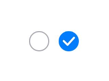
  Toggle({ type: ToggleType.Switch, isOn: false })
  Toggle({ type: ToggleType.Switch, isOn: true })

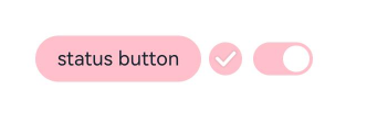
- Create a toggle that contains a child component. When ToggleType is set to Button, only one child component is allowed. If the child component has text set, the text content is displayed on the button.
  Toggle({ type: ToggleType.Button, isOn: false }) {
    Text('status button')
      .fontColor('#182431')
      .fontSize(12)
  }.width(100)
  Toggle({ type: ToggleType.Button, isOn: true }) {
    Text('status button')
      .fontColor('#182431')
      .fontSize(12)
  }.width(100)

Setting Styles
- Use the selectedColor attribute to set the background color of the toggle for when it is turned on.
  Toggle({ type: ToggleType.Button, isOn: true }) {
    Text('status button')
    .fontColor('#182431')
    .fontSize(12)
  }.width(100).selectedColor(Color.Pink)
  Toggle({ type: ToggleType.Checkbox, isOn: true })
    .selectedColor(Color.Pink)
  Toggle({ type: ToggleType.Switch, isOn: true })
    .selectedColor(Color.Pink)
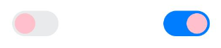
- Use the switchPointColor attribute to set the color of the circular slider. This attribute is valid only when type of the toggle is set to ToggleType.Switch.
  Toggle({ type: ToggleType.Switch, isOn: false })
    .switchPointColor(Color.Pink)
  Toggle({ type: ToggleType.Switch, isOn: true })
    .switchPointColor(Color.Pink)
Adding Events
The Toggle component supports the universal events. In addition, it can be bound to the onChange event so that it responds with custom behavior after being turned on or off.
Toggle({ type: ToggleType.Switch, isOn: false })
  .onChange((isOn: boolean) => {
      if(isOn) {
        // Operation
      }
  })
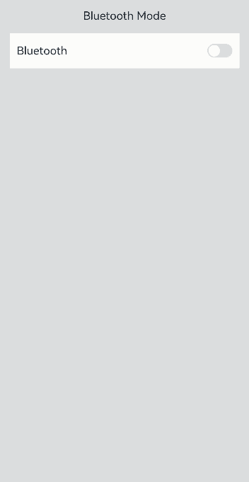
Example Scenario
In this example, the Toggle component is used to enable or disable Bluetooth.
// xxx.ets
import { promptAction } from '@kit.ArkUI';
@Entry
@Component
struct ToggleExample {
  @State BOnSt:promptAction.ShowToastOptions = {'message': 'Bluetooth is on.'}
  @State BOffSt:promptAction.ShowToastOptions = {'message': 'Bluetooth is off.'}
  build() {
    Column() {
      Row() {
        Text("Bluetooth Mode")
          .height(50)
          .fontSize(16)
      }
      Row() {
        Text("Bluetooth")
          .height(50)
          .padding({left: 10})
          .fontSize(16)
          .textAlign(TextAlign.Start)
          .backgroundColor(0xFFFFFF)
        Toggle({ type: ToggleType.Switch })
          .margin({left: 200, right: 10})
          .onChange((isOn: boolean) => {
            if(isOn) {
              promptAction.showToast(this.BOnSt)
            } else {
              promptAction.showToast(this.BOffSt)
            }
          })
      }
      .backgroundColor(0xFFFFFF)
    }
    .padding(10)
    .backgroundColor(0xDCDCDC)
    .width('100%')
    .height('100%')
  }
}
你可能感兴趣的鸿蒙文章
harmony 鸿蒙Atomic Service Full Screen Launch Component (FullScreenLaunchComponent)
harmony 鸿蒙Arc Button (ArcButton)
harmony 鸿蒙Frame Animation (ohos.animator)
harmony 鸿蒙Implementing Property Animation
- 所属分类: 后端技术
- 本文标签:
热门推荐
-
2、 优质文章
-
3、 gt
-
7、 openharmony
-
9、 golang
-
10、 Vue中input框自动聚焦