harmony 鸿蒙Text Display (Text/Span)
Text Display (Text/Span)
The Text component is used to display a piece of textual information. The Span component is used to display inline text.
For details, see Text and Span.
Creating Text
You can create text in either of the following ways:
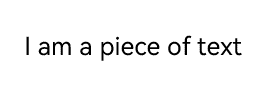
- Entering strings
Text('I am a piece of text')
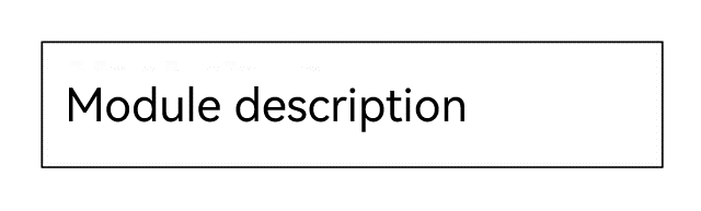
- Referencing Resource objects
You can use $r to create a Resource object to reference resources in /resources/base/element/string.json.
  Text($r('app.string.module_desc'))
    .baselineOffset(0)
    .fontSize(30)
    .border({ width: 1 })
    .padding(10)
    .width(300)
Adding Child Components
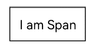
The Span component can only act as a child of the Text and RichEditor components. You can add one or more Span child components to a Text component to display a piece of information, such as the product description and statement of commitment.
- Create a Span component.
The Span component works only when included in a Text component. It does not display any content when used alone. If both the Span and Text components have text configured, the text of the Span overwrites that of the Text component.
  Text('I am Text') {
    Span('I am Span')
  }
  .padding(10)
  .borderWidth(1)
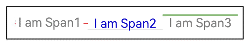
- Set the text decorative line.
Use the decoration attribute to set the style and color of the text decorative line.
  Text() {
    Span('I am Span1,').fontSize(16).fontColor(Color.Grey)
      .decoration({ type: TextDecorationType.LineThrough, color: Color.Red })
    Span('I am Span2').fontColor(Color.Blue).fontSize(16)
      .fontStyle(FontStyle.Italic)
      .decoration({ type: TextDecorationType.Underline, color: Color.Black })
    Span('I am Span3').fontSize(16).fontColor(Color.Grey)
      .decoration({ type: TextDecorationType.Overline, color: Color.Green })
  }
  .borderWidth(1)
  .padding(10)
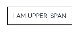
- Use the textCase attribute to set the text case.
  Text() {
    Span('I am Upper-span').fontSize(12)
      .textCase(TextCase.UpperCase)
  }
  .borderWidth(1)
  .padding(10)
- Add an event.
The Span component does not have size information. Therefore, only an onClick event can be added for this component.
  Text() {
    Span('I am Upper-span').fontSize(12)
      .textCase(TextCase.UpperCase)
      .onClick(() => {
        console.info('I am Span - onClick');
      })
  }
Setting Styles
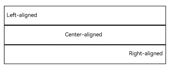
- Use the textAlign attribute to set the alignment mode of text.
  Text('Left aligned')
    .width(300)
    .textAlign(TextAlign.Start)
    .border({ width: 1 })
    .padding(10)
  Text('Center aligned')
    .width(300)
    .textAlign(TextAlign.Center)
    .border({ width: 1 })
    .padding(10)
  Text('Right aligned')
    .width(300)
    .textAlign(TextAlign.End)
    .border({ width: 1 })
    .padding(10)
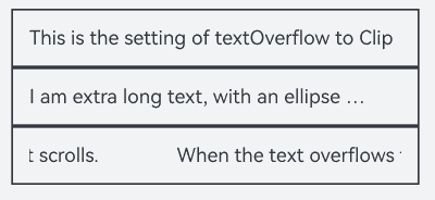
- Use the textOverflow attribute to set the display mode for when the text is too long. This attribute must be used together with maxLines. By default, the text is automatically wrapped.
  Text('This is the setting of textOverflow to Clip text content. This is the setting of textOverflow to None text content. This is the setting of textOverflow to Clip text content This is the setting of textOverflow to None text content.')
    .width(250)
    .textOverflow({ overflow: TextOverflow.None })
    .maxLines(1)
    .fontSize(12)
    .border({ width: 1 })
    .padding(10)
  Text('I am extra long text, with an ellipse displayed for any excess.')
    .width(250)
    .textOverflow({ overflow: TextOverflow.Ellipsis })
    .maxLines(1)
    .fontSize(12)
    .border({ width: 1 })
    .padding(10)
  Text('When the text overflows the container, it scrolls.')
    .width(250)
    .textOverflow({ overflow: TextOverflow.MARQUEE })
    .maxLines(1)
    .fontSize(12)
    .border({ width: 1 })
    .padding(10)
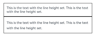
- Use the lineHeight attribute to set the text line height.
  Text('This is the text with the line height set. This is the text with the line height set.')
    .width(300).fontSize(12).border({ width: 1 }).padding(10)
  Text('This is the text with the line height set. This is the text with the line height set.')
    .width(300).fontSize(12).border({ width: 1 }).padding(10)
    .lineHeight(20)
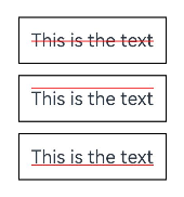
- Use the decoration attribute to set the style and color of the text decorative line.
  Text('This is the text')
    .decoration({
      type: TextDecorationType.LineThrough,
      color: Color.Red
    })
    .borderWidth(1).padding(10).margin(5)
  Text('This is the text')
    .decoration({
      type: TextDecorationType.Overline,
      color: Color.Red
    })
    .borderWidth(1).padding(10).margin(5)
  Text('This is the text')
    .decoration({
      type: TextDecorationType.Underline,
      color: Color.Red
    })
    .borderWidth(1).padding(10).margin(5)
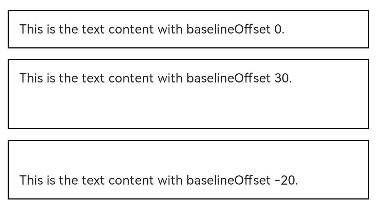
- Use the baselineOffset attribute to set the baseline offset of the text.
  Text('This is the text content with baselineOffset 0.')
    .baselineOffset(0)
    .fontSize(12)
    .border({ width: 1 })
    .padding(10)
    .width('100%')
    .margin(5)
  Text('This is the text content with baselineOffset 30.')
    .baselineOffset(30)
    .fontSize(12)
    .border({ width: 1 })
    .padding(10)
    .width('100%')
    .margin(5)

  Text('This is the text content with baselineOffset -20.')
    .baselineOffset(-20)
    .fontSize(12)
    .border({ width: 1 })
    .padding(10)
    .width('100%')
    .margin(5)
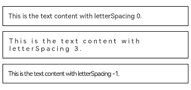
- Use the letterSpacing attribute to set the letter spacing.
  Text('This is the text content with letterSpacing 0.')
    .letterSpacing(0)
    .fontSize(12)
    .border({ width: 1 })
    .padding(10)
    .width('100%')
    .margin(5)
  Text('This is the text content with letterSpacing 3.')
    .letterSpacing(3)
    .fontSize(12)
    .border({ width: 1 })
    .padding(10)
    .width('100%')
    .margin(5)
  Text('This is the text content with letterSpacing -1.')
    .letterSpacing(-1)
    .fontSize(12)
    .border({ width: 1 })
    .padding(10)
    .width('100%')
    .margin(5)
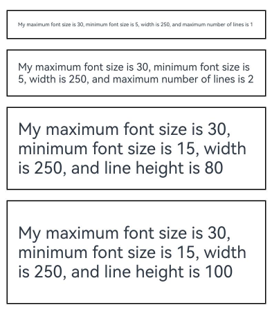
- Use the minFontSize and maxFontSize attributes to set the minimum and maximum font size, respectively.
For the settings to take effect, these attributes must be used together with maxLines or layout constraint settings.
  Text('My maximum font size is 30, minimum font size is 5, width is 250, and maximum number of lines is 1')
    .width(250)
    .maxLines(1)
    .maxFontSize(30)
    .minFontSize(5)
    .border({ width: 1 })
    .padding(10)
    .margin(5)
  Text('My maximum font size is 30, minimum font size is 5, width is 250, and maximum number of lines is 2')
    .width(250)
    .maxLines(2)
    .maxFontSize(30)
    .minFontSize(5)
    .border({ width: 1 })
    .padding(10)
    .margin(5)
  Text('My maximum font size is 30, minimum font size is 15, width is 250, and line height is 80')
    .width(250)
    .height(80)
    .maxFontSize(30)
    .minFontSize(15)
    .border({ width: 1 })
    .padding(10)
    .margin(5)
  Text('My maximum font size is 30, minimum font size is 15, width is 250, and line height is 100')
    .width(250)
    .height(100)
    .maxFontSize(30)
    .minFontSize(15)
    .border({ width: 1 })
    .padding(10)
    .margin(5)
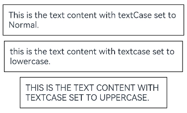
- Use the textCase attribute to set the text case.
  Text('This is the text content with textCase set to Normal.')
    .textCase(TextCase.Normal)
    .padding(10)
    .border({ width: 1 })
    .padding(10)
    .margin(5)

  // The text is displayed in lowercase.
  Text('This is the text content with textCase set to LowerCase.')
    .textCase(TextCase.LowerCase)
    .border({ width: 1 })
    .padding(10)
    .margin(5)

  // The text is displayed in uppercase.
  Text('This is the text content with textCase set to UpperCase.')
    .textCase(TextCase.UpperCase)
    .border({ width: 1 })
    .padding(10)
    .margin(5)
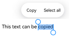
- Use the copyOption attribute to set whether copy and paste is allowed.
  Text("This text is copyable")
    .fontSize(30)
    .copyOption(CopyOptions.InApp)
Adding Events
You can bind the Text component to the onClick, onTouch, or other universal events to respond to user operations.
Text('Click Me')
  .onClick(() => {
      console.info('I am the response to the click event');
   })
Example
This example demonstrates how to implement a hot search list using the maxLines, textOverflow, textAlign, and constraintSize attributes.
// xxx.ets
@Entry
@Component
struct TextExample {
  build() {
    Column() {
      Row() {
        Text("1").fontSize(14).fontColor(Color.Red).margin({ left: 10, right: 10 })
        Text("I am entry 1")
          .fontSize(12)
          .fontColor(Color.Blue)
          .maxLines(1)
          .textOverflow({ overflow: TextOverflow.Ellipsis })
          .fontWeight(300)
        Text("Top Hit")
          .margin({ left: 6 })
          .textAlign(TextAlign.Center)
          .fontSize(10)
          .fontColor(Color.White)
          .fontWeight(600)
          .backgroundColor(0x770100)
          .borderRadius(5)
          .width(40)
          .height(14)
      }.width('100%').margin(5)

      Row() {
        Text("2").fontSize(14).fontColor(Color.Red).margin({ left: 10, right: 10 })
        Text("I am entry 2 I am entry 2 I am entry 2 I am entry 2")
          .fontSize(12)
          .fontColor(Color.Blue)
          .fontWeight(300)
          .constraintSize({ maxWidth: 180 })
          .maxLines(1)
          .textOverflow({ overflow: TextOverflow.Ellipsis })
        Text("Hot")
          .margin({ left: 6 })
          .textAlign(TextAlign.Center)
          .fontSize(10)
          .fontColor(Color.White)
          .fontWeight(600)
          .backgroundColor(0xCC5500)
          .borderRadius(5)
          .width(20)
          .height(14)
      }.width('100%').margin(5)

      Row() {
        Text("3").fontSize(14).fontColor(Color.Orange).margin({ left: 10, right: 10 })
        Text("I am entry 3")
          .fontSize(12)
          .fontColor(Color.Blue)
          .fontWeight(300)
          .maxLines(1)
          .constraintSize({ maxWidth: 200 })
          .textOverflow({ overflow: TextOverflow.Ellipsis })
        Text("Hot")
          .margin({ left: 6 })
          .textAlign(TextAlign.Center)
          .fontSize(10)
          .fontColor(Color.White)
          .fontWeight(600)
          .backgroundColor(0xCC5500)
          .borderRadius(5)
          .width(20)
          .height(14)
      }.width('100%').margin(5)

      Row() {
        Text("4").fontSize(14).fontColor(Color.Grey).margin({ left: 10, right: 10 })
        Text("I am entry 4 I am entry 4 I am entry 4 I am entry 4")
          .fontSize(12)
          .fontColor(Color.Blue)
          .fontWeight(300)
          .constraintSize({ maxWidth: 200 })
          .maxLines(1)
          .textOverflow({ overflow: TextOverflow.Ellipsis })
      }.width('100%').margin(5)
    }.width('100%')
  }
}

你可能感兴趣的鸿蒙文章
harmony 鸿蒙Atomic Service Full Screen Launch Component (FullScreenLaunchComponent)
harmony 鸿蒙Arc Button (ArcButton)
harmony 鸿蒙Frame Animation (ohos.animator)
harmony 鸿蒙Implementing Property Animation
- 所属分类: 后端技术
- 本文标签:
热门推荐
-
2、 优质文章
-
3、 gt
-
7、 openharmony
-
9、 golang
-
10、 Vue中input框自动聚焦