harmony 鸿蒙Text Input (TextInput/TextArea)
Text Input (TextInput/TextArea)
The TextInput and TextArea components are input components typically used to accept input from the user, such as comments, chat messages, and table content. They can be used in combination with other components to meet more diversified purposes, for example, login and registration. For details, see TextInput and TextArea.
Creating a Text Box
The TextInput component provides single-line text input, while the TextArea component provides multi-line text input. To create these components, use the following APIs:
TextInput(value?:{placeholder?: ResourceStr, text?: ResourceStr, controller?: TextInputController})
TextArea(value?:{placeholder?: ResourceStr, text?: ResourceStr, controller?: TextAreaController})
- Single-line text box
TextInput()

- Multi-line text box
TextArea()

The TextArea component automatically wraps text so that each line does not have more than the width of the component.
TextArea({ text: "I am TextArea I am TextArea I am TextArea" }).width(300)

Setting the Input Box Type
The TextInput component comes in nine types. You can specify its type by setting the type parameter to any of the following: Normal, Password, Email, Number, PhoneNumber, USER_NAME, NEW_PASSWORD, NUMBER_PASSWORD, SCREEN_LOCK_PASSWORD, and NUMBER_DECIMAL.
- Normal type (default type)
  TextInput()
    .type(InputType.Normal)

- Password type
  TextInput()
    .type(InputType.Password)

Setting Styles
- Set the placeholder text displayed when there is no input.
TextInput({ placeholder: 'I am placeholder text' })

- Set the current text input.
TextInput({ placeholder: 'I am placeholder text', text: 'I am current text input' })

- Use backgroundColor to set the background color of the text box.
  TextInput({ placeholder: 'I am placeholder text', text: 'I am current text input' })
    .backgroundColor(Color.Pink)

More styles can be implemented by leveraging the universal attributes.
Adding Events
You can add the onChange event for the text box to obtain its content changes. You can also add the universal events to implement user interactions.
TextInput()
  .onChange((value: string) => {
    console.info(value);
  })
  .onFocus(() => {
    console.info('Get Focus');
  })
Example Scenario
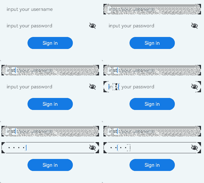
In this example, the text box is used to submit forms on the user login or registration page.
@Entry
@Component
struct TextInputSample {
  build() {
    Column() {
      TextInput({ placeholder: 'input your username' }).margin({ top: 20 })
        .onSubmit((EnterKeyType) => {
          console.info(EnterKeyType + 'Enter key type');
        })
      TextInput({ placeholder: 'input your password' }).type(InputType.Password).margin({ top: 20 })
        .onSubmit((EnterKeyType) => {
          console.info(EnterKeyType + 'Enter key type');
        })
      Button('Sign in').width(150).margin({ top: 20 })
    }.padding(20)
  }
}

Keyboard Avoidance
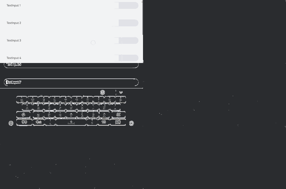
After the keyboard is raised, scrollable container components will only activate the keyboard avoidance feature when switching between landscape and portrait modes. To enable keyboard avoidance for non-scrollable container components, nest them within a scrollable container component, such as Scroll, List, or Grid.
// xxx.ets
@Entry
@Component
struct Index {
  placeHolderArr: string[] = ['1', '2', '3', '4', '5', '6', '7'];

  build() {
    Scroll() {
      Column() {
        ForEach(this.placeHolderArr, (placeholder: string) => {
          TextInput({ placeholder: 'TextInput ' + placeholder })
            .margin(30)
        })
      }
    }
    .height('100%')
    .width('100%')
  }
}

Caret Avoidance
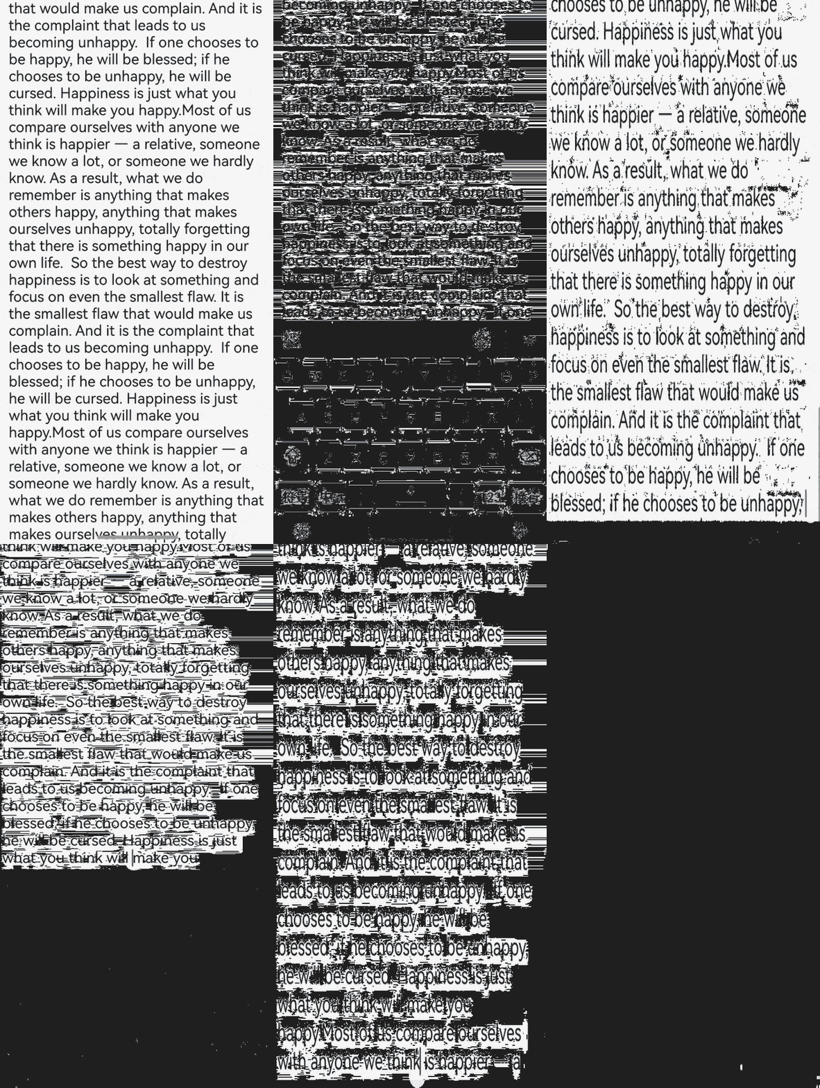
The OFFSET and RESIZE modes of keyBoardAvoidMode do not allow for secondary avoidance actions after the keyboard has been lifted. To support additional caret avoidance actions, you can use the OFFSET_WITH_CARET and RESIZE_CARET options.
RESIZE_WITH_CARET is recommended for scrollable containers, and OFFSET_WITH_CARET is recommended for non-scrollable containers.
// EntryAbility.ets
import { KeyboardAvoidMode } from '@kit.ArkUI';

// Used in UIAbility
onWindowStageCreate(windowStage: window.WindowStage) {
  // The main window is created. Set a main page for this ability.
  hilog.info(0x0000, 'testTag', '%{public}s', 'Ability onWindowStageCreate');

  windowStage.loadContent('pages/Index', (err, data) => {
    let keyboardAvoidMode = windowStage.getMainWindowSync().getUIContext().getKeyboardAvoidMode();
  windowStage.getMainWindowSync().getUIContext().setKeyboardAvoidMode(KeyboardAvoidMode.OFFSET_WITH_CARET);
    if (err.code) {
      hilog.error(0x0000, 'testTag', 'Failed to load the content. Cause: %{public}s', JSON.stringify(err) ?? '');
      return;
    }
    hilog.info(0x0000, 'testTag', 'Succeeded in loading the content. Data: %{public}s', JSON.stringify(data) ?? '');
  });
}
// xxx.ets
@Entry
@Component
struct Index {
@State caretPosition: number = 600;
areaController: TextAreaController = new TextAreaController();
text = "Most of us compare ourselves with anyone we think is happier — a relative, someone we know a lot, or someone we hardly know. As a result, what we do remember is anything that makes others happy, anything that makes ourselves unhappy, totally forgetting that there is something happy in our own life.\
So the best way to destroy happiness is to look at something and focus on even the smallest flaw. It is the smallest flaw that would make us complain. And it is the complaint that leads to us becoming unhappy.\
If one chooses to be happy, he will be blessed; if he chooses to be unhappy, he will be cursed. Happiness is just what you think will make you happy.Most of us compare ourselves with anyone we think is happier — a relative, someone we know a lot, or someone we hardly know. As a result, what we do remember is anything that makes others happy, anything that makes ourselves unhappy, totally forgetting that there is something happy in our own life.\
";
build() {
Scroll() {
Column() {
Row() {
Button('CaretPostiion++: ' + this.caretPosition).onClick(() => {
this.caretPosition += 1;
}).fontSize(10)
Button('CaretPostiion--: ' + this.caretPosition).onClick(() => {
this.caretPosition -= 1;
}).fontSize(10)
Button('SetCaretPostion: ').onClick(() => {
this.areaController.caretPosition(this.caretPosition);
}).fontSize(10)
}
TextArea({ text: this.text, controller: this.areaController })
.width('100%')
.fontSize('20fp')
}
}.width('100%').height('100%')
}
}

你可能感兴趣的鸿蒙文章
harmony 鸿蒙Atomic Service Full Screen Launch Component (FullScreenLaunchComponent)
harmony 鸿蒙Arc Button (ArcButton)
harmony 鸿蒙Frame Animation (ohos.animator)
harmony 鸿蒙Implementing Property Animation
- 所属分类: 后端技术
- 本文标签:
热门推荐
-
2、 - 优质文章
-
3、 gate.io
-
8、 golang
-
9、 openharmony
-
10、 Vue中input框自动聚焦