harmony 鸿蒙Video Playback (Video)
Video Playback (Video)
The Video component is used to play a video and control its playback. It is usually used in video players and video list pages within applications. A video automatically plays once fully loaded. When the user clicks the video area, the video is paused and the playback progress bar is displayed. The user can drag the progress bar to the desired position. For details, see Video.
Creating a Video Component
You can create a Video component by calling the following API:
Video(value: VideoOptions)
Loading Video
The Video component supports both local and online videos.
Loading a Local Video
- Common local video
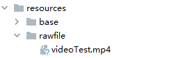
To load a local video, specify the corresponding video file in the local rawfile directory, as shown in the following figure.
Use $rawfile() to reference the video resource.
  // xxx.ets
  @Component
  export struct VideoPlayer {
    private controller: VideoController = new VideoController()
    private previewUris: Resource = $r('app.media.preview')
    private innerResource: Resource = $rawfile('videoTest.mp4')

    build() {
      Column() {
        Video({
          src: this.innerResource,
          previewUri: this.previewUris,
          controller: this.controller
        })
      }
    }
  }
- Video provided by a DataAbility, whose path contains the dataability:// prefix
Ensure that the corresponding video resource exists.
  // xxx.ets
  @Component
  export struct VideoPlayer {
    private controller: VideoController = new VideoController()
    private previewUris: Resource = $r('app.media.preview')
    private videoSrc: string = 'dataability://device_id/com.domainname.dataability.videodata/video/10'

    build() {
      Column() {
        Video({
          src: this.videoSrc,
          previewUri: this.previewUris,
          controller: this.controller
        })
      }
    }
  }
Loading a Video in the Application Sandbox
To load a video in the application sandbox, use a string with the file:// prefix. Ensure that there are files in the specified path and the application has the read permission to the files.
// xxx.ets
@Component
export struct VideoPlayer {
  private controller: VideoController = new VideoController()
  private videoSrc: string = 'file:///data/storage/el2/base/haps/entry/files/show.mp4'

  build() {
    Column() {
      Video({
        src: this.videoSrc,
        controller: this.controller
      })
    }
  }
}
Loading an Online Video
To load online videos, you must apply for the ohos.permission.INTERNET permission. For details about how to apply for the permission, see Declaring Permissions. In this scenario, the src attribute indicates the URL of the online video.
// xxx.ets
@Component
export struct VideoPlayer {
  private controller: VideoController = new VideoController()
  private previewUris: Resource = $r('app.media.preview')
  private videoSrc: string = 'https://www.example.com/example.mp4' // Replace the URL with that of the actual video to load.

  build() {
    Column() {
      Video({
        src: this.videoSrc,
        previewUri: this.previewUris,
        controller: this.controller
      })
    }
  }
}
Adding Attributes
Use the attributes of the Video component to control video playback. For example, you can set whether to mute the video and whether to display the video playback control bar.
// xxx.ets
@Component
export struct VideoPlayer {
  private controller: VideoController = new VideoController()

  build() {
    Column() {
      Video({
        controller: this.controller
      })
        .muted(false) // Set whether to mute the video.
        .controls(false) // Set whether to display the video playback control bar.
        .autoPlay(false) // Set whether to enable auto play.
        .loop(false) // Set whether to repeat the video.
        .objectFit(ImageFit.Contain) // Set the video scale type.
    }
  }
}
Adding Events
The Video component supports various callback events in addition to the universal events. For details, see Events.
// xxx.ets
@Entry
@Component
struct VideoPlayer {
  private controller: VideoController = new VideoController()
  private previewUris: Resource = $r('app.media.preview')
  private innerResource: Resource = $rawfile('videoTest.mp4')

  build() {
    Column() {
      Video({
        src: this.innerResource,
        previewUri: this.previewUris,
        controller: this.controller
      })
        .onUpdate((event) => { // Triggered when the playback progress changes.
          console.info("Video update.");
        })
        .onPrepared((event) => { // Triggered when video preparation is complete.
          console.info("Video prepared.");
        })
        .onError(() => { // Triggered when the video playback fails.
          console.info("Video error.");
        })
        .onStop(() => { // Triggered when the video playback stops.
          console.info("Video stopped.");
        })
    }
  }
}
Using the Video Controller
The video controller is used to control video playback. For details, see VideoController.
- Default controller
The default controller supports four basic features: start playback, pause playback, set the video playback position, and play the video in full screen.
  // xxx.ets
  @Entry
  @Component
  struct VideoGuide {
    @State videoSrc: Resource = $rawfile('videoTest.mp4')
    @State previewUri: string = 'common/videoIcon.png'
    @State curRate: PlaybackSpeed = PlaybackSpeed.Speed_Forward_1_00_X

    build() {
      Row() {
        Column() {
          Video({
            src: this.videoSrc,
            previewUri: this.previewUri,
            currentProgressRate: this.curRate
          })
        }
        .width('100%')
      }
      .height('100%')
    }
  }
- Custom controller
To use a custom controller, disable the default controller, and then use components such as Button and Slider to customize the control and display. This type of controller is applicable to scenarios where customization requirements are involved.
  // xxx.ets
  @Entry
  @Component
  struct VideoGuide {
    @State videoSrc: Resource = $rawfile('videoTest.mp4')
    @State previewUri: string = 'common/videoIcon.png'
    @State curRate: PlaybackSpeed = PlaybackSpeed.Speed_Forward_1_00_X
    @State isAutoPlay: boolean = false
    @State showControls: boolean = true
    @State sliderStartTime: string = ''
    @State currentTime: number = 0
    @State durationTime: number = 0
    @State durationStringTime: string = ''
    controller: VideoController = new VideoController()

    build() {
      Row() {
        Column() {
          Video({
            src: this.videoSrc,
            previewUri: this.previewUri,
            currentProgressRate: this.curRate,
            controller: this.controller
          })
            .controls(false)
            .autoPlay(true)
            .onPrepared((event) => {
              if (event) {
                this.durationTime = event.duration
              }
            })
            .onUpdate((event) => {
              if (event) {
                this.currentTime = event.time
              }
            })
          Row() {
            Text(JSON.stringify(this.currentTime) + 's')
            Slider({
              value: this.currentTime,
              min: 0,
              max: this.durationTime
            })
              .onChange((value: number, mode: SliderChangeMode) => {
                this.controller.setCurrentTime(value);
              })
              .width("90%")
            Text(JSON.stringify(this.durationTime) + 's')
          }
          .opacity(0.8)
          .width("100%")
        }
        .width('100%')
      }
      .height('40%')
    }
  }
Remarks
The Video component has encapsulated the basic capabilities of video playback. You do not need to create video instances or set and obtain video information. Simply set the data source and basic information to play videos. To customize video playback, see Using AVPlayer to Play Videos.
你可能感兴趣的鸿蒙文章
harmony 鸿蒙Atomic Service Full Screen Launch Component (FullScreenLaunchComponent)
harmony 鸿蒙Arc Button (ArcButton)
harmony 鸿蒙Frame Animation (ohos.animator)
harmony 鸿蒙Implementing Property Animation
- 所属分类: 后端技术
- 本文标签:
热门推荐
-
2、 优质文章
-
3、 gt
-
7、 openharmony
-
9、 golang
-
10、 Vue中input框自动聚焦