harmony 鸿蒙Tabs
Tabs
The Tabs component is a container component that allows users to switch between content views through tabs. Each tab page corresponds to a content view.
NOTE
This component is supported since API version 7. Updates will be marked with a superscript to indicate their earliest API version.
Since API version 11, this component supports the safe area attribute by default, with the default attribute value being expandSafeArea([SafeAreaType.SYSTEM], [SafeAreaEdge.BOTTOM]). You can override this attribute to change the default behavior. In earlier versions, you need to use the expandSafeArea attribute to implement the safe area feature.
Child Components
Custom components cannot be used as child components. Only the TabContent child component is allowed, with support for if/else and ForEach rendering control. In addition, the if/else and ForEach statements support TabContent components only, but not custom components.
NOTE
If the child component has the visibility attribute set to None or Hidden, it is hidden but still takes up space in the layout.
The TabContent child component is not destroyed once it is displayed. If you need to implement lazy loading and resource release of pages, see Example 13.
APIs
Tabs(options?: TabsOptions)
Create a Tabs container.
Atomic service API: This API can be used in atomic services since API version 11.
System capability: SystemCapability.ArkUI.ArkUI.Full
Parameters
| Name | Type | Mandatory | Description |
|---|---|---|---|
| options | TabsOptions | No | Options of the Tabs component. |
TabsOptions15+
Provides parameters for configuring the Tabs component, including tab positions, the current index of the displayed tab, the Tabs controller, and universal attributes for the TabBar.
System capability: SystemCapability.ArkUI.ArkUI.Full
| Name | Type | Mandatory | Description |
|---|---|---|---|
| barPosition7+ | BarPosition | No | Position of the Tabs component. Default value: BarPosition.Start Atomic service API: This API can be used in atomic services since API version 11. |
| index7+ | number | No | Index of the currently displayed tab. Default value: 0 NOTE A value less than 0 evaluates to the default value. The value ranges from 0 to the number of TabContent nodes minus 1. When the tab is switched by changing the index, the tab switching animation does not take effect. When changeIndex of TabController is used for tab switching, the tab switching animation is enabled by default. You can disable the animation by setting animationDuration to 0. Since API version 10, this parameter supports two-way binding through $$. When the Tabs component is rebuilt, system resources are switched (for example, system font or theme changes), or component attributes change, the Tab component will switch to the one specified by index. To prevent this behavior, you are advised to use two-way binding. Atomic service API: This API can be used in atomic services since API version 11. |
| controller7+ | TabsController | No | Tab controller. Atomic service API: This API can be used in atomic services since API version 11. |
| barModifier15+ | CommonModifier | No | Universal attributes of the tab bar. NOTE If this parameter is dynamically set to undefined, the current state will be preserved, and universal attributes will not be reset. If the setting switches from one CommonModifier to another, overlapping attributes will be overwritten, while non-overlapping attributes will coexist without resetting the attributes of the previous CommonModifier. The barWidth, barHeight, barBackgroundColor, barBackgroundBlurStyle, and barBackgroundEffect attributes of Tabs will overwrite the width, height, backgroundColor, backgroundBlurStyle, and backgroundEffect attributes of CommonModifier. The align attribute works only in BarMode.Scrollable mode. In addition, for a horizontal Tabs component, it only takes effect when nonScrollableLayoutStyle is set to an invalid value or is not set. When set to the bottom tab style, tabBar attribute of the TabContent component does not support the dragging feature. Atomic service API: This API can be used in atomic services since API version 15. |
BarPosition
Enumerates the positions of the Tabs component.
Atomic service API: This API can be used in atomic services since API version 11.
System capability: SystemCapability.ArkUI.ArkUI.Full
| Name | Description |
|---|---|
| Start | If the vertical attribute is set to true, the tab is on the left of the container. If the vertical attribute is set to false, the tab is on the top of the container. |
| End | If the vertical attribute is set to true, the tab is on the right of the container. If the vertical attribute is set to false, the tab is at the bottom of the container. |
Attributes
In addition to the universal attributes, the following attributes are supported.
vertical
vertical(value: boolean)
Sets whether to use vertical tabs.
Atomic service API: This API can be used in atomic services since API version 11.
System capability: SystemCapability.ArkUI.ArkUI.Full
Parameters
| Name | Type | Mandatory | Description |
|---|---|---|---|
| value | boolean | Yes | Whether to use vertical tabs. The value true means to use vertical tabs, and false means to use horizontal tabs. Default value: false If set to have a height of auto, horizontal tabs auto-adapt the height to child components, which is calculated as follows: Tab bar height + Divider width + Tab content height + Top and bottom paddings + Top and bottom border widths. If set to have a width of auto, vertical tabs auto-adapt the width to child components, which is calculated as follows: Tab bar width + Divider width + Tab content width + Left and right paddings + Left and right border widths. To avoid animation jitter when switching between tabs, maintain a consistent size for child components on each tab. |
scrollable
scrollable(value: boolean)
Sets whether the tabs are scrollable.
Atomic service API: This API can be used in atomic services since API version 11.
System capability: SystemCapability.ArkUI.ArkUI.Full
Parameters
| Name | Type | Mandatory | Description |
|---|---|---|---|
| value | boolean | Yes | Whether the tabs are scrollable. true (default): The tabs are scrollable. false: The tabs are not scrollable. |
barMode
barMode(value: BarMode, options?: ScrollableBarModeOptions)
Sets the tab bar layout mode.
Atomic service API: This API can be used in atomic services since API version 11.
System capability: SystemCapability.ArkUI.ArkUI.Full
Parameters
| Name | Type | Mandatory | Description |
|---|---|---|---|
| value | BarMode | Yes | Layout mode. Default value: BarMode.Fixed |
| options10+ | ScrollableBarModeOptions | No | Layout style of the tab bar in scrollable mode. NOTE This parameter is effective only when the tab bar is in horizontal scrollable mode. |
barMode10+
barMode(value: BarMode.Fixed)
Sets the tab bar layout mode to BarMode.Fixed.
Atomic service API: This API can be used in atomic services since API version 11.
System capability: SystemCapability.ArkUI.ArkUI.Full
Parameters
| Name | Type | Mandatory | Description |
|---|---|---|---|
| value | BarMode.Fixed | Yes | The width of each tab is determined by equally dividing the number of tabs by the bar width (or bar height in the vertical layout). |
barMode10+
barMode(value: BarMode.Scrollable, options: ScrollableBarModeOptions)
Sets the tab bar layout mode to BarMode.Scrollable.
Atomic service API: This API can be used in atomic services since API version 11.
System capability: SystemCapability.ArkUI.ArkUI.Full
Parameters
| Name | Type | Mandatory | Description |
|---|---|---|---|
| value | BarMode.Scrollable | Yes | The width of each tab is determined by the actual layout. The tabs are scrollable in the following case: In horizontal layout, the total width exceeds the tab bar width; in vertical layout, the total height exceeds the tab bar height. |
| options | ScrollableBarModeOptions | Yes | Layout style of the tab bar in scrollable mode. NOTE This parameter is effective only when the tab bar is in scrollable mode. |
barWidth
barWidth(value: Length)
Sets the width of the tab bar. If the set value is less than 0 or greater than the width of the Tabs component, the default value is used.
Atomic service API: This API can be used in atomic services since API version 11.
System capability: SystemCapability.ArkUI.ArkUI.Full
Parameters
| Name | Type | Mandatory | Description |
|---|---|---|---|
| value | Length8+ | Yes | Width of the tab bar. Default value: If the tab bar has the vertical attribute set to false and does not have SubTabBarStyle or BottomTabBarStyle specified, the default value is the width of the Tabs component. If neither SubTabBarStyle nor BottomTabBarStyle is set, and the vertical attribute is true, the default value is 56 vp. If SubTabBarStyle is set, and the vertical attribute is false, the default value is the width of the Tabs component. If SubTabBarStyle is set, and the vertical attribute is true, the default value is 56 vp. If BottomTabBarStyle is set, and the vertical attribute is true, the default value is 96 vp. If BottomTabBarStyle is set, and the vertical attribute is false, the default value is the width of the Tabs component. |
barHeight
barHeight(value: Length)
Sets the height of the tab bar. For horizontal Tabs components, you can set the height to ‘auto’ to allow the tab bar to automatically adapt to the height of its child components. If the height is set to a value less than 0 or greater than the height of the Tabs component, the default value is used.
In versions earlier than API version 14, setting barHeight to a fixed value prevents the tab bar from extending beyond the bottom safe area. Since API version 14, the safeAreaPadding attribute is supported. When safeAreaPadding is set to 0 or is not explicitly set, the tab bar is allowed to extend beyond the bottom safe area.
Atomic service API: This API can be used in atomic services since API version 11.
System capability: SystemCapability.ArkUI.ArkUI.Full
Parameters
| Name | Type | Mandatory | Description |
|---|---|---|---|
| value | Length8+ | Yes | Height of the tab bar. Default value: If the tab bar has the vertical attribute set to false and does not have a style specified, the default value is 56 vp. If the tab bar has the vertical attribute set to true and does not have a style specified, the default value is the height of the Tabs component. If SubTabBarStyle is set, and the vertical attribute is false, the default value is 56 vp. If SubTabBarStyle is set, and the vertical attribute is true, the default value is the height of the Tabs component. If BottomTabBarStyle is set, and the vertical attribute is true, the default value is the height of the Tabs component. If BottomTabBarStyle is set, and the vertical attribute is false, the default value is 56 vp in versions earlier than API version 12 and 48 vp since API version 12. |
barHeight20+
barHeight(height: Length, noMinHeightLimit: boolean)
Sets the height of the tab bar. For horizontal Tabs components, you can set the height to ‘auto’ to allow the tab bar to automatically adapt to the height of its child components; you can also set noMinHeightLimit to true so that the adaptive height can be less than the default tab bar height. If the height is set to a value less than 0 or greater than the height of the Tabs component, the default value is used.
Atomic service API: This API can be used in atomic services since API version 20.
System capability: SystemCapability.ArkUI.ArkUI.Full
Parameters
| Name | Type | Mandatory | Description |
|---|---|---|---|
| height | Length | Yes | Height of the tab bar. Default value: If the tab bar has the vertical attribute set to false and does not have a style specified, the default value is 56 vp. If the tab bar has the vertical attribute set to true and does not have a style specified, the default value is the height of the Tabs component. If SubTabBarStyle is set, and the vertical attribute is false, the default value is 56 vp. If SubTabBarStyle is set, and the vertical attribute is true, the default value is the height of the Tabs component. If BottomTabBarStyle is set, and the vertical attribute is true, the default value is the height of the Tabs component. If BottomTabBarStyle is set, and the vertical attribute is false, the default value is 48 vp. |
| noMinHeightLimit | boolean | Yes | Whether to remove the minimum height limit of the tab bar when height is set to ‘auto’. The default value is false. NOTE true: removes the minimum height limit, allowing the height to be less than the default value. false: enforces the minimum height limit, meaning the height cannot be less than the default value. |
animationCurve20+
animationCurve(curve: Curve|ICurve)
Sets the tab switching animation curve for the Tabs component. For details about commonly used curves, refer to the Curve enum. Custom interpolation curve objects can also be created using the APIs provided in the interpolation calculation module.
Atomic service API: This API can be used in atomic services since API version 20.
System capability: SystemCapability.ArkUI.ArkUI.Full
Parameters
| Name | Type | Mandatory | Description |
|---|---|---|---|
| curve | Curve |ICurve | Yes | Tab switching animation curve. Default value: When pages are turned by swiping in TabContent, the default value is interpolatingSpring(-1, 1, 228, 30). When pages are turned by tapping tabs or calling the changeIndex API of TabsController, the default value is cubicBezierCurve(0.2, 0.0, 0.1, 1.0). When a custom animation curve is set, it applies to all tab switching animations—whether triggered by swiping, tapping a tab, or calling the changeIndex API. |
animationDuration
animationDuration(value: number)
Sets the duration of the tab switching animation for the Tabs component.
If animationCurve is not set, animationDuration only controls the duration of tab switching animations triggered by tapping a tab or calling the changeIndex API, and page-turning animations triggered by swiping in TabContent, the duration is determined by the intrinsic parameters of the default curve interpolatingSpring(-1, 1, 228, 30).
For details about curves unaffected by animationDuration, see Interpolation Calculation. These curves include curves of type springMotion, responsiveSpringMotion, and interpolatingSpring.
Atomic service API: This API can be used in atomic services since API version 11.
System capability: SystemCapability.ArkUI.ArkUI.Full
Parameters
| Name | Type | Mandatory | Description |
|---|---|---|---|
| value | number | Yes | Duration of the tab switching animation. Default value: API version 10 and earlier versions: If this parameter is set to null or is not set, the default value 0, which means no animation for tab switching. If this parameter is set to undefined or a value less than 0, the default value is 300. API version 11 and later versions: If this parameter is set to an invalid value or is not set, the default value is 0 when the tab bar is set to BottomTabBarStyle and 300 when the tab bar is set to any other style. Unit: ms. Value range: [0, +∞). |
animationMode12+
animationMode(mode: Optional<AnimationMode>)
Sets the animation mode for tab switching initiated by clicking a specific tab or by calling the changeIndex API of TabsController.
Atomic service API: This API can be used in atomic services since API version 12.
System capability: SystemCapability.ArkUI.ArkUI.Full
Parameters
| Name | Type | Mandatory | Description |
|---|---|---|---|
| mode | Optional<AnimationMode> | Yes | Animation mode for tab switching initiated by clicking a specific tab or by calling the changeIndex API of TabsController. Default value: AnimationMode.CONTENT_FIRST, which means the target page content is loaded first, followed by the animation. |
barPosition9+
barPosition(value: BarPosition)
Sets the position of the Tabs component.
Atomic service API: This API can be used in atomic services since API version 11.
System capability: SystemCapability.ArkUI.ArkUI.Full
Parameters
| Name | Type | Mandatory | Description |
|---|---|---|---|
| value | BarPosition | Yes | Position of the Tabs component. Default value: BarPosition.Start |
divider10+
divider(value: DividerStyle|null)
Sets the divider between the TabBar and TabContent components.
Atomic service API: This API can be used in atomic services since API version 11.
System capability: SystemCapability.ArkUI.ArkUI.Full
Parameters
| Name | Type | Mandatory | Description |
|---|---|---|---|
| value | DividerStyle |null | Yes | Divider style. By default, the divider is not displayed. DividerStyle: divider style. null: No divider is displayed. |
fadingEdge10+
fadingEdge(value: boolean)
Sets whether the tabs fade out when they exceed the container width. It is recommended that this attribute be used together with the barBackgroundColor attribute. If barBackgroundColor is not defined, the default fade effect shows a white gradient at the container’s edge.
Atomic service API: This API can be used in atomic services since API version 11.
System capability: SystemCapability.ArkUI.ArkUI.Full
Parameters
| Name | Type | Mandatory | Description |
|---|---|---|---|
| value | boolean | Yes | Whether the tabs fade out when they exceed the container width. true (default): The tab fades out when they exceed the container width. false: The tabs are clipped without any fade effect when they exceed the container width. |
barOverlap10+
barOverlap(value: boolean)
Sets whether the tab bar overlaps the TabContent component with a blurred background effect.
Atomic service API: This API can be used in atomic services since API version 11.
System capability: SystemCapability.ArkUI.ArkUI.Full
Parameters
| Name | Type | Mandatory | Description |
|---|---|---|---|
| value | boolean | Yes | Whether the tab bar overlaps the TabContent component with a blurred background effect. true: The tab bar overlaps the TabContent component with a blurred background effect, and the default blur style of the tab bar is set to ‘BlurStyle.COMPONENT_THICK’. false: There is no blur or overlap effect. Default value: false. |
barBackgroundColor10+
barBackgroundColor(value: ResourceColor)
Sets the background color of the tab bar.
Atomic service API: This API can be used in atomic services since API version 11.
System capability: SystemCapability.ArkUI.ArkUI.Full
Parameters
| Name | Type | Mandatory | Description |
|---|---|---|---|
| value | ResourceColor | Yes | Background color of the tab bar. Default value: Color.Transparent |
barBackgroundBlurStyle11+
barBackgroundBlurStyle(value: BlurStyle)
Sets the background blur style of the tab bar.
Atomic service API: This API can be used in atomic services since API version 11.
System capability: SystemCapability.ArkUI.ArkUI.Full
Parameters
| Name | Type | Mandatory | Description |
|---|---|---|---|
| value | BlurStyle | Yes | Background blur style of the tab bar. Default value: BlurStyle.NONE |
barBackgroundBlurStyle18+
barBackgroundBlurStyle(style: BlurStyle, options: BackgroundBlurStyleOptions)
Defines the blur style to apply between the background and content of a tab bar. It encapsulates various blur radius, mask color, mask opacity, saturation, and brightness values through enum values.
Atomic service API: This API can be used in atomic services since API version 18.
System capability: SystemCapability.ArkUI.ArkUI.Full
Parameters
| Name | Type | Mandatory | Description |
|---|---|---|---|
| style | BlurStyle | Yes | Settings of the background blur style, including the blur radius, mask color, mask opacity, saturation, and brightness. |
| options | BackgroundBlurStyleOptions | Yes | Background blur options. |
barGridAlign10+
barGridAlign(value: BarGridColumnOptions)
Sets the visible area of the tab bar in grid mode. For details, see BarGridColumnOptions. This attribute is effective only in horizontal mode. It is not applicable to XS, XL, and XXL devices.
Atomic service API: This API can be used in atomic services since API version 11.
System capability: SystemCapability.ArkUI.ArkUI.Full
Parameters
| Name | Type | Mandatory | Description |
|---|---|---|---|
| value | BarGridColumnOptions | Yes | Visible area of the tab bar in grid mode. |
edgeEffect12+
edgeEffect(edgeEffect: Optional<EdgeEffect>)
Sets the edge effect used when the boundary of the scrolling area is reached.
Atomic service API: This API can be used in atomic services since API version 12.
System capability: SystemCapability.ArkUI.ArkUI.Full
Parameters
| Name | Type | Mandatory | Description |
|---|---|---|---|
| edgeEffect | Optional<EdgeEffect> | Yes | Effect used when the boundary of the scrolling area is reached. Default value: EdgeEffect.Spring |
barBackgroundEffect18+
barBackgroundEffect(options: BackgroundEffectOptions)
Sets the background effect of the tab bar, including the blur radius, brightness, saturation, and color.
Atomic service API: This API can be used in atomic services since API version 18.
System capability: SystemCapability.ArkUI.ArkUI.Full
Parameters
| Name | Type | Mandatory | Description |
|---|---|---|---|
| options | BackgroundEffectOptions | Yes | Background effect options, including the blur radius, brightness, saturation, and color. |
pageFlipMode15+
pageFlipMode(mode: Optional<PageFlipMode>)
Sets the mode for flipping pages using the mouse wheel.
Atomic service API: This API can be used in atomic services since API version 15.
System capability: SystemCapability.ArkUI.ArkUI.Full
Parameters
| Name | Type | Mandatory | Description |
|---|---|---|---|
| mode | Optional<PageFlipMode> | Yes | Mode for flipping pages using the mouse wheel. Default value: PageFlipMode.CONTINUOUS |
cachedMaxCount19+
cachedMaxCount(count: number, mode: TabsCacheMode)
Sets the maximum number of child components to cache and the caching mode. After this attribute is set, only child components outside the caching range will be released, while those within the range will not be preloaded.
Atomic service API: This API can be used in atomic services since API version 19.
System capability: SystemCapability.ArkUI.ArkUI.Full
Parameters
| Name | Type | Mandatory | Description |
|---|---|---|---|
| count | number | Yes | Maximum number of child components to cache. By default, all child components remain loaded and are not released. Value range: [0, +∞) |
| mode | TabsCacheMode | Yes | Caching mode for child components. Default value: TabsCacheMode.CACHE_BOTH_SIDE |
DividerStyle10+
Describes the divider style.
Atomic service API: This API can be used in atomic services since API version 11.
System capability: SystemCapability.ArkUI.ArkUI.Full
| Name | Type | Mandatory | Description |
|---|---|---|---|
| strokeWidth | Length | Yes | Width of the divider. It cannot be set in percentage. Default value: 0.0 Unit: vp Value range: [0, +∞) |
| color | ResourceColor | No | Color of the divider. Default value: #33182431 |
| startMargin | Length | No | Distance between the divider and the top of the sidebar. It cannot be set in percentage. Default value: 0.0 Unit: vp Value range: [0, +∞) |
| endMargin | Length | No | Distance between the divider and the bottom of the sidebar. It cannot be set in percentage. Default value: 0.0 Unit: vp Value range: [0, +∞) |
BarGridColumnOptions10+
Implements a BarGridColumnOptions object for setting the visible area of the tab bar in grid mode, including the column margin and gutter, as well as the number of columns occupied by tabs under small, medium, and large screen sizes.
Atomic service API: This API can be used in atomic services since API version 11.
System capability: SystemCapability.ArkUI.ArkUI.Full
| Name | Type | Mandatory | Description |
|---|---|---|---|
| margin | Dimension | No | Column margin in grid mode. It cannot be set in percentage. Default value: 24.0 Unit: vp |
| gutter | Dimension | No | Column gutter (that is, gap between columns) in grid mode. It cannot be set in percentage. Default value: 24.0 Unit: vp |
| sm | number | No | Number of columns occupied by a tab on a screen whose width is greater than or equal to 320 vp but less than 600 vp. The value must be a non-negative even number. The default value is -1, indicating that the tab takes up the entire width of the tab bar. |
| md | number | No | Number of columns occupied by a tab on a screen whose width is greater than or equal to 600 vp but less than 800 vp. The value must be a non-negative even number. The default value is -1, indicating that the tab takes up the entire width of the tab bar. |
| lg | number | No | Number of columns occupied by a tab on a screen whose width is greater than or equal to 840 vp but less than 1024 vp. The value must be a non-negative even number. The default value is -1, indicating that the tab takes up the entire width of the tab bar. |
ScrollableBarModeOptions10+
Implements a ScrollableBarModeOptions object.
Atomic service API: This API can be used in atomic services since API version 11.
System capability: SystemCapability.ArkUI.ArkUI.Full
| Name | Type | Mandatory | Description |
|---|---|---|---|
| margin | Dimension | No | Left and right margin of the tab bar in scrollable mode. It cannot be set in percentage. Default value: 0.0 Unit: vp Value range: [0, +∞) |
| nonScrollableLayoutStyle | LayoutStyle | No | Tab layout mode of the tab bar when not scrolling in scrollable mode. Default value: LayoutStyle.ALWAYS_CENTER |
BarMode
Enumerates layout modes of the tab bar.
Atomic service API: This API can be used in atomic services since API version 11.
System capability: SystemCapability.ArkUI.ArkUI.Full
|Name |Value|Description | |———-|–|—————————————-| |Scrollable|0|The width of each tab is determined by the actual layout. The tabs are scrollable in the following case: In horizontal layout, the total width exceeds the tab bar width; in vertical layout, the total height exceeds the tab bar height.| |Fixed |1|The width of each tab is determined by equally dividing the number of tabs by the bar width (or bar height in the vertical layout).|
AnimationMode12+
Enumerates the animation modes for switching between tabs.
System capability: SystemCapability.ArkUI.ArkUI.Full
| Name | Value | Description |
|---|---|---|
| CONTENT_FIRST | 0 | Loads the content of the target page before starting the switching animation. Atomic service API: This API can be used in atomic services since API version 12. |
| ACTION_FIRST | 1 | Starts the switching animation before loading the content of the target page. This mode works only when neither the height or width of tabs is set to auto. Atomic service API: This API can be used in atomic services since API version 12. |
| NO_ANIMATION | 2 | Disables the default switching animation. Note that this mode is ineffective when the changeIndex API of TabsController is used to switch content. To disable the animation under this scenario, set animationDuration to 0. Atomic service API: This API can be used in atomic services since API version 12. |
| CONTENT_FIRST_WITH_JUMP15+ | 3 | Loads the content of the target page first, then jumps to the vicinity of the target page without animation, and finally jumps to the target page with animation. Atomic service API: This API can be used in atomic services since API version 15. |
| ACTION_FIRST_WITH_JUMP15+ | 4 | Jumps to the vicinity of the target page without animation first, then jumps to the target page with animation, and finally loads the content of the target page. This mode works only when neither the height or width of tabs is set to auto. Atomic service API: This API can be used in atomic services since API version 15. |
LayoutStyle10+
Enumerates the tab layout styles of the tab bar when not scrolling in scrollable mode.
Atomic service API: This API can be used in atomic services since API version 11.
System capability: SystemCapability.ArkUI.ArkUI.Full
|Name |Value|Description |
|———-|–|—————————————-|
|ALWAYS_CENTER|0|If the tab content exceeds the tab bar width, the tabs are scrollable.
If not, the tabs are compactly centered on the tab bar and not scrollable.|
|ALWAYS_AVERAGE_SPLIT|1|If the tab content exceeds the tab bar width, the tabs are scrollable.
If not, the tabs are not scrollable, and the width of the tab bar is evenly distributed among all tabs.|
|SPACE_BETWEEN_OR_CENTER |2|If the tab content exceeds the tab bar width, the tabs are scrollable.
If the tab content exceeds half the width of the tab bar but is still within the tab bar width, the tabs are compactly centered and not scrollable.
If the tab content does not exceed half the width of the tab bar, the tabs are centered within half the width of the tab bar with even spacing between them and are not scrollable.|
CommonModifier15+
type CommonModifier = CommonModifier
Defines a parameter object for the Tabs component.
Atomic service API: This API can be used in atomic services since API version 15.
System capability: SystemCapability.ArkUI.ArkUI.Full
| Type | Description |
|---|---|
| CommonModifier | Universal attributes for the tab bar. |
TabsCacheMode19+
Caching mode for child components.
Atomic service API: This API can be used in atomic services since API version 19.
System capability: SystemCapability.ArkUI.ArkUI.Full
|Name |Value|Description | |———————|–|—————————————-| |CACHE_BOTH_SIDE |0|Cache the currently displayed child component and the child components on both sides. For example, if cachedMaxCount is set to n, up to 2n+1 child components will be cached.| |CACHE_LATEST_SWITCHED|1|Cache the currently displayed child component and the most recently switched child component. For example, if cachedMaxCount is set to n, up to n+1 child components will be cached.|
Events
In addition to the universal events, the following events are supported.
onChange
onChange(event: Callback<number>)
Triggered after the active tab changes.
This event is triggered when any of the following occurs:
After completing a swipe-triggered tab switching animation.
After the active tab changes by calling the changeIndex API of Controller.
After the active tab changes by updating the index through the bound state variable.
After the active tab changes by tapping a tab in the tab bar.
NOTE
When a custom tab is used, relying solely on the onChange event for synchronization between tabs and swipe gestures may result in delayed visual updates, since it is triggered after the swipe-triggered tab switching animation is completed. For smooth animations, listen for the active tab index in onAnimationStart and update the tab index accordingly. For details about the implementation, see Example 3.
Atomic service API: This API can be used in atomic services since API version 11.
System capability: SystemCapability.ArkUI.ArkUI.Full
Parameters
| Name | Type | Mandatory | Description |
|---|---|---|---|
| event | Callback<number> | Yes | Index of the active tab. The index starts from 0. |
onTabBarClick10+
onTabBarClick(event: Callback<number>)
Triggered when a tab is clicked.
Atomic service API: This API can be used in atomic services since API version 11.
System capability: SystemCapability.ArkUI.ArkUI.Full
Parameters
| Name | Type | Mandatory | Description |
|---|---|---|---|
| event | Callback<number> | Yes | Index of the clicked tab. The index starts from 0. |
onAnimationStart11+
onAnimationStart(handler: OnTabsAnimationStartCallback)
Triggered when the tab switching animation starts. This event is not triggered when animationDuration is set to 0, which effectively disables the animation.
Atomic service API: This API can be used in atomic services since API version 12.
System capability: SystemCapability.ArkUI.ArkUI.Full
Parameters
| Name | Type | Mandatory | Description |
|---|---|---|---|
| handler | OnTabsAnimationStartCallback | Yes | Callback triggered when the switching animation starts. |
onAnimationEnd11+
onAnimationEnd(handler: OnTabsAnimationEndCallback)
Triggered when the tab switching animation is completed, including cases where the gesture is interrupted during animation. This event is not triggered when animationDuration is set to 0, which effectively disables the animation.
Atomic service API: This API can be used in atomic services since API version 12.
System capability: SystemCapability.ArkUI.ArkUI.Full
Parameters
| Name | Type | Mandatory | Description |
|---|---|---|---|
| handler | OnTabsAnimationEndCallback | Yes | Callback triggered upon animation completion or interruption. |
onGestureSwipe11+
onGestureSwipe(handler: OnTabsGestureSwipeCallback)
Triggered on a frame-by-frame basis during swipe gestures for tab switching.
Atomic service API: This API can be used in atomic services since API version 12.
System capability: SystemCapability.ArkUI.ArkUI.Full
Parameters
| Name | Type | Mandatory | Description |
|---|---|---|---|
| handler | OnTabsGestureSwipeCallback | Yes | Triggered on a frame-by-frame basis during swipe gestures for tab switching. |
customContentTransition11+
customContentTransition(delegate: TabsCustomContentTransitionCallback)
Sets the custom tab switching animation.
Instructions:
- When the custom tab switching animation is used, the default switching animation of the Tabs component is disabled, and tabs cannot be switched through swiping.
2. The value undefined means not to use the custom tab switching animation, in which case the default switching animation is used.
3. The custom tab switching animation cannot be interrupted.
4. Currently, the custom tab switching animation can be triggered only by clicking a tab or by calling the TabsController.changeIndex() API.
5. When the custom tab switching animation is used, the Tabs component supports all events except onGestureSwipe.
6. Notes about the onChange and onAnimationEnd events: If the second custom animation is triggered during the execution of the first custom animation, the onChange and onAnimationEnd events of the first custom animation will be triggered when the second custom animation starts.
7. When the custom animation is used, the stack layout is used for pages involved in the animation. If the zIndex attribute is not set for related pages, the zIndex values of all pages are the same. In this case, the pages are rendered in the order in which they are added to the component tree (that is, the sequence of page indexes). In light of this, to control the rendering levels of pages, set the zIndex attribute of the pages.
Atomic service API: This API can be used in atomic services since API version 12.
System capability: SystemCapability.ArkUI.ArkUI.Full
Parameters
| Name | Type | Mandatory | Description |
|---|---|---|---|
| delegate | TabsCustomContentTransitionCallback | Yes | Callback invoked when the custom tab switching animation starts. |
onContentWillChange12+
onContentWillChange(handler: OnTabsContentWillChangeCallback)
Triggered when a new page is about to be displayed.
This event is triggered when any of the following occurs:
When the user swipes through the TabContent to switch to a new page.
When TabsController.changeIndex is called to switch to a new page.
When the index attribute is changed to switch to a new page.
When the user taps a tab on the tab bar to switch to a new page.
When the user presses the left or right arrow key on the keyboard to switch to a new page while the tab bar has focus.
Atomic service API: This API can be used in atomic services since API version 12.
System capability: SystemCapability.ArkUI.ArkUI.Full
Parameters
| Name | Type | Mandatory | Description |
|---|---|---|---|
| handler | OnTabsContentWillChangeCallback | Yes | Callback invoked when a new page is about to be displayed. |
onSelected18+
onSelected(event: Callback<number>)
Triggered when the selected element changes. The index of the currently selected element is returned.
This event is triggered when any of the following occurs:
When the swipe gesture is released and the tab switching threshold is met, triggering the switching animation.
When the changeIndex API of TabsController is called, triggering the switching animation.
When the index of the active tab is changed through the bound state variable.
When a tab is tapped.
Atomic service API: This API can be used in atomic services since API version 18.
System capability: SystemCapability.ArkUI.ArkUI.Full
Parameters
| Name | Type | Mandatory | Description |
|---|---|---|---|
| event | Callback<number> | Yes | Index of the currently selected element. |
NOTE
In the onSelected callback, the index of the current displayed page cannot be set using index of TabsOptions, and TabsController.changeIndex() cannot be called.
onUnselected18+
onUnselected(event: Callback<number>)
Triggered when the selected element changes. The index of the element that is about to be hidden is returned.
This event is triggered when any of the following occurs:
When the swipe gesture is released and the tab switching threshold is met, triggering the switching animation.
When the changeIndex API of TabsController is called, triggering the switching animation.
When the index of the active tab is changed through the bound state variable.
When a tab is tapped.
Atomic service API: This API can be used in atomic services since API version 18.
System capability: SystemCapability.ArkUI.ArkUI.Full
Parameters
| Name | Type | Mandatory | Description |
|---|---|---|---|
| event | Callback<number> | Yes | Index of the element that is about to be hidden. |
NOTE
In the onUnselected callback, the index of the current displayed page cannot be set using index of TabsOptions, and TabsController.changeIndex() cannot be called.
OnTabsAnimationStartCallback18+
type OnTabsAnimationStartCallback = (index: number, targetIndex: number, extraInfo: TabsAnimationEvent) => void
Defines the callback triggered when the tab switching animation starts.
Atomic service API: This API can be used in atomic services since API version 18.
System capability: SystemCapability.ArkUI.ArkUI.Full
Parameters
| Name | Type | Mandatory | Description |
|---|---|---|---|
| index | number | Yes | Index of the currently displayed element. The index is zero-based. |
| targetIndex | number | Yes | Index of the target element to switch to. The index is zero-based. |
| extraInfo | TabsAnimationEvent | Yes | Extra information of the animation, including the offset of the currently displayed element and target element relative to the start position of the Tabs along the main axis, and the hands-off velocity. |
OnTabsAnimationEndCallback18+
type OnTabsAnimationEndCallback = (index: number, extraInfo: TabsAnimationEvent) => void
Defines the callback triggered when the tab switching animation ends.
Atomic service API: This API can be used in atomic services since API version 18.
System capability: SystemCapability.ArkUI.ArkUI.Full
Parameters
| Name | Type | Mandatory | Description |
|---|---|---|---|
| index | number | Yes | Index of the currently displayed element. The index is zero-based. |
| extraInfo | TabsAnimationEvent | Yes | Extra information of the animation, which is the offset of the currently displayed element relative to the start position of the Tabs along the main axis. |
OnTabsGestureSwipeCallback18+
type OnTabsGestureSwipeCallback = (index: number, extraInfo: TabsAnimationEvent) => void
Defines the callback invoked on a frame-by-frame basis when the page is turned by a swipe.
Atomic service API: This API can be used in atomic services since API version 18.
System capability: SystemCapability.ArkUI.ArkUI.Full
Parameters
| Name | Type | Mandatory | Description |
|---|---|---|---|
| index | number | Yes | Index of the currently displayed element. The index is zero-based. |
| extraInfo | TabsAnimationEvent | Yes | Extra information of the animation, which is the offset of the currently displayed element relative to the start position of the Tabs along the main axis. |
TabsCustomContentTransitionCallback18+
type TabsCustomContentTransitionCallback = (from: number, to: number) => TabContentAnimatedTransition|undefined
Defines the callback invoked when the custom tab switching animation starts.
Atomic service API: This API can be used in atomic services since API version 18.
System capability: SystemCapability.ArkUI.ArkUI.Full
Parameters
| Name | Type | Mandatory | Description |
|---|---|---|---|
| from | number | Yes | Index of the currently displayed tab before the animation starts. The index is zero-based. |
| to | number | Yes | Index of the target tab before the animation starts. The index is zero-based. |
Return value
| Type | Description |
|---|---|
| TabContentAnimatedTransition |undefined | Information about the custom tab switching animation. |
OnTabsContentWillChangeCallback18+
type OnTabsContentWillChangeCallback = (currentIndex: number, comingIndex: number) => boolean
Defines the callback invoked when a new page is about to be displayed.
Atomic service API: This API can be used in atomic services since API version 18.
System capability: SystemCapability.ArkUI.ArkUI.Full
Parameters
| Name | Type | Mandatory | Description |
|---|---|---|---|
| currentIndex | number | Yes | Index of the active tab. The index starts from 0. |
| comingIndex | number | Yes | Index of the new tab to be displayed. |
Return value
| Type | Description |
|---|---|
| boolean | The value true means that the tab can switch to the new page. The value false means that the tab cannot switch to the new page and will remain on the current page. |
TabsAnimationEvent11+
Describes the animation information of the Tabs component.
Atomic service API: This API can be used in atomic services since API version 12.
System capability: SystemCapability.ArkUI.ArkUI.Full
| Name | Type | Read Only | Optional | Description |
|---|---|---|---|---|
| currentOffset | number | No | No | Offset of the currently displayed element relative to the start position of the Tabs component along the main axis. Unit: vp. Default value: 0. |
| targetOffset | number | No | No | Offset of the target element relative to the start position of the Tabs component along the main axis. Unit: vp. Default value: 0. |
| velocity | number | No | No | Hands-off velocity at the beginning of the animation. Unit: vp/s. Default value: 0. |
TabContentAnimatedTransition11+
Provides the information about the custom tab switching animation.
Widget capability: This API can be used in ArkTS widgets since API version 11.
Atomic service API: This API can be used in atomic services since API version 12.
System capability: SystemCapability.ArkUI.ArkUI.Full
| Name | Type | Mandatory | Description |
|---|---|---|---|
| timeout | number | No | Timeout for the custom tab switching animation. The timer starts when the switching begins. If this timeframe passes without you calling the finishTransition API in TabContentTransitionProxy, the component will assume that the custom animation has ended and will proceed directly with subsequent operations. Default value: 1000 Unit: ms Value range: [0, +∞) |
| transition | Callback<TabContentTransitionProxy> | Yes | Content of the custom tab switching animation. |
TabContentTransitionProxy11+
Implements the proxy object returned during the execution of the custom switching animation of the Tabs component. You can use this object to obtain the start and target pages for the custom tab switching animation. In addition, you can call the finishTransition API of this object to notify the Tabs component of the ending of the custom animation.
Widget capability: This API can be used in ArkTS widgets since API version 11.
Atomic service API: This API can be used in atomic services since API version 12.
System capability: SystemCapability.ArkUI.ArkUI.Full
Attributes
| Name | Type | Read Only | Optional | Description |
|---|---|---|---|---|
| from | number | No | No | Zero-based index of the source page in the custom animation. |
| to | number | No | No | Zero-based index of the target page in the custom animation. |
finishTransition
finishTransition(): void
Notifies the Tabs component that the custom animation has finished playing.
Widget capability: This API can be used in ArkTS widgets since API version 11.
Atomic service API: This API can be used in atomic services since API version 12.
System capability: SystemCapability.ArkUI.ArkUI.Full
TabsController
Defines a tab controller, which is used to control switching of tabs. One TabsController cannot control multiple Tabs components.
Atomic service API: This API can be used in atomic services since API version 11.
System capability: SystemCapability.ArkUI.ArkUI.Full
constructor
constructor()
A constructor used to create a TabsController object.
Atomic service API: This API can be used in atomic services since API version 11.
System capability: SystemCapability.ArkUI.ArkUI.Full
changeIndex
changeIndex(value: number): void
Switches to the specified tab.
Atomic service API: This API can be used in atomic services since API version 11.
System capability: SystemCapability.ArkUI.ArkUI.Full
Parameters
| Name | Type | Mandatory | Description |
|---|---|---|---|
| value | number | Yes | Index of the tab. The value starts from 0. NOTE If this parameter is set to a value less than 0 or greater than the maximum number, the default value 0 is used. |
preloadItems12+
preloadItems(indices: Optional<Array<number>>): Promise<void>
Preloads child nodes. After this API is called, all specified child nodes will be loaded at once. Therefore, for performance considerations, it is recommended that you load child nodes in batches.
Atomic service API: This API can be used in atomic services since API version 12.
System capability: SystemCapability.ArkUI.ArkUI.Full
Parameters
| Name | Type | Mandatory | Description |
|---|---|---|---|
| indices | Optional<Array<number>> | Yes | Array of indexes of the child nodes to preload. The default value is an empty array. |
Return value
| Type | Description |
|---|---|
| Promise<void> | Promise used to return the value. |
Error codes
For details about the error codes, see Universal Error Codes.
| ID | Error Message |
|---|---|
| 401 | Parameter invalid. Possible causes: 1. The parameter type is not Array<number>; 2. The parameter is an empty array; 3. The parameter contains an invalid index. |
setTabBarTranslate13+
setTabBarTranslate(translate: TranslateOptions): void
Sets the translation distance of the tab bar.
NOTE
When a Tabs component is bound to a scrollable container using APIs like bindTabsToScrollable or bindTabsToNestedScrollable, scrolling the container will trigger the display and hide animations of the tab bar for all Tabs components bound to it. In this case, calling the setTabBarTranslate API has no effect. Therefore, avoid using bindTabsToScrollable, bindTabsToNestedScrollable, and setTabBarTranslate simultaneously.
Atomic service API: This API can be used in atomic services since API version 13.
System capability: SystemCapability.ArkUI.ArkUI.Full
Parameters
| Name | Type | Mandatory | Description |
|---|---|---|---|
| translate | TranslateOptions | Yes | Translation distance of the tab bar. |
setTabBarOpacity13+
setTabBarOpacity(opacity: number): void
Sets the opacity of the tab bar.
NOTE
When a Tabs component is bound to a scrollable container using APIs like bindTabsToScrollable or bindTabsToNestedScrollable, scrolling the container will trigger the display and hide animations of the tab bar for all Tabs components bound to it. In this case, calling the setTabBarOpacity API has no effect. Therefore, avoid using bindTabsToScrollable, bindTabsToNestedScrollable, and setTabBarOpacity simultaneously.
Atomic service API: This API can be used in atomic services since API version 13.
System capability: SystemCapability.ArkUI.ArkUI.Full
Parameters
| Name | Type | Mandatory | Description |
|---|---|---|---|
| opacity | number | Yes | Opacity of the tab bar. The value range is [0.0, 1.0]. |
Example
Example 1: Setting the Tab Bar Layout Mode
This example shows how to use barMode to implement two tab bar layouts: equal-width tab layout and actual-length-based layout. It also shows the scrollable effect when the combined width of tabs exceeds the tab bar container width.
// xxx.ets
@Entry
@Component
struct TabsExample {
  @State text: string = 'Text';
  @State barMode: BarMode = BarMode.Fixed;

  build() {
    Column() {
      Row() {
        Button('Add Text')
          .width('47%')
          .height(50)
          .onClick((event?: ClickEvent) => {
            this.text += 'Add Text';
          })
          .margin({ right: '6%', bottom: '12vp' })

        Button('Reset Text')
          .width('47%')
          .height(50)
          .onClick((event?: ClickEvent) => {
            this.text = 'Text';
          })
          .margin({ bottom: '12vp' })
      }

      Row() {
        Button('BarMode.Fixed')
          .width('47%')
          .height(50)
          .onClick((event?: ClickEvent) => {
            this.barMode = BarMode.Fixed;
          })
          .margin({ right: '6%', bottom: '12vp' })

        Button('BarMode.Scrollable')
          .width('47%')
          .height(50)
          .onClick((event?: ClickEvent) => {
            this.barMode = BarMode.Scrollable;
          })
          .margin({ bottom: '12vp' })
      }

      Tabs() {
        TabContent() {
          Column().width('100%').height('100%').backgroundColor(Color.Pink)
        }.tabBar(SubTabBarStyle.of(this.text))

        TabContent() {
          Column().width('100%').height('100%').backgroundColor(Color.Green)
        }.tabBar(SubTabBarStyle.of(this.text))

        TabContent() {
          Column().width('100%').height('100%').backgroundColor(Color.Blue)
        }.tabBar(SubTabBarStyle.of(this.text))
      }
      .height('60%')
      .backgroundColor(0xf1f3f5)
      .barMode(this.barMode)
    }
    .width('100%')
    .height(500)
    .padding('24vp')
  }
}
Example 2: Setting the Layout Style for a Scrollable TabBar
This example implements the ScrollableBarModeOptions parameter of barMode. This parameter is effective only in Scrollable mode.
// xxx.ets
@Entry
@Component
struct TabsExample6 {
  private controller: TabsController = new TabsController();
  @State scrollMargin: number = 0;
  @State layoutStyle: LayoutStyle = LayoutStyle.ALWAYS_CENTER;
  @State text: string = 'Text';

  build() {
    Column() {
      Row() {
        Button('scrollMargin+10 ' + this.scrollMargin)
          .width('47%')
          .height(50)
          .margin({ top: 5 })
          .onClick((event?: ClickEvent) => {
            this.scrollMargin += 10;
          })
          .margin({ right: '6%', bottom: '12vp' })
        Button('scrollMargin-10 ' + this.scrollMargin)
          .width('47%')
          .height(50)
          .margin({ top: 5 })
          .onClick((event?: ClickEvent) => {
            this.scrollMargin -= 10;
          })
          .margin({ bottom: '12vp' })
      }

      Row() {
        Button('Add Text')
          .width('47%')
          .height(50)
          .margin({ top: 5 })
          .onClick((event?: ClickEvent) => {
            this.text += 'Add Text';
          })
          .margin({ right: '6%', bottom: '12vp' })
        Button('Reset Text')
          .width('47%')
          .height(50)
          .margin({ top: 5 })
          .onClick((event?: ClickEvent) => {
            this.text = 'Text';
          })
          .margin({ bottom: '12vp' })
      }

      Row() {
        Button('layoutStyle.ALWAYS_CENTER')
          .width('100%')
          .height(50)
          .margin({ top: 5 })
          .fontSize(15)
          .onClick((event?: ClickEvent) => {
            this.layoutStyle = LayoutStyle.ALWAYS_CENTER;
          })
          .margin({ bottom: '12vp' })
      }

      Row() {
        Button('layoutStyle.ALWAYS_AVERAGE_SPLIT')
          .width('100%')
          .height(50)
          .margin({ top: 5 })
          .fontSize(15)
          .onClick((event?: ClickEvent) => {
            this.layoutStyle = LayoutStyle.ALWAYS_AVERAGE_SPLIT;
          })
          .margin({ bottom: '12vp' })
      }

      Row() {
        Button('layoutStyle.SPACE_BETWEEN_OR_CENTER')
          .width('100%')
          .height(50)
          .margin({ top: 5 })
          .fontSize(15)
          .onClick((event?: ClickEvent) => {
            this.layoutStyle = LayoutStyle.SPACE_BETWEEN_OR_CENTER;
          })
          .margin({ bottom: '12vp' })
      }

      Tabs({ barPosition: BarPosition.End, controller: this.controller }) {
        TabContent() {
          Column().width('100%').height('100%').backgroundColor(Color.Pink)
        }.tabBar(SubTabBarStyle.of(this.text))

        TabContent() {
          Column().width('100%').height('100%').backgroundColor(Color.Green)
        }.tabBar(SubTabBarStyle.of(this.text))

        TabContent() {
          Column().width('100%').height('100%').backgroundColor(Color.Blue)
        }.tabBar(SubTabBarStyle.of(this.text))
      }
      .animationDuration(300)
      .height('60%')
      .backgroundColor(0xf1f3f5)
      .barMode(BarMode.Scrollable, { margin: this.scrollMargin, nonScrollableLayoutStyle: this.layoutStyle })
    }
    .width('100%')
    .height(500)
    .margin({ top: 5 })
    .padding('24vp')
  }
}
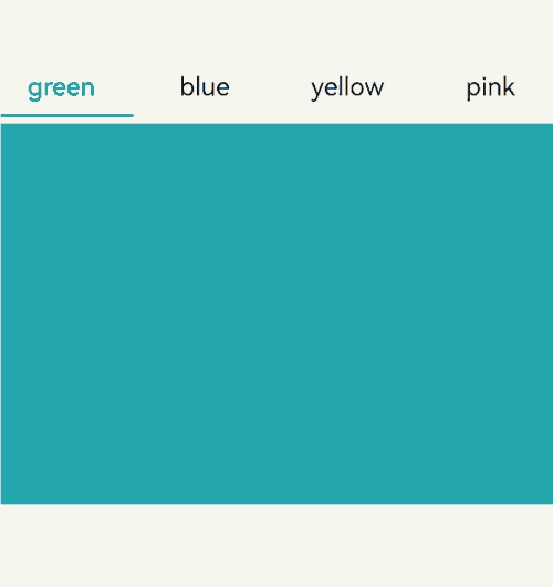
Example 3: Implementing Custom Tab Switching Synchronization
This example demonstrates how to use onAnimationStart and onChange to synchronize tabs with swiping gestures during tab switching.
// xxx.ets
@Entry
@Component
struct TabsExample {
  @State fontColor: string = '#182431';
  @State selectedFontColor: string = '#007DFF';
  @State currentIndex: number = 0;
  @State selectedIndex: number = 0;
  private controller: TabsController = new TabsController();

  @Builder tabBuilder(index: number, name: string) {
    Column() {
      Text(name)
        .fontColor(this.selectedIndex === index ? this.selectedFontColor : this.fontColor)
        .fontSize(16)
        .fontWeight(this.selectedIndex === index ? 500 : 400)
        .lineHeight(22)
        .margin({ top: 17, bottom: 7 })
      Divider()
        .strokeWidth(2)
        .color('#007DFF')
        .opacity(this.selectedIndex === index ? 1 : 0)
    }.width('100%')
  }

  build() {
    Column() {
      Tabs({ barPosition: BarPosition.Start, index: this.currentIndex, controller: this.controller }) {
        TabContent() {
          Column().width('100%').height('100%').backgroundColor('#00CB87')
        }.tabBar(this.tabBuilder(0, 'green'))

        TabContent() {
          Column().width('100%').height('100%').backgroundColor('#007DFF')
        }.tabBar(this.tabBuilder(1, 'blue'))

        TabContent() {
          Column().width('100%').height('100%').backgroundColor('#FFBF00')
        }.tabBar(this.tabBuilder(2, 'yellow'))

        TabContent() {
          Column().width('100%').height('100%').backgroundColor('#E67C92')
        }.tabBar(this.tabBuilder(3, 'pink'))
      }
      .vertical(false)
      .barMode(BarMode.Fixed)
      .barWidth(360)
      .barHeight(56)
      .animationDuration(400)
      .onChange((index: number) => {
        // currentIndex controls which tab is displayed.
        this.currentIndex = index;
        this.selectedIndex = index;
      })
      .onAnimationStart((index: number, targetIndex: number, event: TabsAnimationEvent) => {
        if (index === targetIndex) {
          return;
        }
        // selectedIndex controls the color switching for the image and text in the custom tab bar.
        this.selectedIndex = targetIndex;
      })
      .width(360)
      .height(296)
      .margin({ top: 52 })
      .backgroundColor('#F1F3F5')
    }.width('100%')
  }
}
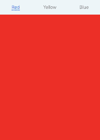
Example 4: Setting the Basic Attributes of the Divider
This example uses divider to present dividers in different styles.
// xxx.ets
@Entry
@Component
struct TabsDivider1 {
  private controller1: TabsController = new TabsController();
  @State dividerColor: string = 'red';
  @State strokeWidth: number = 2;
  @State startMargin: number = 0;
  @State endMargin: number = 0;
  @State nullFlag: boolean = false;

  build() {
    Column() {
      Tabs({ controller: this.controller1 }) {
        TabContent() {
          Column().width('100%').height('100%').backgroundColor(Color.Pink)
        }.tabBar('pink')

        TabContent() {
          Column().width('100%').height('100%').backgroundColor(Color.Yellow)
        }.tabBar('yellow')

        TabContent() {
          Column().width('100%').height('100%').backgroundColor(Color.Blue)
        }.tabBar('blue')

        TabContent() {
          Column().width('100%').height('100%').backgroundColor(Color.Green)
        }.tabBar('green')

        TabContent() {
          Column().width('100%').height('100%').backgroundColor(Color.Red)
        }.tabBar('red')
      }
      .vertical(true)
      .scrollable(true)
      .barMode(BarMode.Fixed)
      .barWidth(70)
      .barHeight(200)
      .animationDuration(400)
      .onChange((index: number) => {
        console.info(index.toString());
      })
      .height('200vp')
      .margin({ bottom: '12vp' })
      .divider(this.nullFlag ? null : {
        strokeWidth: this.strokeWidth,
        color: this.dividerColor,
        startMargin: this.startMargin,
        endMargin: this.endMargin
      })

      Button('Regular Divider').width('100%').margin({ bottom: '12vp' })
        .onClick(() => {
          this.nullFlag = false;
          this.strokeWidth = 2;
          this.dividerColor = 'red';
          this.startMargin = 0;
          this.endMargin = 0;
        })
      Button('Empty Divider').width('100%').margin({ bottom: '12vp' })
        .onClick(() => {
          this.nullFlag = true;
        })
      Button('Change to Blue').width('100%').margin({ bottom: '12vp'})
        .onClick(() => {
          this.dividerColor = 'blue';
        })
      Button('Increase Width').width('100%').margin({ bottom: '12vp' })
        .onClick(() => {
          this.strokeWidth += 2;
        })
      Button('Decrease Width').width('100%').margin({ bottom: '12vp'})
        .onClick(() => {
          if (this.strokeWidth > 2) {
            this.strokeWidth -= 2;
          }
        })
      Button('Increase Top Margin').width('100%').margin({ bottom: '12vp' })
        .onClick(() => {
          this.startMargin += 2;
        })
      Button('Decrease Top Margin').width('100%').margin({ bottom: '12vp' })
        .onClick(() => {
          if (this.startMargin > 2) {
            this.startMargin -= 2;
          }
        })
      Button ('Increase Bottom Margin').width ('100%').margin ({ bottom:'12vp'})
        .onClick(() => {
          this.endMargin += 2;
        })
      Button ('Decrease Bottom Margin').width ('100%').margin ({ bottom:'12vp' })
        .onClick(() => {
          if (this.endMargin > 2) {
            this.endMargin -= 2;
          }
        })
    }.padding({ top: '24vp', left: '24vp', right: '24vp' })
  }
}

Example 5: Setting Tab Bar Fading
This example uses fadingEdge to specify whether to fade out tabs.
// xxx.ets
@Entry
@Component
struct TabsOpaque {
  @State message: string = 'Hello World';
  private controller: TabsController = new TabsController();
  private controller1: TabsController = new TabsController();
  @State selfFadingFade: boolean = true;

  build() {
    Column() {
      Button('Set Tab to Fade').width('100%').margin({ bottom: '12vp' })
        .onClick((event?: ClickEvent) => {
          this.selfFadingFade = true;
        })
      Button('Set Tab Not to Fade').width('100%').margin({ bottom: '12vp' })
        .onClick((event?: ClickEvent) => {
          this.selfFadingFade = false;
        })
      Tabs({ barPosition: BarPosition.End, controller: this.controller }) {
        TabContent() {
          Column().width('100%').height('100%').backgroundColor(Color.Pink)
        }.tabBar('pink')

        TabContent() {
          Column().width('100%').height('100%').backgroundColor(Color.Yellow)
        }.tabBar('yellow')

        TabContent() {
          Column().width('100%').height('100%').backgroundColor(Color.Blue)
        }.tabBar('blue')

        TabContent() {
          Column().width('100%').height('100%').backgroundColor(Color.Green)
        }.tabBar('green')

        TabContent() {
          Column().width('100%').height('100%').backgroundColor(Color.Green)
        }.tabBar('green')

        TabContent() {
          Column().width('100%').height('100%').backgroundColor(Color.Green)
        }.tabBar('green')

        TabContent() {
          Column().width('100%').height('100%').backgroundColor(Color.Green)
        }.tabBar('green')

        TabContent() {
          Column().width('100%').height('100%').backgroundColor(Color.Green)
        }.tabBar('green')
      }
      .vertical(false)
      .scrollable(true)
      .barMode(BarMode.Scrollable)
      .barHeight(80)
      .animationDuration(400)
      .onChange((index: number) => {
        console.info(index.toString());
      })
      .fadingEdge(this.selfFadingFade)
      .height('30%')
      .width('100%')

      Tabs({ barPosition: BarPosition.Start, controller: this.controller1 }) {
        TabContent() {
          Column().width('100%').height('100%').backgroundColor(Color.Pink)
        }.tabBar('pink')

        TabContent() {
          Column().width('100%').height('100%').backgroundColor(Color.Yellow)
        }.tabBar('yellow')

        TabContent() {
          Column().width('100%').height('100%').backgroundColor(Color.Blue)
        }.tabBar('blue')

        TabContent() {
          Column().width('100%').height('100%').backgroundColor(Color.Green)
        }.tabBar('green')

        TabContent() {
          Column().width('100%').height('100%').backgroundColor(Color.Green)
        }.tabBar('green')

        TabContent() {
          Column().width('100%').height('100%').backgroundColor(Color.Green)
        }.tabBar('green')
      }
      .vertical(true)
      .scrollable(true)
      .barMode(BarMode.Scrollable)
      .barHeight(200)
      .barWidth(80)
      .animationDuration(400)
      .onChange((index: number) => {
        console.info(index.toString());
      })
      .fadingEdge(this.selfFadingFade)
      .height('30%')
      .width('100%')
    }
    .padding({ top: '24vp', left: '24vp', right: '24vp' })
  }
}
Example 6: Implementing TabBar Overlay on TabContent
This example shows how to use barOverlap to specify whether the tab bar overlaps the TabContent component with a blurred background effect.
// xxx.ets
@Entry
@Component
struct barHeightTest {
  @State arr: number[] = [0, 1, 2, 3];
  @State barOverlap: boolean = true;

  build() {
    Column() {
      Text(`barOverlap ${this.barOverlap}`).fontSize(16)
      Button('Change barOverlap').width('100%').margin({ bottom: '12vp' })
        .onClick((event?: ClickEvent) => {
          if (this.barOverlap) {
            this.barOverlap = false;
          } else {
            this.barOverlap = true;
          }
        })

      Tabs({ barPosition: BarPosition.End }) {
        TabContent() {
          Column() {
            List({ space: 10 }) {
              ForEach(this.arr, (item: number) => {
                ListItem() {
                  Text('item' + item).width('80%').height(200).fontSize(16).textAlign(TextAlign.Center).backgroundColor('#fff8b81e')
                }
              }, (item: string) => item)
            }.width('100%').height('100%')
            .lanes(2).alignListItem(ListItemAlign.Center)
          }.width('100%').height('100%')
          .backgroundColor(Color.Pink)
        }
        .tabBar(new BottomTabBarStyle($r('sys.media.ohos_icon_mask_svg'), 'test 0'))
      }
      .scrollable(false)
      .height('60%')
      .barOverlap(this.barOverlap)
    }
    .height(500)
    .padding({ top: '24vp', left: '24vp', right: '24vp' })
  }
}
Example 7: Setting the Visible Area for the Tab Bar in Responsive Grid Mode
This example uses barGridAlign to set the visible area of the tab bar in responsive grid mode.
// xxx.ets
@Entry
@Component
struct TabsExample5 {
  private controller: TabsController = new TabsController();
  @State gridMargin: number = 10;
  @State gridGutter: number = 10;
  @State sm: number = -2;
  @State clickedContent: string = '';

  build() {
    Column() {
      Row() {
        Button('gridMargin+10 ' + this.gridMargin)
          .width('47%')
          .height(50)
          .margin({ top: 5 })
          .onClick((event?: ClickEvent) => {
            this.gridMargin += 10;
          })
          .margin({ right: '6%', bottom: '12vp' })
        Button('gridMargin-10 ' + this.gridMargin)
          .width('47%')
          .height(50)
          .margin({ top: 5 })
          .onClick((event?: ClickEvent) => {
            this.gridMargin -= 10;
          })
          .margin({ bottom: '12vp' })
      }

      Row() {
        Button('gridGutter+10 ' + this.gridGutter)
          .width('47%')
          .height(50)
          .margin({ top: 5 })
          .onClick((event?: ClickEvent) => {
            this.gridGutter += 10;
          })
          .margin({ right: '6%', bottom: '12vp' })
        Button('gridGutter-10 ' + this.gridGutter)
          .width('47%')
          .height(50)
          .margin({ top: 5 })
          .onClick((event?: ClickEvent) => {
            this.gridGutter -= 10;
          })
          .margin({ bottom: '12vp' })
      }

      Row() {
        Button('sm+2 ' + this.sm)
          .width('47%')
          .height(50)
          .margin({ top: 5 })
          .onClick((event?: ClickEvent) => {
            this.sm += 2;
          })
          .margin({ right: '6%' })
        Button('sm-2 ' + this.sm).width('47%').height(50).margin({ top: 5 })
          .onClick((event?: ClickEvent) => {
            this.sm -= 2;
          })
      }

      Text('Tapped content: ' + this.clickedContent).width('100%').height(200).margin({ top: 5 })


      Tabs({ barPosition: BarPosition.End, controller: this.controller }) {
        TabContent() {
          Column().width('100%').height('100%').backgroundColor(Color.Pink)
        }.tabBar(BottomTabBarStyle.of($r('sys.media.ohos_app_icon'), '1'))

        TabContent() {
          Column().width('100%').height('100%').backgroundColor(Color.Green)
        }.tabBar(BottomTabBarStyle.of($r('sys.media.ohos_app_icon'), '2'))

        TabContent() {
          Column().width('100%').height('100%').backgroundColor(Color.Blue)
        }.tabBar(BottomTabBarStyle.of($r('sys.media.ohos_app_icon'), '3'))
      }
      .width('350vp')
      .animationDuration(300)
      .height('60%')
      .barGridAlign({ sm: this.sm, margin: this.gridMargin, gutter: this.gridGutter })
      .backgroundColor(0xf1f3f5)
      .onTabBarClick((index: number) => {
        this.clickedContent += 'now index ' + index + ' is clicked\n';
      })
    }
    .width('100%')
    .height(500)
    .margin({ top: 5 })
    .padding('10vp')
  }
}

Example 8: Implementing a Custom Tab Switching Animation
This example uses customContentTransition to implement a custom tab switching animation.
// xxx.ets
interface itemType {
  text: string,
  backgroundColor: Color
}

@Entry
@Component
struct TabsCustomAnimationExample {
  @State data: itemType[] = [
    {
      text: 'Red',
      backgroundColor: Color.Red
    },
    {
      text: 'Yellow',
      backgroundColor: Color.Yellow
    },
    {
      text: 'Blue',
      backgroundColor: Color.Blue
    }];
  @State opacityList: number[] = [];
  @State scaleList: number[] = [];

  private durationList: number[] = [];
  private timeoutList: number[] = [];
  private customContentTransition: (from: number, to: number) => TabContentAnimatedTransition = (from: number, to: number) => {
    let tabContentAnimatedTransition = {
      timeout: this.timeoutList[from],
      transition: (proxy: TabContentTransitionProxy) => {
        this.scaleList[from] = 1.0;
        this.scaleList[to] = 0.5;
        this.opacityList[from] = 1.0;
        this.opacityList[to] = 0.5;
        this.getUIContext()?.animateTo({
          duration: this.durationList[from],
          onFinish: () => {
            proxy.finishTransition();
          }
        }, () => {
          this.scaleList[from] = 0.5;
          this.scaleList[to] = 1.0;
          this.opacityList[from] = 0.5;
          this.opacityList[to] = 1.0;
        });
      }
    } as TabContentAnimatedTransition;
    return tabContentAnimatedTransition;
  };

  aboutToAppear(): void {
    let duration = 1000;
    let timeout = 1000;
    for (let i = 1; i <= this.data.length; i++) {
      this.opacityList.push(1.0);
      this.scaleList.push(1.0);
      this.durationList.push(duration * i);
      this.timeoutList.push(timeout * i);
    }
  }

  build() {
    Column() {
      Tabs() {
        ForEach(this.data, (item: itemType, index: number) => {
          TabContent() {}
          .tabBar(item.text)
          .backgroundColor(item.backgroundColor)
          // Customize the opacity and scale animation.
          .opacity(this.opacityList[index])
          .scale({ x: this.scaleList[index], y: this.scaleList[index] })
        })
      }
      .backgroundColor(0xf1f3f5)
      .width('100%')
      .height(500)
      .customContentTransition(this.customContentTransition)
    }
  }
}
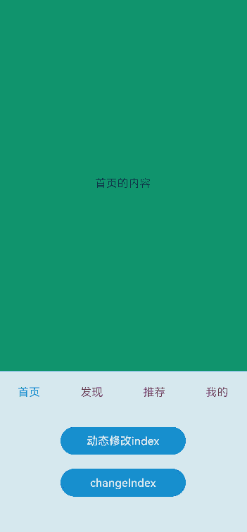
Example 9: Implementing Tab Switching Interception
This example uses onContentWillChange to implement custom swipe-based tab switching interception.
//xxx.ets
@Entry
@Component
struct TabsExample {
  @State selectedIndex: number = 2;
  @State currentIndex: number = 2;
  private controller: TabsController = new TabsController();

  @Builder tabBuilder(title: string,targetIndex: number) {
    Column(){
      Image(this.selectedIndex === targetIndex ? $r('app.media.star_fill') : $r('app.media.star'))
        .width(24)
        .height(24)
        .margin({ bottom: 4 })
        .objectFit(ImageFit.Contain)
      Text(title).fontColor(this.selectedIndex === targetIndex ? '#1698CE' : '#6B6B6B')
    }.width('100%')
    .height(50)
    .justifyContent(FlexAlign.Center)
  }

  build() {
    Column() {
      Tabs({ barPosition: BarPosition.End, index: this.currentIndex, controller: this.controller }) {
        TabContent() {
          Column(){
            Text('Content of the Home tab')
          }.width('100%').height('100%').backgroundColor('#00CB87').justifyContent(FlexAlign.Center)
        }.tabBar(this.tabBuilder('Home',0))

        TabContent() {
          Column(){
            Text('Content of the Discover tab')
          }.width('100%').height('100%').backgroundColor('#007DFF').justifyContent(FlexAlign.Center)
        }.tabBar(this.tabBuilder('Discover',1))

        TabContent() {
          Column(){
            Text('Content of the Recommended tab')
          }.width('100%').height('100%').backgroundColor('#FFBF00').justifyContent(FlexAlign.Center)
        }.tabBar(this.tabBuilder('Recommended',2))

        TabContent() {
          Column(){
            Text('Content of the Me tab')
          }.width('100%').height('100%').backgroundColor('#E67C92').justifyContent(FlexAlign.Center)
        }.tabBar(this.tabBuilder('Me',3))
      }
      .vertical(false)
      .barMode(BarMode.Fixed)
      .barWidth(360)
      .barHeight(60)
      .animationDuration(0)
      .onChange((index: number) => {
        this.currentIndex = index;
        this.selectedIndex = index;
      })
      .width(360)
      .height(600)
      .backgroundColor('#F1F3F5')
      .scrollable(true)
      .onContentWillChange((currentIndex, comingIndex) => {
        if (comingIndex == 2) {
          return false;
        }
        return true;
      })

      Button('Change Index').width('50%').margin({ top: 20 })
        .onClick(()=>{
          this.currentIndex = (this.currentIndex + 1) % 4;
        })

      Button('changeIndex').width('50%').margin({ top: 20 })
        .onClick(()=>{
          this.currentIndex = (this.currentIndex + 1) % 4;
          this.controller.changeIndex(this.currentIndex);
        })
    }.width('100%')
  }
}
Example 10: Customizing the Tab Switching Animation
This example uses onChange, onAnimationStart, onAnimationEnd, and onGestureSwipe APIs to customize the tab switching animation.
// EntryAbility.ets
import { Configuration, UIAbility } from '@kit.AbilityKit';
import { i18n } from '@kit.LocalizationKit';
import { CommonUtil } from '../common/CommonUtil';

export default class EntryAbility extends UIAbility {
  onConfigurationUpdate(newConfig: Configuration): void {
    // Listen for system configuration changes.
    if (newConfig.language) {
      CommonUtil.setIsRTL(i18n.isRTL(newConfig.language));
    }
  }
}
// CommonUtil.ets
import { i18n, intl } from '@kit.LocalizationKit';

export class CommonUtil {
  private static isRTL: boolean = i18n.isRTL((new intl.Locale()).language);

  public static setIsRTL(isRTL: boolean): void {
    CommonUtil.isRTL = isRTL;
  }

  public static getIsRTL(): boolean {
    return CommonUtil.isRTL;
  }
}
// xxx.ets
import { LengthMetrics } from '@kit.ArkUI';
import { CommonUtil } from '../common/CommonUtil';

@Entry
@Component
struct TabsExample {
  @State colorArray: [string, string][] =
    [['green', '#00CB87'], ['blue', '#007DFF'], ['yellow', '#FFBF00'], ['pink', '#E67C92']];
  @State currentIndex: number = 0;
  @State animationDuration: number = 300;
  @State indicatorLeftMargin: number = 0;
  @State indicatorWidth: number = 0;
  private tabsWidth: number = 0;
  private textInfos: [number, number][] = [];
  private isStartAnimateTo: boolean = false;

  aboutToAppear():void {
    for (let i = 0; i < this.colorArray.length; i++) {
      this.textInfos.push([0, 0]);
    }
  }

  @Builder
  tabBuilder(index: number, name: string) {
    Column() {
      Text(name)
        .fontSize(16)
        .fontColor(this.currentIndex === index ? '#007DFF' : '#182431')
        .fontWeight(this.currentIndex === index ? 500 : 400)
        .id(index.toString())
        .onAreaChange((oldValue: Area, newValue: Area) => {
          this.textInfos[index] = [newValue.globalPosition.x as number, newValue.width as number];
          if (!this.isStartAnimateTo && this.currentIndex === index && this.tabsWidth > 0) {
            this.setIndicatorAttr(this.textInfos[this.currentIndex][0], this.textInfos[this.currentIndex][1]);
          }
        })
    }.width('100%')
  }

  build() {
    Stack({ alignContent: Alignment.TopStart }) {
      Tabs({ barPosition: BarPosition.Start }) {
        ForEach(this.colorArray, (item: [string, string], index:number) => {
          TabContent() {
            Column().width('100%').height('100%').backgroundColor(item[1])
          }.tabBar(this.tabBuilder(index, item[0]))
        })
      }
      .onAreaChange((oldValue: Area, newValue: Area)=> {
        this.tabsWidth = newValue.width as number;
        if (!this.isStartAnimateTo) {
          this.setIndicatorAttr(this.textInfos[this.currentIndex][0], this.textInfos[this.currentIndex][1]);
        }
      })
      .barWidth('100%')
      .barHeight(56)
      .width('100%')
      .height(296)
      .backgroundColor('#F1F3F5')
      .animationDuration(this.animationDuration)
      .onChange((index: number) => {
        this.currentIndex = index; // Listen for index changes to switch between tabs.
      })
      .onAnimationStart((index: number, targetIndex: number, event: TabsAnimationEvent) => {
        // Triggered when the tab switching animation starts. The underline moves with the active tab, along with a width gradient.
        this.currentIndex = targetIndex;
        this.startAnimateTo(this.animationDuration, this.textInfos[targetIndex][0], this.textInfos[targetIndex][1]);
      })
      .onAnimationEnd((index: number, event: TabsAnimationEvent) => {
        // Triggered when the tab switching animation ends. The underline animation stops.
        let currentIndicatorInfo = this.getCurrentIndicatorInfo(index, event);
        this.startAnimateTo(0, currentIndicatorInfo.left, currentIndicatorInfo.width);
      })
      .onGestureSwipe((index: number, event: TabsAnimationEvent) => {
        // Triggered on a frame-by-frame basis when the tab is switched by a swipe.
        let currentIndicatorInfo = this.getCurrentIndicatorInfo(index, event);
        this.currentIndex = currentIndicatorInfo.index;
        this.setIndicatorAttr(currentIndicatorInfo.left, currentIndicatorInfo.width);
      })

      Column()
        .height(2)
        .width(this.indicatorWidth)
        .margin({ start: LengthMetrics.vp(this.indicatorLeftMargin), top: LengthMetrics.vp(48) })
        .backgroundColor('#007DFF')
    }.width('100%')
  }

  private getCurrentIndicatorInfo(index: number, event: TabsAnimationEvent): Record<string, number> {
    let nextIndex = index;
    if (index > 0 && (CommonUtil.getIsRTL() ? event.currentOffset < 0 : event.currentOffset > 0)) {
      nextIndex--;
    } else if (index < this.textInfos.length - 1 &&
        (CommonUtil.getIsRTL() ? event.currentOffset > 0 : event.currentOffset < 0)) {
      nextIndex++;
    }
    let indexInfo = this.textInfos[index];
    let nextIndexInfo = this.textInfos[nextIndex];
    let swipeRatio = Math.abs(event.currentOffset / this.tabsWidth);
    let currentIndex = swipeRatio > 0.5 ? nextIndex : index; // If the swipe is more than halfway, the tab bar switches to the next tab.
    let currentLeft = indexInfo[0] + (nextIndexInfo[0] - indexInfo[0]) * swipeRatio;
    let currentWidth = indexInfo[1] + (nextIndexInfo[1] - indexInfo[1]) * swipeRatio;
    return { 'index': currentIndex, 'left': currentLeft, 'width': currentWidth };
  }

  private startAnimateTo(duration: number, leftMargin: number, width: number) {
    this.isStartAnimateTo = true;
    this.getUIContext()?.animateTo({
      duration: duration, // Animation duration.
      curve: Curve.Linear, // Animation curve.
      iterations: 1, // Number of playback times.
      playMode: PlayMode.Normal, // Animation playback mode.
      onFinish: () => {
        this.isStartAnimateTo = false;
        console.info('play end');
      }
    }, () => {
      this.setIndicatorAttr(leftMargin, width);
    });
  }

  private setIndicatorAttr(leftMargin: number, width: number) {
    this.indicatorWidth = width;
    if (CommonUtil.getIsRTL()) {
      this.indicatorLeftMargin = this.tabsWidth - leftMargin - width;
    } else {
      this.indicatorLeftMargin = leftMargin;
    }
  }
}
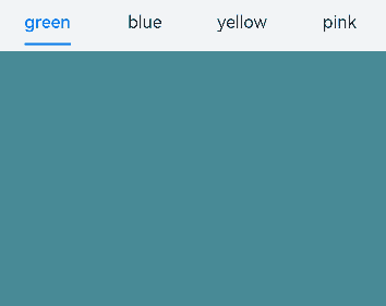
Example 11: Preloading Child Nodes
In this example, the preloadItems API is used to preload specified child nodes.
// xxx.ets
import { BusinessError } from '@kit.BasicServicesKit';

@Entry
@Component
struct TabsPreloadItems {
  @State currentIndex: number = 1;
  private tabsController: TabsController = new TabsController();

  build() {
    Column() {
      Tabs({ index: this.currentIndex, controller: this.tabsController }) {
        TabContent() {
          MyComponent({ color: '#00CB87' })
        }.tabBar(SubTabBarStyle.of('green'))

        TabContent() {
          MyComponent({ color: '#007DFF' })
        }.tabBar(SubTabBarStyle.of('blue'))

        TabContent() {
          MyComponent({ color: '#FFBF00' })
        }.tabBar(SubTabBarStyle.of('yellow'))

        TabContent() {
          MyComponent({ color: '#E67C92' })
        }.tabBar(SubTabBarStyle.of('pink'))
      }
      .width(360)
      .height(296)
      .backgroundColor('#F1F3F5')
      .onChange((index: number) => {
        this.currentIndex = index;
      })

      Button('preload items: [0, 2, 3]')
        .margin(5)
        .onClick(() => {
          // Preload child nodes 0, 2, and 3 to improve the performance when users swipe or click to switch to these nodes.
          this.tabsController.preloadItems([0, 2, 3])
            .then(() => {
              console.info('preloadItems success.');
            })
            .catch((error: BusinessError) => {
              console.error('preloadItems failed, error code: ' + error.code + ', error message: ' + error.message);
            })
        })
    }
  }
}

@Component
struct MyComponent {
  private color: string = '';

  aboutToAppear(): void {
    console.info('aboutToAppear backgroundColor:' + this.color);
  }

  aboutToDisappear(): void {
    console.info('aboutToDisappear backgroundColor:' + this.color);
  }

  build() {
    Column()
      .width('100%')
      .height('100%')
      .backgroundColor(this.color)
  }
}
Example 12: Setting Tab Bar Translation and Opacity
This example demonstrates how to set the translation distance and opacity of the tab bar using the setTabBarTranslate and setTabBarOpacity APIs.
// xxx.ets
@Entry
@Component
struct TabsExample {
  private controller: TabsController = new TabsController();

  build() {
    Column() {
      Button('Set TabBar Translation Distance').margin({ top: 20 })
        .onClick(() => {
          this.controller.setTabBarTranslate({ x: -20, y: -20 });
        })

      Button('Set TabBar Opacity').margin({ top: 20 })
        .onClick(() => {
          this.controller.setTabBarOpacity(0.5);
        })

      Tabs({ barPosition: BarPosition.End, controller: this.controller }) {
        TabContent() {
          Column().width('100%').height('100%').backgroundColor('#00CB87')
        }.tabBar(BottomTabBarStyle.of($r('app.media.startIcon'), 'green'))

        TabContent() {
          Column().width('100%').height('100%').backgroundColor('#007DFF')
        }.tabBar(BottomTabBarStyle.of($r('app.media.startIcon'), 'blue'))

        TabContent() {
          Column().width('100%').height('100%').backgroundColor('#FFBF00')
        }.tabBar(BottomTabBarStyle.of($r('app.media.startIcon'), 'yellow'))

        TabContent() {
          Column().width('100%').height('100%').backgroundColor('#E67C92')
        }.tabBar(BottomTabBarStyle.of($r('app.media.startIcon'), 'pink'))
      }
      .width(360)
      .height(296)
      .margin({ top: 20 })
      .barBackgroundColor('#F1F3F5')
    }
    .width('100%')
  }
}

Example 13: Implementing Lazy Loading and Resource Release of Pages
This example demonstrates how to use a custom tab bar with the Swiper component and LazyForEach to implement lazy loading and resource release of pages.
// xxx.ets
class MyDataSource implements IDataSource {
  private list: number[] = [];

  constructor(list: number[]) {
    this.list = list;
  }

  totalCount(): number {
    return this.list.length;
  }

  getData(index: number): number {
    return this.list[index];
  }

  registerDataChangeListener(listener: DataChangeListener): void {
  }

  unregisterDataChangeListener() {
  }
}

@Entry
@Component
struct TabsSwiperExample {
  @State fontColor: string = '#182431';
  @State selectedFontColor: string = '#007DFF';
  @State currentIndex: number = 0;
  private list: number[] = [];
  private tabsController: TabsController = new TabsController();
  private swiperController: SwiperController = new SwiperController();
  private swiperData: MyDataSource = new MyDataSource([]);

  aboutToAppear(): void {
    for (let i = 0; i <= 9; i++) {
      this.list.push(i);
    }
    this.swiperData = new MyDataSource(this.list);
  }

  @Builder tabBuilder(index: number, name: string) {
    Column() {
      Text(name)
        .fontColor(this.currentIndex === index ? this.selectedFontColor : this.fontColor)
        .fontSize(16)
        .fontWeight(this.currentIndex === index ? 500 : 400)
        .lineHeight(22)
        .margin({ top: 17, bottom: 7 })
      Divider()
        .strokeWidth(2)
        .color('#007DFF')
        .opacity(this.currentIndex === index ? 1 : 0)
    }.width('20%')
  }

  build() {
    Column() {
      Tabs({ barPosition: BarPosition.Start, controller: this.tabsController }) {
        ForEach(this.list, (item: number) => {
          TabContent().tabBar(this.tabBuilder(item, 'Tab ' + this.list[item]))
        })
      }
      .onTabBarClick((index: number) => {
        this.currentIndex = index;
        this.swiperController.changeIndex(index, true);
      })
      .barMode(BarMode.Scrollable)
      .backgroundColor('#F1F3F5')
      .height(56)
      .width('100%')

      Swiper(this.swiperController) {
        LazyForEach(this.swiperData, (item: string) => {
          Text(item.toString())
            .onAppear(()=>{
              console.info('onAppear ' + item.toString());
            })
            .onDisAppear(()=>{
              console.info('onDisAppear ' + item.toString());
            })
            .width('100%')
            .height('100%')
            .backgroundColor(0xAFEEEE)
            .textAlign(TextAlign.Center)
            .fontSize(30)
        }, (item: string) => item)
      }
      .loop(false)
      .onChange((index: number) => {
        this.currentIndex = index;
      })
      .onAnimationStart((index: number, targetIndex: number, extraInfo: SwiperAnimationEvent) => {
        this.currentIndex = targetIndex;
        this.tabsController.changeIndex(targetIndex);
      })
    }
  }
}

Example 14: Implementing the Tab Switching Animation
This example demonstrates how to implement a tab switching animation by setting animationMode.
// xxx.ets
@Entry
@Component
struct TabsExample {
  @State currentIndex: number = 0;
  @State currentAnimationMode: AnimationMode = AnimationMode.CONTENT_FIRST;
  private controller: TabsController = new TabsController();
  private data: number[] = [];

  aboutToAppear(): void {
    for (let i = 0; i < 10; i++) {
      this.data.push(i);
    }
  }

  @Builder
  tabBuilder(title: string,targetIndex: number) {
    Column(){
      Text(title).fontColor(this.currentIndex === targetIndex ? '#FF0000' : '#6B6B6B')
    }.width('100%')
    .height(50)
    .justifyContent(FlexAlign.Center)
  }

  build() {
    Column() {
      Tabs({ barPosition: BarPosition.End, controller: this.controller, index: this.currentIndex }) {
        ForEach(this.data, (item: string) => {
          TabContent() {
            Column(){
              Text('' + item)
            }.width('100%').height('100%').backgroundColor('#00CB87').justifyContent(FlexAlign.Center)
          }.tabBar(this.tabBuilder('P' + item, parseInt(item)))
        }, (item: string) => item)
      }
      .barWidth(360)
      .barHeight(60)
      .animationMode(this.currentAnimationMode)
      .animationDuration(4000)
      .onChange((index: number) => {
        this.currentIndex = index;
      })
      .width(360)
      .height(120)
      .backgroundColor('#F1F3F5')

      Text('AnimationMode:' + AnimationMode[this.currentAnimationMode])

      Button('AnimationMode').width('50%').margin({ top: 1 }).height(25)
        .onClick(()=>{
          if (this.currentAnimationMode === AnimationMode.CONTENT_FIRST) {
            this.currentAnimationMode = AnimationMode.ACTION_FIRST;
          } else if (this.currentAnimationMode === AnimationMode.ACTION_FIRST) {
            this.currentAnimationMode = AnimationMode.NO_ANIMATION;
          } else if (this.currentAnimationMode === AnimationMode.NO_ANIMATION) {
            this.currentAnimationMode = AnimationMode.CONTENT_FIRST_WITH_JUMP;
          } else if (this.currentAnimationMode === AnimationMode.CONTENT_FIRST_WITH_JUMP) {
            this.currentAnimationMode = AnimationMode.ACTION_FIRST_WITH_JUMP;
          } else if (this.currentAnimationMode === AnimationMode.ACTION_FIRST_WITH_JUMP) {
            this.currentAnimationMode = AnimationMode.CONTENT_FIRST;
          }
        })
    }.width('100%')
  }
}

Example 15: Enabling Tabs to Exceed the Tab Bar Area
This example shows how to enable tabs to exceed the tab bar area by setting the clip property of the TabBar using barModifier.
// xxx.ets
import { CommonModifier } from '@kit.ArkUI';

@Entry
@Component
struct TabsBarModifierExample {
  @State selectedIndex: number = 2;
  @State currentIndex: number = 2;
  @State isClip: boolean = false;
  @State tabBarModifier: CommonModifier = new CommonModifier();
  private controller: TabsController = new TabsController();

  aboutToAppear(): void {
    this.tabBarModifier.clip(this.isClip);
  }

  @Builder
  tabBuilder(title: string, targetIndex: number) {
    Column() {
      Image($r('app.media.startIcon')).width(30).height(30)
      Text(title).fontColor(this.selectedIndex === targetIndex ? '#1698CE' : '#6B6B6B')
    }.width('100%')
    .height(50)
    .justifyContent(FlexAlign.Center)
    .offset({ y: this.selectedIndex === targetIndex ? -15 : 0 })
  }

  build() {
    Column() {
      Tabs({
        barPosition: BarPosition.End,
        index: this.currentIndex,
        controller: this.controller,
        barModifier: this.tabBarModifier
      }) {
        TabContent() {
          Column() {
            Text('Content of the Home tab')
          }.width('100%').height('100%').backgroundColor('#00CB87').justifyContent(FlexAlign.Center)
        }.tabBar(this.tabBuilder('Home', 0))

        TabContent() {
          Column() {
            Text('Content of the Discover tab')
          }.width('100%').height('100%').backgroundColor('#007DFF').justifyContent(FlexAlign.Center)
        }.tabBar(this.tabBuilder('Discover', 1))

        TabContent() {
          Column() {
            Text('Content of the Recommended tab')
          }.width('100%').height('100%').backgroundColor('#FFBF00').justifyContent(FlexAlign.Center)
        }.tabBar(this.tabBuilder('Recommended', 2))

        TabContent() {
          Column() {
            Text('Content of the Me tab')
          }.width('100%').height('100%').backgroundColor('#E67C92').justifyContent(FlexAlign.Center)
        }.tabBar(this.tabBuilder('Me',3))
      }
      .vertical(false)
      .barMode(BarMode.Fixed)
      .barWidth(340)
      .barHeight(60)
      .onChange((index: number) => {
        this.currentIndex = index;
        this.selectedIndex = index;
      })
      .width(340)
      .height(400)
      .backgroundColor('#F1F3F5')
      .scrollable(true)

      Button('isClip: ' + this.isClip)
        .margin({ top: 30 })
        .onClick(() => {
          this.isClip = !this.isClip;
          this.tabBarModifier.clip(this.isClip);
        })
    }.width('100%')
  }
}

Example 16: Aligning Tabs
This example demonstrates how to align tabs by setting the align property of the TabBar using barModifier.
// xxx.ets
import { CommonModifier } from '@kit.ArkUI';

@Entry
@Component
struct TabsBarModifierExample {
  private controller: TabsController = new TabsController();
  @State text: string = 'Text';
  @State isVertical: boolean = false;
  @State tabBarModifier: CommonModifier = new CommonModifier();

  build() {
    Column() {
      Row() {
        Button('Alignment.Start ')
          .width('47%')
          .height(50)
          .margin({ top: 5 })
          .onClick((event?: ClickEvent) => {
            this.tabBarModifier.align(Alignment.Start);
          })
          .margin({ right: '6%', bottom: '12vp' })
        Button('Alignment.End')
          .width('47%')
          .height(50)
          .margin({ top: 5 })
          .onClick((event?: ClickEvent) => {
            this.tabBarModifier.align(Alignment.End);
          })
          .margin({ bottom: '12vp' })
      }

      Row() {
        Button('Alignment.Center')
          .width('47%')
          .height(50)
          .margin({ top: 5 })
          .onClick((event?: ClickEvent) => {
            this.tabBarModifier.align(Alignment.Center);
          })
          .margin({ right: '6%', bottom: '12vp' })
        Button('isVertical: ' + this.isVertical)
          .width('47%')
          .height(50)
          .margin({ top: 5 })
          .onClick((event?: ClickEvent) => {
            this.isVertical = !this.isVertical;
          })
          .margin({ bottom: '12vp' })
      }

      Row() {
        Button('Alignment.Top')
          .width('47%')
          .height(50)
          .margin({ top: 5 })
          .onClick((event?: ClickEvent) => {
            this.tabBarModifier.align(Alignment.Top);
          })
          .margin({ right: '6%', bottom: '12vp' })
        Button('Alignment.Bottom')
          .width('47%')
          .height(50)
          .margin({ top: 5 })
          .onClick((event?: ClickEvent) => {
            this.tabBarModifier.align(Alignment.Bottom);
          })
          .margin({ bottom: '12vp' })
      }

      Tabs({ barPosition: BarPosition.End, controller: this.controller, barModifier: this.tabBarModifier }) {
        TabContent() {
          Column().width('100%').height('100%').backgroundColor(Color.Pink)
        }.tabBar(SubTabBarStyle.of(this.text))

        TabContent() {
          Column().width('100%').height('100%').backgroundColor(Color.Green)
        }.tabBar(SubTabBarStyle.of(this.text))

        TabContent() {
          Column().width('100%').height('100%').backgroundColor(Color.Blue)
        }.tabBar(SubTabBarStyle.of(this.text))
      }
      .vertical(this.isVertical)
      .height('60%')
      .backgroundColor(0xf1f3f5)
      .barMode(BarMode.Scrollable)
    }
    .width('100%')
    .height(500)
    .margin({ top: 5 })
    .padding('24vp')
  }
}

Example 17: Implementing Synchronized Switching Between the Tabs and TabBar Components
This example shows how to implement synchronized switching between the Tabs and TabBar components using the onSelected callback.
// xxx.ets
@Entry
@Component
struct TabsExample {
  @State fontColor: string = '#182431';
  @State selectedFontColor: string = '#007DFF';
  @State currentIndex: number = 0;
  @State selectedIndex: number = 0;
  private controller: TabsController = new TabsController();

  @Builder tabBuilder(index: number, name: string) {
    Column() {
      Text(name)
        .fontColor(this.selectedIndex === index ? this.selectedFontColor : this.fontColor)
        .fontSize(16)
        .fontWeight(this.selectedIndex === index ? 500 : 400)
        .lineHeight(22)
        .margin({ top: 17, bottom: 7 })
      Divider()
        .strokeWidth(2)
        .color('#007DFF')
        .opacity(this.selectedIndex === index ? 1 : 0)
    }.width('100%')
  }

  build() {
    Column() {
      Tabs({ barPosition: BarPosition.Start, index: this.currentIndex, controller: this.controller }) {
        TabContent() {
          Column().width('100%').height('100%').backgroundColor('#00CB87')
        }.tabBar(this.tabBuilder(0, 'green'))

        TabContent() {
          Column().width('100%').height('100%').backgroundColor('#007DFF')
        }.tabBar(this.tabBuilder(1, 'blue'))

        TabContent() {
          Column().width('100%').height('100%').backgroundColor('#FFBF00')
        }.tabBar(this.tabBuilder(2, 'yellow'))

        TabContent() {
          Column().width('100%').height('100%').backgroundColor('#E67C92')
        }.tabBar(this.tabBuilder(3, 'pink'))
      }
      .vertical(false)
      .barMode(BarMode.Fixed)
      .barWidth(360)
      .barHeight(56)
      .animationDuration(400)
      .animationMode(AnimationMode.CONTENT_FIRST)
      .onChange((index: number) => {
        console.log('onChange index:' + index);
        this.currentIndex = index;
      })
      .onSelected((index: number) => {
        console.log('onSelected index:' + index);
        this.selectedIndex = index;
      })
      .onUnselected((index: number) => {
        console.log('onUnselected index:' + index);
      })
      .width('100%')
      .height('100%')
      .backgroundColor('#F1F3F5')
    }.width('100%')
  }
}
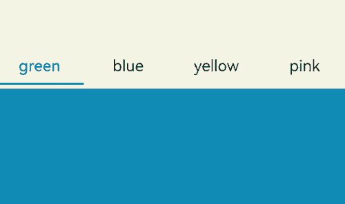
Example 18: Releasing the Tabs Child components
This example demonstrates how to release the Tabs child components by setting cachedMaxCount.
@Entry
@Component
struct TabsExample {
  build() {
    Tabs() {
      TabContent() {
        MyComponent({ color: '#00CB87' })
      }.tabBar(SubTabBarStyle.of('green'))

      TabContent() {
        MyComponent({ color: '#007DFF' })
      }.tabBar(SubTabBarStyle.of('blue'))

      TabContent() {
        MyComponent({ color: '#FFBF00' })
      }.tabBar(SubTabBarStyle.of('yellow'))

      TabContent() {
        MyComponent({ color: '#E67C92' })
      }.tabBar(SubTabBarStyle.of('pink'))
    }
    .width(360)
    .height(296)
    .backgroundColor('#F1F3F5')
    .cachedMaxCount(1, TabsCacheMode.CACHE_BOTH_SIDE)
  }
}

@Component
struct MyComponent {
  private color: string = '';

  aboutToAppear(): void {
    console.info('aboutToAppear backgroundColor:' + this.color);
  }

  aboutToDisappear(): void {
    console.info('aboutToDisappear backgroundColor:' + this.color);
  }

  build() {
    Column()
      .width('100%')
      .height('100%')
      .backgroundColor(this.color)
  }
}
Example 19: Setting the Tab Bar Background Blur Effect
This example shows how to set the background blur effect for the tab bar using barBackgroundBlurStyle and barBackgroundEffect.
// xxx.ets
@Entry
@Component
struct TabsExample {
  build() {
    Column() {
      // Use barBackgroundBlurStyle with an enumerated value to set blur parameters.
      Stack() {
        Image($r('app.media.startIcon'))
        Tabs() {
          TabContent() {
            Column().width('100%').height('100%').backgroundColor('#00CB87')
          }.tabBar('green')

          TabContent() {
            Column().width('100%').height('100%').backgroundColor('#007DFF')
          }.tabBar('blue')

          TabContent() {
            Column().width('100%').height('100%').backgroundColor('#FFBF00')
          }.tabBar('yellow')

          TabContent() {
            Column().width('100%').height('100%').backgroundColor('#E67C92')
          }.tabBar('pink')
        }
        .barBackgroundBlurStyle(BlurStyle.COMPONENT_THICK,
          { colorMode: ThemeColorMode.LIGHT, adaptiveColor: AdaptiveColor.DEFAULT, scale: 1.0 })
      }
      .width(300)
      .height(300)
      .margin(10)

      // barBackgroundEffect can be used to customize the blur radius, brightness, and saturation of the tabBar.
      Stack() {
        Image($r('app.media.startIcon'))
        Tabs() {
          TabContent() {
            Column().width('100%').height('100%').backgroundColor('#00CB87')
          }.tabBar('green')

          TabContent() {
            Column().width('100%').height('100%').backgroundColor('#007DFF')
          }.tabBar('blue')

          TabContent() {
            Column().width('100%').height('100%').backgroundColor('#FFBF00')
          }.tabBar('yellow')

          TabContent() {
            Column().width('100%').height('100%').backgroundColor('#E67C92')
          }.tabBar('pink')
        }
        .barBackgroundEffect({ radius: 20, brightness: 0.6, saturation: 15 })
      }
      .width(300)
      .height(300)
      .margin(10)
    }
  }
}

Example 20: Setting the Edge Scrolling Effect
This example demonstrates how to implement different edge scrolling effects using edgeEffect.
// xxx.ets
@Entry
@Component
struct TabsExample {
  @State edgeEffect: EdgeEffect = EdgeEffect.Spring;

  build() {
    Column() {
      Tabs() {
        TabContent() {
          Column().width('100%').height('100%').backgroundColor('#00CB87')
        }.tabBar('green')

        TabContent() {
          Column().width('100%').height('100%').backgroundColor('#007DFF')
        }.tabBar('blue')

        TabContent() {
          Column().width('100%').height('100%').backgroundColor('#FFBF00')
        }.tabBar('yellow')

        TabContent() {
          Column().width('100%').height('100%').backgroundColor('#E67C92')
        }.tabBar('pink')
      }
      .width(360)
      .height(296)
      .margin({ top: 52 })
      .backgroundColor('#F1F3F5')
      .edgeEffect(this.edgeEffect)

      Button('EdgeEffect.Spring').width('50%').margin({ top: 20 })
        .onClick(() => {
          this.edgeEffect = EdgeEffect.Spring;
        })

      Button('EdgeEffect.Fade').width('50%').margin({ top: 20 })
        .onClick(() => {
          this.edgeEffect = EdgeEffect.Fade;
        })

      Button('EdgeEffect.None').width('50%').margin({ top: 20 })
        .onClick(() => {
          this.edgeEffect = EdgeEffect.None;
        })
    }.width('100%')
  }
}

Example 21: Setting the Tab Switching Animation Curve
This example illustrates how to set the tab switching animation curve using the animationCurve API, and how to combine it with animationDuration to set the animation duration.
import { curves } from '@kit.ArkUI';

interface TabsItemType { text: string, backgroundColor: ResourceColor }

@Entry
@Component
struct TabsExample {
  private tabsController: TabsController = new TabsController();
  private curves: (Curve|ICurve) [] = [
    curves.interpolatingSpring(-1, 1, 328, 34),
    curves.springCurve(10, 1, 228, 30),
    curves.cubicBezierCurve(0.25, 0.1, 0.25, 1.0),
  ];
  @State curveIndex: number = 0;
  private datas: TabsItemType[] = [
    { text: '1', backgroundColor: '#004AAF' },
    { text: '2', backgroundColor: '#2787D9' },
    { text: '3', backgroundColor: '#D5D5D5' },
    { text: '4', backgroundColor: '#707070' },
    { text: '5', backgroundColor: '#F7F7F7' },
  ];
  @State duration: number = 0;

  build() {
    Column({ space:2 }) {
      Tabs({ controller: this.tabsController }) {
        ForEach(this.datas, (item: TabsItemType, index: number) => {
          TabContent() {}
          .tabBar(item.text)
          .backgroundColor(item.backgroundColor)
        })
      }
      .backgroundColor(0xf1f3f5)
      .width('100%')
      .height(500)
      .animationCurve(this.curves[this.curveIndex])
      .animationDuration(this.duration)
      Row({ space:2 }) {
        Text('Curve:' + this.curveIndex)
        Button('++').onClick(() => { this.curveIndex = (this.curveIndex + 1) % this.curves.length; })
        Button('reset').onClick(() => { this.curveIndex = 0; })
      }
      .margin({ left: '10vp' })
      .width('100%')
      Row({ space:2 }) {
        Text('Duration:' + this.duration)
        Button('+100').onClick(() => { this.duration = (this.duration + 100) % 10000; })
        Button('+1000').onClick(() => { this.duration = (this.duration + 1000) % 10000; })
        Button('reset').onClick(() => { this.duration = 0; })
      }
      .margin({ left: '10vp' })
      .width('100%')
    }
    .margin('10vp')
  }
}

你可能感兴趣的鸿蒙文章
- 所属分类: 后端技术
- 本文标签:
热门推荐
-
2、 优质文章
-
3、 gt
-
7、 openharmony
-
9、 golang
-
10、 Vue中input框自动聚焦