harmony 鸿蒙TabContent
TabContent
The TabContent component is used only in the Tabs component. It corresponds to the content view of a switched tab page.
NOTE
This component is supported since API version 7. Updates will be marked with a superscript to indicate their earliest API version.
Child Components
This component supports only one child component.
NOTE
Built-in components and custom components are allowed, with support for (if/else, ForEach, and LazyForEach) rendering control.
APIs
TabContent()
Creates the TabContent component, which represents the content associated with a specific tab.
Atomic service API: This API can be used in atomic services since API version 11.
System capability: SystemCapability.ArkUI.ArkUI.Full
Attributes
In addition to the universal attributes, the following attributes are supported.
tabBar
tabBar(options: string|Resource|CustomBuilder|TabBarOptions)
Sets the content displayed on the tab bar.
If an icon uses an SVG image, the width and height attributes of the SVG image must be deleted. Otherwise, the icon size will be determined by the width and height attributes of the SVG image.
If the content set exceeds the space provided by the tab bar, it will be clipped.
Atomic service API: This API can be used in atomic services since API version 11.
System capability: SystemCapability.ArkUI.ArkUI.Full
Parameters
| Name | Type | Mandatory | Description |
|---|---|---|---|
| options | string |Resource | CustomBuilder8+| TabBarOptions18+ |
Yes | Content displayed on the tab bar. CustomBuilder: builder, to which components can be passed (applicable to API version 8 and later versions). |
tabBar9+
tabBar(value: SubTabBarStyle|BottomTabBarStyle)
Sets the content displayed on the tab bar. The bottom tab style does not include an indicator. When an icon display error occurs, a gray blank block is displayed.
Atomic service API: This API can be used in atomic services since API version 11.
System capability: SystemCapability.ArkUI.ArkUI.Full
Parameters
| Name | Type | Mandatory | Description |
|---|---|---|---|
| value | SubTabBarStyle |BottomTabBarStyle | Yes | Content displayed on the tab bar. SubTabBarStyle: subtab style BottomTabBarStyle: bottom and side tab style |
tabBar18+
tabBar(content: ComponentContent|SubTabBarStyle|BottomTabBarStyle|string|Resource|CustomBuilder|TabBarOptions)
Content displayed on the tab bar.
If BottomTabBarStyle or TabBarOptions is used and an icon is set, a gray block will be displayed if the icon is invalid. If an icon is an SVG image, make sure the SVG image does not have its own width and height attributes. If the SVG image has embedded width and height attributes, the icon size will be determined by these attributes.
If the content exceeds the space provided by the tab bar, it will be clipped.
Atomic service API: This API can be used in atomic services since API version 18.
System capability: SystemCapability.ArkUI.ArkUI.Full
Parameters
| Name | Type | Mandatory | Description |
|---|---|---|---|
| content | ComponentContent | SubTabBarStyle |BottomTabBarStyle | string |Resource | CustomBuilder| TabBarOptions |
Yes | Content displayed on the tab bar. ComponentContent: encapsulation of the component content, which can be customized. SubTabBarStyle: subtab style. BottomTabBarStyle: style of the bottom and side tabs. The bottom style does not have the underline effect. string: string type. Resource: resource reference for importing strings from system or application resources. CustomBuilder: builder that can take components as arguments. TabBarOptions: options for configuring images and text content on the tabs. |
NOTE
- The TabContent component does not support setting of the common width attribute. By default, its width is the same as that of the parent Tabs component.
- The TabContent component does not support setting of the universal height attribute. Its height is determined by the height of the parent Tabs component and the TabBar component.
- If the vertical attribute is false, the width and height descriptions are swapped in the preceding two restrictions.
- TabContent does not support page scrolling. If page scrolling is required, consider nesting a list.
- Whenever possible, use a unified parameter type for the tabBar property of all child TabContent components within the Tabs component.
- If there are focusable components inside any TabContent, focus navigation between TabContent and TabBar components within the Tabs component is only supported using the keyboard arrow keys.
TabBarOptions18+
Defines the options for configuring images and text content on the tabs.
Atomic service API: This API can be used in atomic services since API version 18.
System capability: SystemCapability.ArkUI.ArkUI.Full
Parameters
| Name | Type | Mandatory | Description |
|---|---|---|---|
| icon7+ | string |ResourceStr | No | Image for the tab. Atomic service API: This API can be used in atomic services since API version 11. |
| text7+ | string |ResourceStr | No | Text for the tab. Atomic service API: This API can be used in atomic services since API version 11. |
SubTabBarStyle9+
Implements the subtab style. A transition animation is played when the user switches between tabs.
constructor
constructor(content: ResourceStr)
Constructor used to create a SubTabBarStyle instance.
Atomic service API: This API can be used in atomic services since API version 11.
System capability: SystemCapability.ArkUI.ArkUI.Full
Parameters
| Name | Type | Mandatory | Description |
|---|---|---|---|
| content | ResourceStr | Yes | Text for the tab. |
constructor12+
constructor(content: ResourceStr|ComponentContent)
Constructor used to create a SubTabBarStyle instance. You can set custom content with ComponentContent.
Atomic service API: This API can be used in atomic services since API version 12.
System capability: SystemCapability.ArkUI.ArkUI.Full
Parameters
| Name | Type | Mandatory | Description |
|---|---|---|---|
| content | ResourceStr |ComponentContent | Yes | Content on the tab. NOTE 1. Custom content does not support the labelStyle attribute. 2. If the custom content exceeds the content box of the tab page, the excess part is not displayed. 3. If the custom content is within the content box of the tab page, it is aligned in the center. 4. If the custom content is abnormal or no display component is available, a blank area is displayed. |
of10+
static of(content: ResourceStr): SubTabBarStyle
Static constructor used to create a SubTabBarStyle instance.
Atomic service API: This API can be used in atomic services since API version 11.
System capability: SystemCapability.ArkUI.ArkUI.Full
Parameters
| Name | Type | Mandatory | Description |
|---|---|---|---|
| content | ResourceStr | Yes | Text for the tab. |
Return value
| Type | Description |
|---|---|
| SubTabBarStyle | SubTabBarStyle object created. |
of12+
static of(content: ResourceStr|ComponentContent): SubTabBarStyle
Static constructor used to create a SubTabBarStyle instance. You can set custom content with ComponentContent.
Atomic service API: This API can be used in atomic services since API version 12.
System capability: SystemCapability.ArkUI.ArkUI.Full
Parameters
| Name | Type | Mandatory | Description |
|---|---|---|---|
| content | ResourceStr |ComponentContent | Yes | Content on the tab. You can set custom content with ComponentContent. NOTE 1. Custom content does not support the labelStyle attribute. 2. If the custom content exceeds the content box of the tab page, the excess part is not displayed. 3. If the custom content is within the content box of the tab page, it is aligned in the center. 4. If the custom content is abnormal or no display component is available, a blank area is displayed. |
Return value
| Type | Description |
|---|---|
| SubTabBarStyle | SubTabBarStyle object created. |
indicator10+
indicator(value: IndicatorStyle): SubTabBarStyle
Sets the indicator style of the selected subtab. It takes effect only in the horizontal layout.
Atomic service API: This API can be used in atomic services since API version 11.
System capability: SystemCapability.ArkUI.ArkUI.Full
Parameters
| Name | Type | Mandatory | Description |
|---|---|---|---|
| value | IndicatorStyle | Yes | Indicator style object for the selected subtab. |
Return value
| Type | Description |
|---|---|
| SubTabBarStyle | SubTabBarStyle object. |
selectedMode10+
selectedMode(value: SelectedMode): SubTabBarStyle
Sets the display mode of the selected subtab. It takes effect only in the horizontal layout.
Atomic service API: This API can be used in atomic services since API version 11.
System capability: SystemCapability.ArkUI.ArkUI.Full
Parameters
| Name | Type | Mandatory | Description |
|---|---|---|---|
| value | SelectedMode | Yes | Display mode of the selected subtab. Default value: SelectedMode.INDICATOR |
Return value
| Type | Description |
|---|---|
| SubTabBarStyle | SubTabBarStyle object. |
board10+
board(value: BoardStyle): SubTabBarStyle
Sets the background style (board style) of the selected subtab. It takes effect only in the horizontal layout.
Atomic service API: This API can be used in atomic services since API version 11.
System capability: SystemCapability.ArkUI.ArkUI.Full
Parameters
| Name | Type | Mandatory | Description |
|---|---|---|---|
| value | BoardStyle | Yes | Background style object for the selected subtab. |
Return value
| Type | Description |
|---|---|
| SubTabBarStyle | SubTabBarStyle object. |
labelStyle10+
labelStyle(value: LabelStyle): SubTabBarStyle
Sets the style of the label text and font for the subtab.
Atomic service API: This API can be used in atomic services since API version 11.
System capability: SystemCapability.ArkUI.ArkUI.Full
Parameters
| Name | Type | Mandatory | Description |
|---|---|---|---|
| value | LabelStyle | Yes | Style object for the label text and font of the subtab. |
Return value
| Type | Description |
|---|---|
| SubTabBarStyle | SubTabBarStyle object. |
padding10+
padding(value: Padding|Dimension): SubTabBarStyle
Sets the padding of the subtab. It cannot be set in percentage. When the parameter is of the Dimension type, the value applies to all sides.
Atomic service API: This API can be used in atomic services since API version 11.
System capability: SystemCapability.ArkUI.ArkUI.Full
Parameters
| Name | Type | Mandatory | Description |
|---|---|---|---|
| value | Padding |Dimension | Yes | Padding of the subtab. Default value: {left:8.0vp,right:8.0vp,top:17.0vp,bottom:18.0vp} |
Return value
| Type | Description |
|---|---|
| SubTabBarStyle | SubTabBarStyle object. |
padding12+
padding(padding: LocalizedPadding): SubTabBarStyle
Sets the padding of the subtab. This API supports mirroring but does not support percentage-based settings.
Atomic service API: This API can be used in atomic services since API version 12.
System capability: SystemCapability.ArkUI.ArkUI.Full
Parameters
| Name | Type | Mandatory | Description |
|---|---|---|---|
| padding | LocalizedPadding | Yes | Padding of the subtab. Default value: {start:LengthMetircs.vp(8),end:LengthMetircs.vp(8), top:LengthMetircs.vp(17),bottom:LengthMetircs.vp(18)} |
Return value
| Type | Description |
|---|---|
| SubTabBarStyle | SubTabBarStyle object. |
id11+
id(value: string): SubTabBarStyle
Sets the ID of the subtab.
Atomic service API: This API can be used in atomic services since API version 12.
System capability: SystemCapability.ArkUI.ArkUI.Full
Parameters
| Name | Type | Mandatory | Description |
|---|---|---|---|
| value | string | Yes | ID of the subtab. |
Return value
| Type | Description |
|---|---|
| SubTabBarStyle | SubTabBarStyle object. |
IndicatorStyle10+
Represents an indicator style object.
Atomic service API: This API can be used in atomic services since API version 11.
System capability: SystemCapability.ArkUI.ArkUI.Full
| Name | Type | Mandatory | Description |
|---|---|---|---|
| color | ResourceColor | No | Color of the indicator and board. Default value: #FF007DFF |
| height | Length | No | Height of the indicator. It cannot be set in percentage. Default value: 2.0 Unit: vp Value range: (0, +∞) |
| width | Length | No | Width of the indicator. It cannot be set in percentage. Default value: 0.0 Unit: vp Value range: (0, +∞) NOTE If this parameter is set to 0, the tab text width will be used instead. |
| borderRadius | Length | No | Rounded corner radius of the indicator. It cannot be set in percentage. Default value: 0.0 Unit: vp Value range: [0, +∞) |
| marginTop | Length | No | Spacing between the indicator and text. It cannot be set in percentage. Default value: 8.0 Unit: vp Value range: [0, +∞) |
SelectedMode10+
Enumerates the display modes of selected subtabs.
Atomic service API: This API can be used in atomic services since API version 11.
System capability: SystemCapability.ArkUI.ArkUI.Full
| Name | Description |
|---|---|
| INDICATOR | Indicator mode. |
| BOARD | Board mode. |
BoardStyle10+
Represents a board style object.
Atomic service API: This API can be used in atomic services since API version 11.
System capability: SystemCapability.ArkUI.ArkUI.Full
| Name | Type | Mandatory | Description |
|---|---|---|---|
| borderRadius | Length | No | Rounded corner radius of the board. It cannot be set in percentage. Default value: 8.0 Unit: vp Value range: [0, +∞) |
LabelStyle10+
Represents a style object for the label text and font.
System capability: SystemCapability.ArkUI.ArkUI.Full
| Name | Type | Mandatory | Description |
|---|---|---|---|
| overflow | TextOverflow | No | Display mode when the label text is too long. By default, an ellipsis (…) is used to represent text overflow. Atomic service API: This API can be used in atomic services since API version 11. |
| maxLines | number | No | Maximum number of lines in the label text. If this attribute is specified, the text will not exceed the specified number of lines. You can use textOverflow to specify how to represent text overflow. Default value: 1 Value range: [1, +∞) Atomic service API: This API can be used in atomic services since API version 11. |
| minFontSize | number |ResourceStr | No | Minimum font size of the label text. It cannot be set in percentage. For the setting to take effect, this attribute must be used together with maxFontSize, maxLines, or layout constraint settings. When the adaptive text size is set, font.size does not take effect. The default value is 0.0fp, indicating that the adaptive text size has no effect. Value range: (0, +∞) Atomic service API: This API can be used in atomic services since API version 11. |
| maxFontSize | number |ResourceStr | No | Maximum font size of the label text. It cannot be set in percentage. For the setting to take effect, this attribute must be used together with minFontSize, maxLines, or layout constraint settings. When the adaptive text size is set, font.size does not take effect. The default value is 0.0fp, indicating that the adaptive text size has no effect. Value range: [minFontSize, +∞) Atomic service API: This API can be used in atomic services since API version 11. |
| heightAdaptivePolicy | TextHeightAdaptivePolicy | No | How the adaptive height is determined for the label text. By default, the maxLines settings are prioritized. Atomic service API: This API can be used in atomic services since API version 11. |
| font | Font | No | Font of the label text. When the tab is a subtab, the default font is in 16.0 fp size, ‘HarmonyOS Sans’ family, normal font style, medium weight when selected, and normal weight when not selected. When the tab is a bottom tab, the default font is in 10.0 fp size, ‘HarmonyOS Sans’ family, normal font style, and medium weight. The default font size of the bottom tab page is 12.0 fp since API version 12. Atomic service API: This API can be used in atomic services since API version 11. |
| unselectedColor12+ | ResourceColor | No | Font color of the label text when it is not selected. Default value: #99182431 Atomic service API: This API can be used in atomic services since API version 12. |
| selectedColor12+ | ResourceColor | No | Font color of the label text when it is selected. Default value: #FF007DFF Atomic service API: This API can be used in atomic services since API version 12. |
BottomTabBarStyle9+
Implements the bottom and side tab style.
constructor
constructor(icon: ResourceStr|TabBarSymbol, text: ResourceStr)
Constructor used to create a BottomTabBarStyle instance.
Atomic service API: This API can be used in atomic services since API version 11.
System capability: SystemCapability.ArkUI.ArkUI.Full
Parameters
| Name | Type | Mandatory | Description |
|---|---|---|---|
| icon | ResourceStr |TabBarSymbol12+ | Yes | Image for the tab. |
| text | ResourceStr | Yes | Text for the tab. |
of10+
static of(icon: ResourceStr|TabBarSymbol, text: ResourceStr): BottomTabBarStyle
Static constructor used to create a BottomTabBarStyle instance.
Atomic service API: This API can be used in atomic services since API version 11.
System capability: SystemCapability.ArkUI.ArkUI.Full
Parameters
| Name | Type | Mandatory | Description |
|---|---|---|---|
| icon | ResourceStr |TabBarSymbol12+ | Yes | Image for the tab. |
| text | ResourceStr | Yes | Text for the tab. |
Return value
| Type | Description |
|---|---|
| BottomTabBarStyle | BottomTabBarStyle object created. |
padding10+
padding(value: Padding|Dimension|LocalizedPadding): BottomTabBarStyle
Sets the padding of the bottom tab. It cannot be set in percentage. When the parameter is of the Dimension type, the value applies to all sides.
Atomic service API: This API can be used in atomic services since API version 11.
System capability: SystemCapability.ArkUI.ArkUI.Full
Parameters
| Name | Type | Mandatory | Description |
|---|---|---|---|
| value | Padding |Dimension |LocalizedPadding12+ | Yes | Padding of the bottom tab. Default value: {left:4.0vp,right:4.0vp,top:0.0vp,bottom:0.0vp} If of the LocalizedPadding type, this attribute supports the mirroring capability. Default value: {start:LengthMetircs.vp(4),end:LengthMetircs.vp(4), top:LengthMetircs.vp(0),bottom:LengthMetircs.vp(0)} |
Return value
| Type | Description |
|---|---|
| BottomTabBarStyle | BottomTabBarStyle object. |
verticalAlign10+
verticalAlign(value: VerticalAlign): BottomTabBarStyle
Sets the vertical alignment mode of the images and text on the bottom tab.
Atomic service API: This API can be used in atomic services since API version 11.
System capability: SystemCapability.ArkUI.ArkUI.Full
Parameters
| Name | Type | Mandatory | Description |
|---|---|---|---|
| value | VerticalAlign | Yes | Vertical alignment mode of the images and text on the bottom tab. Default value: VerticalAlign.Center |
Return value
| Type | Description |
|---|---|
| BottomTabBarStyle | BottomTabBarStyle object. |
layoutMode10+
layoutMode(value: LayoutMode): BottomTabBarStyle
Sets the layout mode of the images and texts on the bottom tab.
Atomic service API: This API can be used in atomic services since API version 11.
System capability: SystemCapability.ArkUI.ArkUI.Full
Parameters
| Name | Type | Mandatory | Description |
|---|---|---|---|
| value | LayoutMode | Yes | Layout mode of the images and text on the bottom tab. Default value: LayoutMode.VERTICAL |
Return value
| Type | Description |
|---|---|
| BottomTabBarStyle | BottomTabBarStyle object. |
symmetricExtensible10+
symmetricExtensible(value: boolean): BottomTabBarStyle
Sets whether the images and text on the bottom tab can be symmetrically extended by the minimum value of the available space on the left and right bottom tabs. This parameter is valid only between bottom tabs in fixed horizontal mode.
Atomic service API: This API can be used in atomic services since API version 11.
System capability: SystemCapability.ArkUI.ArkUI.Full
Parameters
| Name | Type | Mandatory | Description |
|---|---|---|---|
| value | boolean | Yes | Whether the images and text on the bottom tab can be symmetrically extended by the minimum value of the available space on the left and right bottom tabs. Default value: false, indicating that the images and text on the bottom tab cannot be symmetrically extended by the minimum value of the available space on the left and right bottom tabs |
Return value
| Type | Description |
|---|---|
| BottomTabBarStyle | BottomTabBarStyle object. |
labelStyle10+
labelStyle(value: LabelStyle): BottomTabBarStyle
Sets the style of the label text and font for the bottom tab.
Atomic service API: This API can be used in atomic services since API version 11.
System capability: SystemCapability.ArkUI.ArkUI.Full
Parameters
| Name | Type | Mandatory | Description |
|---|---|---|---|
| value | LabelStyle | Yes | Style of the label text and font for the bottom tab. |
Return value
| Type | Description |
|---|---|
| BottomTabBarStyle | BottomTabBarStyle object. |
id11+
id(value: string): BottomTabBarStyle
Sets the ID of the bottom tab.
Atomic service API: This API can be used in atomic services since API version 12.
System capability: SystemCapability.ArkUI.ArkUI.Full
Parameters
| Name | Type | Mandatory | Description |
|---|---|---|---|
| value | string | Yes | ID of the bottom tab. |
Return value
| Type | Description |
|---|---|
| BottomTabBarStyle | BottomTabBarStyle object. |
iconStyle12+
iconStyle(style: TabBarIconStyle): BottomTabBarStyle
Sets the style of the label icon on the bottom tab.
Atomic service API: This API can be used in atomic services since API version 12.
System capability: SystemCapability.ArkUI.ArkUI.Full
Parameters
| Name | Type | Mandatory | Description |
|---|---|---|---|
| style | TabBarIconStyle | Yes | Style of the label icon on the bottom tab. |
Return value
| Type | Description |
|---|---|
| BottomTabBarStyle | BottomTabBarStyle object. |
TabBarSymbol12+
Represents a tab bar symbol style object.
Atomic service API: This API can be used in atomic services since API version 12.
System capability: SystemCapability.ArkUI.ArkUI.Full
| Name | Type | Mandatory | Description |
|---|---|---|---|
| normal | SymbolGlyphModifier | Yes | Symbol icon in the normal style. Default value: fontColor: #66182431 renderingStrategy: SymbolRenderingStrategy.MULTIPLE_OPACITY fontSize: 24vp |
| selected | SymbolGlyphModifier | No | Symbol icon in the selected style. Default value: fontColor: #ff007dff renderingStrategy: SymbolRenderingStrategy.MULTIPLE_OPACITY fontSize: 24vp |
LayoutMode10+
Enumerates the layout modes of the images and texts on the bottom tabs.
Atomic service API: This API can be used in atomic services since API version 11.
System capability: SystemCapability.ArkUI.ArkUI.Full
|Name |Value|Description | |———-|-|—————————————-| |AUTO |0|When the tab width is greater than 104 vp, the tab content is arranged from left to right. Otherwise,the tab content is arranged from top to bottom. This parameter is valid only when the tab bar is in vertical mode or fixed horizontal mode.| |VERTICAL |1|The tab content is arranged from top to bottom.| |HORIZONTAL|2|The tab content is arranged from left to right.|
TabBarIconStyle12+
Represents a label icon style object.
Atomic service API: This API can be used in atomic services since API version 12.
System capability: SystemCapability.ArkUI.ArkUI.Full
| Name | Type | Mandatory | Description |
|---|---|---|---|
| unselectedColor | ResourceColor | No | Color of the label icon when it is not selected. Default value: #33182431 NOTE This attribute only applies to an SVG image. Once set, the fill color will replace that of the SVG image. |
| selectedColor | ResourceColor | No | Color of the label icon when it is selected. Default value: #FF007DFF NOTE This attribute only applies to an SVG image. Once set, the fill color will replace that of the SVG image. |
Events
In addition to the universal events, the following events are supported.
onWillShow12+
onWillShow(event: VoidCallback)
Called when the tab content is about to be displayed. The scenarios include the first-time display, tab switching, page switching, and window switching between the foreground and background.
Atomic service API: This API can be used in atomic services since API version 12.
System capability: SystemCapability.ArkUI.ArkUI.Full
Parameters
| Name | Type | Mandatory | Description |
|---|---|---|---|
| event | VoidCallback | Yes | Callback for when the tab content is about to be displayed. |
onWillHide12+
onWillHide(event: VoidCallback)
Called when the tab content is about to be hidden. The scenarios include the tab switching, page switching, and window switching between the foreground and background.
Atomic service API: This API can be used in atomic services since API version 12.
System capability: SystemCapability.ArkUI.ArkUI.Full
Parameters
| Name | Type | Mandatory | Description |
|---|---|---|---|
| event | VoidCallback | Yes | Callback for when the tab content is about to be hidden. |
Example
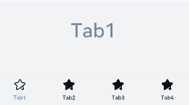
Example 1: Implementing Custom Tab Switching Synchronization
This example demonstrates how to use onAnimationStart and onChange to implement synchronized switching between the tab bar and tab content.
// xxx.ets
@Entry
@Component
struct TabContentExample {
  @State fontColor: string = '#182431'
  @State selectedFontColor: string = '#007DFF'
  @State currentIndex: number = 0
  @State selectedIndex: number = 0
  private controller: TabsController = new TabsController()

  @Builder tabBuilder(index: number) {
    Column() {
      Image(this.selectedIndex === index ? '/common/public_icon_on.svg' : '/common/public_icon_off.svg')
        .width(24)
        .height(24)
        .margin({ bottom: 4 })
        .objectFit(ImageFit.Contain)
      Text(`Tab${index + 1}`)
        .fontColor(this.selectedIndex === index ? this.selectedFontColor : this.fontColor)
        .fontSize(10)
        .fontWeight(500)
        .lineHeight(14)
    }.width('100%')
  }

  build() {
    Column() {
      Tabs({ barPosition: BarPosition.End, controller: this.controller }) {
        TabContent() {
          Column() {
            Text('Tab1')
              .fontSize(36)
              .fontColor('#182431')
              .fontWeight(500)
              .opacity(0.4)
              .margin({ top: 30, bottom: 56.5 })
            Divider()
              .strokeWidth(0.5)
              .color('#182431')
              .opacity(0.05)
          }.width('100%')
        }.tabBar(this.tabBuilder(0))

        TabContent() {
          Column() {
            Text('Tab2')
              .fontSize(36)
              .fontColor('#182431')
              .fontWeight(500)
              .opacity(0.4)
              .margin({ top: 30, bottom: 56.5 })
            Divider()
              .strokeWidth(0.5)
              .color('#182431')
              .opacity(0.05)
          }.width('100%')
        }.tabBar(this.tabBuilder(1))

        TabContent() {
          Column() {
            Text('Tab3')
              .fontSize(36)
              .fontColor('#182431')
              .fontWeight(500)
              .opacity(0.4)
              .margin({ top: 30, bottom: 56.5 })
            Divider()
              .strokeWidth(0.5)
              .color('#182431')
              .opacity(0.05)
          }.width('100%')
        }.tabBar(this.tabBuilder(2))

        TabContent() {
          Column() {
            Text('Tab4')
              .fontSize(36)
              .fontColor('#182431')
              .fontWeight(500)
              .opacity(0.4)
              .margin({ top: 30, bottom: 56.5 })
            Divider()
              .strokeWidth(0.5)
              .color('#182431')
              .opacity(0.05)
          }.width('100%')
        }.tabBar(this.tabBuilder(3))
      }
      .vertical(false)
      .barHeight(56)
      .onChange((index: number) => {
        // currentIndex controls the displayed tab in TabContent.
        this.currentIndex = index
        this.selectedIndex = index
      })
      .onAnimationStart((index: number, targetIndex: number, event: TabsAnimationEvent) => {
        if (index === targetIndex) {
          return
        }
        // selectedIndex controls the color switching for the image and text in the custom tab bar.
        this.selectedIndex = targetIndex
      })
      .width(360)
      .height(190)
      .backgroundColor('#F1F3F5')
      .margin({ top: 38 })
    }.width('100%')
  }
}
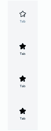
Example 2: Implementing a Custom Side Tabs
This example demonstrates how to create side tabs using vertical and barPosition.
// xxx.ets
@Entry
@Component
struct TabContentExample {
  @State fontColor: string = '#182431'
  @State selectedFontColor: string = '#007DFF'
  @State currentIndex: number = 0
  @State selectedIndex: number = 0
  private controller: TabsController = new TabsController()

  @Builder tabBuilder(index: number) {
    Column() {
      Image(this.selectedIndex === index ? '/common/public_icon_on.svg' : '/common/public_icon_off.svg')
        .width(24)
        .height(24)
        .margin({ bottom: 4 })
        .objectFit(ImageFit.Contain)
      Text('Tab')
        .fontColor(this.selectedIndex === index ? this.selectedFontColor : this.fontColor)
        .fontSize(10)
        .fontWeight(500)
        .lineHeight(14)
    }.width('100%').height('100%').justifyContent(FlexAlign.Center)
  }

  build() {
    Column() {
      Tabs({ barPosition: BarPosition.Start, controller: this.controller }) {
        TabContent()
          .tabBar(this.tabBuilder(0))
        TabContent()
          .tabBar(this.tabBuilder(1))
        TabContent()
          .tabBar(this.tabBuilder(2))
        TabContent()
          .tabBar(this.tabBuilder(3))
      }
      .vertical(true)
      .barWidth(96)
      .barHeight(414)
      .onChange((index: number) => {
        // currentIndex controls the displayed tab in TabContent.
        this.currentIndex = index
        this.selectedIndex = index
      })
      .onAnimationStart((index: number, targetIndex: number, event: TabsAnimationEvent) => {
        if (index === targetIndex) {
          return
        }
        // selectedIndex controls the color switching for the image and text in the custom tab bar.
        this.selectedIndex = targetIndex
      })
      .width(96)
      .height(414)
      .backgroundColor('#F1F3F5')
      .margin({ top: 52 })
    }.width('100%')
  }
}
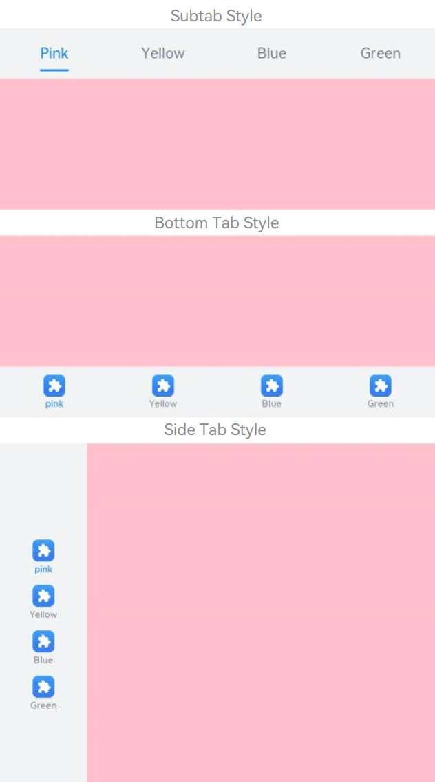
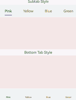
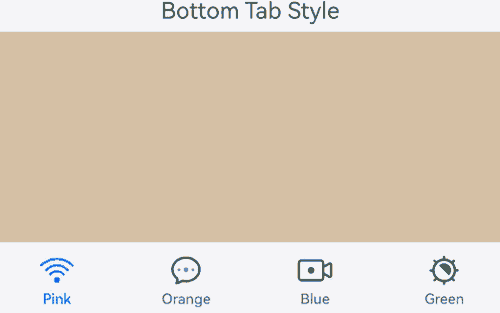
Example 3: Implementing Different Styles of Tabs
This example demonstrates the implementation of subtabs, bottom tabs, and side tabs using SubTabBarStyle and BottomTabBarStyle.
// xxx.ets
@Entry
@Component
struct TabBarStyleExample {
  build() {
    Column({ space: 5 }) {
      Text("Subtab style")
      Column() {
        Tabs({ barPosition: BarPosition.Start }) {
          TabContent() {
            Column().width('100%').height('100%').backgroundColor(Color.Pink)
          }.tabBar(new SubTabBarStyle('Pink'))
          .onWillShow(() => {
            console.info("Pink will show")
          })
          .onWillHide(() => {
            console.info("Pink will hide")
          })

          TabContent() {
            Column().width('100%').height('100%').backgroundColor(Color.Yellow)
          }.tabBar(new SubTabBarStyle('Yellow'))
          .onWillShow(() => {
            console.info("Yellow will show")
          })
          .onWillHide(() => {
            console.info("Yellow will hide")
          })

          TabContent() {
            Column().width('100%').height('100%').backgroundColor(Color.Blue)
          }.tabBar(new SubTabBarStyle('Blue'))
          .onWillShow(() => {
            console.info("Blue will show")
          })
          .onWillHide(() => {
            console.info("Blue will hide")
          })

          TabContent() {
            Column().width('100%').height('100%').backgroundColor(Color.Green)
          }.tabBar(new SubTabBarStyle('Green'))
          .onWillShow(() => {
            console.info("Green will show")
          })
          .onWillHide(() => {
            console.info("Green will hide")
          })
        }
        .vertical(false)
        .scrollable(true)
        .barMode(BarMode.Fixed)
        .onChange((index: number) => {
          console.info(index.toString())
        })
        .width('100%')
        .backgroundColor(0xF1F3F5)
      }.width('100%').height(200)
      Text("Bottom tab style")
      Column() {
        Tabs({ barPosition: BarPosition.End }) {
          TabContent() {
            Column().width('100%').height('100%').backgroundColor(Color.Pink)
          }.tabBar(new BottomTabBarStyle($r('sys.media.ohos_app_icon'), 'Pink'))
          .onWillShow(() => {
            console.info("Pink will show")
          })
          .onWillHide(() => {
            console.info("Pink will hide")
          })

          TabContent() {
            Column().width('100%').height('100%').backgroundColor(Color.Yellow)
          }.tabBar(new BottomTabBarStyle($r('sys.media.ohos_app_icon'), 'Yellow'))
          .onWillShow(() => {
            console.info("Yellow will show")
          })
          .onWillHide(() => {
            console.info("Yellow will hide")
          })

          TabContent() {
            Column().width('100%').height('100%').backgroundColor(Color.Blue)
          }.tabBar(new BottomTabBarStyle($r('sys.media.ohos_app_icon'), 'Blue'))
          .onWillShow(() => {
            console.info("Blue will show")
          })
          .onWillHide(() => {
            console.info("Blue will hide")
          })

          TabContent() {
            Column().width('100%').height('100%').backgroundColor(Color.Green)
          }.tabBar(new BottomTabBarStyle($r('sys.media.ohos_app_icon'), 'Green'))
          .onWillShow(() => {
            console.info("Green will show")
          })
          .onWillHide(() => {
            console.info("Green will hide")
          })
        }
        .vertical(false)
        .scrollable(true)
        .barMode(BarMode.Fixed)
        .onChange((index: number) => {
          console.info(index.toString())
        })
        .width('100%')
        .backgroundColor(0xF1F3F5)
      }.width('100%').height(200)
      Text("Side tab style")
      Column() {
        Tabs({ barPosition: BarPosition.Start }) {
          TabContent() {
            Column().width('100%').height('100%').backgroundColor(Color.Pink)
          }.tabBar(new BottomTabBarStyle($r('sys.media.ohos_app_icon'), 'Pink'))
          .onWillShow(() => {
            console.info("Pink will show")
          })
          .onWillHide(() => {
            console.info("Pink will hide")
          })

          TabContent() {
            Column().width('100%').height('100%').backgroundColor(Color.Yellow)
          }.tabBar(new BottomTabBarStyle($r('sys.media.ohos_app_icon'), 'Yellow'))
          .onWillShow(() => {
            console.info("Yellow will show")
          })
          .onWillHide(() => {
            console.info("Yellow will hide")
          })

          TabContent() {
            Column().width('100%').height('100%').backgroundColor(Color.Blue)
          }.tabBar(new BottomTabBarStyle($r('sys.media.ohos_app_icon'), 'Blue'))
          .onWillShow(() => {
            console.info("Blue will show")
          })
          .onWillHide(() => {
            console.info("Blue will hide")
          })

          TabContent() {
            Column().width('100%').height('100%').backgroundColor(Color.Green)
          }.tabBar(new BottomTabBarStyle($r('sys.media.ohos_app_icon'), 'Green'))
          .onWillShow(() => {
            console.info("Green will show")
          })
          .onWillHide(() => {
            console.info("Green will hide")
          })
        }
        .vertical(true).scrollable(true).barMode(BarMode.Fixed)
        .onChange((index: number) => {
          console.info(index.toString())
        })
        .width('100%')
        .backgroundColor(0xF1F3F5)
      }.width('100%').height(400)
    }
  }
}
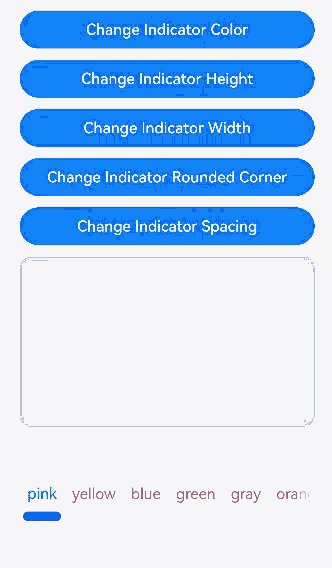
Example 4: Setting the Indicator for Subtabs
This example demonstrates how to set the indicator for subtabs using the indicator property in SubTabBarStyle.
// xxx.ets
@Entry
@Component
struct TabsAttr {
  private controller: TabsController = new TabsController()
  @State indicatorColor: Color = Color.Blue;
  @State indicatorWidth: number = 40;
  @State indicatorHeight: number = 10;
  @State indicatorBorderRadius: number = 5;
  @State indicatorSpace: number = 10;
  @State subTabBorderRadius: number = 20;
  @State selectedMode: SelectedMode = SelectedMode.INDICATOR;
  private colorFlag: boolean = true;
  private widthFlag: boolean = true;
  private heightFlag: boolean = true;
  private borderFlag: boolean = true;
  private spaceFlag: boolean = true;

  build() {
    Column() {
      Button("Change Indicator Color").width('100%').margin({ bottom: '12vp' })
        .onClick((event?: ClickEvent) => {
          // Animation configuration for the width and height attributes of the <Button> component
          if (this.colorFlag) {
            animateTo({
              duration: 1000, // Animation duration.
              curve: Curve.Linear, // Animation curve.
              delay: 200, // Animation delay.
              iterations: 1, // Number of playback times.
              playMode: PlayMode.Normal, // Animation playback mode.
              onFinish: () => {
                console.info('play end')
              }
            }, () => {
              this.indicatorColor = Color.Red
            })
          } else {
            animateTo({
              duration: 1000, // Animation duration.
              curve: Curve.Linear, // Animation curve.
              delay: 200, // Animation delay.
              iterations: 1, // Number of playback times.
              playMode: PlayMode.Normal, // Animation playback mode.
              onFinish: () => {
                console.info('play end')
              }
            }, () => {
              this.indicatorColor = Color.Yellow
            })
          }
          this.colorFlag = !this.colorFlag
        })
      Button("Change Indicator Height").width('100%').margin({ bottom: '12vp' })
        .onClick((event?: ClickEvent) => {
          // Animation configuration for the width and height attributes of the <Button> component
          if (this.heightFlag) {
            animateTo({
              duration: 1000, // Animation duration.
              curve: Curve.Linear, // Animation curve.
              delay: 200, // Animation delay.
              iterations: 1, // Number of playback times.
              playMode: PlayMode.Normal, // Animation playback mode.
              onFinish: () => {
                console.info('play end')
              }
            }, () => {
              this.indicatorHeight = 20
            })
          } else {
            animateTo({
              duration: 1000, // Animation duration.
              curve: Curve.Linear, // Animation curve.
              delay: 200, // Animation delay.
              iterations: 1, // Number of playback times.
              playMode: PlayMode.Normal, // Animation playback mode.
              onFinish: () => {
                console.info('play end')
              }
            }, () => {
              this.indicatorHeight = 10
            })
          }
          this.heightFlag = !this.heightFlag
        })
      Button("Change Indicator Width").width('100%').margin({ bottom: '12vp' })
        .onClick((event?: ClickEvent) => {
          // Animation configuration for the width and height attributes of the <Button> component
          if (this.widthFlag) {
            animateTo({
              duration: 1000, // Animation duration.
              curve: Curve.Linear, // Animation curve.
              delay: 200, // Animation delay.
              iterations: 1, // Number of playback times.
              playMode: PlayMode.Normal, // Animation playback mode.
              onFinish: () => {
                console.info('play end')
              }
            }, () => {
              this.indicatorWidth = 30
            })
          } else {
            animateTo({
              duration: 1000, // Animation duration.
              curve: Curve.Linear, // Animation curve.
              delay: 200, // Animation delay.
              iterations: 1, // Number of playback times.
              playMode: PlayMode.Normal, // Animation playback mode.
              onFinish: () => {
                console.info('play end')
              }
            }, () => {
              this.indicatorWidth = 50
            })
          }
          this.widthFlag = !this.widthFlag
        })
      Button("Change Indicator Corner Radius").width('100%').margin({ bottom: '12vp' })
        .onClick((event?: ClickEvent) => {
          // Animation configuration for the width and height attributes of the <Button> component
          if (this.borderFlag) {
            animateTo({
              duration: 1000, // Animation duration.
              curve: Curve.Linear, // Animation curve.
              delay: 200, // Animation delay.
              iterations: 1, // Number of playback times.
              playMode: PlayMode.Normal, // Animation playback mode.
              onFinish: () => {
                console.info('play end')
              }
            }, () => {
              this.indicatorBorderRadius = 0
            })
          } else {
            animateTo({
              duration: 1000, // Animation duration.
              curve: Curve.Linear, // Animation curve.
              delay: 200, // Animation delay.
              iterations: 1, // Number of playback times.
              playMode: PlayMode.Normal, // Animation playback mode.
              onFinish: () => {
                console.info('play end')
              }
            }, () => {
              this.indicatorBorderRadius = 5
            })
          }
          this.borderFlag = !this.borderFlag
        })
      Button("Change Indicator Spacing").width('100%').margin({ bottom: '12vp' })
        .onClick((event?: ClickEvent) => {
          // Animation configuration for the width and height attributes of the <Button> component
          if (this.spaceFlag) {
            animateTo({
              duration: 1000, // Animation duration.
              curve: Curve.Linear, // Animation curve.
              delay: 200, // Animation delay.
              iterations: 1, // Number of playback times.
              playMode: PlayMode.Normal, // Animation playback mode.
              onFinish: () => {
                console.info('play end')
              }
            }, () => {
              this.indicatorSpace = 20
            })
          } else {
            animateTo({
              duration: 1000, // Animation duration.
              curve: Curve.Linear, // Animation curve.
              delay: 200, // Animation delay.
              iterations: 1, // Number of playback times.
              playMode: PlayMode.Normal, // Animation playback mode.
              onFinish: () => {
                console.info('play end')
              }
            }, () => {
              this.indicatorSpace = 10
            })
          }
          this.spaceFlag = !this.spaceFlag
        })
      Tabs({ barPosition: BarPosition.End, controller: this.controller }) {
        TabContent() {
          Column().width('100%').height('100%').backgroundColor(Color.Pink).borderRadius('12vp')
        }.tabBar(SubTabBarStyle.of('pink')
          .indicator({
            color: this.indicatorColor, // Indicator color.
            height: this.indicatorHeight, // Indicator height.
            width: this.indicatorWidth, // Indicator width.
            borderRadius: this.indicatorBorderRadius, // Rounded corner radius of the indicator.
            marginTop: this.indicatorSpace // Spacing between the indicator and text.
          })
          .selectedMode(this.selectedMode)
          .board({ borderRadius: this.subTabBorderRadius })
          .labelStyle({})
        )

        TabContent() {
          Column().width('100%').height('100%').backgroundColor(Color.Yellow).borderRadius('12vp')
        }.tabBar('yellow')

        TabContent() {
          Column().width('100%').height('100%').backgroundColor(Color.Blue).borderRadius('12vp')
        }.tabBar('blue')

        TabContent() {
          Column().width('100%').height('100%').backgroundColor(Color.Green).borderRadius('12vp')
        }.tabBar('green')

        TabContent() {
          Column().width('100%').height('100%').backgroundColor(Color.Gray).borderRadius('12vp')
        }.tabBar('gray')

        TabContent() {
          Column().width('100%').height('100%').backgroundColor(Color.Orange).borderRadius('12vp')
        }.tabBar('orange')
      }
      .vertical(false)
      .scrollable(true)
      .barMode(BarMode.Scrollable)
      .barHeight(140)
      .animationDuration(400)
      .onChange((index: number) => {
        console.info(index.toString())
      })
      .backgroundColor(0xF5F5F5)
      .height(320)
    }.width('100%').height(250).padding({ top: '24vp', left: '24vp', right: '24vp' })
  }
}
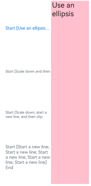
Example 5: Setting Adaptive Height for Subtab Text
This example demonstrates how to achieve adaptive height for subtab text using heightAdaptivePolicy.
// xxx.ets
@Entry
@Component
struct TabsTextOverflow {
  @State message: string = 'Hello World'
  private controller: TabsController = new TabsController()
  @State subTabOverflowOpaque: boolean = true;

  build() {
    Column() {
      Tabs({ barPosition: BarPosition.Start, controller: this.controller }) {
        TabContent() {
          Column() {
            Text('Use an ellipsis').fontSize(30).fontColor(0xFF000000)
          }.width('100%').height('100%').backgroundColor(Color.Pink)
        }
        .tabBar(SubTabBarStyle.of('Start [Use an ellipsis; Use an ellipsis] End')
          .labelStyle({
            overflow: TextOverflow.Ellipsis,
            maxLines: 1,
            minFontSize: 10,
            heightAdaptivePolicy: TextHeightAdaptivePolicy.MAX_LINES_FIRST,
            font: { size: 20 }
          }))

        TabContent() {
          Column() {
            Text('Scale down and then clip').fontSize(30).fontColor(0xFF000000)
          }.width('100%').height('100%').backgroundColor(Color.Pink)
        }
        .tabBar(SubTabBarStyle.of('Start [Scale down and then clip; Scale down and then clip] End')
          .labelStyle({
            overflow: TextOverflow.Clip,
            maxLines: 1,
            minFontSize: 15,
            maxFontSize: 15,
            heightAdaptivePolicy: TextHeightAdaptivePolicy.MIN_FONT_SIZE_FIRST,
            font: { size: 20 }
          }))

        TabContent() {
          Column() {
            Text('Scale down, start a new line, and then clip').fontSize(30).fontColor(0xFF000000)
          }.width('100%').height('100%').backgroundColor(Color.Pink)
        }
        .tabBar(SubTabBarStyle.of('Start [Scale down, start a new line, and then clip; Scale down, start a new line, and then clip] End')
          .labelStyle({
            overflow: TextOverflow.Clip,
            maxLines: 2,
            minFontSize: 15,
            maxFontSize: 15,
            heightAdaptivePolicy: TextHeightAdaptivePolicy.MIN_FONT_SIZE_FIRST,
            font: { size: 20 }
          }))

        TabContent() {
          Column() {
            Text('Start a new line').fontSize(30).fontColor(0xFF000000)
          }
          .width('100%').height('100%').backgroundColor(Color.Pink)
        }.tabBar(SubTabBarStyle.of('Start [Start a new line; Start a new line; Start a new line; Start a new line; Start a new line] End')
          .labelStyle({
            overflow: TextOverflow.Clip,
            maxLines: 10,
            minFontSize: 10,
            heightAdaptivePolicy: TextHeightAdaptivePolicy.MAX_LINES_FIRST,
            font: { size: 20 }
          }))
      }
      .vertical(true).scrollable(true)
      .barMode(BarMode.Fixed)
      .barHeight(720)
      .barWidth(200).animationDuration(400)
      .onChange((index: number) => {
        console.info(index.toString())
      })
      .height('100%').width('100%')
    }
    .height('100%')
  }
}
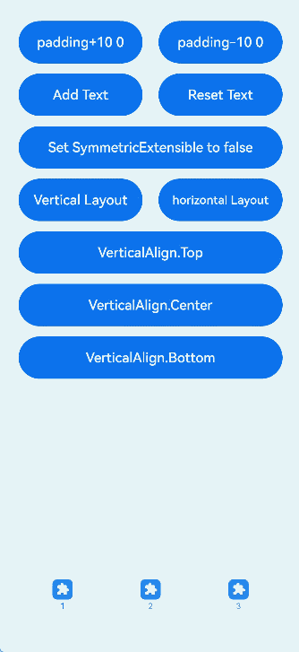
Example 6: Setting Basic Attributes for Bottom Tabs
This example demonstrates how to set basic attributes for bottom tabs using padding, verticalAlign, layoutMode, and symmetricExtensible.
// xxx.ets
@Entry
@Component
struct TabContentExample6 {
  private controller: TabsController = new TabsController()
  @State text: string = "2"
  @State tabPadding: number = 0;
  @State symmetricExtensible: boolean = false;
  @State layoutMode: LayoutMode = LayoutMode.VERTICAL;
  @State verticalAlign: VerticalAlign = VerticalAlign.Center;

  build() {
    Column() {
      Row() {
        Button("padding+10 " + this.tabPadding)
          .width('47%')
          .height(50)
          .margin({ top: 5 })
          .onClick((event?: ClickEvent) => {
            this.tabPadding += 10
          })
          .margin({ right: '6%', bottom: '12vp' })
        Button("padding-10 " + this.tabPadding)
          .width('47%')
          .height(50)
          .margin({ top: 5 })
          .onClick((event?: ClickEvent) => {
            this.tabPadding -= 10
          })
          .margin({ bottom: '12vp' })
      }

      Row() {
        Button("Add Text")
          .width('47%')
          .height(50)
          .margin({ top: 5 })
          .onClick((event?: ClickEvent) => {
            this.text += 'Add Text'
          })
          .margin({ right: '6%', bottom: '12vp' })
        Button("Reset Text")
          .width('47%')
          .height(50)
          .margin({ top: 5 })
          .onClick((event?: ClickEvent) => {
            this.text = "2"
          })
          .margin({ bottom: '12vp' })
      }

      Row() {
        Button("Set SymmetricExtensible to " + this.symmetricExtensible)
          .width('100%')
          .height(50)
          .margin({ top: 5 })
          .onClick((event?: ClickEvent) => {
            this.symmetricExtensible = !this.symmetricExtensible
          })
          .margin({ bottom: '12vp' })
      }

      Row() {
        Button("Vertical Layout")
          .width('47%')
          .height(50)
          .margin({ top: 5 })
          .onClick((event?: ClickEvent) => {
            this.layoutMode = LayoutMode.VERTICAL;
          })
          .margin({ right: '6%', bottom: '12vp' })
        Button("Horizontal Layout")
          .width('47%')
          .height(50)
          .margin({ top: 5 })
          .onClick((event?: ClickEvent) => {
            this.layoutMode = LayoutMode.HORIZONTAL;
          })
          .margin({ bottom: '12vp' })
      }

      Row() {
        Button("VerticalAlign.Top")
          .width('100%')
          .height(50)
          .margin({ top: 5 })
          .onClick((event?: ClickEvent) => {
            this.verticalAlign = VerticalAlign.Top;
          })
          .margin({ bottom: '12vp' })
      }

      Row() {
        Button("VerticalAlign.Center")
          .width('100%')
          .height(50)
          .margin({ top: 5 })
          .onClick((event?: ClickEvent) => {
            this.verticalAlign = VerticalAlign.Center;
          })
          .margin({ bottom: '12vp' })
      }

      Row() {
        Button("VerticalAlign.Bottom")
          .width('100%')
          .height(50)
          .margin({ top: 5 })
          .onClick((event?: ClickEvent) => {
            this.verticalAlign = VerticalAlign.Bottom;
          })
          .margin({ bottom: '12vp' })
      }


      Tabs({ barPosition: BarPosition.End, controller: this.controller }) {
        TabContent() {
          Column().width('100%').height('100%').backgroundColor(Color.Pink)
        }.tabBar(BottomTabBarStyle.of($r("sys.media.ohos_app_icon"), "1"))

        TabContent() {
          Column().width('100%').height('100%').backgroundColor(Color.Green)
        }.tabBar(BottomTabBarStyle.of($r("sys.media.ohos_app_icon"), this.text)
          .padding(this.tabPadding)
          .verticalAlign(this.verticalAlign)
          .layoutMode(this.layoutMode)
          .symmetricExtensible(this.symmetricExtensible))

        TabContent() {
          Column().width('100%').height('100%').backgroundColor(Color.Blue)
        }.tabBar(BottomTabBarStyle.of($r("sys.media.ohos_app_icon"), "3"))
      }
      .animationDuration(300)
      .height('60%')
      .backgroundColor(0xf1f3f5)
      .barMode(BarMode.Fixed)
    }
    .width('100%')
    .height(500)
    .margin({ top: 5 })
    .padding('24vp')
  }
}
Example 7: Setting Text and Icon Colors for Subtabs and Bottom Tabs
This example demonstrates how to change the text color of subtabs and bottom tabs using unselectedColor and selectedColor in labelStyle and how to change the icon color of bottom tabs using unselectedColor and selectedColor in iconStyle.
// xxx.ets
@Entry
@Component
struct TabBarStyleExample {
  build() {
    Column({ space: 5 }) {
      Text("Subtab style")
      Column() {
        Tabs({ barPosition: BarPosition.Start }) {
          TabContent() {
            Column().width('100%').height('100%').backgroundColor(Color.Pink)
          }.tabBar(new SubTabBarStyle('Pink')
            .labelStyle({ unselectedColor: Color.Red, selectedColor: Color.Green }))

          TabContent() {
            Column().width('100%').height('100%').backgroundColor(Color.Yellow)
          }.tabBar(new SubTabBarStyle('Yellow')
            .labelStyle({ unselectedColor: Color.Red, selectedColor: Color.Green }))

          TabContent() {
            Column().width('100%').height('100%').backgroundColor(Color.Blue)
          }.tabBar(new SubTabBarStyle('Blue')
            .labelStyle({ unselectedColor: Color.Red, selectedColor: Color.Green }))

          TabContent() {
            Column().width('100%').height('100%').backgroundColor(Color.Green)
          }.tabBar(new SubTabBarStyle('Green')
            .labelStyle({ unselectedColor: Color.Red, selectedColor: Color.Green })
          )
        }
        .vertical(false)
        .scrollable(true)
        .barMode(BarMode.Fixed)
        .onChange((index: number) => {
          console.info(index.toString())
        })
        .width('100%')
        .backgroundColor(0xF1F3F5)
      }.width('100%').height(200)

      Text("Bottom tab style")
      Column() {
        Tabs({ barPosition: BarPosition.End }) {
          TabContent() {
            Column().width('100%').height('100%').backgroundColor(Color.Pink)
          }
          .tabBar(new BottomTabBarStyle('/common/public_icon_off.svg', 'pink')
            .labelStyle({ unselectedColor: Color.Red, selectedColor: Color.Green })
            .iconStyle({ unselectedColor: Color.Red, selectedColor: Color.Green })
          )

          TabContent() {
            Column().width('100%').height('100%').backgroundColor(Color.Yellow)
          }.tabBar(new BottomTabBarStyle('/common/public_icon_off.svg', 'Yellow')
            .labelStyle({ unselectedColor: Color.Red, selectedColor: Color.Green })
            .iconStyle({ unselectedColor: Color.Red, selectedColor: Color.Green })
          )

          TabContent() {
            Column().width('100%').height('100%').backgroundColor(Color.Blue)
          }.tabBar(new BottomTabBarStyle('/common/public_icon_off.svg', 'Blue')
            .labelStyle({ unselectedColor: Color.Red, selectedColor: Color.Green })
            .iconStyle({ unselectedColor: Color.Red, selectedColor: Color.Green })
          )

          TabContent() {
            Column().width('100%').height('100%').backgroundColor(Color.Green)
          }.tabBar(new BottomTabBarStyle('/common/public_icon_off.svg', 'Green')
            .labelStyle({ unselectedColor: Color.Red, selectedColor: Color.Green })
            .iconStyle({ unselectedColor: Color.Red, selectedColor: Color.Green })
          )
        }
        .vertical(false)
        .scrollable(true)
        .barMode(BarMode.Fixed)
        .onChange((index: number) => {
          console.info(index.toString())
        })
        .width('100%')
        .backgroundColor(0xF1F3F5)
      }.width('100%').height(200)
    }
  }
}
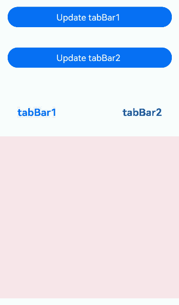
Example 8 (customized subtabs)
This example sets SubTabBarStyle through ComponentContent.
// xxx.ets
import { ComponentContent, UIContext } from "@kit.ArkUI";

class Params {
  text: string = ""

  constructor(text: string) {
    this.text = text;
  }
}

@Builder
function buildText(params: Params) {
  Column() {
    Text(params.text)
      .fontSize(20)
      .fontWeight(FontWeight.Bold)
      .margin(20)
  }
}

@Entry
@Component
struct Index {
  @State message1: string = "tabBar1"
  @State message2: string = "tabBar2"
  context: UIContext = this.getUIContext()
  private count1 = 0;
  private count2 = 0;
  private controller: TabsController = new TabsController();
  tabBar1: ComponentContent<Params> = new ComponentContent<Params>(this.context, wrapBuilder<[Params]>(buildText), new Params(this.message1));
  tabBar2: ComponentContent<Params> = new ComponentContent<Params>(this.context, wrapBuilder<[Params]>(buildText), new Params(this.message2));

  build() {
    Row() {
      Column() {
        Button("Update tabBar1").width('90%').margin(20)
          .onClick((event?: ClickEvent) => {
            this.count1 += 1;
            const message1 = "Update 1_" + this.count1.toString();
            this.tabBar1.update(new Params(message1));
          })
        Button("Update tabBar2").width('90%').margin(20)
          .onClick((event?: ClickEvent) => {
            this.count2 += 1;
            const message2 = "Update 2_" + this.count2.toString();
            this.tabBar2.update(new Params(message2));
          })
        Tabs({ barPosition: BarPosition.Start, controller: this.controller }) {
          TabContent() {
            Column().width('100%').height('100%').backgroundColor(Color.Pink).borderRadius('12vp')
          }.tabBar(new SubTabBarStyle(this.tabBar1))
          TabContent() {
            Column().width('100%').height('100%').backgroundColor(Color.Blue).borderRadius('12vp')
          }.tabBar(SubTabBarStyle.of(this.tabBar2))
        }
        .vertical(false)
        .barWidth(414)
        .barHeight(96)
        .width(414)
        .height(414)
        .backgroundColor('#F1F3F5')
        .margin({ top: 20 })
      }
      .width('100%')
      .height('100%')
    }
    .height('100%')
  }
}
Example 9: Using Symbol Icons for Bottom Tabs
This example shows how to use symbols as icons in BottomTabBarStyle.
// xxx.ets
import { SymbolGlyphModifier } from '@kit.ArkUI';

@Entry
@Component
struct Index {
  @State symbolModifier1: SymbolGlyphModifier = new SymbolGlyphModifier($r('sys.symbol.ohos_wifi'));
  @State symbolModifier2: SymbolGlyphModifier = new SymbolGlyphModifier($r('sys.symbol.ellipsis_bubble'));
  @State symbolModifier3: SymbolGlyphModifier = new SymbolGlyphModifier($r('sys.symbol.dot_video'));
  @State symbolModifier4: SymbolGlyphModifier = new SymbolGlyphModifier($r('sys.symbol.exposure'));
  build() {
    Column({space: 5}) {
      Text("Bottom tab style")
      Column(){
        Tabs({barPosition: BarPosition.End}) {
          TabContent() {
            Column().width('100%').height('100%').backgroundColor(Color.Pink)
          }.tabBar(new BottomTabBarStyle({
            normal: this.symbolModifier1,
          }, 'Pink'))
          .onWillShow(() => {
            console.info("Pink will show")
          })
          .onWillHide(() => {
            console.info("Pink will hide")
          })

          TabContent() {
            Column().width('100%').height('100%').backgroundColor(Color.Orange)
          }.tabBar(new BottomTabBarStyle({
            normal: this.symbolModifier2,
          }, 'Orange'))
          .onWillShow(() => {
            console.info("Orange will show")
          })
          .onWillHide(() => {
            console.info("Orange will hide")
          })

          TabContent() {
            Column().width('100%').height('100%').backgroundColor(Color.Blue)
          }.tabBar(new BottomTabBarStyle({
            normal: this.symbolModifier3,
          }, 'Blue'))
          .onWillShow(() => {
            console.info("Blue will show")
          })
          .onWillHide(() => {
            console.info("Blue will hide")
          })

          TabContent() {
            Column().width('100%').height('100%').backgroundColor(Color.Green)
          }.tabBar(new BottomTabBarStyle({
            normal: this.symbolModifier4,
          }, 'Green'))
          .onWillShow(() => {
            console.info("Green will show")
          })
          .onWillHide(() => {
            console.info("Green will hide")
          })
        }
        .vertical(false)
        .scrollable(true)
        .barMode(BarMode.Fixed)
        .onChange((index:number)=>{
          console.info(index.toString())
        })
        .width('100%')
        .backgroundColor(0xF1F3F5)
      }.width('100%').height(200)
    }
  }
}
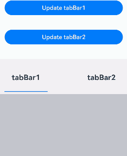
Example 10: Setting TabBar Using ComponentContent
This example demonstrates how to use ComponentContent to encapsulate component content and set the TabBar. The update API of ComponentContent is used to update the TabBar.
// xxx.ets
import { ComponentContent, UIContext } from "@kit.ArkUI";

class Params {
  text: string = ""
  fontColor: string = ""

  constructor(text: string, fontColor: string) {
    this.text = text;
    this.fontColor = fontColor;
  }
}

@Builder
function buildText(params: Params) {
  Column() {
    Text(params.text)
      .fontColor(params.fontColor)
      .fontSize(20)
      .fontWeight(FontWeight.Bold)
      .margin(20)
  }
}

@Entry
@Component
struct Index {
  @State currentIndex: number = 0
  @State message1: string = "tabBar1"
  @State message2: string = "tabBar2"
  unselectedFontColor: string = '#182431'
  selectedFontColor: string = '#007DFF'
  context: UIContext = this.getUIContext()
  private count1 = 0;
  private count2 = 0;
  private controller: TabsController = new TabsController();

  getTabBar1() {
    this.tabBar1.update(new Params(this.message1,
      this.currentIndex === 0 ? this.selectedFontColor : this.unselectedFontColor));
    return this.tabBar1;
  }

  getTabBar2() {
    this.tabBar2.update(new Params(this.message2,
      this.currentIndex === 1 ? this.selectedFontColor : this.unselectedFontColor));
    return this.tabBar2;
  }

  tabBar1: ComponentContent<Params> =
    new ComponentContent<Params>(this.context, wrapBuilder<[Params]>(buildText),
      new Params(this.message1, this.selectedFontColor));
  tabBar2: ComponentContent<Params> =
    new ComponentContent<Params>(this.context, wrapBuilder<[Params]>(buildText),
      new Params(this.message2, this.unselectedFontColor));

  build() {
    Row() {
      Column() {
        Button("Update tabBar1").width('90%').margin(20)
          .onClick((event?: ClickEvent) => {
            this.count1 += 1;
            this.message1 = "Update 1_" + this.count1.toString();
            this.tabBar1.update(new Params(this.message1, this.unselectedFontColor));
          })
        Button("Update tabBar2").width('90%').margin(20)
          .onClick((event?: ClickEvent) => {
            this.count2 += 1;
            this.message2 = "Update 2_" + this.count2.toString();
            this.tabBar2.update(new Params(this.message2, this.unselectedFontColor));
          })
        Tabs({ barPosition: BarPosition.Start, controller: this.controller }) {
          TabContent() {
            Column().width('100%').height('100%').backgroundColor(Color.Pink).borderRadius('12vp')
          }.tabBar(this.getTabBar1())

          TabContent() {
            Column().width('100%').height('100%').backgroundColor(Color.Blue).borderRadius('12vp')
          }.tabBar(this.getTabBar2())
        }
        .vertical(false)
        .barWidth(414)
        .barHeight(96)
        .width(414)
        .height(414)
        .backgroundColor('#F1F3F5')
        .margin({ top: 20 })
        .onChange((index: number) => {
          this.currentIndex = index
        })
      }
      .width('100%')
      .height('100%')
    }
    .height('100%')
  }
}
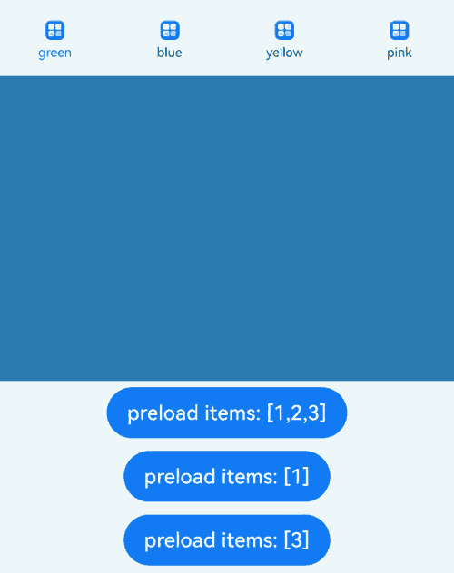
Example 11: Preloading Child Nodes Using ComponentContent
This example demonstrates how to use ComponentContent to set the TabBar and preload child nodes using the preloadItems API of TabsController.
// xxx.ets
import { BusinessError } from '@kit.BasicServicesKit';
import { ComponentContent } from '@kit.ArkUI';

class Params {
  text: string = ""
  fontColor: string = ""

  constructor(text: string, fontColor: string) {
    this.text = text;
    this.fontColor = fontColor;
  }
}

@Component
struct imageCom {
  build() {
    Image($r("app.media.startIcon"))
      .alt($r('app.media.background'))
      .width(15)
      .height(15)
  }
}

@Builder
function TabBuilder(params: Params) {
  Column({ space: 4 }) {
    imageCom()

    Text(params.text)
      .fontSize(10)
      .fontColor(params.fontColor)
  }
}

@Entry
@Component
struct TabsPreloadItems {
  @State currentIndex: number = 0
  private tabsController: TabsController = new TabsController()
  context: UIContext = this.getUIContext()
  unselectedFontColor: string = '#182431'
  selectedFontColor: string = '#007DFF'

  getTabBar1() {
    this.tabBar1.update(new Params('green',
      this.currentIndex === 0 ? this.selectedFontColor : this.unselectedFontColor));
    return this.tabBar1;
  }

  getTabBar2() {
    this.tabBar2.update(new Params('blue',
      this.currentIndex === 1 ? this.selectedFontColor : this.unselectedFontColor));
    return this.tabBar2;
  }

  getTabBar3() {
    this.tabBar3.update(new Params('yellow',
      this.currentIndex === 2 ? this.selectedFontColor : this.unselectedFontColor));
    return this.tabBar3;
  }

  getTabBar4() {
    this.tabBar4.update(new Params('pink',
      this.currentIndex === 3 ? this.selectedFontColor : this.unselectedFontColor));
    return this.tabBar4;
  }

  tabBar1: ComponentContent<Params> =
    new ComponentContent<Params>(this.context, wrapBuilder<[Params]>(TabBuilder),
      new Params('green', this.selectedFontColor));
  tabBar2: ComponentContent<Params> =
    new ComponentContent<Params>(this.context, wrapBuilder<[Params]>(TabBuilder),
      new Params('blue', this.unselectedFontColor));
  tabBar3: ComponentContent<Params> =
    new ComponentContent<Params>(this.context, wrapBuilder<[Params]>(TabBuilder),
      new Params('yellow', this.unselectedFontColor));
  tabBar4: ComponentContent<Params> =
    new ComponentContent<Params>(this.context, wrapBuilder<[Params]>(TabBuilder),
      new Params('pink', this.unselectedFontColor));

  build() {
    Column() {
      Tabs({ index: this.currentIndex, controller: this.tabsController }) {
        TabContent() {
          MyComponent({ color: '#00CB87' })
        }.tabBar(this.getTabBar1())

        TabContent() {
          MyComponent({ color: '#007DFF' })
        }.tabBar(this.getTabBar2())

        TabContent() {
          MyComponent({ color: '#FFBF00' })
        }.tabBar(this.getTabBar3())

        TabContent() {
          MyComponent({ color: '#E67C92' })
        }.tabBar(this.getTabBar4())
      }
      .width(360)
      .height(296)
      .backgroundColor('#F1F3F5')
      .onChange((index: number) => {
        this.currentIndex = index
      })

      Button('preload items: [1,2,3]')
        .margin(5)
        .onClick(() => {
          // Preload the 0th child node.
          this.tabsController.preloadItems([1, 2, 3])
            .then(() => {
              console.info('preloadItems success.')
            })
            .catch((error: BusinessError) => {
              console.error('preloadItems failed, error code: ' + error.code + ', error message: ' + error.message)
            })
        })

      Button('preload items: [1]')
        .margin(5)
        .onClick(() => {
          // Preload the 0th child node.
          this.tabsController.preloadItems([1])
            .then(() => {
              console.info('preloadItems success.')
            })
            .catch((error: BusinessError) => {
              console.error('preloadItems failed, error code: ' + error.code + ', error message: ' + error.message)
            })
        })
      Button('preload items: [3]')
        .margin(5)
        .onClick(() => {
          // Preload the 0th child node.
          this.tabsController.preloadItems([3])
            .then(() => {
              console.info('preloadItems success.')
            })
            .catch((error: BusinessError) => {
              console.error('preloadItems failed, error code: ' + error.code + ', error message: ' + error.message)
            })
        })
    }
  }
}

@Component
struct MyComponent {
  private color: string = ""

  aboutToAppear(): void {
    console.info('aboutToAppear backgroundColor:' + this.color)
  }

  aboutToDisappear(): void {
    console.info('aboutToDisappear backgroundColor:' + this.color)
  }

  build() {
    Column()
      .width('100%')
      .height('100%')
      .backgroundColor(this.color)
  }
}
你可能感兴趣的鸿蒙文章
- 所属分类: 后端技术
- 本文标签:
热门推荐
-
2、 优质文章
-
3、 gt
-
7、 openharmony
-
9、 golang
-
10、 Vue中input框自动聚焦