harmony 鸿蒙Gauge
Gauge
The Gauge component represents a gauge that displays data in a circular format.
NOTE
This component is supported since API version 8. Updates will be marked with a superscript to indicate their earliest API version.
Child Components
This component can contain only one child component.
NOTE
You are advised to use the Text component to build the current value and auxiliary text.
If the width and height of the child component are in percentage, the reference range is the rectangle that has the outer ring as its inscribed circle.
APIs
Gauge(options: GaugeOptions)
Creates a gauge.
Widget capability: This API can be used in ArkTS widgets since API version 9.
Atomic service API: This API can be used in atomic services since API version 11.
System capability: SystemCapability.ArkUI.ArkUI.Full
Parameters
| Name | Type | Mandatory | Description |
|---|---|---|---|
| options | GaugeOptions | Yes | Settings of the gauge. |
GaugeOptions14+
Widget capability: This API can be used in ArkTS widgets since API version 14.
Atomic service API: This API can be used in atomic services since API version 14.
System capability: SystemCapability.ArkUI.ArkUI.Full
| Name | Type | Mandatory | Description |
|---|---|---|---|
| value8+ | number | Yes | Current value of the gauge, that is, the position to which the indicator points in the gauge. It is used as the initial value of the gauge when it is created. Widget capability: This API can be used in ArkTS widgets since API version 9. Atomic service API: This API can be used in atomic services since API version 11. NOTE If the value is not within the range defined by the min and max parameters, the value of min is used. |
| min8+ | number | No | Minimum value of the current data segment. Default value: 0 Widget capability: This API can be used in ArkTS widgets since API version 9. Atomic service API: This API can be used in atomic services since API version 11. |
| max8+ | number | No | Maximum value of the current data segment. Default value: 100 Widget capability: This API can be used in ArkTS widgets since API version 9. Atomic service API: This API can be used in atomic services since API version 11. NOTE If the value of max is less than that of min, the default values 0 and 100 are used. The values of max and min can be negative numbers. |
Attributes
In addition to the universal attributes, the following attributes are supported.
value
value(value: number)
Sets the value of the gauge.
Widget capability: This API can be used in ArkTS widgets since API version 9.
Atomic service API: This API can be used in atomic services since API version 11.
System capability: SystemCapability.ArkUI.ArkUI.Full
Parameters
| Name | Type | Mandatory | Description |
|---|---|---|---|
| value | number | Yes | Value of the gauge. It can be dynamically changed. Default value: 0 |
startAngle
startAngle(angle: number)
Sets the start angle of the gauge.
Widget capability: This API can be used in ArkTS widgets since API version 9.
Atomic service API: This API can be used in atomic services since API version 11.
System capability: SystemCapability.ArkUI.ArkUI.Full
Parameters
| Name | Type | Mandatory | Description |
|---|---|---|---|
| angle | number | Yes | Start angle of the gauge. The value 0 indicates 0 degrees, and a positive value indicates the clockwise direction. Default value: 0 |
endAngle
endAngle(angle: number)
Sets the end angle of the gauge. Ensure an appropriate difference between the start angle and end angle. If this difference is too small, the drawn chart may be abnormal. You are advised to use a monochrome ring to set the value attribute of the Gauge. You can also use setTimeout to delay value loading.
Widget capability: This API can be used in ArkTS widgets since API version 9.
Atomic service API: This API can be used in atomic services since API version 11.
System capability: SystemCapability.ArkUI.ArkUI.Full
Parameters
| Name | Type | Mandatory | Description |
|---|---|---|---|
| angle | number | Yes | End angle of the gauge. The value 0 indicates 0 degrees, and a positive value indicates the clockwise direction. Default value: 360 |
colors
colors(colors: ResourceColor|LinearGradient|Array<[ResourceColor|LinearGradient, number]>)
Sets the colors of the gauge.
Since API version 11, this API follows the following rules:
If the data type is ResourceColor, the ring is of the monochrome type.
If the data type is LinearGradient, the ring is of the gradient type.
If the data type is Array, the ring is of the gradient type. The first parameter indicates the color value. If it is set to a non-color value, the color of 0xFFE84026 is used. The second parameter indicates the color weight. If it is set to a negative number or a non-numeric value, the color weight is 0.
A ring of the gradient type contains a maximum of nine color segments. If there are more than nine segments, the excess is not displayed.
Widget capability: This API can be used in ArkTS widgets since API version 9.
Atomic service API: This API can be used in atomic services since API version 11.
System capability: SystemCapability.ArkUI.ArkUI.Full
Parameters
| Name | Type | Mandatory | Description |
|---|---|---|---|
| colors | ResourceColor11+ |LinearGradient11+ |Array<[ResourceColor |LinearGradient11+ \, number]> | Yes | Colors of the gauge. You can set colors for individual segments. Default value in API version 9: Color.Black Default value in API version 11: If no color is provided or the array is empty, the ring color will be a gradient consisting of the following colors: 0xFF64BB5C, 0xFFF7CE00, and 0xFFE84026. If a color value is provided but invalid, the ring will be in the color of 0xFFE84026. Colors with a weight of 0 are not displayed in the ring. If all weights are 0, the ring is not displayed. |
strokeWidth
strokeWidth(length: Length)
Sets the stroke width of the gauge.
Widget capability: This API can be used in ArkTS widgets since API version 9.
Atomic service API: This API can be used in atomic services since API version 11.
System capability: SystemCapability.ArkUI.ArkUI.Full
Parameters
| Name | Type | Mandatory | Description |
|---|---|---|---|
| length | Length | Yes | Stroke width of the gauge. Default value: 4 Unit: vp NOTE If a value less than 0 is set, the default value is used. If the value exceeds the maximum value, the radius of the gauge, the maximum value is used. The value cannot be in percentage. |
description11+
description(value: CustomBuilder)
Sets the description of the gauge.
Atomic service API: This API can be used in atomic services since API version 12.
System capability: SystemCapability.ArkUI.ArkUI.Full
Parameters
| Name | Type | Mandatory | Description |
|---|---|---|---|
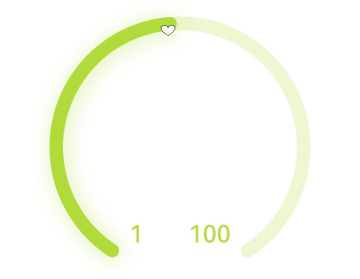
| value | CustomBuilder | Yes | Description. NOTE You need to customize the content – text or imagery recommended – in @Builder. If the width and height of the custom content are in percentage, the reference range is a rectangle that is 44.4% of the diameter of the ring horizontally and 25.4% vertically (for images, it is 28.6% both horizontally and vertically), positioned 0 vp away from the bottom of the ring and centered horizontally. If this parameter is set to null, no description is displayed. If this parameter is not set, what’s displayed is subject to the maximum and minimum value settings. If either or both of the maximum and minimum values are set, they are displayed. If neither maximum nor minimum values are set, no description is displayed. The maximum and minimum values are displayed at the bottom of the ring and cannot be relocated. They may be blocked by the ring if the ring’s start and end angles are not set properly. |
trackShadow11+
trackShadow(value: GaugeShadowOptions)
Sets the shadow style of the gauge.
Atomic service API: This API can be used in atomic services since API version 12.
System capability: SystemCapability.ArkUI.ArkUI.Full
Parameters
| Name | Type | Mandatory | Description |
|---|---|---|---|
| value | GaugeShadowOptions | Yes | Shadow style. NOTE The shadow color is the same as the ring color. If this attribute is set to null, the shadow effect is disabled. |
indicator11+
indicator(value: GaugeIndicatorOptions)
Sets the indicator style of the gauge.
Atomic service API: This API can be used in atomic services since API version 12.
System capability: SystemCapability.ArkUI.ArkUI.Full
Parameters
| Name | Type | Mandatory | Description |
|---|---|---|---|
| value | GaugeIndicatorOptions | Yes | Indicator style. NOTE If this attribute is set to null, no indicator is displayed. |
privacySensitive12+
privacySensitive(isPrivacySensitiveMode: Optional<boolean>)
Sets whether to enable privacy mode.
Widget capability: This API can be used in ArkTS widgets since API version 12.
Atomic service API: This API can be used in atomic services since API version 12.
System capability: SystemCapability.ArkUI.ArkUI.Full
Parameters
| Name | Type | Mandatory | Description |
|---|---|---|---|
| isPrivacySensitiveMode | [Optional<boolean>] | Yes | Whether to enable privacy mode. In privacy mode, the gauge indicator points to 0, the maximum and minimum values are masked, and the scale range is displayed in gray or the background color. NOTE If this parameter is set to null, privacy mode is disabled. Enabling privacy mode requires widget framework support. |
contentModifier12+
contentModifier(modifier: ContentModifier<GaugeConfiguration>)
Creates a content modifier.
Atomic service API: This API can be used in atomic services since API version 12.
System capability: SystemCapability.ArkUI.ArkUI.Full
Parameters
| Name | Type | Mandatory | Description |
|---|---|---|---|
| modifier | ContentModifier<GaugeConfiguration> | Yes | Content modifier to apply to the current component. modifier: content modifier. You need a custom class to implement the ContentModifier API. |
GaugeShadowOptions11+
Inherits from MultiShadowOptions and has all attributes of MultiShadowOptions.
Atomic service API: This API can be used in atomic services since API version 12.
GaugeIndicatorOptions11+
Atomic service API: This API can be used in atomic services since API version 12.
System capability: SystemCapability.ArkUI.ArkUI.Full
| Name | Type | Mandatory | Description |
|---|---|---|---|
| icon | ResourceStr | No | Image path of the icon. NOTE If this parameter is not set, the default triangle style indicator is used. Icons in SVG format are supported. If icons in other formats are used, the default triangle style indicator is used. |
| space | Dimension | No | Distance between the indicator and the outer edge of the ring. The value cannot be in percentage. Default value: 8 Unit: vp NOTE For the default triangle style indicator, the distance is the amount of space between the triangle and the outer edge of the ring. If this parameter is set to a value less than 0, the default value will be used. If this parameter is set to a value greater than the ring radius, the default value will be used. |
GaugeConfiguration12+
You need a custom class to implement the ContentModifier API.
Atomic service API: This API can be used in atomic services since API version 12.
System capability: SystemCapability.ArkUI.ArkUI.Full
| Name | Type | Mandatory | Description |
|---|---|---|---|
| value | number | Yes | Current value. |
| min | number | Yes | Minimum value of the current data segment. |
| max | number | Yes | Maximum value of the current data segment. |
Example
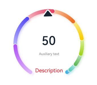
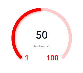
Example 1: Implementing a Multi-color Gauge
This example demonstrates how to implement a multi-color gauge using the colors attribute.
@Entry
@Component
struct Gauge1 {
  @Builder
  descriptionBuilder() {
    Text('Description')
      .maxFontSize('30sp')
      .minFontSize("10.0vp")
      .fontColor("#fffa2a2d")
      .fontWeight(FontWeight.Medium)
      .width('100%')
      .height("100%")
      .textAlign(TextAlign.Center)
  }

  build() {
    Column() {
      Gauge({ value: 50, min: 1, max: 100 }) {
        Column() {
          Text('50')
            .fontWeight(FontWeight.Medium)
            .width('62%')
            .fontColor("#ff182431")
            .maxFontSize("60.0vp")
            .minFontSize("30.0vp")
            .textAlign(TextAlign.Center)
            .margin({ top: '35%' })
            .textOverflow({ overflow: TextOverflow.Ellipsis })
            .maxLines(1)
          Text('Auxiliary text')
            .maxFontSize("16.0fp")
            .minFontSize("10.0vp")
            .fontColor($r('sys.color.ohos_id_color_text_secondary'))
            .fontColor($r('sys.color.ohos_id_color_text_secondary'))
            .fontWeight(FontWeight.Regular)
            .width('67.4%')
            .height('9.5%')
            .textAlign(TextAlign.Center)
        }.width('100%').height('100%')
      }
      .value(50)
      .startAngle(210)
      .endAngle(150)
      .colors([[new LinearGradient([{ color: "#deb6fb", offset: 0 }, { color: "#ac49f5", offset: 1 }]), 9],
        [new LinearGradient([{ color: "#bbb7fc", offset: 0 }, { color: "#564af7", offset: 1 }]), 8],
        [new LinearGradient([{ color: "#f5b5c2", offset: 0 }, { color: "#e64566", offset: 1 }]), 7],
        [new LinearGradient([{ color: "#f8c5a6", offset: 0 }, { color: "#ed6f21", offset: 1 }]), 6],
        [new LinearGradient([{ color: "#fceb99", offset: 0 }, { color: "#f7ce00", offset: 1 }]), 5],
        [new LinearGradient([{ color: "#dbefa5", offset: 0 }, { color: "#a5d61d", offset: 1 }]), 4],
        [new LinearGradient([{ color: "#c1e4be", offset: 0 }, { color: "#64bb5c", offset: 1 }]), 3],
        [new LinearGradient([{ color: "#c0ece5", offset: 0 }, { color: "#61cfbe", offset: 1 }]), 2],
        [new LinearGradient([{ color: "#b5e0f4", offset: 0 }, { color: "#46b1e3", offset: 1 }]), 1]])
      .width('80%')
      .height('80%')
      .strokeWidth(18)
      .trackShadow({ radius: 7, offsetX: 7, offsetY: 7 })
      .description(this.descriptionBuilder)
      .padding(18)
    }.margin({ top: 40 }).width('100%').height('100%')
  }
}
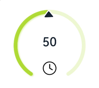
Example 2: Implementing a Single-Color Gauge
This example demonstrates how to implement a single-color gauge using the colors attribute.
@Entry
@Component
struct Gauge2 {
  @Builder
  descriptionBuilderImage() {
    Image($r('sys.media.ohos_ic_public_clock')).width(72).height(72)
  }

  build() {
    Column() {
      Gauge({ value: 50, min: 1, max: 100 }) {
        Column() {
          Text('50')
            .fontWeight(FontWeight.Medium)
            .width('62%')
            .fontColor("#ff182431")
            .maxFontSize("60.0vp")
            .minFontSize("30.0vp")
            .textAlign(TextAlign.Center)
            .margin({ top: '35%' })
            .textOverflow({ overflow: TextOverflow.Ellipsis })
            .maxLines(1)
        }.width('100%').height('100%')
      }
      .startAngle(210)
      .endAngle(150)
      .colors('#cca5d61d')
      .width('80%')
      .height('80%')
      .strokeWidth(18)
      .description(this.descriptionBuilderImage)
      .padding(18)
    }.margin({ top: 40 }).width('100%').height('100%')
  }
}
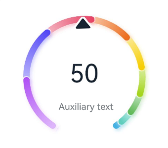
Example 3: Configuring a Custom Description Area
This example illustrates how to configure a custom description area using the description attribute.
@Entry
@Component
struct Gauge3 {
  @Builder
  descriptionBuilder() {
    Text('Description')
      .maxFontSize('30sp')
      .minFontSize("10.0vp")
      .fontColor("#fffa2a2d")
      .fontWeight(FontWeight.Medium)
      .width('100%')
      .height("100%")
      .textAlign(TextAlign.Center)
  }

  build() {
    Column() {
      Column() {
        Gauge({ value: 50, min: 1, max: 100 }) {
          Column() {
            Text('50')
              .fontWeight(FontWeight.Medium)
              .width('62%')
              .fontColor("#ff182431")
              .maxFontSize("60.0vp")
              .minFontSize("30.0vp")
              .textAlign(TextAlign.Center)
              .margin({ top: '35%' })
              .textOverflow({ overflow: TextOverflow.Ellipsis })
              .maxLines(1)
          }.width('100%').height('100%')
        }
        .startAngle(210)
        .endAngle(150)
        .colors([[new LinearGradient([{ color: "#deb6fb", offset: 0 }, { color: "#ac49f5", offset: 1 }]), 9],
          [new LinearGradient([{ color: "#bbb7fc", offset: 0 }, { color: "#564af7", offset: 1 }]), 8],
          [new LinearGradient([{ color: "#f5b5c2", offset: 0 }, { color: "#e64566", offset: 1 }]), 7],
          [new LinearGradient([{ color: "#f8c5a6", offset: 0 }, { color: "#ed6f21", offset: 1 }]), 6],
          [new LinearGradient([{ color: "#fceb99", offset: 0 }, { color: "#f7ce00", offset: 1 }]), 5],
          [new LinearGradient([{ color: "#dbefa5", offset: 0 }, { color: "#a5d61d", offset: 1 }]), 4],
          [new LinearGradient([{ color: "#c1e4be", offset: 0 }, { color: "#64bb5c", offset: 1 }]), 3],
          [new LinearGradient([{ color: "#c0ece5", offset: 0 }, { color: "#61cfbe", offset: 1 }]), 2],
          [new LinearGradient([{ color: "#b5e0f4", offset: 0 }, { color: "#46b1e3", offset: 1 }]), 1]])
        .width('80%')
        .height('80%')
        .strokeWidth(18)
        .description(this.descriptionBuilder)
        .trackShadow({ radius: 7, offsetX: 7, offsetY: 7 })
        .padding(18)
      }.margin({ top: 40 }).width('100%').height('100%')
    }
  }
}

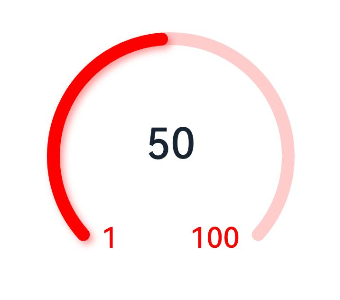
Example 4: Configuring the Auxiliary Area
This example demonstrates how to configure the auxiliary area by setting child components.
@Entry
@Component
struct Gauge4 {
  build() {
    Column() {
      Gauge({ value: 50, min: 1, max: 100 }) {
        Column() {
          Text('50')
            .maxFontSize("72.0vp")
            .minFontSize("10.0vp")
            .fontColor("#ff182431")
            .width('40%')
            .textAlign(TextAlign.Center)
            .margin({ top: '35%' })
            .textOverflow({ overflow: TextOverflow.Ellipsis })
            .maxLines(1)
          Text('Auxiliary text')
            .maxFontSize("30.0vp")
            .minFontSize("18.0vp")
            .fontWeight(FontWeight.Medium)
            .fontColor($r('sys.color.ohos_id_color_text_secondary'))
            .width('62%')
            .height('15.9%')
            .textAlign(TextAlign.Center)
        }.width('100%').height('100%')
      }
      .startAngle(210)
      .endAngle(150)
      .colors([[new LinearGradient([{ color: "#deb6fb", offset: 0 }, { color: "#ac49f5", offset: 1 }]), 9],
        [new LinearGradient([{ color: "#bbb7fc", offset: 0 }, { color: "#564af7", offset: 1 }]), 8],
        [new LinearGradient([{ color: "#f5b5c2", offset: 0 }, { color: "#e64566", offset: 1 }]), 7],
        [new LinearGradient([{ color: "#f8c5a6", offset: 0 }, { color: "#ed6f21", offset: 1 }]), 6],
        [new LinearGradient([{ color: "#fceb99", offset: 0 }, { color: "#f7ce00", offset: 1 }]), 5],
        [new LinearGradient([{ color: "#dbefa5", offset: 0 }, { color: "#a5d61d", offset: 1 }]), 4],
        [new LinearGradient([{ color: "#c1e4be", offset: 0 }, { color: "#64bb5c", offset: 1 }]), 3],
        [new LinearGradient([{ color: "#c0ece5", offset: 0 }, { color: "#61cfbe", offset: 1 }]), 2],
        [new LinearGradient([{ color: "#b5e0f4", offset: 0 }, { color: "#46b1e3", offset: 1 }]), 1]])
      .width('80%')
      .height('80%')
      .strokeWidth(18)
      .description(null)
      .trackShadow({ radius: 7, offsetX: 7, offsetY: 7 })
      .padding(18)
    }.margin({ top: 40 }).width('100%').height('100%')
  }
}
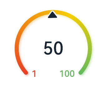
Example 5: Setting the Minimum and Maximum Values
This example shows how to set the minimum and maximum values of the gauge by configuring min and max.
@Entry
@Component
struct Gauge5 {
  build() {
    Column() {
      Gauge({ value: 50, min: 1, max: 100 }) {
        Column() {
          Text('50')
            .maxFontSize("80sp")
            .minFontSize("60.0vp")
            .fontWeight(FontWeight.Medium)
            .fontColor("#ff182431")
            .width('40%')
            .height('30%')
            .textAlign(TextAlign.Center)
            .margin({ top: '22.2%' })
            .textOverflow({ overflow: TextOverflow.Ellipsis })
            .maxLines(1)
        }.width('100%').height('100%')
      }
      .startAngle(225)
      .endAngle(135)
      .colors(new LinearGradient([{ color: "#e84026", offset: 0 },
        { color: "#f7ce00", offset: 0.6 },
        { color: "#64bb5c", offset: 1 }]))
      .width('80%')
      .height('80%')
      .strokeWidth(18)
      .trackShadow({ radius: 7, offsetX: 7, offsetY: 7 })
      .padding(18)
    }.margin({ top: 40 }).width('100%').height('100%')
  }
}
Example 6: Setting the Indicator
This example illustrates how to set the indicator of the gauge using the indicator attribute.
@Entry
@Component
struct Gauge6 {
  build() {
    Column() {
      Gauge({ value: 50, min: 1, max: 100 }) {
        Column() {
          Text('50')
            .maxFontSize('60sp')
            .minFontSize('30.0vp')
            .fontWeight(FontWeight.Medium)
            .fontColor("#ff182431")
            .width('62%')
            .textAlign(TextAlign.Center)
            .margin({ top: '35%' })
            .textOverflow({ overflow: TextOverflow.Ellipsis })
            .maxLines(1)
          Text('Auxiliary text')
            .maxFontSize('16sp')
            .minFontSize("10.0vp")
            .fontColor($r('sys.color.ohos_id_color_text_secondary'))
            .fontWeight(FontWeight.Regular)
            .width('67.4%')
            .height('9.5%')
            .textAlign(TextAlign.Center)
        }.width('100%').height('100%')
      }
      .startAngle(225)
      .endAngle(135)
      .colors(Color.Red)
      .width('80%')
      .height('80%')
      .indicator(null)
      .strokeWidth(18)
      .trackShadow({ radius: 7, offsetX: 7, offsetY: 7 })
      .padding(18)
    }.margin({ top: 40 }).width('100%').height('100%')
  }
}
Example 7: Setting the Start and End Angles
This example demonstrates how to set the start and end angles of the gauge using the startAngle and endAngle attributes.
@Entry
@Component
struct Gauge7 {
  build() {
    Column() {
      Gauge({ value: 50, min: 1, max: 100 }) {
        Column() {
          Text('50')
            .maxFontSize('60sp')
            .minFontSize('30.0vp')
            .fontWeight(FontWeight.Medium)
            .fontColor("#ff182431")
            .width('62%')
            .textAlign(TextAlign.Center)
            .margin({ top: '35%' })
            .textOverflow({ overflow: TextOverflow.Ellipsis })
            .maxLines(1)
        }.width('100%').height('100%')
      }
      .startAngle(225)
      .endAngle(135)
      .colors(Color.Red)
      .width('80%')
      .height('80%')
      .indicator(null)
      .strokeWidth(18)
      .trackShadow({ radius: 7, offsetX: 7, offsetY: 7 })
      .padding(18)
    }.margin({ top: 40 }).width('100%').height('100%')
  }
}
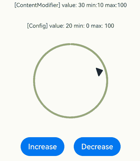
Example 8: Setting the Custom Content Area
This example shows how to customize the content area of the gauge using the contentModifier attribute.
// xxx.ets
// The example implements the customization of the gauge's content area using a Builder, utilizing a circular chart, buttons, and text boxes. When the increase button is clicked, the indicator will shift to the right; conversely, when the decrease button is clicked, the indicator will shift to the left.
@Builder
function buildGauge(config: GaugeConfiguration) {
  Column({ space: 30 }) {
    Row() {
      Text('[ContentModifier] value: ' + JSON.stringify((config.contentModifier as MyGaugeStyle).value) +
        ' min:' + JSON.stringify((config.contentModifier as MyGaugeStyle).min) +
        ' max:' + JSON.stringify((config.contentModifier as MyGaugeStyle).max))
        .fontSize(12)
    }

    Text('[Config] value: ' + config.value + ' min: ' + config.min + ' max: ' + config.max).fontSize(12)
    Gauge({
      value: config.value,
      min: config.min,
      max: config.max
    }).width("50%")
  }
  .width("100%")
  .padding(20)
  .margin({ top: 5 })
  .alignItems(HorizontalAlign.Center)
}

class MyGaugeStyle implements ContentModifier<GaugeConfiguration> {
  value: number = 0
  min: number = 0
  max: number = 0

  constructor(value: number, min: number, max: number) {
    this.value = value
    this.min = min
    this.max = max
  }

  applyContent(): WrappedBuilder<[GaugeConfiguration]> {
    return wrapBuilder(buildGauge)
  }
}

@Entry
@Component
struct refreshExample {
  @State gaugeValue: number = 20
  @State gaugeMin: number = 0
  @State gaugeMax: number = 100

  build() {
    Column({ space: 20 }) {
      Gauge({
        value: this.gaugeValue,
        min: this.gaugeMin,
        max: this.gaugeMax
      })
        .contentModifier(new MyGaugeStyle(30, 10, 100))

      Column({ space: 20 }) {
        Row({ space: 20 }) {
          Button('Increase').onClick(() => {
            if (this.gaugeValue < this.gaugeMax) {
              this.gaugeValue += 1
            }
          })
          Button('Decrease').onClick(() => {
            if (this.gaugeValue > this.gaugeMin) {
              this.gaugeValue -= 1
            }
          })
        }
      }.width('100%')
    }.width('100%').margin({ top: 5 })
  }
}
Example 9: Securing Sensitive Information
This example illustrates how to secure sensitive information using the privacySensitive attribute. Note that the display requires widget framework support.
@Entry
@Component
struct GaugeExample {
  build() {
    Scroll() {
      Column({ space: 15 }) {
        Row() {
          Gauge({ value: 50, min: 1, max: 100 }) {
            Column() {
              Text('60')
                .maxFontSize("180sp")
                .minFontSize("160.0vp")
                .fontWeight(FontWeight.Medium)
                .fontColor("#ff182431")
                .width('40%')
                .height('30%')
                .textAlign(TextAlign.Center)
                .margin({ top: '22.2%' })
                .textOverflow({ overflow: TextOverflow.Ellipsis })
                .maxLines(1)
            }.width('100%').height('100%')
          }
          .startAngle(225)
          .endAngle(135)
          .colors(Color.Red)
          .width('80%')
          .height('80%')
          .strokeWidth(18)
          .trackShadow({ radius: 7, offsetX: 7, offsetY: 7 })
          .padding(18)
          .privacySensitive(true)
        }
      }
    }
  }
}
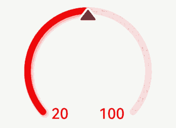
Example 10: Implementing a Custom Indicator
This example demonstrates how to implement a custom indicator using indicator. You can import an SVG image to replace the default indicator.
@Entry
@Component
struct Gauge2 {
  build() {
    Column() {
      Gauge({ value: 50, min: 1, max: 100 })
        .indicator({ space: 10, icon: $r('app.media.indicator') })
        .startAngle(210)
        .endAngle(150)
        .colors('#cca5d61d')
        .width('80%')
        .height('80%')
        .strokeWidth(18)
        .padding(18)
    }.margin({ top: 40 }).width('100%').height('100%')
  }
}
<svg width="200px" height="200px">
    <path d="M 10,30 A 20,20 0,0,1 50,30 A 20,20 0,0,1 90,30 Q 90,60 50,90 Q 10,60 10,30 z"
          stroke="black" stroke-width="3" fill="white">
    </path>
</svg>
你可能感兴趣的鸿蒙文章
- 所属分类: 后端技术
- 本文标签:
热门推荐
-
2、 优质文章
-
3、 gt
-
7、 openharmony
-
9、 golang
-
10、 Vue中input框自动聚焦