harmony 鸿蒙TextPicker
TextPicker
The TextPicker component allows users to scroll to select text.
NOTE
This component is supported since API version 8. Updates will be marked with a superscript to indicate their earliest API version.
Child Components
Not supported
APIs
TextPicker(options?: TextPickerOptions)
Creates a text picker based on the selection range specified by range.
Atomic service API: This API can be used in atomic services since API version 11.
System capability: SystemCapability.ArkUI.ArkUI.Full
Parameters
| Name | Type | Mandatory | Description |
|---|---|---|---|
| options | TextPickerOptions | No | Parameters of the text picker. |
TextPickerOptions
Atomic service API: This API can be used in atomic services since API version 11.
System capability: SystemCapability.ArkUI.ArkUI.Full
| Name | Type | Mandatory | Description |
|---|---|---|---|
| range | string[] |string[] []10+ |Resource | TextPickerRangeContent[]10+ |TextCascadePickerRangeContent[]10+ |
Yes | Data selection range of the picker. This parameter cannot be set to an empty array. If set to an empty array, it will not be displayed. If it is dynamically changed to an empty array, the current value remains displayed. NOTE For a single-column picker, use a value of the string[], Resource, or TextPickerRangeContent[] type. For a multi-column picker, use a value of the string[] type. For a multi-column linked picker, use a value of the TextCascadePickerRangeContent[] type. The Resource type supports only strarray.json. The type and number of columns in the range cannot be dynamically modified. |
| selected | number |number[]10+ | No | Index of the default selected item in the array. The index is zero-based. Default value: 0 NOTE For a single-column picker, use a value of the number type. For a multi-column (linked) picker, use a value of the number[] type. Since API version 10, this parameter supports two-way binding through $$. |
| value | string |string[]10+ | No | Value of the default item in the range. The priority of this parameter is lower than that of selected. Default value: value of the first item NOTE This parameter works only when the picker contains text only. For a single-column picker, use a value of the string type. For a multi-column (linked) picker, use a value of the string[] type. Since API version 10, this parameter supports two-way binding through $$. |
| columnWidths18+ | LengthMetrics[] | No | Width of each column in the picker. Default value: All columns have equal widths. NOTE If the text is longer than the column width, it will be truncated. |
TextPickerRangeContent10+
Atomic service API: This API can be used in atomic services since API version 11.
System capability: SystemCapability.ArkUI.ArkUI.Full
| Name | Type | Mandatory | Description |
|---|---|---|---|
| icon | string |Resource | Yes | Image resource. If the value is a string, such as ”/common/hello.png”, it represents the path to the image. |
| text | string |Resource | No | Text information. An empty character string is used by default. NOTE If the text is longer than the column width, it will be truncated. |
TextCascadePickerRangeContent10+
Atomic service API: This API can be used in atomic services since API version 11.
System capability: SystemCapability.ArkUI.ArkUI.Full
| Name | Type | Mandatory | Description |
|---|---|---|---|
| text | string |Resource | Yes | Text information. NOTE If the text is longer than the column width, it will be truncated. |
| children | TextCascadePickerRangeContent[] | No | Linkage data. |
DividerOptions12+
Atomic service API: This API can be used in atomic services since API version 12.
System capability: SystemCapability.ArkUI.ArkUI.Full
| Name | Type | Mandatory | Description |
|---|---|---|---|
| strokeWidth | Dimension | No | Stroke width of the divider. The unit is vp by default. You can also specify it as px. The percentage type is not supported. If the value is less than 0, the default value is used. The maximum value allowed is half the height of the column. Default value: 2.0px |
| startMargin | Dimension | No | Distance between the divider and the start edge of the picker. The unit is vp by default. You can also specify it as px. The percentage type is not supported. Values less than 0 are invalid. The maximum value allowed is the width of the column. Default value: 0 |
| endMargin | Dimension | No | Distance between the divider and the end edge of the picker. The unit is vp by default. You can also specify it as px. The percentage type is not supported. Values less than 0 are invalid. The maximum value allowed is the width of the column. Default value: 0 |
| color | ResourceColor | No | Color of the divider. Default value: ’#33000000’ |
Attributes
In addition to the universal attributes, the following attributes are supported.
defaultPickerItemHeight
defaultPickerItemHeight(value: number|string)
Sets the height of each item in the picker.
Atomic service API: This API can be used in atomic services since API version 11.
System capability: SystemCapability.ArkUI.ArkUI.Full
Parameters
| Name | Type | Mandatory | Description |
|---|---|---|---|
| value | number |string | Yes | Height of each item in the picker. For the number type, the value range is [0, +∞). For the string type, only numeric string values, for example, “56”, are supported. Default value: 56 vp (selected) and 36 vp (unselected). NOTE The set value applies to both selected and unselected items. |
defaultPickerItemHeight18+
defaultPickerItemHeight(height: Optional<number|string>)
Sets the height of each item in the picker. Compared to defaultPickerItemHeight, this API supports the undefined type for the height parameter.
Atomic service API: This API can be used in atomic services since API version 18.
System capability: SystemCapability.ArkUI.ArkUI.Full
Parameters
| Name | Type | Mandatory | Description |
|---|---|---|---|
| height | Optional<number |string> | Yes | Height of each item in the picker. For the number type, the value range is [0, +∞). For the string type, only numeric string values, for example, “56”, are supported. Default value: 56 vp (selected) and 36 vp (unselected). NOTE The set value applies to both selected and unselected items. If height is set to undefined, the previous value is retained. |
disappearTextStyle10+
disappearTextStyle(value: PickerTextStyle)
Sets the font color, font size, and font weight for the top and bottom items.
Atomic service API: This API can be used in atomic services since API version 11.
System capability: SystemCapability.ArkUI.ArkUI.Full
Parameters
| Name | Type | Mandatory | Description |
|---|---|---|---|
| value | PickerTextStyle | Yes | Font color, font size, and font weight of the top and bottom items. Default value: { color: ‘#ff182431’, font: { size: ‘14fp’, weight: FontWeight.Regular } } |
disappearTextStyle18+
disappearTextStyle(style: Optional<PickerTextStyle>)
Sets the font color, font size, and font weight for the top and bottom items. Compared to disappearTextStyle10+, this API supports the undefined type for the style parameter.
Atomic service API: This API can be used in atomic services since API version 18.
System capability: SystemCapability.ArkUI.ArkUI.Full
Parameters
| Name | Type | Mandatory | Description |
|---|---|---|---|
| style | Optional<PickerTextStyle> | Yes | Font color, font size, and font weight of the top and bottom items. If style is set to undefined, the default value is used: { color: ‘#ff182431’, font: { size: ‘14fp’, weight: FontWeight.Regular } } |
textStyle10+
textStyle(value: PickerTextStyle)
Sets the font color, font size, and font weight for all items except the top, bottom, and selected items.
Atomic service API: This API can be used in atomic services since API version 11.
System capability: SystemCapability.ArkUI.ArkUI.Full
Parameters
| Name | Type | Mandatory | Description |
|---|---|---|---|
| value | PickerTextStyle | Yes | Font color, font size, and font weight of all items except the top, bottom, and selected items. Default value: { color: ‘#ff182431’, font: { size: ‘16fp’, weight: FontWeight.Regular } } |
textStyle18+
textStyle(style: Optional<PickerTextStyle>)
Sets the font color, font size, and font weight for all items except the top, bottom, and selected items. Compared to textStyle10+, this API supports the undefined type for the style parameter.
Atomic service API: This API can be used in atomic services since API version 18.
System capability: SystemCapability.ArkUI.ArkUI.Full
Parameters
| Name | Type | Mandatory | Description |
|---|---|---|---|
| style | Optional<PickerTextStyle> | Yes | Font color, font size, and font weight of all items except the top, bottom, and selected items. If style is set to undefined, the default value is used: { color: ‘#ff182431’, font: { size: ‘16fp’, weight: FontWeight.Regular } } |
selectedTextStyle10+
selectedTextStyle(value: PickerTextStyle)
Sets the font color, font size, and font weight for the selected item.
Atomic service API: This API can be used in atomic services since API version 11.
System capability: SystemCapability.ArkUI.ArkUI.Full
Parameters
| Name | Type | Mandatory | Description |
|---|---|---|---|
| value | PickerTextStyle | Yes | Font color, font size, and font weight of the selected item. Default value: { color: ‘#ff007dff’, font: { size: ‘20fp’, weight: FontWeight.Medium } } |
selectedTextStyle18+
selectedTextStyle(style: Optional<PickerTextStyle>)
Sets the font color, font size, and font weight for the selected item. Compared to selectedTextStyle10+, this API supports the undefined type for the style parameter.
Atomic service API: This API can be used in atomic services since API version 18.
System capability: SystemCapability.ArkUI.ArkUI.Full
Parameters
| Name | Type | Mandatory | Description |
|---|---|---|---|
| style | Optional<PickerTextStyle> | Yes | Font color, font size, and font weight of the selected item. If style is set to undefined, the default value is used: { color: ‘#ff007dff’, font: { size: ‘20fp’, weight: FontWeight.Medium } } |
selectedIndex10+
selectedIndex(value: number|number[])
Sets the index of the default selected item in the array. Its priority is higher than that of the selected value in options. For a single-column picker, use a value of the number type. For a multi-column (linked) picker, use a value of the number[] type.
Atomic service API: This API can be used in atomic services since API version 11.
System capability: SystemCapability.ArkUI.ArkUI.Full
Parameters
| Name | Type | Mandatory | Description |
|---|---|---|---|
| value | number |number[] | Yes | Index of the default selected item in the array. The index is zero-based. Default value: 0 If the value of value is undefined, the default value is the same as the value of selected in options. If the value of selected in options is also undefined, the default value is 0. |
selectedIndex18+
selectedIndex(index: Optional<number|number[]>)
Sets the index of the default selected item in the array. Its priority is higher than that of the selected value in options. For a single-column picker, use a value of the number type. For a multi-column (linked) picker, use a value of the number[] type. Compared to selectedIndex, this API supports the undefined type for the index parameter.
Atomic service API: This API can be used in atomic services since API version 18.
System capability: SystemCapability.ArkUI.ArkUI.Full
Parameters
| Name | Type | Mandatory | Description |
|---|---|---|---|
| index | Optional<number |number[]> | Yes | Index of the default selected item in the array. The index is zero-based. Default value: 0 If the value of index is undefined, the default value is the same as the value of selected in options. If the value of selected in options is also undefined, the default value is 0. |
canLoop10+
canLoop(value: boolean)
Sets whether scrolling is loopable.
Atomic service API: This API can be used in atomic services since API version 11.
System capability: SystemCapability.ArkUI.ArkUI.Full
Parameters
| Name | Type | Mandatory | Description |
|---|---|---|---|
| value | boolean | Yes | Whether scrolling is loopable. true: loopable false: not loopable Default value: true |
canLoop18+
canLoop(isLoop: Optional<boolean>)
Sets whether scrolling is loopable. Compared to canLoop10+, this API supports the undefined type for the isLoop parameter.
Atomic service API: This API can be used in atomic services since API version 18.
System capability: SystemCapability.ArkUI.ArkUI.Full
Parameters
| Name | Type | Mandatory | Description |
|---|---|---|---|
| isLoop | Optional<boolean> | Yes | Whether scrolling is loopable. true: loopable false: not loopable If isLoop is set to undefined, the default value true is used. |
divider12+
divider(value: DividerOptions|null)
Sets the divider style. If this attribute is not set, the divider is displayed based on the default value.
If the sum of startMargin and endMargin exceeds the component width, both startMargin and endMargin will be set to 0.
Atomic service API: This API can be used in atomic services since API version 12.
System capability: SystemCapability.ArkUI.ArkUI.Full
Parameters
|Name|Type |Mandatory|Description |
|——|——-|—-|———————————————————————|
|value|DividerOptions |null|Yes|Divider options.
1. If DividerOptions is set, the divider is displayed in the configured style.
Default value:
{
strokeWidth: ‘2px’,
startMargin: 0,
endMargin: 0,
color: ‘#33000000’
}
2. If this parameter is set to null, the divider is not displayed.|
divider18+
divider(textDivider: Optional<DividerOptions|null>)
Sets the divider style. If this attribute is not set, the divider is displayed based on the default value. Compared to divider12+, this API supports the undefined type for the textDivider parameter.
If the sum of startMargin and endMargin exceeds the component width, both startMargin and endMargin will be set to 0.
Atomic service API: This API can be used in atomic services since API version 18.
System capability: SystemCapability.ArkUI.ArkUI.Full
Parameters
| Name | Type | Mandatory | Description |
|---|---|---|---|
| textDivider | Optional<DividerOptions |null> | Yes | Divider options. 1. If DividerOptions is set, the divider is displayed in the configured style. If textDivider is set to undefined, the default value is used: { strokeWidth: ‘2px’, startMargin: 0, endMargin: 0, color: ‘#33000000’ } 2. If this parameter is set to null, the divider is not displayed. |
gradientHeight12+
gradientHeight(value: Dimension)
Sets the height for the fade effect. If this attribute is not set, the default fade effect is displayed.
Atomic service API: This API can be used in atomic services since API version 12.
System capability: SystemCapability.ArkUI.ArkUI.Full
Parameters
| Name | Type | Mandatory | Description |
|---|---|---|---|
| value | Dimension | Yes | Height of the fade effect at the top and bottom edges of the content area. It can be set in percentage, with 100% (the maximum value) being half the height of the picker. Setting it to 0 results in no fade effect, while negative numbers or other invalid values display the default fade effect. Default value: 36vp |
gradientHeight18+
gradientHeight(height: Optional<Dimension>)
Sets the height for the fade effect. If this attribute is not set, the default fade effect is displayed. Compared to gradientHeight12+, this API supports the undefined type for the height parameter.
Atomic service API: This API can be used in atomic services since API version 18.
System capability: SystemCapability.ArkUI.ArkUI.Full
Parameters
| Name | Type | Mandatory | Description |
|---|---|---|---|
| height | Optional<Dimension> | Yes | Height of the fade effect at the top and bottom edges of the content area. It can be set in percentage, with 100% (the maximum value) being half the height of the picker. Setting it to 0 results in no fade effect, while negative numbers or other invalid values display the default fade effect. Default value: 36vp If height is set to undefined, the default value 36vp is used. |
NOTE
Avoid changing the attribute data during the animation process of this component.
disableTextStyleAnimation15+
disableTextStyleAnimation(disabled: boolean)
Sets whether to enable the text style change animation during the scrolling process. When this API is used with true, there are no text style changes, including the font size, weight, and color, during scrolling, and all text is displayed in the style set by defaultTextStyle. If defaultTextStyle is not set, the text is displayed in the default style of the Text component.
Atomic service API: This API can be used in atomic services since API version 15.
System capability: SystemCapability.ArkUI.ArkUI.Full
Parameters
| Name | Type | Mandatory | Description |
|---|---|---|---|
| disabled | boolean | Yes | Whether to enable the text style change animation during the scrolling process. true: Disable the text style change animation. false: Enable the text style change animation. Default value: false |
defaultTextStyle15+
defaultTextStyle(style: TextPickerTextStyle)
Sets the style of the text items when the text style change animation during the scrolling process is disabled.
Atomic service API: This API can be used in atomic services since API version 15.
System capability: SystemCapability.ArkUI.ArkUI.Full
Parameters
| Name | Type | Mandatory | Description |
|---|---|---|---|
| style | TextPickerTextStyle | Yes | Style of the text items when the text style change animation during the scrolling process is disabled. It is effective only when disableTextStyleAnimation is true. Default value: same as the default value of the Text component |
NOTE
Avoid changing the attribute data during the animation process of this component.
enableHapticFeedback18+
enableHapticFeedback(enable: Optional<boolean>)
Specifies whether to enable haptic feedback.
Atomic service API: This API can be used in atomic services since API version 18.
System capability: SystemCapability.ArkUI.ArkUI.Full
| Name | Type | Mandatory | Description |
|---|---|---|---|
| enable | Optional<boolean> | Yes | Whether to enable haptic feedback. true (default): Haptic feedback is enabled. false: Haptic feedback is disabled. |
NOTE
To enable haptic feedback, you must declare the ohos.permission.VIBRATE permission under requestPermissions in the module.json5 file of the project.
> "requestPermissions": [ > { > "name": "ohos.permission.VIBRATE", > } > ] > ``` ### digitalCrownSensitivity<sup>18+</sup> digitalCrownSensitivity(sensitivity: Optional\<CrownSensitivity>) Sets the sensitivity to the digital crown rotation. **Atomic service API**: This API can be used in atomic services since API version 18. **System capability**: SystemCapability.ArkUI.ArkUI.Full |Name|Type |Mandatory|Description | |-----|----------------------------------------|----|-------------------------| |sensitivity|[Optional](https://m.seaxiang.com/blog/aIyD72)\<[CrownSensitivity](ts-appendix-enums.md#crownsensitivity18)>|Yes |Sensitivity to the digital crown rotation.<br>Default value: **CrownSensitivity.MEDIUM** | > **NOTE** > > This API is only available to circular screens on wearable devices. The component needs to obtain focus before responding to the [crown event](ts-universal-events-crown.md). ## Events In addition to the [universal events](ts-component-general-events.md), the following events are supported. ### onChange onChange(callback: (value: string \|string[], index: number \|number[]) => void) Triggered when an item in the picker is selected. When the picker contains text only or both text and imagery, **value** indicates the text of the selected item. When the picker contains imagery only, **value** is empty. **Atomic service API**: This API can be used in atomic services since API version 11. **System capability**: SystemCapability.ArkUI.ArkUI.Full **Parameters** |Name|Type |Mandatory|Description | |------|------------------------------------------|----|-------------------------------------------------| |value|string \|string[]<sup>10+</sup>|Yes|Text of the selected item. For a multi-column picker, **value** is of the array type.| |index|number \|number[]<sup>10+</sup>|Yes|Index of the selected item. The index is zero-based. For a multi-column picker, **index** is of the array type.| ### onChange<sup>18+</sup> onChange(callback: Optional\<OnTextPickerChangeCallback>) Triggered when the text picker snaps to the selected item. Compared to [onChange](#onchange), this API supports the **undefined** type for the **callback** parameter. **Atomic service API**: This API can be used in atomic services since API version 18. **System capability**: SystemCapability.ArkUI.ArkUI.Full **Parameters** |Name|Type |Mandatory|Description | |--------|------------------------------------------------------------|----|------------------------------------------------------------| |callback|[Optional](https://m.seaxiang.com/blog/aIyD72)\<[OnTextPickerChangeCallback](#ontextpickerchangecallback18)>|Yes|Callback invoked when an item in the picker is selected.<br>If **callback** is set to **undefined**, the callback function is not used.| ### onScrollStop<sup>14+</sup> onScrollStop(callback: TextPickerScrollStopCallback) Triggered when the scrolling in the text picker stops. If the scrolling is initiated by a gesture, this event is triggered when the finger is lifted from the screen and the scrolling stops. **Atomic service API**: This API can be used in atomic services since API version 14. **System capability**: SystemCapability.ArkUI.ArkUI.Full **Parameters** |Name|Type |Mandatory|Description | |------|------------------------------------------|----|-------------------------------------------------| |callback|[TextPickerScrollStopCallback](#textpickerscrollstopcallback14)|Yes|Triggered when the scrolling in the text picker stops.| ### onScrollStop<sup>18+</sup> onScrollStop(callback: Optional\<TextPickerScrollStopCallback>) Triggered when the scrolling in the text picker stops. Compared to [onScrollStop](#onscrollstop14)<sup>14+</sup>, this API supports the **undefined** type for the **callback** parameter. If the scrolling is initiated by a gesture, this event is triggered when the finger is lifted from the screen and the scrolling stops. **Atomic service API**: This API can be used in atomic services since API version 18. **System capability**: SystemCapability.ArkUI.ArkUI.Full **Parameters** |Name|Type |Mandatory|Description | |------|------------------------------------------|----|-------------------------------------------------| |callback|[TextPickerScrollStopCallback](#textpickerscrollstopcallback14)|Yes|Triggered when the scrolling in the text picker stops.<br>If **callback** is set to **undefined**, the callback function is not used.| ### onEnterSelectedArea<sup>18+</sup> onEnterSelectedArea(callback: TextPickerEnterSelectedAreaCallback) Triggered during the scrolling of the text picker when an item enters the divider area. Compared to the **onChange** event, this event is triggered earlier, specifically when the scroll distance of the current column exceeds half the height of the selected item, which indicates that the item has entered the divider area. When the picker contains text only or a combination of images and text, **value** indicates the text of the selected item. When the picker contains images only, **value** is empty. **Atomic service API**: This API can be used in atomic services since API version 18. **System capability**: SystemCapability.ArkUI.ArkUI.Full **Parameters** |Name|Type |Mandatory|Description | |--------|--------------------------|----|------------------------------------------| |callback|[TextPickerEnterSelectedAreaCallback](#textpickerenterselectedareacallback18)|Yes|Triggered during the scrolling of the text picker when an item enters the divider area.| ### onAccept<sup>(deprecated) </sup> onAccept(callback: (value: string, index: number) => void) Triggered when the OK button in the dialog box is clicked. This event can be triggered only in the [text picker dialog box](ts-methods-textpicker-dialog.md). This API is deprecated since API version 10. **System capability**: SystemCapability.ArkUI.ArkUI.Full **Parameters** |Name|Type|Mandatory|Description | |------|------|----|--------------------| |value|string|Yes|Text of the selected item.| |index|number|Yes|Index of the selected item. The index is zero-based.| ### onCancel<sup>(deprecated) </sup> onCancel(callback: () => void) Triggered when the Cancel button in the dialog box is clicked. This event can be triggered only in the [text picker dialog box](ts-methods-textpicker-dialog.md). This API is deprecated since API version 10. **System capability**: SystemCapability.ArkUI.ArkUI.Full ## TextPickerTextStyle<sup>15+</sup> Defines the text style options. Inherits [PickerTextStyle](https://m.seaxiang.com/blog/nxVrUe). **Atomic service API**: This API can be used in atomic services since API version 15. |Name|Type |Mandatory|Description | |-----|----------------------------------------|----|-------------------------| |color|[ResourceColor](https://m.seaxiang.com/blog/QdcP30color)|No |Text color. | |font|[Font](ts-types.md#font) |No |Text style.| |minFontSize|number \|string \|[Resource](https://m.seaxiang.com/blog/QdcP30)|No |Minimum font size, used in conjunction with **maxFontSize**. When **minFontSize** and **maxFontSize** are set, the **size** setting in **font** is ineffective. The default maximum number of lines is 1, and the default height adaptation mode is **MIN_FONT_SIZE_FIRST**. | |maxFontSize|number \|string \|[Resource](https://m.seaxiang.com/blog/QdcP30)|No |Maximum font size. | | overflow | [TextOverflow](ts-appendix-enums.md#textoverflow)|No |Display mode when the text is too long. Ineffective when set to **MARQUEE**. | ## OnTextPickerChangeCallback<sup>18+</sup> type OnTextPickerChangeCallback = (value: string|string[], index: number|number[]) => void Triggered when an item in the picker is selected. When the picker contains text only or both text and imagery, **value** indicates the text of the selected item. When the picker contains imagery only, **value** is empty. **Widget capability**: This API can be used in ArkTS widgets since API version 18. **Atomic service API**: This API can be used in atomic services since API version 18. **System capability**: SystemCapability.ArkUI.ArkUI.Full **Parameters** |Name|Type |Mandatory|Description | |------|------------------------------------------|----|-------------------------------------------------| |value|string \|string[]<sup>10+</sup>|Yes|Text of the selected item. For a multi-column picker, **value** is of the array type.| |index|number \|number[]<sup>10+</sup>|Yes|Index of the selected item. The index is zero-based. For a multi-column picker, **index** is of the array type.| ## TextPickerScrollStopCallback<sup>14+</sup> type TextPickerScrollStopCallback = (value: string|string[], index: number|number[]) => void Triggered when the scrolling in the text picker stops. When the picker contains text only or both text and imagery, **value** indicates the text of the selected item. When the picker contains imagery only, **value** is empty. **Widget capability**: This API can be used in ArkTS widgets since API version 14. **Atomic service API**: This API can be used in atomic services since API version 14. **System capability**: SystemCapability.ArkUI.ArkUI.Full **Parameters** |Name|Type |Mandatory|Description | |------|------------------------------------------|----|-------------------------------------------------| |value|string \|string[]|Yes|Text of the selected item. For a multi-column picker, **value** is of the array type.| |index|number \|number[]|Yes|Index of the selected item. The index is zero-based. For a multi-column picker, **index** is of the array type.| ## TextPickerEnterSelectedAreaCallback<sup>18+</sup> type TextPickerEnterSelectedAreaCallback = (value: string|string[], index: number|number[]) => void Represents the callback triggered during the scrolling of the text picker when an item enters the divider area. In scenarios where the picker contains linked columns, the use of this callback is not recommended. The reason is that it identifies nodes where items enter the divider area during scrolling. However, items that change in response to the scrolling do not themselves scroll. As a result, the callback's return values will only reflect changes for the currently scrolling column, while other non-scrolling columns will remain unchanged. **Widget capability**: This API can be used in ArkTS widgets since API version 18. **Atomic service API**: This API can be used in atomic services since API version 18. **System capability**: SystemCapability.ArkUI.ArkUI.Full **Parameters** |Name|Type |Mandatory|Description | |------|------------------------------------------|----|-------------------------------------------------| |value|string \|string[]|Yes|Text of the selected item. For a multi-column picker, **value** is of the array type.| |index|number \|number[]|Yes|Index of the selected item. The index is zero-based. For a multi-column picker, **index** is of the array type.| ## Example ### Example 1: Setting the Number of Columns in the Picker This example demonstrates how to configure a single-column or multi-column text picker by setting **range** and customizing the width of each column using **columnWidths**. ```ts // xxx.ets import { LengthMetrics } from '@kit.ArkUI' class bottom { bottom:number = 50 } let bott:bottom = new bottom() @Entry @Component struct TextPickerExample { private select: number = 1 private apfruits: string[] = ['apple1', 'apple2', 'apple3', 'apple4'] private orfruits: string[] = ['orange1', 'orange2', 'orange3', 'orange4'] private pefruits: string[] = ['peach1', 'peach2', 'peach3', 'peach4'] private multi: string[][] = [this.apfruits, this.orfruits, this.pefruits] private cascade: TextCascadePickerRangeContent[] = [ { text: 'Liaoning Province', children: [{ text: 'Shenyang', children: [{ text: 'Shenhe District' }, { text: 'Heping District' }, { text: 'Hunnan District' }] }, { text: 'Dalian', children: [{ text: 'Zhongshan District' }, { text: 'Jinzhou District' }, { text: 'Changhai County' }] }] }, { text: 'Jilin Province', children: [{ text: 'Changchun', children: [{ text: 'Nanguan District' }, { text: 'Kuancheng District' }, { text: 'Chaoyang District' }] }, { text: 'Siping', children: [{ text: 'Tiexi District' }, { text: 'Tiedong District' }, { text: 'Lishu County' }] }] }, { text: 'Heilongjiang Province', children: [{ text: 'Harbin', children: [{ text: 'Daoli District' }, { text: 'Daowai District' }, { text: 'Nangang District' }] }, { text: 'Mudanjiang', children: [{ text: 'Dong'an District' }, { text: 'Xi'an District' }, { text: 'Aimin District' }] }] } ] private singleColumnWidths: LengthMetrics[] = [ LengthMetrics.percent(50) ] private multipleColumnWidths: LengthMetrics[] = [ LengthMetrics.vp(100), LengthMetrics.vp(200), LengthMetrics.vp(100) ] private cascadeColumnWidths: LengthMetrics[] = [ LengthMetrics.percent(20), LengthMetrics.percent(30), LengthMetrics.percent(50) ] build() { Column() { TextPicker({ range: this.apfruits, selected: this.select, columnWidths: this.singleColumnWidths }) .onChange((value: string|string[], index: number|number[]) => { console.info('Picker item changed, value: ' + value + ', index: ' + index) }) .onScrollStop((value: string|string[], index: number|number[]) => { console.info('Picker scroll stopped, value: ' + value + ', index: ' + index) }).margin(bott) .onEnterSelectedArea((value: string|string[], index: number|number[]) => { console.info('Picker item enter selected area, value: ' + value + ', index: ' + index) }) TextPicker({ range: this.multi, columnWidths: this.multipleColumnWidths }) .onChange((value: string|string[], index: number|number[]) => { console.info('TextPicker multi-column: onChange' + JSON.stringify(value) + ',' + 'index:' + JSON.stringify(index)) }) .onScrollStop((value: string|string[], index: number|number[]) => { console.info('TextPicker multi-column: onScrollStop ' + JSON.stringify(value) + ', ' + 'index: ' + JSON.stringify(index)) }).margin(bott) .onEnterSelectedArea((value: string|string[], index: number|number[]) => { console.info('TextPicker multi-column: onEnterSelectedArea ' + JSON.stringify(value) + ', ' + 'index: ' + JSON.stringify(index)) }) TextPicker({ range: this.cascade, columnWidths: this.cascadeColumnWidths }) .onChange((value: string|string[], index: number|number[]) => { console.info('TextPicker multi-column linkage: onChange' + JSON.stringify(value) + ',' + 'index:' + JSON.stringify(index)) }) .onScrollStop((value: string|string[], index: number|number[]) => { console.info('TextPicker multi-column linkage: onScrollStop ' + JSON.stringify(value) + ', ' + 'index: ' + JSON.stringify(index)) }) .onEnterSelectedArea((value: string|string[], index: number|number[]) => { console.info('TextPicker multi-column linkage: onEnterSelectedArea ' + JSON.stringify(value) + ', ' + 'index: ' + JSON.stringify(index)) }) } } }
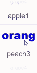
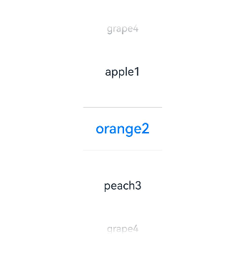
Example 2: Setting the Text Style
This example demonstrates how to configure disappearTextStyle, textStyle, and selectedTextStyle to customize the text style in a text picker.
// xxx.ets
@Entry
@Component
struct TextPickerExample {
  private select: number = 1
  private fruits: string[] = ['apple1', 'orange2', 'peach3', 'grape4']

  build() {
    Column() {
      TextPicker({
        range: this.fruits,
        selected: this.select,
        value: this.fruits[this.select]
      })
        .onChange((value: string|string[], index: number|number[]) => {
          console.info('Picker item changed, value: ' + value + ', index: ' + index)
        })
        .onScrollStop((value: string|string[], index: number|number[]) => {
          console.info('Picker scroll stopped, value: ' + value + ', index: ' + index)
        })
        .disappearTextStyle({ color: Color.Red, font: { size: 15, weight: FontWeight.Lighter } })
        .textStyle({ color: Color.Black, font: { size: 20, weight: FontWeight.Normal } })
        .selectedTextStyle({ color: Color.Blue, font: { size: 30, weight: FontWeight.Bolder } })
        .defaultPickerItemHeight(50)
        .canLoop(false)
        .selectedIndex(2)
    }.width('100%').height('100%')
  }
}
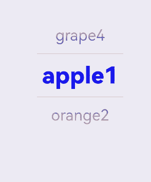
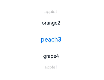
Example 3: Using the No-Divider Style
This example demonstrates how to configure a text picker with no divider by setting divider to null.
// xxx.ets
@Entry
@Component
struct TextPickerExample {
  private select: number = 1
  private fruits: string[] = ['apple1', 'orange2', 'peach3', 'grape4']

  build() {
    Column() {
      TextPicker({ range: this.fruits, selected: this.select })
        .onChange((value: string|string[], index: number|number[]) => {
          console.info('Picker item changed, value: ' + value + ', index: ' + index)
        })
        .onScrollStop((value: string|string[], index: number|number[]) => {
          console.info('Picker scroll stopped, value: ' + value + ', index: ' + index)
        })
        .disappearTextStyle({color: Color.Red, font: {size: 15, weight: FontWeight.Lighter}})
        .textStyle({color: Color.Black, font: {size: 20, weight: FontWeight.Normal}})
        .selectedTextStyle({color: Color.Blue, font: {size: 30, weight: FontWeight.Bolder}})
        .divider(null)
    }.width('100%').height('100%')
  }
}
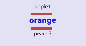
Example 4: Using the Divider Style
This example demonstrates how to configure a text picker with a custom divider style by setting divider with DividerOptions.
// xxx.ets
@Entry
@Component
struct TextPickerExample {
  private select: number = 1
  private fruits: string[] = ['apple1', 'orange2', 'peach3', 'grape4']

  build() {
    Column() {
      TextPicker({ range: this.fruits, selected: this.select })
        .onChange((value: string|string[], index: number|number[]) => {
          console.info('Picker item changed, value: ' + value + ', index: ' + index)
        })
        .onScrollStop((value: string|string[], index: number|number[]) => {
          console.info('Picker scroll stopped, value: ' + value + ', index: ' + index)
        })
        .disappearTextStyle({color: Color.Red, font: {size: 15, weight: FontWeight.Lighter}})
        .textStyle({color: Color.Black, font: {size: 20, weight: FontWeight.Normal}})
        .selectedTextStyle({color: Color.Blue, font: {size: 30, weight: FontWeight.Bolder}})
        .divider({
          strokeWidth: 10,
          color: Color.Red,
          startMargin: 10,
          endMargin: 20
        } as DividerOptions)
    }.width('100%').height('100%')
  }
}
Example 5: Setting the Fade Effect
This example demonstrates how to customize the height of the fade effect in a text picker using gradientHeight.
// xxx.ets
@Entry
@Component
struct TextPickerExample {
  private select: number = 1
  private fruits: string[] = ['apple1', 'orange2', 'peach3', 'grape4']

  build() {
    Column() {
      TextPicker({ range: this.fruits, selected: this.select })
        .onChange((value: string|string[], index: number|number[]) => {
          console.info('Picker item changed, value: ' + value + ', index: ' + index)
        })
        .onScrollStop((value: string|string[], index: number|number[]) => {
          console.info('Picker scroll stopped, value: ' + value + ', index: ' + index)
        })
        .disappearTextStyle({color: Color.Red, font: {size: 15, weight: FontWeight.Lighter}})
        .textStyle({color: Color.Black, font: {size: 20, weight: FontWeight.Normal}})
        .selectedTextStyle({color: Color.Blue, font: {size: 30, weight: FontWeight.Bolder}})
        .gradientHeight(100)
    }.width('100%').height('100%')
  }
}
Example 6: Setting the Item Height
This example demonstrates how to set the height of the picker items using defaultPickerItemHeight.
// xxx.ets
@Entry
@Component
struct TextPickerExample {
  private select: number = 1
  private fruits: string[] = ['apple1', 'orange2', 'peach3', 'grape4']

  build() {
    Column() {
      TextPicker({ range: this.fruits, selected: this.select })
        .defaultPickerItemHeight(60)
        .onChange((value: string|string[], index: number|number[]) => {
          console.info('Picker item changed, value: ' + value + ', index: ' + index)
        })
        .onScrollStop((value: string|string[], index: number|number[]) => {
          console.info('Picker scroll stopped, value: ' + value + ', index: ' + index)
        })
    }.width('100%').height('100%')
  }
}
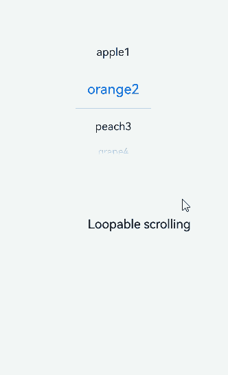
Example 7: Setting Loopable Scrolling
This example demonstrates how to set whether scrolling is loopable in a text picker using canLoop.
// xxx.ets
@Entry
@Component
struct TextPickerExample {
  @State isLoop: boolean = false
  private select: number = 1
  private fruits: string[] = ['apple1', 'orange2', 'peach3', 'grape4']

  build() {
    Column() {
      TextPicker({ range: this.fruits, selected: this.select })
        .onChange((value: string|string[], index: number|number[]) => {
          console.info('Picker item changed, value: ' + value + ', index: ' + index)
        })
        .onScrollStop((value: string|string[], index: number|number[]) => {
          console.info('Picker scroll stopped, value: ' + value + ', index: ' + index)
        })
        .canLoop(this.isLoop)

      Row() {
        Text('Loopable scrolling').fontSize(20)

        Toggle({ type: ToggleType.Switch, isOn: false })
          .onChange((isOn: boolean) => {
            this.isLoop = isOn
          })
      }.position({ x: '60%', y: '40%' })

    }.width('100%')
  }
}
Example 8: Setting the Selected Item Index
This example demonstrates how to set the index of the default selected item using selectedIndex.
// xxx.ets
@Entry
@Component
struct TextPickerExample {
  private fruits: string[] = ['apple1', 'orange2', 'peach3', 'grape4']

  build() {
    Column() {
      TextPicker({ range: this.fruits, selected: 1 })
        .selectedIndex(2)
        .onChange((value: string|string[], index: number|number[]) => {
          console.info('Picker item changed, value: ' + value + ', index: ' + index)
        })
        .onScrollStop((value: string|string[], index: number|number[]) => {
          console.info('Picker scroll stopped, value: ' + value + ', index: ' + index)
        })
    }.width('100%').height('100%')
  }
}
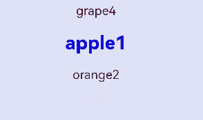
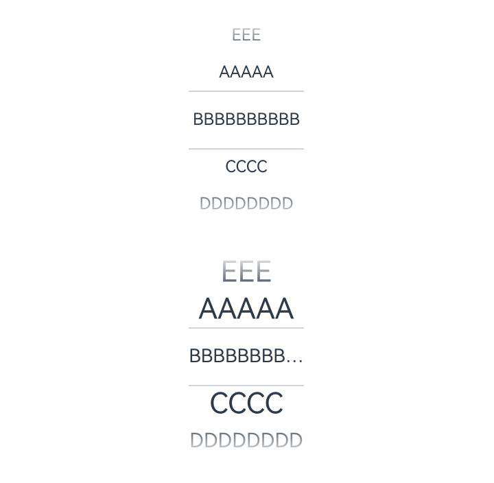
Example 9: Disabling the Text Style Animation and Setting the Corresponding Text Style
This example demonstrates how to disable the text style animation and set the corresponding text style using disableTextStyleAnimation and defaultTextStyle.
// xxx.ets
@Entry
@Component
struct TextPickerExample {
  private select: number = 1
  private fruits: string[] = ['AAAAA', 'BBBBBBBBBBBBB', 'CCCC', 'DDDDDDDD', 'EEE']

  build() {
    Column() {
      TextPicker({
        range: this.fruits,
        selected: this.select,
        value: this.fruits[this.select]
      })
        .disableTextStyleAnimation(true)
        .margin({ bottom: 30 })
      TextPicker({
        range: this.fruits,
        selected: this.select,
        value: this.fruits[this.select]
      })
        .disableTextStyleAnimation(true)
        .defaultTextStyle({ minFontSize: 18, maxFontSize: 28, overflow: TextOverflow.Ellipsis })
    }.width('100%').height('100%')
  }
}
你可能感兴趣的鸿蒙文章
- 所属分类: 后端技术
- 本文标签:
热门推荐
-
2、 优质文章
-
3、 gt
-
7、 openharmony
-
9、 golang
-
10、 Vue中input框自动聚焦