harmony 鸿蒙TextTimer
TextTimer
The TextTimer component displays timing information and is controlled in text format.
The time updates stop when the component is invisible. The component’s visibility is determined by the value of ratios in the onVisibleAreaChange event callback: If the value is greater than 0, the component is visible.
NOTE
This component is supported since API version 8. Updates will be marked with a superscript to indicate their earliest API version.
Child Components
Not supported
APIs
TextTimer(options?: TextTimerOptions)
Widget capability: Since API version 10, this API is supported in ArkTS widgets.
Atomic service API: This API can be used in atomic services since API version 11.
System capability: SystemCapability.ArkUI.ArkUI.Full
Parameters
| Name | Type | Mandatory | Description |
|---|---|---|---|
| options | TextTimerOptions | No | Parameters of the TextTimer component. |
TextTimerOptions
Widget capability: Since API version 10, this API is supported in ArkTS widgets.
Atomic service API: This API can be used in atomic services since API version 11.
System capability: SystemCapability.ArkUI.ArkUI.Full
| Name | Type | Mandatory | Description |
|---|---|---|---|
| isCountDown | boolean | No | Whether the timer is a countdown. The value true means that the timer counts down (for example, from 30 seconds to 0 seconds), and false means that the timer counts up (for example, from 0 seconds to 30 seconds). Default value: false |
| count | number | No | Timer duration, in milliseconds. It is effective only when isCountDown is true. The maximum value is 86400000 ms (24 hours). If 0 < count < 86400000, count is the initial value of the timer. Otherwise, the default value is used as the initial value. Default value: 60000 |
| controller | TextTimerController | No | TextTimer controller. |
Attributes
In addition to the universal attributes, the following attributes are supported.
format
format(value: string)
Sets the custom format. The value must contain at least one of the following keywords: HH, mm, ss, and SS. If the specified date format is yy, MM, or dd, the default value is used instead.
Widget capability: Since API version 10, this API is supported in ArkTS widgets.
Atomic service API: This API can be used in atomic services since API version 11.
System capability: SystemCapability.ArkUI.ArkUI.Full
Parameters
| Name | Type | Mandatory | Description |
|---|---|---|---|
| value | string | Yes | Custom format Default value: ‘HH:mm:ss.SS’ |
fontColor
fontColor(value: ResourceColor)
Sets the font color.
Widget capability: Since API version 10, this API is supported in ArkTS widgets.
Atomic service API: This API can be used in atomic services since API version 11.
System capability: SystemCapability.ArkUI.ArkUI.Full
Parameters
| Name | Type | Mandatory | Description |
|---|---|---|---|
| value | ResourceColor | Yes | Font color. |
fontSize
fontSize(value: Length)
Sets the font size.
Widget capability: Since API version 10, this API is supported in ArkTS widgets.
Atomic service API: This API can be used in atomic services since API version 11.
System capability: SystemCapability.ArkUI.ArkUI.Full
Parameters
| Name | Type | Mandatory | Description |
|---|---|---|---|
| value | Length | Yes | Font size. If fontSize is of the number type, the unit fp is used. The default font size is 16 fp. The value cannot be a percentage. |
fontStyle
fontStyle(value: FontStyle)
Sets the font style.
Widget capability: Since API version 10, this API is supported in ArkTS widgets.
Atomic service API: This API can be used in atomic services since API version 11.
System capability: SystemCapability.ArkUI.ArkUI.Full
Parameters
| Name | Type | Mandatory | Description |
|---|---|---|---|
| value | FontStyle | Yes | Font style. Default value: FontStyle.Normal |
fontWeight
fontWeight(value: number|FontWeight|string)
Sets the font weight. If the value is too large, the text may be clipped depending on the font.
Widget capability: Since API version 10, this API is supported in ArkTS widgets.
Atomic service API: This API can be used in atomic services since API version 11.
System capability: SystemCapability.ArkUI.ArkUI.Full
Parameters
| Name | Type | Mandatory | Description |
|---|---|---|---|
| value | number |FontWeight |string | Yes | Font weight. For the number type, the value range is [100, 900], at an interval of 100. The default value is 400. A larger value indicates a heavier font weight. For the string type, only strings that represent a number, for example, 400, and the following enumerated values of FontWeight are supported: bold, bolder, lighter, regular, and medium. Default value: FontWeight.Normal |
fontFamily
fontFamily(value: ResourceStr)
Sets the font family.
Widget capability: Since API version 10, this API is supported in ArkTS widgets.
Atomic service API: This API can be used in atomic services since API version 11.
System capability: SystemCapability.ArkUI.ArkUI.Full
Parameters
| Name | Type | Mandatory | Description |
|---|---|---|---|
| value | ResourceStr | Yes | Font family. Default font: ‘HarmonyOS Sans’ The ‘HarmonyOS Sans’ font and registered custom fonts are supported for applications. Only the ‘HarmonyOS Sans’ font is supported for widgets. |
textShadow11+
textShadow(value: ShadowOptions|Array<ShadowOptions>)
Sets the text shadow. It supports input parameters in an array to implement multiple text shadows. This API does not work with the fill attribute or coloring strategy.
Atomic service API: This API can be used in atomic services since API version 12.
System capability: SystemCapability.ArkUI.ArkUI.Full
Parameters
| Name | Type | Mandatory | Description |
|---|---|---|---|
| value | ShadowOptions |Array<ShadowOptions> | Yes | Text shadow. |
contentModifier12+
contentModifier(modifier: ContentModifier<TextTimerConfiguration>)
Creates a content modifier.
Atomic service API: This API can be used in atomic services since API version 12.
System capability: SystemCapability.ArkUI.ArkUI.Full
Parameters
| Name | Type | Mandatory | Description |
|---|---|---|---|
| modifier | ContentModifier<TextTimerConfiguration> | Yes | Content modifier to apply to the TextTimer component. modifier: content modifier. You need a custom class to implement the ContentModifier API. |
Events
onTimer
onTimer(event: (utc: number, elapsedTime: number) => void)
Triggered when the time text changes. This event is not triggered when the screen is locked or the application is running in the background. When high-precision formats (such as SSS or SS) are used, the callback interval may vary.
Widget capability: Since API version 10, this API is supported in ArkTS widgets.
Atomic service API: This API can be used in atomic services since API version 11.
System capability: SystemCapability.ArkUI.ArkUI.Full
Parameters
| Name | Type | Mandatory | Description |
|---|---|---|---|
| utc | number | Yes | Linux timestamp, which is the amount of time that has elapsed since January 1, 1970, in the minimum unit of the format. |
| elapsedTime | number | Yes | Elapsed time of the timer, in the minimum unit of the format. |
TextTimerController
Implements a controller for controlling the TextTimer component. A TextTimer component can only be bound to one controller, and the relevant commands can only be called after the component has been created.
Widget capability: Since API version 10, this API is supported in ArkTS widgets.
Atomic service API: This API can be used in atomic services since API version 11.
Objects to Import
textTimerController: TextTimerController = new TextTimerController()
constructor
constructor()
A constructor used to create a TextTimerController object.
Widget capability: Since API version 10, this API is supported in ArkTS widgets.
Atomic service API: This API can be used in atomic services since API version 11.
System capability: SystemCapability.ArkUI.ArkUI.Full
start
start()
Starts the timer.
Widget capability: Since API version 10, this API is supported in ArkTS widgets.
Atomic service API: This API can be used in atomic services since API version 11.
System capability: SystemCapability.ArkUI.ArkUI.Full
pause
pause()
Pauses the timer.
Widget capability: Since API version 10, this API is supported in ArkTS widgets.
Atomic service API: This API can be used in atomic services since API version 11.
System capability: SystemCapability.ArkUI.ArkUI.Full
reset
reset()
Resets the timer.
Widget capability: Since API version 10, this API is supported in ArkTS widgets.
Atomic service API: This API can be used in atomic services since API version 11.
System capability: SystemCapability.ArkUI.ArkUI.Full
TextTimerConfiguration12+
You need a custom class to implement the ContentModifier API.
Atomic service API: This API can be used in atomic services since API version 12.
System capability: SystemCapability.ArkUI.ArkUI.Full
| Name | Type | Mandatory | Description |
|---|---|---|---|
| count | number | Yes | Timer duration, in milliseconds. It is effective only when isCountDown is true. The maximum value is 86400000 ms (24 hours). If the value is between 0 and 86,400,000, it is used as the initial countdown time. Otherwise, the default value is used as the initial countdown time. Default value: 60000 |
| isCountDown | boolean | Yes | Whether the timer is a countdown. The value true means that the timer counts down (for example, from 30 seconds to 0 seconds), and false means that the timer counts up (for example, from 0 seconds to 30 seconds). Default value: false |
| started | boolean | Yes | Whether the timer has already started. |
| elapsedTime | number | Yes | Elapsed time of the timer, in the minimum unit of the format. |
Example
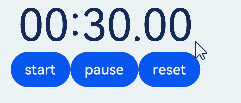
Example 1: Implementing a Text Timer with Start, Pause, and Reset Buttons
This example demonstrates the basic usage of the TextTimer component, setting the timer display format using the format attribute.
Users can start, pause, and reset the timer by clicking the start, pause, and reset buttons.
// xxx.ets
@Entry
@Component
struct TextTimerExample {
  textTimerController: TextTimerController = new TextTimerController()
  @State format: string = 'mm:ss.SS'

  build() {
    Column() {
      TextTimer({ isCountDown: true, count: 30000, controller: this.textTimerController })
        .format(this.format)
        .fontColor(Color.Black)
        .fontSize(50)
        .onTimer((utc: number, elapsedTime: number) => {
          console.info('textTimer notCountDown utc is: ' + utc + ', elapsedTime: ' + elapsedTime)
        })
      Row() {
        Button("start").onClick(() => {
          this.textTimerController.start()
        })
        Button("pause").onClick(() => {
          this.textTimerController.pause()
        })
        Button("reset").onClick(() => {
          this.textTimerController.reset()
        })
      }
    }
  }
}
Example 2: Setting the Text Shadow Style
This example shows how to set the text shadow style for the timer using the textShadow attribute.
// xxx.ets
@Entry
@Component
struct TextTimerExample {
  @State textShadows: ShadowOptions|Array<ShadowOptions> = [{
    radius: 10,
    color: Color.Red,
    offsetX: 10,
    offsetY: 0
  }, {
    radius: 10,
    color: Color.Black,
    offsetX: 20,
    offsetY: 0
  }, {
    radius: 10,
    color: Color.Brown,
    offsetX: 30,
    offsetY: 0
  }, {
    radius: 10,
    color: Color.Green,
    offsetX: 40,
    offsetY: 0
  }, {
    radius: 10,
    color: Color.Yellow,
    offsetX: 100,
    offsetY: 0
  }]

  build() {
    Column({ space: 8 }) {
      TextTimer().fontSize(50).textShadow(this.textShadows)
    }
  }
}

Example 3: Configuring the Custom Content Area
This example showcases two simple TextTimer components set against a light gray background. Once the timers are activated, they display the time progression in real-time. When the countdown timer starts, the background turns black; when the count-up timer starts, the background turns gray.
// xxx.ets
class MyTextTimerModifier implements ContentModifier<TextTimerConfiguration> {
  constructor() {
  }

  applyContent(): WrappedBuilder<[TextTimerConfiguration]> {
    return wrapBuilder(buildTextTimer)
  }
}

@Builder
function buildTextTimer(config: TextTimerConfiguration) {
  Column() {
    Stack({ alignContent: Alignment.Center }) {
      Circle({ width: 150, height: 150 })
        .fill(config.started ? (config.isCountDown ? 0xFF232323 : 0xFF717171) : 0xFF929292)
      Column() {
        Text(config.isCountDown ? "Countdown" : "Count-up").fontColor(Color.White)
        Text(
          (config.isCountDown ? "Remaining" : "Elapsed") + (config.isCountDown ?
            (Math.max(config.count / 1000 - config.elapsedTime / 100, 0)).toFixed(1) + "/" +
            (config.count / 1000).toFixed(0)
            : ((config.elapsedTime / 100).toFixed(0))
          ) + "s"
        ).fontColor(Color.White)
      }
    }
  }
}

@Entry
@Component
struct Index {
  @State count: number = 10000
  @State myTimerModifier: MyTextTimerModifier = new MyTextTimerModifier()
  countDownTextTimerController: TextTimerController = new TextTimerController()
  countUpTextTimerController: TextTimerController = new TextTimerController()

  build() {
    Row() {
      Column() {
        TextTimer({ isCountDown: true, count: this.count, controller: this.countDownTextTimerController })
          .contentModifier(this.myTimerModifier)
          .onTimer((utc: number, elapsedTime: number) => {
            console.info('textTimer onTimer utc is:' + utc + ', elapsedTime: ' + elapsedTime)
          })
          .margin(10)
        TextTimer({ isCountDown: false, controller: this.countUpTextTimerController })
          .contentModifier(this.myTimerModifier)
          .onTimer((utc: number, elapsedTime: number) => {
            console.info('textTimer onTimer utc is:' + utc + ', elapsedTime: ' + elapsedTime)
          })
        Row() {
          Button("start").onClick(() => {
            this.countDownTextTimerController.start()
            this.countUpTextTimerController.start()
          }).margin(10)
          Button("pause").onClick(() => {
            this.countDownTextTimerController.pause()
            this.countUpTextTimerController.pause()
          }).margin(10)
          Button("reset").onClick(() => {
            this.countDownTextTimerController.reset()
            this.countUpTextTimerController.reset()
          }).margin(10)
        }.margin(20)
      }.width('100%')
    }.height('100%')
  }
}
Example 4: Enabling the Timer to Start Immediately After Creation
This example demonstrates how to start the TextTimer immediately after it is created.
// xxx.ets
@Entry
@Component
struct TextTimerStart {
  textTimerController: TextTimerController = new TextTimerController()
  @State format: string = 'mm:ss.SS'

  build() {
    Column() {
      Scroll()
        .height('20%')
      TextTimer({ isCountDown: true, count: 30000, controller: this.textTimerController })
        .format(this.format)
        .fontColor(Color.Black)
        .fontSize(50)
        .onTimer((utc: number, elapsedTime: number) => {
          console.info('textTimer notCountDown utc is: ' + utc + ', elapsedTime: ' + elapsedTime)
        })
        .onAppear(() => {
          this.textTimerController.start()
        })
    }
  }
}
你可能感兴趣的鸿蒙文章
- 所属分类: 后端技术
- 本文标签:
热门推荐
-
2、 优质文章
-
3、 gt
-
7、 openharmony
-
9、 golang
-
10、 Vue中input框自动聚焦