harmony 鸿蒙WithTheme
WithTheme
The WithTheme component is designed to customize the theme style for a specific part of an application page. It allows for the setting of light and dark modes for child components, as well as the use of custom color schemes.
NOTE
This component is supported since API version 12. Updates will be marked with a superscript to indicate their earliest API version.
Child Components
This component supports only one child component.
APIs
WithTheme(options: WithThemeOptions)
Atomic service API: This API can be used in atomic services since API version 12.
System capability: SystemCapability.ArkUI.ArkUI.Full
Parameters
| Name | Type | Mandatory | Description |
|---|---|---|---|
| options | WithThemeOptions | Yes | Color scheme for components within the scope. |
Attributes
The universal attributes are not supported.
Events
The universal events are not supported.
WithThemeOptions
Defines the default theme and color mode for components within the WithTheme scope.
Atomic service API: This API can be used in atomic services since API version 12.
System capability: SystemCapability.ArkUI.ArkUI.Full
| Name | Type | Mandatory | Description |
|---|---|---|---|
| theme | CustomTheme | No | Default theme for components in the WithTheme scope. Default value: undefined, indicating that the styles will follow the system’s default theme. |
| colorMode | ThemeColorMode | No | Color mode for components in the WithTheme scope. Default value: ThemeColorMode.System |
CustomTheme
type CustomTheme = CustomTheme
Defines a custom theme.
Atomic service API: This API can be used in atomic services since API version 12.
System capability: SystemCapability.ArkUI.ArkUI.Full
| Type | Description |
|---|---|
| CustomTheme | Default theme for components in the WithTheme scope. |
ThemeColorMode10+
Atomic service API: This API can be used in atomic services since API version 11.
System capability: SystemCapability.ArkUI.ArkUI.Full
| Name | Description |
|---|---|
| SYSTEM | System color mode. |
| LIGHT | Light color mode. |
| DARK | Dark color mode. |
Example
This example demonstrates how to use WithTheme to set the color mode, which is effective only when a dark.json resource file is included.
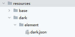
Example of the dark.json file content:
    {
      "color": [
        {
          "name": "start_window_background",
          "value": "#FFFFFF"
        }
      ]
    }
// Specify the local color mode.
@Entry
@Component
struct Index {
build() {
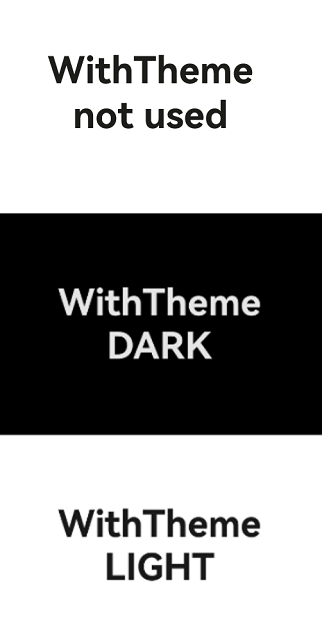
Column() {
// System default
Column() {
Text('WithTheme not used')
.fontSize(40)
.fontWeight(FontWeight.Bold)
}
.justifyContent(FlexAlign.Center)
.width('100%')
.height('33%')
.backgroundColor($r('sys.color.background_primary'))
// Set the component to the dark mode.
WithTheme({ colorMode: ThemeColorMode.DARK }) {
Column() {
Text('WithTheme')
.fontSize(40)
.fontWeight(FontWeight.Bold)
Text('DARK')
.fontSize(40)
.fontWeight(FontWeight.Bold)
}
.justifyContent(FlexAlign.Center)
.width('100%')
.height('33%')
.backgroundColor($r('sys.color.background_primary'))
}
// Set the component to the light mode.
WithTheme({ colorMode: ThemeColorMode.LIGHT }) {
Column() {
Text('WithTheme')
.fontSize(40)
.fontWeight(FontWeight.Bold)
Text('LIGHT')
.fontSize(40)
.fontWeight(FontWeight.Bold)
}
.justifyContent(FlexAlign.Center)
.width('100%')
.height('33%')
.backgroundColor($r('sys.color.background_primary'))
}
}
.height('100%')
.expandSafeArea([SafeAreaType.SYSTEM], [SafeAreaEdge.TOP, SafeAreaEdge.END, SafeAreaEdge.BOTTOM, SafeAreaEdge.START])
}
}
// Customize the default theme for components in the WithTheme scope.
import { CustomTheme, CustomColors } from '@kit.ArkUI';

class GreenColors implements CustomColors {
  fontPrimary = '#ff049404';
  fontEmphasize = '#FF00541F';
  fontOnPrimary = '#FFFFFFFF';
  compBackgroundTertiary = '#1111FF11';
  backgroundEmphasize = '#FF00541F';
  compEmphasizeSecondary = '#3322FF22';
}

class RedColors implements CustomColors {
  fontPrimary = '#fff32b3c';
  fontEmphasize = '#FFD53032';
  fontOnPrimary = '#FFFFFFFF';
  compBackgroundTertiary = '#44FF2222';
  backgroundEmphasize = '#FFD00000';
  compEmphasizeSecondary = '#33FF1111';
}

class PageCustomTheme implements CustomTheme {
  colors?: CustomColors

  constructor(colors: CustomColors) {
    this.colors = colors
  }
}

@Entry
@Component
struct IndexPage {
  static readonly themeCount = 3;
  themeNames: string[] = ['System', 'Custom (green)', 'Custom (red)'];
  themeArray: (CustomTheme|undefined)[] = [
    undefined, // System
    new PageCustomTheme(new GreenColors()),
    new PageCustomTheme(new RedColors())
  ]
  @State themeIndex: number = 0;

  build() {
    Column() {
      Column({ space: '8vp' }) {
        Text('WithTheme not used')
        // Click the button to change the theme.
        Button(`Switch Theme: ${this.themeNames[this.themeIndex]}`)
          .onClick(() => {
            this.themeIndex = (this.themeIndex + 1) % IndexPage.themeCount;
          })

        // Default button color
        Button('Button.style(NORMAL) with System Theme')
          .buttonStyle(ButtonStyleMode.NORMAL)
        Button('Button.style(EMP..ED) with System Theme')
          .buttonStyle(ButtonStyleMode.EMPHASIZED)
        Button('Button.style(TEXTUAL) with System Theme')
          .buttonStyle(ButtonStyleMode.TEXTUAL)
      }
      .margin({
        top: '50vp'
      })

      WithTheme({ theme: this.themeArray[this.themeIndex] }) {
        // WithTheme scope
        Column({ space: '8vp' }) {
          Text('WithTheme used')
          Button('Button.style(NORMAL) with Custom Theme')
            .buttonStyle(ButtonStyleMode.NORMAL)
          Button('Button.style(EMP..ED) with Custom Theme')
            .buttonStyle(ButtonStyleMode.EMPHASIZED)
          Button('Button.style(TEXTUAL) with Custom Theme')
            .buttonStyle(ButtonStyleMode.TEXTUAL)
        }
        .width('100%')
      }
    }
  }
}
你可能感兴趣的鸿蒙文章
- 所属分类: 后端技术
- 本文标签:
热门推荐
-
2、 优质文章
-
3、 gt
-
7、 openharmony
-
9、 golang
-
10、 Vue中input框自动聚焦