harmony 鸿蒙WaterFlow
WaterFlow
The WaterFlow component is a water flow container that consists of cells formed by rows and columns and arranges items of different sizes from top to bottom according to the preset rules.
NOTE
This component is supported since API version 9. Updates will be marked with a superscript to indicate their earliest API version.
Child Components
Only the FlowItem child component is allowed, with support for if/else, ForEach, LazyForEach, and Repeat rendering control.
NOTE
When its visibility attribute is set to None, a FlowItem is not displayed in the container, but its columnsGap, rowsGap, and margin settings are still effective.
APIs
WaterFlow(options?: WaterFlowOptions)
Creates a WaterFlow component.
Atomic service API: This API can be used in atomic services since API version 11.
System capability: SystemCapability.ArkUI.ArkUI.Full
Parameters
| Name | Type | Mandatory | Description |
|---|---|---|---|
| options | WaterFlowOptions | No | Parameters of the WaterFlow component. |
WaterFlowOptions
Provides parameters of the WaterFlow component.
System capability: SystemCapability.ArkUI.ArkUI.Full
| Name | Type | Mandatory | Description |
|---|---|---|---|
| footer | CustomBuilder | No | Footer of the WaterFlow component. Atomic service API: This API can be used in atomic services since API version 11. |
| footerContent18+ | ComponentContent | No | Footer of the WaterFlow component. This parameter has a higher priority than footer. If both footer and footerContent are set, the component set by footerContent will be used. Atomic service API: This API can be used in atomic services since API version 18. |
| scroller | Scroller | No | Controller of the scrollable component, bound to the scrollable component. NOTE The scroller cannot be bound to other scrollable components, such as ArcList, List, Grid, or Scroll. Atomic service API: This API can be used in atomic services since API version 11. |
| sections12+ | WaterFlowSections | No | Water flow item sections. Different sections can have different numbers of columns. NOTE 1. When sections is used, the columnsTemplate and rowsTemplate attributes are ignored. 2. When sections is used, the footer cannot be set separately. The last section can function as the footer. Atomic service API: This API can be used in atomic services since API version 12. |
| layoutMode12+ | WaterFlowLayoutMode | No | Layout mode of the WaterFlow component. NOTE Default value: ALWAYS_TOP_DOWN Atomic service API: This API can be used in atomic services since API version 12. |
WaterFlowSections12+
Describes the water flow item sections.
NOTE
After the section information is modified using splice, push, and update, ensure that the total number of child nodes in all sections matches the actual total number of child nodes in the WaterFlow component. Any failure to do so may result in layout issues that prevent the WaterFlow component from scrolling properly.
constructor
constructor()
A constructor used to create a WaterFlowSections object.
Atomic service API: This API can be used in atomic services since API version 12.
System capability: SystemCapability.ArkUI.ArkUI.Full
splice12+
splice(start: number, deleteCount?: number, sections?: Array<SectionOptions>): boolean
Changes sections by removing or replacing an existing section and/or adding a section.
Atomic service API: This API can be used in atomic services since API version 12.
System capability: SystemCapability.ArkUI.ArkUI.Full
Parameters
| Name | Type | Mandatory | Description |
|---|---|---|---|
| start | number | Yes | Zero-based index at which the changing starts. The value is converted to an integer. NOTE 1. A negative index counts back from the end of the section list. If -WaterFlowSections.length() <= start < 0, start + array.length is used. 2. If start < -WaterFlowSections.length(), 0 is used. 3. If start >= WaterFlowSections.length(), a new section is added at the end. |
| deleteCount | number | No | Number of sections to be deleted from the position specified by start. NOTE 1. If deleteCount is omitted, or if its value is greater than or equal to the number of sections from the position specified by start to the end of the WaterFlowSections, then all sections from the position specified by start to the end of the WaterFlowSections will be deleted. 2. If deleteCount is 0 or a negative number, no sections are deleted. |
| sections | Array<SectionOptions> | No | Sections to add to the section list, beginning from the position specified by start. If no section is specified, splice() will only delete sections from the WaterFlow component. |
Return value
| Type | Description |
|---|---|
| boolean | Whether the changing is successful. If the value of itemsCount in any section to add is not a positive integer, false is returned. |
push12+
push(section: SectionOptions): boolean
Adds the specified sections to the end of the WaterFlow component.
Atomic service API: This API can be used in atomic services since API version 12.
System capability: SystemCapability.ArkUI.ArkUI.Full
Parameters
| Name | Type | Mandatory | Description |
|---|---|---|---|
| section | SectionOptions | Yes | Sections to add to the end of the WaterFlow component. |
Return value
| Type | Description |
|---|---|
| boolean | Whether the adding is successful. If the value of itemsCount in any section to add is not a positive integer, false is returned. |
update12+
update(sectionIndex: number, section: SectionOptions): boolean
Updates the configuration of a specified water flow item section.
Atomic service API: This API can be used in atomic services since API version 12.
System capability: SystemCapability.ArkUI.ArkUI.Full
Parameters
| Name | Type | Mandatory | Description |
|---|---|---|---|
| sectionIndex | number | Yes | Zero-based index of the water flow item section to update. The value is converted to an integer. NOTE 1. A negative index counts back from the end of the section list. If -WaterFlowSections.length() <= sectionIndex < 0, sectionIndex + array.length is used. 2. If sectionIndex < -WaterFlowSections.length(), 0 is used. 3. If sectionIndex >= WaterFlowSections.length(), a new section is added at the end. |
| section | SectionOptions | Yes | New section configuration. |
Return value
| Type | Description |
|---|---|
| boolean | Whether the update is successful. If the value of itemsCount in any section to add is not a positive integer, false is returned. |
values12+
values(): Array<SectionOptions>
Obtains the configuration of all sections in the WaterFlow component.
Atomic service API: This API can be used in atomic services since API version 12.
System capability: SystemCapability.ArkUI.ArkUI.Full
Return value
| Type | Description |
|---|---|
| Array<SectionOptions> | Configuration of all sections in the WaterFlow component. |
length12+
length(): number
Obtains the number of sections in the WaterFlow component.
Atomic service API: This API can be used in atomic services since API version 12.
System capability: SystemCapability.ArkUI.ArkUI.Full
Return value
| Type | Description |
|---|---|
| number | Number of sections in the WaterFlow component. |
SectionOptions12+
Describes the configuration of the water flow item section.
Atomic service API: This API can be used in atomic services since API version 12.
System capability: SystemCapability.ArkUI.ArkUI.Full
| Name | Type | Mandatory | Description |
|---|---|---|---|
| itemsCount | number | Yes | Number of water flow items in the section. The value must be a positive integer. If the splice, push, or update APIs receive a section where the itemsCount value is less than 0, these APIs will not be executed. |
| crossCount | number | No | Number of columns (in vertical layout) or rows (in horizontal layout). Default value: 1 If the value is less than 1, the default value is used. |
| columnsGap | Dimension | No | Gap between columns. If this parameter is not set, the value of columnsGap for the water flow is used. If this parameter is set to an invalid value, 0 vp is used. |
| rowsGap | Dimension | No | Gap between rows. If this parameter is not set, the value of rowsGap for the water flow is used. If this parameter is set to an invalid value, 0 vp is used. |
| margin | Margin |Dimension | No | Padding of the section. A value of the Length type specifies the margin for all the four sides. Default value: 0 Unit: vp When margin is set to a percentage, the width of the WaterFlow component is used as the base value for the top, bottom, left, and right margins. |
| onGetItemMainSizeByIndex | GetItemMainSizeByIndex | No | Callback used to obtain the main axis size, in vp, of the water flow item at a specified index during the layout process of the WaterFlow component. For a vertical WaterFlow component, this size refers to the height, and for a horizontal WaterFlow component, it refers to the width. NOTE 1. When both onGetItemMainSizeByIndex and the width or height attribute of the water flow item are used, the main axis size is determined by the return value of onGetItemMainSizeByIndex, which will override the main axis length of water flow item. 2. Using onGetItemMainSizeByIndex can improve the efficiency of jumping to a specific position or index in the WaterFlow component. Avoid mixing the use of onGetItemMainSizeByIndex with sections that do not have it set, as this can cause layout exceptions. 3. If onGetItemMainSizeByIndex returns a negative number, the height of the water flow item is 0. |
GetItemMainSizeByIndex12+
type GetItemMainSizeByIndex = (index: number) => number
Obtains the main axis size of a specified water flow item based on its index.
Atomic service API: This API can be used in atomic services since API version 12.
System capability: SystemCapability.ArkUI.ArkUI.Full
Parameters
| Name | Type | Mandatory | Description |
|---|---|---|---|
| index | number | Yes | Index of the target water flow item. Value range: [0, total number of child nodes - 1]. |
Return value
| Type | Description |
|---|---|
| number | Main axis size, in vp, of the water flow item at the specified index, which is the height for a vertical WaterFlow component and the width for a horizontal WaterFlow component. |
WaterFlowLayoutMode12+
Enumerates the layout modes of the WaterFlow component.
Atomic service API: This API can be used in atomic services since API version 12.
System capability: SystemCapability.ArkUI.ArkUI.Full
| Name | Value | Description |
|---|---|---|
| ALWAYS_TOP_DOWN | 0 | Default layout mode where water flow items are arranged from top to bottom. Items in the viewport depend on the layout of all items above them. As such, in cases of redirection or switching the number of columns, the layout of all items above the viewport must be recalculated. |
| SLIDING_WINDOW | 1 | Sliding window mode. This mode only takes into account the layout in the viewport, without depending on water flow items above the viewport. As such, in cases of redirection backward or switching the number of columns, only the water flow items within the viewport need to be laid out. This mode is recommended. NOTE 1. During a non-animated redirection to a distant location, water flow items are laid out forward or backward based on the target position. If the user then swipes back to the position prior to the redirection, the layout of the content may not be consistent with its previous state. This can lead to misalignment of the top nodes when the user swipes back to the top after the redirection. To counteract this issue, in this layout mode, the layout will be automatically adjusted after reaching the top of the viewport to ensure that the top is aligned. If there are multiple sections, adjustments will be made to the sections within the viewport when scrolling ends. 2. The total offset returned by the currentOffset API of scroller is inaccurate after a redirection or data update. This offset will be recalibrated when the user swipes back to the top. 3. If a jump action (for example, by calling scrollToIndex without animation or scrollEdge) and an input offset (such as from a swipe gesture or a scrolling animation) are both initiated within the same frame, both will be executed. 4. If the scrollToIndex API is called without animation to jump to a distant position (beyond the range of visible water flow items in the window), the total offset is calculated in the sliding window mode. |
Attributes
In addition to universal attributes and scrollable component common attributes, the following attributes are also supported.
columnsTemplate
columnsTemplate(value: string)
Sets the number of columns in the layout. If this attribute is not set, one column is used by default.
For example, ‘1fr 1fr 2fr’ indicates three columns, with the first column taking up 1⁄4 of the parent component’s full width, the second column 1⁄4, and the third column 2⁄4.
You can use columnsTemplate(‘repeat(auto-fill,track-size)’) to automatically calculate the number of columns based on the specified column width track-size. repeat and auto-fill are keywords. The units for track-size can be px, vp (default), %, or a valid number. For details, see Example 2.
Atomic service API: This API can be used in atomic services since API version 11.
System capability: SystemCapability.ArkUI.ArkUI.Full
Parameters
| Name | Type | Mandatory | Description |
|---|---|---|---|
| value | string | Yes | Number of columns in the layout. Default value: ‘1fr’ |
rowsTemplate
rowsTemplate(value: string)
Sets the number of rows in the layout. If this attribute is not set, one row is used by default.
For example, ‘1fr 1fr 2fr’ indicates three rows, with the first row taking up 1⁄4 of the parent component’s full height, the second row 1⁄4, and the third row 2⁄4.
You can use rowsTemplate(‘repeat(auto-fill,track-size)’) to automatically calculate the number of rows based on the specified row height track-size. repeat and auto-fill are keywords. The units for track-size can be px, vp (default), %, or a valid number.
Atomic service API: This API can be used in atomic services since API version 11.
System capability: SystemCapability.ArkUI.ArkUI.Full
Parameters
| Name | Type | Mandatory | Description |
|---|---|---|---|
| value | string | Yes | Number of rows in the layout. Default value: ‘1fr’ |
itemConstraintSize
itemConstraintSize(value: ConstraintSizeOptions)
Sets the size constraints of the child components during layout.
Atomic service API: This API can be used in atomic services since API version 11.
System capability: SystemCapability.ArkUI.ArkUI.Full
Parameters
| Name | Type | Mandatory | Description |
|---|---|---|---|
| value | ConstraintSizeOptions | Yes | Size constraints of the child components during layout. If the value specified is less than 0, this parameter does not take effect. NOTE 1. If both itemConstraintSize and the constraintSize attribute of the FlowItem are set, the minWidth (or minHeight) will be the larger of the two values, and the maxWidth (or maxHeight) will be the smaller of the two values. The resulting values will then be used as the constraintSize for the FlowItem. 2. When only itemConstraintSize is set, it effectively applies a uniform size constraint to all child components in the WaterFlow. 3. The itemConstraintSize attribute, once converted to the constraintSize attribute of the FlowItem through the two methods mentioned above, follows the same rules for taking effect as the universal attribute constraintSize. |
columnsGap
columnsGap(value: Length)
Sets the gap between columns.
Atomic service API: This API can be used in atomic services since API version 11.
System capability: SystemCapability.ArkUI.ArkUI.Full
Parameters
| Name | Type | Mandatory | Description |
|---|---|---|---|
| value | Length | Yes | Gap between columns. Default value: 0 Value range: [0, +∞). |
rowsGap
rowsGap(value: Length)
Sets the gap between rows.
Atomic service API: This API can be used in atomic services since API version 11.
System capability: SystemCapability.ArkUI.ArkUI.Full
Parameters
| Name | Type | Mandatory | Description |
|---|---|---|---|
| value | Length | Yes | Gap between rows. Default value: 0 Value range: [0, +∞). |
layoutDirection
layoutDirection(value: FlexDirection)
Sets the main axis direction of the layout.
Atomic service API: This API can be used in atomic services since API version 11.
System capability: SystemCapability.ArkUI.ArkUI.Full
Parameters
| Name | Type | Mandatory | Description |
|---|---|---|---|
| value | FlexDirection | Yes | Main axis direction of the layout. Default value: FlexDirection.Column |
The priority of layoutDirection is higher than that of rowsTemplate and columnsTemplate. Depending on the layoutDirection settings, there are three layout modes:
- layoutDirection is set to FlexDirection.Column or FlexDirection.ColumnReverse
In this case, columnsTemplate is valid. If it is not set, the default value is used. For example, if columnsTemplate is set to “1fr 1fr” and rowsTemplate “1fr 1fr 1fr”, child components are arranged in vertical layout, with the cross axis equally divided into two columns.
- layoutDirection set to FlexDirection.Row or FlexDirection.RowReverse
In this case, rowsTemplate is valid. If it is not set, the default value is used. For example, if columnsTemplate is set to “1fr 1fr” and rowsTemplate “1fr 1fr 1fr”, child components are arranged in horizontal layout, with the cross axis equally divided into three columns.
- layoutDirection is not set
In this case, the default value of layoutDirection is used, which is FlexDirection.Column, and columnsTemplate is valid. For example, if columnsTemplate is set to “1fr 1fr” and rowsTemplate “1fr 1fr 1fr”, child components are arranged in vertical layout, with the cross axis equally divided into two columns.
enableScrollInteraction10+
enableScrollInteraction(value: boolean)
Sets whether to support scroll gestures. When this attribute is set to false, scrolling by finger or mouse is not supported, but the scrolling controller API is not affected.
Atomic service API: This API can be used in atomic services since API version 11.
System capability: SystemCapability.ArkUI.ArkUI.Full
Parameters
| Name | Type | Mandatory | Description |
|---|---|---|---|
| value | boolean | Yes | Whether to support scroll gestures. Default value: true |
nestedScroll10+
nestedScroll(value: NestedScrollOptions)
Sets the nested scrolling mode in the forward and backward directions to implement scrolling linkage with the parent component.
Atomic service API: This API can be used in atomic services since API version 11.
System capability: SystemCapability.ArkUI.ArkUI.Full
Parameters
| Name | Type | Mandatory | Description |
|---|---|---|---|
| value | NestedScrollOptions | Yes | Nested scrolling options. |
friction10+
friction(value: number|Resource)
Sets the friction coefficient. It applies only to gestures in the scrolling area, and it affects only indirectly the scroll chaining during the inertial scrolling process.
Atomic service API: This API can be used in atomic services since API version 11.
System capability: SystemCapability.ArkUI.ArkUI.Full
Parameters
| Name | Type | Mandatory | Description |
|---|---|---|---|
| value | number |Resource | Yes | Friction coefficient. Default value: 0.9 for wearable devices and 0.6 for non-wearable devices. Since API version 11, the default value for non-wearable devices is 0.7. Since API version 12, the default value for non-wearable devices is 0.75. Value range: (0, +∞). If the value is less than or equal to 0, the default value is used. |
cachedCount11+
cachedCount(value: number)
Sets the number of items to be cached. This attribute is effective only in LazyForEach. After this attribute is set, items that exceed the display and cache range are released.
Atomic service API: This API can be used in atomic services since API version 12.
System capability: SystemCapability.ArkUI.ArkUI.Full
Parameters
| Name | Type | Mandatory | Description |
|---|---|---|---|
| value | number | Yes | Number of water flow items to be preloaded (cached). Default value: number of nodes visible on the screen, with the maximum value of 16 Value range: [0, +∞). Values less than 0 are treated as 1. |
cachedCount14+
cachedCount(count: number, show: boolean)
Sets the number of water flow items to be cached (preloaded) and specifies whether to display the cached nodes.
When this attribute is used in conjunction with the clip or content clipping attributes, the cached nodes can be displayed.
In LazyForEach and Repeat with the virtualScroll option enabled, water flow items that are outside the display and cache range will be released.
Atomic service API: This API can be used in atomic services since API version 14.
System capability: SystemCapability.ArkUI.ArkUI.Full
Parameters
| Name | Type | Mandatory | Description |
|---|---|---|---|
| count | number | Yes | Number of water flow items to be preloaded (cached). Default value: number of nodes visible on the screen, with the maximum value of 16 Value range: [0, +∞). Values less than 0 are treated as 1. |
| show | boolean | Yes | Whether to display the cached water flow items. Default value: false (the preloaded water flow items are not displayed). |
Events
In addition to universal events and scrollable component common events, the following events are also supported.
onReachStart
onReachStart(event: () => void)
Triggered when the component reaches the start.
Atomic service API: This API can be used in atomic services since API version 11.
System capability: SystemCapability.ArkUI.ArkUI.Full
onReachEnd
onReachEnd(event: () => void)
Triggered when the component reaches the end position.
Atomic service API: This API can be used in atomic services since API version 11.
System capability: SystemCapability.ArkUI.ArkUI.Full
onScrollFrameBegin10+
onScrollFrameBegin(event: (offset: number, state: ScrollState) => { offsetRemain: number; })
Triggered when the component starts to scroll. The input parameters indicate the amount by which the component will scroll. The event handler then works out the amount by which the component needs to scroll based on the real-world situation and returns the result.
This event is triggered when the user starts dragging the component or the component starts inertial scrolling. It is not triggered when the component rebounds, the scrolling controller is used, or the scrollbar is dragged.
Atomic service API: This API can be used in atomic services since API version 11.
System capability: SystemCapability.ArkUI.ArkUI.Full
Parameters
| Name | Type | Mandatory | Description |
|---|---|---|---|
| offset | number | Yes | Amount to scroll by, in vp. |
| state | ScrollState | Yes | Current scroll state. |
Return value
| Type | Description |
|---|---|
| { offsetRemain: number } | Actual amount by which the component scrolls, in vp. |
onScrollIndex11+
onScrollIndex(event: (first: number, last: number) => void)
Triggered when the first or last item displayed in the component changes. It is triggered once when the component is initialized.
This event is triggered when either of the preceding indexes changes.
Atomic service API: This API can be used in atomic services since API version 11.
System capability: SystemCapability.ArkUI.ArkUI.Full
Parameters
| Name | Type | Mandatory | Description |
|---|---|---|---|
| first | number | Yes | Index of the first item of the component. Value range: [0, total number of child nodes - 1]. |
| last | number | Yes | Index of the last item of the component. Value range: [0, total number of child nodes - 1]. |
Example
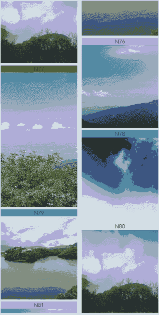
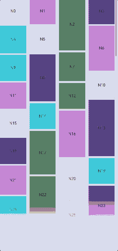
Example 1: Using a Basic WaterFlow Component
This example demonstrates the basic usage of the WaterFlow component, including data loading, attribute setting, and event callbacks.
// WaterFlowDataSource.ets

// Object that implements the IDataSource API, which is used by the WaterFlow component to load data.
export class WaterFlowDataSource implements IDataSource {
  private dataArray: number[] = [];
  private listeners: DataChangeListener[] = [];

  constructor() {
    for (let i = 0; i < 100; i++) {
      this.dataArray.push(i);
    }
  }

  // Obtain the data corresponding to the specified index.
  public getData(index: number): number {
    return this.dataArray[index];
  }

  // Notify the controller of data reloading.
  notifyDataReload(): void {
    this.listeners.forEach(listener => {
      listener.onDataReloaded();
    })
  }

  // Notify the controller of data addition.
  notifyDataAdd(index: number): void {
    this.listeners.forEach(listener => {
      listener.onDataAdd(index);
    })
  }

  // Notify the controller of data changes.
  notifyDataChange(index: number): void {
    this.listeners.forEach(listener => {
      listener.onDataChange(index);
    })
  }

  // Notify the controller of data deletion.
  notifyDataDelete(index: number): void {
    this.listeners.forEach(listener => {
      listener.onDataDelete(index);
    })
  }

  // Notify the controller of the data location change.
  notifyDataMove(from: number, to: number): void {
    this.listeners.forEach(listener => {
      listener.onDataMove(from, to);
    })
  }

  // Notify the controller of batch data modification.
  notifyDatasetChange(operations: DataOperation[]): void {
    this.listeners.forEach(listener => {
      listener.onDatasetChange(operations);
    })
  }

  // Obtain the total number of data records.
  public totalCount(): number {
    return this.dataArray.length;
  }

  // Register the data change listener.
  registerDataChangeListener(listener: DataChangeListener): void {
    if (this.listeners.indexOf(listener) < 0) {
      this.listeners.push(listener);
    }
  }

  // Unregister the data change listener.
  unregisterDataChangeListener(listener: DataChangeListener): void {
    const pos = this.listeners.indexOf(listener);
    if (pos >= 0) {
      this.listeners.splice(pos, 1);
    }
  }

  // Add data.
  public add1stItem(): void {
    this.dataArray.splice(0, 0, this.dataArray.length);
    this.notifyDataAdd(0);
  }

  // Add an item to the end of the data.
  public addLastItem(): void {
    this.dataArray.splice(this.dataArray.length, 0, this.dataArray.length);
    this.notifyDataAdd(this.dataArray.length - 1);
  }

  // Add an item to the position corresponding to the specified index.
  public addItem(index: number): void {
    this.dataArray.splice(index, 0, this.dataArray.length);
    this.notifyDataAdd(index);
  }

  // Delete the first item.
  public delete1stItem(): void {
    this.dataArray.splice(0, 1);
    this.notifyDataDelete(0);
  }

  // Delete the second item.
  public delete2ndItem(): void {
    this.dataArray.splice(1, 1);
    this.notifyDataDelete(1);
  }

  // Delete the last item.
  public deleteLastItem(): void {
    this.dataArray.splice(-1, 1);
    this.notifyDataDelete(this.dataArray.length);
  }

  // Delete an item at the specified index position.
  public deleteItem(index: number): void {
    this.dataArray.splice(index, 1);
    this.notifyDataDelete(index);
  }

  // Reload data.
  public reload(): void {
    this.dataArray.splice(1, 1);
    this.dataArray.splice(3, 2);
    this.notifyDataReload();
  }
}
// Index.ets
import { WaterFlowDataSource } from './WaterFlowDataSource';

@Entry
@Component
struct WaterFlowDemo {
  @State minSize: number = 80;
  @State maxSize: number = 180;
  @State fontSize: number = 24;
  @State colors: number[] = [0xFFC0CB, 0xDA70D6, 0x6B8E23, 0x6A5ACD, 0x00FFFF, 0x00FF7F];
  scroller: Scroller = new Scroller();
  dataSource: WaterFlowDataSource = new WaterFlowDataSource();
  private itemWidthArray: number[] = [];
  private itemHeightArray: number[] = [];

  // Calculate the width and height of a water flow item.
  getSize() {
    let ret = Math.floor(Math.random() * this.maxSize);
    return (ret > this.minSize ? ret : this.minSize);
  }

  // Set the width and height array of the water flow item.
  setItemSizeArray() {
    for (let i = 0; i < 100; i++) {
      this.itemWidthArray.push(this.getSize());
      this.itemHeightArray.push(this.getSize());
    }
  }

  aboutToAppear() {
    this.setItemSizeArray();
  }

  @Builder
  itemFoot() {
    Column() {
      Text(`Footer`)
        .fontSize(10)
        .backgroundColor(Color.Red)
        .width(50)
        .height(50)
        .align(Alignment.Center)
        .margin({ top: 2 })
    }
  }

  build() {
    Column({ space: 2 }) {
      WaterFlow() {
        LazyForEach(this.dataSource, (item: number) => {
          FlowItem() {
            Column() {
              Text("N" + item).fontSize(12).height('16')
              // The image is displayed only when there is a corresponding JPG file.
              Image('res/waterFlowTest(' + item % 5 + ').jpg')
                .objectFit(ImageFit.Fill)
                .width('100%')
                .layoutWeight(1)
            }
          }
          .onAppear(() => {
            // Add data in advance when scrolling is about to end.
            if (item + 20 == this.dataSource.totalCount()) {
              for (let i = 0; i < 100; i++) {
                this.dataSource.addLastItem();
              }
            }
          })
          .width('100%')
          .height(this.itemHeightArray[item % 100])
          .backgroundColor(this.colors[item % 5])
        }, (item: string) => item)
      }
      .columnsTemplate("1fr 1fr")
      .columnsGap(10)
      .rowsGap(5)
      .backgroundColor(0xFAEEE0)
      .width('100%')
      .height('100%')
      .onReachStart(() => {
        console.info('waterFlow reach start');
      })
      .onScrollStart(() => {
        console.info('waterFlow scroll start');
      })
      .onScrollStop(() => {
        console.info('waterFlow scroll stop');
      })
      .onScrollFrameBegin((offset: number, state: ScrollState) => {
        console.info('waterFlow scrollFrameBegin offset: ' + offset + ' state: ' + state.toString());
        return { offsetRemain: offset };
      })
    }
  }
}
Example 2: Implementing Automatic Column Count Calculation
This example showcases how to implement automatic column count calculation using the auto-fill feature.
// Index.ets
import { WaterFlowDataSource } from './WaterFlowDataSource';

@Entry
@Component
struct WaterFlowDemo {
  @State minSize: number = 80;
  @State maxSize: number = 180;
  @State colors: number[] = [0xFFC0CB, 0xDA70D6, 0x6B8E23, 0x6A5ACD, 0x00FFFF, 0x00FF7F];
  dataSource: WaterFlowDataSource = new WaterFlowDataSource();
  private itemWidthArray: number[] = [];
  private itemHeightArray: number[] = [];

  // Calculate the width and height of a water flow item.
  getSize() {
    let ret = Math.floor(Math.random() * this.maxSize);
    return (ret > this.minSize ? ret : this.minSize);
  }

  // Set the width and height array of the water flow item.
  setItemSizeArray() {
    for (let i = 0; i < 100; i++) {
      this.itemWidthArray.push(this.getSize());
      this.itemHeightArray.push(this.getSize());
    }
  }

  aboutToAppear() {
    this.setItemSizeArray();
  }

  build() {
    Column({ space: 2 }) {
      WaterFlow() {
        LazyForEach(this.dataSource, (item: number) => {
          FlowItem() {
            Column() {
              Text("N" + item).fontSize(12).height('16')
              Image('res/waterFlowTest(' + item % 5 + ').jpg')
            }
          }
          .width('100%')
          .height(this.itemHeightArray[item % 100])
          .backgroundColor(this.colors[item % 5])
        }, (item: string) => item)
      }
      .columnsTemplate('repeat(auto-fill,80)')
      .columnsGap(10)
      .rowsGap(5)
      .padding({left:5})
      .backgroundColor(0xFAEEE0)
      .width('100%')
      .height('100%')
    }
  }
}
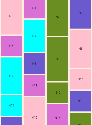
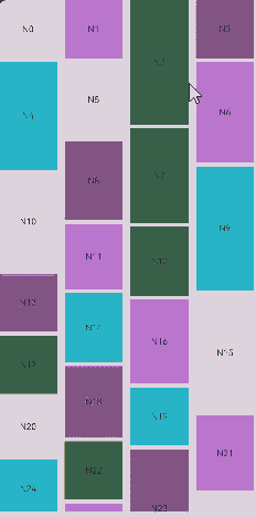
Example 3: Using WaterFlowSections
This example illustrates the initialization of WaterFlowSections and the different effects of various APIs such as splice, push, update, values, and length. For details about how to use these features in conjunction with state management V2, see WaterFlow.
// Index.ets
import { WaterFlowDataSource } from './WaterFlowDataSource';

@Reusable
@Component
struct ReusableFlowItem {
  @State item: number = 0;

  // Invoked when a reusable custom component is re-added to the component tree from the reuse cache. The component state variable can be updated here to display the correct content.
  aboutToReuse(params: Record<string, number>) {
    this.item = params.item;
    console.info('Reuse item:' + this.item);
  }

  aboutToAppear() {
    console.info('new item:' + this.item);
  }

  build() {
    Image('res/waterFlowTest(' + this.item % 5 + ').jpg')
        .overlay('N' + this.item, { align: Alignment.Top })
        .objectFit(ImageFit.Fill)
        .width('100%')
        .layoutWeight(1)
  }
}

@Entry
@Component
struct WaterFlowDemo {
  minSize: number = 80;
  maxSize: number = 180;
  fontSize: number = 24;
  colors: number[] = [0xFFC0CB, 0xDA70D6, 0x6B8E23, 0x6A5ACD, 0x00FFFF, 0x00FF7F];
  scroller: Scroller = new Scroller();
  dataSource: WaterFlowDataSource = new WaterFlowDataSource();
  dataCount: number = this.dataSource.totalCount();
  private itemHeightArray: number[] = [];
  @State sections: WaterFlowSections = new WaterFlowSections();
  sectionMargin: Margin = { top: 10, left: 5, bottom: 10, right: 5 };
  oneColumnSection: SectionOptions = {
    itemsCount: 4,
    crossCount: 1,
    columnsGap: '5vp',
    rowsGap: 10,
    margin: this.sectionMargin,
    onGetItemMainSizeByIndex: (index: number) => {
      return this.itemHeightArray[index % 100];
    }
  }
  twoColumnSection: SectionOptions = {
    itemsCount: 2,
    crossCount: 2,
    onGetItemMainSizeByIndex: (index: number) => {
      return 100;
    }
  }
  lastSection: SectionOptions = {
    itemsCount: 20,
    crossCount: 2,
    onGetItemMainSizeByIndex: (index: number) => {
      return this.itemHeightArray[index % 100];
    }
  }

  // Calculate the FlowItem height.
  getSize() {
    let ret = Math.floor(Math.random() * this.maxSize);
    return (ret > this.minSize ? ret : this.minSize);
  }

  // Set the height array for FlowItems.
  setItemSizeArray() {
    for (let i = 0; i < 100; i++) {
      this.itemHeightArray.push(this.getSize());
    }
  }

  aboutToAppear() {
    this.setItemSizeArray();
    // Initialize the water flow section information.
    let sectionOptions: SectionOptions[] = [];
    let count = 0;
    let oneOrTwo = 0;
    while (count < this.dataCount) {
      if (this.dataCount - count < 20) {
        this.lastSection.itemsCount = this.dataCount - count;
        sectionOptions.push(this.lastSection);
        break;
      }
      if (oneOrTwo++ % 2 == 0) {
        sectionOptions.push(this.oneColumnSection);
        count += this.oneColumnSection.itemsCount;
      } else {
        sectionOptions.push(this.twoColumnSection);
        count += this.twoColumnSection.itemsCount;
      }
    }
    this.sections.splice(0, 0, sectionOptions);
  }

  build() {
    Column({ space: 2 }) {
      Row() {
        Button('splice')
          .height('5%')
          .onClick(() => {
            // Replace all sections with a new section. Ensure that the number of data array items in LazyForEach is the same as the value of itemsCount of the new section.
            let totalCount: number = this.dataSource.totalCount();
            let newSection: SectionOptions = {
              itemsCount: totalCount,
              crossCount: 2,
              onGetItemMainSizeByIndex: (index: number) => {
                return this.itemHeightArray[index % 100];
              }
            }
            let oldLength: number = this.sections.length();
            this.sections.splice(0, oldLength, [newSection]);
          })
          .margin({ top: 10, left: 20 })
        Button('update')
          .height('5%')
          .onClick(() => {
            // Add four FlowItems to the second section. Ensure that the number of data array items in LazyForEach is the same as the sum of itemsCount values of all sections.
            let newSection: SectionOptions = {
              itemsCount: 6,
              crossCount: 3,
              columnsGap: 5,
              rowsGap: 10,
              margin: this.sectionMargin,
              onGetItemMainSizeByIndex: (index: number) => {
                return this.itemHeightArray[index % 100];
              }
            }
            this.dataSource.addItem(this.oneColumnSection.itemsCount);
            this.dataSource.addItem(this.oneColumnSection.itemsCount + 1);
            this.dataSource.addItem(this.oneColumnSection.itemsCount + 2);
            this.dataSource.addItem(this.oneColumnSection.itemsCount + 3);
            const result: boolean = this.sections.update(1, newSection);
            console.info('update:' + result);
          })
          .margin({ top: 10, left: 20 })
        Button('delete')
          .height('5%')
          .onClick(() => {
            // Click Update and then Delete.
            let newSection: SectionOptions = {
              itemsCount: 2,
              crossCount: 2,
              columnsGap: 5,
              rowsGap: 10,
              margin: this.sectionMargin,
              onGetItemMainSizeByIndex: (index: number) => {
                return this.itemHeightArray[index % 100];
              }
            }
            this.dataSource.deleteItem(this.oneColumnSection.itemsCount);
            this.dataSource.deleteItem(this.oneColumnSection.itemsCount);
            this.dataSource.deleteItem(this.oneColumnSection.itemsCount);
            this.dataSource.deleteItem(this.oneColumnSection.itemsCount);
            this.sections.update(1, newSection);
          })
          .margin({ top: 10, left: 20 })
        Button('values')
          .height('5%')
          .onClick(() => {
            const sections: Array<SectionOptions> = this.sections.values();
            for (const value of sections) {
              console.log(JSON.stringify(value));
            }
            console.info('count:' + this.sections.length());
          })
          .margin({ top: 10, left: 20 })
      }.margin({ bottom: 20 })

      WaterFlow({ scroller: this.scroller, sections: this.sections }) {
        LazyForEach(this.dataSource, (item: number) => {
          FlowItem() {
            ReusableFlowItem({ item: item })
          }
          .width('100%')
          // The value of onGetItemMainSizeByIndex is used.
          // .height(this.itemHeightArray[item % 100])
          .backgroundColor(this.colors[item % 5])
        }, (item: string) => item)
      }
      .columnsTemplate('1fr 1fr') // This attribute is ineffective when the sections parameter is used.
      .columnsGap(10)
      .rowsGap(5)
      .backgroundColor(0xFAEEE0)
      .width('100%')
      .height('100%')
      .layoutWeight(1)
      .onScrollIndex((first: number, last: number) => {
        // Add data in advance when scrolling is about to end.
        if (last + 20 >= this.dataSource.totalCount()) {
          for (let i = 0; i < 100; i++) {
            this.dataSource.addLastItem();
          }
          // After the data source is updated, update sections synchronously and change the number of FlowItems in the last section.
          const sections: Array<SectionOptions> = this.sections.values();
          let newSection: SectionOptions = sections[this.sections.length() - 1];
          newSection.itemsCount += 100;
          this.sections.update(-1, newSection);
        }
      })
    }
  }
}
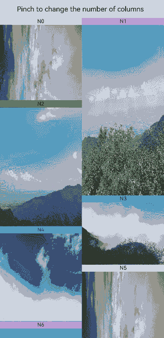
Example 4: Using the Pinch Gesture to Change the Column Count
This example demonstrates how to use priorityGesture and PinchGesture to implement the feature of using a pinch gesture to change the number of columns in a layout.
// Index.ets
import { WaterFlowDataSource } from './WaterFlowDataSource';
import { image } from '@kit.ImageKit';

@Reusable
@Component
struct ReusableFlowItem {
  @State item: number = 0;

  // Invoked when a reusable custom component is re-added to the component tree from the reuse cache. The component state variable can be updated here to display the correct content.
  aboutToReuse(params: Record<string, number>) {
    this.item = params.item;
  }

  build() {
    Column() {
      Text("N" + this.item).fontSize(12).height('16')
      Image('res/waterFlow(' + this.item % 5 + ').JPG')
        .objectFit(ImageFit.Fill)
        .width('100%')
        .layoutWeight(1)
    }
  }
}

@Entry
@Component
struct WaterFlowDemo {
  minSize: number = 80;
  maxSize: number = 180;
  colors: number[] = [0xFFC0CB, 0xDA70D6, 0x6B8E23, 0x6A5ACD, 0x00FFFF, 0x00FF7F];
  dataSource: WaterFlowDataSource = new WaterFlowDataSource(100);
  private itemWidthArray: number[] = [];
  private itemHeightArray: number[] = [];
  @State columns: number = 2;
  @State waterflowScale: number = 1;
  @State imageScale: number = 1;
  @State waterFlowOpacity: number = 1;
  @State waterflowSnapshot: image.PixelMap|undefined = undefined;
  private columnChanged: boolean = false;
  private oldColumn: number = this.columns;
  private pinchTime: number = 0;

  // Calculate the width and height of a water flow item.
  getSize() {
    let ret = Math.floor(Math.random() * this.maxSize);
    return (ret > this.minSize ? ret : this.minSize);
  }

  // Set the width and height array of the water flow item.
  setItemSizeArray() {
    for (let i = 0; i < 100; i++) {
      this.itemWidthArray.push(this.getSize());
      this.itemHeightArray.push(this.getSize());
    }
  }

  aboutToAppear() {
    // Read the last switched column count.
    let lastCount = AppStorage.get<number>('columnsCount');
    if (typeof lastCount != 'undefined') {
      this.columns = lastCount;
    }
    this.setItemSizeArray();
  }

  // Change the number of columns based on the scale threshold and trigger the WaterFlow component to re-layout.
  changeColumns(scale: number) {
    if (scale > (this.columns / (this.columns - 0.5)) && this.columns > 1) {
      this.columns--;
      this.columnChanged = true;
    } else if (scale < 1 && this.columns < 4) {
      this.columns++;
      this.columnChanged = true;
    }
  }

  build() {
    Column({ space: 2 }) {
      Row() {
        Text('Pinch to change the number of columns')
          .height('5%')
          .margin({ top: 10, left: 20 })
      }

      Stack() {
        // Display the WaterFlow snapshot before scaling.
        Image(this.waterflowSnapshot)
          .width('100%')
          .height('100%')
          .scale({
            x: this.imageScale,
            y: this.imageScale,
            centerX: 0,
            centerY: 0
          })

        WaterFlow() {
          LazyForEach(this.dataSource, (item: number) => {
            FlowItem() {
              ReusableFlowItem({ item: item })
            }
            .width('100%')
            .aspectRatio(this.itemHeightArray[item % 100] / this.itemWidthArray[item%100])
            .backgroundColor(this.colors[item % 5])
          }, (item: string) => item)
        }
        .id('waterflow') // Set the ID for capturing snapshots.
        .columnsTemplate('1fr '.repeat(this.columns))
        .backgroundColor(0xFAEEE0)
        .width('100%')
        .height('100%')
        .layoutWeight(1)
        .opacity(this.waterFlowOpacity)
        .scale({
          x: this.waterflowScale,
          y: this.waterflowScale,
          centerX: 0,
          centerY: 0
        })
        .priorityGesture(
          PinchGesture()
            .onActionStart((event: GestureEvent) => {
              // Take a snapshot when the pinch gesture is recognized.
              this.pinchTime = event.timestamp;
              this.columnChanged = false;
              this.oldColumn = this.columns;
              this.getUIContext().getComponentSnapshot().get('waterflow', (error: Error, pixmap: image.PixelMap) => {
                if (error) {
                  console.info('error:' + JSON.stringify(error));
                  return;
                }
                this.waterflowSnapshot = pixmap;
              })
            })
            .onActionUpdate((event: GestureEvent) => {
              // Limit column scaling.
              if ((this.oldColumn === 1 && event.scale > 1)||(this.oldColumn === 4 && event.scale < 1)) {
                return;
              }
              if (event.timestamp - this.pinchTime < 10000000) {
                return;
              }
              this.pinchTime = event.timestamp;

              this.waterflowScale = event.scale;
              this.imageScale = event.scale;
              // Set the WaterFlow opacity based on the scale factor.
              this.waterFlowOpacity = (this.waterflowScale > 1) ? (this.waterflowScale - 1) : (1 - this.waterflowScale);
              this.waterFlowOpacity *= 3;
              if (!this.columnChanged) {
                this.changeColumns(event.scale);
              }
              // Limit the scale factor to avoid blank areas.
              if (this.columnChanged) {
                this.waterflowScale = this.imageScale * this.columns / this.oldColumn;
                if (event.scale < 1) {
                  this.waterflowScale = this.waterflowScale > 1 ? this.waterflowScale : 1;
                } else {
                  this.waterflowScale = this.waterflowScale < 1 ? this.waterflowScale : 1;
                }
              }
            })
            .onActionEnd((event: GestureEvent) => {
              // Animate back to the original position when the finger is released.
              animateTo({ duration: 300 }, () => {
                this.waterflowScale = 1;
                this.waterFlowOpacity = 1;
              })
              // Record the current column count.
              AppStorage.setOrCreate<number>('columnsCount', this.columns);
            })
        )
      }
    }
  }
}
Example 5: Setting the Edge Fading Effect
This example demonstrates how to enable the edge fading effect for the WaterFlow component using the fadingEdge API and set the length of the fading edge using the fadingEdgeLength parameter.
// Index.ets
import { LengthMetrics } from '@kit.ArkUI';
import { WaterFlowDataSource } from './WaterFlowDataSource';

@Entry
@Component
struct WaterFlowDemo {
  @State minSize: number = 80;
  @State maxSize: number = 180;
  @State colors: number[] = [0xFFC0CB, 0xDA70D6, 0x6B8E23, 0x6A5ACD, 0x00FFFF, 0x00FF7F];
  dataSource: WaterFlowDataSource = new WaterFlowDataSource();
  scroller: Scroller = new Scroller();
  private itemWidthArray: number[] = [];
  private itemHeightArray: number[] = [];

  // Calculate the width and height of a water flow item.
  getSize() {
    let ret = Math.floor(Math.random() * this.maxSize);
    return (ret > this.minSize ? ret : this.minSize);
  }

  // Set the width and height array of the water flow item.
  setItemSizeArray() {
    for (let i = 0; i < 100; i++) {
      this.itemWidthArray.push(this.getSize());
      this.itemHeightArray.push(this.getSize());
    }
  }

  aboutToAppear() {
    this.setItemSizeArray();
  }

  build() {
    Column({ space: 2 }) {
      WaterFlow({ scroller: this.scroller }) {
        LazyForEach(this.dataSource, (item: number) => {
          FlowItem() {
            Column() {
              Text("N" + item).fontSize(12).height('16')
            }
          }
          .width('100%')
          .height(this.itemHeightArray[item % 100])
          .backgroundColor(this.colors[item % 5])
        }, (item: string) => item)
      }
      .columnsTemplate('repeat(auto-fill,80)')
      .columnsGap(10)
      .rowsGap(5)
      .height('90%')
      .scrollBar(BarState.On)
      .fadingEdge(true, { fadingEdgeLength: LengthMetrics.vp(80) })
    }
  }
}
Example 6: Setting the Single-Side Edge Effect
This example demonstrates how to set a single-side edge effect for the WaterFlow component using the edgeEffect API.
// Index.ets
import { WaterFlowDataSource } from './WaterFlowDataSource';

@Entry
@Component
struct WaterFlowDemo {
  @State minSize: number = 80;
  @State maxSize: number = 180;
  @State colors: number[] = [0xFFC0CB, 0xDA70D6, 0x6B8E23, 0x6A5ACD, 0x00FFFF, 0x00FF7F];
  dataSource: WaterFlowDataSource = new WaterFlowDataSource();
  scroller: Scroller = new Scroller();
  private itemWidthArray: number[] = [];
  private itemHeightArray: number[] = [];

  // Calculate the width and height of a water flow item.
  getSize() {
    let ret = Math.floor(Math.random() * this.maxSize);
    return (ret > this.minSize ? ret : this.minSize);
  }

  // Set the width and height array of the water flow item.
  setItemSizeArray() {
    for (let i = 0; i < 100; i++) {
      this.itemWidthArray.push(this.getSize());
      this.itemHeightArray.push(this.getSize());
    }
  }

  aboutToAppear() {
    this.setItemSizeArray();
  }

  build() {
    Column({ space: 2 }) {
      WaterFlow({ scroller: this.scroller }) {
        LazyForEach(this.dataSource, (item: number) => {
          FlowItem() {
            Column() {
              Text("N" + item).fontSize(12).height('16')
            }
          }
          .width('100%')
          .height(this.itemHeightArray[item % 100])
          .backgroundColor(this.colors[item % 5])
        }, (item: string) => item)
      }
      .columnsTemplate('repeat(auto-fill,80)')
      .columnsGap(10)
      .rowsGap(5)
      .height('90%')
      .edgeEffect(EdgeEffect.Spring, { alwaysEnabled: true, effectEdge: EffectEdge.START })

    }
  }
}
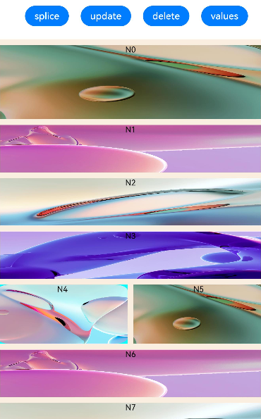
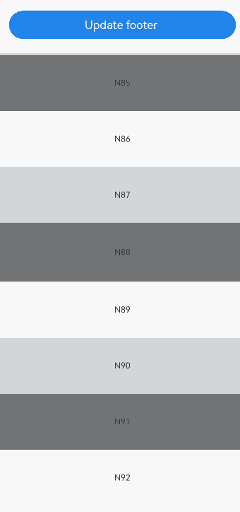
Example 7: Setting and Changing the Footer Component in the WaterFlow Component
This example demonstrates how to set and dynamically change the footer component in the WaterFlow component using footerContent. The footer component is updated using the update API of ComponentContent.
// Index.ets
import { ComponentContent, UIContext } from "@kit.ArkUI";
import { WaterFlowDataSource } from './WaterFlowDataSource';

class Params {
  text: string = "";

  constructor(text: string) {
    this.text = text;
  }
}

@Builder
function buildText(params: Params) {
  Column() {
    Text(params.text)
      .fontSize(20)
      .fontWeight(FontWeight.Bold)
      .margin(20)
  }
}

@Entry
@Component
struct Index {
  @State message1: string = "No more content";
  @State message2: string = "Load more";
  @State colors: number[] = [0xD5D5D5, 0x7F7F7F, 0xF7F7F7];
  @State minSize: number = 80;
  @State maxSize: number = 180;
  context: UIContext = this.getUIContext();
  footerContent: ComponentContent<Params> = new ComponentContent<Params>(this.context, wrapBuilder<[Params]>(buildText), new Params(this.message1));
  dataSource: WaterFlowDataSource = new WaterFlowDataSource();
  private itemWidthArray: number[] = [];
  private itemHeightArray: number[] = [];

  // Calculate the width and height of a water flow item.
  getSize() {
    let ret = Math.floor(Math.random() * this.maxSize);
    return (ret > this.minSize ? ret : this.minSize);
  }

  // Set the width and height array of the water flow item.
  setItemSizeArray() {
    for (let i = 0; i < 100; i++) {
      this.itemWidthArray.push(this.getSize());
      this.itemHeightArray.push(this.getSize());
    }
  }

  aboutToAppear() {
    this.setItemSizeArray();
  }

  build() {
    Row() {
      Column() {
        Button("Update footer").width('90%').margin(20)
          .onClick((event?: ClickEvent) => {
            this.footerContent.update(new Params(this.message2));
          })
        WaterFlow({ footerContent: this.footerContent }) {
          LazyForEach(this.dataSource, (item: number) => {
            FlowItem() {
              Column() {
                Text("N" + item).fontSize(12).height('16')
              }
              .width('100%')
              .height(this.itemHeightArray[item % 100])
              .backgroundColor(this.colors[item % 3])
              .justifyContent(FlexAlign.Center)
              .alignItems(HorizontalAlign.Center)
            }
          }, (item: string) => item)
        }
        .columnsTemplate('1fr')
        .height("90%")
      }
      .width('100%')
      .height('100%')
    }
    .height('100%')
  }
}
你可能感兴趣的鸿蒙文章
- 所属分类: 后端技术
- 本文标签:
热门推荐
-
2、 优质文章
-
3、 gt
-
7、 openharmony
-
9、 golang
-
10、 Vue中input框自动聚焦