harmony 鸿蒙Shape Clipping
Shape Clipping
Shape clipping changes the visible portion of a component through clipping or masking.
NOTE
The APIs of this module are supported since API version 7. Updates will be marked with a superscript to indicate their earliest API version.
clip12+
clip(value: boolean)
Sets whether to clip the areas of child components that extend beyond this component’s boundaries, that is, whether to perform clipping based on the edge contour of the parent container
System capability: SystemCapability.ArkUI.ArkUI.Full
Widget capability: This API can be used in ArkTS widgets since API version 12.
Atomic service API: This API can be used in atomic services since API version 12.
Parameters
| Name | Type | Mandatory | Description |
|---|---|---|---|
| value | boolean | Yes | Whether to perform clipping based on the edge contour of the parent container. Default value: false true: Perform clipping. false: Do not perform clipping. NOTE If this parameter is set to true, child components exceeding the current component’s bounds will not respond to bound gesture events. |
clip18+
clip(clip: Optional<boolean>)
Sets whether to clip the areas of child components that extend beyond this component’s boundaries, that is, whether to perform clipping based on the edge contour of the parent container Compared to clip12+, this API supports the undefined type for the clip parameter.
System capability: SystemCapability.ArkUI.ArkUI.Full
Widget capability: This API can be used in ArkTS widgets since API version 18.
Atomic service API: This API can be used in atomic services since API version 18.
Parameters
| Name | Type | Mandatory | Description |
|---|---|---|---|
| clip | Optional<boolean> | Yes | Whether to perform clipping based on the edge contour of the parent container. Default value: false NOTE If this parameter is set to true, child components exceeding the current component’s bounds will not respond to bound gesture events. If clip is set to undefined, clipping is disabled, and child components are not clipped. |
clip(deprecated)
clip(value: boolean|CircleAttribute|EllipseAttribute|PathAttribute|RectAttribute)
Sets whether to clip this component based on the given shape.
NOTE
This API is supported since API version 7 and deprecated since API version 12. You are advised to use clip and clipShape instead.
Widget capability: This API can be used in ArkTS widgets since API version 9.
System capability: SystemCapability.ArkUI.ArkUI.Full
Parameters
| Name | Type | Mandatory | Description |
|---|---|---|---|
| value | boolean |CircleAttribute |EllipseAttribute |PathAttribute |RectAttribute | Yes | Clip mode. If the value is a shape attribute, the component is clipped based on the specified shape. If the value is of the Boolean type, it specifies whether to clip the component based on the boundaries of the parent container. Default value: false NOTE If the value is a shape attribute, the clipped area can still respond to bound gesture events. If the value is of the Boolean type, the clipped area will not respond to bound gesture events. |
clipShape12+
clipShape(value: CircleShape|EllipseShape|PathShape|RectShape)
Clips this component based on the given shape.
System capability: SystemCapability.ArkUI.ArkUI.Full
Widget capability: This API can be used in ArkTS widgets since API version 12.
Atomic service API: This API can be used in atomic services since API version 12.
Parameters
| Name | Type | Mandatory | Description |
|---|---|---|---|
| value | CircleShape |EllipseShape |PathShape |RectShape | Yes | Shape that the component to be clipped into. NOTE The clipped area remains responsive to bound gesture events. |
clipShape18+
clipShape(shape: Optional<CircleShape|EllipseShape|PathShape|RectShape>)
Sets whether to clip this component based on the given shape. Compared to clipShape12+, this API supports the undefined type for the shape parameter.
System capability: SystemCapability.ArkUI.ArkUI.Full
Widget capability: This API can be used in ArkTS widgets since API version 18.
Atomic service API: This API can be used in atomic services since API version 18.
Parameters
| Name | Type | Mandatory | Description |
|---|---|---|---|
| shape | Optional<CircleShape |EllipseShape |PathShape |RectShape> | Yes | Shape that the component to be clipped into. NOTE The clipped area remains responsive to bound gesture events. If shape is set to undefined, the previous value is retained. |
mask12+
mask(value: ProgressMask)
Adds a mask to the component to indicate the progress.
System capability: SystemCapability.ArkUI.ArkUI.Full
Atomic service API: This API can be used in atomic services since API version 12.
Parameters
| Name | Type | Mandatory | Description |
|---|---|---|---|
| value | ProgressMask | Yes | Mask to add to the component, which allows for dynamic adjustment of progress, maximum value, and color settings. |
mask18+
mask(mask: Optional<ProgressMask>)
Adds a mask to the component to indicate the progress. Compared to mask12+, this API supports the undefined type for the mask parameter.
System capability: SystemCapability.ArkUI.ArkUI.Full
Atomic service API: This API can be used in atomic services since API version 18.
Parameters
| Name | Type | Mandatory | Description |
|---|---|---|---|
| mask | Optional<ProgressMask> | Yes | Mask to add to the component, which allows for dynamic adjustment of progress, maximum value, and color settings. If mask is set to undefined, the component to revert to its original effect without the mask to indicate the progress. |
mask(deprecated)
mask(value: CircleAttribute|EllipseAttribute|PathAttribute|RectAttribute|ProgressMask)
Adds a mask of the specified shape to the component.
NOTE
This API is supported since API version 7 and deprecated since API version 12. You are advised to use mask and maskShape instead.
Widget capability: This API can be used in ArkTS widgets since API version 9.
System capability: SystemCapability.ArkUI.ArkUI.Full
Parameters
| Name | Type | Mandatory | Description |
|---|---|---|---|
| value | CircleAttribute |EllipseAttribute |PathAttribute |RectAttribute |ProgressMask10+ | Yes | Mask of the specified shape to add to the component. |
maskShape12+
maskShape(value: CircleShape|EllipseShape|PathShape|RectShape)
Adds a mask of the specified shape to the component.
System capability: SystemCapability.ArkUI.ArkUI.Full
Widget capability: This API can be used in ArkTS widgets since API version 12.
Atomic service API: This API can be used in atomic services since API version 12.
Parameters
| Name | Type | Mandatory | Description |
|---|---|---|---|
| value | CircleShape |EllipseShape |PathShape |RectShape | Yes | Mask of the specified shape to add to the component. |
maskShape18+
maskShape(shape: Optional<CircleShape|EllipseShape|PathShape|RectShape>)
Adds a mask of the specified shape to the component. Compared to maskShape12+, this API supports the undefined type for the shape parameter.
System capability: SystemCapability.ArkUI.ArkUI.Full
Widget capability: This API can be used in ArkTS widgets since API version 18.
Atomic service API: This API can be used in atomic services since API version 18.
Parameters
| Name | Type | Mandatory | Description |
|---|---|---|---|
| shape | Optional<CircleShape |EllipseShape |PathShape |RectShape> | Yes | Mask of the specified shape to add to the component. If shape is set to undefined, the previous value is retained. |
ProgressMask10+
Implements a ProgressMask object to set the progress, maximum value, and color of the mask.
Atomic service API: This API can be used in atomic services since API version 11.
System capability: SystemCapability.ArkUI.ArkUI.Full
constructor10+
constructor(value: number, total: number, color: ResourceColor)
Constructs a ProgressMask object.
Atomic service API: This API can be used in atomic services since API version 11.
System capability: SystemCapability.ArkUI.ArkUI.Full
Parameters
| Name | Type | Mandatory | Description |
|---|---|---|---|
| value | number | Yes | Current value of the progress mask. Value range: [0.0, +∞) |
| total | number | Yes | Maximum value of the progress mask. Value range: [0.0, +∞) |
| color | ResourceColor | Yes | Color of the progress mask. |
updateProgress10+
updateProgress(value: number): void
Updates the progress value of the progress mask.
Atomic service API: This API can be used in atomic services since API version 11.
System capability: SystemCapability.ArkUI.ArkUI.Full
Parameters
| Name | Type | Mandatory | Description |
|---|---|---|---|
| value | number | Yes | Current value of the progress mask. |
updateColor10+
updateColor(value: ResourceColor): void
Updates the color of the progress mask.
Atomic service API: This API can be used in atomic services since API version 11.
System capability: SystemCapability.ArkUI.ArkUI.Full
Parameters
| Name | Type | Mandatory | Description |
|---|---|---|---|
| value | ResourceColor | Yes | Color of the progress mask. |
enableBreathingAnimation12+
enableBreathingAnimation(value: boolean): void
Sets whether to enable the breathing animation when the progress indicator is full. By default, the breathing animation is disabled.
Atomic service API: This API can be used in atomic services since API version 12.
System capability: SystemCapability.ArkUI.ArkUI.Full
Parameters
| Name | Type | Mandatory | Description |
|---|---|---|---|
| value | boolean | Yes | Whether to enable the breathing animation. The value true means to enable the breathing animation, and false means the opposite. Default value: false |
Example
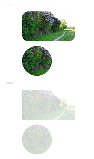
Example 1: Using Different Clipping Attributes
// xxx.ets
import { CircleShape, RectShape } from '@kit.ArkUI'

@Entry
@Component
struct ClipAndMaskExample {
  build() {
    Column({ space: 15 }) {
      Text('clip').fontSize(12).width('75%').fontColor('#DCDCDC')
      Row() {
        Image($r('app.media.testImg')).width('500px').height('280px')
      }
      .clip(true) // If clip is not set to true, the image is not confined by the rounded corners of the <Row> component and may extend beyond the <Row> component.
      .borderRadius(20)

      // Clip the image based on a circle with a diameter of 280 px.
      Image($r('app.media.testImg'))
        .clipShape(new CircleShape({ width: '280px', height: '280px' }))
        .width('500px').height('280px')

      Text('mask').fontSize(12).width('75%').fontColor('#DCDCDC')
      // Add a 500 px x 280 px square mask to the image.
      Image($r('app.media.testImg'))
        .maskShape(new RectShape({ width: '500px', height: '280px' }).fill(Color.Gray))
        .width('500px').height('280px')

      // Add a 280 px x 280 px circular mask to the image.
      Image($r('app.media.testImg'))
        .maskShape(new CircleShape({ width: '280px', height: '280px' }).fill(Color.Gray))
        .width('500px').height('280px')
    }
    .width('100%')
    .margin({ top: 15 })
  }
}
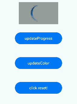
Example 2: Clipping and Masking with Animation
@Entry
@Component
struct ProgressMaskExample {
  @State progressflag1: boolean = true;
  @State color: Color = 0x01006CDE;
  @State value: number = 10.0;
  @State enableBreathingAnimation: boolean = false;
  @State progress: ProgressMask = new ProgressMask(10.0, 100.0, Color.Gray);

  build() {
    Column({ space: 15 }) {
      Text('progress mask').fontSize(12).width('75%').fontColor('#DCDCDC')
      // Add a 280 px x 280 px progress mask to the image.
      Image($r('app.media.testImg'))
        .width('500px').height('280px')
        .mask(this.progress)
        .animation({
          duration: 2000, // Animation duration.
          .curve(Curve.Linear) // Animation curve.
          delay: 0, // Animation delay.
          iterations: 1, // Number of playback times.
          playMode: PlayMode.Normal // Animation playback mode.
        }) // Animation configuration for the width and height attributes of the <Button> component.

      // Update the progress value of the progress mask.
      Button('updateProgress')
        .onClick((event?: ClickEvent) => {
          this.value += 10;
          this.progress.updateProgress(this.value);
        }).width(200).height(50).margin(20)

      // Update the color of the progress mask.
      Button('updateColor')
        .onClick((event?: ClickEvent) => {
          if (this.progressflag1) {
            this.progress.updateColor(0x9fff0000);
          } else {
            this.progress.updateColor(0x9f0000ff);
          }
          this.progressflag1 = !this.progressflag1
        }).width(200).height(50).margin(20)

      // Enable or disable the breathing animation.
      Button('enableBreathingAnimation:' + this.enableBreathingAnimation)
        .onClick((event?: ClickEvent) => {
          this.enableBreathingAnimation = !this.enableBreathingAnimation
          this.progress.enableBreathingAnimation(this.enableBreathingAnimation);
        }).width(200).height(50).margin(20)

      // Restore the progress mask.
      Button('click reset!')
        .onClick((event?: ClickEvent) => {
          this.value = 0;
          this.progress.updateProgress(this.value);
        }).width(200).height(50).margin(20)
    }
    .width('100%')
    .margin({ top: 15 })
  }
}
你可能感兴趣的鸿蒙文章
- 所属分类: 后端技术
- 本文标签:
热门推荐
-
2、 优质文章
-
3、 gt
-
7、 openharmony
-
9、 golang
-
10、 Vue中input框自动聚焦