harmony 鸿蒙Divider
Divider
The Divider component is used to separate content blocks and elements.
NOTE
This component is supported since API version 7. Updates will be marked with a superscript to indicate their earliest API version.
Child Components
Not supported
APIs
Divider()
Widget capability: This API can be used in ArkTS widgets since API version 9.
Atomic service API: This API can be used in atomic services since API version 11.
System capability: SystemCapability.ArkUI.ArkUI.Full
Attributes
In addition to the universal attributes, the following attributes are supported.
vertical
vertical(value: boolean)
Sets the direction of the divider.
Widget capability: This API can be used in ArkTS widgets since API version 9.
Atomic service API: This API can be used in atomic services since API version 11.
System capability: SystemCapability.ArkUI.ArkUI.Full
Parameters
| Name | Type | Mandatory | Description |
|---|---|---|---|
| value | boolean | Yes | Whether the divider is vertical or horizontal. false: A horizontal divider is used. true: A vertical divider is used. Default value: false |
color
color(value: ResourceColor)
Sets the color of the divider.
Widget capability: This API can be used in ArkTS widgets since API version 9.
Atomic service API: This API can be used in atomic services since API version 11.
System capability: SystemCapability.ArkUI.ArkUI.Full
Parameters
| Name | Type | Mandatory | Description |
|---|---|---|---|
| value | ResourceColor | Yes | Color of the divider. Default value: ‘#33182431’ You can set a common divider color using WithTheme. |
strokeWidth
strokeWidth(value: number|string)
Sets the stroke width of the divider.
Widget capability: This API can be used in ArkTS widgets since API version 9.
Atomic service API: This API can be used in atomic services since API version 11.
System capability: SystemCapability.ArkUI.ArkUI.Full
Parameters
| Name | Type | Mandatory | Description |
|---|---|---|---|
| value | number |string | Yes | Stroke width of the divider. Default value: 1px Unit: vp NOTE This attribute cannot be set to a percentage. The priority of this attribute is lower than that of the universal attribute height. If the value of this attribute is greater than that of height, cropping is performed based on the height settings. Due to hardware limitations on some devices where 1 px dividers may not display properly after rounding, you are advised to use the 2px value. |
lineCap
lineCap(value: LineCapStyle)
Sets the cap style of the divider.
Widget capability: This API can be used in ArkTS widgets since API version 9.
Atomic service API: This API can be used in atomic services since API version 11.
System capability: SystemCapability.ArkUI.ArkUI.Full
Parameters
| Name | Type | Mandatory | Description |
|---|---|---|---|
| value | LineCapStyle | Yes | Cap style of the divider. Default value: LineCapStyle.Butt |
Example
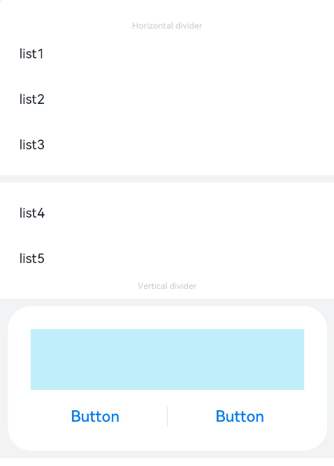
This example demonstrates how to define the style of a divider, including its direction, color, and width.
// xxx.ets
@Entry
@Component
struct DividerExample {
  build() {
    Column() {
      // Use horizontal dividers.
      Text('Horizontal divider').fontSize(9).fontColor(0xCCCCCC)
      List() {
        ForEach([1, 2, 3], (item: number) => {
          ListItem() {
            Text('list' + item).width('100%').fontSize(14).fontColor('#182431').textAlign(TextAlign.Start)
          }.width(244).height(48)
        }, (item: number) => item.toString())
      }.padding({ left: 24, bottom: 8 })

      Divider().strokeWidth(8).color('#F1F3F5')
      List() {
        ForEach([4, 5], (item: number) => {
          ListItem() {
            Text('list' + item).width('100%').fontSize(14).fontColor('#182431').textAlign(TextAlign.Start)
          }.width(244).height(48)
        }, (item: number) => item.toString())
      }.padding({ left: 24, top: 8 })

      // Use vertical dividers.
      Text('Vertical divider').fontSize(9).fontColor(0xCCCCCC)
      Column() {
        Column() {
          Row().width(288).height(64).backgroundColor('#30C9F0').opacity(0.3)
          Row() {
            Button('Button')
              .width(136)
              .height(22)
              .fontSize(16)
              .fontColor('#007DFF')
              .fontWeight(500)
              .backgroundColor(Color.Transparent)
            Divider().vertical(true).height(22).color('#182431').opacity(0.6).margin({ left: 8, right: 8 })
            Button('Button')
              .width(136)
              .height(22)
              .fontSize(16)
              .fontColor('#007DFF')
              .fontWeight(500)
              .backgroundColor(Color.Transparent)
          }.margin({ top: 17 })
        }
        .width(336)
        .height(152)
        .backgroundColor('#FFFFFF')
        .borderRadius(24)
        .padding(24)
      }
      .width('100%')
      .height(168)
      .backgroundColor('#F1F3F5')
      .justifyContent(FlexAlign.Center)
      .margin({ top: 8 })
    }.width('100%').padding({ top: 24 })
  }
}
你可能感兴趣的鸿蒙文章
- 所属分类: 后端技术
- 本文标签:
热门推荐
-
2、 优质文章
-
3、 gt
-
7、 openharmony
-
9、 golang
-
10、 Vue中input框自动聚焦