harmony 鸿蒙Stack
Stack
The Stack component provides a stack container where child components are successively stacked and the latter one overwrites the previous one.
NOTE
This component is supported since API version 7. Updates will be marked with a superscript to indicate their earliest API version.
Child Components
This component can contain child components.
APIs
Stack(options?: StackOptions)
Widget capability: This API can be used in ArkTS widgets since API version 9.
Atomic service API: This API can be used in atomic services since API version 11.
System capability: SystemCapability.ArkUI.ArkUI.Full
Parameters
| Name | Type | Mandatory | Description |
|---|---|---|---|
| options | StackOptions | No | Alignment of child components in the container. |
StackOptions14+
Widget capability: This API can be used in ArkTS widgets since API version 14.
Atomic service API: This API can be used in atomic services since API version 14.
System capability: SystemCapability.ArkUI.ArkUI.Full
| Name | Type | Mandatory | Description |
|---|---|---|---|
| alignContent | Alignment | No | Alignment of child components in the container. Default value: Alignment.Center |
Attributes
In addition to the universal attributes, the following attributes are supported.
alignContent
alignContent(value: Alignment)
Sets the alignment of all child components in the container. When both this attribute and the universal attribute align are set, whichever is set last takes effect.
Atomic service API: This API can be used in atomic services since API version 11.
Widget capability: This API can be used in ArkTS widgets since API version 9.
System capability: SystemCapability.ArkUI.ArkUI.Full
Parameters
| Name | Type | Mandatory | Description |
|---|---|---|---|
| value | Alignment | Yes | Alignment of child components in the container. Default value: Alignment.Center |
Example
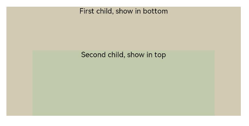
This example demonstrates the display effect of child components when the alignContent attribute of the Stack component is set to Alignment.Bottom.
// xxx.ets
@Entry
@Component
struct StackExample {
  build() {
    Stack({ alignContent: Alignment.Bottom }) {
      Text('First child, show in bottom').width('90%').height('100%').backgroundColor(0xd2cab3).align(Alignment.Top)
      Text('Second child, show in top').width('70%').height('60%').backgroundColor(0xc1cbac).align(Alignment.Top)
    }.width('100%').height(150).margin({ top: 5 })
  }
}
你可能感兴趣的鸿蒙文章
- 所属分类: 后端技术
- 本文标签:
热门推荐
-
2、 优质文章
-
3、 gt
-
7、 openharmony
-
9、 golang
-
10、 Vue中input框自动聚焦