harmony 鸿蒙Checkbox
Checkbox
Checkbox is a component that is used to enable or disable an option.
NOTE
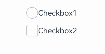
Since API version 11, the default style of the Checkbox component is changed from rounded square to circle.
This component is supported since API version 8. Updates will be marked with a superscript to indicate their earliest API version.
Child Components
Not supported
APIs
Checkbox(options?: CheckboxOptions)
Creates a check box.
Widget capability: This API can be used in ArkTS widgets since API version 9.
Atomic service API: This API can be used in atomic services since API version 11.
System capability: SystemCapability.ArkUI.ArkUI.Full
Parameters
| Name | Type | Mandatory | Description |
|---|---|---|---|
| options | CheckboxOptions | No | Check box parameters. |
CheckboxOptions
System capability: SystemCapability.ArkUI.ArkUI.Full
| Name | Type | Mandatory | Description |
|---|---|---|---|
| name | string | No | Name of the check box. Widget capability: This API can be used in ArkTS widgets since API version 9. Atomic service API: This API can be used in atomic services since API version 11. |
| group | string | No | Group name of the check box (that is, the name of the check box group to which the check box belongs). NOTE For the settings to take effect, this parameter must be used with the CheckboxGroup component. Widget capability: This API can be used in ArkTS widgets since API version 9. Atomic service API: This API can be used in atomic services since API version 11. |
| indicatorBuilder12+ | CustomBuilder | No | Custom component to indicate that the check box is selected. This custom component is center aligned with the check box. When indicatorBuilder is set to undefined or null, it defaults to the state where it is not set. Atomic service API: This API can be used in atomic services since API version 12. |
Attributes
In addition to the universal attributes, the following attributes are supported.
select
select(value: boolean)
Sets whether the check box is selected.
Since API version 10, this attribute supports two-way binding through $$. Since API version 18, this attribute supports two-way binding through !!.
Widget capability: This API can be used in ArkTS widgets since API version 9.
Atomic service API: This API can be used in atomic services since API version 11.
System capability: SystemCapability.ArkUI.ArkUI.Full
Parameters
| Name | Type | Mandatory | Description |
|---|---|---|---|
| value | boolean | Yes | Whether the check box is selected. Default value: false true: The check box is selected. false: The check box is not selected. |
select18+
select(isSelected: Optional<boolean>)
Sets whether the check box is selected. Compared to select, this API supports the undefined type for the isSelected parameter.
This attribute supports two-way binding through $$. This attribute supports two-way binding through !!.
Widget capability: This API can be used in ArkTS widgets since API version 18.
Atomic service API: This API can be used in atomic services since API version 18.
System capability: SystemCapability.ArkUI.ArkUI.Full
Parameters
| Name | Type | Mandatory | Description |
|---|---|---|---|
| isSelected | Optional<boolean> | Yes | Whether the check box is selected. If isSelected is set to undefined, the default value false is used. true: The check box is selected. false: The check box is not selected. |
selectedColor
selectedColor(value: ResourceColor)
Sets the color of the check box when it is selected.
Widget capability: This API can be used in ArkTS widgets since API version 9.
Atomic service API: This API can be used in atomic services since API version 11.
System capability: SystemCapability.ArkUI.ArkUI.Full
Parameters
| Name | Type | Mandatory | Description |
|---|---|---|---|
| value | ResourceColor | Yes | Color of the check box when it is selected. Default value: $r(‘sys.color.ohos_id_color_text_primary_activated’) An invalid value is handled as the default value. |
selectedColor18+
selectedColor(resColor: Optional<ResourceColor>)
Sets the color of the check box when it is selected. Compared to selectedColor, this API supports the undefined type for the resColor parameter.
Widget capability: This API can be used in ArkTS widgets since API version 18.
Atomic service API: This API can be used in atomic services since API version 18.
System capability: SystemCapability.ArkUI.ArkUI.Full
Parameters
| Name | Type | Mandatory | Description |
|---|---|---|---|
| resColor | Optional<ResourceColor> | Yes | Color of the check box when it is selected. If resColor is set to undefined, the default value $r(‘sys.color.ohos_id_color_text_primary_activated’) is used. An invalid value is handled as the default value. |
unselectedColor10+
unselectedColor(value: ResourceColor)
Sets the border color of the check box when it is not selected.
Atomic service API: This API can be used in atomic services since API version 11.
System capability: SystemCapability.ArkUI.ArkUI.Full
Parameters
| Name | Type | Mandatory | Description |
|---|---|---|---|
| value | ResourceColor | Yes | Border color of the check box when it is not selected. Default value: $r(‘sys.color.ohos_id_color_switch_outline_off’) |
unselectedColor18+
unselectedColor(resColor: Optional<ResourceColor>)
Sets the border color of the check box when it is not selected. Compared to unselectedColor10+, this API supports the undefined type for the resColor parameter.
Atomic service API: This API can be used in atomic services since API version 18.
System capability: SystemCapability.ArkUI.ArkUI.Full
Parameters
| Name | Type | Mandatory | Description |
|---|---|---|---|
| resColor | Optional<ResourceColor> | Yes | Border color of the check box when it is not selected. If resColor is set to undefined, the default value $r(‘sys.color.ohos_id_color_switch_outline_off’) is used. |
mark10+
mark(value: MarkStyle)
Sets the check mark style of the check box.
Atomic service API: This API can be used in atomic services since API version 11.
System capability: SystemCapability.ArkUI.ArkUI.Full
Parameters
| Name | Type | Mandatory | Description |
|---|---|---|---|
| value | MarkStyle | Yes | Check mark style of the check box. Since API version 12, if indicatorBuilder is set, the style is determined by indicatorBuilder. Default value: { strokeColor : $r('sys.color.ohos_id_color_foreground_contrary'),strokeWidth: $r('sys.float.ohos_id_checkbox_stroke_width'),size: ‘20vp’ } |
mark18+
mark(style: Optional<MarkStyle>)
Sets the check mark style of the check box. Compared to mark10+, this API supports the undefined type for the style parameter.
Atomic service API: This API can be used in atomic services since API version 18.
System capability: SystemCapability.ArkUI.ArkUI.Full
Parameters
| Name | Type | Mandatory | Description |
|---|---|---|---|
| style | Optional<MarkStyle> | Yes | Check mark style of the check box. If indicatorBuilder is set, the style is determined by indicatorBuilder. If style is set to undefined, the default value is used: { strokeColor : $r('sys.color.ohos_id_color_foreground_contrary'),strokeWidth: $r('sys.float.ohos_id_checkbox_stroke_width'),size: ‘20vp’ } |
shape11+
shape(value: CheckBoxShape)
Sets the shape of the check box.
Widget capability: This API can be used in ArkTS widgets since API version 11.
Atomic service API: This API can be used in atomic services since API version 12.
System capability: SystemCapability.ArkUI.ArkUI.Full
Parameters
| Name | Type | Mandatory | Description |
|---|---|---|---|
| value | CheckBoxShape | Yes | Shape of the check box. Default value: CheckBoxShape.CIRCLE |
shape18+
shape(shape: Optional<CheckBoxShape>)
Sets the shape of the check box. Compared to shape11+, this API supports the undefined type for the shape parameter.
Widget capability: This API can be used in ArkTS widgets since API version 18.
Atomic service API: This API can be used in atomic services since API version 18.
System capability: SystemCapability.ArkUI.ArkUI.Full
Parameters
| Name | Type | Mandatory | Description |
|---|---|---|---|
| shape | Optional<CheckBoxShape> | Yes | Shape of the check box. If shape is set to undefined, the default value CheckBoxShape.CIRCLE is used. |
contentModifier12+
contentModifier(modifier: ContentModifier<CheckBoxConfiguration>)
Creates a content modifier.
Atomic service API: This API can be used in atomic services since API version 12.
System capability: SystemCapability.ArkUI.ArkUI.Full
Parameters
| Name | Type | Mandatory | Description |
|---|---|---|---|
| modifier | ContentModifier<CheckBoxConfiguration> | Yes | Content modifier to apply to the check box. modifier: content modifier. You need a custom class to implement the ContentModifier API. |
contentModifier18+
contentModifier(modifier: Optional
Creates a content modifier. Compared to contentModifier12+, this API supports the undefined type for the modifier parameter.
Atomic service API: This API can be used in atomic services since API version 18.
System capability: SystemCapability.ArkUI.ArkUI.Full
Parameters
| Name | Type | Mandatory | Description |
|---|---|---|---|
| modifier | Optional<ContentModifier<CheckBoxConfiguration>> | Yes | Content modifier to apply to the check box. modifier: content modifier. You need a custom class to implement the ContentModifier API. If modifier is set to undefined, no content modifier is used. |
Events
In addition to the universal events, the following events are supported.
onChange
onChange(callback: OnCheckboxChangeCallback)
Invoked when the selected state of the check box changes.
Widget capability: This API can be used in ArkTS widgets since API version 9.
Atomic service API: This API can be used in atomic services since API version 11.
System capability: SystemCapability.ArkUI.ArkUI.Full
Parameters
| Name | Type | Mandatory | Description |
|---|---|---|---|
| callback | OnCheckboxChangeCallback | Yes | Callback used to return the selected state. |
onChange18+
onChange(callback: Optional<OnCheckboxChangeCallback>)
Invoked when the selected state of the check box changes. Compared to onChange, this API supports the undefined type for the callback parameter.
Widget capability: This API can be used in ArkTS widgets since API version 18.
Atomic service API: This API can be used in atomic services since API version 18.
System capability: SystemCapability.ArkUI.ArkUI.Full
Parameters
| Name | Type | Mandatory | Description |
|---|---|---|---|
| callback | Optional<OnCheckboxChangeCallback> | Yes | Callback used to return the selected state. If callback is set to undefined, the callback function is not used. |
OnCheckboxChangeCallback18+
type OnCheckboxChangeCallback = (value: boolean) => void
Represents the callback invoked when the selected state of the check box changes.
Widget capability: This API can be used in ArkTS widgets since API version 18.
Atomic service API: This API can be used in atomic services since API version 18.
System capability: SystemCapability.ArkUI.ArkUI.Full
Parameters
| Name | Type | Mandatory | Description |
|---|---|---|---|
| value | boolean | Yes | Whether the check box is selected. The value true means that the check box is selected, and false means the opposite. |
CheckBoxConfiguration12+
You need a custom class to implement the ContentModifier API.
Atomic service API: This API can be used in atomic services since API version 12.
System capability: SystemCapability.ArkUI.ArkUI.Full
| Name | Type | Read Only | Optional | Description |
|---|---|---|---|---|
| name | string | No | No | Name of the check box. |
| selected | boolean | No | No | Whether the check box is selected. If the select attribute is not set, the default value false is used. If the select attribute is set, the attribute value is used here. |
| triggerChange | Callback<boolean> | No | No | Changes the selected state of the check box. The value true means that the check box changes from unselected to selected, and false means that the check box changes from selected to unselected. |
Example
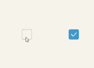
Example 1: Setting the Check Box Shape
This example shows how to set CheckBoxShape to implement check boxes in circle and rounded square shapes.
// xxx.ets
@Entry
@Component
struct CheckboxExample {
  build() {
    Flex({ justifyContent: FlexAlign.SpaceEvenly }) {
      Checkbox({ name: 'checkbox1', group: 'checkboxGroup' })
        .select(true)
        .selectedColor(0xed6f21)
        .shape(CheckBoxShape.CIRCLE)
        .onChange((value: boolean) => {
          console.info('Checkbox1 change is' + value)
        })
      Checkbox({ name: 'checkbox2', group: 'checkboxGroup' })
        .select(false)
        .selectedColor(0x39a2db)
        .shape(CheckBoxShape.ROUNDED_SQUARE)
        .onChange((value: boolean) => {
          console.info('Checkbox2 change is' + value)
        })
    }
  }
}
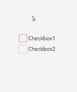
Example 2: Setting the Check Box Color
This example demonstrates how to set mark to customize the color of a check box.
// xxx.ets
@Entry
@Component
struct Index {

  build() {
    Row() {
      Column() {
        Flex({ justifyContent: FlexAlign.Center, alignItems: ItemAlign.Center }) {
          Checkbox({ name: 'checkbox1', group: 'checkboxGroup' })
            .selectedColor(0x39a2db)
            .shape(CheckBoxShape.ROUNDED_SQUARE)
            .onChange((value: boolean) => {
              console.info('Checkbox1 change is'+ value)
            })
            .mark({
              strokeColor:Color.Black,
              size: 50,
              strokeWidth: 5
            })
            .unselectedColor(Color.Red)
            .width(30)
            .height(30)
          Text('Checkbox1').fontSize(20)
        }
        Flex({ justifyContent: FlexAlign.Center, alignItems: ItemAlign.Center }) {
          Checkbox({ name: 'checkbox2', group: 'checkboxGroup' })
            .selectedColor(0x39a2db)
            .shape(CheckBoxShape.ROUNDED_SQUARE)
            .onChange((value: boolean) => {
              console.info('Checkbox2 change is' + value)
            })
            .width(30)
            .height(30)
          Text('Checkbox2').fontSize(20)
        }
      }
      .width('100%')
    }
    .height('100%')
  }
}
Example 3: Customizing the Check Box Style
This example implements a custom check box. This check box comes in the custom pentagon style. When selected, the check box shows a red triangle pattern inside, and the title displays the word “Selected;” when deselected, the check box hides the red triangle pattern inside, and the title displays the word “Unselected.”
// xxx.ets
class MyCheckboxStyle implements ContentModifier<CheckBoxConfiguration> {
  selectedColor: Color = Color.White
  constructor(selectedColor: Color) {
    this.selectedColor = selectedColor;
  }
  applyContent() : WrappedBuilder<[CheckBoxConfiguration]>
  {
    return wrapBuilder(buildCheckbox)
  }
}

@Builder function buildCheckbox(config: CheckBoxConfiguration) {
  Column({space:10}) {
      Text(config.name  + (config.selected ? "(Selected)" : " (Unselected)")).margin({right : 70, top : 50})
      Text(config.enabled ? "enabled true" : "enabled false").margin({right : 110})
      Shape() {
        Path().width(100).height(100).commands('M100 0 L0 100 L50 200 L150 200 L200 100 Z').fillOpacity(0).strokeWidth(3).onClick(()=>{
          if (config.selected) {
            config.triggerChange(false)
          } else {
            config.triggerChange(true)
          }
        }).opacity(config.enabled ? 1 : 0.1)
        Path().width(10).height(10).commands('M50 0 L100 100 L0 100 Z')
          .visibility(config.selected ? Visibility.Visible : Visibility.Hidden)
          .fill(config.selected ? (config.contentModifier as MyCheckboxStyle).selectedColor : Color.Black)
          .stroke((config.contentModifier as MyCheckboxStyle).selectedColor)
          .margin({left:10,top:10})
          .opacity(config.enabled ? 1 : 0.1)
      }
      .width(300)
      .height(200)
      .viewPort({ x: 0, y: 0, width: 310, height: 310 })
      .strokeLineJoin(LineJoinStyle.Miter)
      .strokeMiterLimit(5)
      .margin({left:50})
  }
}

@Entry
@Component
struct Index {
  @State checkboxEnabled: boolean = true;
  build() {
    Column({ space: 100 }) {
        Checkbox({ name: 'Check box status', group: 'checkboxGroup' })
        .contentModifier(new MyCheckboxStyle(Color.Red))
        .onChange((value: boolean) => {
          console.info('Checkbox change is' + value)
        }).enabled(this.checkboxEnabled)

      Row() {
        Toggle({ type: ToggleType.Switch, isOn: true }).onChange((value: boolean) => {
          if (value) {
            this.checkboxEnabled = true
          } else {
            this.checkboxEnabled = false
          }
        })
      }.position({ x: 50, y: 130 })
    }.margin({top : 30})
  }
}

Example 4: Setting the Text Check Box Style
This example configures the selected style of a check box to display as text using the indicatorBuilder property.
// xxx.ets
@Entry
@Component
struct CheckboxExample {
  @Builder
  indicatorBuilder(value: number) {
    Column(){
      Text(value > 99 ? '99+': value.toString())
        .textAlign(TextAlign.Center)
        .fontSize(value > 99 ?  '16vp': '20vp')
        .fontWeight(FontWeight.Medium)
        .fontColor('#ffffffff')
    }
  }
  build() {
    Row() {
      Column() {
        Flex({ justifyContent: FlexAlign.Center, alignItems: ItemAlign.Center}) {
          Checkbox({ name: 'checkbox1', group: 'checkboxGroup', indicatorBuilder:()=>{this.indicatorBuilder(9)}})
            .shape(CheckBoxShape.CIRCLE)
            .onChange((value: boolean) => {
              console.info('Checkbox1 change is'+ value)
            })
            .mark({
              strokeColor:Color.Black,
              size: 50,
              strokeWidth: 5
            })
            .width(30)
            .height(30)
          Text('Checkbox1').fontSize(20)
        }.padding(15)
        Flex({ justifyContent: FlexAlign.Center, alignItems: ItemAlign.Center }) {
          Checkbox({ name: 'checkbox2', group: 'checkboxGroup', indicatorBuilder:()=>{this.indicatorBuilder(100)}})
            .shape(CheckBoxShape.ROUNDED_SQUARE)
            .onChange((value: boolean) => {
              console.info('Checkbox2 change is' + value)
            })
            .width(30)
            .height(30)
          Text('Checkbox2').fontSize(20)
        }
      }
      .width('100%')
    }
    .height('100%')
  }
}
你可能感兴趣的鸿蒙文章
- 所属分类: 后端技术
- 本文标签:
热门推荐
-
2、 优质文章
-
3、 gt
-
7、 openharmony
-
9、 golang
-
10、 Vue中input框自动聚焦