harmony 鸿蒙ScrollBar
ScrollBar
The ScrollBar component is designed to be used together with scrollable components such as ArcList, List, Grid, Scroll, and WaterFlow.
NOTE
This component is supported since API version 8. Updates will be marked with a superscript to indicate their earliest API version.
Child Components
This component can contain a single child component.
APIs
ScrollBar(value: ScrollBarOptions)
Atomic service API: This API can be used in atomic services since API version 11.
System capability: SystemCapability.ArkUI.ArkUI.Full
Parameters
| Name | Type | Mandatory | Description |
|---|---|---|---|
| value | ScrollBarOptions | Yes | Scrollbar settings. |
Properties
In addition to the universal attributes, the following attributes are supported.
enableNestedScroll14+
enableNestedScroll(enabled: Optional<boolean>)
Sets whether nested scrolling is enabled.
Atomic service API: This API can be used in atomic services since API version 14.
System capability: SystemCapability.ArkUI.ArkUI.Full
Parameters
| Name | Type | Mandatory | Description |
|---|---|---|---|
| enabled | Optional<boolean> | Yes | Whether nested scrolling is enabled. The value true means that nested scrolling is enabled, and false means the opposite. Default value: false |
NOTE
When nested scrolling is enabled, the scroll offset is first passed to the inner scrollable component, which then passes it to the outer parent scrollable component based on the set nested scrolling priority.
Nested scrolling is not supported when the WaterFlow component is in SLIDING_WINDOW layout mode.
When the nested scrolling mode is set to PARALLEL, both the parent and child components scroll simultaneously. You need to manage the scroll order in the onScrollFrameBegin event according to the desired logic.
ScrollBarOptions
Atomic service API: This API can be used in atomic services since API version 11.
System capability: SystemCapability.ArkUI.ArkUI.Full
| Name | Type | Mandatory | Description |
|---|---|---|---|
| scroller | Scroller | Yes | Scroller, which can be bound to scrollable components. |
| direction | ScrollBarDirection | No | Scrollbar direction in which scrollable components scroll. Default value: ScrollBarDirection.Vertical |
| state | BarState | No | Scrollbar state. Default value: BarState.Auto |
NOTE
The ScrollBar component defines the behavior style of the scrollable area, and its subnodes define the behavior style of the scrollbar.
This component is bound to a scrollable component through scroller, and can be used to scroll the scrollable component only when their directions are the same. The ScrollBar component can be bound to only one scrollable component, and vice versa.
Since API version 12, the ScrollBar component displays a default scrollbar style when without child nodes.
ScrollBarDirection
Atomic service API: This API can be used in atomic services since API version 11.
System capability: SystemCapability.ArkUI.ArkUI.Full
| Name | Description |
|---|---|
| Vertical | Vertical scrollbar. |
| Horizontal | Horizontal scrollbar. |
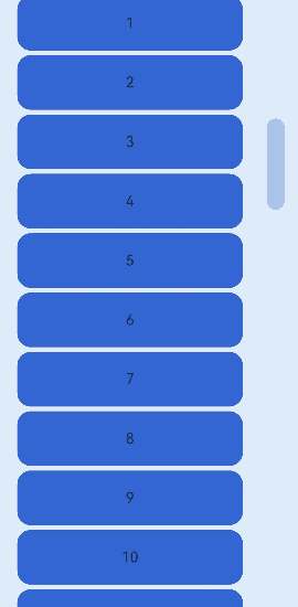
Example 1: Implementing a ScrollBar Component with Child Components
This example illustrates the style of a ScrollBar component with child components.
// xxx.ets
@Entry
@Component
struct ScrollBarExample {
  private scroller: Scroller = new Scroller()
  private arr: number[] = [0, 1, 2, 3, 4, 5, 6, 7, 8, 9, 10, 11, 12, 13, 14, 15]

  build() {
    Column() {
      Stack({ alignContent: Alignment.End }) {
        Scroll(this.scroller) {
          Flex({ direction: FlexDirection.Column }) {
            ForEach(this.arr, (item: number) => {
              Row() {
                Text(item.toString())
                  .width('80%')
                  .height(60)
                  .backgroundColor('#3366CC')
                  .borderRadius(15)
                  .fontSize(16)
                  .textAlign(TextAlign.Center)
                  .margin({ top: 5 })
              }
            }, (item:number) => item.toString())
          }.margin({ right: 15 })
        }
        .width('90%')
        .scrollBar(BarState.Off)
        .scrollable(ScrollDirection.Vertical)
        ScrollBar({ scroller: this.scroller, direction: ScrollBarDirection.Vertical,state: BarState.Auto }) {
          Text()
            .width(20)
            .height(100)
            .borderRadius(10)
            .backgroundColor('#C0C0C0')
        }.width(20).backgroundColor('#ededed')
      }
    }
  }
}
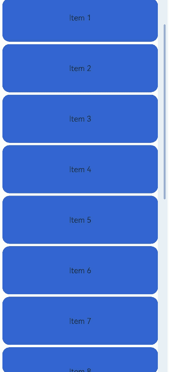
Example 2: Implementing a ScrollBar Component Without Child Components
This example illustrates the style of a ScrollBar component without child components.
@Entry
@Component
struct ScrollBarExample {
  private scroller: Scroller = new Scroller()
  private arr: number[] = [0, 1, 2, 3, 4, 5, 6, 7, 8, 9, 10, 11, 12, 13, 14, 15]

  build() {
    Column() {
      Stack({ alignContent: Alignment.End }) {
        Scroll(this.scroller) {
          Flex({ direction: FlexDirection.Column }) {
            ForEach(this.arr, (item: number) => {
              Row() {
                Text(item.toString())
                  .width('80%')
                  .height(60)
                  .backgroundColor('#3366CC')
                  .borderRadius(15)
                  .fontSize(16)
                  .textAlign(TextAlign.Center)
                  .margin({ top: 5 })
              }
            }, (item:number) => item.toString())
          }.margin({ right: 15 })
        }
        .width('90%')
        .scrollBar(BarState.Off)
        .scrollable(ScrollDirection.Vertical)
        ScrollBar({ scroller: this.scroller, direction: ScrollBarDirection.Vertical,state: BarState.Auto })
      }
    }
  }
}
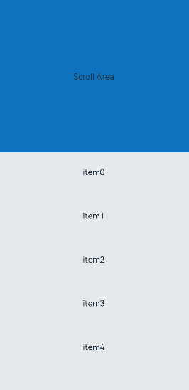
Example 3: Enabling Nested Scrolling
This example demonstrates how to enable nested scrolling for a ScrollBar component using the enableNestedScroll attribute.
@Entry
@Component
struct StickyNestedScroll {
  listScroller: Scroller = new Scroller();
  @State array: number[] = []

  @Styles
  listCard() {
    .backgroundColor(Color.White)
    .height(72)
    .width("100%")
    .borderRadius(12)
  }

  build() {
    Stack() {
      Scroll() {
        Column() {
          Text('Scroll Area')
            .width("100%")
            .height("40%")
            .backgroundColor('#0080DC')
            .textAlign(TextAlign.Center)
          List({ space: 10, scroller: this.listScroller }) {
            ForEach(this.array, (item: number) => {
              ListItem() {
                Text('item' + item)
                  .fontSize(16)
              }
              .listCard()
            }, (item: string) => item)
          }
          .scrollBar(BarState.Off)
          .nestedScroll({
            scrollForward: NestedScrollMode.PARENT_FIRST,
            scrollBackward: NestedScrollMode.SELF_FIRST
          })
          .height("100%")
        }
        .width("100%")
      }
      .edgeEffect(EdgeEffect.Spring)
      .backgroundColor('#DCDCDC')
      .scrollBar(BarState.Off)
      .width('100%')
      .height('100%')
      ScrollBar({ scroller: this.listScroller})
        .position({right:0})
        .enableNestedScroll(true)
    }
  }

  aboutToAppear() {
    for (let i = 0; i < 15; i++) {
      this.array.push(i)
    }
  }
}
你可能感兴趣的鸿蒙文章
- 所属分类: 后端技术
- 本文标签:
热门推荐
-
2、 优质文章
-
3、 gt
-
7、 openharmony
-
9、 golang
-
10、 Vue中input框自动聚焦