harmony 鸿蒙RichText
RichText
The RichText component parses and displays HTML text.
- Applicable scenarios:
The RichText component is suitable for loading and displaying segments of HTML strings in scenarios where extensive customization of the display effect is not required. The component supports only a limited set of universal attributes and events. For details, see Attributes and Events.
The underlying layer of the RichText component uses the Web component to provide basic capabilities, including but not limited to HTML page parsing and rendering. Therefore, the use of the RichText component needs to follow Web component constraints. Common typical constraints are as follows:
The default viewport size of a mobile device is 980 px, which can ensure that most web pages can be viewed correctly on mobile devices. If the width of the RichText component is lower than this value, the HTML inside the content may generate a scrollable page wrapped by the RichText component. If you want to replace the default value, add the following tags to content:
<meta name="viewport" content="width=device-width">
- Inapplicable scenarios:
The RichText component is not suitable for scenarios where there is a need for extensive customization of the display effect of the HTML string. For example, the RichText component does not allow for changing the background color, font color, font size, or content by setting attributes and events. Under such scenarios, the Web component is recommended.
The RichText component can be memory-intensive. If it is reused in scenarios such as lists where multiple instances are created, slow scrolling or rendering may result. Under such scenarios, you may want to use the RichEditor component.
NOTE
- This component is supported since API version 8. Updates will be marked with a superscript to indicate their earliest API version.
- This component is not able to auto-adapt its width and height to the content. Therefore, you must set the layout when using this component.
Child Components
Not supported
APIs
RichText(content:string)
System capability: SystemCapability.ArkUI.ArkUI.Full
Parameters
| Name | Type | Mandatory | Description |
|---|---|---|---|
| content | string | Yes | String in HTML format. |
Events
onStart
onStart(callback: () => void)
Triggered when web page loading starts.
System capability: SystemCapability.ArkUI.ArkUI.Full
onComplete
onComplete(callback: () => void)
Triggered when web page loading is completed.
System capability: SystemCapability.ArkUI.ArkUI.Full
Attributes
Among the universal attributes, only the width, height, size, and layoutWeight attributes are supported.
Supported Tags
| Name | Description | Example |
|---|---|---|
| <h1>–<h6> | Defines six levels of headings in the HTML document. <h1> defines the most important heading, and <h6> defines the least important heading. | <h1>This is an H1 heading</h1> <h2>This is an H2 heading</h2> |
| <p></p> | Defines a paragraph. | <p>This is a paragraph</p> |
| <br/> | Inserts a newline character. | <p>This is a paragraph<br/>This is a new paragraph</p> |
| <font/> | Defines the font style for the text contained within it, including the font face, size, and color. In the tag, the font size can be set only to a number ranging from 1 to 7, with the default value being 3. This tag is deprecated in HTML 4.01 and not supported in XHTML1.0 Strict DTD. Use the CSS font properties to style text instead. CSS syntax: <p style=“font-size: 35px; font-family: verdana; color: rgb(24,78,228)”> | <font size=“3” face=“arial” color=“red”>This is in red</font> |
| <hr/> | Defines a thematic break (such as a shift of topic) on an HTML page and creates a horizontal line. | <p>This is text</p><hr/><p>This is text</p> |
| <image></image> | Defines an image. | <image src=“resource://rawfile/icon.png”></image> |
| <div></div> | Defines a generic container that is generally used to group block-level elements. It allows you to apply CSS styles to multiple elements at the same time. | <div style=‘color:#0000FF’><h3>This is the heading in a div element</h3></div> |
| <i></i> | Displays text in italic style. | <i>This is in italic style</i> |
| <u></u> | Defines text that should be styled differently or have a non-textual annotation, such as misspelt words or a proper name in Chinese text. It is recommended that you avoid using the <u> tag where it could be confused with a hyperlink. | <p><u>This is an underlined paragraph</u></p> |
| <style></style> | Used to embed CSS within an HTML document. | <style>h1{color:red;}p{color:blue;}</style> |
| style | Defines the inline style of an element and is placed inside the tag. Use quotation marks (‘) to separate the styling text and use semicolons (;) to separate styles, for example, style=‘width: 500px;height: 500px;border: 1px solid;margin: 0 auto;’. | <h1 style=‘color:blue;text-align:center’>This is a heading</h1><p style=‘color:green’>This is text</p> |
| <script></script> | Embeds or references a client-side script, such as JavaScript. | <script>document.write(“Hello World!”)</script> |
Example
You can preview how this component looks on a real device, but not in DevEco Studio Previewer.
// xxx.ets
@Entry
@Component
struct RichTextExample {
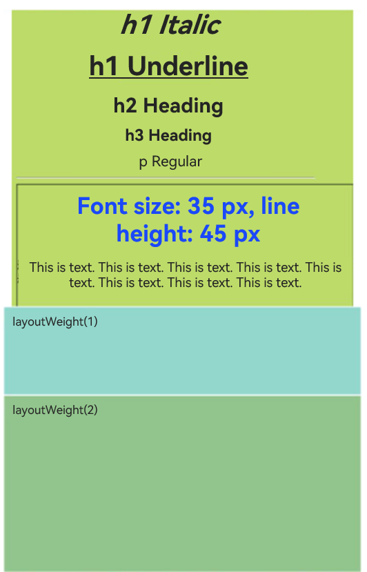
@State data: string = '<h1 style="text-align: center;">h1 heading</h1>' +
'<h1 style="text-align: center;"><i>h1 italic</i></h1>' +
'<h1 style="text-align: center;"><u>h1 underlined</u></h1>' +
'<h2 style="text-align: center;">h2 heading</h2>' +
'<h3 style="text-align: center;">h3 heading</h3>' +
'<p style="text-align: center;">Regular paragraph</p><hr/>' +
'<div style="width: 500px;height: 500px;border: 1px solid;margin: 0 auto;">' +
'<p style="font-size: 35px;text-align: center;font-weight: bold; color: rgb(24,78,228)">Font size: 35px; line height: 45px</p>' +
'<p style="background-color: #e5e5e5;line-height: 45px;font-size: 35px;text-indent: 2em;">' +
'<p>This is text. This is text. This is text. This is text. This is text. This is text. This is text. This is text. This is text.</p>';
build() {
Flex({ direction: FlexDirection.Column, alignItems: ItemAlign.Center,
justifyContent: FlexAlign.Center }) {
RichText(this.data)
.onStart(() => {
console.info('RichText onStart');
})
.onComplete(() => {
console.info('RichText onComplete');
})
.width(500)
.height(500)
.backgroundColor(0XBDDB69)
RichText('layoutWeight(1)')
.onStart(() => {
console.info('RichText onStart');
})
.onComplete(() => {
console.info('RichText onComplete');
})
.size({ width: '100%', height: 110 })
.backgroundColor(0X92D6CC)
.layoutWeight(1)
RichText('layoutWeight(2)')
.onStart(() => {
console.info('RichText onStart');
})
.onComplete(() => {
console.info('RichText onComplete');
})
.size({ width: '100%', height: 110 })
.backgroundColor(0X92C48D)
.layoutWeight(2)
}
}
}
你可能感兴趣的鸿蒙文章
- 所属分类: 后端技术
- 本文标签:
热门推荐
-
2、 优质文章
-
3、 gt
-
7、 openharmony
-
9、 golang
-
10、 Vue中input框自动聚焦