harmony 鸿蒙Menu
Menu
The Menu component is a vertical list of items presented to the user.
NOTE
This component is supported since API version 9. Newly added APIs will be marked with a superscript to indicate their earliest API version.
The Menu component must be used together with the bindMenu or bindContextMenu method. It does not work when used alone.
Child Components
This component contains the MenuItem and MenuItemGroup child components.
APIs
Menu()
Creates a fixed container for a menu. This API does not have any parameters.
NOTE
Rules for calculating the width of menus and menu items:
During the layout, the width of each menu item is expected to be the same. If a child component has its width set, the size calculation rule prevails.
If the width is not set, the Menu component sets the default width of two columns for the MenuItem and MenuItemGroup child components. If a menu item’s content area is wider than two columns, the Menu component automatically expands the menu item content area.
When the width is set, the Menu component sets the MenuItem and MenuItemGroup child components to the fixed width (set width minus the padding).
For the menu border width, the minimum value is 64 vp.
Atomic service API: This API can be used in atomic services since API version 11.
System capability: SystemCapability.ArkUI.ArkUI.Full
Attributes
In addition to the universal attributes, the following attributes are supported.
fontSize(deprecated)
fontSize(value: Length)
Sets the size of all text within the menu.
This API is deprecated since API version 10. You are advised to use font instead.
System capability: SystemCapability.ArkUI.ArkUI.Full
Parameters
| Name | Type | Mandatory | Description |
|---|---|---|---|
| value | Length | Yes | Size of all text within the menu. If the value of the Length type is a number, the unit is fp. |
font10+
font(value: Font)
Sets the size of all text within the menu.
Atomic service API: This API can be used in atomic services since API version 11.
System capability: SystemCapability.ArkUI.ArkUI.Full
Parameters
| Name | Type | Mandatory | Description |
|---|---|---|---|
| value | Font | Yes | Size of all text within the menu. Default value: { size: 16, family: ‘HarmonyOS Sans’, weight: FontWeight.Medium, style: FontStyle.Normal } |
fontColor10+
fontColor(value: ResourceColor)
Sets the font color of all text within the menu.
Atomic service API: This API can be used in atomic services since API version 11.
System capability: SystemCapability.ArkUI.ArkUI.Full
Parameters
| Name | Type | Mandatory | Description |
|---|---|---|---|
| value | ResourceColor | Yes | Font color of all text within the menu. Default value: ’#E5000000’ |
radius10+
radius(value: Dimension|BorderRadiuses)
Sets the radius of the menu border corners.
Atomic service API: This API can be used in atomic services since API version 11.
System capability: SystemCapability.ArkUI.ArkUI.Full
Parameters
| Name | Type | Mandatory | Description |
|---|---|---|---|
| value | Dimension |BorderRadiuses | Yes | Radius of the menu border corners. Default value: 8vp for 2-in-1 devices and 20vp for other devices Since API version 12, if the sum of the two maximum corner radii in the horizontal direction exceeds the menu width, or if the sum of the two maximum corner radii in the vertical direction exceeds the menu height, the default corner radius will be used for all four corners of the menu. |
menuItemDivider12+
menuItemDivider(options: DividerStyleOptions|undefined)
Sets the style of the menu item divider. If this attribute is not set, the divider will not be displayed.
If the sum of startMargin and endMargin exceeds the component width, both startMargin and endMargin will be set to 0.
Atomic service API: This API can be used in atomic services since API version 12.
System capability: SystemCapability.ArkUI.ArkUI.Full
Parameters
| Name | Type | Mandatory | Description |
|---|---|---|---|
| options | DividerStyleOptions | undefined | Yes | Style of the menu item divider. - strokeWidth: stroke width of the divider. - color: color of the divider. - startMargin: distance between the divider and the start edge of the menu item. - endMargin: distance between the divider and the end edge of the menu item. - mode: mode of the divider, which is FLOATING_ABOVE_MENU by default. |
menuItemGroupDivider12+
menuItemGroupDivider(options: DividerStyleOptions|undefined)
Sets the style of the top and bottom dividers for the menu item group. If this attribute is not set, the dividers will be displayed by default.
Atomic service API: This API can be used in atomic services since API version 12.
System capability: SystemCapability.ArkUI.ArkUI.Full
Parameters
| Name | Type | Mandatory | Description |
|---|---|---|---|
| options | DividerStyleOptions | undefined | Yes | Style of the top and bottom dividers for the menu item group. - strokeWidth: stroke width of the divider. The default value is 1 px. - color: color of the divider. The default value is #33000000. - startMargin: distance between the divider and the start edge of the menu item group. The default value is 16. - endMargin: distance between the divider and the end edge of the menu item group. The default value is 16. - mode: mode of the divider, which is FLOATING_ABOVE_MENU by default. |
subMenuExpandingMode12+
subMenuExpandingMode(mode: SubMenuExpandingMode)
Sets the submenu expanding mode of the menu.
Atomic service API: This API can be used in atomic services since API version 12.
System capability: SystemCapability.ArkUI.ArkUI.Full
Parameters
| Name | Type | Mandatory | Description |
|---|---|---|---|
| mode | SubMenuExpandingMode | Yes | Submenu expanding mode of the menu. Default value: SubMenuExpandingMode.SIDE_EXPAND |
SubMenuExpandingMode12+
Enumerates the submenu expanding modes.
Atomic service API: This API can be used in atomic services since API version 12.
System capability: SystemCapability.ArkUI.ArkUI.Full
|Name |Value|Description | |—————|-|——————————————| |SIDE_EXPAND |0|Default mode. Submenus are expanded on the side on the same plane.| |EMBEDDED_EXPAND|1|Embedded mode. Submenus are expanded while embedded within the main menu. | |STACK_EXPAND |2|Stack mode. Submenus are expanded above the main menu. |
Example
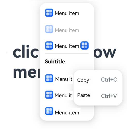
Example 1: Implementing a Multi-Level Menu
This example demonstrates how to implement a multi-level menu by configuring the builder parameter in MenuItem.
@Entry
@Component
struct Index {
  @State select: boolean = true
  private iconStr: ResourceStr = $r("app.media.view_list_filled")
  private iconStr2: ResourceStr = $r("app.media.arrow_right_filled")

  @Builder
  SubMenu() {
    Menu() {
      MenuItem({ content: "Copy", labelInfo: "Ctrl+C" })
      MenuItem({ content: "Paste", labelInfo: "Ctrl+V" })
    }
  }

  @Builder
  MyMenu(){
    Menu() {
      MenuItem({ startIcon: $r("app.media.icon"), content: "Menu item" })
      MenuItem({ startIcon: $r("app.media.icon"), content: "Menu item" })
        .enabled(false)
      MenuItem({
        startIcon: this.iconStr,
        content: "Menu item",
        endIcon: this.iconStr2,
        builder: ():void=>this.SubMenu()
      })
      MenuItemGroup({ header: 'Subtitle' }) {
        MenuItem({
          startIcon: this.iconStr,
          content: "Menu item",
          endIcon: this.iconStr2,
          builder: ():void=>this.SubMenu()
        })
        MenuItem({
          startIcon: $r("app.media.app_icon"),
          content: "Menu item",
          endIcon: this.iconStr2,
          builder: ():void=>this.SubMenu()
        })
      }
      MenuItem({
        startIcon: this.iconStr,
        content: "Menu item",
      })
    }
  }

  build() {
    Row() {
      Column() {
        Text('click to show menu')
          .fontSize(50)
          .fontWeight(FontWeight.Bold)
      }
      .bindMenu(this.MyMenu)
      .width('100%')
    }
    .height('100%')
  }
}
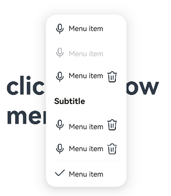
Example 2: Setting the Symbol Icon
This example demonstrates how to implement a menu with symbol icons by configuring symbolStartIcon and symbolEndIcon.
// xxx.ets
import { SymbolGlyphModifier } from '@kit.ArkUI';

@Entry
@Component
struct Index {
  @State startIconModifier: SymbolGlyphModifier = new SymbolGlyphModifier($r('sys.symbol.ohos_mic')).fontSize('24vp');
  @State endIconModifier: SymbolGlyphModifier = new SymbolGlyphModifier($r('sys.symbol.ohos_trash')).fontSize('24vp');
  @State selectIconModifier: SymbolGlyphModifier =
    new SymbolGlyphModifier($r('sys.symbol.checkmark')).fontSize('24vp');
  @State select: boolean = true;

  @Builder
  SubMenu() {
    Menu() {
      MenuItem({ content: "Copy", labelInfo: "Ctrl+C" })
      MenuItem({ content: "Paste", labelInfo: "Ctrl+V" })
    }
  }

  @Builder
  MyMenu() {
    Menu() {
      MenuItem({ symbolStartIcon: this.startIconModifier, content: "Menu item" })
      MenuItem({ symbolStartIcon: this.startIconModifier, content: "Menu item" })
        .enabled(false)
      MenuItem({
        symbolStartIcon: this.startIconModifier,
        content: "Menu item",
        symbolEndIcon: this.endIconModifier,
        builder: (): void => this.SubMenu()
      })
      MenuItemGroup({ header: 'Subtitle' }) {
        MenuItem({
          symbolStartIcon: this.startIconModifier,
          content: "Menu item",
          symbolEndIcon: this.endIconModifier,
          builder: (): void => this.SubMenu()
        })
        MenuItem({
          symbolStartIcon: this.startIconModifier,
          content: "Menu item",
          symbolEndIcon: this.endIconModifier,
          builder: (): void => this.SubMenu()
        })
      }
      MenuItem({
        content: "Menu item",
      }).selected(this.select).selectIcon(this.selectIconModifier)
    }
  }

  build() {
    Row() {
      Column() {
        Text('click to show menu')
          .fontSize(50)
          .fontWeight(FontWeight.Bold)
      }
      .bindMenu(this.MyMenu)
      .width('100%')
    }
    .height('100%')
  }
}
你可能感兴趣的鸿蒙文章
- 所属分类: 后端技术
- 本文标签:
热门推荐
-
2、 优质文章
-
3、 gt
-
7、 openharmony
-
9、 golang
-
10、 Vue中input框自动聚焦