harmony 鸿蒙NavDestination
NavDestination
NavDestination is the root container of a destination page and represents the content area of the Navigation component.
NOTE
This component is supported since API version 9. Updates will be marked with a superscript to indicate their earliest API version.
Since API version 11, this component supports the safe area attribute by default, with the default attribute value being expandSafeArea([SafeAreaType.SYSTEM], [SafeAreaEdge.TOP, SafeAreaEdge.BOTTOM]). You can override this attribute to change the default behavior. In earlier versions, you need to use the expandSafeArea attribute to implement the safe area feature.
The NavDestination component must be used in conjunction with the Navigation component to act as the root node for the navigation destination page. When used alone, it can only function as a standard container component and does not possess any routing-related attributes or capabilities.
If the lifecycle of a page in the middle of the navigation stack changes, the lifecycle of the destination page at the top of the stack before the transition (onWillShow, onShown, onHidden, onWillDisappear) and the lifecycle of the destination page after the transition (onWillShow, onShown, onHidden, onWillDisappear) are both triggered at the end.
If no main title or subtitle is set for NavDestination and there is no back button, the title bar is not displayed.
Child Components
Built-in components and custom components are allowed, with support for (if/else, ForEach, and LazyForEach) rendering control.
Number of child components: multiple.
APIs
NavDestination()
Atomic service API: This API can be used in atomic services since API version 11.
System capability: SystemCapability.ArkUI.ArkUI.Full
Attributes
The universal attributes are supported.
Avoid setting layout-related attributes such as the position and size. They may result in display issues on the page.
title
title(value: string|CustomBuilder|NavDestinationCommonTitle|NavDestinationCustomTitle|Resource, options?: NavigationTitleOptions)
Sets the page title. When the NavigationCustomTitle type is used to set the height, the titleMode attribute does not take effect. When the title string is too long: (1) If no subtitle is set, the string is scaled down, wrapped in two lines, and then clipped with an ellipsis (…); (2) If a subtitle is set, the subtitle is scaled down and then clipped with an ellipsis (…).
Atomic service API: This API can be used in atomic services since API version 11.
System capability: SystemCapability.ArkUI.ArkUI.Full
Parameters
| Name | Type | Mandatory | Description |
|---|---|---|---|
| value | string |CustomBuilder |NavDestinationCommonTitle |NavDestinationCustomTitle |Resource14+ | Yes | Page title. |
| options12+ | NavigationTitleOptions | No | Title bar options. |
hideTitleBar
hideTitleBar(value: boolean)
Specifies whether to hide the title bar.
Atomic service API: This API can be used in atomic services since API version 11.
System capability: SystemCapability.ArkUI.ArkUI.Full
Parameters
| Name | Type | Mandatory | Description |
|---|---|---|---|
| value | boolean | Yes | Whether to hide the title bar. Default value: false true: Hide the title bar. false: Display the title bar. |
hideTitleBar13+
hideTitleBar(hide: boolean, animated: boolean)
Sets whether to hide the title bar and whether to animate the visibility change.
Atomic service API: This API can be used in atomic services since API version 13.
System capability: SystemCapability.ArkUI.ArkUI.Full
Parameters
| Name | Type | Mandatory | Description |
|---|---|---|---|
| hide | boolean | Yes | Whether to hide the title bar. Default value: false true: Hide the title bar. false: Show the title bar. |
| animated | boolean | Yes | Whether to animate the visibility change. Default value: false true: Animate the visibility change. false: Do not animate the visibility change. |
toolbarConfiguration13+
toolbarConfiguration(toolbarParam: Array<ToolbarItem>|CustomBuilder, options?: NavigationToolbarOptions)
Sets the content of the toolbar. If this API is not called, the toolbar remains hidden.
Atomic service API: This API can be used in atomic services since API version 13.
System capability: SystemCapability.ArkUI.ArkUI.Full
Parameters
| Name | Type | Mandatory | Description |
|---|---|---|---|
| toolbarParam | Array<ToolbarItem> |CustomBuilder | Yes | Content of the toolbar. When configured with Array<ToolbarItem>, the toolbar follows the rules below: - Toolbar items are evenly distributed on the bottom toolbar, with text and icons evenly spaced in each content area. - If any item contains overlong text and there are fewer than five items, the toolbar will: 1. Increase the item width to accommodate the text until the toolbar spans the screen width; 2. Reduce the text size progressively; 3. Wrap the text over two lines; 4. Clip the text with an ellipsis (…). - In portrait mode, the toolbar shows a maximum of five icons, with any additional icons placed under an automatically generated More icon. In landscape mode, the behavior of the toolbar is determined by the display mode: (1) If the display mode is Split, the toolbar follows the same rules as in portrait mode. (2) If the display mode is Stack, the toolbar must be used together with Array<NavigationMenuItem> of the menus attribute; in this configuration, the bottom toolbar is automatically hidden, and all items on the toolbar are relocated to the menu in the upper right corner of the screen. When configured with CustomBuilder, the toolbar does not follow the above rules, except for evenly distributing items at the bottom of the toolbar. |
| options | NavigationToolbarOptions | No | Toolbar options. |
NOTE
The following are not allowed: modify the icon size through the fontSize attribute of the SymbolGlyphModifier object, change the animation effects through the effectStrategy attribute, or change the type of animation effects through the symbolEffect attribute.
hideToolBar13+
hideToolBar(hide: boolean, animated?: boolean)
Sets whether to hide the toolbar and whether to animate the visibility change.
Atomic service API: This API can be used in atomic services since API version 13.
System capability: SystemCapability.ArkUI.ArkUI.Full
Parameters
| Name | Type | Mandatory | Description |
|---|---|---|---|
| hide | boolean | Yes | Whether to hide the toolbar. Default value: false true: Hide the toolbar. false: Show the toolbar. |
| animated | boolean | No | Whether to animate the visibility change. Default value: false true: Animate the visibility change. false: Do not animate the visibility change. |
mode 11+
mode(value: NavDestinationMode)
Sets the mode of the NavDestination component. Dynamic modification is not supported.
Atomic service API: This API can be used in atomic services since API version 12.
System capability: SystemCapability.ArkUI.ArkUI.Full
Parameters
| Name | Type | Mandatory | Description |
|---|---|---|---|
| value | NavDestinationMode | Yes | Mode of the NavDestination component. Default value: NavDestinationMode.STANDARD |
backButtonIcon11+
backButtonIcon(value: ResourceStr|PixelMap|SymbolGlyphModifier)
NOTE
The following are not allowed: modify the icon size through the fontSize attribute of the SymbolGlyphModifier object, change the animation effects through the effectStrategy attribute, or change the type of animation effects through the symbolEffect attribute.
Sets the icon of the back button on the title bar.
Atomic service API: This API can be used in atomic services since API version 12.
System capability: SystemCapability.ArkUI.ArkUI.Full
Parameters
| Name | Type | Mandatory | Description |
|---|---|---|---|
| value | ResourceStr |PixelMap |SymbolGlyphModifier12+ | Yes | Icon of the back button on the title bar. |
backButtonIcon18+
backButtonIcon(icon: ResourceStr|PixelMap|SymbolGlyphModifier, accessibilityText?: ResourceStr)
NOTE
The following are not allowed: modify the icon size through the fontSize attribute of the SymbolGlyphModifier object, change the animation effects through the effectStrategy attribute, or change the type of animation effects through the symbolEffect attribute.
Sets the icon and accessibility text for the back button on the title bar.
Atomic service API: This API can be used in atomic services since API version 18.
System capability: SystemCapability.ArkUI.ArkUI.Full
Parameters
| Name | Type | Mandatory | Description |
|---|---|---|---|
| icon | ResourceStr |PixelMap |SymbolGlyphModifier | Yes | Icon of the back button on the title bar. |
| accessibilityText | ResourceStr | No | Accessibility text for the back button. Default value: back when the system language is English. |
menus12+
menus(items: Array<NavigationMenuItem>|CustomBuilder, options?: NavigationMenuOptions)
NOTE
The following are not allowed: modify the icon size through the fontSize attribute of the SymbolGlyphModifier object, change the animation effects through the effectStrategy attribute, or change the type of animation effects through the symbolEffect attribute.
Sets the menu items in the upper right corner of the page. If this attribute is not set, no menu item is displayed. When the value type is Array<NavigationMenuItem>, the menu shows a maximum of three icons in portrait mode and a maximum of five icons in landscape mode, with excess icons (if any) placed under the automatically generated More icon.
Atomic service API: This API can be used in atomic services since API version 12.
System capability: SystemCapability.ArkUI.ArkUI.Full
Parameters
| Name | Type | Mandatory | Description |
|---|---|---|---|
| items | Array<NavigationMenuItem> |CustomBuilder | Yes | Menu items in the upper right corner of the page. |
| options18+ | NavigationMenuOptions | No | Optional settings for menu items in the upper right corner of the page. |
ignoreLayoutSafeArea12+
ignoreLayoutSafeArea(types?: Array<LayoutSafeAreaType>, edges?: Array<LayoutSafeAreaEdge>)
Ignores the layout safe area by allowing the component to extend into the non-safe areas of the screen.
Atomic service API: This API can be used in atomic services since API version 12.
System capability: SystemCapability.ArkUI.ArkUI.Full
Parameters
| Name | Type | Mandatory | Description |
|---|---|---|---|
| types | Array <LayoutSafeAreaType> | No | Types of non-safe areas to extend into. Default value: [LayoutSafeAreaType.SYSTEM] |
| edges | Array <LayoutSafeAreaEdge> | No | Edges for expanding the safe area. Default value: [LayoutSafeAreaEdge.TOP, LayoutSafeAreaEdge.BOTTOM] |
NOTE
After LayoutSafeArea is set:
When LayoutSafeAreaType.SYSTEM is set, the component can extend into the non-safe area if its boundaries overlap with it. For example, if the device’s status bar is 100 high, the component must have an absolute vertical offset between 0 and 100 to extend into the non-safe area.If the component extends into the non-safe area, events triggered within that area (such as click events) might be intercepted by the system. This allows the system to prioritize responses to system components such as the status bar.
systemBarStyle12+
systemBarStyle(style: Optional<SystemBarStyle>)
Sets the style of the system status bar when this NavDestination page is displayed in the Navigation component.
Atomic service API: This API can be used in atomic services since API version 12.
System capability: SystemCapability.ArkUI.ArkUI.Full
Parameters
| Name | Type | Mandatory | Description |
|---|---|---|---|
| style | Optional<SystemBarStyle> | Yes | Style of the system status bar. |
NOTE
- The setting takes effect only when the NavDestination component is used in conjunction with the Navigation component.
- For other usage restrictions, see the description of systemBarStyle for the Navigation component.
systemTransition14+
systemTransition(type: NavigationSystemTransitionType)
Sets the system transition animation of the NavDestination component. System transition animations for the title bar and content area can be configured separately.
Atomic service API: This API can be used in atomic services since API version 14.
System capability: SystemCapability.ArkUI.ArkUI.Full
Parameters
| Name | Type | Mandatory | Description |
|---|---|---|---|
| type | NavigationSystemTransitionType | Yes | Type of the system transition animation. Default value: NavigationSystemTransitionType.DEFAULT |
recoverable14+
recoverable(recoverable: Optional<boolean>)
Sets whether the NavDestination component is recoverable. If set to recoverable, when the application process exits unexpectedly and restarts, the NavDestination component will be automatically recreated. To use this feature, ensure that the recoverable attribute is set for the Navigation component associated with the NavDestination component.
System capability: SystemCapability.ArkUI.ArkUI.Full
Parameters
| Name | Type | Mandatory | Description |
|---|---|---|---|
| recoverable | Optional<boolean> | Yes | Whether the NavDestination component is recoverable. By default, it is not recoverable. Default value: false true: The NavDestination component is recoverable. false: The NavDestination component is not recoverable. |
NOTE
This API must be used together with the recoverable API of Navigation.
bindToScrollable14+
bindToScrollable(scrollers: Array<Scroller>)
Binds the NavDestination component with a scrollable container, which can be a List, Scroll, Grid, or WaterFlow component. This way, scrolling in the scrollable container triggers the display and hide animations of the title bar and toolbar of all NavDestination components that are bound to it – scrolling up triggers the hide animation, and scrolling down triggers the show animation. A single NavDestination component can be bound to multiple scrollable containers, and a single scrollable container can be bound to multiple NavDestination components. For details, see Example 1.
NOTE
- The connection between the scrolling actions and the animations for showing or hiding the title bar and toolbar of the NavDestination component takes effect only when the title bar or toolbar is visible.
- If a NavDestination component is bound to multiple scrollable containers, scrolling in any of these containers triggers the display or hiding animations of the title bar and toolbar. Specifically, when any scrollable container reaches either the bottom or the top, the display animation for the title bar and toolbar is triggered without delay. As such, to ensure the optimal user experience, avoid triggering scroll events of multiple scrollable containers simultaneously.
Atomic service API: This API can be used in atomic services since API version 14.
System capability: SystemCapability.ArkUI.ArkUI.Full
Parameters
| Name | Type | Mandatory | Description |
|---|---|---|---|
| scrollers | Array<Scroller> | Yes | Controller of the target scrollable container. |
bindToNestedScrollable14+
bindToNestedScrollable(scrollInfos: Array<NestedScrollInfo>)
Binds the NavDestination component with a nested scrollable container, which can be a List, Scroll, Grid, or WaterFlow component. This way, scrolling in the scrollable container triggers the display and hide animations of the title bar and toolbar of all NavDestination components that are bound to it – scrolling up triggers the hide animation, and scrolling down triggers the show animation. A single NavDestination component can be bound to multiple nested scrollable containers, and a single nested scrollable container can be bound to multiple NavDestination components. For details, see Example 1.
NOTE
- The connection between the scrolling actions and the animations for showing or hiding the title bar and toolbar of the NavDestination component takes effect only when the title bar or toolbar is visible.
- If a NavDestination component is bound to multiple scrollable containers, scrolling in any of these containers triggers the display or hiding animations of the title bar and toolbar. Specifically, when any scrollable container reaches either the bottom or the top, the display animation for the title bar and toolbar is triggered without delay. As such, to ensure the optimal user experience, avoid triggering scroll events of multiple scrollable containers simultaneously.
Atomic service API: This API can be used in atomic services since API version 14.
System capability: SystemCapability.ArkUI.ArkUI.Full
Parameters
| Name | Type | Mandatory | Description |
|---|---|---|---|
| scrollInfos | Array<NestedScrollInfo> | Yes | Controller of the target nested scrollable containers. |
hideBackButton15+
hideBackButton(hide: Optional<boolean>)
Sets whether to hide the back button in the title bar.
Atomic service API: This API can be used in atomic services since API version 15.
System capability: SystemCapability.ArkUI.ArkUI.Full
Parameters
| Name | Type | Mandatory | Description |
|---|---|---|---|
| hide | Optional<boolean> | Yes | Whether to hide the back button in the title bar. Default value: false true: Hide the back button. false: Show the back button. |
customTransition15+
customTransition(delegate: NavDestinationTransitionDelegate)
Sets a custom transition animation for the NavDestination component.
NOTE
If both this attribute and systemTransition are set, whichever is set later takes effect.
Atomic service API: This API can be used in atomic services since API version 15.
System capability: SystemCapability.ArkUI.ArkUI.Full
Parameters
| Name | Type | Mandatory | Description |
|---|---|---|---|
| delegate | NavDestinationTransitionDelegate | Yes | Delegate function for custom animations of the NavDestination component. |
preferredOrientation18+
preferredOrientation(orientation: Optional<Orientation>)
Sets the display orientation for the NavDestination component. After the transition to the NavDestination, the system also switches the application’s main window to the specified display orientation.
NOTE
This attribute is effective only if the following conditions are all met: 1. The NavDestination component belongs to the application’s main window page, and the main window is a full-screen window. 2. The size of the Navigation container to which the NavDestination component belongs occupies the entire application page. 3. The type of NavDestination is STANDARD.
The actual effect of setting the display orientation depends on the specific device support. For details, see setPreferredOrientation.
Atomic service API: This API can be used in atomic services since API version 18.
System capability: SystemCapability.ArkUI.ArkUI.Full
Parameters
| Name | Type | Mandatory | Description |
|---|---|---|---|
| orientation | Optional<Orientation> | Yes | Display orientation to set. |
enableStatusBar18+
enableStatusBar(enabled: Optional<boolean>, animated?: boolean)
Sets whether to show or hide the system status bar when entering this NavDestination component.
NOTE
This attribute is effective only if the following conditions are all met: 1. The NavDestination component belongs to the application’s main window page, and the main window is a full-screen window. 2. The size of the Navigation container to which the NavDestination component belongs occupies the entire application page. 3. The size of the NavDestination component occupies the entire Navigation container. 4. The type of NavDestination is STANDARD.
The actual effect of setting the system status bar depends on the specific device support. For details, see setSpecificSystemBarEnabled.
Atomic service API: This API can be used in atomic services since API version 18.
System capability: SystemCapability.ArkUI.ArkUI.Full
Parameters
| Name | Type | Mandatory | Description |
|---|---|---|---|
| enabled | Optional<boolean> | Yes | Whether to show or hide the system status bar when entering the current NavDestination component. |
| animated | boolean | No | Whether to use an animation to show or hide the system status bar. Default value: false |
enableNavigationIndicator18+
enableNavigationIndicator(enabled: Optional<boolean>)
Sets whether to show or hide the system navigation bar when entering this NavDestination component.
NOTE
This attribute is effective only if the following conditions are all met: 1. The NavDestination component belongs to the application’s main window page, and the main window is a full-screen window. 2. The size of the Navigation container to which the NavDestination component belongs occupies the entire application page. 3. The size of the NavDestination component occupies the entire Navigation container. 4. The type of NavDestination is STANDARD.
The actual effect of setting the system navigation bar depends on the specific device support. For details, see setSpecificSystemBarEnabled.
Atomic service API: This API can be used in atomic services since API version 18.
System capability: SystemCapability.ArkUI.ArkUI.Full
Parameters
| Name | Type | Mandatory | Description |
|---|---|---|---|
| enabled | Optional<boolean> | Yes | Whether to show or hide the system navigation bar when entering the current NavDestination component. |
NavDestinationMode11+
Atomic service API: This API can be used in atomic services since API version 12.
System capability: SystemCapability.ArkUI.ArkUI.Full
| Name | Value | Description |
|---|---|---|
| STANDARD | 0 | Standard mode. |
| DIALOG | 1 | Dialog mode, where the navigation destination is transparent by default, and adding or removing the navigation destination from the navigation stack does not affect the lifecycle of the lower-layer navigation destinations. System transition animations are supported since API version 13. |
NavigationSystemTransitionType14+
System capability: SystemCapability.ArkUI.ArkUI.Full
| Name | Value | Description |
|---|---|---|
| DEFAULT | 0 | Default system transition animation. Atomic service API: This API can be used in atomic services since API version 14. |
| NONE | 1 | No system transition animation. Atomic service API: This API can be used in atomic services since API version 14. |
| TITLE | 2 | System transition animation of the title bar. Atomic service API: This API can be used in atomic services since API version 14. |
| CONTENT | 3 | System transition animation of the content area. Atomic service API: This API can be used in atomic services since API version 14. |
| FADE15+ | 4 | Fade-type system transition animation. Atomic service API: This API can be used in atomic services since API version 15. |
| EXPLODE15+ | 5 | Center-scale type system transition animation. Atomic service API: This API can be used in atomic services since API version 15. |
| SLIDE_RIGHT15+ | 6 | Right-slide type system transition animation. Atomic service API: This API can be used in atomic services since API version 15. |
| SLIDE_BOTTOM15+ | 7 | Bottom-slide type system transition animation. Atomic service API: This API can be used in atomic services since API version 15. |
NOTE > > System transition animations for the title bar and content area can be configured separately. > > The system transition animation of the title bar is only available for the push and pop animations of navigation destination pages in STANDARD mode, with the following constraints: > 1. When NavigationSystemTransitionType is set to TITLE, only the system transition animation of the title bar is displayed. > 2. When NavigationSystemTransitionType is set to CONTENT, only the system transition animation of the content area is displayed. > > When NONE or TITLE is set, no system transition animation is displayed. When CONTENT or DEFAULT is set, the system transition animation is displayed by default.
Events
In addition to the universal events, the following events are supported.
onShown10+
onShown(callback: () => void)
Called when the navigation destination page is displayed.
Atomic service API: This API can be used in atomic services since API version 11.
System capability: SystemCapability.ArkUI.ArkUI.Full
onHidden10+
onHidden(callback: () => void)
Called when the navigation destination page is hidden.
Atomic service API: This API can be used in atomic services since API version 11.
System capability: SystemCapability.ArkUI.ArkUI.Full
onWillAppear12+
onWillAppear(callback: Callback<void>)
Called when the navigation destination is about to be mounted. You can change the navigation stack in this callback function, and the change takes effect in the current frame.
Atomic service API: This API can be used in atomic services since API version 12.
System capability: SystemCapability.ArkUI.ArkUI.Full
onWillShow12+
onWillShow(callback: Callback<void>)
Called when the navigation destination is about to be displayed.
Atomic service API: This API can be used in atomic services since API version 12.
System capability: SystemCapability.ArkUI.ArkUI.Full
onWillHide12+
onWillHide(callback: Callback<void>)
Called when the navigation destination is about to be hidden.
Atomic service API: This API can be used in atomic services since API version 12.
System capability: SystemCapability.ArkUI.ArkUI.Full
onWillDisappear12+
onWillDisappear(callback: Callback<void>)
Called when the navigation destination is about to be unmounted (or when the transition animation, if any, is about to start).
Atomic service API: This API can be used in atomic services since API version 12.
System capability: SystemCapability.ArkUI.ArkUI.Full
onBackPressed10+
onBackPressed(callback: () => boolean)
This callback takes effect when there is one or more entries in the navigation stack bound to the Navigation component. Called when the back button is pressed.
The value true means that the back button logic is overridden, and false means that the previous page is displayed.
Atomic service API: This API can be used in atomic services since API version 11.
System capability: SystemCapability.ArkUI.ArkUI.Full
onReady11+
onReady(callback: Callback<NavDestinationContext>)
Called when the NavDestination component is about to build a child component.
Atomic service API: This API can be used in atomic services since API version 11.
System capability: SystemCapability.ArkUI.ArkUI.Full
onResult15+
onResult(callback: Optional<Callback<ESObject>>)
Triggered when the NavDestination component returns.
Atomic service API: This API can be used in atomic services since API version 15.
System capability: SystemCapability.ArkUI.ArkUI.Full
Parameters |Name|Type|Mandatory|Description| |——|——|—-|—————-| |callback|Optional<Callback<ESObject>>|Yes|Callback for page returning, with the parameter being the result parameter passed to the pop API. If this parameter is not passed, the input is undefined.|
onActive18+
onActive(callback: Optional<Callback<NavDestinationActiveReason>>)
Triggered when the NavDestination component becomes active (on top of the stack and operable, with no special components blocking it).
Atomic service API: This API can be used in atomic services since API version 18.
System capability: SystemCapability.ArkUI.ArkUI.Full
Parameters |Name|Type|Mandatory|Description| |——|——|—-|—————-| |callback|Optional<Callback<NavDestinationActiveReason>>|Yes|Reason why the NavDestination component switches from inactive to active.|
onInactive18+
onInactive(callback: Optional<Callback<NavDestinationActiveReason>>)
Triggered when NavDestination component becomes inactive (not on top of the stack and inoperable, or on top but blocked by special components).
Atomic service API: This API can be used in atomic services since API version 18.
System capability: SystemCapability.ArkUI.ArkUI.Full
Parameters |Name|Type|Mandatory|Description| |——|——|—-|—————-| |callback|Optional<Callback<NavDestinationActiveReason>>|Yes|Reason why the NavDestination component switches from active to inactive.|
onNewParam18+
onNewParam(callback: Optional<Callback<ESObject>>)
Triggered when a NavDestination page that already exists in the stack is moved to the top using launchMode.MOVE_TO_TOP_SINGLETON or launchMode.POP_TO_SINGLETON.
Atomic service API: This API can be used in atomic services since API version 18.
System capability: SystemCapability.ArkUI.ArkUI.Full
Parameters |Name|Type|Mandatory|Description| |——|——|—-|—————-| |callback|Optional<Callback<ESObject>>|Yes|Callback triggered by onNewParam, with the parameter being the data passed to the target page during navigation.|
NOTE
This callback is not triggered by replacePath or replaceDestination.
NavDestinationCommonTitle
Atomic service API: This API can be used in atomic services since API version 11.
System capability: SystemCapability.ArkUI.ArkUI.Full
| Name | Type | Mandatory | Description |
|---|---|---|---|
| main | string |Resource14+ | Yes | Main title. |
| sub | string |Resource14+ | Yes | Subtitle. |
NavDestinationCustomTitle
Atomic service API: This API can be used in atomic services since API version 11.
System capability: SystemCapability.ArkUI.ArkUI.Full
| Name | Type | Mandatory | Description |
|---|---|---|---|
| builder | CustomBuilder | Yes | Content of the title bar. |
| height | TitleHeight |Length | Yes | Height of the title bar. Value range: [0, +∞) |
NavDestinationContext11+
System capability: SystemCapability.ArkUI.ArkUI.Full
| Name | Type | Mandatory | Description |
|---|---|---|---|
| pathInfo | NavPathInfo | Yes | Path information of the navigation destination page. Atomic service API: This API can be used in atomic services since API version 11. |
| pathStack | NavPathStack | Yes | Page stack where the current navigation destination page is located. Atomic service API: This API can be used in atomic services since API version 11. |
| navDestinationId12+ | string | No | Unique ID of the current navigation destination page, which is automatically generated by the system and is irrelevant to the universal attribute id of the component. Atomic service API: This API can be used in atomic services since API version 12. |
getConfigInRouteMap12+
getConfigInRouteMap(): RouteMapConfig|undefined
Atomic service API: This API can be used in atomic services since API version 12.
System capability: SystemCapability.ArkUI.ArkUI.Full
Return value
| Type | Description |
|---|---|
| RouteMapConfig | Route map configuration of the current page. |
| undefined | undefined, returned when the page is not configured through the route table. |
RouteMapConfig12+
Atomic service API: This API can be used in atomic services since API version 12.
System capability: SystemCapability.ArkUI.ArkUI.Full
| Name | Type | Mandatory | Description |
|---|---|---|---|
| name | string | Yes | Page name. |
| pageSourceFile | string | Yes | Path of the page in the current package. |
| data | Object | Yes | Custom data of the page. |
NestedScrollInfo14+
Provides the information about the nested scrollable containers.
Atomic service API: This API can be used in atomic services since API version 14.
System capability: SystemCapability.ArkUI.ArkUI.Full
| Name | Type | Mandatory | Description |
|---|---|---|---|
| parent | Scroller | Yes | Controller of the target scrollable container. |
| child | Scroller | Yes | Controller of the scrollable container nested within the target scrollable container. This scrollable container is a child component of the target scrollable container. |
NavDestinationActiveReason18+
Enumerates the reasons why the activation state of the NavDestination component changes.
Atomic service API: This API can be used in atomic services since API version 18.
System capability: SystemCapability.ArkUI.ArkUI.Full
|Name|Value|Description | |—-|–|—————————————-| |TRANSITION|0 |The activation state changes through page navigation. | |CONTENT_COVER|1 |The activation state changes due to the opening or closing of a modal page.| |SHEET|2 |The activation state changes due to the opening or closing of a sheet.| |DIALOG|3 |The activation state changes due to the opening or closing of a custom dialog box.| |OVERLAY|4 |The activation state changes due to the opening or closing of an overlay using OverlayManager.| |APP_STATE|5 |The activation state changes due to switching between foreground and background states of the application.|
NavDestinationTransition15+
Defines a custom transition animation for the NavDestination component.
Atomic service API: This API can be used in atomic services since API version 15.
System capability: SystemCapability.ArkUI.ArkUI.Full
| Name | Type | Mandatory | Description |
|---|---|---|---|
| onTransitionEnd | Callback<void> | No | Callback triggered when the transition animation ends. |
| duration | number | No | Duration of the transition animation. Default value: 1000 (in milliseconds) |
| curve | Curve | No | Curve type of the animation. Default value: Curve.EaseInOut](https://m.seaxiang.com/blog/GqrIsa) |
| delay | number | No | Delay of the transition animation. Default value: 0 (in milliseconds) |
| event | Callback<void> | Yes | Closure function specifying the transition animation. The system generates the corresponding transition animation based on the modifications to the component’s UI state within the closure. For details, see event in animateTo. |
NavDestinationTransitionDelegate15+
type NavDestinationTransitionDelegate = (operation: NavigationOperation, isEnter: boolean) => Array<NavDestinationTransition>|undefined
Defines the delegate function for custom transition animations of the NavDestination component.
Atomic service API: This API can be used in atomic services since API version 15.
System capability: SystemCapability.ArkUI.ArkUI.Full
Parameters
| Name | Type | Mandatory | Description |
|---|---|---|---|
| operation | NavigationOperation | Yes | Type of navigation operation for the current page transition. |
| isEnter | boolean | Yes | Whether the current page is an entry page. true: The current page is an entry page. false: The current page is not an entry page. |
Return value
| Type | Description |
|---|---|
| Array<NavDestinationTransition> |undefined | Array of custom animations for the NavDestination page. If undefined is returned, the default system animation is used. |
Example
Example 1: Linking the Title Bar and Toolbar with Scrollable Components
This example shows how to bind a NavDestination component to scrollable containers so that scrolling in the scrollable containers triggers the animations for showing or hiding the title bar and toolbar of the NavDestination component.
import { SymbolGlyphModifier } from '@kit.ArkUI';

@Component
struct MyPageOne {
  private listScroller: Scroller = new Scroller();
  private scrollScroller: Scroller = new Scroller();
  private arr: number[] = [];

  aboutToAppear(): void {
    for (let i = 0; i < 30; i++) {
      this.arr.push(i);
    }
  }

  build() {
    NavDestination() {
      Scroll(this.scrollScroller) {
        Column() {
          List({ space: 0, initialIndex: 0, scroller: this.listScroller }) {
            ForEach(this.arr, (item: number, index: number) => {
              ListItem() {
                Text('' + item)
                  .height(100)
                  .fontSize(16)
                  .textAlign(TextAlign.Center)
                  .width('90%')
                  .margin({ left: '5%' })
                  .borderRadius(10)
                  .backgroundColor(Color.Gray)
              }
            }, (item: string) => item);
          }.width('100%').height('80%').scrollBar(BarState.Off)
          .nestedScroll({ scrollForward: NestedScrollMode.SELF_FIRST, scrollBackward: NestedScrollMode.SELF_FIRST })

          ForEach(this.arr, (item: number, index: number) => {
            ListItem() {
              Text('' + item)
                .height(100)
                .fontSize(16)
                .textAlign(TextAlign.Center)
                .width('90%')
                .margin({ top: '5%' })
                .borderRadius(10)
                .backgroundColor(Color.Pink)
            }
          }, (item: string) => item);
        }
      }
      .width('100%')
      .scrollBar(BarState.Off)
      .scrollable(ScrollDirection.Vertical)
      .edgeEffect(EdgeEffect.Spring)
    }
    .title('PageOne', { backgroundColor: Color.Yellow, barStyle: BarStyle.STACK })
    .toolbarConfiguration([
      {
        value: 'item1',
        symbolIcon: new SymbolGlyphModifier($r('sys.symbol.phone_badge_star'))
      }
    ], { backgroundColor: Color.Orange, barStyle: BarStyle.STACK })
    // Bind the NavDestination component to nested scrollable containers.
    .bindToNestedScrollable([{ parent: this.scrollScroller, child: this.listScroller }])
  }
}

@Component
struct MyPageTwo {
  private listScroller: Scroller = new Scroller();
  private arr: number[] = [];

  aboutToAppear(): void {
    for (let i = 0; i < 30; i++) {
      this.arr.push(i);
    }
  }

  build() {
    NavDestination() {
      List({ scroller: this.listScroller }) {
        ForEach(this.arr, (item: number, index: number) => {
          ListItem() {
            Text('' + item)
              .height(100)
              .fontSize(16)
              .textAlign(TextAlign.Center)
              .width('90%')
              .margin({ left: '5%' })
              .borderRadius(10)
              .backgroundColor(Color.Gray)
          }
        }, (item: string) => item);
      }.width('100%')
    }
    .title('PageTwo', { backgroundColor: Color.Yellow, barStyle: BarStyle.STACK })
    .toolbarConfiguration([
      {
        value: 'item1',
        symbolIcon: new SymbolGlyphModifier($r('sys.symbol.phone_badge_star'))
      }
    ], { backgroundColor: Color.Orange, barStyle: BarStyle.STACK })
    // Bind the NavDestination component to a scrollable container.
    .bindToScrollable([this.listScroller])
  }
}

@Entry
@Component
struct Index {
  private stack: NavPathStack = new NavPathStack();

  @Builder
  MyPageMap(name: string) {
    if (name === 'myPageOne') {
      MyPageOne()
    } else {
      MyPageTwo()
    }
  }

  build() {
    Navigation(this.stack) {
      Column() {
        Button('push PageOne').onClick(() => {
          this.stack.pushPath({ name: 'myPageOne' })
        })
        Button('push PageTwo').onClick(() => {
          this.stack.pushPath({ name: 'myPageTwo' })
        })
      }.height('40%').justifyContent(FlexAlign.SpaceAround)
    }.width('100%')
    .height('100%')
    .title({ main: 'MainTitle', sub: 'subTitle' })
    .navDestination(this.MyPageMap)
  }
}

Example 2: Setting a Custom Transitions for the NavDestination Component
The following example demonstrates how to set a custom transition animation for the NavDestination component using customTransition.
@Entry
@Component
struct NavDestinationCustomTransition {
  stack: NavPathStack = new NavPathStack()

  @Builder
  pageMap(name: string) {
    if (name) {
      NavDest()
    }
  }

  aboutToAppear(): void {
    this.stack.pushPath({name: 'dest0'})
  }

  build() {
    Navigation(this.stack) {
      // empty
    }
    .navDestination(this.pageMap)
    .hideNavBar(true)
    .title('Main Page')
    .titleMode(NavigationTitleMode.Mini)
  }
}

declare type voidFunc = () => void;

@Component
struct NavDest {
  @State name: string = 'NA'
  @State destWidth: string = '100%'
  stack: NavPathStack = new NavPathStack()
  @State y: string = '0';

  build() {
    NavDestination() {
      Column() {
        Button('push next page', { stateEffect: true, type: ButtonType.Capsule })
          .width('80%')
          .height(40)
          .margin(20)
          .onClick(() => {
            this.stack.pushPath({ name: this.name == 'PageOne' ? "PageTwo" : "PageOne" })
          })
      }
      .size({ width: '100%', height: '100%' })
    }
    .title(this.name)
    .translate({ y: this.y })
    .onReady((context) => {
      this.name = context.pathInfo.name;
      this.stack = context.pathStack;
    })
    .backgroundColor(this.name == 'PageOne' ? '#F1F3F5' : '#ff11dee5')
    .customTransition(
      (op: NavigationOperation, isEnter: boolean)
        : Array<NavDestinationTransition>|undefined => {
        console.log('[NavDestinationTransition]', 'reached delegate in frontend, op: ' + op + ', isEnter: ' + isEnter);

        let transitionOneEvent: voidFunc = () => { console.log('[NavDestinationTransition]', 'reached transitionOne, empty now!'); }
        let transitionOneFinishEvent: voidFunc = () => { console.log('[NavDestinationTransition]', 'reached transitionOneFinish, empty now!'); }
        let transitionOneDuration: number = 500;
        if (op === NavigationOperation.PUSH) {
          if (isEnter) {
            // ENTER_PUSH
            this.y = '100%';
            transitionOneEvent = () => {
              console.log('[NavDestinationTransition]', 'transitionOne, push & isEnter');
              this.y = '0';
            }
          } else {
            // EXIT_PUSH
            this.y = '0';
            transitionOneEvent = () => {
              console.log('[NavDestinationTransition]', 'transitionOne, push & !isEnter');
              this.y = '0';
            }
            transitionOneDuration = 450
          }
        } else if (op === NavigationOperation.POP) {
          if (isEnter) {
            // ENTER_POP
            this.y = '0';
            transitionOneEvent = () => {
              console.log('[NavDestinationTransition]', 'transitionOne, pop & isEnter');
              this.y = '0';
            }
          } else {
            // EXIT_POP
            this.y = '0';
            transitionOneEvent = () => {
              console.log('[NavDestinationTransition]', 'transitionOne, pop & !isEnter');
              this.y = '100%';
            }
          }
        } else {
          console.log('[NavDestinationTransition]', '----- NOT-IMPL BRANCH of NAV-DESTINATION CUSTOM TRANSITION -----');
        }

        let transitionOne: NavDestinationTransition = {
          duration: transitionOneDuration,
          delay: 0,
          curve: Curve.Friction,
          event: transitionOneEvent,
          onTransitionEnd: transitionOneFinishEvent
        };

        let transitionTwoEvent: voidFunc = () => { console.log('[NavDestinationTransition]', 'reached transitionTwo, empty now!'); }
        let transitionTwo: NavDestinationTransition = {
          duration: 1000,
          delay: 0,
          curve: Curve.EaseInOut,
          event: transitionTwoEvent,
          onTransitionEnd: () => { console.log('[NavDestinationTransition]', 'reached Two\'s finish'); }
        };

        return [
          transitionOne,
          transitionTwo,
        ];
      })
  }
}

Example 3: Setting System Transition Animations for the NavDestination Component
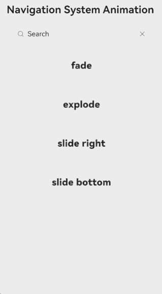
The following example demonstrates how to set system transition animations using systemTransition with Fade, Explode, SlideBottom, and SlideRight effects.
@Entry
@Component
struct NavDestinationSystemTransition {
  @Provide stack: NavPathStack = new NavPathStack()
  @Provide homePageTransitionType: NavigationSystemTransitionType = NavigationSystemTransitionType.DEFAULT;

  @Builder
  pageMap(name: string) {
    if (name === 'Fade') {
      Fade()
    } else if (name === 'Explode') {
      Explode()
    } else if (name === 'SlideRight') {
      SlideRight()
    } else if (name === 'SlideBottom') {
      SlideBottom()
    } else {
      Dest()
    }
  }

  aboutToAppear(): void {
    this.stack.pushPath({name: 'Dest'})
  }

  build() {
    Navigation(this.stack) {
      // empty
    }
    .navDestination(this.pageMap)
    .hideNavBar(true)
  }
}

@Component
struct Dest {
  @Consume stack: NavPathStack;
  @Consume homePageTransitionType: NavigationSystemTransitionType;
  @State name: string = 'NA';

  build() {
    NavDestination() {
      HomeBody()
    }
    .title('Navigation System Animation')
    .onReady((context) => {
      this.name = context.pathInfo.name
    })
    .systemTransition(this.homePageTransitionType)
  }
}

@Component
struct Fade {
  @Consume stack: NavPathStack;
  @State name: string = 'NA';

  build() {
    NavDestination() {
      DestBody({
        name: this.name
      })
    }
    .title(this.name)
    .onReady((context) => {
      this.name = context.pathInfo.name
    })
    .systemTransition(NavigationSystemTransitionType.FADE)
  }
}

@Component
struct Explode {
  @Consume stack: NavPathStack;
  @State name: string = 'NA';

  build() {
    NavDestination() {
      DestBody({
        name: this.name
      })
    }
    .title(this.name)
    .onReady((context) => {
      this.name = context.pathInfo.name
    })
    .systemTransition(NavigationSystemTransitionType.EXPLODE)
  }
}

@Component
struct SlideRight {
  @Consume stack: NavPathStack;
  @State name: string = 'NA';

  build() {
    NavDestination() {
      DestBody({
        name: this.name
      })
    }
    .title(this.name)
    .onReady((context) => {
      this.name = context.pathInfo.name
    })
    .systemTransition(NavigationSystemTransitionType.SLIDE_RIGHT)
  }
}

@Component
struct SlideBottom {
  @Consume stack: NavPathStack;
  @State name: string = 'NA';

  build() {
    NavDestination() {
      DestBody({
        name: this.name
      })
    }
    .title(this.name)
    .onReady((context) => {
      this.name = context.pathInfo.name
    })
    .systemTransition(NavigationSystemTransitionType.SLIDE_BOTTOM)
  }
}

@Component
struct DestBody {
  name: string = 'NA'

  columnTextSize: number = 22
  columnTextFontWeight: FontWeight = FontWeight.Bolder
  columnWidth: string = '65%'
  columnPadding: number = 22
  columnMargin: number = 10
  columnBorderRadius: number = 10

  build() {
    Column() {
      Column()
        .width('85')
        .height(50)
        .backgroundColor(Color.White)
      Column() {
        Text(this.name)
          .fontSize(this.columnTextSize)
          .fontWeight(this.columnTextFontWeight)
      }
      .width(this.columnWidth)
      .padding(this.columnPadding)
      .margin(this.columnMargin)
      .borderRadius(this.columnBorderRadius)
      .shadow(ShadowStyle.OUTER_DEFAULT_LG)
    }
  }
}

@Component
struct HomeBody {
  @Consume stack: NavPathStack;
  @Consume homePageTransitionType: NavigationSystemTransitionType;

  columnTextSize: number = 22
  columnTextFontWeight: FontWeight = FontWeight.Bolder
  columnWidth: string = '85%'
  columnPadding: number = 22
  columnMargin: number = 10
  columnBorderRadius: number = 10
  columnShadow: ShadowStyle = ShadowStyle.OUTER_DEFAULT_MD

  build() {
    Column() {
      Search({ value: 'Search' })
        .width(this.columnWidth)

      Column() {
        Text('fade')
          .fontSize(this.columnTextSize)
          .fontWeight(this.columnTextFontWeight)
      }
      .width(this.columnWidth)
      .padding(this.columnPadding)
      .margin(this.columnMargin)
      .borderRadius(this.columnBorderRadius)
      .shadow(this.columnShadow)
      .onClick(() => {
        this.homePageTransitionType = NavigationSystemTransitionType.FADE
        this.stack.pushPath({name: 'Fade'})
      })

      Column() {
        Text('explode')
          .fontSize(this.columnTextSize)
          .fontWeight(this.columnTextFontWeight)
      }
      .width(this.columnWidth)
      .padding(this.columnPadding)
      .margin(this.columnMargin)
      .borderRadius(this.columnBorderRadius)
      .shadow(this.columnShadow)
      .onClick(() => {
        this.homePageTransitionType = NavigationSystemTransitionType.EXPLODE
        this.stack.pushPath({name: 'Explode'})
      })

      Column() {
        Text('slide right')
          .fontSize(this.columnTextSize)
          .fontWeight(this.columnTextFontWeight)
      }
      .width(this.columnWidth)
      .padding(this.columnPadding)
      .margin(this.columnMargin)
      .borderRadius(this.columnBorderRadius)
      .shadow(this.columnShadow)
      .onClick(() => {
        this.homePageTransitionType = NavigationSystemTransitionType.SLIDE_RIGHT
        this.stack.pushPath({name: 'SlideRight'})
      })

      Column() {
        Text('slide bottom')
          .fontSize(this.columnTextSize)
          .fontWeight(this.columnTextFontWeight)
      }
      .width(this.columnWidth)
      .padding(this.columnPadding)
      .margin(this.columnMargin)
      .borderRadius(this.columnBorderRadius)
      .shadow(this.columnShadow)
      .onClick(() => {
        this.homePageTransitionType = NavigationSystemTransitionType.SLIDE_BOTTOM
        this.stack.pushPath({name: 'SlideBottom'})
      })
    }
  }
}
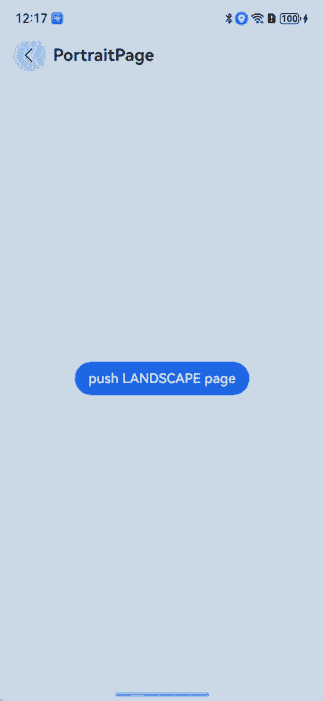
Example 4: Configuring Display Orientation and Status Bar and Navigation Bar Visibility
This example demonstrates how to configure each NavDestination component with specific display orientations and control the visibility of the status bar and navigation bar.
import { window } from '@kit.ArkUI';

@Component
struct PortraitPage {
  private stack: NavPathStack|undefined = undefined;
  build() {
    NavDestination() {
      Stack({alignContent: Alignment.Center}) {
        Button('push LANDSCAPE page').onClick(() => {
          this.stack?.pushPath({name: 'landscape'})
        })
      }.width('100%').height('100%')
    }
    .width('100%').height('100%')
    .title('PortraitPage')
    .preferredOrientation(window.Orientation.PORTRAIT) // Portrait orientation.
    .enableStatusBar (true) // Show the status bar.
    .enableNavigationIndicator(true) // Show the navigation bar.
    .backgroundColor('#ffbaece9')
    .onReady((ctx: NavDestinationContext) => {
      this.stack = ctx.pathStack;
    })
  }
}

@Component
struct LandscapePage {
  private stack: NavPathStack|undefined = undefined;
  build() {
    NavDestination() {
      Stack({alignContent: Alignment.Center}) {
        Button('push PORTRAIT page').onClick(() => {
          this.stack?.pushPath({name: 'portrait'})
        })
      }.width('100%').height('100%')
    }
    .width('100%').height('100%')
    .title('LandscapePage')
    .preferredOrientation(window.Orientation.LANDSCAPE) // Landscape orientation.
    .enableStatusBar(false) // Hide the status bar.
    .enableNavigationIndicator(false) // Hide the navigation bar.
    .backgroundColor('#ffecb8b8')
    .ignoreLayoutSafeArea([LayoutSafeAreaType.SYSTEM], [LayoutSafeAreaEdge.TOP, LayoutSafeAreaEdge.BOTTOM])
    .onReady((ctx: NavDestinationContext) => {
      this.stack = ctx.pathStack;
    })
  }
}

@Entry
@Component
struct ExamplePage {
  private stack: NavPathStack = new NavPathStack();

  aboutToAppear(): void {
    this.stack.pushPath({name: "portrait"})
  }

  @Builder
  MyPageMap(name: string) {
    if (name === 'portrait') {
      PortraitPage()
    } else {
      LandscapePage()
    }
  }

  build() {
    Navigation(this.stack) {
    }
    .width('100%')
    .height('100%')
    .hideNavBar(true)
    .navDestination(this.MyPageMap)
  }
}
For more usage of the NavDestination component, see Example in Navigation.
你可能感兴趣的鸿蒙文章
- 所属分类: 后端技术
- 本文标签:
热门推荐
-
2、 优质文章
-
3、 gt
-
7、 openharmony
-
9、 golang
-
10、 Vue中input框自动聚焦