harmony 鸿蒙RowSplit
RowSplit
The RowSplit lays out child components horizontally and inserts a vertical divider between every two child components.
NOTE
This component is supported since API version 7. Updates will be marked with a superscript to indicate their earliest API version.
Child Components
Supported
This component limits the width of its child components through dividers. During initialization, the divider positions are calculated based on the width of its child components. After initialization, changes to the width of the child components do not take effect. Still, the space occupied by the child components can be changed by dragging the dividers between them.
After initialization, if, due to dynamic changes to the margin, border, or padding attributes, the width of the child components is greater than the allowable distance between adjacent dividers, dividers cannot be dragged to adjust the width of the child components.
APIs
RowSplit()
Atomic service API: This API can be used in atomic services since API version 11.
System capability: SystemCapability.ArkUI.ArkUI.Full
Attributes
resizeable
resizeable(value: boolean)
Sets whether the divider can be dragged.
Atomic service API: This API can be used in atomic services since API version 11.
System capability: SystemCapability.ArkUI.ArkUI.Full
Parameters
| Name | Type | Mandatory | Description |
|---|---|---|---|
| value | boolean | Yes | Whether the divider can be dragged. Default value: false |
NOTE
The divider of RowSplit can change the width of the left and right child components, but only to the extent that the resultant width falls within the maximum and minimum widths of the child components.
Universal attributes such as clip and margin are supported. If clip is not set, the default value true is used.
Example
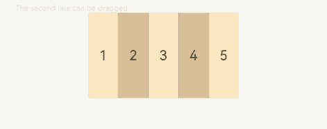
This example demonstrates the basic usage of RowSplit, which allows you to create draggable, horizontally laid-out child components.
// xxx.ets
@Entry
@Component
struct RowSplitExample {
  build() {
    Column() {
      Text('The second line can be dragged').fontSize(9).fontColor(0xCCCCCC).width('90%')
      RowSplit() {
        Text('1').width('10%').height(100).backgroundColor(0xF5DEB3).textAlign(TextAlign.Center)
        Text('2').width('10%').height(100).backgroundColor(0xD2B48C).textAlign(TextAlign.Center)
        Text('3').width('10%').height(100).backgroundColor(0xF5DEB3).textAlign(TextAlign.Center)
        Text('4').width('10%').height(100).backgroundColor(0xD2B48C).textAlign(TextAlign.Center)
        Text('5').width('10%').height(100).backgroundColor(0xF5DEB3).textAlign(TextAlign.Center)
      }
      .resizeable(true) // The divider can be dragged.
      .width('90%').height(100)
    }.width('100%').margin({ top: 5 })
  }
}
你可能感兴趣的鸿蒙文章
- 所属分类: 后端技术
- 本文标签:
热门推荐
-
2、 优质文章
-
3、 gt
-
7、 openharmony
-
9、 golang
-
10、 Vue中input框自动聚焦