harmony 鸿蒙Badge
Badge
The Badge component is a container that can be attached to another component for notification and reminder purposes.
NOTE
This component is supported since API version 7. Updates will be marked with a superscript to indicate their earliest API version.
Child Components
This component supports only one child component.
NOTE
Supported types of child components: built-in components and custom components, with support for (if/else, ForEach, and LazyForEach) rendering control.
APIs
Badge
Badge(value: BadgeParamWithNumber)
Creates a badge with the given numerical value.
Widget capability: This API can be used in ArkTS widgets since API version 9.
Atomic service API: This API can be used in atomic services since API version 11.
System capability: SystemCapability.ArkUI.ArkUI.Full
Parameters
| Name | Type | Mandatory | Description |
|---|---|---|---|
| value | BadgeParamWithNumber | Yes | Options of the numeric badge. |
Badge
Badge(value: BadgeParamWithString)
Creates a badge with the given string.
Widget capability: This API can be used in ArkTS widgets since API version 9.
Atomic service API: This API can be used in atomic services since API version 11.
System capability: SystemCapability.ArkUI.ArkUI.Full
This component supports the scaling effect for visibility transition since API version 12.
Parameters
| Name | Type | Mandatory | Description |
|---|---|---|---|
| value | BadgeParamWithString | Yes | Options of the string-type badge. |
BadgeParam
Provides basic parameters for creating a badge.
Widget capability: This API can be used in ArkTS widgets since API version 9.
Atomic service API: This API can be used in atomic services since API version 11.
System capability: SystemCapability.ArkUI.ArkUI.Full
| Name | Type | Mandatory | Description |
|---|---|---|---|
| position | BadgePosition|Position10+ | No | Position to display the badge relative to the parent component. Default value: BadgePosition.RightTop NOTE With the Position type, percentage values are not supported. If an invalid value is set, the default value (0,0), which indicates the upper left corner of the component, will be used. With the BadgePosition type, the position is mirrored based on the Direction property. |
| style | BadgeStyle | Yes | Style of the badge, including the font color, font size, badge color, and badge size. |
BadgeParamWithNumber
Inherits from BadgeParam and has all attributes of BadgeParam.
Widget capability: This API can be used in ArkTS widgets since API version 9.
Atomic service API: This API can be used in atomic services since API version 11.
System capability: SystemCapability.ArkUI.ArkUI.Full
| Name | Type | Mandatory | Description |
|---|---|---|---|
| count | number | Yes | Number of notifications. NOTE If the value is less than or equal to 0 and less than the value of maxCount, no badge is displayed. Value range: [-2147483648, 2147483647] If the value is out of the range, it will be adjusted by adding or subtracting 4294967296 to bring it back within the range. If the value is not an integer, it is rounded off to the nearest integer. For example, 5.5 is rounded off to 5. |
| maxCount | number | No | Maximum number of notifications. When the maximum number is reached, only maxCount+ is displayed. Default value: 99 Value range: [-2147483648, 2147483647] If the value is out of the range, it will be adjusted by adding or subtracting 4294967296 to bring it back within the range. If the value is not an integer, it is rounded off to the nearest integer. For example, 5.5 is rounded off to 5. |
BadgeParamWithString
Inherits from BadgeParam and has all attributes of BadgeParam.
Widget capability: This API can be used in ArkTS widgets since API version 9.
Atomic service API: This API can be used in atomic services since API version 11.
System capability: SystemCapability.ArkUI.ArkUI.Full
| Name | Type | Mandatory | Description |
|---|---|---|---|
| value | string | Yes | Prompt content. |
BadgePosition
Widget capability: This API can be used in ArkTS widgets since API version 9.
Atomic service API: This API can be used in atomic services since API version 11.
System capability: SystemCapability.ArkUI.ArkUI.Full
| Name | Value | Description |
|---|---|---|
| RightTop | 0 | The badge is displayed in the upper right corner of the parent component. |
| Right | 1 | The badge is vertically centered on the right of the parent component. |
| Left | 2 | The badge is vertically centered on the left of the parent component. |
BadgeStyle
Atomic service API: This API can be used in atomic services since API version 11.
System capability: SystemCapability.ArkUI.ArkUI.Full
| Name | Type | Mandatory | Description |
|---|---|---|---|
| color | ResourceColor | No | Font color. Default value: Color.White Widget capability: This API can be used in ArkTS widgets since API version 9. |
| fontSize | number |string | No | Font size. For the string type, only numeric string values with optional units, for example, “10” or “10fp”, are supported. Default value: 10 Unit: fp The value must be greater than or equal to 0. If the value is less than 0, the default value is used. NOTE This parameter cannot be set in percentage. Widget capability: This API can be used in ArkTS widgets since API version 9. |
| badgeSize | number |string | No | Badge size. For the string type, numeric string values with optional units, for example, “16” or “16fp”, are supported. Default value: 16 Unit: vp The value must be greater than or equal to 0. If the value is less than 0, the default value is used. NOTE This parameter cannot be set in percentage. If it is set to an invalid value, the default value is used. Widget capability: This API can be used in ArkTS widgets since API version 9. |
| badgeColor | ResourceColor | No | Badge color. Default value: Color.Red Widget capability: This API can be used in ArkTS widgets since API version 9. |
| fontWeight10+ | number |FontWeight |string | No | Font weight of the text. For the number type, the value ranges from 100 to 900, at an interval of 100. The default value is 400. A larger value indicates a heavier font weight. For the string type, only strings that represent a number, for example, 400, and the following enumerated values of FontWeight are supported: bold, bolder, lighter, regular, and medium. Default value: FontWeight.Normal NOTE This parameter cannot be set in percentage. |
| borderColor10+ | ResourceColor | No | Border color of the background. Default value: Color.Red |
| borderWidth10+ | Length | No | Border width of the background. Default value: 1 Unit: vp NOTE This parameter cannot be set in percentage. |
Attributes
The universal attributes are supported.
Events
The universal events are supported.
Example
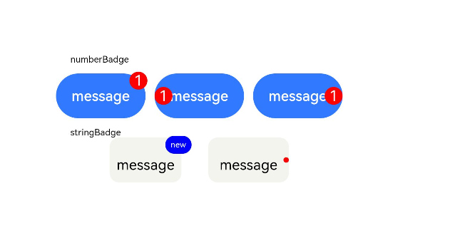
Example 1: Setting the Badge Content
This example illustrates the varying visual effects of the Badge component when it receives empty values, character strings, and numerical values through the value and count properties.
// xxx.ets
@Entry
@Component
struct BadgeExample {
  @Builder
  tabBuilder(index: number) {
    Column() {
      if (index === 2) {
        Badge({
          value: '',
          style: { badgeSize: 6, badgeColor: '#FA2A2D' }
        }) {
          Image('/common/public_icon_off.svg')
            .width(24)
            .height(24)
        }
        .width(24)
        .height(24)
        .margin({ bottom: 4 })
      } else {
        Image('/common/public_icon_off.svg')
          .width(24)
          .height(24)
          .margin({ bottom: 4 })
      }
      Text('Tab')
        .fontColor('#182431')
        .fontSize(10)
        .fontWeight(500)
        .lineHeight(14)
    }.width('100%').height('100%').justifyContent(FlexAlign.Center)
  }

  @Builder
  itemBuilder(value: string) {
    Row() {
      Image('common/public_icon.svg').width(32).height(32).opacity(0.6)
      Text(value)
        .width(177)
        .height(21)
        .margin({ left: 15, right: 76 })
        .textAlign(TextAlign.Start)
        .fontColor('#182431')
        .fontWeight(500)
        .fontSize(16)
        .opacity(0.9)
      Image('common/public_icon_arrow_right.svg').width(12).height(24).opacity(0.6)
    }.width('100%').padding({ left: 12, right: 12 }).height(56)
  }

  build() {
    Column() {
      // Badge of the red dot type
      Text('dotsBadge').fontSize(18).fontColor('#182431').fontWeight(500).margin(24)
      Tabs() {
        TabContent()
          .tabBar(this.tabBuilder(0))
        TabContent()
          .tabBar(this.tabBuilder(1))
        TabContent()
          .tabBar(this.tabBuilder(2))
        TabContent()
          .tabBar(this.tabBuilder(3))
      }
      .width(360)
      .height(56)
      .backgroundColor('#F1F3F5')

      // Create a badge with the given string.
      Column() {
        Text('stringBadge').fontSize(18).fontColor('#182431').fontWeight(500).margin(24)
        List({ space: 12 }) {
          ListItem() {
            Text('list1').fontSize(14).fontColor('#182431').margin({ left: 12 })
          }
          .width('100%')
          .height(56)
          .backgroundColor('#FFFFFF')
          .borderRadius(24)
          .align(Alignment.Start)

          ListItem() {
            Badge({
              value: 'New',
              position: BadgePosition.Right,
              style: { badgeSize: 16, badgeColor: '#FA2A2D' }
            }) {
              Text('list2').width(27).height(19).fontSize(14).fontColor('#182431')
            }.width(49.5).height(19)
            .margin({ left: 12 })
          }
          .width('100%')
          .height(56)
          .backgroundColor('#FFFFFF')
          .borderRadius(24)
          .align(Alignment.Start)
        }.width(336)

        // Create a badge with the given numerical value.
        Text('numberBadge').fontSize(18).fontColor('#182431').fontWeight(500).margin(24)
        List() {
          ListItem() {
            this.itemBuilder('list1')
          }

          ListItem() {
            Row() {
              Image('common/public_icon.svg').width(32).height(32).opacity(0.6)
              Badge({
                count: 1,
                position: BadgePosition.Right,
                style: { badgeSize: 16, badgeColor: '#FA2A2D' }
              }) {
                Text('list2')
                  .width(177)
                  .height(21)
                  .textAlign(TextAlign.Start)
                  .fontColor('#182431')
                  .fontWeight(500)
                  .fontSize(16)
                  .opacity(0.9)
              }.width(240).height(21).margin({ left: 15, right: 11 })

              Image('common/public_icon_arrow_right.svg').width(12).height(24).opacity(0.6)
            }.width('100%').padding({ left: 12, right: 12 }).height(56)
          }

          ListItem() {
            this.itemBuilder('list3')
          }

          ListItem() {
            this.itemBuilder('list4')
          }
        }
        .width(336)
        .height(232)
        .backgroundColor('#FFFFFF')
        .borderRadius(24)
        .padding({ top: 4, bottom: 4 })
        .divider({
          strokeWidth: 0.5,
          color: 'rgba(0,0,0,0.1)',
          startMargin: 60,
          endMargin: 12
        })
      }.width('100%').backgroundColor('#F1F3F5').padding({ bottom: 12 })
    }.width('100%')
  }
}
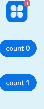
Example 2: Controlling the Badge Visibility with Numbers
This example shows how to use the count property to toggle the visibility of the Badge component. Specifically, when the count property is set to 0, the badge is hidden; when it is set to 1, the badge becomes visible.
// This example implements scaling when the badge visibility changes.
@Entry
@Component
struct Index {
  @State badgeCount: number = 1

  build() {
    Column({ space: 40 }) {
      Badge({
        count: this.badgeCount,
        style: {},
        position: BadgePosition.RightTop,
      }) {
        Image($r("app.media.startIcon"))
          .width(50)
          .height(50)
      }
      .width(55)

      Button('count 0').onClick(() => {
        this.badgeCount = 0
      })
      Button('count 1').onClick(() => {
        this.badgeCount = 1
      })
    }
    .margin({ top: 20 })
  }
}
你可能感兴趣的鸿蒙文章
- 所属分类: 后端技术
- 本文标签:
热门推荐
-
2、 优质文章
-
3、 gt
-
7、 openharmony
-
9、 golang
-
10、 Vue中input框自动聚焦