harmony 鸿蒙Focus Event
Focus Event
A focus event is triggered when the page focus moves between components. It can be used to process related logic within the component.
NOTE
The APIs of this module are supported since API version 8. Updates will be marked with a superscript to indicate their earliest API version.
Currently, only the Tab button and arrow buttons on the external keyboard can be used to trigger the focus event. Sequential keyboard navigation is not supported for nested scrollable components.
Components that have default interaction logic, such as Button and TextInput, are focusable by default. Other components, such as Text and Image, are not focusable by default. Only focusable components can trigger a focus event. To enable a component to be focusable, set its focusable attribute to true.
Container components that can gain focus, such as Stack and Row, are not focusable if they do not have any focusable child components. To make them focusable, you can add an onClick event or a tap gesture to the component. This makes the component implicitly focusable.
For details about focus development and component focusability, see Focus Event.
onFocus
onFocus(event: () => void)
Triggered when the current component obtains focus.
Atomic service API: This API can be used in atomic services since API version 11.
System capability: SystemCapability.ArkUI.ArkUI.Full
onBlur
onBlur(event:() => void)
Triggered when the current component loses focus.
Atomic service API: This API can be used in atomic services since API version 11.
System capability: SystemCapability.ArkUI.ArkUI.Full
Example
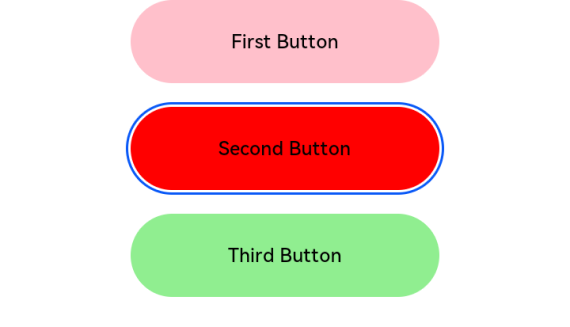
This example demonstrates how components gain and lose focus. The colors of the buttons change when they gain or lose focus.
// xxx.ets
@Entry
@Component
struct FocusEventExample {
  @State oneButtonColor: string = '#FFC0CB'
  @State twoButtonColor: string = '#87CEFA'
  @State threeButtonColor: string = '#90EE90'

  build() {
    Column({ space: 20 }) {
      // You can use the up and down arrow keys on an external keyboard to move the focus between the three buttons. When a button gains focus, its color changes. When it loses focus, its color changes back.
      Button('First Button')
        .backgroundColor(this.oneButtonColor)
        .width(260)
        .height(70)
        .fontColor(Color.Black)
        .focusable(true)
        .onFocus(() => {
          this.oneButtonColor = '#FF0000'
        })
        .onBlur(() => {
          this.oneButtonColor = '#FFC0CB'
        })
      Button('Second Button')
        .backgroundColor(this.twoButtonColor)
        .width(260)
        .height(70)
        .fontColor(Color.Black)
        .focusable(true)
        .onFocus(() => {
          this.twoButtonColor = '#FF0000'
        })
        .onBlur(() => {
          this.twoButtonColor = '#87CEFA'
        })
      Button('Third Button')
        .backgroundColor(this.threeButtonColor)
        .width(260)
        .height(70)
        .fontColor(Color.Black)
        .focusable(true)
        .onFocus(() => {
          this.threeButtonColor = '#FF0000'
        })
        .onBlur(() => {
          this.threeButtonColor = '#90EE90'
        })
    }.width('100%').margin({ top: 20 })
  }
}
你可能感兴趣的鸿蒙文章
- 所属分类: 后端技术
- 本文标签:
热门推荐
-
2、 优质文章
-
3、 gt
-
7、 openharmony
-
9、 golang
-
10、 Vue中input框自动聚焦