Action Sheet
An action sheet is a dialog box that displays actions a user can take.
NOTE
The APIs of this module are supported since API version 8. Updates will be marked with a superscript to indicate their earliest API version.
The functionality of this module depends on UI context. This means that the APIs of this module cannot be used where the UI context is unclear. For details, see UIContext.
Since API version 10, you can use the showActionSheet API in UIContext to obtain the UI context.
ActionSheet.show
show(value: { title: string|Resource, subtitle: Resource, message: string|Resource, confirm?: {enabled?: boolean, defaultFocus?: boolean, style?: DialogButtonStyle, value: string|Resource, action:() => void}, cancel?:()=>void, sheets: Array<SheetInfo>, autoCancel?:boolean, alignment?: DialogAlignment, offset?: { dx: number|string|Resource; dy: number|string|Resource } })
Defines and shows the action sheet.
Parameters
| Name | Type | Mandatory | Description |
|---|---|---|---|
| title | Resource |string | Yes | Title of the dialog box. |
| subtitle10+ | ResourceStr | No | Subtitle of the dialog box. |
| message | Resource |string | Yes | Content of the dialog box. |
| autoCancel | boolean | No | Whether to close the dialog box when the overlay is clicked. Default value: true The value true means to close the dialog box when the overlay is clicked, and false means the opposite. |
| confirm | { enabled10+?: boolean, defaultFocus10+?: boolean, style10+?: DialogButtonStyle, value: ResourceStr, action: () => void } | No | Information about the confirm button. enabled: whether to respond when the button is clicked. Default value: true defaultFocus: whether the button is the default focus. Default value: false style: button style. Default value: DialogButtonStyle.DEFAULT value: button text. action: callback upon button clicking. |
| cancel | () => void | No | Callback invoked when the dialog box is closed after the overlay is clicked. |
| alignment | DialogAlignment | No | Alignment mode of the dialog box in the vertical direction. Default value: DialogAlignment.Bottom |
| offset | { dx: Length, dy: Length } | No | Offset of the dialog box relative to the alignment position.{ dx: 0, dy: 0 } |
| sheets | Array<SheetInfo> | Yes | Options in the dialog box. Each option supports the image, text, and callback. |
| maskRect10+ | Rectangle | No | Mask area of the dialog box. Events outside the mask area are transparently transmitted, and events within the mask area are not. Default value: { x: 0, y: 0, width: '100%', height: '100%' } |
SheetInfo
| Name | Type | Mandatory | Description |
|---|---|---|---|
| title | ResourceStr | Yes | Sheet text. |
| icon | ResourceStr | No | Sheet icon. By default, no icon is displayed. |
| action | ()=>void | Yes | Callback when the sheet is selected. |
DialogButtonStyle10+
| Name | Description. |
|---|---|
| DEFAULT | Blue text on white background (black background under the dark theme). |
| HIGHLIGHT | White text on blue background. |
Example
@Entry
@Component
struct ActionSheetExample {
  build() {
    Flex({ direction: FlexDirection.Column, alignItems: ItemAlign.Center, justifyContent: FlexAlign.Center }) {
      Button('Click to Show ActionSheet')
        .onClick(() => {
          ActionSheet.show({
            title: 'ActionSheet title',
            subtitle: 'ActionSheet subtitle',
            message: 'message',
            autoCancel: true,
            confirm: {
              defaultFocus: true,
              value: 'Confirm button',
              action: () => {
                console.log('Get Alert Dialog handled')
              }
            },
            cancel: () => {
              console.log('actionSheet canceled')
            },
            alignment: DialogAlignment.Bottom,
            offset: { dx: 0, dy: -10 },
            sheets: [
              {
                title: 'apples',
                action: () => {
                  console.log('apples')
                }
              },
              {
                title: 'bananas',
                action: () => {
                  console.log('bananas')
                }
              },
              {
                title: 'pears',
                action: () => {
                  console.log('pears')
                }
              }
            ]
          })
        })
    }.width('100%')
    .height('100%')
  }
}
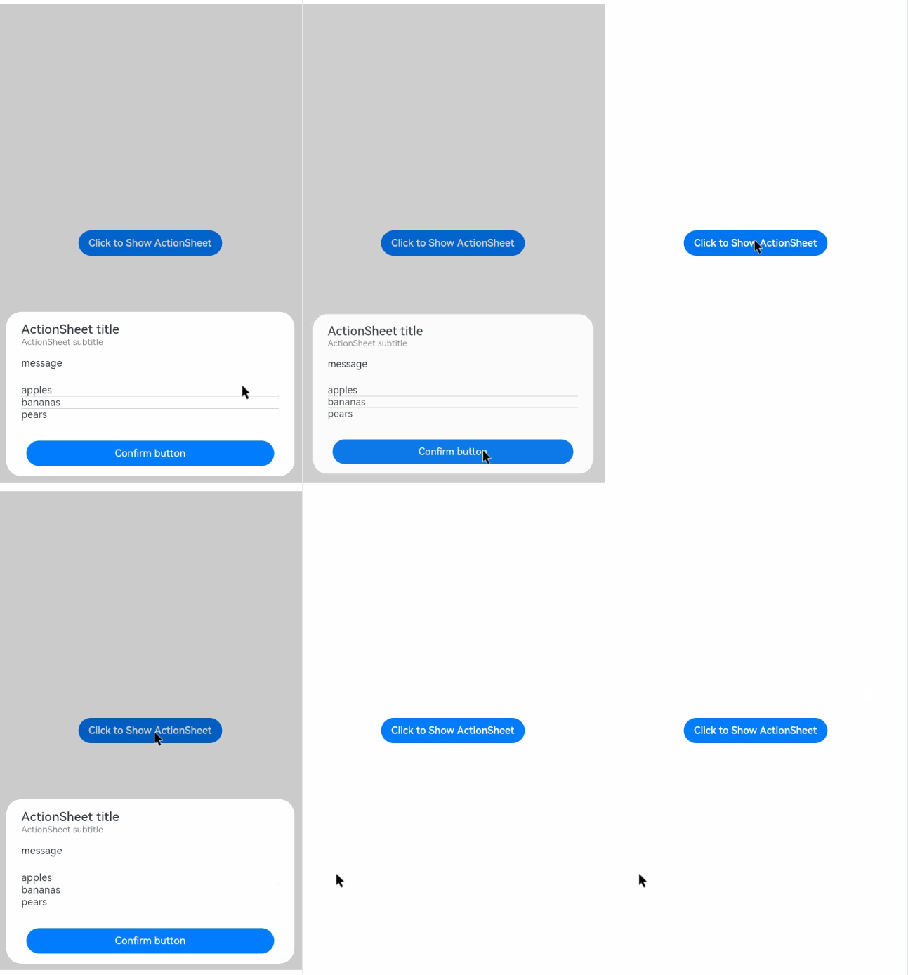
你可能感兴趣的鸿蒙文章
harmony 鸿蒙ArkTS-based Declarative Development Paradigm