harmony 鸿蒙Focus Control
Focus Control
Focus control attributes set whether a component is focusable and how it participates in focus navigation.
NOTE
The APIs of this module are supported since API version 8. Updates will be marked with a superscript to indicate their earliest API version.
Attributes
| Name | Type | Description |
|---|---|---|
| focusable | boolean | Whether the current component is focusable. NOTE Components that have default interaction logic, such as <Button> and <TextInput>, are focusable by default. Other components, such as <Text> and <Image>, are not focusable by default. Only focusable components can trigger a focus event. |
| tabIndex9+ | number | Tab order of the component in sequential focus navigation with the Tab key. When components with positive tabIndex values are present, only these components are reachable through sequential focus navigation, and they are navigated cyclically in ascending order based on the tabIndex value. When components with positive tabIndex values are not present, those components with a tabIndex value of 0 are navigated based on the preset focus navigation rule. - tabIndex >= 0: The component is focusable and can be reached through sequential keyboard navigation. - tabIndex < 0 (usually tabIndex = -1): The component is focusable, but cannot be reached through sequential keyboard navigation. Default value: 0 |
| defaultFocus9+ | boolean | Whether to set the component as the default focus of the page. This attribute takes effect only when the page is new and accessed for the first time. Default value: false |
| groupDefaultFocus9+ | boolean | Whether to set the component as the default focus of the parent container. This attribute takes effect only when the container is new and obtains focus for the first time. Default value: false NOTE This attribute must be used together with tabIndex. When tabIndex is set for a container and groupDefaultFocus is set for a component in the container, the focus is automatically shifted to that component when the container obtains focus for the first time. |
| focusOnTouch9+ | boolean | Whether the component is focusable on touch. Default value: false NOTE The component can obtain focus only when it is touchable or clickable. |
focusControl9+
requestFocus9+
requestFocus(value: string): boolean
Requests the focus to move to the specified component. This API can be used in global method statements.
Parameters
| Name | Type | Mandatory | Description |
|---|---|---|---|
| value | string | Yes | String bound to the target component using the key(value: string). |
Return value
| Type | Description |
|---|---|
| boolean | Returns whether the focus is successfully moved to the target component. Returns true if the specified component exists and the focus is successfully moved to the target component; returns false otherwise. |
NOTE
The following components support focus control: <TextInput>, <TextArea>, <Search>, <Button>, <Text>, <Image>, <List>, and <Grid>. Currently, the running effect of the focus event can be displayed only on a real device.
Example
Example 1
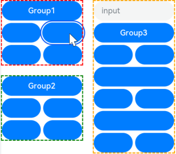
This example shows how to use defaultFocus, groupDefaultFocus, and focusOnTouch.
defaultFocus sets the bound component as the initial focus of the page after the page is created. groupDefaultFocus sets the bound component as the initial focus of the tabIndex container after the container is created. focusOnTouch sets the bound component to obtain focus upon being clicked.
// focusTest.ets
@Entry
@Component
struct FocusableExample {
  @State inputValue: string = ''

  build() {
    Scroll() {
      Row({ space: 20 }) {
        Column({ space: 20 }) {
          Column({ space: 5 }) {
            Button('Group1')
              .width(165)
              .height(40)
              .fontColor(Color.White)
              .focusOnTouch(true)           // The button is focusable on touch.
            Row({ space: 5 }) {
              Button()
                .width(80)
                .height(40)
                .fontColor(Color.White)
              Button()
                .width(80)
                .height(40)
                .fontColor(Color.White)
                .focusOnTouch(true)           // The button is focusable on touch.
            }
            Row({ space: 5 }) {
              Button()
                .width(80)
                .height(40)
                .fontColor(Color.White)
              Button()
                .width(80)
                .height(40)
                .fontColor(Color.White)
            }
          }.borderWidth(2).borderColor(Color.Red).borderStyle(BorderStyle.Dashed)
          .tabIndex(1)                      // The column is the initial component to have focus in sequential keyboard navigation.
          Column({ space: 5 }) {
            Button('Group2')
              .width(165)
              .height(40)
              .fontColor(Color.White)
            Row({ space: 5 }) {
              Button()
                .width(80)
                .height(40)
                .fontColor(Color.White)
              Button()
                .width(80)
                .height(40)
                .fontColor(Color.White)
                .groupDefaultFocus(true)      // The button obtains focus when its upper-level column is in focus.
            }
            Row({ space: 5 }) {
              Button()
                .width(80)
                .height(40)
                .fontColor(Color.White)
              Button()
                .width(80)
                .height(40)
                .fontColor(Color.White)
            }
          }.borderWidth(2).borderColor(Color.Green).borderStyle(BorderStyle.Dashed)
          .tabIndex(2)                      // The column is the second component to have focus in sequential keyboard navigation.
        }
        Column({ space: 5 }) {
          TextInput({placeholder: 'input', text: this.inputValue})
            .onChange((value: string) => {
              this.inputValue = value
            })
            .width(156)
            .defaultFocus(true)             // The <TextInput> component is the initial default focus of the page.
          Button('Group3')
            .width(165)
            .height(40)
            .fontColor(Color.White)
          Row({ space: 5 }) {
            Button()
              .width(80)
              .height(40)
              .fontColor(Color.White)
            Button()
              .width(80)
              .height(40)
              .fontColor(Color.White)
          }
          Button()
            .width(165)
            .height(40)
            .fontColor(Color.White)
          Row({ space: 5 }) {
            Button()
              .width(80)
              .height(40)
              .fontColor(Color.White)
            Button()
              .width(80)
              .height(40)
              .fontColor(Color.White)
          }
        }.borderWidth(2).borderColor(Color.Orange).borderStyle(BorderStyle.Dashed)
        .tabIndex(3)                      // The column is the third component to have focus in sequential keyboard navigation.
      }.alignItems(VerticalAlign.Top)
    }
  }
}
Diagrams:
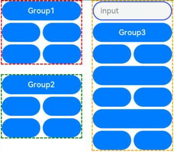
When you press the Tab key for the first time, the focus switches to the component bound to defaultFocus.
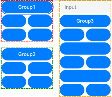
When you press the Tab key for the second time, the focus switches to the container that matches tabIndex(1) and automatically moves to the component bound to groupDefaultFocus.
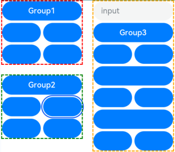
When you press the Tab key for the third time, the focus switches to the container that matches tabIndex(2) and automatically moves to the component bound to groupDefaultFocus.
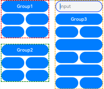
When you press the Tab key for the fourth time, the focus switches to the container that matches tabIndex(3) and automatically moves to the component bound to groupDefaultFocus.
Click the component bound to focusOnTouch. The component then obtains focus.
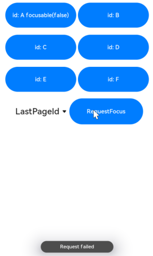
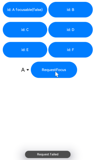
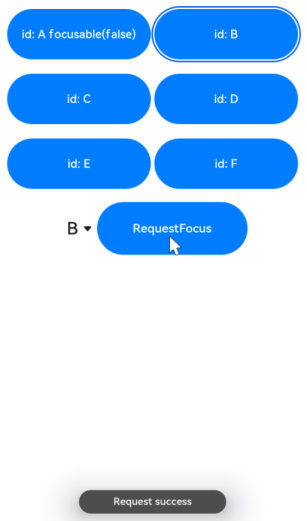
Example 2
This example shows how to use focusControl.requestFocus to move the focus to the specified component.
// requestFocus.ets
import promptAction from '@ohos.promptAction';

@Entry
@Component
struct RequestFocusExample {
  @State idList: string[] = ['A', 'B', 'C', 'D', 'E', 'F', 'LastPageId']
  @State selectId: string = 'LastPageId'

  build() {
    Column({ space:20 }){
      Row({space: 5}) {
        Button("id: " + this.idList[0] + " focusable(false)")
          .width(200).height(70).fontColor(Color.White)
          .key(this.idList[0])
          .focusable(false)
        Button("id: " + this.idList[1])
          .width(200).height(70).fontColor(Color.White)
          .key(this.idList[1])
      }
      Row({space: 5}) {
        Button("id: " + this.idList[2])
          .width(200).height(70).fontColor(Color.White)
          .key(this.idList[2])
        Button("id: " + this.idList[3])
          .width(200).height(70).fontColor(Color.White)
          .key(this.idList[3])
      }
      Row({space: 5}) {
        Button("id: " + this.idList[4])
          .width(200).height(70).fontColor(Color.White)
          .key(this.idList[4])
        Button("id: " + this.idList[5])
          .width(200).height(70).fontColor(Color.White)
          .key(this.idList[5])
      }
      Row({space: 5}) {
        Select([{value: this.idList[0]},
                {value: this.idList[1]},
                {value: this.idList[2]},
                {value: this.idList[3]},
                {value: this.idList[4]},
                {value: this.idList[5]},
                {value: this.idList[6]}])
          .value(this.selectId)
          .onSelect((index: number) => {
            this.selectId = this.idList[index]
          })
        Button("RequestFocus")
          .width(200).height(70).fontColor(Color.White)
          .onClick(() => {
            let res = focusControl.requestFocus(this.selectId)      // Move the focus to the component specified by this.selectId.
            if (res) {
              promptAction.showToast({message: 'Request success'})
            } else {
              promptAction.showToast({message: 'Request failed'})
            }
          })
      }
    }.width('100%').margin({ top:20 })
  }
}
Diagrams:
Press the Tab key to activate the focus state.
Below shows how the UI behaves when you request focus for a component that does not exist.
Below shows how the UI behaves when you request focus for a component that is not focusable.
Below shows how the UI behaves when you request focus for a focusable component.
你可能感兴趣的鸿蒙文章
harmony 鸿蒙ArkTS-based Declarative Development Paradigm
- 所属分类: 后端技术
- 本文标签:
热门推荐
-
2、 优质文章
-
3、 gt
-
7、 openharmony
-
9、 golang
-
10、 Vue中input框自动聚焦