harmony 鸿蒙ArkUI Subsystem Changelog
ArkUI Subsystem Changelog
cl.arkui.1 Floating Point Number Support Added for timeZoneOffset of the <TextClock> Component
Access Level
Public
Reason for Change
The time zone offset for some countries and regions is a floating point number. Therefore, floating point numbers need to be supported.
Change Impact
This change is a compatible change.
API Level
8
Change Since
OpenHarmony SDK 4.1.6.5
Key API/Component Changes
In versions earlier than API version 11, any floating point number set for the timeZoneOffset parameter of the <TextClock> component is converted to the corresponding integer.
Since API version 11, a floating point number in the { 9.5, 3.5, -3.5, -4.5, -5.5, -5.75, -6.5, -9.5, -10.5, -12.75 } range can be set for the timeZoneOffset parameter of the <TextClock> component.
Adaptation Guide
For details, see TextClock.
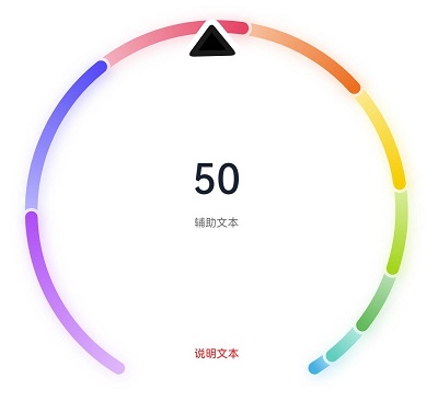
cl.arkui.2 Change in the Default Shadow Blur Radius of the <Gauge> Component
Access Level
Public
Reason for Change
The original default shadow blur radius, 5 vp, is too small for the <Gauge> component according to the UX specifications. Therefore, the default shadow blur radius is enlarged to 20 vp.
Change Impact
This change is a compatible change. It enhances the default display effect of the component.
API Level
11
Change Since
OpenHarmony SDK 4.1.6.5
Key API/Component Changes
Before OpenHarmony SDK 4.1.6.5, the default shadow blur radius of the <Gauge> component is 5 vp.
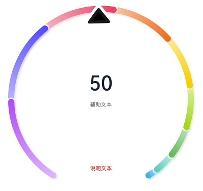
Since OpenHarmony SDK 4.1.6.5, the default shadow blur radius of the <Gauge> component is 20 vp.
Adaptation Guide
No adaptation is required. Yet, since the default display effect is changed, you need to check whether it meets your expectation. Change the display variables where necessary.
cl.arkui.3 Return Value Unit Change for getItemRect and getItemRectInGroup
Access Level
Public
Reason for Change
The unit of the return value type RectResult should be vp, not previously px.
Change Impact
This change is a non-compatible change. The unit of the value returned by o the getItemRect API of a scrollable component and the getItemRectInGroup API of the <List> component is changed from px to vp. The affected scenarios are as follows:
(a) The getItemRect API is called in a scrollable component to obtain the size and position of a child component.
Before change: The size and position returned are both in px.
After change: The size and position returned are both in vp.
(b) The getItemRectInGroup API is called in a <List> component to obtain the size and position of a list item in a list item group.
Before change: The size and position returned are both in px.
After change: The size and position returned are both in vp.
API Level
11
Change Since
OpenHarmony SDK 4.1.6.5
Key API/Component Changes
getItemRect (<List>, <Grid>, <WaterFlow>, <Scroll>) and getItemRectInGroup (<List>)
Adaptation Guide
If the px unit is required, you can use the vp2px API to convert the unit.
cl.arkui.4 Log Level Change for Value Assignment of @Link/@ObjectLink Decorated Variables
Access Level
Public
Reason for Change
The log level for value assignment of an @Link/@ObjectLink decorated variable in the parent component is changed from WARN to ERROR.
Change Impact
This change is a non-compatible change. After the change, an error is reported if an @Link/@ObjectLink decorated variable is not assigned a value in the parent component.
API Level
11
Change Since
OpenHarmony SDK 4.1.6.5
Example
let NextID: number = 1;

@Observed
class ClassA {
  public id: number;
  public c: number;

  constructor(c: number) {
    this.id = NextID++;
    this.c = c;
  }
}

@Entry
@Component
struct Parent {
  @State message: string = 'Hello';

  build() {
    Column() {
      // ERROR: Property 'message' in the custom component 'Child' is missing (mandatory to specify).
      // ERROR: Property 'message1' in the custom component 'Child' is missing (mandatory to specify).
      Child();
    }
  }
}

@Component
struct Child {
  @Link message: string;
  @ObjectLink message1: ClassA;

  build() {
    Row() {
    }
  }
}
Key API/Component Changes
N/A
Adaptation Guide
If a child component uses an @Link/@ObjectLink decorated variable, then the variable must be assigned a value in its parent component.
cl.arkui.5 Click Event Change for isShow in bindmenu
Access Level
Public
Reason for Change
When isShow is used in bindMenu, the menu can be displayed only through isShow.
Change Impact
This change is a non-compatible change. After the change, when isShow is used in bindMenu, clicking the parent component does not show the menu.
API Level
11
Change Since
OpenHarmony SDK 4.1.6.5 Example
@Entry
@Component
struct MenuExample {
  @State listData: number[] = [0, 0, 0]
  @State isShow: boolean = false

  @Builder MenuBuilder() {
    Flex({ direction: FlexDirection.Column, justifyContent: FlexAlign.Center, alignItems: ItemAlign.Center }) {
      ForEach(this.listData, (item:number, index) => {
        Column() {
          Row() {
            Image($r("app.media.icon")).width(20).height(20).margin({ right: 5 })
            Text(`Menu${index as number + 1}`).fontSize(20)
          }
          .width('100%')
          .height(30)
          .justifyContent(FlexAlign.Center)
          .align(Alignment.Center)
          .onClick(() => {
            console.info(`Menu${index as number + 1} Clicked!`)
          })

          if (index != this.listData.length - 1) {
            Divider().height(10).width('80%').color('#ccc')
          }
        }.padding(5).height(40)
      })
    }.width(100)
  }

  build() {
    Column() {
      Text('click for menu')
        .fontSize(20)
        .margin({ top: 20 })
        .onClick(()=>{
          this.isShow = true
        })
        .bindMenu(this.isShow, this.MenuBuilder,
          {
            onDisappear: ()=>{
              this.isShow = false
            }
          }
        )
    }
    .height('100%')
    .width('100%')
    .backgroundColor('#f0f0f0')
  }
}
Key API/Component Changes
bindMenu
Adaptation Guide
When isShow is used in bindMenu, the menu is displayed only after isShow is changed from false to true in related click, gesture, and hover events. If the menu cannot be displayed after the value of isShow is changed, use logs to print the value of isShow before and after your change. If the value remains unchanged, check whether the value of isShow is not updated to false in onDisappear when the menu disappears, or whether isShow is set to true initially.
cl.arkui.6 Removal of Incorrect Inheritance from OffscreenCanvas Class Declaration
Access Level
Public
Reason for Change
In the previous OffscreenCanvas class declaration, the parent class incorrect. As a result, DevEco Studio incorrectly associates methods and attributes that are not of the OffscreenCanvas class.
Change Impact
This change is a compatible change. After the change, the methods and attributes of the OffscreenCanvas class can be correctly displayed for intelligent code completion in DevEco Studio.
API Level
11
Change Since
OpenHarmony SDK 4.1.6.5
Key API/Component Changes
OffscreenCanvas
Adaptation Guide
N/A
cl.arkui.7 Float Type Support Added for layoutWeight
Access Level
Public
Reason for Change
The layoutWeight parameter needs to be set more precisely.
Change Impact
This change is a compatible change.
API Level
9
Change Since
OpenHarmony SDK 4.1.6.5
Key API/Component Changes
layoutWeight
Before API version 12, when the parameter is set to a float number, the digits after the decimal point are not counted.
Since API version 12, when the parameter is set to a float number, the digits after the decimal point are counted.
Adaptation Guide
N/A
cl.arkui.8 Height Configuration Change for the <GridRow> Component
Access Level
Public
Reason for Change
In previous versions, the <GridRow> component always adapts its height to child components, regardless of whether the height is set. The change is to correct this known issue.
Change Impact
This change is a non-compatible change. The height of the <GridRow> component can be customized.
API Level
9
Change Since
OpenHarmony SDK 4.1.6.5
Key API/Component Changes
<GridRow> component
Before API version 11, the <GridRow> component always adapts its height to child components, regardless of whether the height is set.
Since API version 11, the <GridRow> component is drawn based on the specified height. If no height is specified, the component adapts its height to child components.
Adaptation Guide
N/A
cl.arkui.9 Behavior Change for backgroundColor in <XComponent> of the surface Type
Access Level
Public
Reason for Change
Background color configuration is required for the <XComponent> of the surface type.
Change Impact
This change is a non-compatible change.
Before change: The background color is black by default regardless of the backgroundColor attribute settings.
After change: The background color specified through the backgroundColor attribute takes effect.
API Level
9
Change Since
OpenHarmony SDK 4.1.6.5
Example
@Entry
@Component
struct XComponentBKColor {
  private surfaceId: string = ''
  private xComponentContext: Record<string, () => void> = {}
  xComponentController: XComponentController = new XComponentController()

  build() {
    Row() {
      XComponent({
        id: 'xcomponentid',
        type: XComponentType.SURFACE,
        controller: this.xComponentController
      })
        .onLoad(() => {
          this.xComponentController.setXComponentSurfaceSize({ surfaceWidth: 1920, surfaceHeight: 1080 })
          this.surfaceId = this.xComponentController.getXComponentSurfaceId()
          this.xComponentContext = this.xComponentController.getXComponentContext() as Record<string, () => void>
        })
        .width('640px')
        .height('480px')
        .backgroundColor(Color.White)
    }
  }
}
Key API/Component Changes
XComponent
Adaptation Guide
After setting the backgroundColor attribute for the <XComponent> component of the surface type, ensure that the background color is what is required by the use scenario.
cl.arkui.10 Display Effect Change for the <TextInput> or <TextArea> Component When the Caret Exceeds the Rounded Corner
Access Level
Public
Reason for Change
This change is a non-compatible change. Previously, when padding is set to 0, the caret is displayed outside the default rounded corner of the text box, which does not meet application requirements.
Change Impact
Before change: When the text box uses the default rounded corners with a padding of 0, the caret is not clipped if it exceeds the rounded corners.
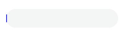
After change: When the text box uses the default rounded corners with a padding of 0, the caret is clipped if it exceeds the rounded corners.

API Level
9
Change Since
OpenHarmony SDK 4.1.6.5
Key API/Component Changes
TextInput/TextArea
Adaptation Guide
N/A
cl.arkui.11 Matching Rule Change for UI Instances of Global APIs
Access Level
Public
Reason for Change
The change is to standardize the UI instance matching of global APIs to avoid unexpected behavior caused by unclear instances.
Change Impact
In the multi-instance scenario, if a global API is called in the context that is not bound to any UI instance (for example, the routing API is used in an asynchronous callback), the instance scope of the API may change.
A global API requires a specific UI context to determine the UI instance that takes effect. You are advised to use the global APIs bound to an instance.
API Level
8
Change Since
OpenHarmony SDK 4.1.6.5
Key API/Component Changes
The following APIs are not recommended in multi-instance scenarios. You are advised to use the substitutes described in the adaptation guide.
| API | Description |
|---|---|
| @ohos.animator | Custom animation controller. |
| @ohos.arkui.componentSnapshot | Component screenshot. |
| @ohos.arkui.componentUtils | Component utility class. |
| @ohos.arkui.dragController | Drag controller. |
| @ohos.arkui.inspector | Layout callback. |
| @ohos.arkui.observer | Observer. |
| @ohos.font | Custom font registration. |
| @ohos.measure | Text measurement. |
| @ohos.mediaquery | Media query. |
| @ohos.promptAction | Prompt. |
| @ohos.router | Page routing. |
| AlertDialog | Alert dialog box. |
| ActionSheet | Action sheet. |
| CalendarPickerDialog | Calendar picker dialog box. |
| DatePickerDialog | Date picker dialog box. |
| TimePickerDialog | Time picker dialog box. |
| TextPickerDialog | Text picker dialog box. |
| ContextMenu | Menu control. |
| vp2px/px2vp/fp2px/px2fp/lpx2px/px2lpx | Pixel unit conversion. |
| focusControl | Focus control. |
| cursorControl | Cursor control. |
| getContext | Obtains the context of the current ability. |
| LocalStorage.getShared | Obtains the storage passed by the current ability. |
| animateTo | Explicit animation. |
| animateToImmediately | Explicit instant animation. |
Adaptation Guide
You can use the built-in method getUIContext of a component to obtain the UI context where the component is located and use the APIs listed below in UIContext to obtain the object bound to the instance.
| API in UIContext | Description |
|---|---|
| getRouter | Page routing. |
| getComponentUtils | Component utility class. |
| getUIInspector | Layout callback. |
| getUIObserver | Observer. |
| getMediaQuery | Media query. |
| getFont | Font. |
| getPrompAction | Prompt. |
| animateTo | Explicit animation. |
| showAlerDialog | Alert dialog box. |
| showActionSheet | Action sheet. |
| showDatePickerDialog | Date picker dialog box. |
| showTimePickerDialog | Time picker dialog box. |
| showTextPcikerDialog | Text picker dialog box. |
| createAnimator | Custom animation controller. |
| KeyboardAvoidMode | Keyboard avoidance. |
| getAtomicServiceBar | Cloud service. |
| getDragController/getDragPreview | Drag and drop. |
| runScopedTask | Executes the closure of the bound instance. |
For the following APIs that are not provided in UIContext, you can use runScopedTask for adaptation.
| API | Description |
|---|---|
| measure | Text measurement. |
| getContext | Obtains the context of the current ability. |
| LocalStorage.getShared | Obtains the storage passed by the current ability. |
| animateToImmediately | Explicit instant animation. |
| ContextMenu | Menu control. |
| vp2px/px2vp/fp2px/px2fp/lpx2px/px2lpx | Pixel unit conversion. |
| focusControl | Focus control. |
| cursorControl | Cursor control. |
| @ohos.arkui.componentSnapshot | Component screenshot. |
Example 1
// Use the route object bound to the instance for page routing.
@Entry
@Component
struct Index {
  build() {
    Row() {
      Button()
        .onClick(() => {
          let uiContext = this.getUIContext();
          let uiRouter = uiContext.getRouter();
          uiRouter.pushUrl({
            url: 'pages/Page'
          })
        })
    }
  }
}
Example 2
// Execute the closure of the bound instance.
@Entry
@Component
struct Index {
  build() {
    Row() {
      Button()
        .onClick(() => {
          let uiContext = this.getUIContext();
          uiContext.runScopedTask(() => {
            let context = getContext();
            console.log('Get context: ' + JSON.stringify(context))
          })
        })
    }
  }
}
你可能感兴趣的鸿蒙文章
harmony 鸿蒙Ability Subsystem Changelog
harmony 鸿蒙ArkCompiler Subsystem Changelog
harmony 鸿蒙ArkWeb Subsystem Changelog
harmony 鸿蒙Distributed Data Management Subsystem Changelog
- 所属分类: 后端技术
- 本文标签:
热门推荐
-
2、 优质文章
-
3、 gt
-
7、 openharmony
-
9、 golang
-
10、 Vue中input框自动聚焦