Progress
The <Progress> component represents a progress indicator that displays the progress of content loading or an operation.
NOTE
This component is supported since API version 7. Updates will be marked with a superscript to indicate their earliest API version.
Child Components
Not supported
APIs
Progress(options: {value: number, total?: number, type?: ProgressType})
Creates a progress indicator.
Since API version 9, this API is supported in ArkTS widgets.
Parameters
| Name | Type | Mandatory | Description |
|---|---|---|---|
| value | number | Yes | Current progress. If the value is less than 0, the value 0 is used. If the value is greater than that of total, the value of total is used. Since API version 9, this API is supported in ArkTS widgets. |
| total | number | No | Total progress. Default value: 100 Since API version 9, this API is supported in ArkTS widgets. |
| type8+ | ProgressType | No | Style of the progress indicator. Default value: ProgressType.Linear Since API version 9, this API is supported in ArkTS widgets. |
| style(deprecated) | ProgressStyle | No | Style of the progress indicator. This parameter is deprecated since API version 8. You are advised to use type instead. Default value: ProgressStyle.Linear |
ProgressType
Since API version 9, this API is supported in ArkTS widgets.
| Name | Description |
|---|---|
| Linear | Linear style. Since API version 9, the progress indicator adaptively switches to vertical layout if the height is greater than the width. |
| Ring8+ | Indeterminate ring style. The ring fills up as the progress increases. |
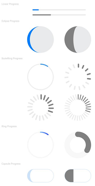
| Eclipse8+ | Eclipse style, which visualizes the progress in a way similar to the moon waxing from new to full. |
| ScaleRing8+ | Determinate ring style, which is similar to the clock scale. Since API version 9, when the outer circles of scales overlap, the progress indicator is automatically converted to the Ring style. |
| Capsule8+ | Capsule style. At both ends, the progress indicator works in a same manner as the eclipse style. In the middle part of the capsule, the progress indicator works in a same manner as the linear style. If the height is greater than the width, the progress indicator adaptively switches to vertical layout. |
ProgressStyle
Since API version 9, this API is supported in ArkTS widgets.
| Name | Description |
|---|---|
| Linear | Linear style. |
| Ring | Indeterminate ring style. The ring fills up as the progress increases. |
| Eclipse | Eclipse style, which visualizes the progress in a way similar to the moon waxing from new to full. |
| ScaleRing | Determinate ring style, which is similar to the clock scale. |
| Capsule | Capsule style. At both ends, the progress indicator works in a same manner as the eclipse style. In the middle part of the capsule, the progress indicator works in a same manner as the linear style. If the height is greater than the width, the progress indicator adaptively switches to vertical layout. |
Attributes
In addition to the universal attributes, the following attributes are supported.
| Name | Type | Description |
|---|---|---|
| value | number | Current progress. If the value is less than 0, the value 0 is used. If the value is greater than that of total, the value of total is used. Invalid values do not take effect. Since API version 9, this API is supported in ArkTS widgets. |
| color | ResourceColor |LinearGradient10+ | Background color of the progress indicator. Since API version 10, this attribute can be set to LinearGradient for the Ring style. Default value (API version 9): '#ff007dff' Default value (API version 10): - Capsule: '#33006cde' - Ring: starting point: '#ff3b61f7', ending point: '#ff6591bf' - Other styles: '#ff007dff' Since API version 9, this API is supported in ArkTS widgets, except that LinearGradient is not supported. |
| backgroundColor | ResourceColor | Background color of the progress indicator. Default value (API version 9): '#19182431' Default value (API version 10): - Capsule: '#33ffffff' - Ring: '#08182431' - Other styles: '#19182431' Since API version 9, this API is supported in ArkTS widgets. NOTE The settings of the universal attribute backgroundColor applies to the progress indicator instead of the entire <Progress> component. |
| style8+ | ProgressStyleOptions |CapsuleStyleOptions10+ |RingStyleOptions10+ |LinearStyleOptions10+ |ScaleRingStyleOptions10+ |EclipseStyleOptions10+ | Component style. Since API version 10, the following types are supported: - CapsuleStyleOptions: capsule style. - RingStyleOptions: ring style. - LinearStyleOptions: linear style. - ScaleRingStyleOptions: determinate ring style. - EclipseStyleOptions: eclipse style. - ProgressStyleOptions: basic style. Since API version 9, this API is supported in ArkTS widgets, but only the ProgressStyleOptions type is available. |
ProgressStyleOptions
| Name | Type | Mandatory | Description |
|---|---|---|---|
| strokeWidth | Length | No | Stroke width of the progress indicator. It cannot be set in percentage. Default value: 4.0vp |
| scaleCount | number | No | Number of divisions on the ring-style process indicator. Default value: 120 |
| scaleWidth | Length | No | Scale width of the ring-style progress bar. It cannot be set in percentage. If it is greater than the value of strokeWidth, the default scale width is used. Default value: 2.0vp |
| enableSmoothEffect10+ | boolean | No | Whether to enable the smooth effect. When this effect is enabled, the progress change to the set value takes place gradually. Otherwise, it takes place immediately. Default value: true |
CapsuleStyleOptions10+
| Name | Type | Mandatory | Description |
|---|---|---|---|
| borderColor | ResourceColor | No | Border color. Default value: '#33006cde' |
| borderWidth | Length | No | Border width. It cannot be set in percentage. Default value: 1vp |
| content | string | No | Text content, which can be customized . |
| font | Font | No | Text style. Default value: - Font size (cannot be set in percentage): 12fp - Other attributes: following the settings of the <Text> component. |
| fontColor | ResourceColor | No | Font color. Default value: '#ff182431' |
| enableScanEffect | boolean | No | Whether to enable the scan effect. Default value: false |
| showDefaultPercentage | boolean | No | Whether to show the percentage of the current progress. This attribute does not take effect when the content attribute is set. Default value: false |
| enableSmoothEffect | boolean | No | Whether to enable the smooth effect. When this effect is enabled, the progress change to the set value takes place gradually. Otherwise, it takes place immediately. Default value: true |
RingStyleOptions10+
| Name | Type | Mandatory | Description |
|---|---|---|---|
| strokeWidth | Length | No | Stroke width of the progress indicator. It cannot be set in percentage. A value greater than or equal to the radius evaluates to half of the radius. Default value: 4.0vp |
| shadow | boolean | No | Whether to enable the shadow effect. Default value: false |
| status | ProgressStatus10+ | No | Status of the progress indicator. When this parameter is set to LOADING, the check update animation is played, and the value settings do not take effect. When the value changes from LOADING to PROGRESSING, the check update animation stops when it has reached the end state. Default value: ProgressStatus.PROGRESSING |
| enableScanEffect | boolean | No | Whether to enable the scan effect. Default value: false |
| enableSmoothEffect | boolean | No | Whether to enable the smooth effect. When this effect is enabled, the progress change to the set value takes place gradually. Otherwise, it takes place immediately. Default value: true |
LinearStyleOptions10+
| Name | Type | Mandatory | Description |
|---|---|---|---|
| strokeWidth | Length | No | Stroke width of the progress indicator. It cannot be set in percentage. Default value: 4.0vp |
| strokeRadius | PX |VP |LPX |Resource | No | Rounded corner radius of the progress indicator. Value range: [0, strokeWidth/2] Default value: strokeWidth/2 |
| enableScanEffect | boolean | No | Whether to enable the scan effect. Default value: false |
| enableSmoothEffect | boolean | No | Whether to enable the smooth effect. When this effect is enabled, the progress change to the set value takes place gradually. Otherwise, it takes place immediately. Default value: true |
ScaleRingStyleOptions10+
| Name | Type | Mandatory | Description |
|---|---|---|---|
| strokeWidth | Length | No | Stroke width of the progress indicator. It cannot be set in percentage. Default value: 4.0vp |
| scaleCount | number | No | Number of divisions on the ring-style process indicator. Default value: 120 |
| scaleWidth | Length | No | Scale width of the ring-style progress bar. It cannot be set in percentage. If it is greater than the value of strokeWidth, the default scale width is used. Default value: 2.0vp |
| enableSmoothEffect | boolean | No | Whether to enable the smooth effect. When this effect is enabled, the progress change to the set value takes place gradually. Otherwise, it takes place immediately. Default value: true |
EclipseStyleOptions10+
| Name | Type | Mandatory | Description |
|---|---|---|---|
| enableSmoothEffect | boolean | No | Whether to enable the smooth effect. When this effect is enabled, the progress change to the set value takes place gradually. Otherwise, it takes place immediately. Default value: true |
ProgressStatus10+
| Name | Description |
|---|---|
| LOADING | Loading. |
| PROGRESSING | The progress is being updated. |
Events
The universal events are supported.
Example
Example 1
This example shows the effect of the basic attributes for different types of progress indicators.
// xxx.ets
@Entry
@Component
struct ProgressExample {
  build() {
    Column({ space: 15 }) {
      Text('Linear Progress').fontSize(9).fontColor(0xCCCCCC).width('90%')
      Progress({ value: 10, type: ProgressType.Linear }).width(200)
      Progress({ value: 20, total: 150, type: ProgressType.Linear }).color(Color.Grey).value(50).width(200)


      Text('Eclipse Progress').fontSize(9).fontColor(0xCCCCCC).width('90%')
      Row({ space: 40 }) {
        Progress({ value: 10, type: ProgressType.Eclipse }).width(100)
        Progress({ value: 20, total: 150, type: ProgressType.Eclipse }).color(Color.Grey).value(50).width(100)
      }

      Text('ScaleRing Progress').fontSize(9).fontColor(0xCCCCCC).width('90%')
      Row({ space: 40 }) {
        Progress({ value: 10, type: ProgressType.ScaleRing }).width(100)
        Progress({ value: 20, total: 150, type: ProgressType.ScaleRing })
          .color(Color.Grey).value(50).width(100)
          .style({ strokeWidth: 15, scaleCount: 15, scaleWidth: 5 })
      }

      // scaleCount vs. scaleWidth
      Row({ space: 40 }) {
        Progress({ value: 20, total: 150, type: ProgressType.ScaleRing })
          .color(Color.Grey).value(50).width(100)
          .style({ strokeWidth: 20, scaleCount: 20, scaleWidth: 5 })
        Progress({ value: 20, total: 150, type: ProgressType.ScaleRing })
          .color(Color.Grey).value(50).width(100)
          .style({ strokeWidth: 20, scaleCount: 30, scaleWidth: 3 })
      }

      Text('Ring Progress').fontSize(9).fontColor(0xCCCCCC).width('90%')
      Row({ space: 40 }) {
        Progress({ value: 10, type: ProgressType.Ring }).width(100)
        Progress({ value: 20, total: 150, type: ProgressType.Ring })
          .color(Color.Grey).value(50).width(100)
          .style({ strokeWidth: 20 })
      }

      Text('Capsule Progress').fontSize(9).fontColor(0xCCCCCC).width('90%')
      Row({ space: 40 }) {
        Progress({ value: 10, type: ProgressType.Capsule }).width(100).height(50)
        Progress({ value: 20, total: 150, type: ProgressType.Capsule })
          .color(Color.Grey)
          .value(50)
          .width(100)
          .height(50)
      }
    }.width('100%').margin({ top: 30 })
  }
}
Example 2
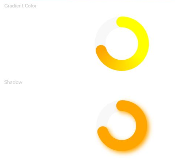
This example shows the effect of visual attributes of the ring style progress indicator.
@Entry
@Component
struct ProgressExample {
  private gradientColor: LinearGradient = new LinearGradient([{ color: Color.Yellow, offset: 0.5 },
                                                              { color: Color.Orange, offset: 1.0 }])
  build() {
    Column({ space: 15 }) {
      Text('Gradient Color').fontSize(9).fontColor(0xCCCCCC).width('90%')
      Progress({ value: 70, total: 100, type: ProgressType.Ring })
        .width(100).style({ strokeWidth: 20 })
        .color(this.gradientColor)

      Text('Shadow').fontSize(9).fontColor(0xCCCCCC).width('90%')
      Progress({ value: 70, total: 100, type: ProgressType.Ring })
        .width(120).color(Color.Orange)
        .style({ strokeWidth: 20, shadow: true })
    }.width('100%').padding({ top: 5 })
  }
}
Example 3
This example shows the animation effect of the ring style progress indicator.
@Entry
@Component
struct ProgressExample {
  private gradientColor: LinearGradient = new LinearGradient([{ color: Color.Yellow, offset: 0.5 },
                                                              { color: Color.Orange, offset: 1.0 }])
  build() {
    Column({ space: 15 }) {
      Text('Loading Effect').fontSize(9).fontColor(0xCCCCCC).width('90%')
      Progress({ value: 0, total: 100, type: ProgressType.Ring })
        .width(100).color(Color.Blue)
        .style({ strokeWidth: 20, status: ProgressStatus.LOADING })

      Text('Scan Effect').fontSize(9).fontColor(0xCCCCCC).width('90%')
      Progress({ value: 30, total: 100, type: ProgressType.Ring })
        .width(100).color(Color.Orange)
        .style({ strokeWidth: 20, enableScanEffect: true })
    }.width('100%').padding({ top: 5 })
  }
}

Example 4
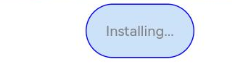
This example shows the effect of visual attributes of the capsule style progress indicator.
@Entry
@Component
struct ProgressExample {

  build() {
    Column({ space: 15 }) {
      Row({ space: 40 }) {
        Progress({ value: 100, total: 100,type: ProgressType.Capsule }).width(100).height(50)
          .style({borderColor: Color.Blue, borderWidth: 1, content: 'Installing...',
                  font: {size: 13, style: FontStyle.Normal}, fontColor: Color.Gray,
                  enableScanEffect: false, showDefaultPercentage: false})
      }
    }.width('100%').padding({ top: 5 })
  }
}
Example 5
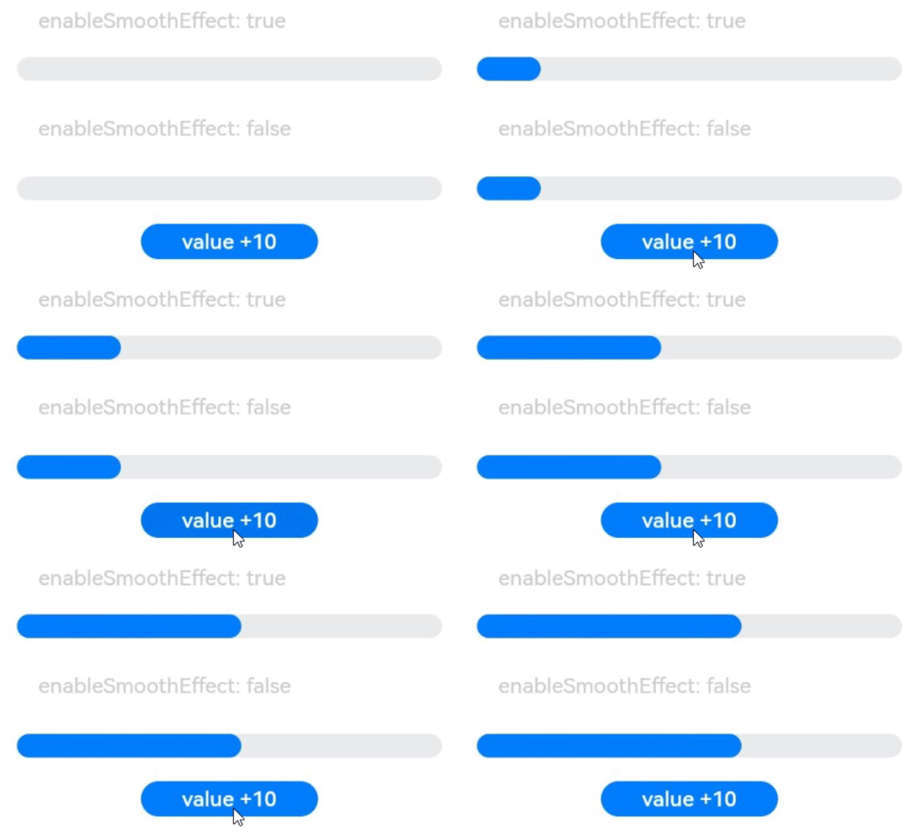
This example shows the smooth effect.
@Entry
@Component
struct Index {
  @State value: number = 0

  build() {
    Column({space: 10}) {
      Text('enableSmoothEffect: true').fontSize(9).fontColor(0xCCCCCC).width('90%').margin(5)
        .margin({top: 20})
      Progress({value: this.value, total: 100, type:ProgressType.Linear})
        .style({strokeWidth: 10, enableSmoothEffect: true})

      Text('enableSmoothEffect: false').fontSize(9).fontColor(0xCCCCCC).width('90%').margin(5)
      Progress({value: this.value, total: 100, type:ProgressType.Linear})
        .style({strokeWidth: 10, enableSmoothEffect: false})

      Button('value +10').onClick(() => {
        this.value += 10
      })
        .width(75)
        .height(15)
        .fontSize(9)
    }
    .width('50%')
    .height('100%')
    .margin({left:20})
  }
}
你可能感兴趣的鸿蒙文章
harmony 鸿蒙ArkTS-based Declarative Development Paradigm